06Menu icon morph
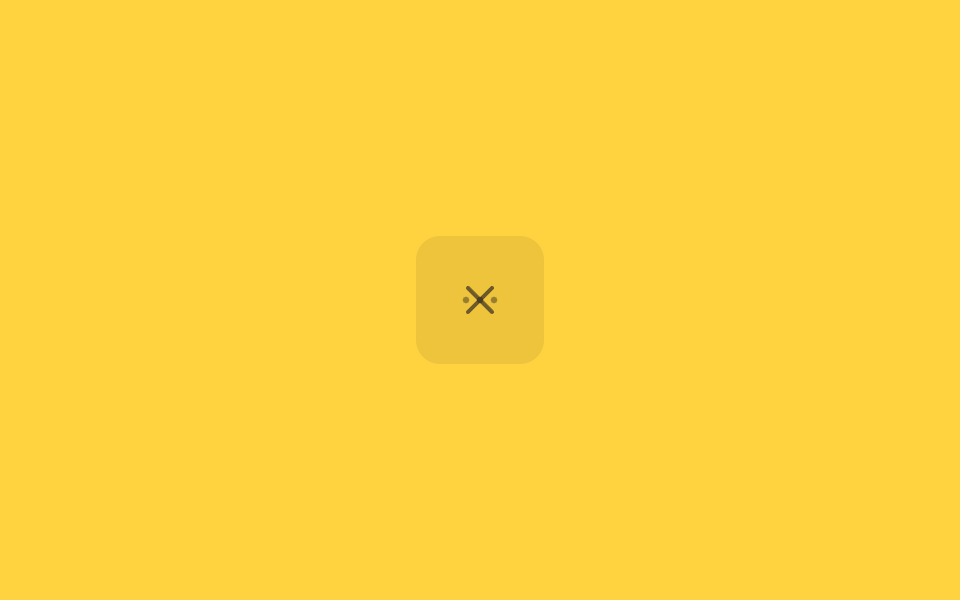
A three-dot menu path and an X path sit stacked and cross-dissolve via opacity.
Best for"More options" buttons on cards and list rows
점 3개 → Xopacity 크로스페이드220ms
<main class="stage">
  <button class="iconbtn is-demo" type="button" aria-expanded="false" aria-labelledby="t6">
    <span class="iconbtn__stack">
      <svg class="ic ic--dots" viewBox="0 0 24 24" width="24" height="24">
        <title id="t6">Open menu</title>
        <circle cx="5" cy="12" r="1.6"/><circle cx="12" cy="12" r="1.6"/><circle cx="19" cy="12" r="1.6"/>
      </svg>
      <svg class="ic ic--x" viewBox="0 0 24 24" width="24" height="24" aria-hidden="true">
        <path d="M6 6l12 12M18 6L6 18" fill="none" stroke="currentColor" stroke-width="2" stroke-linecap="round"/>
      </svg>
      <svg class="fx" viewBox="0 0 24 24" width="24" height="24" aria-hidden="true">
        <circle class="fx__halo" cx="12" cy="12" r="6"/>
        <circle class="fx__spark" r=".9" cx="12" cy="12"/>
        <circle class="fx__bit" r=".5" cx="5" cy="12" style="--dx:-2.6px;--dy:0px"/>
        <circle class="fx__bit" r=".5" cx="12" cy="12" style="--dx:0px;--dy:-2.6px"/>
        <circle class="fx__bit" r=".5" cx="19" cy="12" style="--dx:2.6px;--dy:0px"/>
        <circle class="fx__bit" r=".45" cx="7" cy="7" style="--dx:-2px;--dy:-2px"/>
        <circle class="fx__bit" r=".45" cx="17" cy="17" style="--dx:2px;--dy:2px"/>
        <circle class="fx__bit" r=".45" cx="17" cy="7" style="--dx:2px;--dy:-2px"/>
      </svg>
    </span>
  </button>
</main>
@use "../../../../site/static/demo-tokens" as *;
// ── 변수 3개 ──────────────────────────────
$duration: $dur-quick; // 220ms — 실제 클릭 전환 시간
$easing: $ease-out;
$color: $subject-ink;
// ── 데모 무대 ───────────────────────────────
@include stage($stage-yellow);
.iconbtn {
border: 0; border-radius: $r-control; cursor: pointer;
width: clamp(52px, 14vw, 64px); height: clamp(52px, 14vw, 64px);
display: grid; place-items: center;
background: rgba(23, 20, 26, .08); color: $color;
-webkit-tap-highlight-color: transparent;
}
.iconbtn:focus-visible { outline: 2px solid $color; outline-offset: 3px; }
.iconbtn__stack { display: grid; place-items: center; width: 100%; height: 100%; }
// 점 3개 아이콘과 X 아이콘을 같은 칸에 겹쳐 놓고 opacity 로만 넘긴다
.ic { grid-area: 1 / 1; fill: currentColor; transition: opacity $duration $easing; }
.ic--dots { opacity: 1; }
.ic--x { opacity: 0; }
.iconbtn[aria-expanded="true"] .ic--dots { opacity: 0; }
.iconbtn[aria-expanded="true"] .ic--x { opacity: 1; }
.iconbtn.is-demo .ic--dots { animation: dots-loop $dur-loop $easing infinite; }
.iconbtn.is-demo .ic--x { animation: x-loop $dur-loop $easing infinite; }
@keyframes dots-loop { 0%, 15% { opacity: 1; } 40%, 60% { opacity: 0; } 85%, 100% { opacity: 1; } }
@keyframes x-loop { 0%, 15% { opacity: 0; } 40%, 60% { opacity: 1; } 85%, 100% { opacity: 0; } }
// ── 한 겹: 전환 순간 링 파동 + 스파크 입자 ─────────────────
// 아이콘과 같은 칸에 겹쳐 놓은 효과 레이어 — 레이아웃에는 영향이 없다
.fx {
grid-area: 1 / 1;
fill: currentColor;
pointer-events: none;
}
// 링 파동 — 전환 순간 중앙에서 퍼지며 옅어지는 미광
.fx__halo {
fill: none;
stroke: $color;
stroke-width: .8;
opacity: 0;
transform-box: fill-box;
transform-origin: 50% 50%;
}
@keyframes halo-ring {
0% { opacity: .55; transform: scale(.4); }
100% { opacity: 0; transform: scale(1.7); }
}
// 중앙 스파크 — 터지는 순간 밝게 점멸
.fx__spark {
opacity: 0;
transform-box: fill-box;
transform-origin: 50% 50%;
filter: drop-shadow(0 0 1px $color);
}
@keyframes spark-pop {
0% { opacity: .95; transform: scale(1.8); }
60% { opacity: .4; transform: scale(.8); }
100% { opacity: 0; transform: scale(.3); }
}
// 전환 순간 흩어지는 입자 — 각자 지정 방향(--dx,--dy)으로 튄다
.fx__bit {
opacity: 0;
transform: translate(0, 0);
animation: bit-fly 420ms $ease-out forwards;
}
@keyframes bit-fly {
0% { opacity: .9; transform: translate(0, 0) scale(1); }
100% { opacity: 0; transform: translate(var(--dx), var(--dy)) scale(.3); }
}
@media (prefers-reduced-motion: reduce) {
.iconbtn.is-demo .ic--dots, .iconbtn.is-demo .ic--x { animation: none; }
.ic { transition: none; }
.fx { display: none; }
}html, body {
margin: 0;
overflow: hidden;
}
.stage {
box-sizing: border-box;
min-height: 100vh;
display: grid;
place-items: center;
margin: 0;
background: #ffd23f;
font-family: -apple-system, "Segoe UI", "Noto Sans KR", sans-serif;
padding: clamp(8px, 4vw, 24px);
}
.iconbtn {
border: 0;
border-radius: 12px;
cursor: pointer;
width: clamp(52px, 14vw, 64px);
height: clamp(52px, 14vw, 64px);
display: grid;
place-items: center;
background: rgba(23, 20, 26, 0.08);
color: #17141a;
-webkit-tap-highlight-color: transparent;
}
.iconbtn:focus-visible {
outline: 2px solid #17141a;
outline-offset: 3px;
}
.iconbtn__stack {
display: grid;
place-items: center;
width: 100%;
height: 100%;
}
.ic {
grid-area: 1/1;
fill: currentColor;
transition: opacity 220ms ease-out;
}
.ic--dots {
opacity: 1;
}
.ic--x {
opacity: 0;
}
.iconbtn[aria-expanded=true] .ic--dots {
opacity: 0;
}
.iconbtn[aria-expanded=true] .ic--x {
opacity: 1;
}
.iconbtn.is-demo .ic--dots {
animation: dots-loop 2s ease-out infinite;
}
.iconbtn.is-demo .ic--x {
animation: x-loop 2s ease-out infinite;
}
@keyframes dots-loop {
0%, 15% {
opacity: 1;
}
40%, 60% {
opacity: 0;
}
85%, 100% {
opacity: 1;
}
}
@keyframes x-loop {
0%, 15% {
opacity: 0;
}
40%, 60% {
opacity: 1;
}
85%, 100% {
opacity: 0;
}
}
.fx {
grid-area: 1/1;
fill: currentColor;
pointer-events: none;
}
.fx__halo {
fill: none;
stroke: #17141a;
stroke-width: 0.8;
opacity: 0;
transform-box: fill-box;
transform-origin: 50% 50%;
}
@keyframes halo-ring {
0% {
opacity: 0.55;
transform: scale(0.4);
}
100% {
opacity: 0;
transform: scale(1.7);
}
}
.fx__spark {
opacity: 0;
transform-box: fill-box;
transform-origin: 50% 50%;
filter: drop-shadow(0 0 1px #17141a);
}
@keyframes spark-pop {
0% {
opacity: 0.95;
transform: scale(1.8);
}
60% {
opacity: 0.4;
transform: scale(0.8);
}
100% {
opacity: 0;
transform: scale(0.3);
}
}
.fx__bit {
opacity: 0;
transform: translate(0, 0);
animation: bit-fly 420ms ease-out forwards;
}
@keyframes bit-fly {
0% {
opacity: 0.9;
transform: translate(0, 0) scale(1);
}
100% {
opacity: 0;
transform: translate(var(--dx), var(--dy)) scale(0.3);
}
}
@media (prefers-reduced-motion: reduce) {
.iconbtn.is-demo .ic--dots, .iconbtn.is-demo .ic--x {
animation: none;
}
.ic {
transition: none;
}
.fx {
display: none;
}
}document.querySelectorAll(".iconbtn").forEach(function (b) {
var t = b.querySelector("title");
b.addEventListener("click", function () {
b.classList.remove("is-demo");
var open = b.getAttribute("aria-expanded") === "true";
b.setAttribute("aria-expanded", String(!open));
t.textContent = open ? "Open menu" : "Close menu";
});
});
// ── 한 겹: 전환 순간 링 파동 + 스파크 입자 ─────────────────
// 점↔X 크로스페이드는 짧은 사건(spike)이다 — 01 처럼 펜 끝을 쫓는 대신, 전환 프레임을
// getComputedStyle opacity 실측으로 감지해 그 순간 중앙에서 링(halo)과 입자를 터뜨린다.
(function () {
var btn = document.querySelector('.iconbtn');
if (!btn) return;
var fx = btn.querySelector('.fx');
if (!fx) return;
var dots = btn.querySelector('.ic--dots');
var x = btn.querySelector('.ic--x');
var halo = fx.querySelector('.fx__halo');
var spark = fx.querySelector('.fx__spark');
var bits = [].slice.call(fx.querySelectorAll('.fx__bit'));
var reduce = window.matchMedia('(prefers-reduced-motion: reduce)').matches;
if (reduce) { fx.style.display = 'none'; return; }
if (!halo || !spark || !dots || !x) return;
var prevO = null, prevX = null, lastBurst = 0;
function burst(t) {
// 링 파동 — 스타일 재시작으로 다시 퍼진다
halo.style.animation = 'none';
void halo.getBoundingClientRect();
halo.style.animation = '';
halo.style.animationName = 'halo-ring';
// 중앙 스파크 점멸
spark.style.animation = 'none';
void spark.getBoundingClientRect();
spark.style.animation = '';
spark.style.animationName = 'spark-pop';
// 입자 6개 — 각자 지정된 방향으로 흩어진다
bits.forEach(function (b, i) {
b.style.animationDelay = (i % 3) * 18 + 'ms';
b.style.animation = 'none';
void b.getBoundingClientRect();
b.style.animation = '';
b.style.animationName = 'bit-fly';
});
lastBurst = t;
}
function frame(t) {
// 전환 = 두 아이콘 opacity 의 교차. 어느 한쪽이 움직이는 프레임을 실측으로 잡는다
// (데모 루프의 교차는 500ms 에 걸쳐 일어나 프레임당 Δ≈.03 — 문턱은 그 아래로)
// 데모 루프의 교차 페이드는 500ms — 문턱을 그보다 길게 잡아 한 전환에 한 번만 터진다
var od = parseFloat(getComputedStyle(dots).opacity);
var ox = parseFloat(getComputedStyle(x).opacity);
if (prevO !== null) {
var dD = Math.abs(od - prevO), dX = Math.abs(ox - prevX);
if ((dD > .02 || dX > .02) && t - lastBurst > 700) burst(t);
}
prevO = od; prevX = ox;
requestAnimationFrame(frame);
}
requestAnimationFrame(frame);
})();import { useEffect, useRef, useState } from "react";
import type { CSSProperties } from "react";
import styles from "./MenuMorph.module.scss";
export type MenuMorphProps = {
/** 점→X 전환 시간, ms */
duration?: number;
easing?: string;
color?: string;
onToggle?: (open: boolean) => void;
};
type Vars = CSSProperties & { "--duration"?: string; "--easing"?: string; "--color"?: string };
// 입자 6개의 시작 좌표(뷰박스)와 흩어질 방향 — 점 3개→X 교차점 중앙 기준 방사형
const BITS: Array<{ x: number; y: number; dx: number; dy: number; r: number }> = [
{ x: 5, y: 12, dx: -2.6, dy: 0, r: 0.5 },
{ x: 12, y: 12, dx: 0, dy: -2.6, r: 0.5 },
{ x: 19, y: 12, dx: 2.6, dy: 0, r: 0.5 },
{ x: 7, y: 7, dx: -2, dy: -2, r: 0.45 },
{ x: 17, y: 17, dx: 2, dy: 2, r: 0.45 },
{ x: 17, y: 7, dx: 2, dy: -2, r: 0.45 },
];
export default function MenuMorph({
duration = 220,
easing = "ease-out",
color = "#17141a",
onToggle,
}: MenuMorphProps) {
const [open, setOpen] = useState(false);
const haloRef = useRef<SVGCircleElement>(null);
const sparkRef = useRef<SVGCircleElement>(null);
const bitRefs = useRef<Array<SVGCircleElement | null>>([]) as unknown as { current: Array<SVGCircleElement | null> };
const burstRef = useRef<(() => void) | null>(null);
const vars: Vars = { "--duration": `${duration}ms`, "--easing": easing, "--color": color };
// 한 겹: 전환 순간 링 파동 + 스파크 입자 (vanilla 데모와 동일 연출).
// 애니메이션은 css-module keyframes 가 달려 있고, burst 는 재시작만 담당한다.
useEffect(() => {
if (window.matchMedia("(prefers-reduced-motion: reduce)").matches) return;
const bits = bitRefs.current.filter(Boolean) as SVGCircleElement[];
// 01 과 같은 재시작 법칙: none 으로 지웠다가 지운다 — stylesheet 의 모듈 keyframes 이름이 그대로 돌아온다
const restart = (el: SVGElement, delay?: string) => {
el.style.animation = "none";
void el.getBoundingClientRect();
el.style.animation = "";
if (delay !== undefined) el.style.animationDelay = delay;
};
burstRef.current = () => {
if (haloRef.current) restart(haloRef.current);
if (sparkRef.current) restart(sparkRef.current);
bits.forEach((b, i) => restart(b, (i % 3) * 18 + "ms"));
};
return () => { burstRef.current = null; };
}, []);
return (
<button
type="button"
className={styles.iconbtn}
style={vars}
aria-expanded={open}
aria-label={open ? "메뉴 닫기" : "메뉴 열기"}
onClick={() => {
setOpen((o) => !o);
burstRef.current?.();
onToggle?.(!open);
}}
>
<span className={styles.iconbtn__stack}>
<svg className={`${styles.ic} ${open ? styles["ic--hidden"] : ""}`} viewBox="0 0 24 24" width="24" height="24" aria-hidden="true">
<circle cx="5" cy="12" r="1.6" /><circle cx="12" cy="12" r="1.6" /><circle cx="19" cy="12" r="1.6" />
</svg>
<svg className={`${styles.ic} ${open ? "" : styles["ic--hidden"]}`} viewBox="0 0 24 24" width="24" height="24" aria-hidden="true">
<path d="M6 6l12 12M18 6L6 18" fill="none" stroke="currentColor" strokeWidth={2} strokeLinecap="round" />
</svg>
<svg className={styles.fx} viewBox="0 0 24 24" width="24" height="24" aria-hidden="true">
<circle ref={haloRef} className={styles["fx__halo"]} cx={12} cy={12} r={6} />
<circle ref={sparkRef} className={styles["fx__spark"]} r={0.9} cx={12} cy={12} />
{BITS.map((b, i) => (
<circle
key={i}
ref={(el: SVGCircleElement | null) => { bitRefs.current[i] = el; }}
className={styles["fx__bit"]}
r={b.r}
cx={b.x}
cy={b.y}
style={{ "--dx": `${b.dx}px`, "--dy": `${b.dy}px` } as CSSProperties}
/>
))}
</svg>
</span>
</button>
);
}06 Menu icon morph — Measured area 0.111% · moving frames 15/23Original by GODRICH · SCSS and React ship in the zip · 9 SVG Icon Animation CSS — One Line, Copy-Paste
The post this demo lives in
 9 SVG Icon Animation CSS — One Line, Copy-PasteThese nine svg icon animation css patterns swap a static interface icon for a live one, redrawing a bell, a refresh arro See all demos in this post