04Search box expand
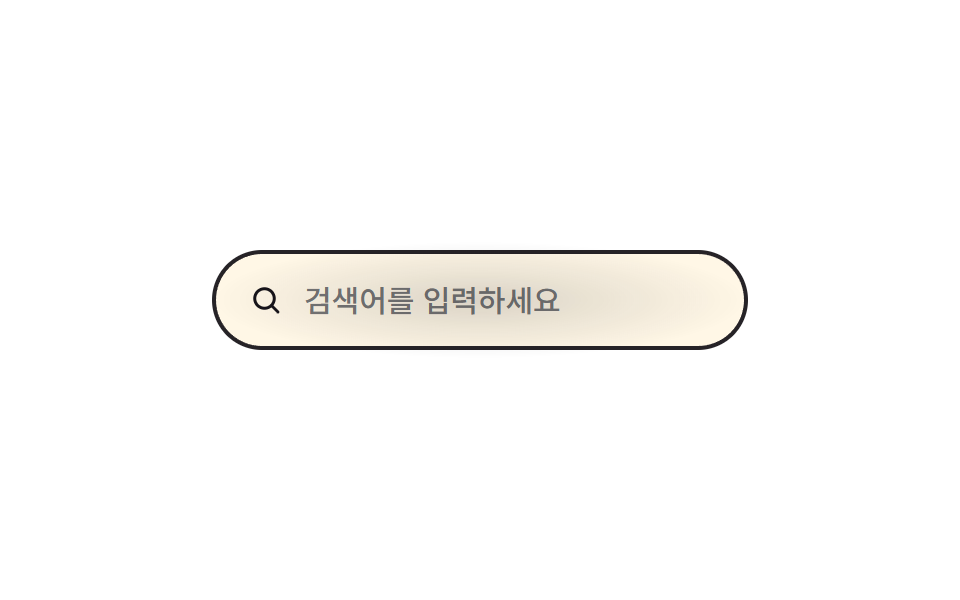
The pill-shaped search box, narrow by default, widens the moment it's focused, pushing its neighbors aside.
Best forHeader search boxes, tight navigation bars
:focus-withinwidth300ms
<main class="stage">
  <label class="se is-demo" for="se-input">
    <svg class="se__icon" viewBox="0 0 24 24" aria-hidden="true"><circle cx="11" cy="11" r="6.5"/><line x1="20" y1="20" x2="15.7" y2="15.7"/></svg>
    <input id="se-input" class="se__input" type="search" placeholder="Type to search" aria-label="Search">
    <span class="se__bloom" aria-hidden="true"></span>
  </label>
</main>
@use "../../../../site/static/demo-tokens" as *;
// ── 변수 3개 ──────────────────────────────────────────
$duration: $dur-base; // 폭이 넓어지는 시간
$easing: cubic-bezier(.3, 1.4, .4, 1); // 스프링 오버슛 — 폭이 목표 240px 을 지나 살짝 뻗었다가 돌아온다
$color: $subject-ink; // 포커스 시 테두리·아이콘 색
@include stage($stage-paper);
.se {
display: inline-flex;
align-items: center;
gap: $sp-2;
border-radius: $r-pill;
border: 2px solid rgba($stage-ink, .25);
padding: $sp-3 $sp-4;
cursor: text;
background: $subject-cream;
width: 148px;
position: relative;
transition: width $duration $easing, border-color $duration $easing;
}
// 실사용: 입력에 포커스가 가면(:focus-within) 폭이 넓어진다
.se:focus-within { width: 240px; border-color: $color; }
// 포커스 순간 필 중심에서 번지는 radial 글로우 확산 한 겹
.se__bloom {
position: absolute;
inset: -8px;
border-radius: $r-pill;
background: radial-gradient(ellipse at 50% 50%, rgba($color, .18) 0%, rgba($color, 0) 70%);
opacity: 0;
pointer-events: none;
}
.se:focus-within .se__bloom { animation: se-bloom $dur-base $ease-out; }
@keyframes se-bloom {
0% { opacity: 0; transform: scale(.7); }
40% { opacity: 1; transform: scale(1); }
100% { opacity: 0; transform: scale(1.2); }
}
.se__icon {
width: 18px; height: 18px;
flex: none;
fill: none;
stroke: $color;
stroke-width: 2;
stroke-linecap: round;
}
.se__input {
border: 0;
outline: 0;
background: transparent;
width: 100%;
font-weight: 500;
font-size: clamp(13px, 3.8vw, 15px);
line-height: 1;
font-family: inherit;
color: $stage-ink;
}
@media (prefers-reduced-motion: reduce) {
.se { transition: none; }
.se:focus-within .se__bloom { animation: none; }
}html, body {
margin: 0;
overflow: hidden;
}
.stage {
box-sizing: border-box;
min-height: 100vh;
display: grid;
place-items: center;
margin: 0;
background: #ffffff;
font-family: -apple-system, "Segoe UI", "Noto Sans KR", sans-serif;
padding: clamp(8px, 4vw, 24px);
}
.se {
display: inline-flex;
align-items: center;
gap: 8px;
border-radius: 999px;
border: 2px solid rgba(23, 20, 26, 0.25);
padding: 12px 16px;
cursor: text;
background: #fff7e6;
width: 148px;
position: relative;
transition: width 300ms cubic-bezier(0.3, 1.4, 0.4, 1), border-color 300ms cubic-bezier(0.3, 1.4, 0.4, 1);
}
.se:focus-within {
width: 240px;
border-color: #17141a;
}
.se__bloom {
position: absolute;
inset: -8px;
border-radius: 999px;
background: radial-gradient(ellipse at 50% 50%, rgba(23, 20, 26, 0.18) 0%, rgba(23, 20, 26, 0) 70%);
opacity: 0;
pointer-events: none;
}
.se:focus-within .se__bloom {
animation: se-bloom 300ms ease-out;
}
@keyframes se-bloom {
0% {
opacity: 0;
transform: scale(0.7);
}
40% {
opacity: 1;
transform: scale(1);
}
100% {
opacity: 0;
transform: scale(1.2);
}
}
.se__icon {
width: 18px;
height: 18px;
flex: none;
fill: none;
stroke: #17141a;
stroke-width: 2;
stroke-linecap: round;
}
.se__input {
border: 0;
outline: 0;
background: transparent;
width: 100%;
font-weight: 500;
font-size: clamp(13px, 3.8vw, 15px);
line-height: 1;
font-family: inherit;
color: #17141a;
}
@media (prefers-reduced-motion: reduce) {
.se {
transition: none;
}
.se:focus-within .se__bloom {
animation: none;
}
}// .is-demo 자동 재생: 진짜 focus 를 오가며 :focus-within 을 그대로 탄다 (3줄)
var el = document.querySelector('.is-demo .se__input');
var t = function () { document.activeElement === el ? el.blur() : el.focus({ preventScroll: true }); }; // preventScroll — iframe 안 포커스가 홈 그리드의 부모 스크롤을 끌어당기지 않게 (사용자 2026-09-10 실측)
t(); setInterval(t, 450);import { useState } from "react";
import type { CSSProperties, ChangeEvent } from "react";
import styles from "./SearchExpand.module.scss";
export type SearchExpandProps = {
placeholder?: string;
ariaLabel?: string;
duration?: number;
easing?: string;
color?: string;
};
type Vars = CSSProperties & { "--duration"?: string; "--easing"?: string; "--color"?: string };
export default function SearchExpand({
placeholder = "Type to search",
ariaLabel = "Search",
duration = 300,
easing = "cubic-bezier(.3,1.4,.4,1)",
color = "#17141a",
}: SearchExpandProps) {
const [value, setValue] = useState("");
const vars: Vars = { "--duration": `${duration}ms`, "--easing": easing, "--color": color };
return (
<label className={styles.se} style={vars}>
<svg className={styles.icon} viewBox="0 0 24 24" aria-hidden="true">
<circle cx="11" cy="11" r="6.5" />
<line x1="20" y1="20" x2="15.7" y2="15.7" />
</svg>
<input
className={styles.input}
type="search"
placeholder={placeholder}
aria-label={ariaLabel}
value={value}
onChange={(e: ChangeEvent<HTMLInputElement>) => setValue(e.target.value)}
/>
<span className={styles.bloom} aria-hidden="true" />
</label>
);
}04 Search box expand — Measured area 7.744% · moving frames 7/23Original by GODRICH · SCSS and React ship in the zip · 9 CSS Input Focus Animations: One Line, Copy-Paste
The post this demo lives in
 9 CSS Input Focus Animations: One Line, Copy-PasteA css input focus animation is what a text field does in one line of CSS the moment :focus, :focus-within, or a validity See all demos in this post