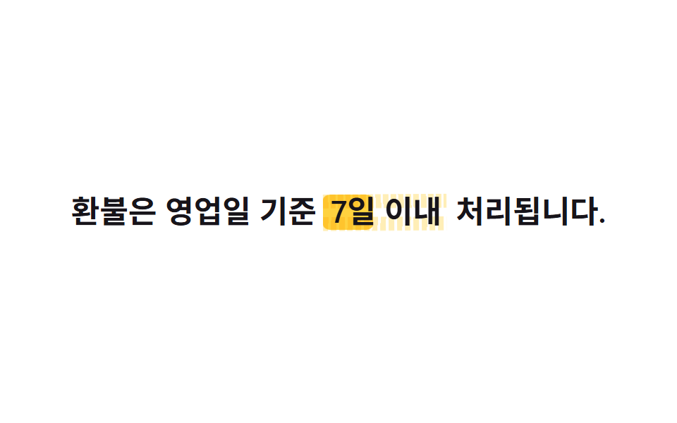
08Hover highlight marker
A ::before marker block, tilted with skewX(-6deg) and rounded at the ends, sits behind the text with mix-blend-mode: multiply, then grows via scaleX(0→1) on hover or focus so it reads like a highlighter stroke just made.
Best forA recommended-read link, the featured link in a related-posts list
skewXmix-blend-modescaleX

<main class="stage">
  <a class="link is-demo" href="#">You might also like this</a>
</main>
@use "../../../../site/static/demo-tokens" as *;
// ── 변수 3개 ─────────────────────────────
$duration: $dur-base;
$easing: $ease-pop;
$color: $stage-yellow;
// ── 데모 무대 ───────────────────────────────
@include stage($stage-paper);
.link {
position: relative;
isolation: isolate; // z-index:-1 마커가 무대 배경보다 먼저 그려져 안 보이는 걸 막는다 (046 01·02 실측)
display: inline-block;
padding: $sp-1 $sp-2;
color: $subject-ink;
text-decoration: none;
font-weight: 700; font-size: clamp(18px, 5vw, 26px); line-height: 1.3;
&::before {
content: "";
position: absolute;
inset: 10% -4% 6%;
background: $color;
border-radius: $r-xs;
transform: skewX(-6deg) scaleX(0);
transform-origin: left center; // 규칙8: 형광펜 마커 왼쪽 채움
mix-blend-mode: multiply;
z-index: -1;
transition: transform $duration $easing;
}
&:hover::before, &:focus-visible::before {
transform: skewX(-6deg) scaleX(1);
}
&.is-demo::before {
animation: marker-hover $dur-loop $easing infinite;
}
}
@keyframes marker-hover {
0%, 100% { transform: skewX(-6deg) scaleX(0); }
35%, 60% { transform: skewX(-6deg) scaleX(1); }
}
@media (prefers-reduced-motion: reduce) {
.link::before, .link.is-demo::before { transition: none; animation: none; }
.link:hover::before, .link:focus-visible::before { transform: skewX(-6deg) scaleX(1); }
}html, body {
margin: 0;
overflow: hidden;
}
.stage {
box-sizing: border-box;
min-height: 100vh;
display: grid;
place-items: center;
margin: 0;
background: #ffffff;
font-family: -apple-system, "Segoe UI", "Noto Sans KR", sans-serif;
padding: clamp(8px, 4vw, 24px);
}
.link {
position: relative;
isolation: isolate;
display: inline-block;
padding: 4px 8px;
color: #17141a;
text-decoration: none;
font-weight: 700;
font-size: clamp(18px, 5vw, 26px);
line-height: 1.3;
}
.link::before {
content: "";
position: absolute;
inset: 10% -4% 6%;
background: #ffd23f;
border-radius: 4px;
transform: skewX(-6deg) scaleX(0);
transform-origin: left center;
mix-blend-mode: multiply;
z-index: -1;
transition: transform 300ms cubic-bezier(0.2, 1.4, 0.4, 1);
}
.link:hover::before, .link:focus-visible::before {
transform: skewX(-6deg) scaleX(1);
}
.link.is-demo::before {
animation: marker-hover 2s cubic-bezier(0.2, 1.4, 0.4, 1) infinite;
}
@keyframes marker-hover {
0%, 100% {
transform: skewX(-6deg) scaleX(0);
}
35%, 60% {
transform: skewX(-6deg) scaleX(1);
}
}
@media (prefers-reduced-motion: reduce) {
.link::before, .link.is-demo::before {
transition: none;
animation: none;
}
.link:hover::before, .link:focus-visible::before {
transform: skewX(-6deg) scaleX(1);
}
}document.querySelectorAll('.link').forEach(function (b) {
b.addEventListener('pointerenter', function () { b.classList.remove('is-demo'); });
b.addEventListener('click', function (e) { e.preventDefault(); });
});import type { CSSProperties, ReactNode } from "react";
import styles from "./HighlightMarkerHover.module.scss";
export type HighlightMarkerHoverProps = { children: ReactNode; href: string; duration?: number; color?: string; skew?: number };
export default function HighlightMarkerHover({ children, href, duration = 300, color = "#ffd23f", skew = -6 }: HighlightMarkerHoverProps) {
const vars = { "--duration": `${duration}ms`, "--color": color, "--skew": `${skew}deg` } as CSSProperties;
return (
<a className={styles.link} href={href} style={vars}>
{children}
</a>
);
}08 Hover highlight marker — Measured area 5.158% · moving frames 18/23Original by GODRICH · SCSS and React ship in the zip · 9 CSS Link Hover Underline — One Line, Copy-Paste
The post this demo lives in
 9 CSS Link Hover Underline — One Line, Copy-PasteA CSS link hover underline is the short line that grows under a link only on hover or keyboard focus, showing at a glanc See all demos in this post