09AI-app style pulse orb
A blurred gradient orb gently grows and shrinks to suggest the AI is thinking through a response.
Best forAI chatbot response waits, voice-assistant listening indicators
blur 그라디언트2초 펄스::before 글로우
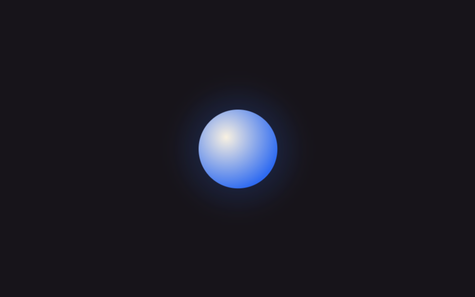
<main class="stage">
  <div class="orb" role="status" aria-label="Preparing a response"></div>
</main>
@use "../../../../site/static/demo-tokens" as *;
$duration: $dur-loop; // 펄스 한 사이클 (2초)
$easing: ease-in-out;
$color: $subject-blue; // 구체 안쪽 색
@include stage($stage-ink);
.orb {
position: relative;
width: clamp(56px, 16vw, 84px);
height: clamp(56px, 16vw, 84px);
}
.orb::before {
content: "";
position: absolute;
inset: -30%;
border-radius: 50%;
background: radial-gradient(circle, rgba($color, .55), transparent 70%);
filter: blur(6px);
animation: glow $duration $easing infinite;
}
.orb::after {
content: "";
position: absolute;
inset: 0;
border-radius: 50%;
background: radial-gradient(circle at 35% 35%, $subject-cream, $color 75%);
animation: core $duration $easing infinite;
}
@keyframes core {
0%, 100% { transform: scale(.88); opacity: .88; }
50% { transform: scale(1.08); opacity: 1; }
}
@keyframes glow {
0%, 100% { transform: scale(.8); opacity: .35; }
50% { transform: scale(1.25); opacity: .65; }
}
@media (prefers-reduced-motion: reduce) {
.orb::before, .orb::after { animation: none; transform: scale(1); opacity: .75; }
}html, body {
margin: 0;
overflow: hidden;
}
.stage {
box-sizing: border-box;
min-height: 100vh;
display: grid;
place-items: center;
margin: 0;
background: #17141a;
font-family: -apple-system, "Segoe UI", "Noto Sans KR", sans-serif;
padding: clamp(8px, 4vw, 24px);
}
.orb {
position: relative;
width: clamp(56px, 16vw, 84px);
height: clamp(56px, 16vw, 84px);
}
.orb::before {
content: "";
position: absolute;
inset: -30%;
border-radius: 50%;
background: radial-gradient(circle, rgba(47, 109, 246, 0.55), transparent 70%);
filter: blur(6px);
animation: glow 2s ease-in-out infinite;
}
.orb::after {
content: "";
position: absolute;
inset: 0;
border-radius: 50%;
background: radial-gradient(circle at 35% 35%, #fff7e6, #2f6df6 75%);
animation: core 2s ease-in-out infinite;
}
@keyframes core {
0%, 100% {
transform: scale(0.88);
opacity: 0.88;
}
50% {
transform: scale(1.08);
opacity: 1;
}
}
@keyframes glow {
0%, 100% {
transform: scale(0.8);
opacity: 0.35;
}
50% {
transform: scale(1.25);
opacity: 0.65;
}
}
@media (prefers-reduced-motion: reduce) {
.orb::before, .orb::after {
animation: none;
transform: scale(1);
opacity: 0.75;
}
}import type { CSSProperties } from "react";
import styles from "./PulseOrb.module.scss";
export type PulseOrbProps = {
/** 오브 지름 (기본 68px) */
size?: number;
/** 펄스 한 사이클 시간 (기본 2000ms) */
duration?: number;
/** 구체 안쪽 색 */
color?: string;
label?: string;
};
type Vars = CSSProperties & { "--size"?: string; "--duration"?: string; "--color"?: string };
export default function PulseOrb({
size = 68,
duration = 2000,
color = "#2f6df6",
label = "Preparing a response",
}: PulseOrbProps) {
const vars: Vars = {
"--size": `${size}px`,
"--duration": `${duration}ms`,
"--color": color,
};
return <div className={styles.orb} style={vars} role="status" aria-label={label} />;
}09 AI-app style pulse orb — Measured area 8.89% · moving frames 23/23Original by GODRICH · SCSS and React ship in the zip · 9 CSS Loading Spinners: Copy-Paste, Single Element
The post this demo lives in
 9 CSS Loading Spinners: Copy-Paste, Single ElementA css loading spinner is a small shape — a ring, three dots, a bar — that loops in place to tell someone a page or actio See all demos in this post
If you like this effect - similar demos
 Loaders02 Orb Pulse Whose Breathing Widens With a Growing Wait-time ValueAI Loading Animation: 9 Patterns by One Value
 Loaders01 Bottom spinner fade — a loading indicator computing its opacity from the remaining scroll distanceInfinite Scroll Loading: 9 Essential UI Patterns
 Loaders01 Button Whose Label Crossfades Into a Spinner IconLoading Button UI — 9 States, Spinner to Success