03Pause on hover
Switches animation-play-state to paused the moment the pointer lands, holding the exact frame the reader was on.
Best forAnnouncement banners with text worth reading
animation-play-statepausedhover

<main class="stage">
  <div class="marquee is-demo" tabindex="0">
    <div class="marquee__track">
      <span class="marquee__chip">Join today, first month free</span>
      <span class="marquee__chip" aria-hidden="true">Join today, first month free</span>
    </div>
    <span class="marquee__cursor" aria-hidden="true"></span>
  </div>
</main>
@use "../../../../site/static/demo-tokens" as *;
$duration: 10s; // 실서비스 속도 — 데모는 아래 .is-demo 가 별도로 2s 루프에 맞춘다
$easing: linear;
$color: $subject-cream;
@include stage($stage-orange);
.marquee {
position: relative;
width: min(300px, 82vw);
overflow: hidden;
border-radius: $r-card;
padding: 16px 0;
background: rgba($color, .12);
outline: none;
}
.marquee__track {
display: flex;
width: max-content;
animation: marquee-scroll $duration $easing infinite;
}
.marquee__chip {
margin-right: 40px; // 트랙의 gap 대신 — 세트 폭이 정확히 절반이 되어 -50% 이음새가 0px 이 된다
flex-shrink: 0;
white-space: nowrap;
font-weight: 700; font-size: clamp(13px, 3.6vw, 15px); line-height: 1; font-family: inherit;
color: $subject-ink; // 주황 면 위 글자 — AA 4.5 (blog-design 글자 대비)
}
.marquee__cursor {
position: absolute;
top: 8px;
right: 22px;
width: 16px;
height: 16px;
border-radius: 50%;
background: $subject-blue;
box-shadow: 0 0 0 3px rgba($subject-blue, .28);
opacity: 0;
}
// 실제 사용자는 마우스를 올리면 여기서 멈춘다 — 읽던 문구가 그대로 남는다
.marquee:hover .marquee__track,
.marquee:focus-within .marquee__track,
.marquee:active .marquee__track {
animation-play-state: paused;
}
// 데모 · 문서용: 진짜 hover 는 렌더에서 못 일으키니, 흐르다 멈췄다 다시 흐르는 한 사이클을
// 트랙 자신의 keyframes 안에 구간(plateau)으로 넣어 2초마다 반복시킨다. 커서 점은 그 구간에서만 보인다
.marquee.is-demo .marquee__track {
animation: marquee-hover-cycle $dur-loop $easing infinite;
}
.marquee.is-demo .marquee__cursor {
animation: cursor-hover $dur-loop $easing infinite;
}
@keyframes marquee-hover-cycle {
0% { transform: translateX(0); }
38% { transform: translateX(-32%); }
62% { transform: translateX(-32%); } // 정지 구간 — 실제 hover 로 멈춘 순간을 흉내
100% { transform: translateX(-50%); }
}
@keyframes cursor-hover {
0%, 30% { opacity: 0; transform: translateY(6px) scale(.6); }
38%, 62% { opacity: 1; transform: translateY(0) scale(1); }
70%, 100% { opacity: 0; transform: translateY(6px) scale(.6); }
}
@media (prefers-reduced-motion: reduce) {
.marquee__track { animation: none; transform: translateX(0); }
.marquee__cursor { animation: none; opacity: 0; }
}html, body {
margin: 0;
overflow: hidden;
}
.stage {
box-sizing: border-box;
min-height: 100vh;
display: grid;
place-items: center;
margin: 0;
background: #ff4d1f;
font-family: -apple-system, "Segoe UI", "Noto Sans KR", sans-serif;
padding: clamp(8px, 4vw, 24px);
}
.marquee {
position: relative;
width: min(300px, 82vw);
overflow: hidden;
border-radius: 16px;
padding: 16px 0;
background: rgba(255, 247, 230, 0.12);
outline: none;
}
.marquee__track {
display: flex;
width: max-content;
animation: marquee-scroll 10s linear infinite;
}
.marquee__chip {
margin-right: 40px;
flex-shrink: 0;
white-space: nowrap;
font-weight: 700;
font-size: clamp(13px, 3.6vw, 15px);
line-height: 1;
font-family: inherit;
color: #17141a;
}
.marquee__cursor {
position: absolute;
top: 8px;
right: 22px;
width: 16px;
height: 16px;
border-radius: 50%;
background: #2f6df6;
box-shadow: 0 0 0 3px rgba(47, 109, 246, 0.28);
opacity: 0;
}
.marquee:hover .marquee__track,
.marquee:focus-within .marquee__track,
.marquee:active .marquee__track {
animation-play-state: paused;
}
.marquee.is-demo .marquee__track {
animation: marquee-hover-cycle 2s linear infinite;
}
.marquee.is-demo .marquee__cursor {
animation: cursor-hover 2s linear infinite;
}
@keyframes marquee-hover-cycle {
0% {
transform: translateX(0);
}
38% {
transform: translateX(-32%);
}
62% {
transform: translateX(-32%);
}
100% {
transform: translateX(-50%);
}
}
@keyframes cursor-hover {
0%, 30% {
opacity: 0;
transform: translateY(6px) scale(0.6);
}
38%, 62% {
opacity: 1;
transform: translateY(0) scale(1);
}
70%, 100% {
opacity: 0;
transform: translateY(6px) scale(0.6);
}
}
@media (prefers-reduced-motion: reduce) {
.marquee__track {
animation: none;
transform: translateX(0);
}
.marquee__cursor {
animation: none;
opacity: 0;
}
}import type { CSSProperties } from "react";
import styles from "./PauseHoverMarquee.module.scss";
export type PauseHoverMarqueeProps = {
text?: string;
/** 한 바퀴가 도는 시간 (기본 10000ms) */
duration?: number;
easing?: string;
color?: string;
};
type Vars = CSSProperties & { "--duration"?: string; "--easing"?: string; "--color"?: string };
export default function PauseHoverMarquee({
text = "지금 가입하면 첫 달 무료",
duration = 10000,
easing = "linear",
color = "#fff7e6",
}: PauseHoverMarqueeProps) {
const vars: Vars = { "--duration": `${duration}ms`, "--easing": easing, "--color": color };
return (
<div className={styles.marquee} style={vars} tabIndex={0}>
<div className={styles.track}>
<span className={styles.chip}>{text}</span>
<span className={styles.chip} aria-hidden="true">{text}</span>
</div>
</div>
);
}03 Pause on hover — Measured area 3.244% · moving frames 19/23Original by GODRICH · SCSS and React ship in the zip · 9 CSS Marquee Infinite Loop — No JS, Scroll-Driven
The post this demo lives in
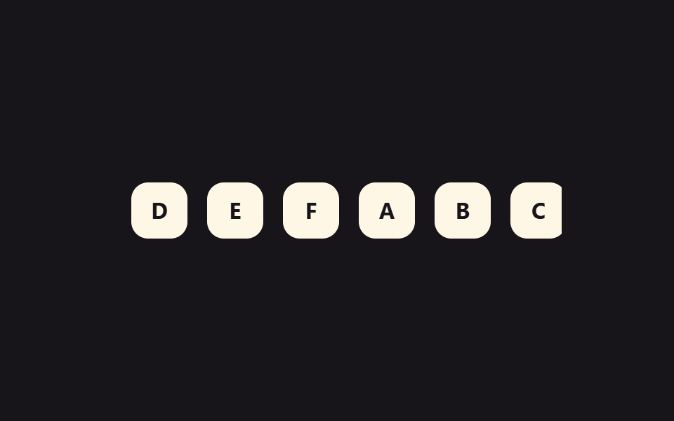 9 CSS Marquee Infinite Loop — No JS, Scroll-DrivenA css marquee infinite loop is a row of duplicated content — logos, a price ticker, a headline — that slides on repeat u See all demos in this post