07Variable-speed flow
Swap the linear timing-function for a custom cubic-bezier so the loop feels slower near the seam and faster mid-cycle — no JS, still seamless.
Best forCalmer brand logo strips that shouldn't feel like a conveyor belt
cubic-bezier비선형 easing이음매 유지
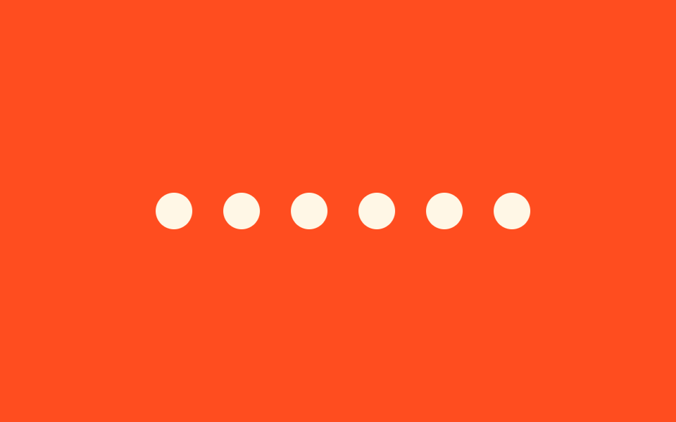
<main class="stage">
  <div class="marquee">
    <div class="marquee__track">
      <span class="marquee__chip"></span>
      <span class="marquee__chip"></span>
      <span class="marquee__chip"></span>
      <span class="marquee__chip"></span>
      <span class="marquee__chip"></span>
      <span class="marquee__chip" aria-hidden="true"></span>
      <span class="marquee__chip" aria-hidden="true"></span>
      <span class="marquee__chip" aria-hidden="true"></span>
      <span class="marquee__chip" aria-hidden="true"></span>
      <span class="marquee__chip" aria-hidden="true"></span>
    </div>
  </div>
</main>
@use "../../../../site/static/demo-tokens" as *;
$duration: $dur-loop;
$easing: cubic-bezier(.65, 0, .35, 1); // 비선형 — 이음매 근처는 느리고 중간은 빠르다
$color: $subject-cream;
@include stage($stage-orange);
.marquee {
width: min(300px, 80vw);
overflow: hidden;
}
.marquee__track {
display: flex;
width: max-content;
animation: marquee-scroll $duration $easing infinite;
}
.marquee__chip {
margin-right: 22px; // 트랙의 gap 대신 — 세트 폭이 정확히 절반이 되어 -50% 이음새가 0px 이 된다
flex-shrink: 0;
width: 26px;
height: 26px;
border-radius: 50%;
background: $color;
}
// linear 대신 커스텀 cubic-bezier 를 타이밍 함수로 써도 -50% 이동량은 그대로다.
// 이음매(0%·100%)에선 느리게 붙고 구간 중간에서 빨라지는 리듬만 달라진다 — JS 없이, 한 줄로
@keyframes marquee-scroll {
from { transform: translateX(0); }
to { transform: translateX(-50%); }
}
@media (prefers-reduced-motion: reduce) {
.marquee__track { animation: none; transform: translateX(0); }
}html, body {
margin: 0;
overflow: hidden;
}
.stage {
box-sizing: border-box;
min-height: 100vh;
display: grid;
place-items: center;
margin: 0;
background: #ff4d1f;
font-family: -apple-system, "Segoe UI", "Noto Sans KR", sans-serif;
padding: clamp(8px, 4vw, 24px);
}
.marquee {
width: min(300px, 80vw);
overflow: hidden;
}
.marquee__track {
display: flex;
width: max-content;
animation: marquee-scroll 2s cubic-bezier(0.65, 0, 0.35, 1) infinite;
}
.marquee__chip {
margin-right: 22px;
flex-shrink: 0;
width: 26px;
height: 26px;
border-radius: 50%;
background: #fff7e6;
}
@keyframes marquee-scroll {
from {
transform: translateX(0);
}
to {
transform: translateX(-50%);
}
}
@media (prefers-reduced-motion: reduce) {
.marquee__track {
animation: none;
transform: translateX(0);
}
}import type { CSSProperties } from "react";
import styles from "./VariableSpeedMarquee.module.scss";
export type VariableSpeedMarqueeProps = {
count?: number;
duration?: number;
/** 비선형 타이밍 함수 — 이음매 근처는 느리고 가운데는 빠르다 */
easing?: string;
color?: string;
};
type Vars = CSSProperties & { "--duration"?: string; "--easing"?: string; "--color"?: string };
export default function VariableSpeedMarquee({
count = 5,
duration = 9000,
easing = "cubic-bezier(.65,0,.35,1)",
color = "#fff7e6",
}: VariableSpeedMarqueeProps) {
const vars: Vars = { "--duration": `${duration}ms`, "--easing": easing, "--color": color };
const dots = Array.from({ length: count * 2 });
return (
<div className={styles.marquee} style={vars}>
<div className={styles.track}>
{dots.map((_, i) => (
<span key={i} className={styles.chip} aria-hidden={i >= count} />
))}
</div>
</div>
);
}07 Variable-speed flow — Measured area 5.417% · moving frames 23/23Original by GODRICH · SCSS and React ship in the zip · 9 CSS Marquee Infinite Loop — No JS, Scroll-Driven
The post this demo lives in
 9 CSS Marquee Infinite Loop — No JS, Scroll-DrivenA css marquee infinite loop is a row of duplicated content — logos, a price ticker, a headline — that slides on repeat u See all demos in this post
If you like this effect - similar demos
 Scroll07 Friction decel — once the input value stops, a speed value slows gradually by a friction valueScroll Inertia CSS — 9 Value Patterns
 Scroll01 Ambient drift field — a baseline flow where particles rise at a resting-speed value even without any scroll valueMoving Particles Background CSS: 9 Scroll Scenes
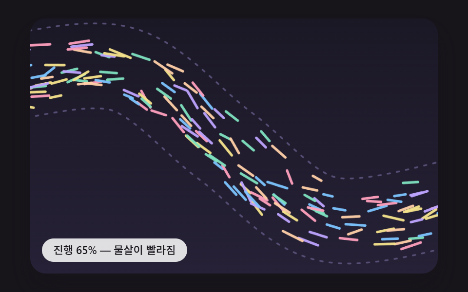 Scroll08 A Swarm of Dots That Flows Along the Path With Scroll SpeedScroll Path Animation: 9 Scenes Along a Curve