07Fullscreen takeover
The pressed button grows into a full-screen modal.
Best forGalleries, detail views
420ms둥글게 유지페이드 섞기
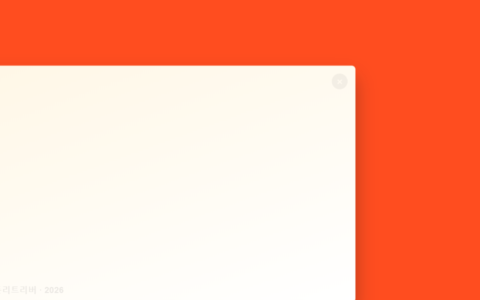
<main class="stage is-demo">
  <button class="thumb" type="button" aria-label="View photo full size">
    <span class="thumb__caption">Golden Retriever · 2026</span>
    <span class="thumb__close" aria-hidden="true">×</span>
  </button>
</main>
@use "../../../../site/static/demo-tokens" as *;
// ── 변수 3개 ──────────────────────────────────────────
$duration: $dur-enter; // 커지는 시간
$easing: $ease-spring;
$color: $subject-cream; // 강조색(캡션·닫기)
@include stage($stage-orange);
// 실제로는 width/height 를 바꾸지 않는다. inset:0 인 상자를 transform: scale 로만 줄여
// "작은 썸네일" 처럼 보이게 한다 — 커질 때도 레이아웃 재계산이 없다
.thumb {
position: fixed; inset: 0; margin: 0; padding: 0; border: 0;
border-radius: $r-card; overflow: hidden; cursor: pointer;
background: linear-gradient(160deg, $subject-cream, $stage-paper);
box-shadow: $shadow-raised;
transform: translate(-30%, 20%) scale(.3);
transform-origin: 20% 75%; // 규칙8: 썸네일 자리 앵커 확대
transition: transform $duration $easing, border-radius $duration $easing;
-webkit-tap-highlight-color: transparent;
}
.thumb__caption {
position: absolute; left: clamp(10px, 3vmin, 16px); bottom: clamp(10px, 3vmin, 16px);
font-weight: 600;
font-size: clamp(11px, 3.4vmin, 14px);
line-height: 1;
font-family: inherit;
color: $stage-ink;
opacity: 0; transition: opacity $duration $easing;
}
.thumb__close {
position: absolute; right: clamp(10px, 3vmin, 16px); top: clamp(10px, 3vmin, 16px);
width: clamp(20px, 6vmin, 26px); height: clamp(20px, 6vmin, 26px);
display: grid; place-items: center; border-radius: 50%;
background: rgba($stage-ink, .55); color: $color; font-size: clamp(13px, 3.8vmin, 16px);
opacity: 0; transition: opacity $duration $easing;
}
.stage.is-open .thumb {
transform: translate(0, 0) scale(1);
border-radius: 0;
}
.stage.is-open .thumb__caption,
.stage.is-open .thumb__close { opacity: 1; }
.stage.is-demo .thumb { animation: thumb-loop $dur-loop $easing infinite; }
.stage.is-demo .thumb__caption,
.stage.is-demo .thumb__close { animation: fade-loop $dur-loop ease-in-out infinite; }
@keyframes thumb-loop {
0% { transform: translate(-30%, 20%) scale(.3); border-radius: $r-card; }
20% { transform: translate(0, 0) scale(1); border-radius: 0; }
65% { transform: translate(0, 0) scale(1); border-radius: 0; }
85% { transform: translate(-30%, 20%) scale(.3); border-radius: $r-card; }
100% { transform: translate(-30%, 20%) scale(.3); border-radius: $r-card; }
}
@keyframes fade-loop {
0% { opacity: 0; }
20% { opacity: 1; }
65% { opacity: 1; }
85% { opacity: 0; }
100% { opacity: 0; }
}
@media (prefers-reduced-motion: reduce) {
.stage.is-demo .thumb,
.stage.is-demo .thumb__caption,
.stage.is-demo .thumb__close { animation: none; }
.thumb, .thumb__caption, .thumb__close { transition-duration: 1ms; }
}html, body {
margin: 0;
overflow: hidden;
}
.stage {
box-sizing: border-box;
min-height: 100vh;
display: grid;
place-items: center;
margin: 0;
background: #ff4d1f;
font-family: -apple-system, "Segoe UI", "Noto Sans KR", sans-serif;
padding: clamp(8px, 4vw, 24px);
}
.thumb {
position: fixed;
inset: 0;
margin: 0;
padding: 0;
border: 0;
border-radius: 16px;
overflow: hidden;
cursor: pointer;
background: linear-gradient(160deg, #fff7e6, #ffffff);
box-shadow: 0 14px 24px rgba(23, 20, 26, 0.32);
transform: translate(-30%, 20%) scale(0.3);
transform-origin: 20% 75%;
transition: transform 600ms cubic-bezier(0.2, 0.8, 0.2, 1), border-radius 600ms cubic-bezier(0.2, 0.8, 0.2, 1);
-webkit-tap-highlight-color: transparent;
}
.thumb__caption {
position: absolute;
left: clamp(10px, 3vmin, 16px);
bottom: clamp(10px, 3vmin, 16px);
font-weight: 600;
font-size: clamp(11px, 3.4vmin, 14px);
line-height: 1;
font-family: inherit;
color: #17141a;
opacity: 0;
transition: opacity 600ms cubic-bezier(0.2, 0.8, 0.2, 1);
}
.thumb__close {
position: absolute;
right: clamp(10px, 3vmin, 16px);
top: clamp(10px, 3vmin, 16px);
width: clamp(20px, 6vmin, 26px);
height: clamp(20px, 6vmin, 26px);
display: grid;
place-items: center;
border-radius: 50%;
background: rgba(23, 20, 26, 0.55);
color: #fff7e6;
font-size: clamp(13px, 3.8vmin, 16px);
opacity: 0;
transition: opacity 600ms cubic-bezier(0.2, 0.8, 0.2, 1);
}
.stage.is-open .thumb {
transform: translate(0, 0) scale(1);
border-radius: 0;
}
.stage.is-open .thumb__caption,
.stage.is-open .thumb__close {
opacity: 1;
}
.stage.is-demo .thumb {
animation: thumb-loop 2s cubic-bezier(0.2, 0.8, 0.2, 1) infinite;
}
.stage.is-demo .thumb__caption,
.stage.is-demo .thumb__close {
animation: fade-loop 2s ease-in-out infinite;
}
@keyframes thumb-loop {
0% {
transform: translate(-30%, 20%) scale(0.3);
border-radius: 16px;
}
20% {
transform: translate(0, 0) scale(1);
border-radius: 0;
}
65% {
transform: translate(0, 0) scale(1);
border-radius: 0;
}
85% {
transform: translate(-30%, 20%) scale(0.3);
border-radius: 16px;
}
100% {
transform: translate(-30%, 20%) scale(0.3);
border-radius: 16px;
}
}
@keyframes fade-loop {
0% {
opacity: 0;
}
20% {
opacity: 1;
}
65% {
opacity: 1;
}
85% {
opacity: 0;
}
100% {
opacity: 0;
}
}
@media (prefers-reduced-motion: reduce) {
.stage.is-demo .thumb,
.stage.is-demo .thumb__caption,
.stage.is-demo .thumb__close {
animation: none;
}
.thumb, .thumb__caption, .thumb__close {
transition-duration: 1ms;
}
}(function () {
var stage = document.querySelector('.stage');
var thumb = document.querySelector('.thumb');
var isOpen = false;
thumb.addEventListener('click', function () {
stage.classList.remove('is-demo');
isOpen = !isOpen;
stage.classList.toggle('is-open', isOpen);
});
document.addEventListener('keydown', function (e) {
if (e.key === 'Escape' && isOpen) { isOpen = false; stage.classList.remove('is-open'); }
});
})();import { useState } from "react";
import type { CSSProperties } from "react";
import styles from "./FullscreenTakeover.module.scss";
export type FullscreenTakeoverProps = {
caption: string;
/** 커지는 시간 (기본 600ms) */
duration?: number;
easing?: string;
color?: string;
};
type Vars = CSSProperties & { "--duration"?: string; "--easing"?: string; "--color"?: string };
export default function FullscreenTakeover({
caption,
duration = 600,
easing = "cubic-bezier(.2,.8,.2,1)",
color = "#fff7e6",
}: FullscreenTakeoverProps) {
const [open, setOpen] = useState(false);
const vars: Vars = { "--duration": `${duration}ms`, "--easing": easing, "--color": color };
return (
<div className={styles.stage} style={vars}>
<button
type="button"
className={open ? `${styles.thumb} ${styles.isOpen}` : styles.thumb}
aria-label={caption}
onClick={() => setOpen((v) => !v)}
>
<span className={styles.caption}>{caption}</span>
<span className={styles.close} aria-hidden="true">×</span>
</button>
</div>
);
}07 Fullscreen takeover — Measured area 96.809% · moving frames 11/23Original by GODRICH · SCSS and React ship in the zip · 9 CSS Modal Animation Patterns, No Library Needed
The post this demo lives in
 9 CSS Modal Animation Patterns, No Library NeededA css modal animation is the motion a dialog uses to open and close, instead of snapping straight from hidden to visible See all demos in this post