07Ticket-tear confirm
At confirmation the ticket's dashed perforation lights up and the left and right halves tilt away in opposite directions, exiting the frame as two torn stubs.
Best forOrder and check-in confirmations, coupon redemption
rotate 분리opacity 퇴장점선 마디
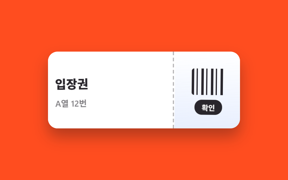
<main class="stage">
  <section class="tear is-demo" aria-label="At confirmation the ticket tears into two stubs">
    <input class="tear__check" type="checkbox" id="tear-ok">
    <div class="tear__ticket">
      <div class="tear__half tear__half--l">
        <p class="tear__title">Admission</p>
        <p class="tear__seat">Row A, 12</p>
      </div>
      <div class="tear__half tear__half--r">
        <span class="tear__barcode" aria-hidden="true"></span>
        <label class="tear__btn" for="tear-ok">Confirm</label>
      </div>
      <span class="tear__perf" aria-hidden="true"></span>
    </div>
  </section>
</main>
@use "../../../../site/static/demo-tokens" as *;
$duration: 720ms; // 찢겨 빠지는 시간
$easing: $ease-spring;
$color: $subject-blue; // 티켓 포인트색
@include stage($stage-orange);
.tear { display: grid; place-items: center; }
.tear__check { position: absolute; opacity: 0; pointer-events: none; }
.tear__ticket {
position: relative;
display: flex;
width: min(320px, 90vw);
height: 128px;
border-radius: $r-card;
background: $stage-paper;
box-shadow: $shadow-raised;
overflow: hidden;
}
.tear__half {
box-sizing: border-box;
display: grid;
align-content: center;
gap: $sp-2;
padding: $sp-4;
background: $stage-paper;
transition: transform $duration $easing, opacity $duration $easing;
z-index: 1;
}
.tear__half--l { flex: 1 1 auto; border-right: 0; }
.tear__half--r {
flex: 0 0 112px;
justify-items: center;
background: linear-gradient(180deg, $stage-paper 0%, rgba($color, .12) 100%);
}
.tear__title {
margin: 0;
font-weight: 800;
font-size: clamp(16px, 4.6vw, 20px);
font-family: inherit;
color: $stage-ink;
}
.tear__seat {
margin: 0;
font-weight: 600;
font-size: clamp(12px, 3.4vw, 14px);
font-family: inherit;
color: rgba(23, 20, 26, .6);
}
.tear__barcode {
width: 56px; height: 44px;
border-radius: $r-xs;
background: repeating-linear-gradient(90deg,
$stage-ink 0 4px, transparent 4px 8px, $stage-ink 8px 10px, transparent 10px 16px);
}
.tear__btn {
padding: $sp-1 $sp-3;
border-radius: $r-control;
background: $stage-ink;
font-weight: 700;
font-size: 12px;
font-family: inherit;
color: $stage-paper;
cursor: pointer;
transition: transform $dur-quick $easing;
}
.tear__btn:active { transform: scale(.94); }
// 가운데 점선 미신흔 — 찢기는 순간 밝아진다
.tear__perf {
position: absolute; top: 0; bottom: 0; left: calc(100% - 112px);
width: 0;
border-left: 2px dashed rgba(23, 20, 26, .3);
z-index: 2;
transition: border-color $dur-quick $easing;
}
// 확인: 왼쪽·오른쪽 반대 방향으로 기울며 벌어져 빠진다
#tear-ok:checked ~ .tear__ticket .tear__perf { border-color: rgba(23, 20, 26, .9); }
#tear-ok:checked ~ .tear__ticket .tear__half--l {
transform: translate(-52px, 26px) rotate(-9deg);
opacity: 0;
}
#tear-ok:checked ~ .tear__ticket .tear__half--r {
transform: translate(44px, 30px) rotate(8deg);
opacity: 0;
}
// 렌더·갤러리용 자동 루프: 온전 → 미싯값 밝아짐 → 찢김 퇴장 → 재등장
.tear.is-demo .tear__half--l { animation: half-l $dur-loop $easing infinite; }
.tear.is-demo .tear__half--r { animation: half-r $dur-loop $easing infinite; }
.tear.is-demo .tear__perf { animation: perf $dur-loop $easing infinite; }
@keyframes half-l {
0%, 24% { transform: translate(0, 0) rotate(0); opacity: 1; }
56%, 84% { transform: translate(-52px, 26px) rotate(-9deg); opacity: 0; }
92%, 100% { transform: translate(0, 0) rotate(0); opacity: 1; }
}
@keyframes half-r {
0%, 24% { transform: translate(0, 0) rotate(0); opacity: 1; }
56%, 84% { transform: translate(44px, 30px) rotate(8deg); opacity: 0; }
92%, 100% { transform: translate(0, 0) rotate(0); opacity: 1; }
}
@keyframes perf {
0%, 24% { border-color: rgba(23, 20, 26, .3); }
32%, 52% { border-color: rgba(23, 20, 26, .9); }
60%, 100% { border-color: rgba(23, 20, 26, .3); }
}
@media (prefers-reduced-motion: reduce) {
.tear__half, .tear__perf, .tear__btn { transition: none; }
.tear.is-demo .tear__half,
.tear.is-demo .tear__perf { animation: none; } // 찢김 없이 즉시 사라진다
}html, body {
margin: 0;
overflow: hidden;
}
.stage {
box-sizing: border-box;
min-height: 100vh;
display: grid;
place-items: center;
margin: 0;
background: #ff4d1f;
font-family: -apple-system, "Segoe UI", "Noto Sans KR", sans-serif;
padding: clamp(8px, 4vw, 24px);
}
.tear {
display: grid;
place-items: center;
}
.tear__check {
position: absolute;
opacity: 0;
pointer-events: none;
}
.tear__ticket {
position: relative;
display: flex;
width: min(320px, 90vw);
height: 128px;
border-radius: 16px;
background: #ffffff;
box-shadow: 0 14px 24px rgba(23, 20, 26, 0.32);
overflow: hidden;
}
.tear__half {
box-sizing: border-box;
display: grid;
align-content: center;
gap: 8px;
padding: 16px;
background: #ffffff;
transition: transform 720ms cubic-bezier(0.2, 0.8, 0.2, 1), opacity 720ms cubic-bezier(0.2, 0.8, 0.2, 1);
z-index: 1;
}
.tear__half--l {
flex: 1 1 auto;
border-right: 0;
}
.tear__half--r {
flex: 0 0 112px;
justify-items: center;
background: linear-gradient(180deg, #ffffff 0%, rgba(47, 109, 246, 0.12) 100%);
}
.tear__title {
margin: 0;
font-weight: 800;
font-size: clamp(16px, 4.6vw, 20px);
font-family: inherit;
color: #17141a;
}
.tear__seat {
margin: 0;
font-weight: 600;
font-size: clamp(12px, 3.4vw, 14px);
font-family: inherit;
color: rgba(23, 20, 26, 0.6);
}
.tear__barcode {
width: 56px;
height: 44px;
border-radius: 4px;
background: repeating-linear-gradient(90deg, #17141a 0 4px, transparent 4px 8px, #17141a 8px 10px, transparent 10px 16px);
}
.tear__btn {
padding: 4px 12px;
border-radius: 12px;
background: #17141a;
font-weight: 700;
font-size: 12px;
font-family: inherit;
color: #ffffff;
cursor: pointer;
transition: transform 220ms cubic-bezier(0.2, 0.8, 0.2, 1);
}
.tear__btn:active {
transform: scale(0.94);
}
.tear__perf {
position: absolute;
top: 0;
bottom: 0;
left: calc(100% - 112px);
width: 0;
border-left: 2px dashed rgba(23, 20, 26, 0.3);
z-index: 2;
transition: border-color 220ms cubic-bezier(0.2, 0.8, 0.2, 1);
}
#tear-ok:checked ~ .tear__ticket .tear__perf {
border-color: rgba(23, 20, 26, 0.9);
}
#tear-ok:checked ~ .tear__ticket .tear__half--l {
transform: translate(-52px, 26px) rotate(-9deg);
opacity: 0;
}
#tear-ok:checked ~ .tear__ticket .tear__half--r {
transform: translate(44px, 30px) rotate(8deg);
opacity: 0;
}
.tear.is-demo .tear__half--l {
animation: half-l 2s cubic-bezier(0.2, 0.8, 0.2, 1) infinite;
}
.tear.is-demo .tear__half--r {
animation: half-r 2s cubic-bezier(0.2, 0.8, 0.2, 1) infinite;
}
.tear.is-demo .tear__perf {
animation: perf 2s cubic-bezier(0.2, 0.8, 0.2, 1) infinite;
}
@keyframes half-l {
0%, 24% {
transform: translate(0, 0) rotate(0);
opacity: 1;
}
56%, 84% {
transform: translate(-52px, 26px) rotate(-9deg);
opacity: 0;
}
92%, 100% {
transform: translate(0, 0) rotate(0);
opacity: 1;
}
}
@keyframes half-r {
0%, 24% {
transform: translate(0, 0) rotate(0);
opacity: 1;
}
56%, 84% {
transform: translate(44px, 30px) rotate(8deg);
opacity: 0;
}
92%, 100% {
transform: translate(0, 0) rotate(0);
opacity: 1;
}
}
@keyframes perf {
0%, 24% {
border-color: rgba(23, 20, 26, 0.3);
}
32%, 52% {
border-color: rgba(23, 20, 26, 0.9);
}
60%, 100% {
border-color: rgba(23, 20, 26, 0.3);
}
}
@media (prefers-reduced-motion: reduce) {
.tear__half, .tear__perf, .tear__btn {
transition: none;
}
.tear.is-demo .tear__half,
.tear.is-demo .tear__perf {
animation: none;
}
}import type { CSSProperties } from "react";
import { useState } from "react";
import styles from "./TicketTearConfirm.module.scss";
export type TicketTearConfirmProps = {
title: string;
meta: string;
confirmLabel: string;
/** 찢겨 빠지는 시간 (기본 720ms) */
duration?: number;
easing?: string;
color?: string;
};
type Vars = CSSProperties & { "--duration"?: string; "--easing"?: string; "--color"?: string };
export default function TicketTearConfirm({
title,
meta,
confirmLabel,
duration = 720,
easing = "cubic-bezier(.2,.8,.2,1)",
color = "#2f6df6",
}: TicketTearConfirmProps) {
const [torn, setTorn] = useState(false);
const vars: Vars = { "--duration": `${duration}ms`, "--easing": easing, "--color": color };
return (
<section className={styles.tear} style={vars} aria-label={title}>
<div className={styles.ticket}>
<div className={`${styles.half} ${styles.halfL} ${torn ? styles.halfLGo : ""}`}>
<p className={styles.title}>{title}</p>
<p className={styles.meta}>{meta}</p>
</div>
<div className={`${styles.half} ${styles.halfR} ${torn ? styles.halfRGo : ""}`}>
<span className={styles.barcode} aria-hidden="true" />
<button type="button" className={styles.btn} onClick={() => setTorn(true)}>{confirmLabel}</button>
</div>
<span className={`${styles.perf} ${torn ? styles.perfOn : ""}`} aria-hidden="true" />
</div>
</section>
);
}07 Ticket-tear confirm — Measured area 8.812% · moving frames 10/23Original by GODRICH · SCSS and React ship in the zip · 9 CSS Screen Transition Animation Effects
The post this demo lives in
 9 CSS Screen Transition Animation EffectsA CSS screen transition animation smooths every moment the screen changes — an image swap, a confirmed order, a form ste See all demos in this post
If you like this effect - similar demos
 Transitions06 Popover confirm9 CSS Modal Animation Patterns, No Library Needed
 Transitions08 Screen Transition Where a Tear-offset Value Locks Back Together9 CSS Glitch Effect Transitions (No Codepen)
 Transitions09 A Checkout Confirm Modal That Opens, Confirms and Returns to Its ButtonModal Animation Examples: 9 Open and Close Effects