05Push content
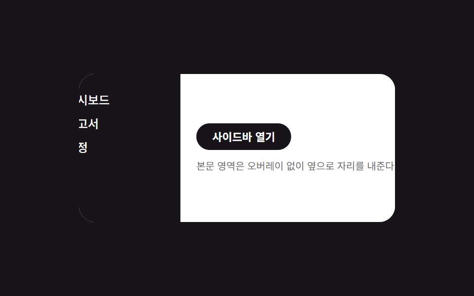
The sidebar and the content beside it translateX together over the same duration, sharing space with no overlay.
Best forNavigation panels in desktop document tools
콘텐츠 동반 이동translateX 쌍오버레이 없음
<main class="stage is-demo">
  <div class="layout">
    <nav class="drawer" aria-label="Side navigation" aria-hidden="true">
      <a class="drawer__link" href="#" tabindex="-1">Dashboard</a>
      <a class="drawer__link" href="#" tabindex="-1">Reports</a>
      <a class="drawer__link" href="#" tabindex="-1">Settings</a>
    </nav>
    <div class="content">
      <button class="trigger" type="button" aria-expanded="false">Open sidebar</button>
      <p class="content__line">The content area shifts aside with no overlay.</p>
    </div>
  </div>
</main>
@use "../../../../site/static/demo-tokens" as *;
// ── 변수 3개 ──────────────────────────────────────────
$duration: $dur-enter; // 600ms — 사이드바·콘텐츠가 함께 이동하는 시간
$easing: $ease-spring;
$color: $subject-blue; // 링크 hover 강조색
// ── 데모 무대 ───────────────────────────────────────────
@include stage($stage-ink);
.stage { position: relative; }
.layout {
position: relative;
overflow: hidden;
width: min(88vw, 320px);
height: min(50vw, 150px);
border-radius: $r-card;
background: $stage-paper;
}
// 드로어는 콘텐츠 밑에 고정, 처음엔 왼쪽 밖으로 밀려 있다
.drawer {
position: absolute; inset: 0 auto 0 0;
width: 40%;
box-sizing: border-box;
display: flex; flex-direction: column; gap: $sp-1;
padding: $sp-4 $sp-2;
background: $stage-ink; color: $stage-paper;
transform: translateX(-100%);
transition: transform $duration $easing;
z-index: 1;
}
.drawer__link {
padding: $sp-1;
border-radius: $r-xs;
color: $stage-paper; text-decoration: none; font-weight: 500; font-size: 12px; line-height: 1; font-family: inherit;
&:hover, &:focus-visible { background: rgba($stage-paper, .16); color: $color; }
}
// 콘텐츠는 항상 레이아웃 전체 폭 — 오른쪽으로 밀려 드로어를 드러낸다(오버레이 없음)
.content {
position: relative;
height: 100%;
box-sizing: border-box;
display: flex; flex-direction: column; gap: $sp-2; justify-content: center;
padding: $sp-4;
background: $stage-paper; color: $stage-ink;
transform: translateX(0);
transition: transform $duration $easing;
z-index: 2;
}
.content__line { margin: 0; font-size: clamp(10px, 3vmin, 12px); color: rgba($stage-ink, .65); }
.trigger {
align-self: flex-start;
border: 0; border-radius: $r-pill;
padding: $sp-2 $sp-4;
font-weight: 600;
font-size: clamp(11px, 3.4vmin, 13px);
line-height: 1;
font-family: inherit;
color: $stage-paper; background: $stage-ink;
cursor: pointer; -webkit-tap-highlight-color: transparent;
}
.stage.is-open .drawer { transform: translateX(0); }
.stage.is-open .content { transform: translateX(40%); }
// 데모 루프: 닫힘 → 밀려남 → 닫힘 순으로 2초에 한 바퀴
.stage.is-demo .drawer { animation: drawer-loop $dur-loop $easing infinite; }
.stage.is-demo .content { animation: content-loop $dur-loop $easing infinite; }
@keyframes drawer-loop {
0%, 100% { transform: translateX(-100%); }
15%, 70% { transform: translateX(0); }
85% { transform: translateX(-100%); }
}
@keyframes content-loop {
0%, 100% { transform: translateX(0); }
15%, 70% { transform: translateX(40%); }
85% { transform: translateX(0); }
}
@media (prefers-reduced-motion: reduce) {
.stage.is-demo .drawer, .stage.is-demo .content { animation: none; }
.drawer, .content { transition-duration: 1ms; }
}html, body {
margin: 0;
overflow: hidden;
}
.stage {
box-sizing: border-box;
min-height: 100vh;
display: grid;
place-items: center;
margin: 0;
background: #17141a;
font-family: -apple-system, "Segoe UI", "Noto Sans KR", sans-serif;
padding: clamp(8px, 4vw, 24px);
}
.stage {
position: relative;
}
.layout {
position: relative;
overflow: hidden;
width: min(88vw, 320px);
height: min(50vw, 150px);
border-radius: 16px;
background: #ffffff;
}
.drawer {
position: absolute;
inset: 0 auto 0 0;
width: 40%;
box-sizing: border-box;
display: flex;
flex-direction: column;
gap: 4px;
padding: 16px 8px;
background: #17141a;
color: #ffffff;
transform: translateX(-100%);
transition: transform 600ms cubic-bezier(0.2, 0.8, 0.2, 1);
z-index: 1;
}
.drawer__link {
padding: 4px;
border-radius: 4px;
color: #ffffff;
text-decoration: none;
font-weight: 500;
font-size: 12px;
line-height: 1;
font-family: inherit;
}
.drawer__link:hover, .drawer__link:focus-visible {
background: rgba(255, 255, 255, 0.16);
color: #2f6df6;
}
.content {
position: relative;
height: 100%;
box-sizing: border-box;
display: flex;
flex-direction: column;
gap: 8px;
justify-content: center;
padding: 16px;
background: #ffffff;
color: #17141a;
transform: translateX(0);
transition: transform 600ms cubic-bezier(0.2, 0.8, 0.2, 1);
z-index: 2;
}
.content__line {
margin: 0;
font-size: clamp(10px, 3vmin, 12px);
color: rgba(23, 20, 26, 0.65);
}
.trigger {
align-self: flex-start;
border: 0;
border-radius: 999px;
padding: 8px 16px;
font-weight: 600;
font-size: clamp(11px, 3.4vmin, 13px);
line-height: 1;
font-family: inherit;
color: #ffffff;
background: #17141a;
cursor: pointer;
-webkit-tap-highlight-color: transparent;
}
.stage.is-open .drawer {
transform: translateX(0);
}
.stage.is-open .content {
transform: translateX(40%);
}
.stage.is-demo .drawer {
animation: drawer-loop 2s cubic-bezier(0.2, 0.8, 0.2, 1) infinite;
}
.stage.is-demo .content {
animation: content-loop 2s cubic-bezier(0.2, 0.8, 0.2, 1) infinite;
}
@keyframes drawer-loop {
0%, 100% {
transform: translateX(-100%);
}
15%, 70% {
transform: translateX(0);
}
85% {
transform: translateX(-100%);
}
}
@keyframes content-loop {
0%, 100% {
transform: translateX(0);
}
15%, 70% {
transform: translateX(40%);
}
85% {
transform: translateX(0);
}
}
@media (prefers-reduced-motion: reduce) {
.stage.is-demo .drawer, .stage.is-demo .content {
animation: none;
}
.drawer, .content {
transition-duration: 1ms;
}
}// 모달이 아니라 상시 내비게이션이라 inert 대신 aria-hidden·tabindex 로만 여닫힘을 알린다.
(function () {
var stage = document.querySelector('.stage');
var trigger = document.querySelector('.trigger');
var drawer = document.querySelector('.drawer');
var links = drawer.querySelectorAll('a');
function set(open) {
stage.classList.remove('is-demo');
stage.classList.toggle('is-open', open);
trigger.setAttribute('aria-expanded', String(open));
drawer.setAttribute('aria-hidden', String(!open));
links.forEach(function (a) { a.tabIndex = open ? 0 : -1; });
}
trigger.addEventListener('click', function () { set(!stage.classList.contains('is-open')); });
document.addEventListener('keydown', function (e) {
if (e.key === 'Escape' && stage.classList.contains('is-open')) { set(false); trigger.focus({ preventScroll: true }); }
});
})();import { useState } from "react";
import type { CSSProperties } from "react";
import styles from "./PushContentDrawer.module.scss";
export type PushContentDrawerProps = {
duration?: number;
easing?: string;
color?: string;
};
export default function PushContentDrawer({
duration = 600,
easing = "cubic-bezier(.2,.8,.2,1)",
color = "#2f6df6",
}: PushContentDrawerProps) {
const [open, setOpen] = useState(false);
const vars: CSSProperties = { "--duration": `${duration}ms`, "--easing": easing, "--color": color };
return (
<div className={styles.stage} style={vars}>
<div className={styles.layout}>
<nav className={styles.drawer} data-open={open} aria-label="사이드 내비게이션" aria-hidden={!open}>
<a className={styles.link} href="#" tabIndex={open ? 0 : -1}>대시보드</a>
<a className={styles.link} href="#" tabIndex={open ? 0 : -1}>보고서</a>
<a className={styles.link} href="#" tabIndex={open ? 0 : -1}>설정</a>
</nav>
<div className={styles.content} data-open={open}>
<button className={styles.trigger} type="button" aria-expanded={open} onClick={() => setOpen((v) => !v)}>
사이드바 열기
</button>
<p className={styles.line}>본문 영역은 오버레이 없이 옆으로 자리를 내준다.</p>
</div>
</div>
</div>
);
}05 Push content — Measured area 15.844% · moving frames 9/23Original by GODRICH · SCSS and React ship in the zip · 9 CSS Sidebar Animations — Minimal JS
The post this demo lives in
 9 CSS Sidebar Animations — Minimal JSA css sidebar animation is a panel pinned to a screen edge that slides, fades, snaps, or scales open on a trigger, and t See all demos in this post