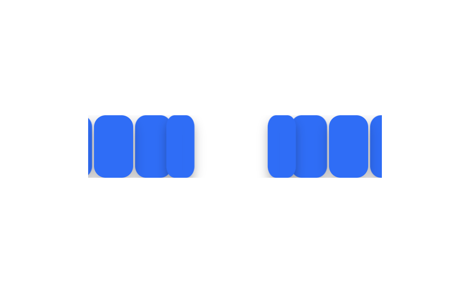
04Sequential 3D card flip
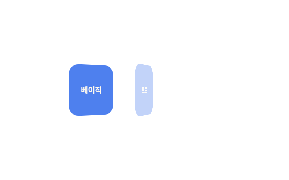
Three cards wait rotated 90 degrees on the Y axis, then unfold one by one, 150ms apart, to reveal their front face.
Best forPricing card comparisons, product spec cards
rotateY 90→0150ms 간격perspective
<main class="stage">
  <div class="cards is-demo">
    <div class="card">Basic</div>
    <div class="card">Pro</div>
    <div class="card">Team</div>
  </div>
</main>
@use "../../../../site/static/demo-tokens" as *;
$duration: $dur-base; // 카드 한 장이 펴지는 시간
$easing: $ease-out; // 시작 빠르고 끝은 부드럽게
$stagger: 150ms; // 카드 사이 시차
@include stage($stage-paper);
.cards {
display: flex;
gap: clamp(8px, 2.6vw, 14px);
perspective: 600px;
}
.card {
width: clamp(56px, 16vw, 76px);
height: clamp(64px, 18vw, 84px);
display: grid;
place-items: center;
border-radius: $r-card;
background: $subject-blue-deep;
color: $subject-cream;
font-weight: 700; font-size: clamp(11px, 3vw, 13px); line-height: 1.2; font-family: inherit;
transform-style: preserve-3d;
}
// 반복 재생은 데모 상태에서만 — 정지 상태의 카드는 불투명해야 글자가 읽힌다(크림 글자 · 진파랑 면 5.98:1)
.cards.is-demo .card { animation: flip-loop $dur-loop $easing infinite; }
@for $i from 1 through 3 {
.cards.is-demo .card:nth-child(#{$i}) { animation-delay: ($i - 1) * $stagger; }
}
@keyframes flip-loop {
0%, 6% { opacity: 0; transform: rotateY(90deg); }
26%, 66% { opacity: 1; transform: rotateY(0deg); }
86%, 100% { opacity: 0; transform: rotateY(-90deg); }
}
@media (prefers-reduced-motion: reduce) {
.card { animation: none; opacity: 1; transform: none; }
}html, body {
margin: 0;
overflow: hidden;
}
.stage {
box-sizing: border-box;
min-height: 100vh;
display: grid;
place-items: center;
margin: 0;
background: #ffffff;
font-family: -apple-system, "Segoe UI", "Noto Sans KR", sans-serif;
padding: clamp(8px, 4vw, 24px);
}
.cards {
display: flex;
gap: clamp(8px, 2.6vw, 14px);
perspective: 600px;
}
.card {
width: clamp(56px, 16vw, 76px);
height: clamp(64px, 18vw, 84px);
display: grid;
place-items: center;
border-radius: 16px;
background: #0a4fe8;
color: #fff7e6;
font-weight: 700;
font-size: clamp(11px, 3vw, 13px);
line-height: 1.2;
font-family: inherit;
transform-style: preserve-3d;
}
.cards.is-demo .card {
animation: flip-loop 2s ease-out infinite;
}
.cards.is-demo .card:nth-child(1) {
animation-delay: 0ms;
}
.cards.is-demo .card:nth-child(2) {
animation-delay: 150ms;
}
.cards.is-demo .card:nth-child(3) {
animation-delay: 300ms;
}
@keyframes flip-loop {
0%, 6% {
opacity: 0;
transform: rotateY(90deg);
}
26%, 66% {
opacity: 1;
transform: rotateY(0deg);
}
86%, 100% {
opacity: 0;
transform: rotateY(-90deg);
}
}
@media (prefers-reduced-motion: reduce) {
.card {
animation: none;
opacity: 1;
transform: none;
}
}import styles from "./CardFlipSequence.module.scss";
export type CardFlipSequenceProps = {
cards: string[];
/** 카드 사이 시차 ms (기본 150ms) */
stagger?: number;
duration?: number;
easing?: string;
};
export default function CardFlipSequence({ cards, stagger = 150 }: CardFlipSequenceProps) {
return (
<div className={styles.cards}>
{cards.map((label, i) => (
<div key={label} className={styles.card} style={{ animationDelay: `${i * stagger}ms` }}>
{label}
</div>
))}
</div>
);
}04 Sequential 3D card flip — Measured area 13.364% · moving frames 17/23Original by GODRICH · SCSS and React ship in the zip · 9 CSS Stagger Animation Demos You Can Copy-Paste
The post this demo lives in
 9 CSS Stagger Animation Demos You Can Copy-PasteA css stagger animation gives each item in a list or grid its own delay, so a group that starts together finishes appear See all demos in this post