03Color invert on scroll
Over the dark hero the header is transparent with white text, then flips its background and text colors entirely once the hero scrolls past.
Best forLanding pages with a full-screen hero, portfolio headers
IntersectionObserver색 토큰 교체히어로 높이 기준
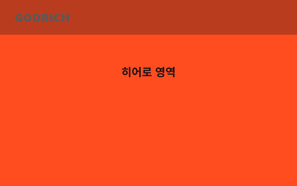
<main class="stage">
  <header class="head is-demo">
    <span class="head__layer head__layer--dark"></span>
    <span class="head__layer head__layer--light"></span>
    <span class="head__logo">GODRICH</span>
  </header>
  <div class="hero">
    <div class="hero__sentinel"></div>
    <p class="hero__title">Hero section</p>
  </div>
</main>
@use "../../../../site/static/demo-tokens" as *;
// ── 변수 3개 ──────────────────────────────────────────
$duration: $dur-base; // 색이 뒤집히는 시간
$easing: $ease-out;
$color: $subject-ink; // 반전 뒤 헤더 배경
// ── 데모 무대 ──────────────────────────────────────────
html, body { margin: 0; overflow: hidden; }
.stage {
min-height: 100vh;
margin: 0;
background: $stage-orange;
font-family: -apple-system, "Segoe UI", "Noto Sans KR", sans-serif;
}
.head {
position: sticky;
top: 0;
height: 56px;
display: flex;
align-items: center;
padding: 0 clamp(16px, 5vw, 24px);
// 두 배경 레이어를 겹쳐 두고 opacity 만 크로스페이드한다 (배경색 자체는 애니메이션하지 않는다)
&__layer { position: absolute; inset: 0; }
&__layer--dark { background: transparent; opacity: 1; transition: opacity $duration $easing; }
&__layer--light { background: $color; opacity: 0; transition: opacity $duration $easing; }
&.is-inverted &__layer--dark { opacity: 0; }
&.is-inverted &__layer--light { opacity: 1; }
// 로고도 헤더와 같이 뒤집힌다 — 주황(투명) 구간에선 잉크, 먹 구간에선 크림이라야 둘 다 AA 를 넘는다
&__logo { position: relative; color: $subject-ink; font-weight: 800; font-size: 18px; line-height: 1; font-family: inherit; letter-spacing: .04em; transition: color $duration $easing; }
&.is-inverted &__logo { color: $subject-cream; }
}
// ── 데모(.is-demo): 뒤집혔다 돌아왔다 2초 루프 ─────────────
.head.is-demo .head__layer--light {
animation: invert-loop $dur-loop $easing infinite;
}
.head.is-demo .head__logo {
animation: logo-invert $dur-loop $easing infinite;
}
@keyframes invert-loop {
0%, 15% { opacity: 0; }
45%, 70% { opacity: 1; }
95%, 100% { opacity: 0; }
}
@keyframes logo-invert {
0%, 15% { color: $subject-ink; }
45%, 70% { color: $subject-cream; }
95%, 100% { color: $subject-ink; }
}
// ── 히어로: 어두운 배경 위 흰 글자 자리 ───────────────────
.hero { position: relative; height: clamp(100px, 40vh, 220px); display: grid; place-items: center; }
.hero__sentinel { position: absolute; bottom: 0; height: 1px; width: 1px; }
.hero__title { color: $subject-ink; font-weight: 700; font-size: clamp(14px, 4vw, 18px); line-height: 1; font-family: inherit; margin: 0; }
@media (prefers-reduced-motion: reduce) {
.head__layer { transition: none; }
.head__logo { transition: none; }
.head.is-demo .head__layer--light { animation: none !important; opacity: 1; }
.head.is-demo .head__logo { animation: none !important; color: $subject-cream; }
}html, body {
margin: 0;
overflow: hidden;
}
.stage {
min-height: 100vh;
margin: 0;
background: #ff4d1f;
font-family: -apple-system, "Segoe UI", "Noto Sans KR", sans-serif;
}
.head {
position: sticky;
top: 0;
height: 56px;
display: flex;
align-items: center;
padding: 0 clamp(16px, 5vw, 24px);
}
.head__layer {
position: absolute;
inset: 0;
}
.head__layer--dark {
background: transparent;
opacity: 1;
transition: opacity 300ms ease-out;
}
.head__layer--light {
background: #17141a;
opacity: 0;
transition: opacity 300ms ease-out;
}
.head.is-inverted .head__layer--dark {
opacity: 0;
}
.head.is-inverted .head__layer--light {
opacity: 1;
}
.head__logo {
position: relative;
color: #17141a;
font-weight: 800;
font-size: 18px;
line-height: 1;
font-family: inherit;
letter-spacing: 0.04em;
transition: color 300ms ease-out;
}
.head.is-inverted .head__logo {
color: #fff7e6;
}
.head.is-demo .head__layer--light {
animation: invert-loop 2s ease-out infinite;
}
.head.is-demo .head__logo {
animation: logo-invert 2s ease-out infinite;
}
@keyframes invert-loop {
0%, 15% {
opacity: 0;
}
45%, 70% {
opacity: 1;
}
95%, 100% {
opacity: 0;
}
}
@keyframes logo-invert {
0%, 15% {
color: #17141a;
}
45%, 70% {
color: #fff7e6;
}
95%, 100% {
color: #17141a;
}
}
.hero {
position: relative;
height: clamp(100px, 40vh, 220px);
display: grid;
place-items: center;
}
.hero__sentinel {
position: absolute;
bottom: 0;
height: 1px;
width: 1px;
}
.hero__title {
color: #17141a;
font-weight: 700;
font-size: clamp(14px, 4vw, 18px);
line-height: 1;
font-family: inherit;
margin: 0;
}
@media (prefers-reduced-motion: reduce) {
.head__layer {
transition: none;
}
.head__logo {
transition: none;
}
.head.is-demo .head__layer--light {
animation: none !important;
opacity: 1;
}
.head.is-demo .head__logo {
animation: none !important;
color: #fff7e6;
}
}// 실제 페이지: 히어로 하단 센티넬을 지나면 색이 뒤집힌다 (IntersectionObserver, 6줄)
var head = document.querySelector('.head');
new IntersectionObserver(function (es) {
head.classList.toggle('is-inverted', !es[0].isIntersecting);
}).observe(document.querySelector('.hero__sentinel'));import { useEffect, useRef } from "react";
import type { CSSProperties } from "react";
import styles from "./ColorInvertHeader.module.scss";
export type ColorInvertHeaderProps = {
logo: string;
heroSentinelRef: { current: HTMLElement | null };
/** 색이 뒤집히는 시간 (기본 300ms) */
duration?: number;
easing?: string;
color?: string;
};
type Vars = CSSProperties & { "--duration"?: string; "--easing"?: string; "--color"?: string };
export default function ColorInvertHeader({
logo,
heroSentinelRef,
duration = 300,
easing = "ease-out",
color = "#17141a",
}: ColorInvertHeaderProps) {
const head = useRef<HTMLElement>(null);
const vars: Vars = { "--duration": `${duration}ms`, "--easing": easing, "--color": color };
useEffect(() => {
if (!heroSentinelRef.current) return;
const io = new IntersectionObserver(([e]) => {
head.current?.classList.toggle("is-inverted", !e.isIntersecting);
});
io.observe(heroSentinelRef.current);
return () => io.disconnect();
}, [heroSentinelRef]);
return (
<header ref={head} className={styles.head} style={vars}>
<span className={styles.layerDark} />
<span className={styles.layerLight} />
<span className={styles.logo}>{logo}</span>
</header>
);
}03 Color invert on scroll — Measured area 18.667% · moving frames 13/23Original by GODRICH · SCSS and React ship in the zip · 9 CSS Sticky Header Effects — No JS, Scroll-Driven
The post this demo lives in
 9 CSS Sticky Header Effects — No JS, Scroll-DrivenA css sticky header is a header pinned with position: sticky so it locks to the top of the viewport once the page scroll See all demos in this post