08Bounce tab
Picking a tab overshoots the indicator past its target with a spring easing before it settles back, and the chosen tab's label pops briefly via scale.
Best forPlayful toggle-style filter tabs, selection tabs in onboarding tutorials
cubic-bezier 스프링scaletranslateX
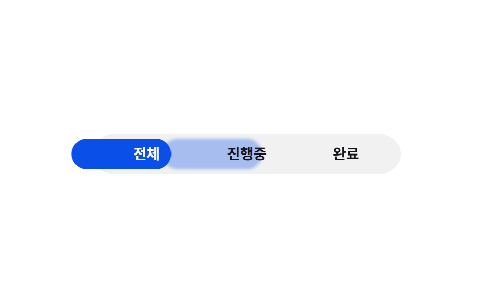
<main class="stage">
  <div class="bt is-demo">
    <input type="radio" name="bt-tab" id="bt-1" class="bt__radio" checked>
    <input type="radio" name="bt-tab" id="bt-2" class="bt__radio">
    <input type="radio" name="bt-tab" id="bt-3" class="bt__radio">
    <div class="bt__nav">
      <label class="bt__tab" for="bt-1"><span class="bt__text">All</span></label>
      <label class="bt__tab" for="bt-2"><span class="bt__text">In progress</span></label>
      <label class="bt__tab" for="bt-3"><span class="bt__text">Done</span></label>
      <span class="bt__trail" aria-hidden="true"></span>
      <span class="bt__indicator" aria-hidden="true"></span>
    </div>
  </div>
</main>
@use "../../../../site/static/demo-tokens" as *;
// ── 변수 3개 ──────────────────────────────────────────
$duration: $dur-enter; // 인디케이터가 튕기며 도착하는 시간
$easing: $ease-lerp-settle; // 관성 lerp — 목표를 12.6% 넘겼다가 정착 (2026-09-15 형태 2차 한 겹). 글자 팝(bt-pop)도 같은 곡선을 탄다
$color: $subject-blue-deep; // 잉크 글자가 4.03 으로 미달이라 짙은 파랑으로 (크림 글자 5.98:1)
@include stage($stage-paper);
.bt { width: min(300px, 86vw); }
.bt__radio { position: absolute; opacity: 0; pointer-events: none; }
.bt__nav {
position: relative;
display: grid;
grid-template-columns: repeat(3, 1fr);
padding: $sp-1;
background: rgba(23, 20, 26, .06);
border-radius: $r-pill;
}
// 글자색의 기본은 잉크다 — 무대(흰색) 위에서 16:1. 알약 위에 온(:checked) 글자만 크림(5.98:1)으로 바뀐다.
// 활성 신호는 알약의 위치와 글자의 튕김이 맡고, 데모 루프에서는 bt-ink-* 가 알약과 같은 박자로 글자색을 옮긴다
.bt__tab {
position: relative; z-index: 1;
text-align: center;
padding: $sp-2 $sp-1;
font-weight: 600;
font-size: clamp(12px, 3.4vw, 14px);
line-height: 1;
font-family: inherit;
color: $subject-ink;
cursor: pointer;
-webkit-tap-highlight-color: transparent;
}
.bt__text { display: inline-block; transform: scale(1); }
.bt__indicator {
position: absolute; top: $sp-1; bottom: $sp-1; left: $sp-1;
width: calc((100% - #{$sp-1} * 2) / 3);
background: $color;
border-radius: $r-pill;
transform: translateX(0);
transition: transform $duration $easing;
}
// 이동 궤적 트레일 잔상 — 인디케이터보다 1.8배 느리게 같은 목적지를 쫓아가며 뒤로 흐른다
.bt__trail {
position: absolute; top: $sp-1; bottom: $sp-1; left: $sp-1;
width: calc((100% - #{$sp-1} * 2) / 3);
background: $color;
border-radius: $r-pill;
opacity: .32;
filter: blur(1.5px);
transform: translateX(0);
transition: transform calc($duration * 1.8) ease-out;
}
// ── 실제 동작: :checked 만으로 인디케이터가 튕기며 옮겨간다 ──────────────
#bt-1:checked ~ .bt__nav .bt__indicator { transform: translateX(0%); }
#bt-2:checked ~ .bt__nav .bt__indicator { transform: translateX(100%); }
#bt-3:checked ~ .bt__nav .bt__indicator { transform: translateX(200%); }
#bt-1:checked ~ .bt__nav .bt__trail { transform: translateX(0%); }
#bt-2:checked ~ .bt__nav .bt__trail { transform: translateX(100%); }
#bt-3:checked ~ .bt__nav .bt__trail { transform: translateX(200%); }
// 알약 위에 온 글자만 크림 — 잉크를 그대로 두면 짙은 파랑 위 2.87:1 이다
#bt-1:checked ~ .bt__nav label[for="bt-1"],
#bt-2:checked ~ .bt__nav label[for="bt-2"],
#bt-3:checked ~ .bt__nav label[for="bt-3"] { color: $subject-cream; }
// 실제 클릭으로 :checked 가 바뀔 때만 그 글자가 한 번 튕긴다
#bt-1:checked ~ .bt__nav label[for="bt-1"] .bt__text,
#bt-2:checked ~ .bt__nav label[for="bt-2"] .bt__text,
#bt-3:checked ~ .bt__nav label[for="bt-3"] .bt__text { animation: bt-pop 400ms $easing; }
@keyframes bt-pop { 0% { transform: scale(1); } 55% { transform: scale(1.18); } 100% { transform: scale(1); } }
// ── 데모 루프: 클릭 전까지 인디케이터와 글자가 같은 박자로 세 탭을 오간다 ──────────────
.bt.is-demo .bt__indicator { animation: bt-loop $dur-loop $easing infinite; }
.bt.is-demo .bt__trail { animation: bt-loop $dur-loop $easing infinite; animation-delay: calc($dur-loop * .06); } // 6% 위상만큼 늦게 쫓아가 트레일로 읽힌다
.bt.is-demo .bt__nav label:nth-child(1) .bt__text { animation: bt-pop-1 $dur-loop $easing infinite, bt-ink-1 $dur-loop linear infinite; }
.bt.is-demo .bt__nav label:nth-child(2) .bt__text { animation: bt-pop-2 $dur-loop $easing infinite, bt-ink-2 $dur-loop linear infinite; }
.bt.is-demo .bt__nav label:nth-child(3) .bt__text { animation: bt-pop-3 $dur-loop $easing infinite, bt-ink-3 $dur-loop linear infinite; }
// 글자색도 알약과 같은 박자(0·15/33·48/66·81/100%)로 — 크림 글자가 알약 없는 자리에 남지 않게
@keyframes bt-ink-1 { 0%, 15% { color: $subject-cream; } 23%, 87% { color: $subject-ink; } 95%, 100% { color: $subject-cream; } }
@keyframes bt-ink-2 { 0%, 25% { color: $subject-ink; } 33%, 48% { color: $subject-cream; } 56%, 100% { color: $subject-ink; } }
@keyframes bt-ink-3 { 0%, 58% { color: $subject-ink; } 66%, 81% { color: $subject-cream; } 89%, 100% { color: $subject-ink; } }
@keyframes bt-loop {
0%, 15% { transform: translateX(0%); }
33%, 48% { transform: translateX(100%); }
66%, 81% { transform: translateX(200%); }
100% { transform: translateX(0%); }
}
// 인디케이터가 도착하는 지점(15%·48%·81%·100%→0%)에서 그 탭 글자만 튕긴다
@keyframes bt-pop-1 { 0%, 100% { transform: scale(1.18); } 5%, 96% { transform: scale(1); } }
@keyframes bt-pop-2 { 0%, 43%, 100% { transform: scale(1); } 48% { transform: scale(1.18); } 53% { transform: scale(1); } }
@keyframes bt-pop-3 { 0%, 76%, 100% { transform: scale(1); } 81% { transform: scale(1.18); } 86% { transform: scale(1); } }
@media (prefers-reduced-motion: reduce) {
.bt__indicator, .bt__text, .bt__trail { transition: none; animation: none !important; }
.bt.is-demo .bt__indicator, .bt.is-demo .bt__text, .bt.is-demo .bt__trail { animation: none !important; }
.bt__trail { opacity: 0; } // 관성·트레일 한 겹은 reduced-motion 에서 완전히 꺼진다
}html, body {
margin: 0;
overflow: hidden;
}
.stage {
box-sizing: border-box;
min-height: 100vh;
display: grid;
place-items: center;
margin: 0;
background: #ffffff;
font-family: -apple-system, "Segoe UI", "Noto Sans KR", sans-serif;
padding: clamp(8px, 4vw, 24px);
}
.bt {
width: min(300px, 86vw);
}
.bt__radio {
position: absolute;
opacity: 0;
pointer-events: none;
}
.bt__nav {
position: relative;
display: grid;
grid-template-columns: repeat(3, 1fr);
padding: 4px;
background: rgba(23, 20, 26, 0.06);
border-radius: 999px;
}
.bt__tab {
position: relative;
z-index: 1;
text-align: center;
padding: 8px 4px;
font-weight: 600;
font-size: clamp(12px, 3.4vw, 14px);
line-height: 1;
font-family: inherit;
color: #17141a;
cursor: pointer;
-webkit-tap-highlight-color: transparent;
}
.bt__text {
display: inline-block;
transform: scale(1);
}
.bt__indicator {
position: absolute;
top: 4px;
bottom: 4px;
left: 4px;
width: calc((100% - 4px * 2) / 3);
background: #0a4fe8;
border-radius: 999px;
transform: translateX(0);
transition: transform 600ms linear(0, 0.051, 0.176, 0.341, 0.518, 0.685, 0.831, 0.947, 1.032, 1.087, 1.117, 1.126, 1.121, 1.105, 1.085, 1.062, 1.041, 1.022, 1.008, 0.997, 1);
}
.bt__trail {
position: absolute;
top: 4px;
bottom: 4px;
left: 4px;
width: calc((100% - 4px * 2) / 3);
background: #0a4fe8;
border-radius: 999px;
opacity: 0.32;
filter: blur(1.5px);
transform: translateX(0);
transition: transform 1080ms ease-out;
}
#bt-1:checked ~ .bt__nav .bt__indicator {
transform: translateX(0%);
}
#bt-2:checked ~ .bt__nav .bt__indicator {
transform: translateX(100%);
}
#bt-3:checked ~ .bt__nav .bt__indicator {
transform: translateX(200%);
}
#bt-1:checked ~ .bt__nav .bt__trail {
transform: translateX(0%);
}
#bt-2:checked ~ .bt__nav .bt__trail {
transform: translateX(100%);
}
#bt-3:checked ~ .bt__nav .bt__trail {
transform: translateX(200%);
}
#bt-1:checked ~ .bt__nav label[for=bt-1],
#bt-2:checked ~ .bt__nav label[for=bt-2],
#bt-3:checked ~ .bt__nav label[for=bt-3] {
color: #fff7e6;
}
#bt-1:checked ~ .bt__nav label[for=bt-1] .bt__text,
#bt-2:checked ~ .bt__nav label[for=bt-2] .bt__text,
#bt-3:checked ~ .bt__nav label[for=bt-3] .bt__text {
animation: bt-pop 400ms linear(0, 0.051, 0.176, 0.341, 0.518, 0.685, 0.831, 0.947, 1.032, 1.087, 1.117, 1.126, 1.121, 1.105, 1.085, 1.062, 1.041, 1.022, 1.008, 0.997, 1);
}
@keyframes bt-pop {
0% {
transform: scale(1);
}
55% {
transform: scale(1.18);
}
100% {
transform: scale(1);
}
}
.bt.is-demo .bt__indicator {
animation: bt-loop 2s linear(0, 0.051, 0.176, 0.341, 0.518, 0.685, 0.831, 0.947, 1.032, 1.087, 1.117, 1.126, 1.121, 1.105, 1.085, 1.062, 1.041, 1.022, 1.008, 0.997, 1) infinite;
}
.bt.is-demo .bt__trail {
animation: bt-loop 2s linear(0, 0.051, 0.176, 0.341, 0.518, 0.685, 0.831, 0.947, 1.032, 1.087, 1.117, 1.126, 1.121, 1.105, 1.085, 1.062, 1.041, 1.022, 1.008, 0.997, 1) infinite;
animation-delay: 0.12s;
}
.bt.is-demo .bt__nav label:nth-child(1) .bt__text {
animation: bt-pop-1 2s linear(0, 0.051, 0.176, 0.341, 0.518, 0.685, 0.831, 0.947, 1.032, 1.087, 1.117, 1.126, 1.121, 1.105, 1.085, 1.062, 1.041, 1.022, 1.008, 0.997, 1) infinite, bt-ink-1 2s linear infinite;
}
.bt.is-demo .bt__nav label:nth-child(2) .bt__text {
animation: bt-pop-2 2s linear(0, 0.051, 0.176, 0.341, 0.518, 0.685, 0.831, 0.947, 1.032, 1.087, 1.117, 1.126, 1.121, 1.105, 1.085, 1.062, 1.041, 1.022, 1.008, 0.997, 1) infinite, bt-ink-2 2s linear infinite;
}
.bt.is-demo .bt__nav label:nth-child(3) .bt__text {
animation: bt-pop-3 2s linear(0, 0.051, 0.176, 0.341, 0.518, 0.685, 0.831, 0.947, 1.032, 1.087, 1.117, 1.126, 1.121, 1.105, 1.085, 1.062, 1.041, 1.022, 1.008, 0.997, 1) infinite, bt-ink-3 2s linear infinite;
}
@keyframes bt-ink-1 {
0%, 15% {
color: #fff7e6;
}
23%, 87% {
color: #17141a;
}
95%, 100% {
color: #fff7e6;
}
}
@keyframes bt-ink-2 {
0%, 25% {
color: #17141a;
}
33%, 48% {
color: #fff7e6;
}
56%, 100% {
color: #17141a;
}
}
@keyframes bt-ink-3 {
0%, 58% {
color: #17141a;
}
66%, 81% {
color: #fff7e6;
}
89%, 100% {
color: #17141a;
}
}
@keyframes bt-loop {
0%, 15% {
transform: translateX(0%);
}
33%, 48% {
transform: translateX(100%);
}
66%, 81% {
transform: translateX(200%);
}
100% {
transform: translateX(0%);
}
}
@keyframes bt-pop-1 {
0%, 100% {
transform: scale(1.18);
}
5%, 96% {
transform: scale(1);
}
}
@keyframes bt-pop-2 {
0%, 43%, 100% {
transform: scale(1);
}
48% {
transform: scale(1.18);
}
53% {
transform: scale(1);
}
}
@keyframes bt-pop-3 {
0%, 76%, 100% {
transform: scale(1);
}
81% {
transform: scale(1.18);
}
86% {
transform: scale(1);
}
}
@media (prefers-reduced-motion: reduce) {
.bt__indicator, .bt__text, .bt__trail {
transition: none;
animation: none !important;
}
.bt.is-demo .bt__indicator, .bt.is-demo .bt__text, .bt.is-demo .bt__trail {
animation: none !important;
}
.bt__trail {
opacity: 0;
}
}// 이동은 :checked 만으로 이미 동작한다. 실제 클릭이 오면 데모 루프(.is-demo)만 뗀다.
document.querySelectorAll('.bt__radio').forEach(function (r) {
r.addEventListener('pointerdown', function () { document.querySelector('.bt').classList.remove('is-demo'); });
});import { useState } from "react";
import type { CSSProperties } from "react";
import styles from "./BounceTab.module.scss";
const TABS = ["전체", "진행중", "완료"];
export type BounceTabProps = {
duration?: number;
easing?: string;
color?: string;
};
type Vars = CSSProperties & { "--duration"?: string; "--easing"?: string; "--color"?: string; "--i"?: number };
export default function BounceTab({ duration = 600, easing = "cubic-bezier(.2,1.4,.4,1)", color = "#0a4fe8" }: BounceTabProps) {
const [active, setActive] = useState(0);
const vars: Vars = { "--duration": `${duration}ms`, "--easing": easing, "--color": color, "--i": active };
return (
<div className={styles.bt} style={vars}>
<div className={styles.nav} role="tablist">
{TABS.map((t, i) => (
<button key={t} type="button" role="tab" aria-selected={i === active}
className={styles.tab} onClick={() => setActive(i)}>
<span key={i === active ? "on" : "off"} className={styles.text}>{t}</span>
</button>
))}
<span className={styles.indicator} aria-hidden="true" />
</div>
</div>
);
}08 Bounce tab — Measured area 7.166% · moving frames 21/23Original by GODRICH · SCSS and React ship in the zip · 9 CSS Tab Switch Animations — No Library, Pure CSS
The post this demo lives in
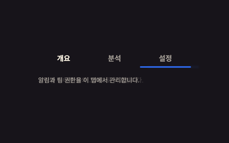 9 CSS Tab Switch Animations — No Library, Pure CSSA css tab switch animation slides an indicator or swaps a panel when a different tab is picked. Seven of these nine run See all demos in this post
If you like this effect - similar demos
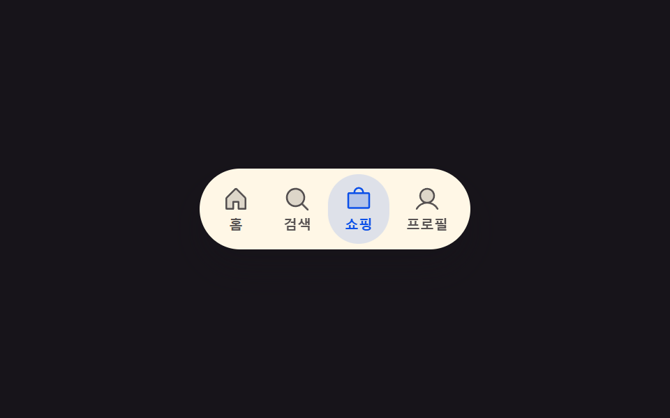 Transitions01 Active-indicator slide-morph toggle — when the selected tab changes, the highlight's position and width values shift together from the old spot to the new oneCSS Bottom Navigation Bar: 9 Transition Patterns
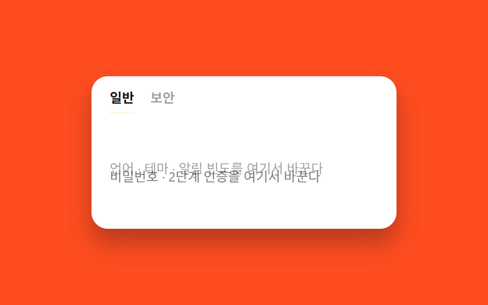 Transitions07 Tab content cross-fade9 CSS Page Transitions — No Library, Pure CSS
 Transitions01 height:auto transition9 CSS Dropdown Menu Animation—No Library, Pure CSS