08Spin utility
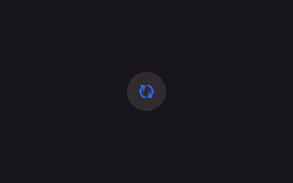
Leaving the built-in `animate-spin` (1s) untouched and simply adding `--animate-spin-slow: spin 3s linear infinite` in `@theme` lets a logo and a loading ring share the same rotation at two different speeds.
Best forDecorative logo spins, a loading ring alongside a refresh button
@keyframes spinrotate(360deg) 공유linear infinite
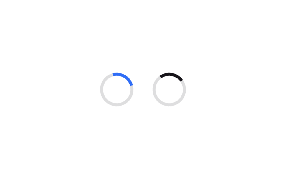
<main class="stage">
  <div class="row">
    <span class="ring ring--fast" aria-hidden="true"></span>
    <span class="ring ring--slow" aria-hidden="true"></span>
  </div>
</main>
@use "../../../../site/static/demo-tokens" as *;
// ── 변수 3개 ──────────────────────────────────────────
$duration: 1000ms; // 기본 animate-spin 과 같은 1초
$easing: linear;
$color: $subject-blue;
// ── 데모 무대 ──────────────────────────────────────────
@include stage($stage-paper);
.row {
display: flex;
align-items: center;
gap: $sp-8;
}
.ring {
box-sizing: border-box;
width: 56px;
height: 56px;
border-radius: 50%;
border: 5px solid rgba($subject-ink, .14);
}
// 기본 --animate-spin 그대로 (1초 linear)
.ring--fast {
border-top-color: $color;
animation: spin $duration $easing infinite;
}
// 확장한 --animate-spin-slow (3초 linear) — 같은 spin 키프레임을 속도만 다르게 공유
.ring--slow {
border-top-color: $subject-ink;
animation: spin 3000ms $easing infinite;
}
@keyframes spin {
to { transform: rotate(360deg); }
}
// ── 접근성 ──────────────────────────────────────────
@media (prefers-reduced-motion: reduce) {
.ring--fast, .ring--slow { animation: none; }
}html, body {
margin: 0;
overflow: hidden;
}
.stage {
box-sizing: border-box;
min-height: 100vh;
display: grid;
place-items: center;
margin: 0;
background: #ffffff;
font-family: -apple-system, "Segoe UI", "Noto Sans KR", sans-serif;
padding: clamp(8px, 4vw, 24px);
}
.row {
display: flex;
align-items: center;
gap: 32px;
}
.ring {
box-sizing: border-box;
width: 56px;
height: 56px;
border-radius: 50%;
border: 5px solid rgba(23, 20, 26, 0.14);
}
.ring--fast {
border-top-color: #2f6df6;
animation: spin 1000ms linear infinite;
}
.ring--slow {
border-top-color: #17141a;
animation: spin 3000ms linear infinite;
}
@keyframes spin {
to {
transform: rotate(360deg);
}
}
@media (prefers-reduced-motion: reduce) {
.ring--fast, .ring--slow {
animation: none;
}
}import type { CSSProperties } from "react";
import styles from "./SpinUtilRings.module.scss";
export type SpinUtilRingsProps = {
/** 기본 animate-spin 속도, ms */
duration?: number;
/** --animate-spin-slow 속도, ms */
slowDuration?: number;
easing?: string;
color?: string;
};
type Vars = CSSProperties & {
"--duration"?: string;
"--slow-duration"?: string;
"--easing"?: string;
"--color"?: string;
};
export default function SpinUtilRings({
duration = 1000,
slowDuration = 3000,
easing = "linear",
color = "#2f6df6",
}: SpinUtilRingsProps) {
const vars: Vars = {
"--duration": `${duration}ms`,
"--slow-duration": `${slowDuration}ms`,
"--easing": easing,
"--color": color,
};
return (
<div className={styles.row} style={vars}>
<span className={styles.ring} aria-hidden="true" />
<span className={`${styles.ring} ${styles["ring--slow"]}`} aria-hidden="true" />
</div>
);
}08 Spin utility — Measured area 1.432% · moving frames 23/23Original by GODRICH · SCSS and React ship in the zip · 9 Tailwind v4 Animations — One Line, Copy-Paste
The post this demo lives in
 9 Tailwind v4 Animations — One Line, Copy-PasteThese nine Tailwind v4 animations turn one utility class into a real keyframe, a hover state, or a reduced-motion guard, See all demos in this post