09Radar sweep fill
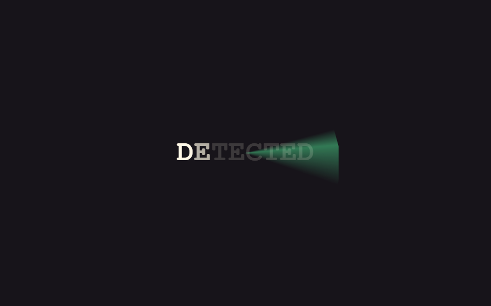
A bright radar-style sweep line rotates once across the heading, and each letter locks into full visibility right as the sweep passes over it.
Best forSecurity or monitoring dashboard titles, game loading-screen headlines
conic-gradienttransform: rotateanimation-delay per letter
<main class="stage">
  <div class="rs-wrap is-demo">
    <span class="rs-sweep" aria-hidden="true"></span>
    <p class="rs-text">
      <span>D</span><span>E</span><span>T</span><span>E</span><span>C</span><span>T</span><span>E</span><span>D</span>
    </p>
  </div>
</main>
@use "../../../../site/static/demo-tokens" as *;
// ── 변수 3개 ──────────────────────────────────────────
$duration: $dur-loop;
$easing: $ease-out;
$color: $subject-cream;
@include stage($stage-ink);
.rs-wrap {
position: relative;
overflow: hidden;
padding: $sp-6;
border-radius: $r-card;
}
.rs-sweep {
position: absolute;
inset: -60%;
background: conic-gradient(from 0deg, transparent 0deg, rgba(61, 220, 132, .5) 10deg, transparent 34deg);
border-radius: $r-pill;
mix-blend-mode: screen;
}
.rs-text {
position: relative;
margin: 0;
display: flex;
gap: 0;
font: 800 clamp(18px, 6vw, 28px)/1.2 "Space Mono", "Courier New", monospace;
color: $color;
}
.rs-text span { opacity: .16; }
@keyframes rs-rotate { to { transform: rotate(360deg); } }
@keyframes rs-lock {
0%, 4% { opacity: .16; }
14%, 88% { opacity: 1; }
100% { opacity: .16; }
}
.rs-wrap.is-demo .rs-sweep { animation: rs-rotate $duration linear infinite; }
.rs-wrap.is-demo .rs-text span {
animation: rs-lock $duration $easing infinite;
}
@for $i from 1 through 8 {
.rs-wrap.is-demo .rs-text span:nth-child(#{$i}) { animation-delay: calc(#{$duration} / 8 * #{$i - 1}); }
}
@media (prefers-reduced-motion: reduce) {
.rs-sweep,
.rs-wrap.is-demo .rs-sweep { animation: none !important; opacity: 0 !important; }
.rs-text span,
.rs-wrap.is-demo .rs-text span { animation: none !important; opacity: 1 !important; }
}html, body {
margin: 0;
overflow: hidden;
}
.stage {
box-sizing: border-box;
min-height: 100vh;
display: grid;
place-items: center;
margin: 0;
background: #17141a;
font-family: -apple-system, "Segoe UI", "Noto Sans KR", sans-serif;
padding: clamp(8px, 4vw, 24px);
}
.rs-wrap {
position: relative;
overflow: hidden;
padding: 24px;
border-radius: 16px;
}
.rs-sweep {
position: absolute;
inset: -60%;
background: conic-gradient(from 0deg, transparent 0deg, rgba(61, 220, 132, 0.5) 10deg, transparent 34deg);
border-radius: 999px;
mix-blend-mode: screen;
}
.rs-text {
position: relative;
margin: 0;
display: flex;
gap: 0;
font: 800 clamp(18px, 6vw, 28px)/1.2 "Space Mono", "Courier New", monospace;
color: #fff7e6;
}
.rs-text span {
opacity: 0.16;
}
@keyframes rs-rotate {
to {
transform: rotate(360deg);
}
}
@keyframes rs-lock {
0%, 4% {
opacity: 0.16;
}
14%, 88% {
opacity: 1;
}
100% {
opacity: 0.16;
}
}
.rs-wrap.is-demo .rs-sweep {
animation: rs-rotate 2s linear infinite;
}
.rs-wrap.is-demo .rs-text span {
animation: rs-lock 2s ease-out infinite;
}
.rs-wrap.is-demo .rs-text span:nth-child(1) {
animation-delay: calc(2s / 8 * 0);
}
.rs-wrap.is-demo .rs-text span:nth-child(2) {
animation-delay: calc(2s / 8 * 1);
}
.rs-wrap.is-demo .rs-text span:nth-child(3) {
animation-delay: calc(2s / 8 * 2);
}
.rs-wrap.is-demo .rs-text span:nth-child(4) {
animation-delay: calc(2s / 8 * 3);
}
.rs-wrap.is-demo .rs-text span:nth-child(5) {
animation-delay: calc(2s / 8 * 4);
}
.rs-wrap.is-demo .rs-text span:nth-child(6) {
animation-delay: calc(2s / 8 * 5);
}
.rs-wrap.is-demo .rs-text span:nth-child(7) {
animation-delay: calc(2s / 8 * 6);
}
.rs-wrap.is-demo .rs-text span:nth-child(8) {
animation-delay: calc(2s / 8 * 7);
}
@media (prefers-reduced-motion: reduce) {
.rs-sweep,
.rs-wrap.is-demo .rs-sweep {
animation: none !important;
opacity: 0 !important;
}
.rs-text span,
.rs-wrap.is-demo .rs-text span {
animation: none !important;
opacity: 1 !important;
}
}import { CSSProperties, useEffect, useRef, useState } from "react";
import styles from "./RadarSweepFill.module.scss";
export interface RadarSweepFillProps {
text?: string;
duration?: string;
easing?: string;
}
// 실사용: 뷰포트에 들어오면 레이더 스윕이 한 바퀴 돌며 지나간 자리의 글자만 순서대로 선명해진다.
export default function RadarSweepFill({
text = "DETECTED",
duration = "1400ms",
easing = "ease-out",
}: RadarSweepFillProps) {
const ref = useRef<HTMLDivElement>(null);
const [locked, setLocked] = useState(0);
const [sweeping, setSweeping] = useState(false);
useEffect(() => {
const el = ref.current;
if (!el) return;
let timer: ReturnType<typeof setInterval> | null = null;
const io = new IntersectionObserver((entries) => {
entries.forEach((entry) => {
if (!entry.isIntersecting || timer) return;
io.unobserve(entry.target);
const reduced = window.matchMedia("(prefers-reduced-motion: reduce)").matches;
if (reduced) { setLocked(text.length); return; }
setSweeping(true);
let i = 0;
timer = setInterval(() => {
i += 1;
setLocked(i);
if (i >= text.length && timer) { clearInterval(timer); timer = null; setSweeping(false); }
}, 160);
});
}, { threshold: 0.3 });
io.observe(el);
return () => { io.disconnect(); if (timer) clearInterval(timer); };
}, [text]);
const style = { "--duration": duration, "--easing": easing } as CSSProperties;
return (
<div className={styles.wrap} style={style} ref={ref}>
<span className={`${styles.sweep} ${sweeping ? styles.spin : ""}`} aria-hidden="true" />
<p className={styles.text}>
{text.split("").map((ch, i) => (
<span key={i} style={{ opacity: i < locked ? 1 : 0.16 }}>{ch}</span>
))}
</p>
</div>
);
}09 Radar sweep fill — Measured area 10.213% · moving frames 23/23Original by GODRICH · SCSS and React ship in the zip · 9 CSS Text Reveal Effects — Hex, Cipher, Radar
The post this demo lives in
 9 CSS Text Reveal Effects — Hex, Cipher, RadarA css text reveal effect is a short animation for text appearing on screen, ready to paste in with no coding needed. All See all demos in this post