05Alternating card slide
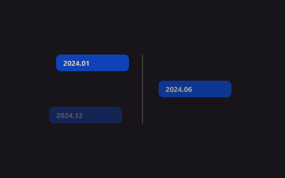
Odd cards start at translateX(-24px) and even cards at translateX(24px) from the center rail, both easing to 0 while opacity rises from 0 to 1.
Best forProject milestone showcases, company-history pages
translateXopacity500ms
<main class="stage">
  <div class="ts05-timeline is-demo">
    <div class="ts05-row ts05-row--l"><div class="ts05-card">2024.01</div></div>
    <div class="ts05-row ts05-row--r"><div class="ts05-card">2024.06</div></div>
    <div class="ts05-row ts05-row--l"><div class="ts05-card">2024.12</div></div>
  </div>
</main>
@use "../../../../site/static/demo-tokens" as *;
// ── 변수 3개 ──────────────────────────────────────────
$duration: $dur-loop;
$easing: $ease-spring;
$color: $subject-blue-deep; // 크림 글자가 얹히므로 진한 파랑
@include stage($stage-ink);
.ts05-timeline {
position: relative;
width: min(280px, 84vw);
display: flex;
flex-direction: column;
gap: $sp-4;
// 가운데 세로선
&::before {
content: "";
position: absolute;
left: 50%;
top: 0;
width: 2px;
height: 100%;
background: rgba(255, 247, 230, .18);
transform: translateX(-50%);
}
}
.ts05-row {
display: flex;
&--l { justify-content: flex-start; }
&--r { justify-content: flex-end; }
}
.ts05-card {
width: 44%;
box-sizing: border-box;
padding: $sp-2 $sp-3;
border-radius: $r-sm;
background: $color;
color: $subject-cream;
font: 700 12px/1 -apple-system, "Segoe UI", "Noto Sans KR", sans-serif;
opacity: 0;
}
// 실제 사용 코드: 뷰포트에 들어오면 홀수는 왼쪽, 짝수는 오른쪽에서 모인다
.ts05-row--l .ts05-card { transform: translateX(-24px); }
.ts05-row--r .ts05-card { transform: translateX(24px); }
@supports (animation-timeline: view()) {
.ts05-row--l .ts05-card { animation: ts05-in-l $duration $easing both; animation-timeline: view(); animation-range: entry 0% cover 60%; }
.ts05-row--r .ts05-card { animation: ts05-in-r $duration $easing both; animation-timeline: view(); animation-range: entry 0% cover 60%; }
}
@supports not (animation-timeline: view()) {
.ts05-card { opacity: 1; transform: none; }
}
@keyframes ts05-in-l { from { opacity: 0; transform: translateX(-24px); } to { opacity: 1; transform: translateX(0); } }
@keyframes ts05-in-r { from { opacity: 0; transform: translateX(24px); } to { opacity: 1; transform: translateX(0); } }
// 데모 루프: 위에서부터 순서대로
.ts05-timeline.is-demo .ts05-row--l .ts05-card { animation: ts05-in-l $duration $easing infinite; }
.ts05-timeline.is-demo .ts05-row--r .ts05-card { animation: ts05-in-r $duration $easing infinite; animation-delay: .18s; }
.ts05-timeline.is-demo .ts05-row:nth-child(3) .ts05-card { animation-delay: .36s; }
@media (prefers-reduced-motion: reduce) {
.ts05-card, .ts05-timeline.is-demo .ts05-card { animation: none !important; opacity: 1 !important; transform: none !important; }
}html, body {
margin: 0;
overflow: hidden;
}
.stage {
box-sizing: border-box;
min-height: 100vh;
display: grid;
place-items: center;
margin: 0;
background: #17141a;
font-family: -apple-system, "Segoe UI", "Noto Sans KR", sans-serif;
padding: clamp(8px, 4vw, 24px);
}
.ts05-timeline {
position: relative;
width: min(280px, 84vw);
display: flex;
flex-direction: column;
gap: 16px;
}
.ts05-timeline::before {
content: "";
position: absolute;
left: 50%;
top: 0;
width: 2px;
height: 100%;
background: rgba(255, 247, 230, 0.18);
transform: translateX(-50%);
}
.ts05-row {
display: flex;
}
.ts05-row--l {
justify-content: flex-start;
}
.ts05-row--r {
justify-content: flex-end;
}
.ts05-card {
width: 44%;
box-sizing: border-box;
padding: 8px 12px;
border-radius: 8px;
background: #0a4fe8;
color: #fff7e6;
font: 700 12px/1 -apple-system, "Segoe UI", "Noto Sans KR", sans-serif;
opacity: 0;
}
.ts05-row--l .ts05-card {
transform: translateX(-24px);
}
.ts05-row--r .ts05-card {
transform: translateX(24px);
}
@supports (animation-timeline: view()) {
.ts05-row--l .ts05-card {
animation: ts05-in-l 2s cubic-bezier(0.2, 0.8, 0.2, 1) both;
animation-timeline: view();
animation-range: entry 0% cover 60%;
}
.ts05-row--r .ts05-card {
animation: ts05-in-r 2s cubic-bezier(0.2, 0.8, 0.2, 1) both;
animation-timeline: view();
animation-range: entry 0% cover 60%;
}
}
@supports not (animation-timeline: view()) {
.ts05-card {
opacity: 1;
transform: none;
}
}
@keyframes ts05-in-l {
from {
opacity: 0;
transform: translateX(-24px);
}
to {
opacity: 1;
transform: translateX(0);
}
}
@keyframes ts05-in-r {
from {
opacity: 0;
transform: translateX(24px);
}
to {
opacity: 1;
transform: translateX(0);
}
}
.ts05-timeline.is-demo .ts05-row--l .ts05-card {
animation: ts05-in-l 2s cubic-bezier(0.2, 0.8, 0.2, 1) infinite;
}
.ts05-timeline.is-demo .ts05-row--r .ts05-card {
animation: ts05-in-r 2s cubic-bezier(0.2, 0.8, 0.2, 1) infinite;
animation-delay: 0.18s;
}
.ts05-timeline.is-demo .ts05-row:nth-child(3) .ts05-card {
animation-delay: 0.36s;
}
@media (prefers-reduced-motion: reduce) {
.ts05-card, .ts05-timeline.is-demo .ts05-card {
animation: none !important;
opacity: 1 !important;
transform: none !important;
}
}import { CSSProperties } from "react";
import styles from "./AlternatingCardSlide.module.scss";
type Vars = CSSProperties & {
"--duration"?: string;
"--easing"?: string;
"--color"?: string;
};
export interface AlternatingCardSlideProps {
duration?: string;
easing?: string;
color?: string;
dates?: string[];
}
export default function AlternatingCardSlide({
duration = "2s",
easing = "cubic-bezier(.2, .8, .2, 1)",
color = "#0a4fe8",
dates = ["2024.01", "2024.06", "2024.12"],
}: AlternatingCardSlideProps) {
const style: Vars = { "--duration": duration, "--easing": easing, "--color": color };
return (
<div className={styles.timeline} style={style}>
{dates.map((d, i) => (
<div key={d} className={`${styles.row} ${i % 2 === 0 ? styles.rowL : styles.rowR}`}>
<div className={styles.card} style={{ animationDelay: `${i * 180}ms` }}>{d}</div>
</div>
))}
</div>
);
}05 Alternating card slide — Measured area 8.283% · moving frames 23/23Original by GODRICH · SCSS and React ship in the zip · 9 CSS Timeline Animation Ideas, Copy-Paste
The post this demo lives in
 9 CSS Timeline Animation Ideas, Copy-PasteA CSS timeline animation is a line of dots, bars, or cards that draws or fills itself to show steps in order — a company See all demos in this post