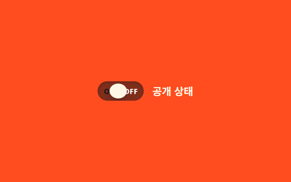
03ON/OFF label inside
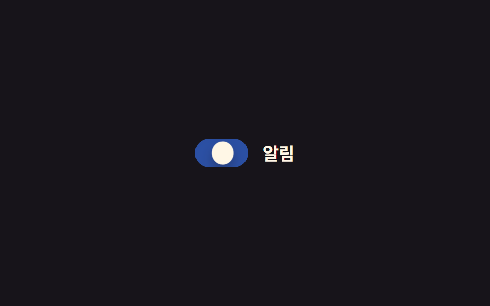
ON and OFF text sits fixed at both ends of the track, and the sliding knob covers whichever label it moves over.
Best forAdmin dashboard status switches, notification on/off
z-indexoverflow:hidden0.25초
<main class="stage">
  <label class="switch is-demo">
    <input type="checkbox" class="switch__input" role="switch">
    <span class="switch__track">
      <span class="switch__text switch__text--on">ON</span>
      <span class="switch__text switch__text--off">OFF</span>
      <span class="switch__knob"></span>
    </span>
    <span class="switch__label">Public status</span>
  </label>
</main>
@use "../../../../site/static/demo-tokens" as *;
// ── 변수 3개 ──────────────────────────────
$duration: $dur-base;
$easing: $ease-out;
$color: $subject-cream;
// ── 데모 무대 ───────────────────────────────
@include stage($stage-orange);
.switch {
position: relative;
display: inline-flex; align-items: center; gap: clamp(10px, 3vw, 14px);
cursor: pointer;
-webkit-tap-highlight-color: transparent;
}
.switch__input {
position: absolute; inset: 0; width: 100%; height: 100%;
margin: 0; opacity: 0; cursor: pointer;
}
.switch__track {
position: relative; overflow: hidden;
width: clamp(64px, 17vw, 76px); height: clamp(28px, 7.5vw, 32px);
border-radius: $r-pill;
background: rgba(23, 20, 26, .55);
}
.switch__text {
position: absolute; top: 50%; transform: translateY(-50%);
font-weight: 700; font-size: clamp(10px, 2.8vw, 12px); line-height: 1; font-family: inherit; letter-spacing: .04em;
color: $subject-ink;
}
.switch__text--on { left: clamp(8px, 2.5vw, 10px); }
.switch__text--off { right: clamp(8px, 2.5vw, 10px); color: $stage-paper; }
.switch__knob {
position: absolute; top: 3px; left: 3px; z-index: 1;
width: clamp(22px, 6vw, 26px); height: clamp(22px, 6vw, 26px);
border-radius: 50%;
background: $color;
box-shadow: $shadow-press;
transform: translateX(0);
transition: transform $duration cubic-bezier(0.34, 1.56, 0.64, 1);
}
.switch__label { color: $subject-cream; font-weight: 600; font-size: clamp(14px, 4vw, 17px); line-height: 1; font-family: inherit; }
// ── 실제 동작: 노브가 이동하며 반대쪽 글자를 덮는다 ──────
.switch__input:checked ~ .switch__track .switch__knob {
transform: translateX(clamp(36px, 10vw, 44px));
}
.switch__input:focus-visible ~ .switch__track {
outline: 2px solid $subject-cream; outline-offset: 3px;
}
// ── 데모 루프 ─────────────────────────────
// 한 겹: 노브가 도착 지점을 지나쳤다(47px) 되돌아오며 찌그러지고,
// 트랙 내부 그림자가 상태 전환 때 깊어졌다 얕아진다.
.switch.is-demo .switch__knob { animation: knob-spring-loop $dur-loop $easing infinite; }
.switch.is-demo .switch__track { animation: shadow-depth-loop $dur-loop $easing infinite; }
@keyframes knob-loop {
0%, 15% { transform: translateX(0); }
40%, 60% { transform: translateX(44px); }
85%, 100% { transform: translateX(0); }
}
@keyframes knob-spring-loop {
0%, 15% { transform: translateX(0) scaleX(1) scaleY(1); }
38% { transform: translateX(47px) scaleX(1.25) scaleY(.85); } // 오버슈트 + 도착 순간 squash
43% { transform: translateX(43px) scaleX(1.08) scaleY(.94); } // 되튕기며 회복
47%, 60% { transform: translateX(44px) scaleX(1) scaleY(1); } // 안착
84% { transform: translateX(-2px) scaleX(.92) scaleY(1.06); } // 출발 반동
85%, 100% { transform: translateX(0) scaleX(1) scaleY(1); }
}
@keyframes shadow-depth-loop {
0%, 15% { box-shadow: inset 0 1px 3px rgba(0, 0, 0, .15); }
38% { box-shadow: inset 0 3px 8px rgba(0, 0, 0, .28); }
40%, 60% { box-shadow: inset 0 3px 8px rgba(0, 0, 0, .28); }
85%, 100% { box-shadow: inset 0 1px 3px rgba(0, 0, 0, .15); }
}
@media (prefers-reduced-motion: reduce) {
.switch.is-demo .switch__knob,
.switch.is-demo .switch__track { animation: none !important; }
.switch__knob { transition: none; }
}html, body {
margin: 0;
overflow: hidden;
}
.stage {
box-sizing: border-box;
min-height: 100vh;
display: grid;
place-items: center;
margin: 0;
background: #ff4d1f;
font-family: -apple-system, "Segoe UI", "Noto Sans KR", sans-serif;
padding: clamp(8px, 4vw, 24px);
}
.switch {
position: relative;
display: inline-flex;
align-items: center;
gap: clamp(10px, 3vw, 14px);
cursor: pointer;
-webkit-tap-highlight-color: transparent;
}
.switch__input {
position: absolute;
inset: 0;
width: 100%;
height: 100%;
margin: 0;
opacity: 0;
cursor: pointer;
}
.switch__track {
position: relative;
overflow: hidden;
width: clamp(64px, 17vw, 76px);
height: clamp(28px, 7.5vw, 32px);
border-radius: 999px;
background: rgba(23, 20, 26, 0.55);
}
.switch__text {
position: absolute;
top: 50%;
transform: translateY(-50%);
font-weight: 700;
font-size: clamp(10px, 2.8vw, 12px);
line-height: 1;
font-family: inherit;
letter-spacing: 0.04em;
color: #17141a;
}
.switch__text--on {
left: clamp(8px, 2.5vw, 10px);
}
.switch__text--off {
right: clamp(8px, 2.5vw, 10px);
color: #ffffff;
}
.switch__knob {
position: absolute;
top: 3px;
left: 3px;
z-index: 1;
width: clamp(22px, 6vw, 26px);
height: clamp(22px, 6vw, 26px);
border-radius: 50%;
background: #fff7e6;
box-shadow: 0 6px 12px rgba(23, 20, 26, 0.32);
transform: translateX(0);
transition: transform 300ms cubic-bezier(0.34, 1.56, 0.64, 1);
}
.switch__label {
color: #fff7e6;
font-weight: 600;
font-size: clamp(14px, 4vw, 17px);
line-height: 1;
font-family: inherit;
}
.switch__input:checked ~ .switch__track .switch__knob {
transform: translateX(clamp(36px, 10vw, 44px));
}
.switch__input:focus-visible ~ .switch__track {
outline: 2px solid #fff7e6;
outline-offset: 3px;
}
.switch.is-demo .switch__knob {
animation: knob-spring-loop 2s ease-out infinite;
}
.switch.is-demo .switch__track {
animation: shadow-depth-loop 2s ease-out infinite;
}
@keyframes knob-loop {
0%, 15% {
transform: translateX(0);
}
40%, 60% {
transform: translateX(44px);
}
85%, 100% {
transform: translateX(0);
}
}
@keyframes knob-spring-loop {
0%, 15% {
transform: translateX(0) scaleX(1) scaleY(1);
}
38% {
transform: translateX(47px) scaleX(1.25) scaleY(0.85);
}
43% {
transform: translateX(43px) scaleX(1.08) scaleY(0.94);
}
47%, 60% {
transform: translateX(44px) scaleX(1) scaleY(1);
}
84% {
transform: translateX(-2px) scaleX(0.92) scaleY(1.06);
}
85%, 100% {
transform: translateX(0) scaleX(1) scaleY(1);
}
}
@keyframes shadow-depth-loop {
0%, 15% {
box-shadow: inset 0 1px 3px rgba(0, 0, 0, 0.15);
}
38% {
box-shadow: inset 0 3px 8px rgba(0, 0, 0, 0.28);
}
40%, 60% {
box-shadow: inset 0 3px 8px rgba(0, 0, 0, 0.28);
}
85%, 100% {
box-shadow: inset 0 1px 3px rgba(0, 0, 0, 0.15);
}
}
@media (prefers-reduced-motion: reduce) {
.switch.is-demo .switch__knob,
.switch.is-demo .switch__track {
animation: none !important;
}
.switch__knob {
transition: none;
}
}document.querySelectorAll(".switch").forEach(function (s) {
var input = s.querySelector(".switch__input");
var sync = function () { input.setAttribute("aria-checked", String(input.checked)); };
input.addEventListener("pointerdown", function () { s.classList.remove("is-demo"); });
input.addEventListener("change", sync);
sync();
});import { useState } from "react";
import type { ChangeEvent, CSSProperties } from "react";
import styles from "./OnOffToggle.module.scss";
export type OnOffToggleProps = {
label?: string;
duration?: number;
easing?: string;
color?: string;
defaultChecked?: boolean;
onChange?: (checked: boolean) => void;
};
type Vars = CSSProperties & { "--duration"?: string; "--easing"?: string; "--color"?: string };
export default function OnOffToggle({
label = "공개 상태",
duration = 300,
easing = "cubic-bezier(0.34, 1.56, 0.64, 1)",
color = "#fff7e6",
defaultChecked = false,
onChange,
}: OnOffToggleProps) {
const [checked, setChecked] = useState(defaultChecked);
const vars: Vars = { "--duration": `${duration}ms`, "--easing": easing, "--color": color };
return (
<label className={styles.switch} style={vars}>
<input
type="checkbox"
role="switch"
aria-checked={checked}
className={styles.switch__input}
checked={checked}
onChange={(e: ChangeEvent<HTMLInputElement>) => { setChecked(e.target.checked); onChange?.(e.target.checked); }}
/>
<span className={styles.switch__track}>
<span className={styles["switch__text--on"]}>ON</span>
<span className={styles["switch__text--off"]}>OFF</span>
<span className={styles.switch__knob} />
</span>
<span className={styles.switch__label}>{label}</span>
</label>
);
}03 ON/OFF label inside — Measured area 1.507% · moving frames 16/23Original by GODRICH · SCSS and React ship in the zip · 9 CSS Toggle Switches — One Line, Copy-Paste
The post this demo lives in
 9 CSS Toggle Switches — One Line, Copy-PasteA css toggle switch is a real <input type="checkbox"> styled as a track and knob, so :checked decides which side the kno See all demos in this post