06Color-fill background
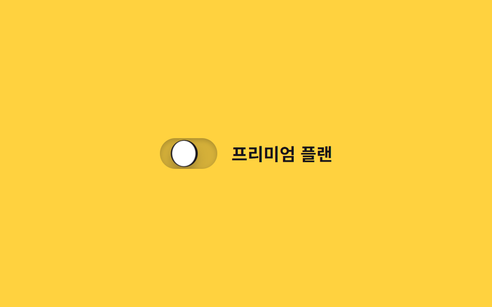
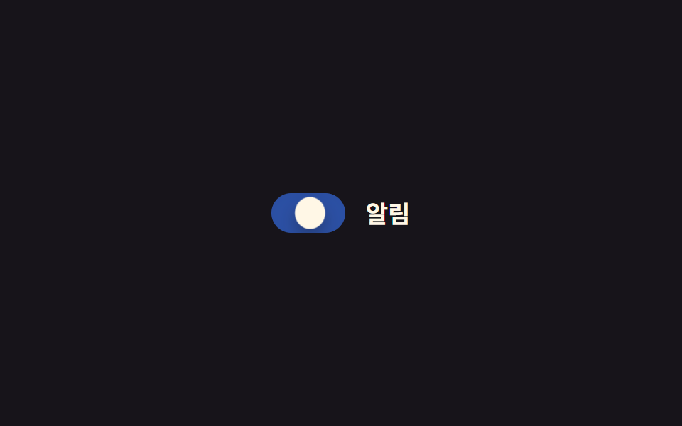
Instead of switching instantly, the track's background fills gradually as a clip-path circle spreads from where the knob passes.
Best forPremium-feel settings cards, landing page demo switches
clip-path:circle()번짐0.4초
<main class="stage">
  <label class="switch is-demo">
    <input type="checkbox" class="switch__input" role="switch">
    <span class="switch__track">
      <span class="switch__fill"></span>
      <span class="switch__knob"></span>
    </span>
    <span class="switch__label">Premium plan</span>
  </label>
</main>
@use "../../../../site/static/demo-tokens" as *;
// ── 변수 3개 ──────────────────────────────
$duration: $dur-base;
$easing: $ease-out;
$color: $subject-ink;
// ── 데모 무대 ───────────────────────────────
@include stage($stage-yellow);
.switch {
position: relative;
display: inline-flex; align-items: center; gap: clamp(10px, 3vw, 14px);
cursor: pointer;
-webkit-tap-highlight-color: transparent;
}
.switch__input {
position: absolute; inset: 0; width: 100%; height: 100%;
margin: 0; opacity: 0; cursor: pointer;
}
.switch__track {
position: relative; overflow: hidden;
width: clamp(48px, 13vw, 56px); height: clamp(26px, 7vw, 30px);
border-radius: $r-pill;
background: rgba(23, 20, 26, .18);
box-shadow: inset 0 1px 3px rgba(0, 0, 0, .15);
transition: box-shadow $duration $easing;
}
.switch__fill {
position: absolute; inset: 0;
background: $color;
clip-path: circle(0% at 18% 50%);
transition: clip-path $duration $easing;
}
.switch__knob {
position: absolute; top: 3px; left: 3px; z-index: 1;
width: clamp(20px, 5.5vw, 24px); height: clamp(20px, 5.5vw, 24px);
border-radius: 50%;
background: $stage-paper;
box-shadow: $shadow-press;
transform: translateX(0);
transition: transform $duration cubic-bezier(0.34, 1.56, 0.64, 1);
}
.switch__label { color: $subject-ink; font-weight: 600; font-size: clamp(14px, 4vw, 17px); line-height: 1; font-family: inherit; }
// ── 실제 동작: 노브가 지나간 자리부터 clip-path 원이 번진다 ──────
.switch__input:checked ~ .switch__track .switch__fill { clip-path: circle(75% at 82% 50%); }
.switch__input:checked ~ .switch__track .switch__knob { transform: translateX(clamp(22px, 6vw, 26px)); }
.switch__input:checked ~ .switch__track { box-shadow: inset 0 3px 8px rgba(0, 0, 0, .28); }
.switch__input:focus-visible ~ .switch__track {
outline: 2px solid $subject-ink; outline-offset: 3px;
}
// ── 데모 루프 ─────────────────────────────
// 한 겹: 노브는 도착 지점을 지나쳤다 찌그러지며 안착하고(스프링+squash),
// 트랙 내부 그림자가 채워지는 순간 깊어졌다 얕아진다(바닥에 앉는 깊이).
.switch.is-demo .switch__fill { animation: fill-loop $dur-loop $easing infinite; }
.switch.is-demo .switch__knob { animation: knob-spring-loop $dur-loop $easing infinite; }
.switch.is-demo .switch__track { animation: shadow-depth-loop $dur-loop $easing infinite; }
@keyframes fill-loop {
0%, 15% { clip-path: circle(0% at 18% 50%); }
40%, 60% { clip-path: circle(75% at 82% 50%); }
85%, 100% { clip-path: circle(0% at 18% 50%); }
}
@keyframes knob-loop {
0%, 15% { transform: translateX(0); }
40%, 60% { transform: translateX(26px); }
85%, 100% { transform: translateX(0); }
}
@keyframes knob-spring-loop {
0%, 15% { transform: translateX(0) scaleX(1) scaleY(1); }
38% { transform: translateX(29px) scaleX(1.25) scaleY(.85); } // 오버슈트 + 도착 순간 squash
43% { transform: translateX(25px) scaleX(1.08) scaleY(.94); } // 되튕기며 회복
47%, 60% { transform: translateX(26px) scaleX(1) scaleY(1); } // 안착
84% { transform: translateX(-2px) scaleX(.92) scaleY(1.06); } // 출발 반동
85%, 100% { transform: translateX(0) scaleX(1) scaleY(1); }
}
@keyframes shadow-depth-loop {
0%, 15% { box-shadow: inset 0 1px 3px rgba(0, 0, 0, .15); }
38% { box-shadow: inset 0 3px 8px rgba(0, 0, 0, .28); }
40%, 60% { box-shadow: inset 0 3px 8px rgba(0, 0, 0, .28); }
85%, 100% { box-shadow: inset 0 1px 3px rgba(0, 0, 0, .15); }
}
@media (prefers-reduced-motion: reduce) {
.switch.is-demo .switch__fill, .switch.is-demo .switch__knob,
.switch.is-demo .switch__track { animation: none !important; }
.switch__fill, .switch__knob { transition: none; }
}html, body {
margin: 0;
overflow: hidden;
}
.stage {
box-sizing: border-box;
min-height: 100vh;
display: grid;
place-items: center;
margin: 0;
background: #ffd23f;
font-family: -apple-system, "Segoe UI", "Noto Sans KR", sans-serif;
padding: clamp(8px, 4vw, 24px);
}
.switch {
position: relative;
display: inline-flex;
align-items: center;
gap: clamp(10px, 3vw, 14px);
cursor: pointer;
-webkit-tap-highlight-color: transparent;
}
.switch__input {
position: absolute;
inset: 0;
width: 100%;
height: 100%;
margin: 0;
opacity: 0;
cursor: pointer;
}
.switch__track {
position: relative;
overflow: hidden;
width: clamp(48px, 13vw, 56px);
height: clamp(26px, 7vw, 30px);
border-radius: 999px;
background: rgba(23, 20, 26, 0.18);
box-shadow: inset 0 1px 3px rgba(0, 0, 0, 0.15);
transition: box-shadow 300ms ease-out;
}
.switch__fill {
position: absolute;
inset: 0;
background: #17141a;
clip-path: circle(0% at 18% 50%);
transition: clip-path 300ms ease-out;
}
.switch__knob {
position: absolute;
top: 3px;
left: 3px;
z-index: 1;
width: clamp(20px, 5.5vw, 24px);
height: clamp(20px, 5.5vw, 24px);
border-radius: 50%;
background: #ffffff;
box-shadow: 0 6px 12px rgba(23, 20, 26, 0.32);
transform: translateX(0);
transition: transform 300ms cubic-bezier(0.34, 1.56, 0.64, 1);
}
.switch__label {
color: #17141a;
font-weight: 600;
font-size: clamp(14px, 4vw, 17px);
line-height: 1;
font-family: inherit;
}
.switch__input:checked ~ .switch__track .switch__fill {
clip-path: circle(75% at 82% 50%);
}
.switch__input:checked ~ .switch__track .switch__knob {
transform: translateX(clamp(22px, 6vw, 26px));
}
.switch__input:checked ~ .switch__track {
box-shadow: inset 0 3px 8px rgba(0, 0, 0, 0.28);
}
.switch__input:focus-visible ~ .switch__track {
outline: 2px solid #17141a;
outline-offset: 3px;
}
.switch.is-demo .switch__fill {
animation: fill-loop 2s ease-out infinite;
}
.switch.is-demo .switch__knob {
animation: knob-spring-loop 2s ease-out infinite;
}
.switch.is-demo .switch__track {
animation: shadow-depth-loop 2s ease-out infinite;
}
@keyframes fill-loop {
0%, 15% {
clip-path: circle(0% at 18% 50%);
}
40%, 60% {
clip-path: circle(75% at 82% 50%);
}
85%, 100% {
clip-path: circle(0% at 18% 50%);
}
}
@keyframes knob-loop {
0%, 15% {
transform: translateX(0);
}
40%, 60% {
transform: translateX(26px);
}
85%, 100% {
transform: translateX(0);
}
}
@keyframes knob-spring-loop {
0%, 15% {
transform: translateX(0) scaleX(1) scaleY(1);
}
38% {
transform: translateX(29px) scaleX(1.25) scaleY(0.85);
}
43% {
transform: translateX(25px) scaleX(1.08) scaleY(0.94);
}
47%, 60% {
transform: translateX(26px) scaleX(1) scaleY(1);
}
84% {
transform: translateX(-2px) scaleX(0.92) scaleY(1.06);
}
85%, 100% {
transform: translateX(0) scaleX(1) scaleY(1);
}
}
@keyframes shadow-depth-loop {
0%, 15% {
box-shadow: inset 0 1px 3px rgba(0, 0, 0, 0.15);
}
38% {
box-shadow: inset 0 3px 8px rgba(0, 0, 0, 0.28);
}
40%, 60% {
box-shadow: inset 0 3px 8px rgba(0, 0, 0, 0.28);
}
85%, 100% {
box-shadow: inset 0 1px 3px rgba(0, 0, 0, 0.15);
}
}
@media (prefers-reduced-motion: reduce) {
.switch.is-demo .switch__fill, .switch.is-demo .switch__knob,
.switch.is-demo .switch__track {
animation: none !important;
}
.switch__fill, .switch__knob {
transition: none;
}
}document.querySelectorAll(".switch").forEach(function (s) {
var input = s.querySelector(".switch__input");
var sync = function () { input.setAttribute("aria-checked", String(input.checked)); };
input.addEventListener("pointerdown", function () { s.classList.remove("is-demo"); });
input.addEventListener("change", sync);
sync();
});import { useState } from "react";
import type { ChangeEvent, CSSProperties } from "react";
import styles from "./ColorFillToggle.module.scss";
export type ColorFillToggleProps = {
label?: string;
duration?: number;
easing?: string;
color?: string;
defaultChecked?: boolean;
onChange?: (checked: boolean) => void;
};
type Vars = CSSProperties & { "--duration"?: string; "--easing"?: string; "--color"?: string };
export default function ColorFillToggle({
label = "프리미엄 플랜",
duration = 300,
easing = "ease-out",
color = "#17141a",
defaultChecked = false,
onChange,
}: ColorFillToggleProps) {
const [checked, setChecked] = useState(defaultChecked);
const vars: Vars = { "--duration": `${duration}ms`, "--easing": easing, "--color": color };
return (
<label className={styles.switch} style={vars}>
<input
type="checkbox"
role="switch"
aria-checked={checked}
className={styles.switch__input}
checked={checked}
onChange={(e: ChangeEvent<HTMLInputElement>) => { setChecked(e.target.checked); onChange?.(e.target.checked); }}
/>
<span className={styles.switch__track}>
<span className={styles.switch__fill} />
<span className={styles.switch__knob} />
</span>
<span className={styles.switch__label}>{label}</span>
</label>
);
}06 Color-fill background — Measured area 1.033% · moving frames 16/23Original by GODRICH · SCSS and React ship in the zip · 9 CSS Toggle Switches — One Line, Copy-Paste
The post this demo lives in
 9 CSS Toggle Switches — One Line, Copy-PasteA css toggle switch is a real <input type="checkbox"> styled as a track and knob, so :checked decides which side the kno See all demos in this post