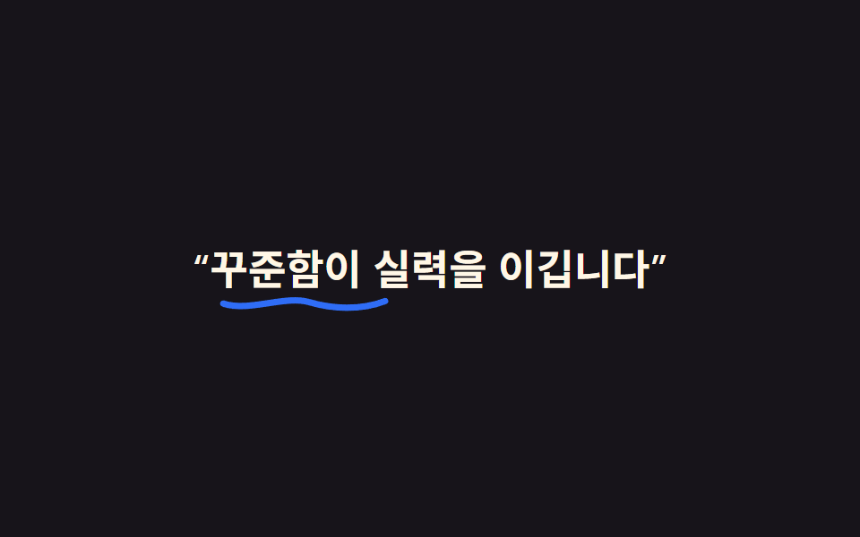
08SVG handwriting effect
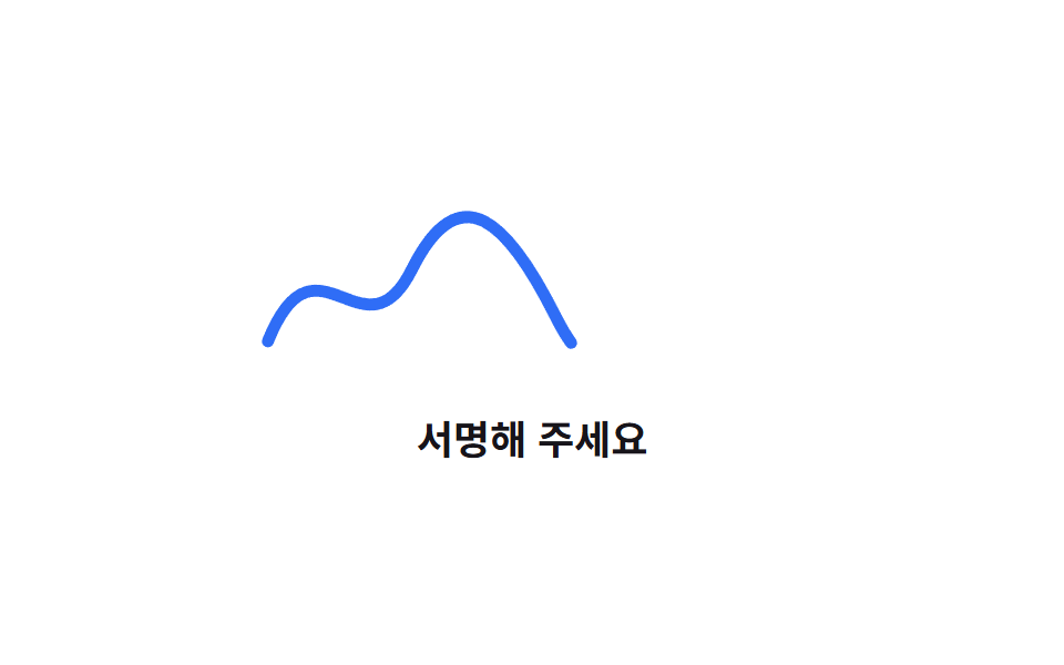
The SVG path's stroke-dasharray is set to its full length, and stroke-dashoffset transitions from that length to 0, so the handwriting appears to draw itself stroke by stroke.
Best forSignature-style reveals, hand-lettered event invitations
stroke-dasharraystroke-dashoffsetpath 길이 측정
<main class="stage">
  <div class="sig">
    <svg class="sig__svg" viewBox="0 0 240 80" fill="none" aria-hidden="true">
      <path d="M10 60 C 30 10, 50 70, 70 30 S 110 10, 130 50 S 170 70, 190 20 S 220 40, 230 30" />
    </svg>
    <p class="sig__label">Please sign here</p>
  </div>
</main>
@use "../../../../site/static/demo-tokens" as *;
$duration: $dur-loop; // 획을 그리는 한 루프
$easing: $ease-out; // 손으로 긋는 듯 빠르게 시작해 부드럽게 끝난다
$color: $subject-blue; // 선 색
@include stage($stage-paper);
.sig {
display: grid;
justify-items: center;
gap: clamp(6px, 2vw, 12px);
&__svg {
width: min(260px, 82vw);
height: auto;
path {
stroke: $color;
stroke-width: 5;
stroke-linecap: round;
stroke-linejoin: round;
stroke-dasharray: 520;
stroke-dashoffset: 520;
animation: draw $duration $easing infinite;
}
}
&__label {
margin: 0;
font-weight: 700; font-size: clamp(14px, 4vw, 18px); line-height: 1.4; font-family: inherit;
color: $stage-ink;
}
}
@keyframes draw {
0%, 6% { stroke-dashoffset: 520; }
55% { stroke-dashoffset: 0; }
80% { stroke-dashoffset: 0; }
96%, 100% { stroke-dashoffset: 520; }
}
@media (prefers-reduced-motion: reduce) {
.sig__svg path { animation: none; stroke-dashoffset: 0; }
}html, body {
margin: 0;
overflow: hidden;
}
.stage {
box-sizing: border-box;
min-height: 100vh;
display: grid;
place-items: center;
margin: 0;
background: #ffffff;
font-family: -apple-system, "Segoe UI", "Noto Sans KR", sans-serif;
padding: clamp(8px, 4vw, 24px);
}
.sig {
display: grid;
justify-items: center;
gap: clamp(6px, 2vw, 12px);
}
.sig__svg {
width: min(260px, 82vw);
height: auto;
}
.sig__svg path {
stroke: #2f6df6;
stroke-width: 5;
stroke-linecap: round;
stroke-linejoin: round;
stroke-dasharray: 520;
stroke-dashoffset: 520;
animation: draw 2s ease-out infinite;
}
.sig__label {
margin: 0;
font-weight: 700;
font-size: clamp(14px, 4vw, 18px);
line-height: 1.4;
font-family: inherit;
color: #17141a;
}
@keyframes draw {
0%, 6% {
stroke-dashoffset: 520;
}
55% {
stroke-dashoffset: 0;
}
80% {
stroke-dashoffset: 0;
}
96%, 100% {
stroke-dashoffset: 520;
}
}
@media (prefers-reduced-motion: reduce) {
.sig__svg path {
animation: none;
stroke-dashoffset: 0;
}
}import type { CSSProperties } from "react";
import styles from "./HandwritingSvg.module.scss";
export type HandwritingSvgProps = {
label: string;
/** 획을 그리는 한 루프 (기본 2000ms) */
duration?: number;
color?: string;
};
export default function HandwritingSvg({ label, duration = 2000, color = "#2f6df6" }: HandwritingSvgProps) {
const vars = { "--duration": `${duration}ms`, "--color": color } as CSSProperties;
return (
<div className={styles.sig} style={vars}>
<svg className={styles.svg} viewBox="0 0 240 80" fill="none" aria-hidden="true">
<path d="M10 60 C 30 10, 50 70, 70 30 S 110 10, 130 50 S 170 70, 190 20 S 220 40, 230 30" />
</svg>
<p className={styles.label}>{label}</p>
</div>
);
}08 SVG handwriting effect — Measured area 1.597% · moving frames 9/23Original by GODRICH · SCSS and React ship in the zip · 9 CSS Typing Animation, One Line, Copy-Paste
The post this demo lives in
 9 CSS Typing Animation, One Line, Copy-PasteA css typing animation is a text effect that types itself onto the screen letter by letter, built from a width transitio See all demos in this post