09Toast stacking
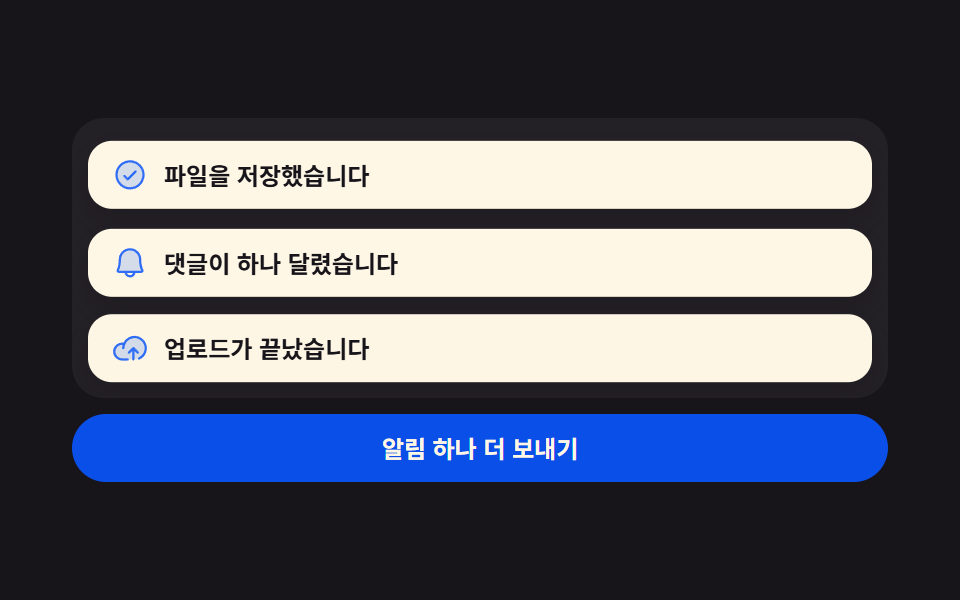
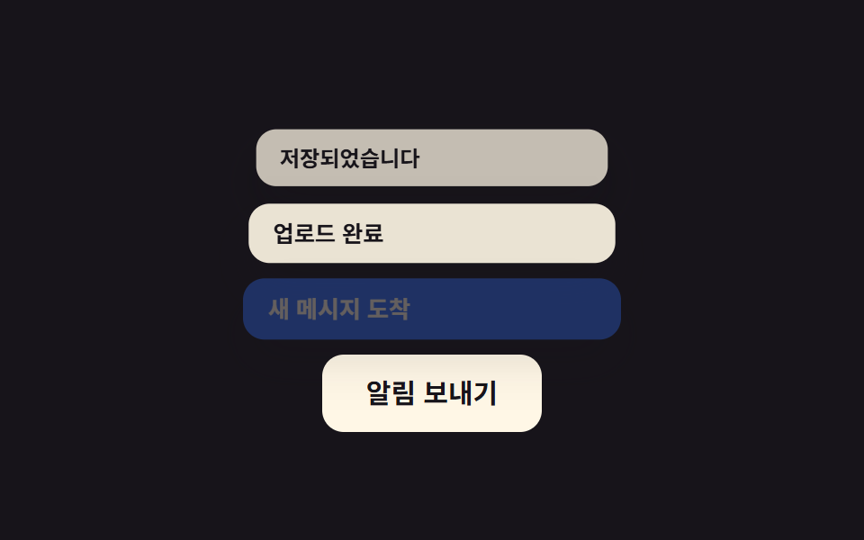
Each new toast pushes the existing ones up by one slot and shrinks them slightly, so multiple notifications stack visibly instead of overlapping.
Best forSave-confirmation notifications, multi-file upload progress alerts
translateY 밀림scale 축소순차 스택
<main class="stage">
  <div class="toasts">
    <button class="toasts__trigger" type="button">Send notification</button>
    <div class="toasts__list is-demo" aria-live="polite">
      <div class="toast toast--1">Saved</div>
      <div class="toast toast--2">Upload complete</div>
      <div class="toast toast--3">New message</div>
    </div>
  </div>
</main>
@use "../../../../site/static/demo-tokens" as *;
// ── 변수 3개 ──────────────────────────────────────────
$duration: $dur-loop; // 세 개가 다 쌓이는 한 주기
$easing: $ease-spring; // 밀려나는 곡선
$color: $subject-blue; // 새 토스트 강조색
// ── 데모 무대 ──────────────────────────────────────────
@include stage($stage-ink);
.toasts {
display: flex;
flex-direction: column-reverse; // 트리거를 아래에 둬서 위로 쌓이는 스택과 안 겹친다
align-items: center;
gap: clamp(14px, 4vw, 20px);
}
.toasts__trigger {
border: 0;
border-radius: $r-control;
padding: clamp(10px, 3.4vw, 14px) clamp(18px, 5.6vw, 24px);
font-weight: 700;
font-size: clamp(13px, 3.8vw, 15px);
line-height: 1;
font-family: inherit;
color: $stage-ink;
background: $subject-cream;
cursor: pointer;
}
.toasts__list {
position: relative;
width: min(210px, 78vw);
height: 118px; // 슬롯 하나(34px) + 두 칸 밀려 올라갈 여유(42px × 2)
}
.toast {
position: absolute;
left: 0; right: 0; bottom: 0;
box-sizing: border-box;
padding: 9px 14px;
border-radius: $r-control;
background: $subject-cream;
color: $stage-ink;
font-weight: 600;
font-size: clamp(11.5px, 3.2vw, 13px);
line-height: 1.2;
font-family: inherit;
box-shadow: $shadow-raised;
opacity: 0;
transform: translateY(16px);
}
.toast--3 { background: $color; color: $subject-cream; } // 가장 새 토스트만 강조색
.toasts__list.is-demo {
.toast--1 { animation: slot-1 $duration $easing infinite; }
.toast--2 { animation: slot-2 $duration $easing infinite; }
.toast--3 { animation: slot-3 $duration $easing infinite; }
}
.toasts__list.is-replaying {
.toast--1 { animation: slot-1 $duration $easing 1; }
.toast--2 { animation: slot-2 $duration $easing 1; }
.toast--3 { animation: slot-3 $duration $easing 1; }
}
// 1번(가장 오래됨): 맨 처음 슬롯0 에 등장 → 2번이 오면 슬롯1 로, 3번이 오면 슬롯2 로 밀려 올라간다
@keyframes slot-1 {
0%, 4% { opacity: 0; transform: translateY(16px) scale(1); }
12%, 38% { opacity: 1; transform: translateY(0) scale(1); }
50%, 68% { opacity: .88; transform: translateY(-42px) scale(.96); }
80%, 92% { opacity: .7; transform: translateY(-84px) scale(.92); }
98%, 100% { opacity: 0; transform: translateY(-84px) scale(.92); }
}
// 2번: 슬롯0 에 늦게 등장 → 3번이 오면 슬롯1 로 밀려 올라간다
@keyframes slot-2 {
0%, 40% { opacity: 0; transform: translateY(16px) scale(1); }
50%, 68% { opacity: 1; transform: translateY(0) scale(1); }
80%, 92% { opacity: .88; transform: translateY(-42px) scale(.96); }
98%, 100% { opacity: 0; transform: translateY(-42px) scale(.96); }
}
// 3번(가장 새 토스트): 가장 늦게 슬롯0 에 등장해 끝까지 자리를 지킨다
@keyframes slot-3 {
0%, 70% { opacity: 0; transform: translateY(16px) scale(1); }
80%, 92% { opacity: 1; transform: translateY(0) scale(1); }
98%, 100% { opacity: 0; transform: translateY(0) scale(1); }
}
// ── 접근성: 움직임 줄이기 설정이면 최종 스택 상태로 고정 ────────
@media (prefers-reduced-motion: reduce) {
.toasts__list.is-demo .toast,
.toasts__list.is-replaying .toast { animation: none !important; }
.toast--1 { opacity: .7; transform: translateY(-84px); }
.toast--2 { opacity: .88; transform: translateY(-42px); }
.toast--3 { opacity: 1; transform: translateY(0); }
}html, body {
margin: 0;
overflow: hidden;
}
.stage {
box-sizing: border-box;
min-height: 100vh;
display: grid;
place-items: center;
margin: 0;
background: #17141a;
font-family: -apple-system, "Segoe UI", "Noto Sans KR", sans-serif;
padding: clamp(8px, 4vw, 24px);
}
.toasts {
display: flex;
flex-direction: column-reverse;
align-items: center;
gap: clamp(14px, 4vw, 20px);
}
.toasts__trigger {
border: 0;
border-radius: 12px;
padding: clamp(10px, 3.4vw, 14px) clamp(18px, 5.6vw, 24px);
font-weight: 700;
font-size: clamp(13px, 3.8vw, 15px);
line-height: 1;
font-family: inherit;
color: #17141a;
background: #fff7e6;
cursor: pointer;
}
.toasts__list {
position: relative;
width: min(210px, 78vw);
height: 118px;
}
.toast {
position: absolute;
left: 0;
right: 0;
bottom: 0;
box-sizing: border-box;
padding: 9px 14px;
border-radius: 12px;
background: #fff7e6;
color: #17141a;
font-weight: 600;
font-size: clamp(11.5px, 3.2vw, 13px);
line-height: 1.2;
font-family: inherit;
box-shadow: 0 14px 24px rgba(23, 20, 26, 0.32);
opacity: 0;
transform: translateY(16px);
}
.toast--3 {
background: #2f6df6;
color: #fff7e6;
}
.toasts__list.is-demo .toast--1 {
animation: slot-1 2s cubic-bezier(0.2, 0.8, 0.2, 1) infinite;
}
.toasts__list.is-demo .toast--2 {
animation: slot-2 2s cubic-bezier(0.2, 0.8, 0.2, 1) infinite;
}
.toasts__list.is-demo .toast--3 {
animation: slot-3 2s cubic-bezier(0.2, 0.8, 0.2, 1) infinite;
}
.toasts__list.is-replaying .toast--1 {
animation: slot-1 2s cubic-bezier(0.2, 0.8, 0.2, 1) 1;
}
.toasts__list.is-replaying .toast--2 {
animation: slot-2 2s cubic-bezier(0.2, 0.8, 0.2, 1) 1;
}
.toasts__list.is-replaying .toast--3 {
animation: slot-3 2s cubic-bezier(0.2, 0.8, 0.2, 1) 1;
}
@keyframes slot-1 {
0%, 4% {
opacity: 0;
transform: translateY(16px) scale(1);
}
12%, 38% {
opacity: 1;
transform: translateY(0) scale(1);
}
50%, 68% {
opacity: 0.88;
transform: translateY(-42px) scale(0.96);
}
80%, 92% {
opacity: 0.7;
transform: translateY(-84px) scale(0.92);
}
98%, 100% {
opacity: 0;
transform: translateY(-84px) scale(0.92);
}
}
@keyframes slot-2 {
0%, 40% {
opacity: 0;
transform: translateY(16px) scale(1);
}
50%, 68% {
opacity: 1;
transform: translateY(0) scale(1);
}
80%, 92% {
opacity: 0.88;
transform: translateY(-42px) scale(0.96);
}
98%, 100% {
opacity: 0;
transform: translateY(-42px) scale(0.96);
}
}
@keyframes slot-3 {
0%, 70% {
opacity: 0;
transform: translateY(16px) scale(1);
}
80%, 92% {
opacity: 1;
transform: translateY(0) scale(1);
}
98%, 100% {
opacity: 0;
transform: translateY(0) scale(1);
}
}
@media (prefers-reduced-motion: reduce) {
.toasts__list.is-demo .toast,
.toasts__list.is-replaying .toast {
animation: none !important;
}
.toast--1 {
opacity: 0.7;
transform: translateY(-84px);
}
.toast--2 {
opacity: 0.88;
transform: translateY(-42px);
}
.toast--3 {
opacity: 1;
transform: translateY(0);
}
}// 실제 클릭 한 번마다 토스트를 하나씩 다시 쌓는다. 데모(.is-demo) 자동 루프는 손을 대면 멈춘다.
var list = document.querySelector('.toasts__list');
document.querySelector('.toasts__trigger').addEventListener('click', function () {
list.classList.remove('is-demo');
list.classList.remove('is-replaying');
void list.offsetWidth;
list.classList.add('is-replaying');
});import { useState } from "react";
import type { CSSProperties } from "react";
import styles from "./ToastStack.module.scss";
export type ToastStackProps = {
messages: string[];
triggerLabel: string;
/** 세 개가 다 쌓이는 시간 (기본 260ms 씩 순차) */
duration?: number;
easing?: string;
color?: string;
};
type Vars = CSSProperties & { "--duration"?: string; "--easing"?: string; "--color"?: string };
export default function ToastStack({
messages,
triggerLabel,
duration = 260,
easing = "cubic-bezier(.2,.8,.2,1)",
color = "#2f6df6",
}: ToastStackProps) {
const [visible, setVisible] = useState<number[]>([]);
const vars: Vars = { "--duration": `${duration}ms`, "--easing": easing, "--color": color };
const push = () => {
setVisible([]);
messages.forEach((_, i) => {
setTimeout(() => setVisible((v) => [...v, i]), i * duration);
});
};
return (
<div className={styles.toasts} style={vars}>
<button type="button" className={styles.trigger} onClick={push}>{triggerLabel}</button>
<div className={styles.list} aria-live="polite">
{messages.map((msg, i) => {
const shown = visible.includes(i);
const depth = visible.length - 1 - i; // 도착 순서가 곧 인덱스 순서라 뺄셈만으로 깊이가 나온다
return (
<div
key={msg}
className={i === messages.length - 1 ? `${styles.toast} ${styles.newest}` : styles.toast}
style={{
opacity: shown ? Math.max(1 - depth * .12, 0) : 0,
transform: shown ? `translateY(${-depth * 42}px) scale(${1 - depth * .04})` : "translateY(16px) scale(1)",
}}
>
{msg}
</div>
);
})}
</div>
</div>
);
}09 Toast stacking — Measured area 19.122% · moving frames 10/23Original by GODRICH · SCSS and React ship in the zip · 9 Micro Interactions CSS — One Line, Copy-Paste
The post this demo lives in
 9 Micro Interactions CSS — One Line, Copy-PasteSearch for micro interactions css and the answer is always the same shape: a small, self-contained bit of motion — a but See all demos in this post