07Translucent blur badge
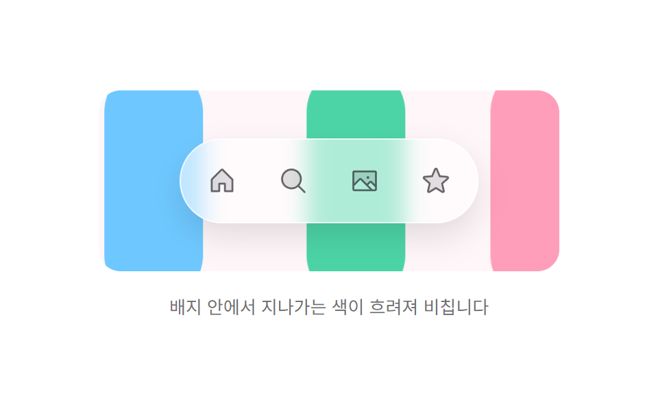
As color bands drift across the bright backdrop, each one shows up smeared inside the white badge — the moving background itself proves the badge is glass.
Best forQuietly floating menus on service screens that use bright solids and fruit tones
backdrop-filterblurtranslateX
<main class="stage">
  <div class="bb is-demo" id="bb">
    <div class="bb__scene">
      <i class="bb__band bb__band--1" aria-hidden="true"></i>
      <i class="bb__band bb__band--2" aria-hidden="true"></i>
      <i class="bb__band bb__band--3" aria-hidden="true"></i>
      <nav class="bb__dock" aria-label="Main menu">
        <button class="bb__btn" type="button" aria-label="Home">
          <svg xmlns="http://www.w3.org/2000/svg" viewBox="0 0 256 256" aria-hidden="true"><g fill="currentColor"><path d="M216 120v96h-64v-64h-48v64H40v-96a8 8 0 0 1 2.34-5.66l80-80a8 8 0 0 1 11.32 0l80 80A8 8 0 0 1 216 120" opacity=".2"/><path d="m219.31 108.68l-80-80a16 16 0 0 0-22.62 0l-80 80A15.87 15.87 0 0 0 32 120v96a8 8 0 0 0 8 8h64a8 8 0 0 0 8-8v-56h32v56a8 8 0 0 0 8 8h64a8 8 0 0 0 8-8v-96a15.87 15.87 0 0 0-4.69-11.32M208 208h-48v-56a8 8 0 0 0-8-8h-48a8 8 0 0 0-8 8v56H48v-88l80-80l80 80Z"/></g></svg>
        </button>
        <button class="bb__btn" type="button" aria-label="Search">
          <svg xmlns="http://www.w3.org/2000/svg" viewBox="0 0 256 256" aria-hidden="true"><g fill="currentColor"><path d="M192 112a80 80 0 1 1-80-80a80 80 0 0 1 80 80" opacity=".2"/><path d="m229.66 218.34l-50.06-50.06a88.21 88.21 0 1 0-11.32 11.31l50.06 50.07a8 8 0 0 0 11.32-11.32M40 112a72 72 0 1 1 72 72a72.08 72.08 0 0 1-72-72"/></g></svg>
        </button>
        <button class="bb__btn" type="button" aria-label="Photos">
          <svg xmlns="http://www.w3.org/2000/svg" viewBox="0 0 256 256" aria-hidden="true"><g fill="currentColor"><path d="M224 56v122.06l-39.72-39.72a8 8 0 0 0-11.31 0L147.31 164l-49.65-49.66a8 8 0 0 0-11.32 0L32 168.69V56a8 8 0 0 1 8-8h176a8 8 0 0 1 8 8" opacity=".2"/><path d="M216 40H40a16 16 0 0 0-16 16v144a16 16 0 0 0 16 16h176a16 16 0 0 0 16-16V56a16 16 0 0 0-16-16m0 16v102.75l-26.07-26.06a16 16 0 0 0-22.63 0l-20 20l-44-44a16 16 0 0 0-22.62 0L40 149.37V56ZM40 172l52-52l80 80H40Zm176 28h-21.37l-36-36l20-20L216 181.38zm-72-100a12 12 0 1 1 12 12a12 12 0 0 1-12-12"/></g></svg>
        </button>
        <button class="bb__btn" type="button" aria-label="Favorites">
          <svg xmlns="http://www.w3.org/2000/svg" viewBox="0 0 256 256" aria-hidden="true"><g fill="currentColor"><path d="m229.06 108.79l-48.7 42l14.88 62.79a8.4 8.4 0 0 1-12.52 9.17L128 189.09l-54.72 33.65a8.4 8.4 0 0 1-12.52-9.17l14.88-62.79l-48.7-42A8.46 8.46 0 0 1 31.73 94l63.91-5.2l24.62-59.6a8.36 8.36 0 0 1 15.48 0l24.62 59.6l63.91 5.2a8.46 8.46 0 0 1 4.79 14.79" opacity=".2"/><path d="M239.18 97.26A16.38 16.38 0 0 0 224.92 86l-59-4.76l-22.78-55.09a16.36 16.36 0 0 0-30.27 0L90.11 81.23L31.08 86a16.46 16.46 0 0 0-9.37 28.86l45 38.83L53 211.75a16.38 16.38 0 0 0 24.5 17.82l50.5-31.08l50.53 31.08A16.4 16.4 0 0 0 203 211.75l-13.76-58.07l45-38.83a16.43 16.43 0 0 0 4.94-17.59m-15.34 5.47l-48.7 42a8 8 0 0 0-2.56 7.91l14.88 62.8a.37.37 0 0 1-.17.48c-.18.14-.23.11-.38 0l-54.72-33.65a8 8 0 0 0-8.38 0l-54.72 33.67c-.15.09-.19.12-.38 0a.37.37 0 0 1-.17-.48l14.88-62.8a8 8 0 0 0-2.56-7.91l-48.7-42c-.12-.1-.23-.19-.13-.5s.18-.27.33-.29l63.92-5.16a8 8 0 0 0 6.72-4.94l24.62-59.61c.08-.17.11-.25.35-.25s.27.08.35.25L153 91.86a8 8 0 0 0 6.75 4.92l63.92 5.16c.15 0 .24 0 .33.29s0 .4-.16.5"/></g></svg>
        </button>
      </nav>
    </div>
    <p class="bb__cap">Passing colors show through the badge, blurred</p>
  </div>
</main>
@use "../../../../site/static/demo-tokens" as *;
$duration: $dur-base;
$easing: $ease-spring;
$color: $subject-pink;
@include stage($stage-paper);
.bb {
display: flex;
flex-direction: column;
align-items: center;
gap: $sp-4;
}
.bb__scene {
position: relative;
width: min(336px, 86vw);
height: 132px;
display: grid;
place-items: center;
border-radius: $r-card;
overflow: hidden;
background: #fff6f9;
}
/* 배경을 가로지르는 색 띠 — 배지가 유리임을 증명하는 재료 */
.bb__band {
position: absolute;
top: -20px;
width: 72px;
height: 176px;
border-radius: $r-pill;
}
.bb__band--1 { left: -80px; background: $color; }
.bb__band--2 { left: -80px; background: $subject-mint; }
.bb__band--3 { left: -80px; background: $subject-sky; }
.bb__dock {
position: relative;
display: flex;
gap: $sp-2;
padding: $sp-2;
border: 1px solid rgba(255, 255, 255, .7);
border-radius: $r-pill;
background: rgba(255, 255, 255, .55);
backdrop-filter: blur(8px);
box-shadow: 0 10px 22px rgba(23, 20, 26, .12);
}
.bb__btn {
flex: 0 0 auto;
width: 44px;
height: 44px;
display: grid;
place-items: center;
padding: 0;
border: 0;
border-radius: $r-pill;
background: none;
color: rgba(23, 20, 26, .62);
cursor: pointer;
transition: color $duration $easing, background-color $duration $easing;
}
.bb__btn svg { width: 22px; height: 22px; display: block; }
.bb__btn:hover { color: $subject-ink; background: rgba(255, 255, 255, .7); }
.bb__btn:focus-visible { outline: 2px solid $subject-ink; outline-offset: 2px; }
.bb__cap {
margin: 0;
font-size: 13px;
line-height: 1.5;
color: rgba(23, 20, 26, .62);
}
/* 자동 재생 — 띠가 오른쪽 끝까지 갔다가 같은 길로 돌아온다(복귀 텔레포트 없음) */
.is-demo .bb__band {
animation-name: bb-drift;
animation-duration: 2s;
animation-timing-function: ease-in-out;
animation-iteration-count: infinite;
}
.is-demo .bb__band--2 { animation-delay: -.22s; }
.is-demo .bb__band--3 { animation-delay: -.44s; }
@keyframes bb-drift {
0% { transform: translateX(0); }
50% { transform: translateX(420px); }
100% { transform: translateX(0); }
}
@media (max-width: 340px) {
.bb__scene { height: 120px; }
.bb__btn { width: 40px; height: 40px; }
}
@media (prefers-reduced-motion: reduce) {
.is-demo .bb__band { animation-name: none; }
.bb__btn { transition: none; }
}@charset "UTF-8";
html, body {
margin: 0;
overflow: hidden;
}
.stage {
box-sizing: border-box;
min-height: 100vh;
display: grid;
place-items: center;
margin: 0;
background: #ffffff;
font-family: -apple-system, "Segoe UI", "Noto Sans KR", sans-serif;
padding: clamp(8px, 4vw, 24px);
}
.bb {
display: flex;
flex-direction: column;
align-items: center;
gap: 16px;
}
.bb__scene {
position: relative;
width: min(336px, 86vw);
height: 132px;
display: grid;
place-items: center;
border-radius: 16px;
overflow: hidden;
background: #fff6f9;
}
/* 배경을 가로지르는 색 띠 — 배지가 유리임을 증명하는 재료 */
.bb__band {
position: absolute;
top: -20px;
width: 72px;
height: 176px;
border-radius: 999px;
}
.bb__band--1 {
left: -80px;
background: #ff9ebb;
}
.bb__band--2 {
left: -80px;
background: #4cd4a6;
}
.bb__band--3 {
left: -80px;
background: #6ec8ff;
}
.bb__dock {
position: relative;
display: flex;
gap: 8px;
padding: 8px;
border: 1px solid rgba(255, 255, 255, 0.7);
border-radius: 999px;
background: rgba(255, 255, 255, 0.55);
backdrop-filter: blur(8px);
box-shadow: 0 10px 22px rgba(23, 20, 26, 0.12);
}
.bb__btn {
flex: 0 0 auto;
width: 44px;
height: 44px;
display: grid;
place-items: center;
padding: 0;
border: 0;
border-radius: 999px;
background: none;
color: rgba(23, 20, 26, 0.62);
cursor: pointer;
transition: color 300ms cubic-bezier(0.2, 0.8, 0.2, 1), background-color 300ms cubic-bezier(0.2, 0.8, 0.2, 1);
}
.bb__btn svg {
width: 22px;
height: 22px;
display: block;
}
.bb__btn:hover {
color: #17141a;
background: rgba(255, 255, 255, 0.7);
}
.bb__btn:focus-visible {
outline: 2px solid #17141a;
outline-offset: 2px;
}
.bb__cap {
margin: 0;
font-size: 13px;
line-height: 1.5;
color: rgba(23, 20, 26, 0.62);
}
/* 자동 재생 — 띠가 오른쪽 끝까지 갔다가 같은 길로 돌아온다(복귀 텔레포트 없음) */
.is-demo .bb__band {
animation-name: bb-drift;
animation-duration: 2s;
animation-timing-function: ease-in-out;
animation-iteration-count: infinite;
}
.is-demo .bb__band--2 {
animation-delay: -0.22s;
}
.is-demo .bb__band--3 {
animation-delay: -0.44s;
}
@keyframes bb-drift {
0% {
transform: translateX(0);
}
50% {
transform: translateX(420px);
}
100% {
transform: translateX(0);
}
}
@media (max-width: 340px) {
.bb__scene {
height: 120px;
}
.bb__btn {
width: 40px;
height: 40px;
}
}
@media (prefers-reduced-motion: reduce) {
.is-demo .bb__band {
animation-name: none;
}
.bb__btn {
transition: none;
}
}// 실제 동작: 사람이 만지면 자동 루프를 멈추고, 그 뒤로는 :hover 로 배지가 또렷해진다.
var root = document.getElementById('bb');
['pointerdown', 'focusin'].forEach(function (t) {
root.addEventListener(t, function () { root.classList.remove('is-demo'); });
});import type { CSSProperties } from "react";
import styles from "./BlurBadgeDock.module.scss";
export type BlurBadgeDockProps = {
duration?: number;
easing?: string;
color?: string;
};
type Vars = CSSProperties & { "--duration"?: string; "--easing"?: string; "--color"?: string };
export default function BlurBadgeDock({
duration = 300,
easing = "cubic-bezier(.2,.8,.2,1)",
color = "#ff9ebb",
}: BlurBadgeDockProps) {
const vars: Vars = {
"--duration": `${duration}ms`,
"--easing": easing,
"--color": color,
};
return (
<div className={styles.bb} style={vars}>
<div className={styles.scene}>
<i className={`${styles.band} ${styles.band1}`} aria-hidden="true" />
<i className={`${styles.band} ${styles.band2}`} aria-hidden="true" />
<i className={`${styles.band} ${styles.band3}`} aria-hidden="true" />
<nav className={styles.dock} aria-label="Main menu">
<button className={styles.btn} type="button" aria-label="Home">
<svg xmlns="http://www.w3.org/2000/svg" viewBox="0 0 256 256" aria-hidden="true"><g fill="currentColor"><path d="M216 120v96h-64v-64h-48v64H40v-96a8 8 0 0 1 2.34-5.66l80-80a8 8 0 0 1 11.32 0l80 80A8 8 0 0 1 216 120" opacity=".2"/><path d="m219.31 108.68l-80-80a16 16 0 0 0-22.62 0l-80 80A15.87 15.87 0 0 0 32 120v96a8 8 0 0 0 8 8h64a8 8 0 0 0 8-8v-56h32v56a8 8 0 0 0 8 8h64a8 8 0 0 0 8-8v-96a15.87 15.87 0 0 0-4.69-11.32M208 208h-48v-56a8 8 0 0 0-8-8h-48a8 8 0 0 0-8 8v56H48v-88l80-80l80 80Z"/></g></svg>
</button>
<button className={styles.btn} type="button" aria-label="Search">
<svg xmlns="http://www.w3.org/2000/svg" viewBox="0 0 256 256" aria-hidden="true"><g fill="currentColor"><path d="M192 112a80 80 0 1 1-80-80a80 80 0 0 1 80 80" opacity=".2"/><path d="m229.66 218.34l-50.06-50.06a88.21 88.21 0 1 0-11.32 11.31l50.06 50.07a8 8 0 0 0 11.32-11.32M40 112a72 72 0 1 1 72 72a72.08 72.08 0 0 1-72-72"/></g></svg>
</button>
<button className={styles.btn} type="button" aria-label="Photos">
<svg xmlns="http://www.w3.org/2000/svg" viewBox="0 0 256 256" aria-hidden="true"><g fill="currentColor"><path d="M224 56v122.06l-39.72-39.72a8 8 0 0 0-11.31 0L147.31 164l-49.65-49.66a8 8 0 0 0-11.32 0L32 168.69V56a8 8 0 0 1 8-8h176a8 8 0 0 1 8 8" opacity=".2"/><path d="M216 40H40a16 16 0 0 0-16 16v144a16 16 0 0 0 16 16h176a16 16 0 0 0 16-16V56a16 16 0 0 0-16-16m0 16v102.75l-26.07-26.06a16 16 0 0 0-22.63 0l-20 20l-44-44a16 16 0 0 0-22.62 0L40 149.37V56ZM40 172l52-52l80 80H40Zm176 28h-21.37l-36-36l20-20L216 181.38zm-72-100a12 12 0 1 1 12 12a12 12 0 0 1-12-12"/></g></svg>
</button>
<button className={styles.btn} type="button" aria-label="Favorites">
<svg xmlns="http://www.w3.org/2000/svg" viewBox="0 0 256 256" aria-hidden="true"><g fill="currentColor"><path d="m229.06 108.79l-48.7 42l14.88 62.79a8.4 8.4 0 0 1-12.52 9.17L128 189.09l-54.72 33.65a8.4 8.4 0 0 1-12.52-9.17l14.88-62.79l-48.7-42A8.46 8.46 0 0 1 31.73 94l63.91-5.2l24.62-59.6a8.36 8.36 0 0 1 15.48 0l24.62 59.6l63.91 5.2a8.46 8.46 0 0 1 4.79 14.79" opacity=".2"/><path d="M239.18 97.26A16.38 16.38 0 0 0 224.92 86l-59-4.76l-22.78-55.09a16.36 16.36 0 0 0-30.27 0L90.11 81.23L31.08 86a16.46 16.46 0 0 0-9.37 28.86l45 38.83L53 211.75a16.38 16.38 0 0 0 24.5 17.82l50.5-31.08l50.53 31.08A16.4 16.4 0 0 0 203 211.75l-13.76-58.07l45-38.83a16.43 16.43 0 0 0 4.94-17.59m-15.34 5.47l-48.7 42a8 8 0 0 0-2.56 7.91l14.88 62.8a.37.37 0 0 1-.17.48c-.18.14-.23.11-.38 0l-54.72-33.65a8 8 0 0 0-8.38 0l-54.72 33.67c-.15.09-.19.12-.38 0a.37.37 0 0 1-.17-.48l14.88-62.8a8 8 0 0 0-2.56-7.91l-48.7-42c-.12-.1-.23-.19-.13-.5s.18-.27.33-.29l63.92-5.16a8 8 0 0 0 6.72-4.94l24.62-59.61c.08-.17.11-.25.35-.25s.27.08.35.25L153 91.86a8 8 0 0 0 6.75 4.92l63.92 5.16c.15 0 .24 0 .33.29s0 .4-.16.5"/></g></svg>
</button>
</nav>
</div>
<p className={styles.cap}>Colors passing behind the bar blur inside the badge</p>
</div>
);
}07 Translucent blur badge — Measured area 30.672% · moving frames 23/23Original by GODRICH · SCSS and React ship in the zip · Mac Dock CSS — 9 Floating Dock Styles, No Library
The post this demo lives in
 Mac Dock CSS — 9 Floating Dock Styles, No LibraryMac dock CSS is the plain-CSS way to rebuild that floating strip of icons at a screen edge: a short bar, a few icon butt See all demos in this post
If you like this effect - similar demos
 Transitions01 Active-indicator slide-morph toggle — when the selected tab changes, the highlight's position and width values shift together from the old spot to the new oneCSS Bottom Navigation Bar: 9 Transition Patterns
 Transitions01 Slide in from right9 CSS Toast Notifications — No Library, Pure CSS
 Transitions03 Overlay fade9 CSS Sidebar Animations — Minimal JS