073-tier password strength fill
Three bars for weak, mid, and strong sit stacked on one track, each growing via scaleX(transform-origin:left) then handing off to the next via opacity — the color never transitions, the bar is swapped.
Best forSignup password fields, account security settings
scaleXopacity 단계 교체transform-origin:left
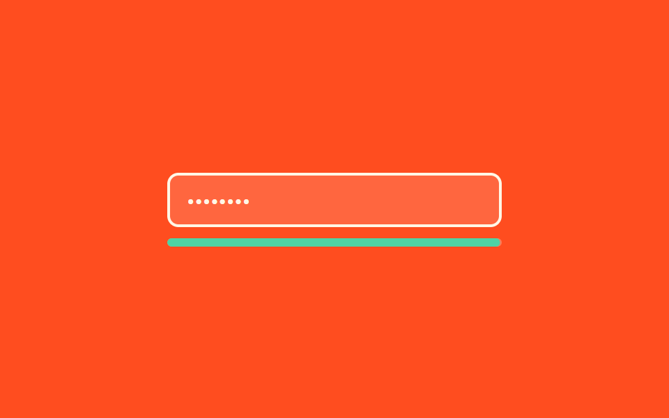
<main class="stage">
  <div class="fv7 is-demo">
    <input class="fv7__input" type="password" value="********" readonly>
    <div class="fv7__track">
      <span class="fv7__fill fv7__fill--weak"></span>
      <span class="fv7__fill fv7__fill--mid"></span>
      <span class="fv7__fill fv7__fill--strong"></span>
    </div>
  </div>
</main>
@use "../../../../site/static/demo-tokens" as *;
// 강도 3단계가 같은 트랙 위에 겹쳐 있다: 각 단계는 scaleX 로 자라고(transform-origin:left), 단계마다 다른 색은 opacity 로 교차한다
$duration: $dur-loop;
$easing: $ease-spring;
$color: $subject-mint;
@include stage($stage-orange);
.fv7 { width: min(240px, 86vw); display: flex; flex-direction: column; gap: $sp-2; }
.fv7__input {
box-sizing: border-box; width: 100%; padding: $sp-2 $sp-3; border-radius: $r-sm;
border: 2px solid $subject-cream; background: rgba(255, 255, 255, .14);
color: $subject-cream; font-weight: 400; font-size: 14px; line-height: 1; font-family: inherit;
}
.fv7__track { position: relative; height: 6px; border-radius: $r-xs; background: rgba(255, 255, 255, .25); overflow: hidden; }
.fv7__fill {
position: absolute; left: 0; top: 0; bottom: 0; width: 100%;
border-radius: $r-xs; transform-origin: left center; transform: scaleX(0); opacity: 0;
}
.fv7__fill--weak { background: $error-soft; }
.fv7__fill--mid { background: $stage-yellow; }
.fv7__fill--strong { background: $color; }
// 한 겹: 트랙 링은 overflow: hidden 바깥에서 파동을 그린다 (트랙 자체는 불변)
.fv7__track::after {
content: ""; position: absolute; left: 0; top: -3px; bottom: -3px; width: 100%;
border-radius: $r-xs; opacity: 0; pointer-events: none;
}
@keyframes fv7-weak { 0%, 6% { transform: scaleX(0); opacity: 0; } 14%, 30% { transform: scaleX(.32); opacity: 1; } 36%, 100% { opacity: 0; } }
@keyframes fv7-mid { 0%, 36% { transform: scaleX(.32); opacity: 0; } 44%, 62% { transform: scaleX(.64); opacity: 1; } 68%, 100% { opacity: 0; } }
@keyframes fv7-strong { 0%, 68% { transform: scaleX(.64); opacity: 0; } 78%, 96% { transform: scaleX(1); opacity: 1; } 100% { opacity: 0; transform: scaleX(0); } }
// 한 겹: 단계 도달 순간(weak 14% · mid 44% · strong 78%) 감쇠 scaleY 펄스 + 단계색 글로우 surge
@keyframes fv7-track-pulse {
0%, 13% { transform: scaleY(1); }
14% { transform: scaleY(1.15); } 17% { transform: scaleY(.95); } 20% { transform: scaleY(1.03); } 23% { transform: scaleY(1); }
43% { transform: scaleY(1); }
44% { transform: scaleY(1.15); } 47% { transform: scaleY(.95); } 50% { transform: scaleY(1.03); } 53% { transform: scaleY(1); }
77% { transform: scaleY(1); }
78% { transform: scaleY(1.15); } 81% { transform: scaleY(.95); } 84% { transform: scaleY(1.03); } 87% { transform: scaleY(1); }
100% { transform: scaleY(1); }
}
@keyframes fv7-surge {
0%, 12% { opacity: 0; box-shadow: 0 0 0 0 rgba($error-soft, 0); }
14% { opacity: .9; box-shadow: 0 0 0 4px rgba($error-soft, .55); }
22% { opacity: 0; box-shadow: 0 0 0 9px rgba($error-soft, 0); }
42% { opacity: 0; box-shadow: 0 0 0 0 rgba($stage-yellow, 0); }
44% { opacity: .9; box-shadow: 0 0 0 4px rgba($stage-yellow, .55); }
52% { opacity: 0; box-shadow: 0 0 0 9px rgba($stage-yellow, 0); }
76% { opacity: 0; box-shadow: 0 0 0 0 rgba($color, 0); }
78% { opacity: .9; box-shadow: 0 0 0 4px rgba($color, .55); }
86% { opacity: 0; box-shadow: 0 0 0 9px rgba($color, 0); }
100% { opacity: 0; box-shadow: 0 0 0 0 rgba($error-soft, 0); }
}
.fv7.is-demo .fv7__fill--weak { animation: fv7-weak $duration $easing infinite; }
.fv7.is-demo .fv7__fill--mid { animation: fv7-mid $duration $easing infinite; }
.fv7.is-demo .fv7__fill--strong { animation: fv7-strong $duration $easing infinite; }
.fv7.is-demo .fv7__track { animation: fv7-track-pulse $duration $easing infinite; }
.fv7.is-demo .fv7__track::after { animation: fv7-surge $duration $easing infinite; }
@media (prefers-reduced-motion: reduce) {
.fv7.is-demo .fv7__fill { animation: none !important; opacity: 0; }
.fv7.is-demo .fv7__fill--strong { opacity: 1; transform: scaleX(1); }
.fv7.is-demo .fv7__track,
.fv7.is-demo .fv7__track::after { animation: none !important; }
.fv7.is-demo .fv7__track::after { opacity: 0; }
}html, body {
margin: 0;
overflow: hidden;
}
.stage {
box-sizing: border-box;
min-height: 100vh;
display: grid;
place-items: center;
margin: 0;
background: #ff4d1f;
font-family: -apple-system, "Segoe UI", "Noto Sans KR", sans-serif;
padding: clamp(8px, 4vw, 24px);
}
.fv7 {
width: min(240px, 86vw);
display: flex;
flex-direction: column;
gap: 8px;
}
.fv7__input {
box-sizing: border-box;
width: 100%;
padding: 8px 12px;
border-radius: 8px;
border: 2px solid #fff7e6;
background: rgba(255, 255, 255, 0.14);
color: #fff7e6;
font-weight: 400;
font-size: 14px;
line-height: 1;
font-family: inherit;
}
.fv7__track {
position: relative;
height: 6px;
border-radius: 4px;
background: rgba(255, 255, 255, 0.25);
overflow: hidden;
}
.fv7__fill {
position: absolute;
left: 0;
top: 0;
bottom: 0;
width: 100%;
border-radius: 4px;
transform-origin: left center;
transform: scaleX(0);
opacity: 0;
}
.fv7__fill--weak {
background: #ffe0d8;
}
.fv7__fill--mid {
background: #ffd23f;
}
.fv7__fill--strong {
background: #4cd4a6;
}
.fv7__track::after {
content: "";
position: absolute;
left: 0;
top: -3px;
bottom: -3px;
width: 100%;
border-radius: 4px;
opacity: 0;
pointer-events: none;
}
@keyframes fv7-weak {
0%, 6% {
transform: scaleX(0);
opacity: 0;
}
14%, 30% {
transform: scaleX(0.32);
opacity: 1;
}
36%, 100% {
opacity: 0;
}
}
@keyframes fv7-mid {
0%, 36% {
transform: scaleX(0.32);
opacity: 0;
}
44%, 62% {
transform: scaleX(0.64);
opacity: 1;
}
68%, 100% {
opacity: 0;
}
}
@keyframes fv7-strong {
0%, 68% {
transform: scaleX(0.64);
opacity: 0;
}
78%, 96% {
transform: scaleX(1);
opacity: 1;
}
100% {
opacity: 0;
transform: scaleX(0);
}
}
@keyframes fv7-track-pulse {
0%, 13% {
transform: scaleY(1);
}
14% {
transform: scaleY(1.15);
}
17% {
transform: scaleY(0.95);
}
20% {
transform: scaleY(1.03);
}
23% {
transform: scaleY(1);
}
43% {
transform: scaleY(1);
}
44% {
transform: scaleY(1.15);
}
47% {
transform: scaleY(0.95);
}
50% {
transform: scaleY(1.03);
}
53% {
transform: scaleY(1);
}
77% {
transform: scaleY(1);
}
78% {
transform: scaleY(1.15);
}
81% {
transform: scaleY(0.95);
}
84% {
transform: scaleY(1.03);
}
87% {
transform: scaleY(1);
}
100% {
transform: scaleY(1);
}
}
@keyframes fv7-surge {
0%, 12% {
opacity: 0;
box-shadow: 0 0 0 0 rgba(255, 224, 216, 0);
}
14% {
opacity: 0.9;
box-shadow: 0 0 0 4px rgba(255, 224, 216, 0.55);
}
22% {
opacity: 0;
box-shadow: 0 0 0 9px rgba(255, 224, 216, 0);
}
42% {
opacity: 0;
box-shadow: 0 0 0 0 rgba(255, 210, 63, 0);
}
44% {
opacity: 0.9;
box-shadow: 0 0 0 4px rgba(255, 210, 63, 0.55);
}
52% {
opacity: 0;
box-shadow: 0 0 0 9px rgba(255, 210, 63, 0);
}
76% {
opacity: 0;
box-shadow: 0 0 0 0 rgba(76, 212, 166, 0);
}
78% {
opacity: 0.9;
box-shadow: 0 0 0 4px rgba(76, 212, 166, 0.55);
}
86% {
opacity: 0;
box-shadow: 0 0 0 9px rgba(76, 212, 166, 0);
}
100% {
opacity: 0;
box-shadow: 0 0 0 0 rgba(255, 224, 216, 0);
}
}
.fv7.is-demo .fv7__fill--weak {
animation: fv7-weak 2s cubic-bezier(0.2, 0.8, 0.2, 1) infinite;
}
.fv7.is-demo .fv7__fill--mid {
animation: fv7-mid 2s cubic-bezier(0.2, 0.8, 0.2, 1) infinite;
}
.fv7.is-demo .fv7__fill--strong {
animation: fv7-strong 2s cubic-bezier(0.2, 0.8, 0.2, 1) infinite;
}
.fv7.is-demo .fv7__track {
animation: fv7-track-pulse 2s cubic-bezier(0.2, 0.8, 0.2, 1) infinite;
}
.fv7.is-demo .fv7__track::after {
animation: fv7-surge 2s cubic-bezier(0.2, 0.8, 0.2, 1) infinite;
}
@media (prefers-reduced-motion: reduce) {
.fv7.is-demo .fv7__fill {
animation: none !important;
opacity: 0;
}
.fv7.is-demo .fv7__fill--strong {
opacity: 1;
transform: scaleX(1);
}
.fv7.is-demo .fv7__track,
.fv7.is-demo .fv7__track::after {
animation: none !important;
}
.fv7.is-demo .fv7__track::after {
opacity: 0;
}
}import type { CSSProperties } from "react";
import styles from "./PasswordStrengthFill.module.scss";
export type PasswordStrengthFillProps = { duration?: number; easing?: string; color?: string };
type Vars = CSSProperties & { "--duration"?: string; "--easing"?: string; "--color"?: string };
export default function PasswordStrengthFill({ duration = 2000, easing = "cubic-bezier(.2,.8,.2,1)", color = "#4cd4a6" }: PasswordStrengthFillProps) {
const vars: Vars = { "--duration": `${duration}ms`, "--easing": easing, "--color": color };
return (
<div className={styles.fv7} style={vars}>
<input className={styles.input} type="password" defaultValue="********" readOnly />
<div className={styles.track}>
<span className={`${styles.fill} ${styles.weak}`} />
<span className={`${styles.fill} ${styles.mid}`} />
<span className={`${styles.fill} ${styles.strong}`} />
</div>
</div>
);
}07 3-tier password strength fill — Measured area 1.161% · moving frames 18/23Original by GODRICH · SCSS and React ship in the zip · 9 Form Validation CSS Animations You Can Paste
The post this demo lives in
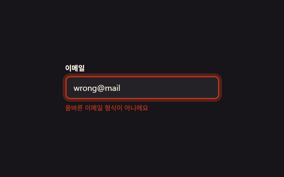 9 Form Validation CSS Animations You Can PasteForm validation CSS animations are small signals — color, icon, glow — that show a field is right or wrong, no shaking r See all demos in this post