09Spotlight circle
On a pinned screen a circular window grows with scroll to uncover a hidden image.
Best forProduct reveal moments, artist intros
clip-path: circle()scroll-timeline: --sl-scroll이미지 공개
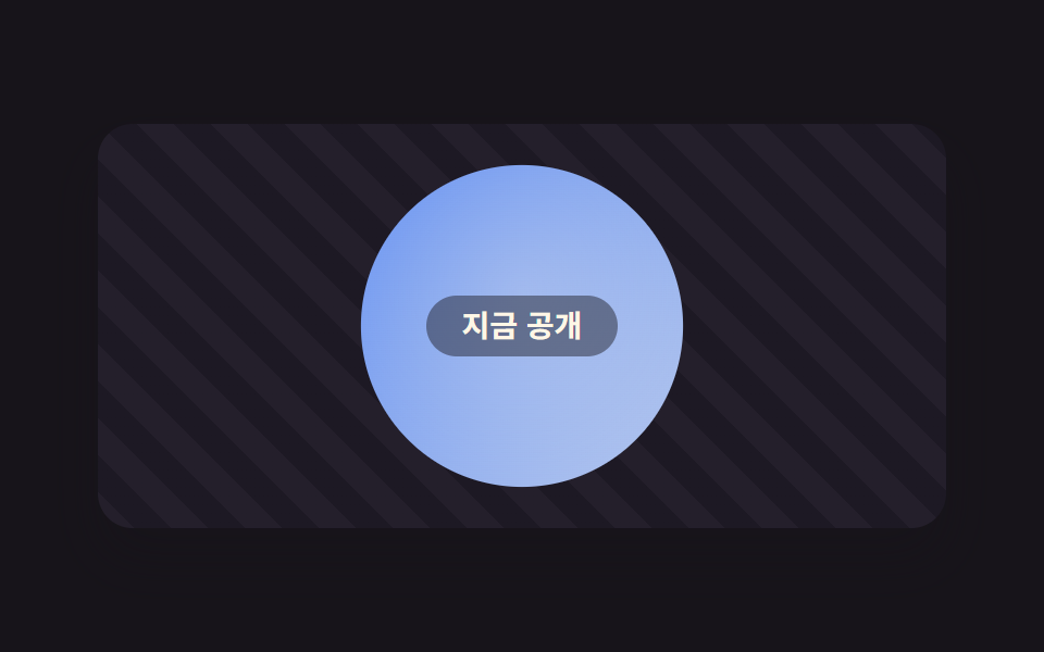
<main class="stage">
  <div class="sl">
    <div class="sl__scroll">
      <div class="sl__inner">
        <div class="sl__pin">
          <div class="sl__dim"><span class="sl__dimm">Still a secret</span></div>
          <div class="sl__spot is-demo"><span class="sl__cap">Now revealed</span></div>
        </div>
      </div>
    </div>
  </div>
</main>
@use "../../../../site/static/demo-tokens" as *;
// ── 변수 3개 ──────────────────────────────────────────
$duration: $dur-loop;
$easing: $ease-out;
$color: $subject-blue;
@include stage($stage-ink);
.sl {
width: min(390px, 88vw);
height: clamp(150px, 62vh, 216px);
border-radius: $r-card;
overflow: hidden;
box-shadow: $shadow-raised;
}
.sl__scroll {
height: 100%;
overflow-y: auto;
scroll-timeline: --sl-scroll block;
scrollbar-width: none;
&::-webkit-scrollbar { display: none; }
}
.sl__inner { height: 280%; }
.sl__pin {
position: sticky;
top: 0;
height: calc(100% / 2.8);
display: grid;
overflow: hidden;
}
// 감춰둔 화면(어두운 데 갈무리 무늬) — 스포트라이트가 자라면 삼켜지는 자리
.sl__dim {
grid-area: 1 / 1;
display: grid;
background: repeating-linear-gradient(45deg, #241f2b 0 12px, #1d1924 12px 24px);
}
.sl__dimm {
align-self: start;
justify-self: center;
margin-top: 14%;
padding: $sp-1 $sp-4;
border-radius: $r-pill;
color: rgba(255, 247, 230, .5);
border: 1px dashed rgba(255, 247, 230, .35);
font: 700 13px/1.4 -apple-system, "Segoe UI", "Noto Sans KR", sans-serif;
}
// ── 실제 동작: 스포트라이트 = 위에 얹은 밝은 화면의 원형 창. 스크롤이 반지름을 키운다 ──
.sl__spot {
grid-area: 1 / 1;
display: grid;
place-items: center;
background:
radial-gradient(circle at 50% 42%, rgba(255, 247, 230, .28), transparent 58%),
linear-gradient(135deg, $color, #d6ddeb);
clip-path: circle(14% at 50% 50%);
}
.sl__cap {
padding: $sp-1 $sp-4;
border-radius: $r-pill;
background: rgba(23, 20, 26, .45);
color: $subject-cream;
font: 700 14px/1.4 -apple-system, "Segoe UI", "Noto Sans KR", sans-serif;
}
@supports (animation-timeline: scroll()) {
.sl__spot:not(.is-demo) {
animation: sl-open linear both;
animation-timeline: --sl-scroll;
}
}
@supports not (animation-timeline: scroll()) {
// 미지원 브라우저(Firefox·Safari): 원이 처음부터 활짝 열려 있다
.sl__spot:not(.is-demo) { clip-path: circle(75% at 50% 50%); }
}
@keyframes sl-open {
from { clip-path: circle(14% at 50% 50%); }
to { clip-path: circle(75% at 50% 50%); }
}
// 데모 루프: 실제 스크롤 대신 원이 열렸다 닫히는 걸 흉내(캡처용)
.sl__spot.is-demo { animation: sl-loop $duration $easing infinite; }
@keyframes sl-loop {
0%, 10% { clip-path: circle(14% at 50% 50%); }
55%, 88% { clip-path: circle(75% at 50% 50%); }
100% { clip-path: circle(14% at 50% 50%); }
}
@media (prefers-reduced-motion: reduce) {
.sl__spot.is-demo { animation: none !important; clip-path: circle(75% at 50% 50%) !important; }
.sl__scroll { scroll-behavior: auto; }
}html, body {
margin: 0;
overflow: hidden;
}
.stage {
box-sizing: border-box;
min-height: 100vh;
display: grid;
place-items: center;
margin: 0;
background: #17141a;
font-family: -apple-system, "Segoe UI", "Noto Sans KR", sans-serif;
padding: clamp(8px, 4vw, 24px);
}
.sl {
width: min(390px, 88vw);
height: clamp(150px, 62vh, 216px);
border-radius: 16px;
overflow: hidden;
box-shadow: 0 14px 24px rgba(23, 20, 26, 0.32);
}
.sl__scroll {
height: 100%;
overflow-y: auto;
scroll-timeline: --sl-scroll block;
scrollbar-width: none;
}
.sl__scroll::-webkit-scrollbar {
display: none;
}
.sl__inner {
height: 280%;
}
.sl__pin {
position: sticky;
top: 0;
height: 35.7142857143%;
display: grid;
overflow: hidden;
}
.sl__dim {
grid-area: 1/1;
display: grid;
background: repeating-linear-gradient(45deg, #241f2b 0 12px, #1d1924 12px 24px);
}
.sl__dimm {
align-self: start;
justify-self: center;
margin-top: 14%;
padding: 4px 16px;
border-radius: 999px;
color: rgba(255, 247, 230, 0.5);
border: 1px dashed rgba(255, 247, 230, 0.35);
font: 700 13px/1.4 -apple-system, "Segoe UI", "Noto Sans KR", sans-serif;
}
.sl__spot {
grid-area: 1/1;
display: grid;
place-items: center;
background: radial-gradient(circle at 50% 42%, rgba(255, 247, 230, 0.28), transparent 58%), linear-gradient(135deg, #2f6df6, #d6ddeb);
clip-path: circle(14% at 50% 50%);
}
.sl__cap {
padding: 4px 16px;
border-radius: 999px;
background: rgba(23, 20, 26, 0.45);
color: #fff7e6;
font: 700 14px/1.4 -apple-system, "Segoe UI", "Noto Sans KR", sans-serif;
}
@supports (animation-timeline: scroll()) {
.sl__spot:not(.is-demo) {
animation: sl-open linear both;
animation-timeline: --sl-scroll;
}
}
@supports not (animation-timeline: scroll()) {
.sl__spot:not(.is-demo) {
clip-path: circle(75% at 50% 50%);
}
}
@keyframes sl-open {
from {
clip-path: circle(14% at 50% 50%);
}
to {
clip-path: circle(75% at 50% 50%);
}
}
.sl__spot.is-demo {
animation: sl-loop 2s ease-out infinite;
}
@keyframes sl-loop {
0%, 10% {
clip-path: circle(14% at 50% 50%);
}
55%, 88% {
clip-path: circle(75% at 50% 50%);
}
100% {
clip-path: circle(14% at 50% 50%);
}
}
@media (prefers-reduced-motion: reduce) {
.sl__spot.is-demo {
animation: none !important;
clip-path: circle(75% at 50% 50%) !important;
}
.sl__scroll {
scroll-behavior: auto;
}
}// 실제 동작: 스크롤 상자의 scroll-timeline 이 clip-path 원 반지름을 키운다(0줄).
// is-demo 클래스는 캡처용 미리보기 루프일 뿐 — 실제 스크롤 반응은 그대로 살아있다.import type { CSSProperties } from "react";
import styles from "./SpotlightCircle.module.scss";
export type SpotlightCircleProps = {
duration?: number;
easing?: string;
color?: string;
secret?: string;
reveal?: string;
};
type Vars = CSSProperties & { "--duration"?: string; "--easing"?: string; "--color"?: string };
export default function SpotlightCircle({
duration = 300,
easing = "linear",
color = "#2f6df6",
secret = "아직 비밀",
reveal = "지금 공개",
}: SpotlightCircleProps) {
const vars: Vars = { "--duration": `${duration}ms`, "--easing": easing, "--color": color };
return (
<div className={styles.sl} style={vars}>
{/* 스포트라이트 = 위에 얹은 밝은 화면의 원형 창. 스크롤이 반지름을 키운다 */}
<div className={styles.scroll}>
<div className={styles.inner}>
<div className={styles.pin}>
<div className={styles.dim}>
<span className={styles.dimm}>{secret}</span>
</div>
<div className={styles.spot}>
<span className={styles.cap}>{reveal}</span>
</div>
</div>
</div>
</div>
</div>
);
}09 Spotlight circle — Measured area 46.333% · moving frames 11/23Original by GODRICH · SCSS and React ship in the zip · 9 Website Scroll Effects — Apple-Style, CSS Only
The post this demo lives in
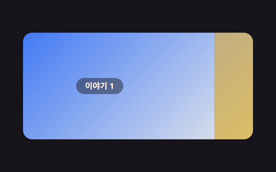 9 Website Scroll Effects — Apple-Style, CSS OnlyWebsite scroll effects, done with no scroll library at all, feel the way Apple's product pages do. Nine of them are here See all demos in this post
If you like this effect - similar demos
 Scroll03 Circular progress ring9 Back To Top Button CSS: No JS, Scroll-Driven
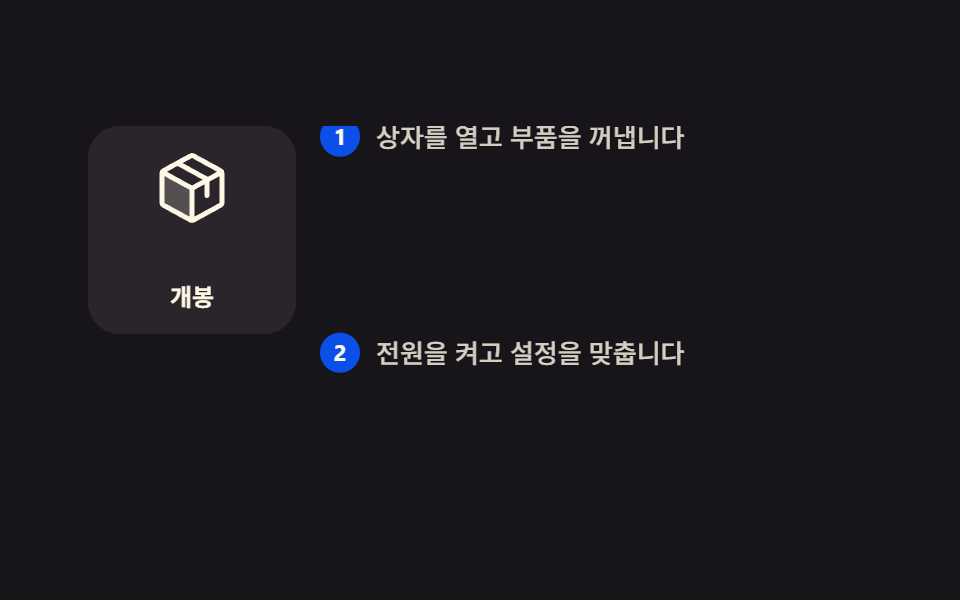 Scroll01 Pinned figure, stepped text9 Scrollytelling CSS Section Patterns, Copy-Paste
 Scroll02 A Pinned Panel Scene Where the Section Stays Fixed and Vertical Progress Splits Into Sideways Moves per PanelHorizontal Scroll Animation CSS: 9 Inertia Scenes