01Permission request modal
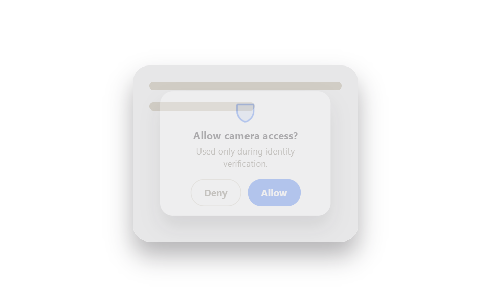
When the app asks for camera or location access, an icon bounces into view and the allow button sits slightly larger than deny so the safer default stands out.
Best forCamera/mic access prompts before an identity check, first-launch notification permission screens
@keyframes 아이콘 바운스포커스 트랩aria-modal
<main class="stage">
  <div class="perm-scene is-demo">
    <div class="perm-scene__page">
      <span class="perm-scene__line"></span>
      <span class="perm-scene__line perm-scene__line--short"></span>
    </div>
    <div class="perm-scene__backdrop"></div>
    <div class="perm-scene__modal" role="alertdialog" aria-modal="true" aria-label="Camera access">
      <span class="perm-scene__icon" aria-hidden="true">
        <svg viewBox="0 0 256 256"><g fill="currentColor"><path d="M216 56v56c0 96-88 120-88 120s-88-24-88-120V56a8 8 0 0 1 8-8h160a8 8 0 0 1 8 8" opacity=".2"/><path d="M208 40H48a16 16 0 0 0-16 16v56c0 52.72 25.52 84.67 46.93 102.19c23.06 18.86 46 25.26 47 25.53a8 8 0 0 0 4.2 0c1-.27 23.91-6.67 47-25.53C198.48 196.67 224 164.72 224 112V56a16 16 0 0 0-16-16m0 72c0 37.07-13.66 67.16-40.6 89.42a129.3 129.3 0 0 1-39.4 22.2a128.3 128.3 0 0 1-38.92-22.2C61.66 175.16 48 145.07 48 108V56h160Z"/></g></svg>
      </span>
      <h2 class="perm-scene__title">Allow camera access?</h2>
      <p class="perm-scene__desc">Used only during identity verification.</p>
      <div class="perm-scene__actions">
        <button class="perm-scene__btn perm-scene__btn--ghost" type="button">Deny</button>
        <button class="perm-scene__btn perm-scene__btn--primary" type="button">Allow</button>
      </div>
    </div>
  </div>
</main>
@use "../../../../site/static/demo-tokens" as *;
$duration: $dur-enter; // 모달 등장 시간
$easing: $ease-pop;
$color: $subject-blue; // 허용 버튼·아이콘 색 (신뢰감 있는 밝은 축)
@include stage($stage-paper);
.perm-scene {
position: relative;
width: min(220px, 80vw);
height: 172px;
border-radius: $r-card;
overflow: hidden;
box-shadow: $shadow-raised;
}
.perm-scene__page {
position: absolute;
inset: 0;
padding: $sp-4;
background: $stage-paper;
display: flex;
flex-direction: column;
gap: $sp-3;
}
.perm-scene__line { display: block; height: 8px; border-radius: $r-xs; background: #e6e2d8; }
.perm-scene__line--short { width: 55%; }
.perm-scene__backdrop {
position: absolute;
inset: 0;
background: rgba(23, 20, 26, 0);
transition: background $duration $easing;
pointer-events: none;
}
.perm-scene__modal {
position: absolute;
left: 50%; top: 50%;
width: min(184px, 82%);
padding: $sp-3 $sp-4;
background: $stage-paper;
border-radius: $r-card;
box-shadow: $shadow-raised;
text-align: center;
transform: translate(-50%, -50%) scale(.7);
opacity: 0;
transition: transform $duration $easing, opacity $duration $easing;
}
.perm-scene__icon {
display: inline-flex;
width: 30px; height: 30px;
color: $color;
margin-bottom: $sp-1;
animation: icon-bounce $dur-loop $ease-out infinite;
}
.perm-scene__title { margin: 0 0 $sp-1; font-size: 13px; font-weight: 700; color: $stage-ink; font-family: inherit; }
.perm-scene__desc { margin: 0 0 $sp-3; font-size: 11px; color: #6b6455; font-family: inherit; }
.perm-scene__actions { display: flex; gap: $sp-2; justify-content: center; }
.perm-scene__btn {
padding: $sp-2 $sp-4;
border-radius: $r-pill;
font-size: 12px;
font-weight: 700;
font-family: inherit;
cursor: pointer;
border: 1.5px solid transparent;
}
.perm-scene__btn--ghost { background: $stage-paper; border-color: #d8d2c4; color: #6b6455; }
.perm-scene__btn--ghost:hover, .perm-scene__btn--ghost:focus-visible { background: #f3efe4; }
.perm-scene__btn--primary { background: $color; color: $stage-paper; }
.perm-scene__btn--primary:hover, .perm-scene__btn--primary:focus-visible { background: darken($color, 8%); }
// 자동 재생 루프. 사람이 Allow/Deny 를 누르면 is-demo 를 떼고 실제로 닫힌다 (index.html)
.perm-scene.is-demo .perm-scene__backdrop { animation: backdrop-cycle $dur-loop $easing infinite; }
.perm-scene.is-demo .perm-scene__modal { animation: modal-cycle $dur-loop $easing infinite; }
.perm-scene.is-closed .perm-scene__backdrop { background: rgba(23, 20, 26, 0); }
.perm-scene.is-closed .perm-scene__modal { transform: translate(-50%, -50%) scale(.7); opacity: 0; }
@keyframes backdrop-cycle {
0%, 8% { background: rgba(23, 20, 26, 0); }
23%, 77% { background: rgba(23, 20, 26, .35); }
92%, 100% { background: rgba(23, 20, 26, 0); }
}
@keyframes modal-cycle {
0%, 8% { transform: translate(-50%, -50%) scale(.7); opacity: 0; }
23%, 77% { transform: translate(-50%, -50%) scale(1); opacity: 1; }
92%, 100% { transform: translate(-50%, -50%) scale(.7); opacity: 0; }
}
@keyframes icon-bounce {
0%, 100% { transform: translateY(0); }
50% { transform: translateY(-4px); }
}
@media (prefers-reduced-motion: reduce) {
.perm-scene__backdrop, .perm-scene__modal { transition: none; }
.perm-scene.is-demo .perm-scene__backdrop,
.perm-scene.is-demo .perm-scene__modal,
.perm-scene__icon { animation: none; }
}html, body {
margin: 0;
overflow: hidden;
}
.stage {
box-sizing: border-box;
min-height: 100vh;
display: grid;
place-items: center;
margin: 0;
background: #ffffff;
font-family: -apple-system, "Segoe UI", "Noto Sans KR", sans-serif;
padding: clamp(8px, 4vw, 24px);
}
.perm-scene {
position: relative;
width: min(220px, 80vw);
height: 172px;
border-radius: 16px;
overflow: hidden;
box-shadow: 0 14px 24px rgba(23, 20, 26, 0.32);
}
.perm-scene__page {
position: absolute;
inset: 0;
padding: 16px;
background: #ffffff;
display: flex;
flex-direction: column;
gap: 12px;
}
.perm-scene__line {
display: block;
height: 8px;
border-radius: 4px;
background: #e6e2d8;
}
.perm-scene__line--short {
width: 55%;
}
.perm-scene__backdrop {
position: absolute;
inset: 0;
background: rgba(23, 20, 26, 0);
transition: background 600ms cubic-bezier(0.2, 1.4, 0.4, 1);
pointer-events: none;
}
.perm-scene__modal {
position: absolute;
left: 50%;
top: 50%;
width: min(184px, 82%);
padding: 12px 16px;
background: #ffffff;
border-radius: 16px;
box-shadow: 0 14px 24px rgba(23, 20, 26, 0.32);
text-align: center;
transform: translate(-50%, -50%) scale(0.7);
opacity: 0;
transition: transform 600ms cubic-bezier(0.2, 1.4, 0.4, 1), opacity 600ms cubic-bezier(0.2, 1.4, 0.4, 1);
}
.perm-scene__icon {
display: inline-flex;
width: 30px;
height: 30px;
color: #2f6df6;
margin-bottom: 4px;
animation: icon-bounce 2s ease-out infinite;
}
.perm-scene__title {
margin: 0 0 4px;
font-size: 13px;
font-weight: 700;
color: #17141a;
font-family: inherit;
}
.perm-scene__desc {
margin: 0 0 12px;
font-size: 11px;
color: #6b6455;
font-family: inherit;
}
.perm-scene__actions {
display: flex;
gap: 8px;
justify-content: center;
}
.perm-scene__btn {
padding: 8px 16px;
border-radius: 999px;
font-size: 12px;
font-weight: 700;
font-family: inherit;
cursor: pointer;
border: 1.5px solid transparent;
}
.perm-scene__btn--ghost {
background: #ffffff;
border-color: #d8d2c4;
color: #6b6455;
}
.perm-scene__btn--ghost:hover, .perm-scene__btn--ghost:focus-visible {
background: #f3efe4;
}
.perm-scene__btn--primary {
background: #2f6df6;
color: #ffffff;
}
.perm-scene__btn--primary:hover, .perm-scene__btn--primary:focus-visible {
background: rgb(4.1019246408%, 32.3596277221%, 94.8000361435%);
}
.perm-scene.is-demo .perm-scene__backdrop {
animation: backdrop-cycle 2s cubic-bezier(0.2, 1.4, 0.4, 1) infinite;
}
.perm-scene.is-demo .perm-scene__modal {
animation: modal-cycle 2s cubic-bezier(0.2, 1.4, 0.4, 1) infinite;
}
.perm-scene.is-closed .perm-scene__backdrop {
background: rgba(23, 20, 26, 0);
}
.perm-scene.is-closed .perm-scene__modal {
transform: translate(-50%, -50%) scale(0.7);
opacity: 0;
}
@keyframes backdrop-cycle {
0%, 8% {
background: rgba(23, 20, 26, 0);
}
23%, 77% {
background: rgba(23, 20, 26, 0.35);
}
92%, 100% {
background: rgba(23, 20, 26, 0);
}
}
@keyframes modal-cycle {
0%, 8% {
transform: translate(-50%, -50%) scale(0.7);
opacity: 0;
}
23%, 77% {
transform: translate(-50%, -50%) scale(1);
opacity: 1;
}
92%, 100% {
transform: translate(-50%, -50%) scale(0.7);
opacity: 0;
}
}
@keyframes icon-bounce {
0%, 100% {
transform: translateY(0);
}
50% {
transform: translateY(-4px);
}
}
@media (prefers-reduced-motion: reduce) {
.perm-scene__backdrop, .perm-scene__modal {
transition: none;
}
.perm-scene.is-demo .perm-scene__backdrop,
.perm-scene.is-demo .perm-scene__modal,
.perm-scene__icon {
animation: none;
}
}(function(){
var scene=document.querySelector('.perm-scene'),
modal=scene.querySelector('.perm-scene__modal'),
deny=scene.querySelector('.perm-scene__btn--ghost'),
allow=scene.querySelector('.perm-scene__btn--primary');
function close(){ scene.classList.remove('is-demo'); scene.classList.add('is-closed'); }
deny.addEventListener('click', close);
allow.addEventListener('click', close);
modal.addEventListener('keydown', function(e){ if(e.key==='Escape') close(); });
}());import { useState } from "react";
import styles from "./PermissionRequestModal.module.scss";
export type PermissionRequestModalProps = {
title?: string;
description?: string;
onAllow?: () => void;
onDeny?: () => void;
};
/** 권한 요청 모달 — Allow/Deny 또는 Escape 로 닫힌다 */
export default function PermissionRequestModal({
title = "Allow camera access?",
description = "Used only during identity verification.",
onAllow,
onDeny,
}: PermissionRequestModalProps) {
const [open, setOpen] = useState(true);
if (!open) return null;
const close = (fn?: () => void) => () => {
fn?.();
setOpen(false);
};
return (
<div className={styles.scene}>
<div className={styles.backdrop} />
<div
className={styles.modal}
role="alertdialog"
aria-modal="true"
aria-label={title}
onKeyDown={(e: any) => e.key === "Escape" && setOpen(false)}
>
<span className={styles.icon} aria-hidden="true">
<svg viewBox="0 0 256 256">
<g fill="currentColor">
<path d="M216 56v56c0 96-88 120-88 120s-88-24-88-120V56a8 8 0 0 1 8-8h160a8 8 0 0 1 8 8" opacity=".2" />
<path d="M208 40H48a16 16 0 0 0-16 16v56c0 52.72 25.52 84.67 46.93 102.19c23.06 18.86 46 25.26 47 25.53a8 8 0 0 0 4.2 0c1-.27 23.91-6.67 47-25.53C198.48 196.67 224 164.72 224 112V56a16 16 0 0 0-16-16m0 72c0 37.07-13.66 67.16-40.6 89.42a129.3 129.3 0 0 1-39.4 22.2a128.3 128.3 0 0 1-38.92-22.2C61.66 175.16 48 145.07 48 108V56h160Z" />
</g>
</svg>
</span>
<h2 className={styles.title}>{title}</h2>
<p className={styles.desc}>{description}</p>
<div className={styles.actions}>
<button className={styles.ghost} type="button" onClick={close(onDeny)}>Deny</button>
<button className={styles.primary} type="button" onClick={close(onAllow)}>Allow</button>
</div>
</div>
</div>
);
}01 Permission request modal — Measured area 26.15% · moving frames 18/23Original by GODRICH · SCSS and React ship in the zip · 9 ID Verification Screen UI Patterns, Paste-Ready
The post this demo lives in
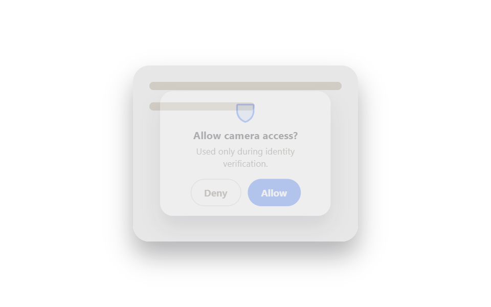 9 ID Verification Screen UI Patterns, Paste-ReadyAn id verification screen ui is a screen — a permission prompt, an OTP grid, a security question card — that proves a pe See all demos in this post
If you like this effect - similar demos
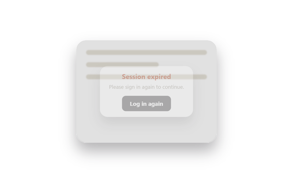 Auth UI08 Session-expired re-login modal9 Login Form Design Patterns You Can Copy-Paste
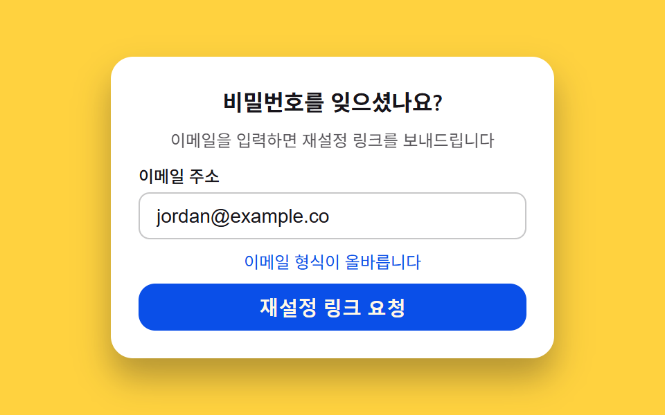 Auth UI06 Password reset request — a form that scores email validity to set its button state9 Login UI Design Patterns (Copy-Paste)
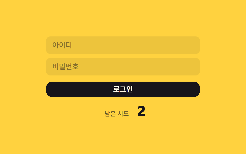 Auth UI01 Remaining-tries shake — the remaining-tries value drops and the number shakes briefly each time login failsToo Many Failed Login Attempts: 9 Patterns