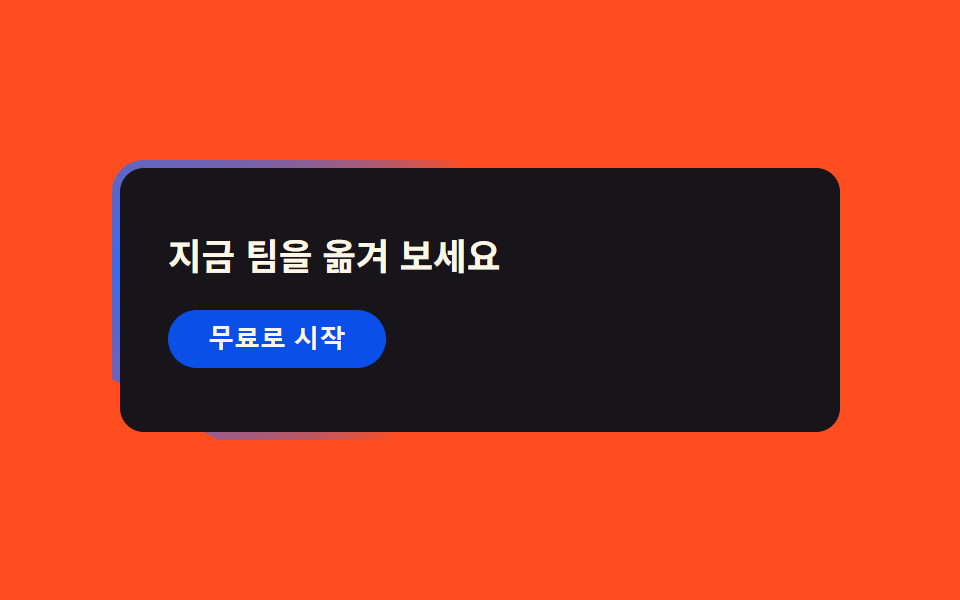
07Gradient-border band
A gradient line wrapping the CTA band's border rotates slowly, making the edge read like a glowing badge.
Best forSign-up bands, start-free-trial prompts
conic-gradient 회전mask borderradius 16
<main class="stage">
  <section class="band">
    <div class="band__inner is-demo">
      <h3 class="band__title">Move your team over today</h3>
      <button class="band__cta" type="button">Start for free</button>
    </div>
  </section>
</main>
@use "../../../../site/static/demo-tokens" as *;
$duration: $dur-loop; // 테두리 그라디언트가 한 바퀴 도는 시간
$easing: linear; // 회전은 일정 속도가 자연스럽다 (spring·pop 은 회전에 안 맞는다)
$color: $subject-blue;
@include stage($stage-orange);
.band {
position: relative;
width: clamp(240px, 84vw, 360px);
border-radius: $r-card;
padding: $sp-1;
overflow: hidden;
isolation: isolate;
}
.band::before {
content: "";
position: absolute;
inset: -40%;
background: conic-gradient(from 0deg, transparent 0%, rgba($color, .95) 18%, transparent 40%);
animation: bandSpin $duration $easing infinite;
}
.band__inner {
position: relative;
z-index: 1;
border-radius: calc(#{$r-card} - $sp-1);
background: $subject-ink;
padding: $sp-8 $sp-6;
display: flex;
flex-direction: column;
align-items: flex-start;
gap: $sp-4;
}
.band__title {
margin: 0;
color: $subject-cream;
font: 700 clamp(15px, 3.8vw, 19px)/1.3 -apple-system, "Segoe UI", "Noto Sans KR", sans-serif;
}
.band__cta {
border: 0;
border-radius: $r-pill;
background: $subject-blue-deep;
color: $subject-cream;
padding: $sp-2 $sp-5;
font-weight: 600; font-size: clamp(11px, 2.8vw, 13px); line-height: 1;
}
@keyframes bandSpin {
from { transform: rotate(0deg); }
to { transform: rotate(360deg); }
}
@media (prefers-reduced-motion: reduce) {
.band::before { animation: none !important; }
}html, body {
margin: 0;
overflow: hidden;
}
.stage {
box-sizing: border-box;
min-height: 100vh;
display: grid;
place-items: center;
margin: 0;
background: #ff4d1f;
font-family: -apple-system, "Segoe UI", "Noto Sans KR", sans-serif;
padding: clamp(8px, 4vw, 24px);
}
.band {
position: relative;
width: clamp(240px, 84vw, 360px);
border-radius: 16px;
padding: 4px;
overflow: hidden;
isolation: isolate;
}
.band::before {
content: "";
position: absolute;
inset: -40%;
background: conic-gradient(from 0deg, transparent 0%, rgba(47, 109, 246, 0.95) 18%, transparent 40%);
animation: bandSpin 2s linear infinite;
}
.band__inner {
position: relative;
z-index: 1;
border-radius: calc(16px - 4px);
background: #17141a;
padding: 32px 24px;
display: flex;
flex-direction: column;
align-items: flex-start;
gap: 16px;
}
.band__title {
margin: 0;
color: #fff7e6;
font: 700 clamp(15px, 3.8vw, 19px)/1.3 -apple-system, "Segoe UI", "Noto Sans KR", sans-serif;
}
.band__cta {
border: 0;
border-radius: 999px;
background: #0a4fe8;
color: #fff7e6;
padding: 8px 20px;
font-weight: 600;
font-size: clamp(11px, 2.8vw, 13px);
line-height: 1;
}
@keyframes bandSpin {
from {
transform: rotate(0deg);
}
to {
transform: rotate(360deg);
}
}
@media (prefers-reduced-motion: reduce) {
.band::before {
animation: none !important;
}
}import type { CSSProperties } from "react";
import styles from "./CtaBandLinear.module.scss";
export type CtaBandLinearProps = {
title?: string;
cta?: string;
/** 테두리 그라디언트가 한 바퀴 도는 시간(기본 2000ms) */
duration?: number;
easing?: string;
color?: string;
};
type Vars = CSSProperties & { "--duration"?: string; "--easing"?: string; "--color"?: string };
export default function CtaBandLinear({
title = "Move your team over today",
cta = "Start for free",
duration = 2000,
easing = "linear",
color = "#2f6df6",
}: CtaBandLinearProps) {
const vars: Vars = { "--duration": `${duration}ms`, "--easing": easing, "--color": color };
return (
<section className={styles.band} style={vars}>
<div className={styles.inner}>
<h3 className={styles.title}>{title}</h3>
<button type="button" className={styles.cta}>{cta}</button>
</div>
</section>
);
}07 Gradient-border band — Measured area 2.754% · moving frames 23/23Original by GODRICH · SCSS and React ship in the zip · Linear Style Landing Page: 9 Dark SaaS Sections
The post this demo lives in
 Linear Style Landing Page: 9 Dark SaaS SectionsA linear style landing page — all over Dribbble and Pinterest right now — leans on Linear.app's ink-black background and See all demos in this post