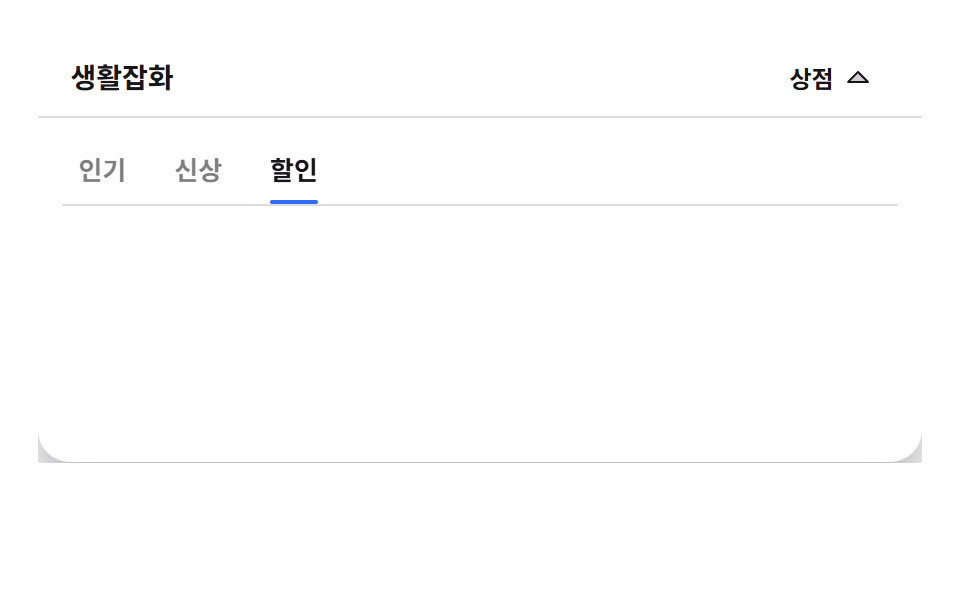
03Mega menu that swaps panels by tab
Press a tab inside the panel and the card bundle swaps in place within a single frame, while only the pressed tab reads as selected.
Best forStore navigation that must show one category from a few angles
flex: 0 0 autosteps(1, end)aria-selected
<main class="stage">
  <div class="tmp is-demo" id="root">
    <header class="tmp__bar">
      <span class="tmp__brand">Homeware</span>
      <button class="tmp__trigger" id="trigger" type="button" aria-controls="panel">Shop
        <svg class="tmp__caret" viewBox="0 0 256 256" width="16" height="16" aria-hidden="true"><g fill="currentColor"><path d="m208 96l-80 80l-80-80Z" opacity=".2"/><path d="M215.39 92.94A8 8 0 0 0 208 88H48a8 8 0 0 0-5.66 13.66l80 80a8 8 0 0 0 11.32 0l80-80a8 8 0 0 0 1.73-8.72M128 164.69L67.31 104h121.38Z"/></g></svg>
      </button>
    </header>
    <div class="tmp__panel" id="panel">
      <div class="tmp__tabs" role="tablist" aria-label="Shop menu" id="tablist">
        <button class="tmp__tab" id="tab0" type="button" role="tab" aria-controls="set0" data-i="0">Popular</button>
        <button class="tmp__tab" id="tab1" type="button" role="tab" aria-controls="set1" data-i="1">New</button>
        <button class="tmp__tab" id="tab2" type="button" role="tab" aria-controls="set2" data-i="2">Sale</button>
      </div>
      <div class="tmp__body">
        <ul class="tmp__set" id="set0" role="tabpanel" aria-labelledby="tab0">
          <li class="tmp__card">
            <span class="tmp__block tmp__block--0"></span>
            <strong class="tmp__name">Wall shelf</strong>
            <span class="tmp__price">24,000</span>
          </li>
          <li class="tmp__card">
            <span class="tmp__block tmp__block--1"></span>
            <strong class="tmp__name">Mini planter</strong>
            <span class="tmp__price">9,800</span>
          </li>
          <li class="tmp__card">
            <span class="tmp__block tmp__block--2"></span>
            <strong class="tmp__name">Mood lamp</strong>
            <span class="tmp__price">16,500</span>
          </li>
        </ul>
        <ul class="tmp__set" id="set1" role="tabpanel" aria-labelledby="tab1">
          <li class="tmp__card">
            <span class="tmp__block tmp__block--0"></span>
            <strong class="tmp__name">Bamboo desk</strong>
            <span class="tmp__price">89,000</span>
          </li>
          <li class="tmp__card">
            <span class="tmp__block tmp__block--1"></span>
            <strong class="tmp__name">Glass cup set</strong>
            <span class="tmp__price">19,900</span>
          </li>
          <li class="tmp__card">
            <span class="tmp__block tmp__block--2"></span>
            <strong class="tmp__name">Drawer unit</strong>
            <span class="tmp__price">42,000</span>
          </li>
        </ul>
        <ul class="tmp__set" id="set2" role="tabpanel" aria-labelledby="tab2">
          <li class="tmp__card">
            <span class="tmp__block tmp__block--0"><span class="tmp__badge">30% off</span></span>
            <strong class="tmp__name">Rug</strong>
            <span class="tmp__price">27,300</span>
          </li>
          <li class="tmp__card">
            <span class="tmp__block tmp__block--1"><span class="tmp__badge">20% off</span></span>
            <strong class="tmp__name">Clothes rack</strong>
            <span class="tmp__price">31,200</span>
          </li>
          <li class="tmp__card">
            <span class="tmp__block tmp__block--2"><span class="tmp__badge">45% off</span></span>
            <strong class="tmp__name">Mirror</strong>
            <span class="tmp__price">15,400</span>
          </li>
        </ul>
      </div>
    </div>
  </div>
</main>@use "../../../../site/static/demo-tokens" as *;
$duration: $dur-loop;
$easing: $ease-spring;
$color: $subject-blue;
@include stage($stage-paper);
// 패널이 아래로 열리는 드롭다운 — 무대 중앙 정렬 대신 뿌리를 상단에 붙인다
.stage { align-items: flex-start; }
$ink-70: rgba(23, 20, 26, .7);
$ink-55: rgba(23, 20, 26, .55);
$ink-14: rgba(23, 20, 26, .14);
.tmp {
position: relative;
width: 100%;
}
.tmp__bar {
position: relative;
z-index: 3;
box-sizing: border-box;
display: flex;
align-items: center;
justify-content: space-between;
gap: $sp-2;
height: 40px;
padding: 0 $sp-4;
background: $stage-paper;
border-bottom: 1px solid $ink-14;
}
.tmp__brand {
font-size: 14px;
font-weight: 700;
line-height: 20px;
color: $subject-ink;
}
.tmp__trigger {
box-sizing: border-box;
display: inline-flex;
align-items: center;
gap: $sp-1;
padding: $sp-1 $sp-2;
border: 0;
border-radius: $r-control;
background: transparent;
font-family: -apple-system, "Segoe UI", "Noto Sans KR", sans-serif;
font-size: 12px;
font-weight: 700;
line-height: 18px;
color: $subject-ink;
cursor: pointer;
transition: background-color $dur-quick $easing;
}
.tmp__trigger:hover { background: rgba(47, 109, 246, .12); }
.tmp__trigger:focus-visible { outline: 2px solid $color; outline-offset: -2px; }
.tmp__caret { display: block; transition: transform $dur-quick $ease-spring; }
.tmp__trigger[aria-expanded="true"] .tmp__caret { transform: rotate(180deg); }
.tmp__panel {
position: absolute;
left: 0;
right: 0;
top: 41px;
z-index: 2;
box-sizing: border-box;
padding: $sp-2 $sp-3 $sp-3;
background: $stage-paper;
border-radius: 0 0 $r-card $r-card;
box-shadow: $shadow-raised;
opacity: 0;
visibility: hidden;
transform: translateY(-6px);
transition: opacity $dur-quick $easing, transform $dur-quick $easing, visibility 0s linear $dur-quick;
}
.tmp:not(.is-demo).is-open .tmp__panel {
opacity: 1;
visibility: visible;
transform: translateY(0);
transition: opacity $dur-quick $easing, transform $dur-quick $easing, visibility 0s;
}
// 탭은 flex: 0 0 auto — 밑줄은 탭마다 제자리(::after)에서 채워지고, 이동하지 않는다
.tmp__tabs {
display: flex;
align-items: stretch;
gap: $sp-2;
height: 34px;
margin-bottom: $sp-2;
border-bottom: 1px solid $ink-14;
}
.tmp__tab {
position: relative;
flex: 0 0 auto;
box-sizing: border-box;
padding: 0 $sp-2;
border: 0;
background: transparent;
font-family: -apple-system, "Segoe UI", "Noto Sans KR", sans-serif;
font-size: 13px;
font-weight: 700;
line-height: 34px;
color: $ink-55;
cursor: pointer;
transition: color $dur-quick $easing;
}
.tmp__tab:hover { color: $ink-70; }
.tmp__tab:focus-visible { outline: 2px solid $color; outline-offset: -2px; }
.tmp__tab[aria-selected="true"] { color: $subject-ink; }
.tmp__tab::after {
content: "";
position: absolute;
left: $sp-2;
right: $sp-2;
bottom: 0;
height: 2px;
border-radius: $r-pill;
background: $color;
transform: scaleX(0);
transform-origin: center;
transition: transform $dur-quick $ease-spring;
}
.tmp__tab[aria-selected="true"]::after { transform: scaleX(1); }
.tmp__body {
position: relative;
height: 108px;
}
.tmp__set {
position: absolute;
inset: 0;
display: grid;
grid-template-columns: repeat(3, 1fr);
gap: $sp-2;
margin: 0;
padding: 0;
list-style: none;
}
.tmp__set[hidden] { display: none; }
.tmp__card {
box-sizing: border-box;
display: flex;
flex-direction: column;
gap: $sp-1;
padding: $sp-2;
border: 1px solid $ink-14;
border-radius: $r-sm;
background: $stage-paper;
}
.tmp__block {
position: relative;
display: block;
height: 52px;
border-radius: $r-xs;
}
.tmp__block--0 { background: $subject-blue; }
.tmp__block--1 { background: $stage-yellow; }
.tmp__block--2 { background: $stage-orange; }
.tmp__name {
font-size: 12px;
font-weight: 700;
line-height: 16px;
color: $subject-ink;
}
.tmp__price {
font-size: 11px;
font-weight: 400;
line-height: 14px;
color: $ink-70;
}
.tmp__badge {
position: absolute;
top: $sp-1;
right: $sp-1;
box-sizing: border-box;
padding: 0 $sp-1;
border-radius: $r-xs;
background: $subject-ink;
color: $subject-cream;
font-size: 9px;
font-weight: 700;
line-height: 12px;
}
// 정적 조작 — 탭을 고르면 해당 묶음만 살리고 카드가 시차로 팝한다
.tmp__set.is-pop .tmp__card {
animation-name: tmp-card-pop;
animation-duration: $dur-base;
animation-timing-function: $ease-pop;
animation-iteration-count: 1;
animation-fill-mode: backwards;
}
.tmp__set.is-pop .tmp__card:nth-child(2) { animation-delay: 40ms; }
.tmp__set.is-pop .tmp__card:nth-child(3) { animation-delay: 80ms; }
@keyframes tmp-card-pop {
0% { opacity: 0; transform: translateY(8px); }
100% { opacity: 1; transform: translateY(0); }
}
// ── 자동 루프 (2s) ────────────────────────────────────
// 8% 패널 등장(인기) → 34% 신상 컷+팝 → 58% 할인 컷+팝 → 80-84% 닫힘(짧게)
// 묶음 교체는 steps(1, end) 컷, 그 옆에서 새 카드가 translateY 팝으로 프레임을 채운다
.tmp.is-demo .tmp__panel {
visibility: visible;
animation-name: tmp-panel;
animation-duration: $duration;
animation-timing-function: $easing;
animation-iteration-count: infinite;
animation-fill-mode: backwards;
}
.tmp.is-demo .tmp__caret {
animation-name: tmp-caret;
animation-duration: $duration;
animation-timing-function: $easing;
animation-iteration-count: infinite;
animation-fill-mode: backwards;
}
.tmp.is-demo .tmp__set,
.tmp.is-demo .tmp__set[hidden] { display: grid; }
.tmp.is-demo .tmp__set {
animation-duration: $duration;
animation-timing-function: steps(1, end);
animation-iteration-count: infinite;
animation-fill-mode: backwards;
}
.tmp.is-demo #set0 { animation-name: tmp-set0; }
.tmp.is-demo #set1 { animation-name: tmp-set1; }
.tmp.is-demo #set2 { animation-name: tmp-set2; }
.tmp.is-demo .tmp__tab {
animation-duration: $duration;
animation-timing-function: steps(1, end);
animation-iteration-count: infinite;
animation-fill-mode: backwards;
}
.tmp.is-demo #tab0 { animation-name: tmp-tab0; }
.tmp.is-demo #tab1 { animation-name: tmp-tab1; }
.tmp.is-demo #tab2 { animation-name: tmp-tab2; }
.tmp.is-demo #tab0::after,
.tmp.is-demo #tab1::after,
.tmp.is-demo #tab2::after {
animation-duration: $duration;
animation-timing-function: steps(1, end);
animation-iteration-count: infinite;
animation-fill-mode: backwards;
}
.tmp.is-demo #tab0::after { animation-name: tmp-u0; }
.tmp.is-demo #tab1::after { animation-name: tmp-u1; }
.tmp.is-demo #tab2::after { animation-name: tmp-u2; }
.tmp.is-demo .tmp__card {
animation-name: tmp-card;
animation-duration: $duration;
animation-timing-function: $ease-pop;
animation-iteration-count: infinite;
animation-fill-mode: backwards;
}
.tmp.is-demo #set0 .tmp__card:nth-child(1) { animation-delay: 220ms; }
.tmp.is-demo #set0 .tmp__card:nth-child(2) { animation-delay: 260ms; }
.tmp.is-demo #set0 .tmp__card:nth-child(3) { animation-delay: 300ms; }
.tmp.is-demo #set1 .tmp__card:nth-child(1) { animation-delay: 700ms; }
.tmp.is-demo #set1 .tmp__card:nth-child(2) { animation-delay: 740ms; }
.tmp.is-demo #set1 .tmp__card:nth-child(3) { animation-delay: 780ms; }
.tmp.is-demo #set2 .tmp__card:nth-child(1) { animation-delay: 1180ms; }
.tmp.is-demo #set2 .tmp__card:nth-child(2) { animation-delay: 1220ms; }
.tmp.is-demo #set2 .tmp__card:nth-child(3) { animation-delay: 1260ms; }
@keyframes tmp-panel {
0%, 8.3% { opacity: 0; transform: translateY(-6px); clip-path: inset(0 0 100% 0); }
8.4%, 74% { opacity: 1; transform: translateY(0); clip-path: inset(0 0 0 0); }
86%, 100% { opacity: 1; transform: translateY(0); clip-path: inset(100% 0 0 0); }
}
@keyframes tmp-caret {
0%, 8.3% { transform: rotate(0deg); }
8.4%, 74% { transform: rotate(180deg); }
86%, 100% { transform: rotate(0deg); }
}
@keyframes tmp-set0 {
0%, 7.9% { opacity: 0; }
8%, 33.9% { opacity: 1; }
34%, 100% { opacity: 0; }
}
@keyframes tmp-set1 {
0%, 33.9% { opacity: 0; }
34%, 57.9% { opacity: 1; }
58%, 100% { opacity: 0; }
}
@keyframes tmp-set2 {
0%, 57.9% { opacity: 0; }
58%, 100% { opacity: 1; }
}
@keyframes tmp-tab0 {
0%, 7.9% { color: $ink-55; }
8%, 33.9% { color: $subject-ink; }
34%, 100% { color: $ink-55; }
}
@keyframes tmp-tab1 {
0%, 33.9% { color: $ink-55; }
34%, 57.9% { color: $subject-ink; }
58%, 100% { color: $ink-55; }
}
@keyframes tmp-tab2 {
0%, 57.9% { color: $ink-55; }
58%, 100% { color: $subject-ink; }
}
@keyframes tmp-u0 {
0%, 7.9% { transform: scaleX(0); }
8%, 33.9% { transform: scaleX(1); }
34%, 100% { transform: scaleX(0); }
}
@keyframes tmp-u1 {
0%, 33.9% { transform: scaleX(0); }
34%, 57.9% { transform: scaleX(1); }
58%, 100% { transform: scaleX(0); }
}
@keyframes tmp-u2 {
0%, 57.9% { transform: scaleX(0); }
58%, 100% { transform: scaleX(1); }
}
@keyframes tmp-card {
0% { opacity: 0; transform: translateY(8px); }
4%, 100% { opacity: 1; transform: translateY(0); }
}
@media (max-width: 340px) {
.tmp__bar { height: 32px; padding: 0 $sp-2; }
.tmp__brand { font-size: 12px; line-height: 16px; }
.tmp__trigger { padding: 0 $sp-1; font-size: 11px; line-height: 16px; }
.tmp__panel { top: 33px; padding: $sp-1 $sp-2 $sp-2; }
.tmp__tabs { height: 26px; gap: $sp-1; margin-bottom: $sp-1; }
.tmp__tab { padding: 0 $sp-1; font-size: 11px; line-height: 26px; }
.tmp__body { height: 76px; }
.tmp__card { gap: 0; padding: $sp-1; }
.tmp__block { height: 34px; }
.tmp__name { font-size: 10px; line-height: 13px; }
.tmp__price { font-size: 9px; line-height: 12px; }
.tmp__badge { font-size: 8px; line-height: 10px; }
}
@media (prefers-reduced-motion: reduce) {
.tmp.is-demo .tmp__panel,
.tmp.is-demo .tmp__caret,
.tmp.is-demo .tmp__set,
.tmp.is-demo .tmp__card,
.tmp.is-demo .tmp__tab,
.tmp.is-demo .tmp__tab::after { animation: none !important; }
.tmp.is-demo .tmp__panel { opacity: 1; visibility: visible; transform: none; }
.tmp.is-demo #set1,
.tmp.is-demo #set2 { opacity: 0; }
}html, body {
margin: 0;
overflow: hidden;
}
.stage {
box-sizing: border-box;
min-height: 100vh;
display: grid;
place-items: center;
margin: 0;
background: #ffffff;
font-family: -apple-system, "Segoe UI", "Noto Sans KR", sans-serif;
padding: clamp(8px, 4vw, 24px);
}
.stage {
align-items: flex-start;
}
.tmp {
position: relative;
width: 100%;
}
.tmp__bar {
position: relative;
z-index: 3;
box-sizing: border-box;
display: flex;
align-items: center;
justify-content: space-between;
gap: 8px;
height: 40px;
padding: 0 16px;
background: #ffffff;
border-bottom: 1px solid rgba(23, 20, 26, 0.14);
}
.tmp__brand {
font-size: 14px;
font-weight: 700;
line-height: 20px;
color: #17141a;
}
.tmp__trigger {
box-sizing: border-box;
display: inline-flex;
align-items: center;
gap: 4px;
padding: 4px 8px;
border: 0;
border-radius: 12px;
background: transparent;
font-family: -apple-system, "Segoe UI", "Noto Sans KR", sans-serif;
font-size: 12px;
font-weight: 700;
line-height: 18px;
color: #17141a;
cursor: pointer;
transition: background-color 220ms cubic-bezier(0.2, 0.8, 0.2, 1);
}
.tmp__trigger:hover {
background: rgba(47, 109, 246, 0.12);
}
.tmp__trigger:focus-visible {
outline: 2px solid #2f6df6;
outline-offset: -2px;
}
.tmp__caret {
display: block;
transition: transform 220ms cubic-bezier(0.2, 0.8, 0.2, 1);
}
.tmp__trigger[aria-expanded=true] .tmp__caret {
transform: rotate(180deg);
}
.tmp__panel {
position: absolute;
left: 0;
right: 0;
top: 41px;
z-index: 2;
box-sizing: border-box;
padding: 8px 12px 12px;
background: #ffffff;
border-radius: 0 0 16px 16px;
box-shadow: 0 14px 24px rgba(23, 20, 26, 0.32);
opacity: 0;
visibility: hidden;
transform: translateY(-6px);
transition: opacity 220ms cubic-bezier(0.2, 0.8, 0.2, 1), transform 220ms cubic-bezier(0.2, 0.8, 0.2, 1), visibility 0s linear 220ms;
}
.tmp:not(.is-demo).is-open .tmp__panel {
opacity: 1;
visibility: visible;
transform: translateY(0);
transition: opacity 220ms cubic-bezier(0.2, 0.8, 0.2, 1), transform 220ms cubic-bezier(0.2, 0.8, 0.2, 1), visibility 0s;
}
.tmp__tabs {
display: flex;
align-items: stretch;
gap: 8px;
height: 34px;
margin-bottom: 8px;
border-bottom: 1px solid rgba(23, 20, 26, 0.14);
}
.tmp__tab {
position: relative;
flex: 0 0 auto;
box-sizing: border-box;
padding: 0 8px;
border: 0;
background: transparent;
font-family: -apple-system, "Segoe UI", "Noto Sans KR", sans-serif;
font-size: 13px;
font-weight: 700;
line-height: 34px;
color: rgba(23, 20, 26, 0.55);
cursor: pointer;
transition: color 220ms cubic-bezier(0.2, 0.8, 0.2, 1);
}
.tmp__tab:hover {
color: rgba(23, 20, 26, 0.7);
}
.tmp__tab:focus-visible {
outline: 2px solid #2f6df6;
outline-offset: -2px;
}
.tmp__tab[aria-selected=true] {
color: #17141a;
}
.tmp__tab::after {
content: "";
position: absolute;
left: 8px;
right: 8px;
bottom: 0;
height: 2px;
border-radius: 999px;
background: #2f6df6;
transform: scaleX(0);
transform-origin: center;
transition: transform 220ms cubic-bezier(0.2, 0.8, 0.2, 1);
}
.tmp__tab[aria-selected=true]::after {
transform: scaleX(1);
}
.tmp__body {
position: relative;
height: 108px;
}
.tmp__set {
position: absolute;
inset: 0;
display: grid;
grid-template-columns: repeat(3, 1fr);
gap: 8px;
margin: 0;
padding: 0;
list-style: none;
}
.tmp__set[hidden] {
display: none;
}
.tmp__card {
box-sizing: border-box;
display: flex;
flex-direction: column;
gap: 4px;
padding: 8px;
border: 1px solid rgba(23, 20, 26, 0.14);
border-radius: 8px;
background: #ffffff;
}
.tmp__block {
position: relative;
display: block;
height: 52px;
border-radius: 4px;
}
.tmp__block--0 {
background: #2f6df6;
}
.tmp__block--1 {
background: #ffd23f;
}
.tmp__block--2 {
background: #ff4d1f;
}
.tmp__name {
font-size: 12px;
font-weight: 700;
line-height: 16px;
color: #17141a;
}
.tmp__price {
font-size: 11px;
font-weight: 400;
line-height: 14px;
color: rgba(23, 20, 26, 0.7);
}
.tmp__badge {
position: absolute;
top: 4px;
right: 4px;
box-sizing: border-box;
padding: 0 4px;
border-radius: 4px;
background: #17141a;
color: #fff7e6;
font-size: 9px;
font-weight: 700;
line-height: 12px;
}
.tmp__set.is-pop .tmp__card {
animation-name: tmp-card-pop;
animation-duration: 300ms;
animation-timing-function: cubic-bezier(0.2, 1.4, 0.4, 1);
animation-iteration-count: 1;
animation-fill-mode: backwards;
}
.tmp__set.is-pop .tmp__card:nth-child(2) {
animation-delay: 40ms;
}
.tmp__set.is-pop .tmp__card:nth-child(3) {
animation-delay: 80ms;
}
@keyframes tmp-card-pop {
0% {
opacity: 0;
transform: translateY(8px);
}
100% {
opacity: 1;
transform: translateY(0);
}
}
.tmp.is-demo .tmp__panel {
visibility: visible;
animation-name: tmp-panel;
animation-duration: 2s;
animation-timing-function: cubic-bezier(0.2, 0.8, 0.2, 1);
animation-iteration-count: infinite;
animation-fill-mode: backwards;
}
.tmp.is-demo .tmp__caret {
animation-name: tmp-caret;
animation-duration: 2s;
animation-timing-function: cubic-bezier(0.2, 0.8, 0.2, 1);
animation-iteration-count: infinite;
animation-fill-mode: backwards;
}
.tmp.is-demo .tmp__set,
.tmp.is-demo .tmp__set[hidden] {
display: grid;
}
.tmp.is-demo .tmp__set {
animation-duration: 2s;
animation-timing-function: steps(1, end);
animation-iteration-count: infinite;
animation-fill-mode: backwards;
}
.tmp.is-demo #set0 {
animation-name: tmp-set0;
}
.tmp.is-demo #set1 {
animation-name: tmp-set1;
}
.tmp.is-demo #set2 {
animation-name: tmp-set2;
}
.tmp.is-demo .tmp__tab {
animation-duration: 2s;
animation-timing-function: steps(1, end);
animation-iteration-count: infinite;
animation-fill-mode: backwards;
}
.tmp.is-demo #tab0 {
animation-name: tmp-tab0;
}
.tmp.is-demo #tab1 {
animation-name: tmp-tab1;
}
.tmp.is-demo #tab2 {
animation-name: tmp-tab2;
}
.tmp.is-demo #tab0::after,
.tmp.is-demo #tab1::after,
.tmp.is-demo #tab2::after {
animation-duration: 2s;
animation-timing-function: steps(1, end);
animation-iteration-count: infinite;
animation-fill-mode: backwards;
}
.tmp.is-demo #tab0::after {
animation-name: tmp-u0;
}
.tmp.is-demo #tab1::after {
animation-name: tmp-u1;
}
.tmp.is-demo #tab2::after {
animation-name: tmp-u2;
}
.tmp.is-demo .tmp__card {
animation-name: tmp-card;
animation-duration: 2s;
animation-timing-function: cubic-bezier(0.2, 1.4, 0.4, 1);
animation-iteration-count: infinite;
animation-fill-mode: backwards;
}
.tmp.is-demo #set0 .tmp__card:nth-child(1) {
animation-delay: 220ms;
}
.tmp.is-demo #set0 .tmp__card:nth-child(2) {
animation-delay: 260ms;
}
.tmp.is-demo #set0 .tmp__card:nth-child(3) {
animation-delay: 300ms;
}
.tmp.is-demo #set1 .tmp__card:nth-child(1) {
animation-delay: 700ms;
}
.tmp.is-demo #set1 .tmp__card:nth-child(2) {
animation-delay: 740ms;
}
.tmp.is-demo #set1 .tmp__card:nth-child(3) {
animation-delay: 780ms;
}
.tmp.is-demo #set2 .tmp__card:nth-child(1) {
animation-delay: 1180ms;
}
.tmp.is-demo #set2 .tmp__card:nth-child(2) {
animation-delay: 1220ms;
}
.tmp.is-demo #set2 .tmp__card:nth-child(3) {
animation-delay: 1260ms;
}
@keyframes tmp-panel {
0%, 8.3% {
opacity: 0;
transform: translateY(-6px);
clip-path: inset(0 0 100% 0);
}
8.4%, 74% {
opacity: 1;
transform: translateY(0);
clip-path: inset(0 0 0 0);
}
86%, 100% {
opacity: 1;
transform: translateY(0);
clip-path: inset(100% 0 0 0);
}
}
@keyframes tmp-caret {
0%, 8.3% {
transform: rotate(0deg);
}
8.4%, 74% {
transform: rotate(180deg);
}
86%, 100% {
transform: rotate(0deg);
}
}
@keyframes tmp-set0 {
0%, 7.9% {
opacity: 0;
}
8%, 33.9% {
opacity: 1;
}
34%, 100% {
opacity: 0;
}
}
@keyframes tmp-set1 {
0%, 33.9% {
opacity: 0;
}
34%, 57.9% {
opacity: 1;
}
58%, 100% {
opacity: 0;
}
}
@keyframes tmp-set2 {
0%, 57.9% {
opacity: 0;
}
58%, 100% {
opacity: 1;
}
}
@keyframes tmp-tab0 {
0%, 7.9% {
color: rgba(23, 20, 26, 0.55);
}
8%, 33.9% {
color: #17141a;
}
34%, 100% {
color: rgba(23, 20, 26, 0.55);
}
}
@keyframes tmp-tab1 {
0%, 33.9% {
color: rgba(23, 20, 26, 0.55);
}
34%, 57.9% {
color: #17141a;
}
58%, 100% {
color: rgba(23, 20, 26, 0.55);
}
}
@keyframes tmp-tab2 {
0%, 57.9% {
color: rgba(23, 20, 26, 0.55);
}
58%, 100% {
color: #17141a;
}
}
@keyframes tmp-u0 {
0%, 7.9% {
transform: scaleX(0);
}
8%, 33.9% {
transform: scaleX(1);
}
34%, 100% {
transform: scaleX(0);
}
}
@keyframes tmp-u1 {
0%, 33.9% {
transform: scaleX(0);
}
34%, 57.9% {
transform: scaleX(1);
}
58%, 100% {
transform: scaleX(0);
}
}
@keyframes tmp-u2 {
0%, 57.9% {
transform: scaleX(0);
}
58%, 100% {
transform: scaleX(1);
}
}
@keyframes tmp-card {
0% {
opacity: 0;
transform: translateY(8px);
}
4%, 100% {
opacity: 1;
transform: translateY(0);
}
}
@media (max-width: 340px) {
.tmp__bar {
height: 32px;
padding: 0 8px;
}
.tmp__brand {
font-size: 12px;
line-height: 16px;
}
.tmp__trigger {
padding: 0 4px;
font-size: 11px;
line-height: 16px;
}
.tmp__panel {
top: 33px;
padding: 4px 8px 8px;
}
.tmp__tabs {
height: 26px;
gap: 4px;
margin-bottom: 4px;
}
.tmp__tab {
padding: 0 4px;
font-size: 11px;
line-height: 26px;
}
.tmp__body {
height: 76px;
}
.tmp__card {
gap: 0;
padding: 4px;
}
.tmp__block {
height: 34px;
}
.tmp__name {
font-size: 10px;
line-height: 13px;
}
.tmp__price {
font-size: 9px;
line-height: 12px;
}
.tmp__badge {
font-size: 8px;
line-height: 10px;
}
}
@media (prefers-reduced-motion: reduce) {
.tmp.is-demo .tmp__panel,
.tmp.is-demo .tmp__caret,
.tmp.is-demo .tmp__set,
.tmp.is-demo .tmp__card,
.tmp.is-demo .tmp__tab,
.tmp.is-demo .tmp__tab::after {
animation: none !important;
}
.tmp.is-demo .tmp__panel {
opacity: 1;
visibility: visible;
transform: none;
}
.tmp.is-demo #set1,
.tmp.is-demo #set2 {
opacity: 0;
}
}var root = document.getElementById('root');
var trigger = document.getElementById('trigger');
var tablist = document.getElementById('tablist');
var tabs = [0, 1, 2].map(function (i) { return document.getElementById('tab' + i); });
var sets = [0, 1, 2].map(function (i) { return document.getElementById('set' + i); });
trigger.setAttribute('aria-haspopup', 'true');
trigger.setAttribute('aria-expanded', 'false');
function stopDemo() { root.classList.remove('is-demo'); }
function open() { stopDemo(); root.classList.add('is-open'); trigger.setAttribute('aria-expanded', 'true'); }
function close() { stopDemo(); root.classList.remove('is-open'); trigger.setAttribute('aria-expanded', 'false'); }
function select(i) {
tabs.forEach(function (t, k) {
t.setAttribute('aria-selected', k === i ? 'true' : 'false');
t.tabIndex = k === i ? 0 : -1;
sets[k].hidden = k !== i;
if (k === i && !root.classList.contains('is-demo')) {
sets[k].classList.remove('is-pop');
void sets[k].offsetWidth;
sets[k].classList.add('is-pop');
}
});
}
trigger.addEventListener('click', function () { root.classList.contains('is-open') ? close() : open(); });
tablist.addEventListener('click', function (e) {
var t = e.target.closest ? e.target.closest('button') : null;
if (t) { stopDemo(); select(tabs.indexOf(t)); }
});
tablist.addEventListener('keydown', function (e) {
if (e.key !== 'ArrowRight' && e.key !== 'ArrowLeft') return;
e.preventDefault();
var i = tabs.indexOf(tablist.querySelector('[aria-selected="true"]'));
var n = e.key === 'ArrowRight' ? (i + 1) % 3 : (i + 2) % 3;
stopDemo();
select(n);
tabs[n].focus({ preventScroll: true });
});
document.addEventListener('keydown', function (e) { if (e.key === 'Escape') close(); });
document.addEventListener('pointerdown', stopDemo, { once: true });
document.addEventListener('keydown', stopDemo, { once: true });
select(0);import { useState, useRef } from "react";
import type { CSSProperties } from "react";
import styles from "./TabbedMegaPanel.module.scss";
export type TabbedCard = { name: string; price: string; badge?: string };
export type TabbedMegaPanelLabels = {
brand: string;
trigger: string;
tabsLabel: string;
tabs: string[];
cards: TabbedCard[][];
};
export type TabbedMegaPanelProps = {
labels?: TabbedMegaPanelLabels;
duration?: number;
easing?: string;
color?: string;
};
type Vars = CSSProperties & { "--duration"?: string; "--easing"?: string; "--color"?: string };
type KeyEvt = { key: string; preventDefault(): void };
type Box<T> = { current: T };
type BtnRef = (el: HTMLButtonElement | null) => void;
const DEFAULT_LABELS: TabbedMegaPanelLabels = {
brand: "Homeware",
trigger: "Shop",
tabsLabel: "Shop menu",
tabs: ["Popular", "New", "Sale"],
cards: [
[
{ name: "Wall shelf", price: "24,000" },
{ name: "Mini planter", price: "9,800" },
{ name: "Mood lamp", price: "16,500" },
],
[
{ name: "Bamboo desk", price: "89,000" },
{ name: "Glass cup set", price: "19,900" },
{ name: "Drawer unit", price: "42,000" },
],
[
{ name: "Rug", price: "27,300", badge: "30%" },
{ name: "Hanger", price: "31,200", badge: "20%" },
{ name: "Mirror", price: "15,400", badge: "45%" },
],
],
};
function CaretDown() {
return (
<svg viewBox="0 0 256 256" width="16" height="16" aria-hidden="true">
<g fill="currentColor">
<path d="m208 96l-80 80l-80-80Z" opacity=".2" />
<path d="M215.39 92.94A8 8 0 0 0 208 88H48a8 8 0 0 0-5.66 13.66l80 80a8 8 0 0 0 11.32 0l80-80a8 8 0 0 0 1.73-8.72M128 164.69L67.31 104h121.38Z" />
</g>
</svg>
);
}
function CardView({ card, j }: { card: TabbedCard; j: number; key?: string }) {
return (
<li className={styles.card}>
<span className={[styles.block, styles["block" + (j % 3)]].join(" ")}>
{card.badge ? <span className={styles.badge}>{card.badge}</span> : null}
</span>
<strong className={styles.name}>{card.name}</strong>
<span className={styles.price}>{card.price}</span>
</li>
);
}
export default function TabbedMegaPanel({
labels = DEFAULT_LABELS,
duration = 2000,
easing = "cubic-bezier(.2,.8,.2,1)",
color = "#2f6df6",
}: TabbedMegaPanelProps) {
const [live, setLive] = useState(true);
const [open, setOpen] = useState(false);
const [tab, setTab] = useState(0);
const tabRefs = useRef<(HTMLButtonElement | null)[]>([]) as Box<(HTMLButtonElement | null)[]>;
function wake() {
setLive(false);
}
function openPanel() {
wake();
setOpen(true);
}
function closePanel() {
wake();
setOpen(false);
}
function select(i: number) {
wake();
setTab(i);
}
function setTabRef(i: number): BtnRef {
return (el: HTMLButtonElement | null) => {
tabRefs.current[i] = el;
};
}
function onTabsKey(e: KeyEvt) {
if (e.key !== "ArrowRight" && e.key !== "ArrowLeft") return;
e.preventDefault();
const next = e.key === "ArrowRight" ? (tab + 1) % 3 : (tab + 2) % 3;
select(next);
const btn = tabRefs.current[next];
if (btn) btn.focus({ preventScroll: true });
}
const vars: Vars = { "--duration": `${duration}ms`, "--easing": easing, "--color": color };
return (
<div
className={[styles.tmp, live ? styles.isDemo : "", open ? styles.isOpen : ""].join(" ")}
style={vars}
onPointerDownCapture={wake}
onKeyDownCapture={wake}
onKeyDown={(e: KeyEvt) => {
if (e.key === "Escape") closePanel();
}}
>
<header className={styles.tmpBar}>
<span className={styles.tmpBrand}>{labels.brand}</span>
<button
type="button"
className={styles.tmpTrigger}
aria-expanded={open}
aria-haspopup="true"
onClick={() => (open ? closePanel() : openPanel())}
>
{labels.trigger}
<span className={styles.tmpCaret}>
<CaretDown />
</span>
</button>
</header>
<div className={styles.tmpPanel}>
<div className={styles.tmpTabs} role="tablist" aria-label={labels.tabsLabel} onKeyDown={onTabsKey}>
{labels.tabs.map((t, i) => (
<button
key={t}
type="button"
role="tab"
id={"tmp-tab-" + i}
aria-controls={"tmp-set-" + i}
className={live ? [styles.tab, styles["tab" + i]].join(" ") : styles.tab}
aria-selected={live ? undefined : tab === i}
tabIndex={live ? -1 : tab === i ? 0 : -1}
ref={setTabRef(i)}
onClick={() => select(i)}
>
{t}
</button>
))}
</div>
<div className={styles.tmpBody}>
{live ? (
labels.cards.map((set, i) => (
<ul
key={i}
id={"tmp-set-" + i}
role="tabpanel"
aria-labelledby={"tmp-tab-" + i}
className={[styles.set, styles["set" + i]].join(" ")}
>
{set.map((c, j) => (
<CardView card={c} j={j} key={c.name} />
))}
</ul>
))
) : (
<ul
key={tab}
id={"tmp-set-" + tab}
role="tabpanel"
aria-labelledby={"tmp-tab-" + tab}
className={styles.set}
>
{labels.cards[tab].map((c, j) => (
<CardView card={c} j={j} key={c.name} />
))}
</ul>
)}
</div>
</div>
</div>
);
}03 Mega menu that swaps panels by tab — Measured area 17.594% · moving frames 14/23Original by GODRICH · SCSS and React ship in the zip · 9 mega menu ui patterns, link list to site map
The post this demo lives in
 9 mega menu ui patterns, link list to site mapA mega menu ui opens a screen-wide panel from one top-row item, turning the site into one readable map. The nine running See all demos in this post