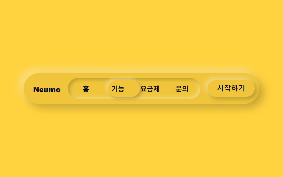
02Pressed-in nav indicator
The whole track sits pressed in with an inset shadow, while the active tab alone carries the opposite raised shadow so it stands proud of the track.
Best forLanding page top bar, in-app tab switching
inset 트랙raised 인디케이터translateX 25%
<main class="stage">
  <nav class="navneu">
    <span class="navneu__brand">Neumo</span>
    <div class="navneu__track is-demo">
      <span class="navneu__indicator" aria-hidden="true"></span>
      <span class="navneu__item">Home</span>
      <span class="navneu__item">Features</span>
      <span class="navneu__item">Pricing</span>
      <span class="navneu__item">Contact</span>
    </div>
    <button class="navneu__cta" type="button">Get started</button>
  </nav>
</main>
@use "../../../../site/static/demo-tokens" as *;
$duration: $dur-loop; // 인디케이터가 4칸을 한 바퀴 도는 시간
$easing: $ease-spring; // 미끄러지는 곡선
$color: $subject-blue; // 강조 색
@include stage($stage-yellow);
$neu-surface: mix($stage-yellow, black, 94%);
$neu-light: rgba(mix($neu-surface, white, 40%), .6);
$neu-dark: rgba(mix($neu-surface, black, 40%), .35);
.navneu {
box-sizing: border-box;
width: clamp(260px, 84vw, 400px);
display: flex;
align-items: center;
gap: $sp-3;
border-radius: $r-pill;
background: $neu-surface;
padding: $sp-2;
box-shadow: 7px 7px 14px $neu-dark, -7px -7px 14px $neu-light;
}
.navneu__brand {
padding-left: $sp-2;
color: $subject-ink;
font-weight: 800; font-size: clamp(11px, 2.8vw, 13px); line-height: 1;
white-space: nowrap;
}
.navneu__track {
position: relative;
flex: 1;
display: flex;
border-radius: $r-pill;
background: $neu-surface;
padding: $sp-1;
// 눌린 트랙 — 안쪽으로 파인 뉴모피즘 인셋 그림자
box-shadow: inset 3px 3px 6px $neu-dark, inset -3px -3px 6px $neu-light;
}
.navneu__indicator {
position: absolute;
top: $sp-1;
bottom: $sp-1;
left: $sp-1;
width: calc((100% - #{$sp-1} * 2) / 4);
border-radius: $r-pill;
background: $neu-surface;
// 인디케이터만 볼록하게 — 트랙(오목)과 대비되는 유일한 볼록 표면
box-shadow: 3px 3px 6px $neu-dark, -3px -3px 6px $neu-light;
animation: navSlide $duration $easing infinite;
}
.navneu__item {
position: relative;
z-index: 1;
flex: 1;
text-align: center;
padding: $sp-2 0;
color: $subject-ink;
font-weight: 600; font-size: clamp(10.5px, 2.6vw, 12px); line-height: 1;
}
.navneu__cta {
border: 0;
border-radius: $r-pill;
background: $neu-surface;
color: $subject-ink;
padding: $sp-2 $sp-4;
font-weight: 700; font-size: clamp(10.5px, 2.6vw, 12px); line-height: 1;
white-space: nowrap;
box-shadow: 4px 4px 8px $neu-dark, -4px -4px 8px $neu-light;
}
.navneu__cta:focus-visible {
outline: 3px solid $color;
outline-offset: 2px;
}
// 데모: 캡슐 안 인디케이터가 4칸을 순서대로 돈다. width 25% 이므로 translateX(100%) = 제 폭만큼 = 한 칸
@keyframes navSlide {
0%, 15% { transform: translateX(0%); }
25%, 40% { transform: translateX(100%); }
50%, 65% { transform: translateX(200%); }
75%, 90% { transform: translateX(300%); }
100% { transform: translateX(0%); }
}
@media (prefers-reduced-motion: reduce) {
.navneu__indicator { animation: none !important; transform: translateX(0%); }
}html, body {
margin: 0;
overflow: hidden;
}
.stage {
box-sizing: border-box;
min-height: 100vh;
display: grid;
place-items: center;
margin: 0;
background: #ffd23f;
font-family: -apple-system, "Segoe UI", "Noto Sans KR", sans-serif;
padding: clamp(8px, 4vw, 24px);
}
.navneu {
box-sizing: border-box;
width: clamp(260px, 84vw, 400px);
display: flex;
align-items: center;
gap: 12px;
border-radius: 999px;
background: rgb(94%, 77.4117647059%, 23.2235294118%);
padding: 8px;
box-shadow: 7px 7px 14px rgba(37.6%, 30.9647058824%, 9.2894117647%, 0.35), -7px -7px 14px rgba(97.6%, 90.9647058824%, 69.2894117647%, 0.6);
}
.navneu__brand {
padding-left: 8px;
color: #17141a;
font-weight: 800;
font-size: clamp(11px, 2.8vw, 13px);
line-height: 1;
white-space: nowrap;
}
.navneu__track {
position: relative;
flex: 1;
display: flex;
border-radius: 999px;
background: rgb(94%, 77.4117647059%, 23.2235294118%);
padding: 4px;
box-shadow: inset 3px 3px 6px rgba(37.6%, 30.9647058824%, 9.2894117647%, 0.35), inset -3px -3px 6px rgba(97.6%, 90.9647058824%, 69.2894117647%, 0.6);
}
.navneu__indicator {
position: absolute;
top: 4px;
bottom: 4px;
left: 4px;
width: calc((100% - 4px * 2) / 4);
border-radius: 999px;
background: rgb(94%, 77.4117647059%, 23.2235294118%);
box-shadow: 3px 3px 6px rgba(37.6%, 30.9647058824%, 9.2894117647%, 0.35), -3px -3px 6px rgba(97.6%, 90.9647058824%, 69.2894117647%, 0.6);
animation: navSlide 2s cubic-bezier(0.2, 0.8, 0.2, 1) infinite;
}
.navneu__item {
position: relative;
z-index: 1;
flex: 1;
text-align: center;
padding: 8px 0;
color: #17141a;
font-weight: 600;
font-size: clamp(10.5px, 2.6vw, 12px);
line-height: 1;
}
.navneu__cta {
border: 0;
border-radius: 999px;
background: rgb(94%, 77.4117647059%, 23.2235294118%);
color: #17141a;
padding: 8px 16px;
font-weight: 700;
font-size: clamp(10.5px, 2.6vw, 12px);
line-height: 1;
white-space: nowrap;
box-shadow: 4px 4px 8px rgba(37.6%, 30.9647058824%, 9.2894117647%, 0.35), -4px -4px 8px rgba(97.6%, 90.9647058824%, 69.2894117647%, 0.6);
}
.navneu__cta:focus-visible {
outline: 3px solid #2f6df6;
outline-offset: 2px;
}
@keyframes navSlide {
0%, 15% {
transform: translateX(0%);
}
25%, 40% {
transform: translateX(100%);
}
50%, 65% {
transform: translateX(200%);
}
75%, 90% {
transform: translateX(300%);
}
100% {
transform: translateX(0%);
}
}
@media (prefers-reduced-motion: reduce) {
.navneu__indicator {
animation: none !important;
transform: translateX(0%);
}
}import type { CSSProperties } from "react";
import styles from "./NavNeu.module.scss";
export type NavNeuProps = {
brand?: string;
items?: string[];
cta?: string;
/** 인디케이터가 항목 전부를 한 바퀴 도는 시간(기본 2000ms) */
duration?: number;
easing?: string;
color?: string;
};
type Vars = CSSProperties & { "--duration"?: string; "--easing"?: string; "--color"?: string };
export default function NavNeu({
brand = "Neumo",
items = ["홈", "기능", "요금제", "문의"],
cta = "시작하기",
duration = 2000,
easing = "cubic-bezier(.2,.8,.2,1)",
color = "#2f6df6",
}: NavNeuProps) {
const vars: Vars = { "--duration": `${duration}ms`, "--easing": easing, "--color": color };
return (
<nav className={styles.nav} style={vars}>
<span className={styles.brand}>{brand}</span>
<div className={styles.track}>
<span className={styles.indicator} aria-hidden="true" style={{ width: `calc((100% - 8px) / ${items.length})` }} />
{items.map((label) => (
<span key={label} className={styles.item}>{label}</span>
))}
</div>
<button type="button" className={styles.cta}>{cta}</button>
</nav>
);
}02 Pressed-in nav indicator — Measured area 3.481% · moving frames 11/23Original by GODRICH · SCSS and React ship in the zip · Neumorphism Design Kit: 9 Soft-Shadow Sections
The post this demo lives in
 Neumorphism Design Kit: 9 Soft-Shadow SectionsNeumorphism design keeps a card's background nearly identical to the page behind it, then adds one light shadow and one See all demos in this post