04Recessed icon list
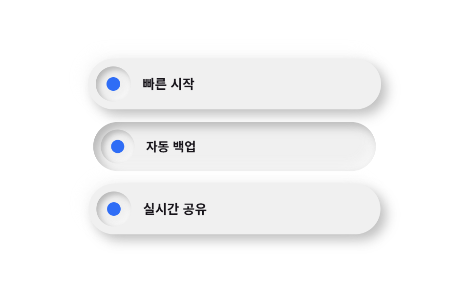
Each pill-shaped row sits raised while the icon chip inside it alone sinks inward, so raised and inset read side by side in one row.
Best forFeature lists, onboarding steps
inset 칩raised 행순백 대신 6% 눌린 캔버스
<main class="stage">
  <ul class="listneu">
    <li class="listneu__row listneu__row--a is-demo">
      <span class="listneu__chip" aria-hidden="true"></span>
      <span class="listneu__text">Quick start</span>
    </li>
    <li class="listneu__row listneu__row--b is-demo">
      <span class="listneu__chip" aria-hidden="true"></span>
      <span class="listneu__text">Auto backup</span>
    </li>
    <li class="listneu__row listneu__row--c is-demo">
      <span class="listneu__chip" aria-hidden="true"></span>
      <span class="listneu__text">Real-time sharing</span>
    </li>
  </ul>
</main>
@use "../../../../site/static/demo-tokens" as *;
$duration: $dur-loop; // 칩이 눌렸다 돌아오는 한 주기
$easing: $ease-pop; // 눌림 곡선
$color: $subject-blue; // 칩 강조 색
@include stage($stage-paper);
// 순백 배경은 밝은 쪽 그림자가 갈 곳이 없다(배경보다 밝힐 여지가 없음) — 6% 만큼 어둡게 눌러
// 두 방향 모두 보이게 한다. 실제 뉴모피즘 튜토리얼이 순백 대신 옅은 회색 캔버스에서 시작하는 이유다.
$neu-surface: mix($stage-paper, black, 94%);
$neu-light: rgba(mix($neu-surface, white, 40%), .85);
$neu-dark: rgba(mix($neu-surface, black, 40%), .4);
.listneu {
list-style: none;
margin: 0;
padding: 0;
display: flex;
flex-direction: column;
gap: $sp-3;
width: clamp(220px, 70vw, 300px);
}
.listneu__row {
box-sizing: border-box;
display: flex;
align-items: center;
gap: $sp-3;
padding: $sp-2 $sp-4 $sp-2 $sp-2;
border-radius: $r-pill;
background: $neu-surface;
box-shadow: 6px 6px 12px $neu-dark, -6px -6px 12px $neu-light;
}
.listneu__row--a { animation: chipPress $duration $easing infinite; animation-delay: 0s; }
.listneu__row--b { animation: chipPress $duration $easing infinite; animation-delay: -0.6s; }
.listneu__row--c { animation: chipPress $duration $easing infinite; animation-delay: -1.2s; }
.listneu__chip {
flex: none;
width: clamp(30px, 9vw, 36px);
height: clamp(30px, 9vw, 36px);
border-radius: $r-pill;
background: $neu-surface;
// 칩만 안쪽으로 파인 표면 — 튀어나온 알약 안에서 유일하게 눌려 있는 지점으로 대비를 만든다
box-shadow: inset 3px 3px 6px $neu-dark, inset -3px -3px 6px $neu-light;
position: relative;
}
.listneu__chip::after {
content: "";
position: absolute;
inset: 30%;
border-radius: 50%;
background: $color;
}
.listneu__text {
color: $subject-ink;
font-weight: 600; font-size: clamp(12px, 2.8vw, 14px); line-height: 1;
}
// 데모: 행 전체가 살짝 눌리며(scale) 그림자 부호가 raised→inset 으로 뒤집혔다가 돌아온다
@keyframes chipPress {
0%, 40%, 100% {
transform: scale(1);
box-shadow: 6px 6px 12px $neu-dark, -6px -6px 12px $neu-light;
}
70% {
transform: scale(.96);
box-shadow: inset 5px 5px 10px $neu-dark, inset -5px -5px 10px $neu-light;
}
}
@media (prefers-reduced-motion: reduce) {
.listneu__row { animation: none !important; transform: none; }
}html, body {
margin: 0;
overflow: hidden;
}
.stage {
box-sizing: border-box;
min-height: 100vh;
display: grid;
place-items: center;
margin: 0;
background: #ffffff;
font-family: -apple-system, "Segoe UI", "Noto Sans KR", sans-serif;
padding: clamp(8px, 4vw, 24px);
}
.listneu {
list-style: none;
margin: 0;
padding: 0;
display: flex;
flex-direction: column;
gap: 12px;
width: clamp(220px, 70vw, 300px);
}
.listneu__row {
box-sizing: border-box;
display: flex;
align-items: center;
gap: 12px;
padding: 8px 16px 8px 8px;
border-radius: 999px;
background: rgb(94%, 94%, 94%);
box-shadow: 6px 6px 12px rgba(37.6%, 37.6%, 37.6%, 0.4), -6px -6px 12px rgba(97.6%, 97.6%, 97.6%, 0.85);
}
.listneu__row--a {
animation: chipPress 2s cubic-bezier(0.2, 1.4, 0.4, 1) infinite;
animation-delay: 0s;
}
.listneu__row--b {
animation: chipPress 2s cubic-bezier(0.2, 1.4, 0.4, 1) infinite;
animation-delay: -0.6s;
}
.listneu__row--c {
animation: chipPress 2s cubic-bezier(0.2, 1.4, 0.4, 1) infinite;
animation-delay: -1.2s;
}
.listneu__chip {
flex: none;
width: clamp(30px, 9vw, 36px);
height: clamp(30px, 9vw, 36px);
border-radius: 999px;
background: rgb(94%, 94%, 94%);
box-shadow: inset 3px 3px 6px rgba(37.6%, 37.6%, 37.6%, 0.4), inset -3px -3px 6px rgba(97.6%, 97.6%, 97.6%, 0.85);
position: relative;
}
.listneu__chip::after {
content: "";
position: absolute;
inset: 30%;
border-radius: 50%;
background: #2f6df6;
}
.listneu__text {
color: #17141a;
font-weight: 600;
font-size: clamp(12px, 2.8vw, 14px);
line-height: 1;
}
@keyframes chipPress {
0%, 40%, 100% {
transform: scale(1);
box-shadow: 6px 6px 12px rgba(37.6%, 37.6%, 37.6%, 0.4), -6px -6px 12px rgba(97.6%, 97.6%, 97.6%, 0.85);
}
70% {
transform: scale(0.96);
box-shadow: inset 5px 5px 10px rgba(37.6%, 37.6%, 37.6%, 0.4), inset -5px -5px 10px rgba(97.6%, 97.6%, 97.6%, 0.85);
}
}
@media (prefers-reduced-motion: reduce) {
.listneu__row {
animation: none !important;
transform: none;
}
}import type { CSSProperties } from "react";
import styles from "./FeatureListNeu.module.scss";
export type FeatureListNeuProps = {
items?: string[];
duration?: number;
easing?: string;
color?: string;
};
type Vars = CSSProperties & { "--duration"?: string; "--easing"?: string; "--color"?: string };
export default function FeatureListNeu({
items = ["빠른 시작", "자동 백업", "실시간 공유"],
duration = 2000,
easing = "cubic-bezier(.2,1.4,.4,1)",
color = "#2f6df6",
}: FeatureListNeuProps) {
const vars: Vars = { "--duration": `${duration}ms`, "--easing": easing, "--color": color };
return (
<ul className={styles.list} style={vars}>
{items.map((label, i) => (
<li key={label} className={styles.row} style={{ animationDelay: `${-i * 0.6}s` }}>
<span className={styles.chip} aria-hidden="true" />
<span className={styles.text}>{label}</span>
</li>
))}
</ul>
);
}04 Recessed icon list — Measured area 16.408% · moving frames 22/23Original by GODRICH · SCSS and React ship in the zip · Neumorphism Design Kit: 9 Soft-Shadow Sections
The post this demo lives in
 Neumorphism Design Kit: 9 Soft-Shadow SectionsNeumorphism design keeps a card's background nearly identical to the page behind it, then adds one light shadow and one See all demos in this post