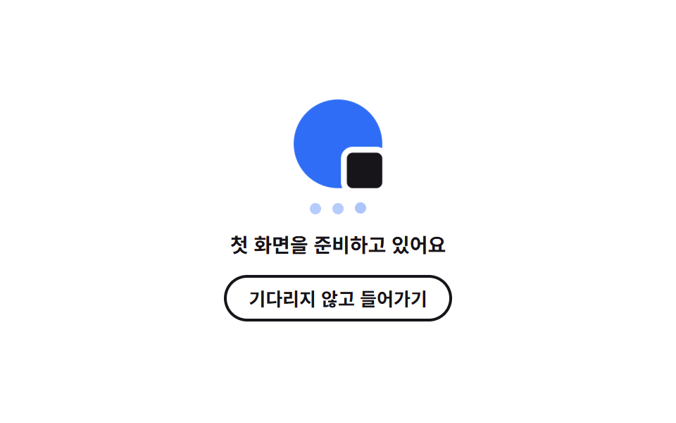
04Brand mark splash that breathes on the very first entry
A brand mark built from nothing but a circle and a square swells and shrinks with transform: scale, and three dots below hand the turn over with animation-delay to say it is still getting ready.
Best forThe first entry of a web app that must prepare a whole first screen like a native app
transform: scaleanimation-delayaria-live
<main class="stage">
  <section class="sp is-demo" id="sp" aria-label="First run splash">
    <div class="sp__mark" aria-hidden="true">
      <span class="sp__disc"></span>
      <span class="sp__box"></span>
    </div>
    <p class="sp__dots" aria-hidden="true">
      <span class="sp__dot"></span><span class="sp__dot"></span><span class="sp__dot"></span>
    </p>
    <p class="sp__msg" id="sp-msg" aria-live="polite">Getting your first screen ready</p>
    <button class="sp__enter" type="button" id="sp-enter">Go in without waiting</button>
  </section>
</main>
@use "../../../../site/static/demo-tokens" as *;
// 첫 진입 스플래시 — 동그라미와 사각형으로 만든 브랜드 마크가 transform: scale 로 천천히 부풀었다 줄고,
// 그 아래 점 셋이 animation-delay 로 차례를 넘긴다.
// 루프에서 스플래시가 걷히는 장면은 재현하지 않는다 — 퇴장 프레임이 대표 이미지로 뽑히면 빈 화면만 남는다.
// 걷히는 건 버튼을 눌러 .is-ready 가 붙었을 때뿐이다.
$duration: $dur-enter;
$easing: $ease-spring;
$color: $subject-blue;
@include stage($stage-paper);
.sp {
box-sizing: border-box;
display: grid;
justify-items: center;
gap: $sp-3;
width: min(272px, 92vw);
color: $subject-ink;
text-align: center;
}
.sp * { box-sizing: border-box; }
// ── 브랜드 마크: 아이콘이 아니라 도형 둘(원 + 사각형)의 조합이다 ──
.sp__mark {
position: relative;
width: 60px;
height: 60px;
transform: scale(1); // 정적 상태의 기준 크기 — 루프가 이 값을 흔든다
transition: transform $duration $easing; // 준비가 끝나면 부풀던 마크가 기준 크기로 내려앉는다
}
.sp__disc {
position: absolute;
inset: 0;
border-radius: 50%;
background: $color;
}
.sp__box {
position: absolute;
right: 0;
bottom: 0;
width: 24px;
height: 24px;
border-radius: $r-xs;
background: $subject-ink;
box-shadow: 0 0 0 4px $stage-paper; // 무대 색으로 테를 둘러 원과 떨어져 보이게
}
// ── 준비 중 표시: 점 셋이 차례를 넘긴다 ──
.sp__dots {
display: flex;
gap: $sp-2;
margin: 0;
padding: 0;
}
.sp__dot {
width: 8px;
height: 8px;
border-radius: 50%;
background: $color;
opacity: .35; // 정적 상태에서도 점이 보인다
}
.sp__msg {
margin: 0;
font-size: 14px;
font-weight: 700;
line-height: 1.4;
}
.sp__enter {
margin: 0;
padding: $sp-2 $sp-4;
border: 2px solid $subject-ink;
border-radius: $r-pill;
background: none;
color: $subject-ink;
font-family: inherit;
font-size: 13px;
font-weight: 700;
line-height: 1;
cursor: pointer;
transition: transform $dur-instant $easing;
}
.sp__enter:focus-visible { outline: 2px solid $color; outline-offset: 2px; }
.sp__enter:active { transform: scale(.96); }
.sp__enter[disabled] { opacity: .4; cursor: default; }
// 준비가 끝난 상태 — 맥박도 점도 멈추고 마크만 남는다
.sp.is-ready .sp__dots { visibility: hidden; }
.sp.is-ready .sp__mark { transform: scale(1); }
// ── 격자 미리보기 전용 2초 루프 ──
@keyframes sp-breath {
0% { transform: scale(1); }
44% { transform: scale(1.1); }
88%, 100% { transform: scale(1); }
}
@keyframes sp-dot {
0%, 10% { transform: translateY(0); opacity: .35; }
22% { transform: translateY(-7px); opacity: 1; }
40%, 100% { transform: translateY(0); opacity: .35; }
}
.sp.is-demo {
.sp__mark {
animation-name: sp-breath;
animation-duration: $dur-loop;
animation-timing-function: $easing;
animation-iteration-count: infinite;
}
// 지연이 걸린 애니메이션은 backwards 가 없으면 첫 프레임에 기본 상태로 한 번 번쩍인다
.sp__dot {
animation-name: sp-dot;
animation-duration: $dur-loop;
animation-timing-function: $easing;
animation-iteration-count: infinite;
animation-fill-mode: backwards;
}
.sp__dot:nth-child(1) { animation-delay: 0ms; }
.sp__dot:nth-child(2) { animation-delay: 200ms; }
.sp__dot:nth-child(3) { animation-delay: 400ms; }
}
@media (max-width: 340px) {
.sp { gap: $sp-2; width: min(232px, 96vw); }
.sp__mark { width: 44px; height: 44px; }
.sp__box { width: 18px; height: 18px; }
.sp__dot { width: 6px; height: 6px; }
.sp__msg { font-size: 12px; }
.sp__enter { padding: $sp-1 $sp-3; font-size: 11px; }
}
@media (prefers-reduced-motion: reduce) {
.sp.is-demo .sp__mark,
.sp.is-demo .sp__dot { animation: none !important; }
// 움직임만 끄고 "준비 중" 이라는 결과 상태는 남긴다
.sp.is-demo .sp__mark { transform: scale(1) !important; }
.sp.is-demo .sp__dot { transform: none !important; opacity: .35 !important; }
.sp__mark,
.sp__enter { transition: none !important; }
}html, body {
margin: 0;
overflow: hidden;
}
.stage {
box-sizing: border-box;
min-height: 100vh;
display: grid;
place-items: center;
margin: 0;
background: #ffffff;
font-family: -apple-system, "Segoe UI", "Noto Sans KR", sans-serif;
padding: clamp(8px, 4vw, 24px);
}
.sp {
box-sizing: border-box;
display: grid;
justify-items: center;
gap: 12px;
width: min(272px, 92vw);
color: #17141a;
text-align: center;
}
.sp * {
box-sizing: border-box;
}
.sp__mark {
position: relative;
width: 60px;
height: 60px;
transform: scale(1);
transition: transform 600ms cubic-bezier(0.2, 0.8, 0.2, 1);
}
.sp__disc {
position: absolute;
inset: 0;
border-radius: 50%;
background: #2f6df6;
}
.sp__box {
position: absolute;
right: 0;
bottom: 0;
width: 24px;
height: 24px;
border-radius: 4px;
background: #17141a;
box-shadow: 0 0 0 4px #ffffff;
}
.sp__dots {
display: flex;
gap: 8px;
margin: 0;
padding: 0;
}
.sp__dot {
width: 8px;
height: 8px;
border-radius: 50%;
background: #2f6df6;
opacity: 0.35;
}
.sp__msg {
margin: 0;
font-size: 14px;
font-weight: 700;
line-height: 1.4;
}
.sp__enter {
margin: 0;
padding: 8px 16px;
border: 2px solid #17141a;
border-radius: 999px;
background: none;
color: #17141a;
font-family: inherit;
font-size: 13px;
font-weight: 700;
line-height: 1;
cursor: pointer;
transition: transform 140ms cubic-bezier(0.2, 0.8, 0.2, 1);
}
.sp__enter:focus-visible {
outline: 2px solid #2f6df6;
outline-offset: 2px;
}
.sp__enter:active {
transform: scale(0.96);
}
.sp__enter[disabled] {
opacity: 0.4;
cursor: default;
}
.sp.is-ready .sp__dots {
visibility: hidden;
}
.sp.is-ready .sp__mark {
transform: scale(1);
}
@keyframes sp-breath {
0% {
transform: scale(1);
}
44% {
transform: scale(1.1);
}
88%, 100% {
transform: scale(1);
}
}
@keyframes sp-dot {
0%, 10% {
transform: translateY(0);
opacity: 0.35;
}
22% {
transform: translateY(-7px);
opacity: 1;
}
40%, 100% {
transform: translateY(0);
opacity: 0.35;
}
}
.sp.is-demo .sp__mark {
animation-name: sp-breath;
animation-duration: 2s;
animation-timing-function: cubic-bezier(0.2, 0.8, 0.2, 1);
animation-iteration-count: infinite;
}
.sp.is-demo .sp__dot {
animation-name: sp-dot;
animation-duration: 2s;
animation-timing-function: cubic-bezier(0.2, 0.8, 0.2, 1);
animation-iteration-count: infinite;
animation-fill-mode: backwards;
}
.sp.is-demo .sp__dot:nth-child(1) {
animation-delay: 0ms;
}
.sp.is-demo .sp__dot:nth-child(2) {
animation-delay: 200ms;
}
.sp.is-demo .sp__dot:nth-child(3) {
animation-delay: 400ms;
}
@media (max-width: 340px) {
.sp {
gap: 8px;
width: min(232px, 96vw);
}
.sp__mark {
width: 44px;
height: 44px;
}
.sp__box {
width: 18px;
height: 18px;
}
.sp__dot {
width: 6px;
height: 6px;
}
.sp__msg {
font-size: 12px;
}
.sp__enter {
padding: 4px 12px;
font-size: 11px;
}
}
@media (prefers-reduced-motion: reduce) {
.sp.is-demo .sp__mark,
.sp.is-demo .sp__dot {
animation: none !important;
}
.sp.is-demo .sp__mark {
transform: scale(1) !important;
}
.sp.is-demo .sp__dot {
transform: none !important;
opacity: 0.35 !important;
}
.sp__mark,
.sp__enter {
transition: none !important;
}
}// 스플래시: 준비가 끝나는 순간만 사람이 만든다. 루프는 마크의 맥박과 점 셋만 보여 준다.
var sp = document.getElementById('sp');
var spMsg = document.getElementById('sp-msg');
var spEnter = document.getElementById('sp-enter');
spEnter.addEventListener('click', function () {
sp.classList.remove('is-demo');
sp.classList.add('is-ready');
spMsg.textContent = 'All set';
spEnter.disabled = true;
});import { useState } from "react";
import type { CSSProperties } from "react";
import styles from "./LogoPulseSplash.module.scss";
export type LogoPulseSplashProps = {
/** 준비 중 안내 — aria-live="polite" 영역에 들어간다 */
message?: string;
/** 버튼을 눌러 준비가 끝났을 때의 안내 */
readyMessage?: string;
enterLabel?: string;
groupLabel?: string;
/** 격자 미리보기용 2초 자동 루프. 사람이 버튼을 누르면 꺼진다 */
demo?: boolean;
duration?: number;
easing?: string;
color?: string;
};
type Vars = CSSProperties & { "--duration"?: string; "--easing"?: string; "--color"?: string };
export default function LogoPulseSplash({
message = "Getting your first screen ready",
readyMessage = "All set",
enterLabel = "Go in without waiting",
groupLabel = "First run splash",
demo = true,
duration = 600,
easing = "cubic-bezier(.2,.8,.2,1)",
color = "#2f6df6",
}: LogoPulseSplashProps) {
const [ready, setReady] = useState(false);
const vars: Vars = { "--duration": `${duration}ms`, "--easing": easing, "--color": color };
// 루프는 마크의 맥박과 점 셋만 돈다 — 스플래시가 걷히는 장면은 사람이 버튼을 눌렀을 때만 일어난다
const cls = [styles.sp, demo && !ready ? styles.isDemo : "", ready ? styles.isReady : ""]
.filter(Boolean)
.join(" ");
return (
<section className={cls} style={vars} aria-label={groupLabel}>
<div className={styles.mark} aria-hidden="true">
<span className={styles.disc} />
<span className={styles.box} />
</div>
<p className={styles.dots} aria-hidden="true">
<span className={styles.dot} />
<span className={styles.dot} />
<span className={styles.dot} />
</p>
<p className={styles.msg} aria-live="polite">{ready ? readyMessage : message}</p>
<button className={styles.enter} type="button" disabled={ready} onClick={() => setReady(true)}>
{enterLabel}
</button>
</section>
);
}04 Brand mark splash that breathes on the very first entry — Measured area 0.917% · moving frames 17/23Original by GODRICH · SCSS and React ship in the zip · Page Loading Animation CSS: 9 Route-Change Demos
The post this demo lives in
 Page Loading Animation CSS: 9 Route-Change DemosPage loading animation css is the feedback layer covering the moment one screen gives way to the next. The nine here are See all demos in this post
If you like this effect - similar demos
 Loaders01 Three-dot bounce — a basic indicator staggered by index9 Typing Indicator CSS Patterns (Chat UI)
 Loaders01 A Loader That Traces the Logo Outline at an Even Pace With a Glowing Pen TipLogo Loading Animation: 9 Progress-Driven Marks
 Loaders04 A Two Panel Curtain That Splits to Reveal the PageSplash Screen Animation: 9 Canvas Opening Scenes