02Polaroid stack gallery
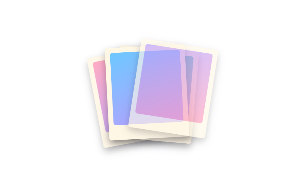
Four polaroid-style photos sit stacked at slightly different angles, and the top one slides aside and rotates away to reveal the next, cycling through the stack in order.
Best forA travel photo album you flip through one at a time, a review section that stacks customer photos with a scrapbook feel
rotate() 각도 오프셋z-index 스택transform 순환 키프레임
<main class="stage">
  <div class="stack is-demo" aria-label="A stack of polaroid photos you flip through" tabindex="0">
    <div class="polaroid polaroid--1"><span class="polaroid__photo polaroid__photo--a"></span></div>
    <div class="polaroid polaroid--2"><span class="polaroid__photo polaroid__photo--b"></span></div>
    <div class="polaroid polaroid--3"><span class="polaroid__photo polaroid__photo--c"></span></div>
    <div class="polaroid polaroid--4"><span class="polaroid__photo polaroid__photo--d"></span></div>
  </div>
</main>
@use "../../../../site/static/demo-tokens" as *;
$duration: $dur-loop; // 한 장이 물러났다 돌아오는 주기
$easing: $ease-spring;
$color: $subject-lilac; // 폴라로이드 사진 색 포인트
@include stage($stage-paper);
.stack {
position: relative;
width: 128px;
height: 148px;
outline: none;
}
.polaroid {
position: absolute;
inset: 0;
padding: $sp-2 $sp-2 $sp-6;
background: $subject-cream;
border-radius: $r-xs;
box-shadow: $shadow-press;
transform-origin: 50% 85%; // 규칙8: 폴라로이드 회전 피벗 아래축
}
.polaroid__photo {
display: block;
width: 100%;
height: 100%;
border-radius: $r-xs;
}
.polaroid__photo--a { background: linear-gradient(160deg, $subject-pink 0%, $color 100%); }
.polaroid__photo--b { background: linear-gradient(160deg, $subject-mint 0%, $color 100%); }
.polaroid__photo--c { background: linear-gradient(160deg, $subject-sky 0%, $color 100%); }
.polaroid__photo--d { background: linear-gradient(160deg, $color 0%, $subject-pink 100%); }
.polaroid--1 { transform: rotate(-8deg) translate(-6px, 4px); z-index: 1; }
.polaroid--2 { transform: rotate(5deg) translate(4px, 1px); z-index: 2; }
.polaroid--3 { transform: rotate(-3deg) translate(-2px, -2px); z-index: 3; }
.polaroid--4 { transform: rotate(2deg) translate(1px, -4px); z-index: 4; }
// 네 장이 차례로 살짝씩 밀려났다 제자리로 돌아온다 — 항상 한 장은 움직이는 중이라 스택이 계속 넘겨지는 것처럼 보인다
.stack.is-demo .polaroid--1 { animation: shuffle-1 $duration $easing infinite; }
.stack.is-demo .polaroid--2 { animation: shuffle-2 $duration $easing infinite; animation-delay: -0.5s; }
.stack.is-demo .polaroid--3 { animation: shuffle-3 $duration $easing infinite; animation-delay: -1s; }
.stack.is-demo .polaroid--4 { animation: shuffle-4 $duration $easing infinite; animation-delay: -1.5s; }
@keyframes shuffle-1 {
0%, 10%, 55%, 100% { transform: rotate(-8deg) translate(-6px, 4px); opacity: 1; }
30% { transform: rotate(-24deg) translate(-64px, -22px) scale(.94); opacity: .25; }
}
@keyframes shuffle-2 {
0%, 10%, 55%, 100% { transform: rotate(5deg) translate(4px, 1px); opacity: 1; }
30% { transform: rotate(20deg) translate(60px, -20px) scale(.94); opacity: .25; }
}
@keyframes shuffle-3 {
0%, 10%, 55%, 100% { transform: rotate(-3deg) translate(-2px, -2px); opacity: 1; }
30% { transform: rotate(-18deg) translate(-58px, -24px) scale(.94); opacity: .25; }
}
@keyframes shuffle-4 {
0%, 10%, 55%, 100% { transform: rotate(2deg) translate(1px, -4px); opacity: 1; }
30% { transform: rotate(16deg) translate(56px, -26px) scale(.94); opacity: .25; }
}
@media (prefers-reduced-motion: reduce) {
.stack.is-demo .polaroid--1,
.stack.is-demo .polaroid--2,
.stack.is-demo .polaroid--3,
.stack.is-demo .polaroid--4 { animation: none; }
}html, body {
margin: 0;
overflow: hidden;
}
.stage {
box-sizing: border-box;
min-height: 100vh;
display: grid;
place-items: center;
margin: 0;
background: #ffffff;
font-family: -apple-system, "Segoe UI", "Noto Sans KR", sans-serif;
padding: clamp(8px, 4vw, 24px);
}
.stack {
position: relative;
width: 128px;
height: 148px;
outline: none;
}
.polaroid {
position: absolute;
inset: 0;
padding: 8px 8px 24px;
background: #fff7e6;
border-radius: 4px;
box-shadow: 0 6px 12px rgba(23, 20, 26, 0.32);
transform-origin: 50% 85%;
}
.polaroid__photo {
display: block;
width: 100%;
height: 100%;
border-radius: 4px;
}
.polaroid__photo--a {
background: linear-gradient(160deg, #ff9ebb 0%, #b9a0ff 100%);
}
.polaroid__photo--b {
background: linear-gradient(160deg, #4cd4a6 0%, #b9a0ff 100%);
}
.polaroid__photo--c {
background: linear-gradient(160deg, #6ec8ff 0%, #b9a0ff 100%);
}
.polaroid__photo--d {
background: linear-gradient(160deg, #b9a0ff 0%, #ff9ebb 100%);
}
.polaroid--1 {
transform: rotate(-8deg) translate(-6px, 4px);
z-index: 1;
}
.polaroid--2 {
transform: rotate(5deg) translate(4px, 1px);
z-index: 2;
}
.polaroid--3 {
transform: rotate(-3deg) translate(-2px, -2px);
z-index: 3;
}
.polaroid--4 {
transform: rotate(2deg) translate(1px, -4px);
z-index: 4;
}
.stack.is-demo .polaroid--1 {
animation: shuffle-1 2s cubic-bezier(0.2, 0.8, 0.2, 1) infinite;
}
.stack.is-demo .polaroid--2 {
animation: shuffle-2 2s cubic-bezier(0.2, 0.8, 0.2, 1) infinite;
animation-delay: -0.5s;
}
.stack.is-demo .polaroid--3 {
animation: shuffle-3 2s cubic-bezier(0.2, 0.8, 0.2, 1) infinite;
animation-delay: -1s;
}
.stack.is-demo .polaroid--4 {
animation: shuffle-4 2s cubic-bezier(0.2, 0.8, 0.2, 1) infinite;
animation-delay: -1.5s;
}
@keyframes shuffle-1 {
0%, 10%, 55%, 100% {
transform: rotate(-8deg) translate(-6px, 4px);
opacity: 1;
}
30% {
transform: rotate(-24deg) translate(-64px, -22px) scale(0.94);
opacity: 0.25;
}
}
@keyframes shuffle-2 {
0%, 10%, 55%, 100% {
transform: rotate(5deg) translate(4px, 1px);
opacity: 1;
}
30% {
transform: rotate(20deg) translate(60px, -20px) scale(0.94);
opacity: 0.25;
}
}
@keyframes shuffle-3 {
0%, 10%, 55%, 100% {
transform: rotate(-3deg) translate(-2px, -2px);
opacity: 1;
}
30% {
transform: rotate(-18deg) translate(-58px, -24px) scale(0.94);
opacity: 0.25;
}
}
@keyframes shuffle-4 {
0%, 10%, 55%, 100% {
transform: rotate(2deg) translate(1px, -4px);
opacity: 1;
}
30% {
transform: rotate(16deg) translate(56px, -26px) scale(0.94);
opacity: 0.25;
}
}
@media (prefers-reduced-motion: reduce) {
.stack.is-demo .polaroid--1,
.stack.is-demo .polaroid--2,
.stack.is-demo .polaroid--3,
.stack.is-demo .polaroid--4 {
animation: none;
}
}import type { CSSProperties } from "react";
import styles from "./PolaroidStack.module.scss";
export type PolaroidStackProps = {
/** 한 장이 물러났다 돌아오는 주기 (기본 2000ms) */
duration?: number;
easing?: string;
/** 사진 색 포인트 */
color?: string;
};
type Vars = CSSProperties & { "--duration"?: string; "--easing"?: string; "--color"?: string };
/** 네 장이 차례로 살짝씩 밀려났다 제자리로 돌아와, 스택이 계속 넘겨지는 것처럼 보인다 */
export default function PolaroidStack({
duration = 2000,
easing = "cubic-bezier(.2,.8,.2,1)",
color = "#b9a0ff",
}: PolaroidStackProps) {
const vars: Vars = { "--duration": `${duration}ms`, "--easing": easing, "--color": color };
return (
<div className={styles.stack} style={vars} tabIndex={0} aria-label="A stack of polaroid photos you flip through">
<div className={`${styles.polaroid} ${styles.p1}`}><span className={`${styles.photo} ${styles.photoA}`} /></div>
<div className={`${styles.polaroid} ${styles.p2}`}><span className={`${styles.photo} ${styles.photoB}`} /></div>
<div className={`${styles.polaroid} ${styles.p3}`}><span className={`${styles.photo} ${styles.photoC}`} /></div>
<div className={`${styles.polaroid} ${styles.p4}`}><span className={`${styles.photo} ${styles.photoD}`} /></div>
</div>
);
}02 Polaroid stack gallery — Measured area 29.485% · moving frames 23/23Original by GODRICH · SCSS and React ship in the zip · Portfolio Gallery HTML CSS: 9 UI Patterns
The post this demo lives in
 Portfolio Gallery HTML CSS: 9 UI PatternsA portfolio gallery html css layout arranges photos in a grid that zooms, filters, or morphs into a single view on hover See all demos in this post