02Metal dial CTA
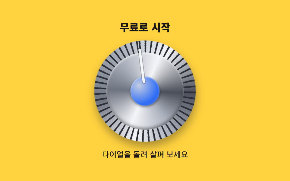
The metal dial turns 32 degrees each way, so the conic-gradient highlight streams across its face while the rim notches and pointer follow along.
Best forHero CTAs on product landings, dial-style conversion buttons
conic-gradient노치 테두리왕복 회전
<main class="stage">
  <section class="metaldial">
    <p class="metaldial__label">Start free</p>
    <button class="metaldial__dial" type="button" aria-label="Start free">
      <span class="metaldial__rim" aria-hidden="true"></span>
      <span class="metaldial__face" aria-hidden="true"></span>
      <span class="metaldial__cap" aria-hidden="true"></span>
      <span class="metaldial__pointer" aria-hidden="true"></span>
    </button>
    <p class="metaldial__hint">Turn the dial to explore</p>
  </section>
</main>
@use "../../../../site/static/demo-tokens" as *;
// 스큐어모픽 금속 다이얼 — conic-gradient 음영이 회전과 함께 흘러 표면이 금속으로 보인다.
$metal-hi: #f4f5f8; // 가장 밝은 하이라이트
$metal-mid: #aab0bc; // 중간 톤
$metal-lo: #6f7481; // 어두운 톤
$metal-edge: #4b4f59; // 테두리
$knurl: #2c2f36; // 테두리 노치 (깎인 홈)
$duration: $dur-loop; // 좌우로 한 번 도는 주기
$easing: $ease-spring; // 물리 다이얼은 끝에서 살짝 돌아온다
$color: $metal-hi;
@include stage($stage-yellow);
.metaldial {
display: flex;
flex-direction: column;
align-items: center;
gap: $sp-3;
}
.metaldial__label {
margin: 0;
color: $subject-ink;
font-weight: 800; font-size: clamp(14px, 3.6vw, 18px); line-height: 1.2;
font-family: inherit;
}
// 다이얼 = CTA 버튼. 원반이 통째로 돌아야 음영이 표면을 흐른다
.metaldial__dial {
position: relative;
width: clamp(120px, 38vw, 168px);
aspect-ratio: 1;
border: 0;
border-radius: 50%;
padding: 0;
cursor: pointer;
background: transparent;
animation: dialSwing $duration $easing infinite;
}
.metaldial__dial:focus-visible {
outline: 3px solid $subject-blue;
outline-offset: 4px;
}
// 바깥 테두리 — 노치(knurl): 반복 conic 어두운 눈금을 금속 링 위에 깎는다
.metaldial__rim {
position: absolute;
top: 0; left: 0; right: 0; bottom: 0;
border-radius: 50%;
background:
repeating-conic-gradient(from 0deg, $knurl 0deg 2deg, transparent 2deg 7deg) padding-box,
conic-gradient(from 200deg, $metal-hi, $metal-lo 18%, $metal-mid 38%, $metal-hi 55%, $metal-edge 72%, $metal-mid 88%, $metal-hi);
box-shadow: 0 8px 14px rgba(23, 20, 26, .35);
}
// 다이얼 면 — conic 음영 4계절. 이 면이 돌면 하이라이트가 표면을 흐른다
.metaldial__face {
position: absolute;
top: 12%; left: 12%; right: 12%; bottom: 12%;
border-radius: 50%;
background:
conic-gradient(from 210deg,
$metal-hi 0deg, $metal-lo 70deg, $metal-mid 120deg,
$metal-hi 180deg, $metal-edge 250deg, $metal-mid 300deg, $metal-hi 360deg);
box-shadow: inset 0 2px 3px rgba(255, 255, 255, .65), inset 0 -3px 5px rgba(0, 0, 0, .4);
}
// 중앙 캡 — 파란 인레이. 정지 축 역할
.metaldial__cap {
position: absolute;
top: 36%; left: 36%; right: 36%; bottom: 36%;
border-radius: 50%;
background: radial-gradient(120% 120% at 32% 28%, #c4cde2, $subject-blue 55%, #5d74af);
box-shadow: inset 0 1px 2px rgba(255, 255, 255, .5), 0 2px 4px rgba(0, 0, 0, .45);
}
// 지침 — 캡에서 바깥으로 뻗는 밝은 선. 방향을 가리킨다
.metaldial__pointer {
position: absolute;
top: 8%; left: calc(50% - 2px);
width: 4px;
height: 34%;
border-radius: $r-pill;
background: $metal-hi;
box-shadow: 0 0 0 1px rgba(0, 0, 0, .25);
}
.metaldial__hint {
margin: 0;
color: $subject-ink;
font-weight: 500; font-size: clamp(11px, 2.8vw, 13px); line-height: 1.4;
font-family: inherit;
}
// 32도씩 왕복 — conic 하이라이트가 면을 흘러 다니고 노치·지침이 함께 돈다
@keyframes dialSwing {
0%, 6% { transform: rotate(-32deg); }
48%, 56% { transform: rotate(32deg); }
94%, 100% { transform: rotate(-32deg); }
}
@media (max-width: 340px), (max-height: 220px) {
.metaldial { gap: $sp-2; }
.metaldial__label { font-size: 13px; }
.metaldial__hint { display: none; }
}
@media (prefers-reduced-motion: reduce) {
.metaldial__dial { animation: none !important; transform: none; }
}html, body {
margin: 0;
overflow: hidden;
}
.stage {
box-sizing: border-box;
min-height: 100vh;
display: grid;
place-items: center;
margin: 0;
background: #ffd23f;
font-family: -apple-system, "Segoe UI", "Noto Sans KR", sans-serif;
padding: clamp(8px, 4vw, 24px);
}
.metaldial {
display: flex;
flex-direction: column;
align-items: center;
gap: 12px;
}
.metaldial__label {
margin: 0;
color: #17141a;
font-weight: 800;
font-size: clamp(14px, 3.6vw, 18px);
line-height: 1.2;
font-family: inherit;
}
.metaldial__dial {
position: relative;
width: clamp(120px, 38vw, 168px);
aspect-ratio: 1;
border: 0;
border-radius: 50%;
padding: 0;
cursor: pointer;
background: transparent;
animation: dialSwing 2s cubic-bezier(0.2, 0.8, 0.2, 1) infinite;
}
.metaldial__dial:focus-visible {
outline: 3px solid #2f6df6;
outline-offset: 4px;
}
.metaldial__rim {
position: absolute;
top: 0;
left: 0;
right: 0;
bottom: 0;
border-radius: 50%;
background: repeating-conic-gradient(from 0deg, #2c2f36 0deg 2deg, transparent 2deg 7deg) padding-box, conic-gradient(from 200deg, #f4f5f8, #6f7481 18%, #aab0bc 38%, #f4f5f8 55%, #4b4f59 72%, #aab0bc 88%, #f4f5f8);
box-shadow: 0 8px 14px rgba(23, 20, 26, 0.35);
}
.metaldial__face {
position: absolute;
top: 12%;
left: 12%;
right: 12%;
bottom: 12%;
border-radius: 50%;
background: conic-gradient(from 210deg, #f4f5f8 0deg, #6f7481 70deg, #aab0bc 120deg, #f4f5f8 180deg, #4b4f59 250deg, #aab0bc 300deg, #f4f5f8 360deg);
box-shadow: inset 0 2px 3px rgba(255, 255, 255, 0.65), inset 0 -3px 5px rgba(0, 0, 0, 0.4);
}
.metaldial__cap {
position: absolute;
top: 36%;
left: 36%;
right: 36%;
bottom: 36%;
border-radius: 50%;
background: radial-gradient(120% 120% at 32% 28%, #c4cde2, #2f6df6 55%, #5d74af);
box-shadow: inset 0 1px 2px rgba(255, 255, 255, 0.5), 0 2px 4px rgba(0, 0, 0, 0.45);
}
.metaldial__pointer {
position: absolute;
top: 8%;
left: calc(50% - 2px);
width: 4px;
height: 34%;
border-radius: 999px;
background: #f4f5f8;
box-shadow: 0 0 0 1px rgba(0, 0, 0, 0.25);
}
.metaldial__hint {
margin: 0;
color: #17141a;
font-weight: 500;
font-size: clamp(11px, 2.8vw, 13px);
line-height: 1.4;
font-family: inherit;
}
@keyframes dialSwing {
0%, 6% {
transform: rotate(-32deg);
}
48%, 56% {
transform: rotate(32deg);
}
94%, 100% {
transform: rotate(-32deg);
}
}
@media (max-width: 340px), (max-height: 220px) {
.metaldial {
gap: 8px;
}
.metaldial__label {
font-size: 13px;
}
.metaldial__hint {
display: none;
}
}
@media (prefers-reduced-motion: reduce) {
.metaldial__dial {
animation: none !important;
transform: none;
}
}import type { CSSProperties } from "react";
import styles from "./MetalDialCta.module.scss";
export type MetalDialCtaProps = {
label?: string;
hint?: string;
/** 한 주기(기본 2000ms) */
duration?: number;
easing?: string;
color?: string;
};
type Vars = CSSProperties & { "--duration"?: string; "--easing"?: string; "--color"?: string };
export default function MetalDialCta({
label = "무료로 시작",
hint = "다이얼을 돌려 살펴 보세요",
duration = 2000,
easing = "cubic-bezier(.2, .8, .2, 1)",
color = "#f4f5f8",
}: MetalDialCtaProps) {
const vars: Vars = { "--duration": `${duration}ms`, "--easing": easing, "--color": color };
return (
<section className={styles.metaldial} style={vars}>
<p className={styles.label}>{label}</p>
<button type="button" className={styles.dial} aria-label={label}>
<span className={styles.rim} aria-hidden="true" />
<span className={styles.face} aria-hidden="true" />
<span className={styles.cap} aria-hidden="true" />
<span className={styles.pointer} aria-hidden="true" />
</button>
<p className={styles.hint}>{hint}</p>
</section>
);
}02 Metal dial CTA — Measured area 17.386% · moving frames 18/23Original by GODRICH · SCSS and React ship in the zip · Skeuomorphism Design Kit: 9 Tactile Landing Parts
The post this demo lives in
 Skeuomorphism Design Kit: 9 Tactile Landing PartsSkeuomorphism design brings the feel of real materials — leather, metal, wood, glass — onto the screen. This kit rebuild See all demos in this post