04Volume knob widget
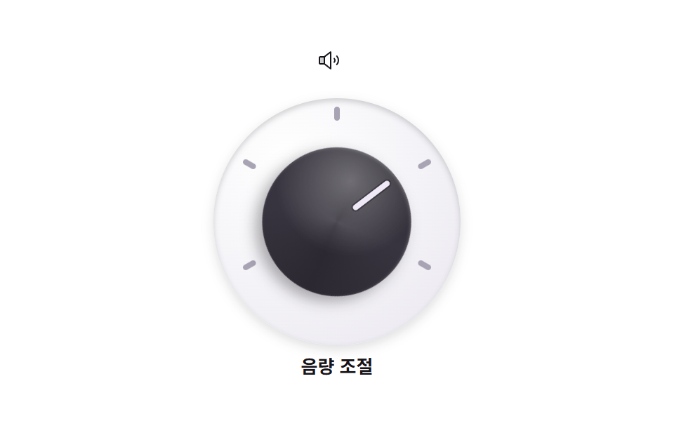
The volume knob sweeps 120 degrees each way from the low tick to the high one, its pale pointer line travelling across the dial marks.
Best forAudio and video player setting widgets
rotate 왕복지침 선radius 50%
<main class="stage">
  <section class="volknob" aria-label="Volume knob">
    <span class="volknob__icon" aria-hidden="true">
      <svg xmlns="http://www.w3.org/2000/svg" width="1em" height="1em" viewBox="0 0 256 256"><g fill="currentColor"><path d="M80 88v80H32a8 8 0 0 1-8-8V96a8 8 0 0 1 8-8Z" opacity=".2"/><path d="M155.51 24.81a8 8 0 0 0-8.42.88L77.25 80H32a16 16 0 0 0-16 16v64a16 16 0 0 0 16 16h45.25l69.84 54.31A8 8 0 0 0 160 224V32a8 8 0 0 0-4.49-7.19M32 96h40v64H32Zm112 111.64l-56-43.55V91.91l56-43.55Zm54-106.08a40 40 0 0 1 0 52.88a8 8 0 0 1-12-10.58a24 24 0 0 0 0-31.72a8 8 0 0 1 12-10.58M248 128a79.9 79.9 0 0 1-20.37 53.34a8 8 0 0 1-11.92-10.67a64 64 0 0 0 0-85.33a8 8 0 1 1 11.92-10.67A79.83 79.83 0 0 1 248 128"/></g></svg>
    </span>
    <div class="volknob__panel">
      <span class="volknob__tick volknob__tick--1" aria-hidden="true"></span>
      <span class="volknob__tick volknob__tick--2" aria-hidden="true"></span>
      <span class="volknob__tick volknob__tick--3" aria-hidden="true"></span>
      <span class="volknob__tick volknob__tick--4" aria-hidden="true"></span>
      <span class="volknob__tick volknob__tick--5" aria-hidden="true"></span>
      <div class="volknob__knob">
        <span class="volknob__needle" aria-hidden="true"></span>
      </div>
    </div>
    <p class="volknob__label">Volume</p>
  </section>
</main>
@use "../../../../site/static/demo-tokens" as *;
// 스큐어모픽 볼륨 노브 — 어두운 몸통에 밝은 지침. 몸통이 돌면 위 하이라이트 대비로 회전이 읽힌다
$knob-body: #2b2831; // 노브 몸통
$knob-face: #38343f; // 노브 윗면
$knob-line: #efe8f7; // 지침 선 (밝게)
$panel-bg: #eceaf1; // 눈금 판
$duration: $dur-loop; // 최소 → 최대 → 최소 한 주기
$easing: $ease-out; // 손을 떼면 감속하며 멈춘다
$color: $knob-body;
@include stage($stage-paper);
.volknob {
display: flex;
flex-direction: column;
align-items: center;
gap: $sp-2;
}
.volknob__icon {
width: 28px;
height: 28px;
color: $subject-ink;
}
// 눈금 판 — 눈금 다섯 개를 원주 위에 미리 돌려 놓는다 (정적)
.volknob__panel {
position: relative;
width: clamp(132px, 42vw, 176px);
aspect-ratio: 1;
border-radius: 50%;
background: radial-gradient(130% 130% at 30% 24%, #ffffff, $panel-bg 70%);
box-shadow: inset 0 2px 4px rgba(23, 20, 26, .18), 0 3px 8px rgba(23, 20, 26, .14);
}
.volknob__tick {
position: absolute;
top: 6px; left: calc(50% - 2px);
width: 4px;
height: 10px;
border-radius: $r-pill;
background: #a9a4b4;
transform-origin: 50% calc(clamp(66px, 21vw, 88px) - 11px); // 패널 중심까지 = 반지름 - 눈금 중심 y
}
.volknob__tick--1 { transform: rotate(-120deg); }
.volknob__tick--2 { transform: rotate(-60deg); }
.volknob__tick--3 { transform: rotate(0deg); }
.volknob__tick--4 { transform: rotate(60deg); }
.volknob__tick--5 { transform: rotate(120deg); }
// 노브 몸통 — 도는 주인공. 윗면 그라디언트가 살짝 비스듬해 회전이 읽힌다
.volknob__knob {
position: absolute;
top: 20%; left: 20%; right: 20%; bottom: 20%;
border-radius: 50%;
background:
radial-gradient(120% 120% at 34% 26%, rgba(255, 255, 255, .32), transparent 42%),
conic-gradient(from 250deg, $knob-face, $knob-body 90deg, $knob-face 170deg, $knob-body 260deg, $knob-face 340deg);
box-shadow: 0 6px 10px rgba(23, 20, 26, .35), inset 0 1px 2px rgba(255, 255, 255, .22);
animation: knobSweep $duration $easing infinite;
}
.volknob__knob:focus-visible {
outline: 3px solid $subject-blue;
outline-offset: 3px;
}
// 지침 선 — 노브 안에서 위로 뻗는다
.volknob__needle {
position: absolute;
top: 6%; left: calc(50% - 2px);
width: 4px;
height: 30%;
border-radius: $r-pill;
background: $knob-line;
box-shadow: 0 0 0 1px rgba(0, 0, 0, .3);
}
.volknob__label {
margin: 0;
color: $subject-ink;
font-weight: 700; font-size: clamp(11px, 2.8vw, 13px); line-height: 1;
font-family: inherit;
}
// 최소 눈금(-120도) 에서 최대(+120도) 까지 돌고 돌아온다 — 양 끝에서 잠시 멈춘다
@keyframes knobSweep {
0%, 8% { transform: rotate(-120deg); }
46%, 56% { transform: rotate(120deg); }
92%, 100% { transform: rotate(-120deg); }
}
@media (max-width: 340px), (max-height: 220px) {
.volknob__icon { width: 20px; height: 20px; }
.volknob__label { display: none; }
}
@media (prefers-reduced-motion: reduce) {
.volknob__knob { animation: none !important; transform: none; }
}html, body {
margin: 0;
overflow: hidden;
}
.stage {
box-sizing: border-box;
min-height: 100vh;
display: grid;
place-items: center;
margin: 0;
background: #ffffff;
font-family: -apple-system, "Segoe UI", "Noto Sans KR", sans-serif;
padding: clamp(8px, 4vw, 24px);
}
.volknob {
display: flex;
flex-direction: column;
align-items: center;
gap: 8px;
}
.volknob__icon {
width: 28px;
height: 28px;
color: #17141a;
}
.volknob__panel {
position: relative;
width: clamp(132px, 42vw, 176px);
aspect-ratio: 1;
border-radius: 50%;
background: radial-gradient(130% 130% at 30% 24%, #ffffff, #eceaf1 70%);
box-shadow: inset 0 2px 4px rgba(23, 20, 26, 0.18), 0 3px 8px rgba(23, 20, 26, 0.14);
}
.volknob__tick {
position: absolute;
top: 6px;
left: calc(50% - 2px);
width: 4px;
height: 10px;
border-radius: 999px;
background: #a9a4b4;
transform-origin: 50% calc(clamp(66px, 21vw, 88px) - 11px);
}
.volknob__tick--1 {
transform: rotate(-120deg);
}
.volknob__tick--2 {
transform: rotate(-60deg);
}
.volknob__tick--3 {
transform: rotate(0deg);
}
.volknob__tick--4 {
transform: rotate(60deg);
}
.volknob__tick--5 {
transform: rotate(120deg);
}
.volknob__knob {
position: absolute;
top: 20%;
left: 20%;
right: 20%;
bottom: 20%;
border-radius: 50%;
background: radial-gradient(120% 120% at 34% 26%, rgba(255, 255, 255, 0.32), transparent 42%), conic-gradient(from 250deg, #38343f, #2b2831 90deg, #38343f 170deg, #2b2831 260deg, #38343f 340deg);
box-shadow: 0 6px 10px rgba(23, 20, 26, 0.35), inset 0 1px 2px rgba(255, 255, 255, 0.22);
animation: knobSweep 2s ease-out infinite;
}
.volknob__knob:focus-visible {
outline: 3px solid #2f6df6;
outline-offset: 3px;
}
.volknob__needle {
position: absolute;
top: 6%;
left: calc(50% - 2px);
width: 4px;
height: 30%;
border-radius: 999px;
background: #efe8f7;
box-shadow: 0 0 0 1px rgba(0, 0, 0, 0.3);
}
.volknob__label {
margin: 0;
color: #17141a;
font-weight: 700;
font-size: clamp(11px, 2.8vw, 13px);
line-height: 1;
font-family: inherit;
}
@keyframes knobSweep {
0%, 8% {
transform: rotate(-120deg);
}
46%, 56% {
transform: rotate(120deg);
}
92%, 100% {
transform: rotate(-120deg);
}
}
@media (max-width: 340px), (max-height: 220px) {
.volknob__icon {
width: 20px;
height: 20px;
}
.volknob__label {
display: none;
}
}
@media (prefers-reduced-motion: reduce) {
.volknob__knob {
animation: none !important;
transform: none;
}
}import type { CSSProperties } from "react";
import styles from "./VolumeKnob.module.scss";
export type VolumeKnobProps = {
label?: string;
/** 스크린리더용 섹션 이름 (기본 "볼륨 노브") */
ariaLabel?: string;
/** 한 주기(기본 2000ms) */
duration?: number;
easing?: string;
color?: string;
};
type Vars = CSSProperties & { "--duration"?: string; "--easing"?: string; "--color"?: string };
export default function VolumeKnob({
label = "음량 조절",
ariaLabel = "볼륨 노브",
duration = 2000,
easing = "ease-out",
color = "#2b2831",
}: VolumeKnobProps) {
const vars: Vars = { "--duration": `${duration}ms`, "--easing": easing, "--color": color };
return (
<section className={styles.volknob} style={vars} aria-label={ariaLabel}>
<span className={styles.icon} aria-hidden="true">
<svg xmlns="http://www.w3.org/2000/svg" width="1em" height="1em" viewBox="0 0 256 256"><g fill="currentColor"><path d="M80 88v80H32a8 8 0 0 1-8-8V96a8 8 0 0 1 8-8Z" opacity=".2"/><path d="M155.51 24.81a8 8 0 0 0-8.42.88L77.25 80H32a16 16 0 0 0-16 16v64a16 16 0 0 0 16 16h45.25l69.84 54.31A8 8 0 0 0 160 224V32a8 8 0 0 0-4.49-7.19M32 96h40v64H32Zm112 111.64l-56-43.55V91.91l56-43.55Zm54-106.08a40 40 0 0 1 0 52.88a8 8 0 0 1-12-10.58a24 24 0 0 0 0-31.72a8 8 0 0 1 12-10.58M248 128a79.9 79.9 0 0 1-20.37 53.34a8 8 0 0 1-11.92-10.67a64 64 0 0 0 0-85.33a8 8 0 1 1 11.92-10.67A79.83 79.83 0 0 1 248 128"/></g></svg>
</span>
<div className={styles.panel}>
<span className={`${styles.tick} ${styles.tick1}`} aria-hidden="true" />
<span className={`${styles.tick} ${styles.tick2}`} aria-hidden="true" />
<span className={`${styles.tick} ${styles.tick3}`} aria-hidden="true" />
<span className={`${styles.tick} ${styles.tick4}`} aria-hidden="true" />
<span className={`${styles.tick} ${styles.tick5}`} aria-hidden="true" />
<div className={styles.knob}>
<span className={styles.needle} aria-hidden="true" />
</div>
</div>
<p className={styles.label}>{label}</p>
</section>
);
}04 Volume knob widget — Measured area 8.684% · moving frames 18/23Original by GODRICH · SCSS and React ship in the zip · Skeuomorphism Design Kit: 9 Tactile Landing Parts
The post this demo lives in
 Skeuomorphism Design Kit: 9 Tactile Landing PartsSkeuomorphism design brings the feel of real materials — leather, metal, wood, glass — onto the screen. This kit rebuild See all demos in this post