08Premium / verified badge flip
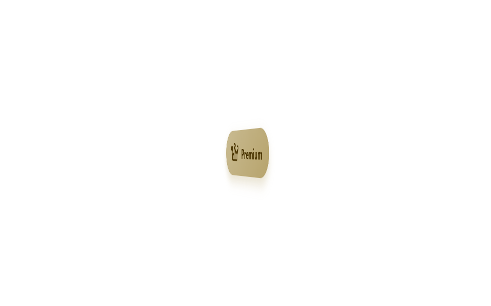
Instead of post 213's static SVG check badge that only pops with scale, this whole card does a 3D rotateY(0→180→360deg) spin to alternate between a gold 'Premium' face and a blue 'Verified' face, with backface-visibility: hidden keeping the reverse side from bleeding through.
Best forSeller or creator profile tier badges, paid-membership-only marks
rotateY 3D flipbackface-visibilityperspective
<main class="stage is-demo">
  <div class="flip" aria-label="Premium verified account">
    <div class="flip__inner">
      <div class="flip__face flip__face--front">
        <svg viewBox="0 0 256 256" width="26" height="26" aria-hidden="true"><g fill="currentColor"><path d="M216.71,99.73l-15.6,93.59a8,8,0,0,1-7.89,6.68H62.78a8,8,0,0,1-7.89-6.68L39.29,99.73l.08,0a19.82,19.82,0,0,0,9.22-4.16h0L88,144l32-73.65h0a20,20,0,0,0,15.92,0h0L168,144l39.39-48.48h0a19.82,19.82,0,0,0,9.22,4.16Z" opacity=".2"/><path d="M248,80a28,28,0,1,0-51.12,15.77l-26.79,33L146,73.4a28,28,0,1,0-36.06,0L85.91,128.74l-26.79-33a28,28,0,1,0-26.6,12L47,194.63A16,16,0,0,0,62.78,208H193.22A16,16,0,0,0,209,194.63l14.47-86.85A28,28,0,0,0,248,80ZM128,40a12,12,0,1,1-12,12A12,12,0,0,1,128,40ZM24,80A12,12,0,1,1,36,92,12,12,0,0,1,24,80ZM193.22,192H62.78L48.86,108.52,81.79,149A8,8,0,0,0,88,152a7.83,7.83,0,0,0,1.08-.07,8,8,0,0,0,6.26-4.74l29.3-67.4a27,27,0,0,0,6.72,0l29.3,67.4a8,8,0,0,0,6.26,4.74A7.83,7.83,0,0,0,168,152a8,8,0,0,0,6.21-3l32.93-40.52ZM220,92a12,12,0,1,1,12-12A12,12,0,0,1,220,92Z"/></g></svg>
        <span>Premium</span>
      </div>
      <div class="flip__face flip__face--back">
        <svg viewBox="0 0 256 256" width="26" height="26" aria-hidden="true"><g fill="currentColor"><path d="M216,56v56c0,96-88,120-88,120S40,208,40,112V56a8,8,0,0,1,8-8H208A8,8,0,0,1,216,56Z" opacity=".2"/><path d="M208,40H48A16,16,0,0,0,32,56v56c0,52.72,25.52,84.67,46.93,102.19,23.06,18.86,46,25.26,47,25.53a8,8,0,0,0,4.2,0c1-.27,23.91-6.67,47-25.53C198.48,196.67,224,164.72,224,112V56A16,16,0,0,0,208,40Zm0,72c0,37.07-13.66,67.16-40.6,89.42A129.3,129.3,0,0,1,128,223.62a128.25,128.25,0,0,1-38.92-21.81C61.82,179.51,48,149.3,48,112l0-56,160,0ZM82.34,141.66a8,8,0,0,1,11.32-11.32L112,148.69l50.34-50.35a8,8,0,0,1,11.32,11.32l-56,56a8,8,0,0,1-11.32,0Z"/></g></svg>
        <span>Verified</span>
      </div>
    </div>
  </div>
</main>
@use "../../../../site/static/demo-tokens" as *;
// ── 변수 3개 ──────────────────────────────────────────
$duration: $dur-loop; // 2s — 앞뒤 한 번씩 뒤집는 한 주기
$easing: $ease-spring;
$color: #b7a46d; // 프리미엄 골드
@include stage($stage-paper);
.flip {
width: 128px; height: 46px;
perspective: 600px;
}
.flip__inner {
position: relative;
width: 100%; height: 100%;
transform-style: preserve-3d;
transform: rotateY(0deg);
}
// 213-03(SVG stroke-dashoffset 그리기)과 다른 메커니즘 — 카드 자체가 rotateY 로 뒤집힌다
.flip__face {
position: absolute; inset: 0;
display: flex; align-items: center; justify-content: center; gap: $sp-2;
border-radius: $r-pill;
backface-visibility: hidden;
font-family: -apple-system, "Segoe UI", "Noto Sans KR", sans-serif;
font-weight: 700;
font-size: 14px;
box-shadow: $shadow-press;
}
.flip__face--front {
background: linear-gradient(135deg, mix(#fff, $color, 25%), $color);
color: #4a3400;
}
.flip__face--back {
background: linear-gradient(135deg, mix(#fff, $subject-blue, 20%), $subject-blue);
color: #fff;
transform: rotateY(180deg);
}
.stage.is-demo .flip__inner {
animation: flip $duration $easing infinite;
}
@keyframes flip {
0%, 40% { transform: rotateY(0deg); }
55%, 85% { transform: rotateY(180deg); }
100% { transform: rotateY(360deg); }
}
// ── 한 겹: 플립 뒤집힘(55~85%) 구간 앞면 box-shadow 색 전이 ──
// blur/spread 는 $shadow-press 그대로, 색만 골드 → 스카이 파스텔 로 (레이아아웃 불변)
.stage.is-demo .flip__face--front {
animation: face-glow $duration $easing infinite;
}
@keyframes face-glow {
0%, 50% { box-shadow: 0 6px 12px rgba(#b7a46d, .32); }
62% { box-shadow: 0 6px 12px rgba($subject-sky, .38); }
85%, 100% { box-shadow: 0 6px 12px rgba(#b7a46d, .32); }
}
@media (prefers-reduced-motion: reduce) {
.stage.is-demo .flip__inner { animation: none; }
.stage.is-demo .flip__face--front { animation: none; }
}html, body {
margin: 0;
overflow: hidden;
}
.stage {
box-sizing: border-box;
min-height: 100vh;
display: grid;
place-items: center;
margin: 0;
background: #ffffff;
font-family: -apple-system, "Segoe UI", "Noto Sans KR", sans-serif;
padding: clamp(8px, 4vw, 24px);
}
.flip {
width: 128px;
height: 46px;
perspective: 600px;
}
.flip__inner {
position: relative;
width: 100%;
height: 100%;
transform-style: preserve-3d;
transform: rotateY(0deg);
}
.flip__face {
position: absolute;
inset: 0;
display: flex;
align-items: center;
justify-content: center;
gap: 8px;
border-radius: 999px;
backface-visibility: hidden;
font-family: -apple-system, "Segoe UI", "Noto Sans KR", sans-serif;
font-weight: 700;
font-size: 14px;
box-shadow: 0 6px 12px rgba(23, 20, 26, 0.32);
}
.flip__face--front {
background: linear-gradient(135deg, rgb(78.8235294118%, 73.2352941176%, 57.0588235294%), #b7a46d);
color: #4a3400;
}
.flip__face--back {
background: linear-gradient(135deg, rgb(34.7450980392%, 54.1960784314%, 97.1764705882%), #2f6df6);
color: #fff;
transform: rotateY(180deg);
}
.stage.is-demo .flip__inner {
animation: flip 2s cubic-bezier(0.2, 0.8, 0.2, 1) infinite;
}
@keyframes flip {
0%, 40% {
transform: rotateY(0deg);
}
55%, 85% {
transform: rotateY(180deg);
}
100% {
transform: rotateY(360deg);
}
}
.stage.is-demo .flip__face--front {
animation: face-glow 2s cubic-bezier(0.2, 0.8, 0.2, 1) infinite;
}
@keyframes face-glow {
0%, 50% {
box-shadow: 0 6px 12px rgba(183, 164, 109, 0.32);
}
62% {
box-shadow: 0 6px 12px rgba(110, 200, 255, 0.38);
}
85%, 100% {
box-shadow: 0 6px 12px rgba(183, 164, 109, 0.32);
}
}
@media (prefers-reduced-motion: reduce) {
.stage.is-demo .flip__inner {
animation: none;
}
.stage.is-demo .flip__face--front {
animation: none;
}
}import type { CSSProperties } from "react";
import styles from "./PremiumVerifiedBadgeFlip.module.scss";
export type PremiumVerifiedBadgeFlipProps = {
duration?: number;
easing?: string;
color?: string;
};
export default function PremiumVerifiedBadgeFlip({
duration = 2000,
easing = "cubic-bezier(.2,.8,.2,1)",
color = "#d4a418",
}: PremiumVerifiedBadgeFlipProps) {
const vars: CSSProperties = { "--duration": `${duration}ms`, "--easing": easing, "--color": color } as CSSProperties;
return (
<div className={styles.flip} style={vars} aria-label="premium verified account">
<div className={styles.inner}>
<div className={`${styles.face} ${styles.front}`}>
<svg viewBox="0 0 256 256" width={26} height={26} aria-hidden="true">
<g fill="currentColor">
<path d="M216.71,99.73l-15.6,93.59a8,8,0,0,1-7.89,6.68H62.78a8,8,0,0,1-7.89-6.68L39.29,99.73l.08,0a19.82,19.82,0,0,0,9.22-4.16h0L88,144l32-73.65h0a20,20,0,0,0,15.92,0h0L168,144l39.39-48.48h0a19.82,19.82,0,0,0,9.22,4.16Z" opacity=".2" />
<path d="M248,80a28,28,0,1,0-51.12,15.77l-26.79,33L146,73.4a28,28,0,1,0-36.06,0L85.91,128.74l-26.79-33a28,28,0,1,0-26.6,12L47,194.63A16,16,0,0,0,62.78,208H193.22A16,16,0,0,0,209,194.63l14.47-86.85A28,28,0,0,0,248,80ZM128,40a12,12,0,1,1-12,12A12,12,0,0,1,128,40ZM24,80A12,12,0,1,1,36,92,12,12,0,0,1,24,80ZM193.22,192H62.78L48.86,108.52,81.79,149A8,8,0,0,0,88,152a7.83,7.83,0,0,0,1.08-.07,8,8,0,0,0,6.26-4.74l29.3-67.4a27,27,0,0,0,6.72,0l29.3,67.4a8,8,0,0,0,6.26,4.74A7.83,7.83,0,0,0,168,152a8,8,0,0,0,6.21-3l32.93-40.52ZM220,92a12,12,0,1,1,12-12A12,12,0,0,1,220,92Z" />
</g>
</svg>
<span>Premium</span>
</div>
<div className={`${styles.face} ${styles.back}`}>
<svg viewBox="0 0 256 256" width={26} height={26} aria-hidden="true">
<g fill="currentColor">
<path d="M216,56v56c0,96-88,120-88,120S40,208,40,112V56a8,8,0,0,1,8-8H208A8,8,0,0,1,216,56Z" opacity=".2" />
<path d="M208,40H48A16,16,0,0,0,32,56v56c0,52.72,25.52,84.67,46.93,102.19,23.06,18.86,46,25.26,47,25.53a8,8,0,0,0,4.2,0c1-.27,23.91-6.67,47-25.53C198.48,196.67,224,164.72,224,112V56A16,16,0,0,0,208,40Zm0,72c0,37.07-13.66,67.16-40.6,89.42A129.3,129.3,0,0,1,128,223.62a128.25,128.25,0,0,1-38.92-21.81C61.82,179.51,48,149.3,48,112l0-56,160,0ZM82.34,141.66a8,8,0,0,1,11.32-11.32L112,148.69l50.34-50.35a8,8,0,0,1,11.32,11.32l-56,56a8,8,0,0,1-11.32,0Z" />
</g>
</svg>
<span>Verified</span>
</div>
</div>
</div>
);
}08 Premium / verified badge flip — Measured area 4.885% · moving frames 7/23Original by GODRICH · SCSS and React ship in the zip · Status Badge Design UI — 9 CSS Ideas to Copy
The post this demo lives in
 Status Badge Design UI — 9 CSS Ideas to CopyThis status badge design ui roundup turns a small detail — one dot, one label — into instant feedback: online or away, u See all demos in this post