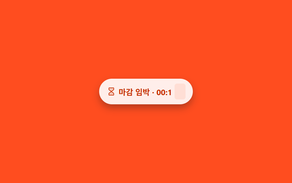
09Countdown expiry chip
Unlike post 213's stock bar (a scaleX drain), this chip stacks ten digits vertically and steps them one at a time via translateY(0→-9em) on a steps(10) easing, so it reads like a mechanical flip counter clicking through numbers.
Best forFlash-sale closing timers, limited-coupon or booking-expiry notices
translateY steps(10)@keyframes tickoverflow: hidden window
<main class="stage is-demo">
  <div class="chip" aria-label="Expires in 12 minutes">
    <svg viewBox="0 0 256 256" width="16" height="16" aria-hidden="true"><g fill="currentColor"><path d="M188.82,82,128,128,67.2,82.4A8,8,0,0,1,64,76V40a8,8,0,0,1,8-8H184a8,8,0,0,1,8,8V75.64A8,8,0,0,1,188.82,82ZM64,180v36a8,8,0,0,0,8,8H184a8,8,0,0,0,8-8V180.36a8,8,0,0,0-3.18-6.38L128,128,67.2,173.6A8,8,0,0,0,64,180Z" opacity=".2"/><path d="M200,75.64V40a16,16,0,0,0-16-16H72A16,16,0,0,0,56,40V76a16.07,16.07,0,0,0,6.4,12.8L114.67,128,62.4,167.2A16.07,16.07,0,0,0,56,180v36a16,16,0,0,0,16,16H184a16,16,0,0,0,16-16V180.36a16.09,16.09,0,0,0-6.35-12.77L141.27,128l52.38-39.59A16.09,16.09,0,0,0,200,75.64ZM184,216H72V180l56-42,56,42.35Zm0-140.36L128,118,72,76V40H184Z"/></g></svg>
    <span class="chip__label">Ends in 00:1</span>
    <span class="chip__digit" aria-hidden="true"><span class="chip__digit-track">
      <span>9</span><span>8</span><span>7</span><span>6</span><span>5</span><span>4</span><span>3</span><span>2</span><span>1</span><span>0</span>
    </span></span>
    <span class="sr-only">12 minutes left</span>
  </div>
</main>
@use "../../../../site/static/demo-tokens" as *;
// ── 변수 3개 ──────────────────────────────────────────
$duration: $dur-loop; // 2s — 숫자 10칸이 한 바퀴 도는 시간
$easing: steps(10);
$color: $stage-orange;
@include stage($stage-orange);
.chip {
display: inline-flex; align-items: center; gap: $sp-1;
padding: $sp-2 $sp-3;
border-radius: $r-pill;
overflow: hidden;
background: #fff;
color: $subject-orange-deep;
box-shadow: $shadow-press;
font-family: -apple-system, "Segoe UI", "Noto Sans KR", sans-serif;
font-weight: 700;
font-size: 13px;
white-space: nowrap;
}
.sr-only {
position: absolute; width: 1px; height: 1px;
padding: 0; margin: -1px; overflow: hidden;
clip: rect(0, 0, 0, 0); white-space: nowrap; border: 0;
}
// 초 자리만 플립 카운터처럼 세로로 넘어간다 — 213-08 의 scaleX 드레인 바와 다른 메커니즘
// 별도 고정 크기 박스라 주변 텍스트의 줄 높이와 섞이지 않는다
.chip__digit {
display: inline-flex; align-items: center; justify-content: center;
width: 18px; height: 26px;
overflow: hidden;
border-radius: $r-xs;
background: rgba($color, .1);
font-size: 19px;
flex: 0 0 auto;
}
.chip__digit-track {
display: flex;
flex-direction: column;
transform: translateY(0);
span {
display: block;
width: 18px; height: 26px;
line-height: 26px;
text-align: center;
// 트랙은 칩 밖(주황 무대) 위를 지나가므로 주황 면 위 글자 규칙대로 잉크로 — $subject-orange-deep 은 밝은 면 전용
color: $subject-ink;
}
}
.stage.is-demo .chip__digit-track {
animation: tick $duration $easing infinite;
}
@keyframes tick {
0% { transform: translateY(0); }
100% { transform: translateY(-260px); }
}
// ── 한 겹: 0 도달(주기 끝 92~100%) 레드→코럴 링 확산 + 칩 배경 색 전이 ──
// tick 의 steps(10) 와 달리 별도 keyframes — ease-out 으로 색만 움직인다
.chip { position: relative; }
.chip::after {
content: "";
position: absolute;
inset: -3px;
border-radius: $r-pill;
border: 2px solid rgba($stage-orange, .0);
transform: scale(.9);
pointer-events: none;
}
.stage.is-demo .chip {
animation: chip-expire $duration ease-out infinite;
}
.stage.is-demo .chip::after {
animation: expire-ring $duration ease-out infinite;
}
@keyframes chip-expire {
0%, 88% { background-color: #fff; }
94% { background-color: mix(#fff, $stage-orange, 88%); }
100% { background-color: #fff; }
}
@keyframes expire-ring {
0%, 88% { transform: scale(.9); opacity: 0; border-color: rgba($stage-orange, 0); }
92% { transform: scale(1); opacity: .8; border-color: rgba(mix(#ffb8a3, $stage-orange, 30%), .85); }
100% { transform: scale(1.12); opacity: 0; border-color: rgba(mix(#ffb8a3, $stage-orange, 30%), 0); }
}
@media (prefers-reduced-motion: reduce) {
.stage.is-demo .chip__digit-track { animation: none; }
.stage.is-demo .chip { animation: none; }
.stage.is-demo .chip::after { animation: none; opacity: 0; }
}html, body {
margin: 0;
overflow: hidden;
}
.stage {
box-sizing: border-box;
min-height: 100vh;
display: grid;
place-items: center;
margin: 0;
background: #ff4d1f;
font-family: -apple-system, "Segoe UI", "Noto Sans KR", sans-serif;
padding: clamp(8px, 4vw, 24px);
}
.chip {
display: inline-flex;
align-items: center;
gap: 4px;
padding: 8px 12px;
border-radius: 999px;
overflow: hidden;
background: #fff;
color: #c93000;
box-shadow: 0 6px 12px rgba(23, 20, 26, 0.32);
font-family: -apple-system, "Segoe UI", "Noto Sans KR", sans-serif;
font-weight: 700;
font-size: 13px;
white-space: nowrap;
}
.sr-only {
position: absolute;
width: 1px;
height: 1px;
padding: 0;
margin: -1px;
overflow: hidden;
clip: rect(0, 0, 0, 0);
white-space: nowrap;
border: 0;
}
.chip__digit {
display: inline-flex;
align-items: center;
justify-content: center;
width: 18px;
height: 26px;
overflow: hidden;
border-radius: 4px;
background: rgba(255, 77, 31, 0.1);
font-size: 19px;
flex: 0 0 auto;
}
.chip__digit-track {
display: flex;
flex-direction: column;
transform: translateY(0);
}
.chip__digit-track span {
display: block;
width: 18px;
height: 26px;
line-height: 26px;
text-align: center;
color: #17141a;
}
.stage.is-demo .chip__digit-track {
animation: tick 2s steps(10) infinite;
}
@keyframes tick {
0% {
transform: translateY(0);
}
100% {
transform: translateY(-260px);
}
}
.chip {
position: relative;
}
.chip::after {
content: "";
position: absolute;
inset: -3px;
border-radius: 999px;
border: 2px solid rgba(255, 77, 31, 0);
transform: scale(0.9);
pointer-events: none;
}
.stage.is-demo .chip {
animation: chip-expire 2s ease-out infinite;
}
.stage.is-demo .chip::after {
animation: expire-ring 2s ease-out infinite;
}
@keyframes chip-expire {
0%, 88% {
background-color: #fff;
}
94% {
background-color: rgb(100%, 91.6235294118%, 89.4588235294%);
}
100% {
background-color: #fff;
}
}
@keyframes expire-ring {
0%, 88% {
transform: scale(0.9);
opacity: 0;
border-color: rgba(255, 77, 31, 0);
}
92% {
transform: scale(1);
opacity: 0.8;
border-color: rgba(100%, 42.7843137255%, 27.6862745098%, 0.85);
}
100% {
transform: scale(1.12);
opacity: 0;
border-color: rgba(100%, 42.7843137255%, 27.6862745098%, 0);
}
}
@media (prefers-reduced-motion: reduce) {
.stage.is-demo .chip__digit-track {
animation: none;
}
.stage.is-demo .chip {
animation: none;
}
.stage.is-demo .chip::after {
animation: none;
opacity: 0;
}
}import type { CSSProperties } from "react";
import styles from "./CountdownExpiryChip.module.scss";
export type CountdownExpiryChipProps = {
duration?: number;
easing?: string;
color?: string;
};
const DIGITS = ["9", "8", "7", "6", "5", "4", "3", "2", "1", "0"];
export default function CountdownExpiryChip({
duration = 2000,
easing = "steps(10)",
color = "#ff4d1f",
}: CountdownExpiryChipProps) {
const vars: CSSProperties = { "--duration": `${duration}ms`, "--easing": easing, "--color": color } as CSSProperties;
return (
<div className={styles.chip} style={vars} aria-label="expires in 12 minutes">
<svg viewBox="0 0 256 256" width={16} height={16} aria-hidden="true">
<g fill="currentColor">
<path d="M188.82,82,128,128,67.2,82.4A8,8,0,0,1,64,76V40a8,8,0,0,1,8-8H184a8,8,0,0,1,8,8V75.64A8,8,0,0,1,188.82,82ZM64,180v36a8,8,0,0,0,8,8H184a8,8,0,0,0,8-8V180.36a8,8,0,0,0-3.18-6.38L128,128,67.2,173.6A8,8,0,0,0,64,180Z" opacity=".2" />
<path d="M200,75.64V40a16,16,0,0,0-16-16H72A16,16,0,0,0,56,40V76a16.07,16.07,0,0,0,6.4,12.8L114.67,128,62.4,167.2A16.07,16.07,0,0,0,56,180v36a16,16,0,0,0,16,16H184a16,16,0,0,0,16-16V180.36a16.09,16.09,0,0,0-6.35-12.77L141.27,128l52.38-39.59A16.09,16.09,0,0,0,200,75.64ZM184,216H72V180l56-42,56,42.35Zm0-140.36L128,118,72,76V40H184Z" />
</g>
</svg>
<span className={styles.label}>Ends in 00:1</span>
<span className={styles.digit} aria-hidden="true">
<span className={styles.track}>
{DIGITS.map((d) => <span key={d}>{d}</span>)}
</span>
</span>
<span className={styles.srOnly}>12 minutes left</span>
</div>
);
}09 Countdown expiry chip — Measured area 3.926% · moving frames 7/23Original by GODRICH · SCSS and React ship in the zip · Status Badge Design UI — 9 CSS Ideas to Copy
The post this demo lives in
 Status Badge Design UI — 9 CSS Ideas to CopyThis status badge design ui roundup turns a small detail — one dot, one label — into instant feedback: online or away, u See all demos in this post