03グラデーション枠カード
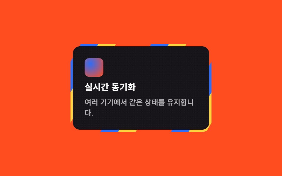
カードの枠を包むグラデーションの線が時計回りに回り続け、カード自体がオーロラの欠片のように光ります。
使いどころ機能紹介グリッド・目立たせたい1枚のカード
repeating-linear-gradient@keyframes sweepmask 이중 레이어
<main class="stage">
  <article class="card-a">
    <div class="card-a__body">
      <span class="card-a__icon" aria-hidden="true"></span>
      <h3 class="card-a__title">リアルタイム同期</h3>
      <p class="card-a__desc">複数のデバイスで同じ状態を保ちます。</p>
    </div>
  </article>
</main>
@use "../../../../site/static/demo-tokens" as *;
$duration: $dur-loop;
$easing: linear;
$color: $subject-blue;
@include stage($stage-orange);
.stage { padding: clamp(8px, 3vw, 20px); }
// 테두리 자리에만 보이게 잘라낸 링 위에 오로라 3색 줄무늬를 흘려보낸다
.card-a {
position: relative;
box-sizing: border-box;
width: min(240px, 78vw);
border-radius: $r-card;
padding: $sp-1;
isolation: isolate;
}
.card-a::before {
content: "";
position: absolute;
inset: 0;
border-radius: $r-card;
padding: $sp-1;
background: repeating-linear-gradient(120deg, $color 0 26px, $stage-yellow 26px 52px, $stage-orange 52px 78px, transparent 78px 104px);
-webkit-mask: linear-gradient(#000 0 0) content-box, linear-gradient(#000 0 0);
-webkit-mask-composite: xor;
mask-composite: exclude;
animation: sweep $duration $easing infinite;
}
.card-a__body {
position: relative;
overflow: hidden;
border-radius: calc($r-card - $sp-1);
background: $stage-ink;
padding: $sp-5;
display: flex;
flex-direction: column;
gap: $sp-2;
}
.card-a__body::after {
content: "";
position: absolute;
inset: 0;
pointer-events: none;
opacity: .3;
mix-blend-mode: overlay;
background-image:
radial-gradient(rgba($stage-paper, .6) .5px, transparent .5px),
radial-gradient(rgba($stage-ink, .6) .5px, transparent .5px);
background-size: 3px 3px, 5px 5px;
}
.card-a__icon { position: relative; z-index: 1; width: $sp-8; height: $sp-8; border-radius: $r-sm; background: radial-gradient(circle at 30% 30%, $color, $stage-orange); }
.card-a__title { position: relative; z-index: 1; margin: 0; color: $stage-paper; font: 700 clamp(13px, 3.2vw, 15px)/1.3 -apple-system, "Segoe UI", "Noto Sans KR", sans-serif; }
.card-a__desc { position: relative; z-index: 1; margin: 0; color: rgba($stage-paper, .7); font-weight: 500; font-size: clamp(11px, 2.6vw, 12.5px); line-height: 1.4; }
@keyframes sweep { to { background-position: 208px 0; } }
@media (prefers-reduced-motion: reduce) {
.card-a::before { animation: none; }
}html, body {
margin: 0;
overflow: hidden;
}
.stage {
box-sizing: border-box;
min-height: 100vh;
display: grid;
place-items: center;
margin: 0;
background: #ff4d1f;
font-family: -apple-system, "Segoe UI", "Noto Sans KR", sans-serif;
padding: clamp(8px, 4vw, 24px);
}
.stage {
padding: clamp(8px, 3vw, 20px);
}
.card-a {
position: relative;
box-sizing: border-box;
width: min(240px, 78vw);
border-radius: 16px;
padding: 4px;
isolation: isolate;
}
.card-a::before {
content: "";
position: absolute;
inset: 0;
border-radius: 16px;
padding: 4px;
background: repeating-linear-gradient(120deg, #2f6df6 0 26px, #ffd23f 26px 52px, #ff4d1f 52px 78px, transparent 78px 104px);
-webkit-mask: linear-gradient(#000 0 0) content-box, linear-gradient(#000 0 0);
-webkit-mask-composite: xor;
mask-composite: exclude;
animation: sweep 2s linear infinite;
}
.card-a__body {
position: relative;
overflow: hidden;
border-radius: 12px;
background: #17141a;
padding: 20px;
display: flex;
flex-direction: column;
gap: 8px;
}
.card-a__body::after {
content: "";
position: absolute;
inset: 0;
pointer-events: none;
opacity: 0.3;
mix-blend-mode: overlay;
background-image: radial-gradient(rgba(255, 255, 255, 0.6) 0.5px, transparent 0.5px), radial-gradient(rgba(23, 20, 26, 0.6) 0.5px, transparent 0.5px);
background-size: 3px 3px, 5px 5px;
}
.card-a__icon {
position: relative;
z-index: 1;
width: 32px;
height: 32px;
border-radius: 8px;
background: radial-gradient(circle at 30% 30%, #2f6df6, #ff4d1f);
}
.card-a__title {
position: relative;
z-index: 1;
margin: 0;
color: #ffffff;
font: 700 clamp(13px, 3.2vw, 15px)/1.3 -apple-system, "Segoe UI", "Noto Sans KR", sans-serif;
}
.card-a__desc {
position: relative;
z-index: 1;
margin: 0;
color: rgba(255, 255, 255, 0.7);
font-weight: 500;
font-size: clamp(11px, 2.6vw, 12.5px);
line-height: 1.4;
}
@keyframes sweep {
to {
background-position: 208px 0;
}
}
@media (prefers-reduced-motion: reduce) {
.card-a::before {
animation: none;
}
}import type { CSSProperties } from "react";
import styles from "./AuroraCard.module.scss";
export type AuroraCardProps = {
title?: string;
desc?: string;
duration?: number;
easing?: string;
color?: string;
};
type Vars = CSSProperties & { "--duration"?: string; "--easing"?: string; "--color"?: string };
export default function AuroraCard({
title = "Real-time sync",
desc = "Stays in sync across every device.",
duration = 2000,
easing = "linear",
color = "#2f6df6",
}: AuroraCardProps) {
const vars: Vars = { "--duration": `${duration}ms`, "--easing": easing, "--color": color };
return (
<article className={styles.card} style={vars}>
<div className={styles.body}>
<span className={styles.icon} aria-hidden="true" />
<h3 className={styles.title}>{title}</h3>
<p className={styles.desc}>{desc}</p>
</div>
</article>
);
}03 グラデーション枠カード — 計測 累積面積 2.081% · 動いたフレーム 23/23GODRICH オリジナル · SCSS と React は zip に同梱 · メッシュグラデーションの上に、あえてグレインを残す
このデモが属する記事
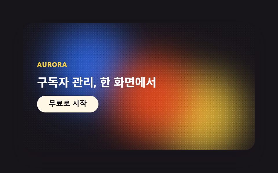 メッシュグラデーションの上に、あえてグレインを残すメッシュグラデーションは、暗い背景の上で複数のぼかした色の塊がオーロラのようににじみ合い、その上にフィルムグレインを重ねる背景スタイルです。AIっぽさを消すために、デザイナーはあえてこのグレインを残します。このスタイルから、9つのパーツをそ この記事のデモをすべて見る