メッシュグラデーションの上に、あえてグレインを残す
メッシュグラデーションは、暗い背景の上で複数のぼかした色の塊がオーロラのようににじみ合い、その上にフィルムグレインを重ねる背景スタイルです。AIっぽさを消すために、デザイナーはあえてこのグレインを残します。このスタイルから、9つのパーツをそのまま切り出しました。
下のワンページは、この9パーツを実際につなげたものです。まずは上から下までスクロールして、オーロラがどこで濃くなりどこで薄まるかを見てください。

オーロラ グラデーション 背景をつくる9パーツは、それぞれ単体でも格子にまとめました。並び順は人気順ではなく、訪問者が実際に画面を追う流れ(目を引き→機能を見て→価格を確認し→口コミで信じ→最後に押す)のとおりです。同じ柔らかさを塊として彫ればクレイモーフィズムのLPキットになり、逆に境界を鋭く立てればネオブルータリズムのLPパーツが向かい側に立ちます。
 01 hero-aurora
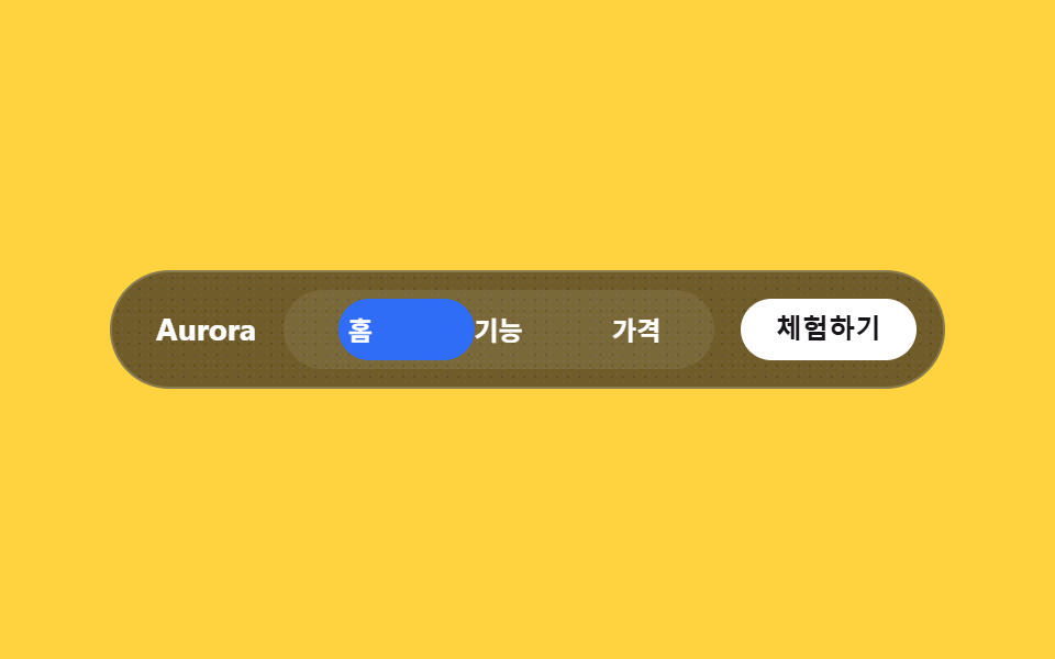 02 nav-aurora
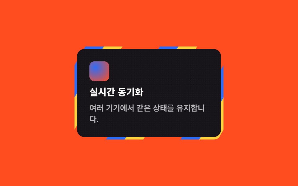 03 card-grid-aurora
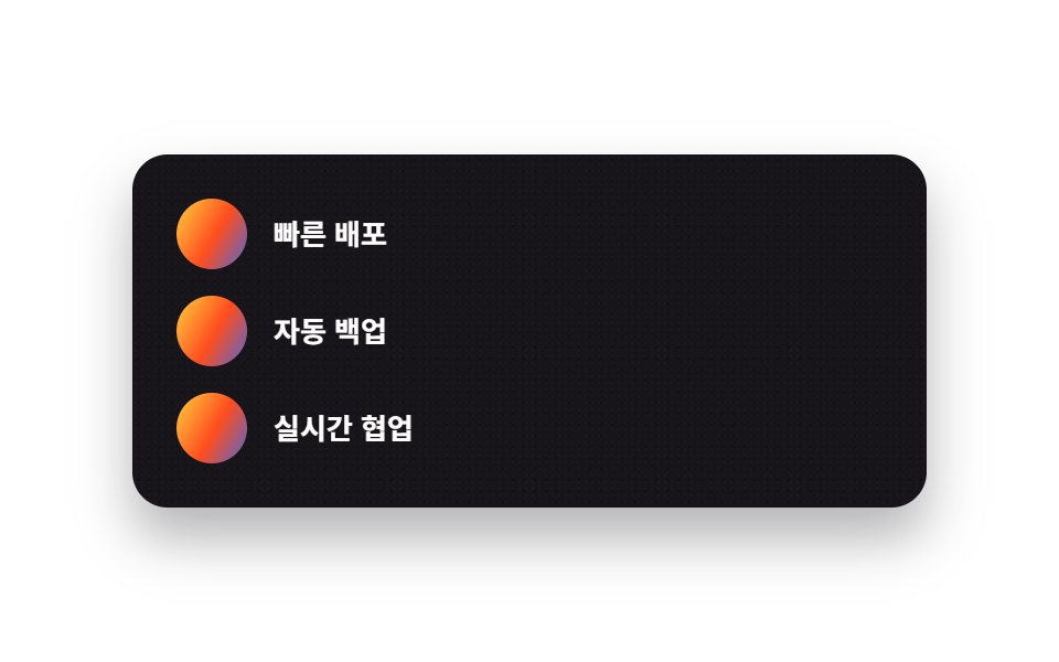 04 feature-list-aurora
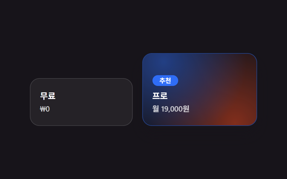 05 pricing-aurora
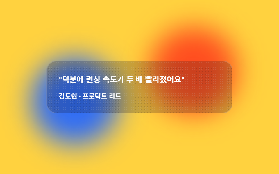 06 testimonial-aurora
 07 cta-band-aurora
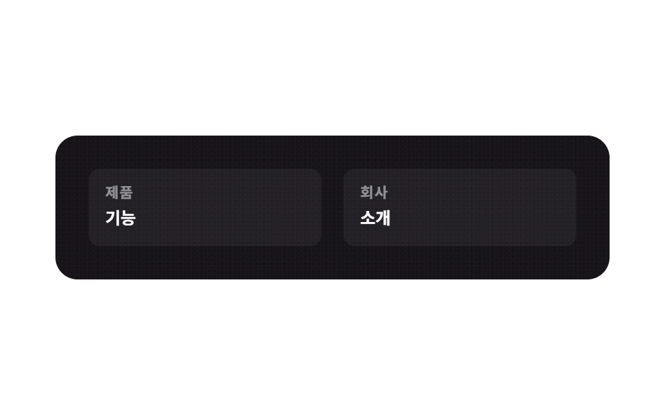 08 footer-aurora
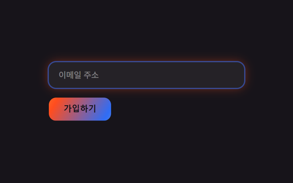 09 buttons-inputs-aurora
自動再生 · タイルを押すとその項目へ · すべて1つのzip
- 01 動くオーブ背景ヒーロー
- 02 透明ナビ
- 03 グラデーション枠カード
- 04 グラデーションアイコンリスト
- 05 強調プランのグラデーション
- 06 ぼかし背景引用
- 07 全面オーロラ帯
- 08 グレインダークフッター
- 09 グラデーションボタン・グローフォーカス
01ヒーロー
3つの塊が奥で漂う
ぼかした色の塊3つが見出しの奥でそれぞれ違うリズムで漂い、重なり合います。
<main class="stage">
  <section class="hero-a">
    <div class="hero-a__orb hero-a__orb--1" aria-hidden="true"></div>
    <div class="hero-a__orb hero-a__orb--2" aria-hidden="true"></div>
    <div class="hero-a__orb hero-a__orb--3" aria-hidden="true"></div>
    <p class="hero-a__eyebrow">AURORA</p>
    <h2 class="hero-a__title">購読者管理を、ひとつの画面で</h2>
    <button class="hero-a__cta" type="button">無料で始める</button>
  </section>
</main>
@use "../../../../site/static/demo-tokens" as *;
// ── 변수 3개 ──────────────────────────────────────────
$duration: $dur-loop; // 오브 세 개가 한 바퀴 도는 시간
$easing: steps(4, jump-none); // 부드러운 곡선은 블러 뒤에서 프레임 간 변화가 너무 작아 안 잡힌다
$color: $subject-blue; // 오브 색 하나
@include stage($stage-ink);
.hero-a {
position: relative;
overflow: hidden;
box-sizing: border-box;
width: clamp(260px, 84vw, 400px);
min-height: clamp(172px, 48vw, 220px);
border-radius: $r-card;
background: $stage-ink;
box-shadow: $shadow-raised;
padding: $sp-6;
display: flex;
flex-direction: column;
justify-content: center;
gap: $sp-3;
}
// filter: blur 로 흐린 오브를 겹치고, transform(translate·rotate)으로만 움직인다
.hero-a__orb {
position: absolute;
width: 46%;
aspect-ratio: 1;
border-radius: 50%;
filter: blur(28px);
opacity: .85;
}
.hero-a__orb--1 { background: radial-gradient($color 0%, $color 35%, transparent 68%); top: -10%; left: 4%; animation: driftA $duration $easing infinite; }
.hero-a__orb--2 { background: radial-gradient($stage-yellow 0%, $stage-yellow 35%, transparent 68%); bottom: -14%; right: 0%; animation: driftB $duration $easing infinite; animation-delay: -.6s; }
.hero-a__orb--3 { background: radial-gradient($stage-orange 0%, $stage-orange 35%, transparent 68%); top: 26%; right: 26%; animation: driftC $duration $easing infinite; animation-delay: -1.2s; }
// 그레인 — 정지 텍스처. 프레임마다 안 바뀐다 (움직이는 건 오브 하나)
.hero-a::after {
content: "";
position: absolute;
inset: 0;
pointer-events: none;
opacity: .35;
mix-blend-mode: overlay;
background-image:
radial-gradient(rgba($stage-paper, .6) .5px, transparent .5px),
radial-gradient(rgba($stage-ink, .6) .5px, transparent .5px);
background-size: 3px 3px, 5px 5px;
background-position: 0 0, 1px 2px;
border-radius: inherit;
}
.hero-a__eyebrow { position: relative; z-index: 1; margin: 0; color: $stage-yellow; font: 700 clamp(10px, 2.4vw, 12px)/1 -apple-system, "Segoe UI", "Noto Sans KR", sans-serif; letter-spacing: .06em; text-transform: uppercase; }
.hero-a__title { position: relative; z-index: 1; margin: 0; color: $stage-paper; font: 700 clamp(16px, 4.2vw, 20px)/1.25 -apple-system, "Segoe UI", "Noto Sans KR", sans-serif; }
.hero-a__cta { position: relative; z-index: 1; align-self: flex-start; border: 0; border-radius: $r-pill; background: $subject-cream; color: $stage-ink; padding: $sp-2 $sp-5; font-weight: 700; font-size: clamp(11px, 2.6vw, 13px); line-height: 1; }
@keyframes driftA { 0% { transform: translate(0,0) rotate(0deg); } 50% { transform: translate(22px, 16px) rotate(20deg); } 100% { transform: translate(0,0) rotate(0deg); } }
@keyframes driftB { 0% { transform: translate(0,0) rotate(0deg); } 50% { transform: translate(-24px, -14px) rotate(-18deg); } 100% { transform: translate(0,0) rotate(0deg); } }
@keyframes driftC { 0% { transform: translate(0,0) rotate(0deg); } 50% { transform: translate(18px, -20px) rotate(16deg); } 100% { transform: translate(0,0) rotate(0deg); } }
@media (prefers-reduced-motion: reduce) {
.hero-a__orb { animation: none; }
}html, body {
margin: 0;
overflow: hidden;
}
.stage {
box-sizing: border-box;
min-height: 100vh;
display: grid;
place-items: center;
margin: 0;
background: #17141a;
font-family: -apple-system, "Segoe UI", "Noto Sans KR", sans-serif;
padding: clamp(8px, 4vw, 24px);
}
.hero-a {
position: relative;
overflow: hidden;
box-sizing: border-box;
width: clamp(260px, 84vw, 400px);
min-height: clamp(172px, 48vw, 220px);
border-radius: 16px;
background: #17141a;
box-shadow: 0 14px 24px rgba(23, 20, 26, 0.32);
padding: 24px;
display: flex;
flex-direction: column;
justify-content: center;
gap: 12px;
}
.hero-a__orb {
position: absolute;
width: 46%;
aspect-ratio: 1;
border-radius: 50%;
filter: blur(28px);
opacity: 0.85;
}
.hero-a__orb--1 {
background: radial-gradient(#2f6df6 0%, #2f6df6 35%, transparent 68%);
top: -10%;
left: 4%;
animation: driftA 2s steps(4, jump-none) infinite;
}
.hero-a__orb--2 {
background: radial-gradient(#ffd23f 0%, #ffd23f 35%, transparent 68%);
bottom: -14%;
right: 0%;
animation: driftB 2s steps(4, jump-none) infinite;
animation-delay: -0.6s;
}
.hero-a__orb--3 {
background: radial-gradient(#ff4d1f 0%, #ff4d1f 35%, transparent 68%);
top: 26%;
right: 26%;
animation: driftC 2s steps(4, jump-none) infinite;
animation-delay: -1.2s;
}
.hero-a::after {
content: "";
position: absolute;
inset: 0;
pointer-events: none;
opacity: 0.35;
mix-blend-mode: overlay;
background-image: radial-gradient(rgba(255, 255, 255, 0.6) 0.5px, transparent 0.5px), radial-gradient(rgba(23, 20, 26, 0.6) 0.5px, transparent 0.5px);
background-size: 3px 3px, 5px 5px;
background-position: 0 0, 1px 2px;
border-radius: inherit;
}
.hero-a__eyebrow {
position: relative;
z-index: 1;
margin: 0;
color: #ffd23f;
font: 700 clamp(10px, 2.4vw, 12px)/1 -apple-system, "Segoe UI", "Noto Sans KR", sans-serif;
letter-spacing: 0.06em;
text-transform: uppercase;
}
.hero-a__title {
position: relative;
z-index: 1;
margin: 0;
color: #ffffff;
font: 700 clamp(16px, 4.2vw, 20px)/1.25 -apple-system, "Segoe UI", "Noto Sans KR", sans-serif;
}
.hero-a__cta {
position: relative;
z-index: 1;
align-self: flex-start;
border: 0;
border-radius: 999px;
background: #fff7e6;
color: #17141a;
padding: 8px 20px;
font-weight: 700;
font-size: clamp(11px, 2.6vw, 13px);
line-height: 1;
}
@keyframes driftA {
0% {
transform: translate(0, 0) rotate(0deg);
}
50% {
transform: translate(22px, 16px) rotate(20deg);
}
100% {
transform: translate(0, 0) rotate(0deg);
}
}
@keyframes driftB {
0% {
transform: translate(0, 0) rotate(0deg);
}
50% {
transform: translate(-24px, -14px) rotate(-18deg);
}
100% {
transform: translate(0, 0) rotate(0deg);
}
}
@keyframes driftC {
0% {
transform: translate(0, 0) rotate(0deg);
}
50% {
transform: translate(18px, -20px) rotate(16deg);
}
100% {
transform: translate(0, 0) rotate(0deg);
}
}
@media (prefers-reduced-motion: reduce) {
.hero-a__orb {
animation: none;
}
}import type { CSSProperties } from "react";
import styles from "./AuroraHero.module.scss";
export type AuroraHeroProps = {
eyebrow?: string;
title?: string;
cta?: string;
/** 한 주기(기본 2000ms) */
duration?: number;
easing?: string;
color?: string;
};
type Vars = CSSProperties & { "--duration"?: string; "--easing"?: string; "--color"?: string };
export default function AuroraHero({
eyebrow = "AURORA",
title = "Manage subscribers from one screen",
cta = "Start for free",
duration = 2000,
easing = "steps(4, jump-none)",
color = "#2f6df6",
}: AuroraHeroProps) {
const vars: Vars = { "--duration": `${duration}ms`, "--easing": easing, "--color": color };
return (
<section className={styles.hero} style={vars}>
<div className={`${styles.orb} ${styles.orb1}`} aria-hidden="true" />
<div className={`${styles.orb} ${styles.orb2}`} aria-hidden="true" />
<div className={`${styles.orb} ${styles.orb3}`} aria-hidden="true" />
<p className={styles.eyebrow}>{eyebrow}</p>
<h2 className={styles.title}>{title}</h2>
<button type="button" className={styles.cta}>{cta}</button>
</section>
);
}01 · 動くオーブ背景ヒーロー — 計測 累積面積 38.218% · 動いたフレーム 18/23GODRICH オリジナル · SCSS と React は zip に同梱 · パスワードを見る
動くのは光だけ
カード自体は濃いインク色で固定し、オーロラはその上を通り過ぎる光としてだけ使います。
.hero-a__orb { position: absolute; width: 46%; aspect-ratio: 1;
  border-radius: 50%; filter: blur(28px); opacity: .85; }
.hero-a__orb--1 {
  background: radial-gradient($color 0%, $color 35%, transparent 68%);
  top: -10%; left: 4%;
  animation: driftA $duration steps(4, jump-none) infinite;
}
@keyframes driftA {
  0%   { transform: translate(0,0) rotate(0deg); }
  50%  { transform: translate(22px, 16px) rotate(20deg); }
  100% { transform: translate(0,0) rotate(0deg); }
}
02ナビゲーション
ほぼ透明な背景
メニューの背景はほぼ透明で、内側に薄いインク色のガラス層が一枚あるだけです。
<main class="stage">
  <nav class="nav-a">
    <span class="nav-a__brand">Aurora</span>
    <div class="nav-a__menu">
      <span class="nav-a__pill" aria-hidden="true"></span>
      <span class="nav-a__label">ホーム</span>
      <span class="nav-a__label">機能</span>
      <span class="nav-a__label">料金</span>
    </div>
    <button class="nav-a__cta" type="button">無料で試す</button>
  </nav>
</main>
@use "../../../../site/static/demo-tokens" as *;
$duration: $dur-loop;
$easing: $ease-spring;
$color: $subject-blue;
@include stage($stage-yellow);
.nav-a {
position: relative;
box-sizing: border-box;
display: flex;
align-items: center;
gap: $sp-3;
width: clamp(240px, 82vw, 380px);
padding: $sp-2 $sp-3;
border-radius: $r-pill;
background: rgba($stage-ink, .62); // .38 은 흰 글자가 2.98:1 이었다 — AA 4.5 (brand 6.49 · label 5.35)
backdrop-filter: blur(10px);
-webkit-backdrop-filter: blur(10px);
border: 1px solid rgba($stage-paper, .18);
overflow: hidden;
}
.nav-a::after {
content: "";
position: absolute;
inset: 0;
pointer-events: none;
opacity: .3;
mix-blend-mode: overlay;
background-image:
radial-gradient(rgba($stage-paper, .6) .5px, transparent .5px),
radial-gradient(rgba($stage-ink, .6) .5px, transparent .5px);
background-size: 3px 3px, 5px 5px;
border-radius: inherit;
}
.nav-a__brand { position: relative; z-index: 1; padding-left: $sp-2; color: $stage-paper; font: 700 clamp(12px, 3vw, 14px)/1 -apple-system, "Segoe UI", "Noto Sans KR", sans-serif; }
.nav-a__menu {
position: relative;
z-index: 1;
flex: 1;
display: flex;
background: rgba($stage-paper, .08);
border-radius: $r-pill;
padding: $sp-1;
}
// 인디케이터는 퍼센트 폭(항목 3등분)으로 움직인다 — 고정 px 짐작값 금지 (BD19)
.nav-a__pill {
position: absolute;
top: $sp-1;
bottom: $sp-1;
left: $sp-1;
width: calc((100% - #{$sp-1 * 2}) / 3);
border-radius: $r-pill;
background: $color;
animation: pillSlide $duration $easing infinite;
}
.nav-a__label { position: relative; z-index: 1; flex: 1; text-align: center; padding: $sp-2 0; color: $stage-paper; font-weight: 600; font-size: clamp(10.5px, 2.6vw, 12px); line-height: 1; }
.nav-a__cta { position: relative; z-index: 1; border: 0; border-radius: $r-pill; background: $stage-paper; color: $stage-ink; padding: $sp-2 $sp-4; font-weight: 700; font-size: clamp(10.5px, 2.6vw, 12px); line-height: 1; }
@keyframes pillSlide {
0%, 12% { transform: translateX(0%); }
38%, 50% { transform: translateX(100%); }
76%, 88% { transform: translateX(200%); }
100% { transform: translateX(0%); }
}
@media (prefers-reduced-motion: reduce) {
.nav-a__pill { animation: none; }
}html, body {
margin: 0;
overflow: hidden;
}
.stage {
box-sizing: border-box;
min-height: 100vh;
display: grid;
place-items: center;
margin: 0;
background: #ffd23f;
font-family: -apple-system, "Segoe UI", "Noto Sans KR", sans-serif;
padding: clamp(8px, 4vw, 24px);
}
.nav-a {
position: relative;
box-sizing: border-box;
display: flex;
align-items: center;
gap: 12px;
width: clamp(240px, 82vw, 380px);
padding: 8px 12px;
border-radius: 999px;
background: rgba(23, 20, 26, 0.62);
backdrop-filter: blur(10px);
-webkit-backdrop-filter: blur(10px);
border: 1px solid rgba(255, 255, 255, 0.18);
overflow: hidden;
}
.nav-a::after {
content: "";
position: absolute;
inset: 0;
pointer-events: none;
opacity: 0.3;
mix-blend-mode: overlay;
background-image: radial-gradient(rgba(255, 255, 255, 0.6) 0.5px, transparent 0.5px), radial-gradient(rgba(23, 20, 26, 0.6) 0.5px, transparent 0.5px);
background-size: 3px 3px, 5px 5px;
border-radius: inherit;
}
.nav-a__brand {
position: relative;
z-index: 1;
padding-left: 8px;
color: #ffffff;
font: 700 clamp(12px, 3vw, 14px)/1 -apple-system, "Segoe UI", "Noto Sans KR", sans-serif;
}
.nav-a__menu {
position: relative;
z-index: 1;
flex: 1;
display: flex;
background: rgba(255, 255, 255, 0.08);
border-radius: 999px;
padding: 4px;
}
.nav-a__pill {
position: absolute;
top: 4px;
bottom: 4px;
left: 4px;
width: calc((100% - 8px) / 3);
border-radius: 999px;
background: #2f6df6;
animation: pillSlide 2s cubic-bezier(0.2, 0.8, 0.2, 1) infinite;
}
.nav-a__label {
position: relative;
z-index: 1;
flex: 1;
text-align: center;
padding: 8px 0;
color: #ffffff;
font-weight: 600;
font-size: clamp(10.5px, 2.6vw, 12px);
line-height: 1;
}
.nav-a__cta {
position: relative;
z-index: 1;
border: 0;
border-radius: 999px;
background: #ffffff;
color: #17141a;
padding: 8px 16px;
font-weight: 700;
font-size: clamp(10.5px, 2.6vw, 12px);
line-height: 1;
}
@keyframes pillSlide {
0%, 12% {
transform: translateX(0%);
}
38%, 50% {
transform: translateX(100%);
}
76%, 88% {
transform: translateX(200%);
}
100% {
transform: translateX(0%);
}
}
@media (prefers-reduced-motion: reduce) {
.nav-a__pill {
animation: none;
}
}import type { CSSProperties } from "react";
import styles from "./AuroraNav.module.scss";
export type AuroraNavProps = {
brand?: string;
items?: string[];
cta?: string;
activeIndex?: number;
duration?: number;
easing?: string;
color?: string;
};
type Vars = CSSProperties & { "--duration"?: string; "--easing"?: string; "--color"?: string };
export default function AuroraNav({
brand = "Aurora",
items = ["Home", "Features", "Pricing"],
cta = "Try it free",
duration = 2000,
easing = "cubic-bezier(.2,.8,.2,1)",
color = "#2f6df6",
}: AuroraNavProps) {
const vars: Vars = { "--duration": `${duration}ms`, "--easing": easing, "--color": color };
return (
<nav className={styles.nav} style={vars}>
<span className={styles.brand}>{brand}</span>
<div className={styles.menu}>
<span className={styles.pill} aria-hidden="true" />
{items.map((label) => (
<span key={label} className={styles.label}>{label}</span>
))}
</div>
<button type="button" className={styles.cta}>{cta}</button>
</nav>
);
}02 · 透明ナビ — 計測 累積面積 3.459% · 動いたフレーム 15/23GODRICH オリジナル · SCSS と React は zip に同梱 · パスワードを見る
三等分で移動させる
現在地を示すピルは、3項目ぶんの幅を均等な割合で三等分し、その分だけ移動します。
.nav-a {
  background: rgba($stage-ink, .38);
  backdrop-filter: blur(10px);
  border: 1px solid rgba($stage-paper, .18);
}
.nav-a__pill {
  position: absolute; top: $sp-1; bottom: $sp-1; left: $sp-1;
  width: calc((100% - #{$sp-1 * 2}) / 3);
  border-radius: $r-pill; background: $color;
  animation: pillSlide $duration $ease-spring infinite;
}
03カードグリッド
枠の位置だけ切り抜く
カードの枠の位置だけを切り抜いてオーロラ3色の縞模様を見せ、その縞を流し続けます。
<main class="stage">
  <article class="card-a">
    <div class="card-a__body">
      <span class="card-a__icon" aria-hidden="true"></span>
      <h3 class="card-a__title">リアルタイム同期</h3>
      <p class="card-a__desc">複数のデバイスで同じ状態を保ちます。</p>
    </div>
  </article>
</main>
@use "../../../../site/static/demo-tokens" as *;
$duration: $dur-loop;
$easing: linear;
$color: $subject-blue;
@include stage($stage-orange);
.stage { padding: clamp(8px, 3vw, 20px); }
// 테두리 자리에만 보이게 잘라낸 링 위에 오로라 3색 줄무늬를 흘려보낸다
.card-a {
position: relative;
box-sizing: border-box;
width: min(240px, 78vw);
border-radius: $r-card;
padding: $sp-1;
isolation: isolate;
}
.card-a::before {
content: "";
position: absolute;
inset: 0;
border-radius: $r-card;
padding: $sp-1;
background: repeating-linear-gradient(120deg, $color 0 26px, $stage-yellow 26px 52px, $stage-orange 52px 78px, transparent 78px 104px);
-webkit-mask: linear-gradient(#000 0 0) content-box, linear-gradient(#000 0 0);
-webkit-mask-composite: xor;
mask-composite: exclude;
animation: sweep $duration $easing infinite;
}
.card-a__body {
position: relative;
overflow: hidden;
border-radius: calc($r-card - $sp-1);
background: $stage-ink;
padding: $sp-5;
display: flex;
flex-direction: column;
gap: $sp-2;
}
.card-a__body::after {
content: "";
position: absolute;
inset: 0;
pointer-events: none;
opacity: .3;
mix-blend-mode: overlay;
background-image:
radial-gradient(rgba($stage-paper, .6) .5px, transparent .5px),
radial-gradient(rgba($stage-ink, .6) .5px, transparent .5px);
background-size: 3px 3px, 5px 5px;
}
.card-a__icon { position: relative; z-index: 1; width: $sp-8; height: $sp-8; border-radius: $r-sm; background: radial-gradient(circle at 30% 30%, $color, $stage-orange); }
.card-a__title { position: relative; z-index: 1; margin: 0; color: $stage-paper; font: 700 clamp(13px, 3.2vw, 15px)/1.3 -apple-system, "Segoe UI", "Noto Sans KR", sans-serif; }
.card-a__desc { position: relative; z-index: 1; margin: 0; color: rgba($stage-paper, .7); font-weight: 500; font-size: clamp(11px, 2.6vw, 12.5px); line-height: 1.4; }
@keyframes sweep { to { background-position: 208px 0; } }
@media (prefers-reduced-motion: reduce) {
.card-a::before { animation: none; }
}html, body {
margin: 0;
overflow: hidden;
}
.stage {
box-sizing: border-box;
min-height: 100vh;
display: grid;
place-items: center;
margin: 0;
background: #ff4d1f;
font-family: -apple-system, "Segoe UI", "Noto Sans KR", sans-serif;
padding: clamp(8px, 4vw, 24px);
}
.stage {
padding: clamp(8px, 3vw, 20px);
}
.card-a {
position: relative;
box-sizing: border-box;
width: min(240px, 78vw);
border-radius: 16px;
padding: 4px;
isolation: isolate;
}
.card-a::before {
content: "";
position: absolute;
inset: 0;
border-radius: 16px;
padding: 4px;
background: repeating-linear-gradient(120deg, #2f6df6 0 26px, #ffd23f 26px 52px, #ff4d1f 52px 78px, transparent 78px 104px);
-webkit-mask: linear-gradient(#000 0 0) content-box, linear-gradient(#000 0 0);
-webkit-mask-composite: xor;
mask-composite: exclude;
animation: sweep 2s linear infinite;
}
.card-a__body {
position: relative;
overflow: hidden;
border-radius: 12px;
background: #17141a;
padding: 20px;
display: flex;
flex-direction: column;
gap: 8px;
}
.card-a__body::after {
content: "";
position: absolute;
inset: 0;
pointer-events: none;
opacity: 0.3;
mix-blend-mode: overlay;
background-image: radial-gradient(rgba(255, 255, 255, 0.6) 0.5px, transparent 0.5px), radial-gradient(rgba(23, 20, 26, 0.6) 0.5px, transparent 0.5px);
background-size: 3px 3px, 5px 5px;
}
.card-a__icon {
position: relative;
z-index: 1;
width: 32px;
height: 32px;
border-radius: 8px;
background: radial-gradient(circle at 30% 30%, #2f6df6, #ff4d1f);
}
.card-a__title {
position: relative;
z-index: 1;
margin: 0;
color: #ffffff;
font: 700 clamp(13px, 3.2vw, 15px)/1.3 -apple-system, "Segoe UI", "Noto Sans KR", sans-serif;
}
.card-a__desc {
position: relative;
z-index: 1;
margin: 0;
color: rgba(255, 255, 255, 0.7);
font-weight: 500;
font-size: clamp(11px, 2.6vw, 12.5px);
line-height: 1.4;
}
@keyframes sweep {
to {
background-position: 208px 0;
}
}
@media (prefers-reduced-motion: reduce) {
.card-a::before {
animation: none;
}
}import type { CSSProperties } from "react";
import styles from "./AuroraCard.module.scss";
export type AuroraCardProps = {
title?: string;
desc?: string;
duration?: number;
easing?: string;
color?: string;
};
type Vars = CSSProperties & { "--duration"?: string; "--easing"?: string; "--color"?: string };
export default function AuroraCard({
title = "Real-time sync",
desc = "Stays in sync across every device.",
duration = 2000,
easing = "linear",
color = "#2f6df6",
}: AuroraCardProps) {
const vars: Vars = { "--duration": `${duration}ms`, "--easing": easing, "--color": color };
return (
<article className={styles.card} style={vars}>
<div className={styles.body}>
<span className={styles.icon} aria-hidden="true" />
<h3 className={styles.title}>{title}</h3>
<p className={styles.desc}>{desc}</p>
</div>
</article>
);
}03 · グラデーション枠カード — 計測 累積面積 2.081% · 動いたフレーム 23/23GODRICH オリジナル · SCSS と React は zip に同梱 · パスワードを見る
視線を枠に留める
内側のカード本体は濃いインク色で固定し、視線が枠に留まるようにしています。
.card-a::before {
  content: ""; position: absolute; inset: 0;
  border-radius: $r-card; padding: $sp-1;
  background: repeating-linear-gradient(120deg,
    $color 0 26px, $stage-yellow 26px 52px,
    $stage-orange 52px 78px, transparent 78px 104px);
  -webkit-mask: linear-gradient(#000 0 0) content-box, linear-gradient(#000 0 0);
  mask-composite: exclude;
  animation: sweep $duration linear infinite;
}
@keyframes sweep { to { background-position: 208px 0; } }
04機能一覧
丸いバッジをひとつ
機能ごとに丸いバッジを1つ置き、バッジの中のグラデーションだけを左右に流します。
<main class="stage">
  <ul class="feat-a">
    <li class="feat-a__row">
      <span class="feat-a__icon" aria-hidden="true"></span>
      <p class="feat-a__text">高速デプロイ</p>
    </li>
    <li class="feat-a__row">
      <span class="feat-a__icon" aria-hidden="true"></span>
      <p class="feat-a__text">自動バックアップ</p>
    </li>
    <li class="feat-a__row">
      <span class="feat-a__icon" aria-hidden="true"></span>
      <p class="feat-a__text">リアルタイム共同編集</p>
    </li>
  </ul>
</main>
@use "../../../../site/static/demo-tokens" as *;
$duration: $dur-loop;
$easing: $ease-out;
$color: $subject-blue;
@include stage($stage-paper);
.feat-a {
// 태그가 <ul> 이라 UA 기본 margin·padding(list-style)부터 지운다 — 안 지우면 320px 세로 넘침의 숨은 원인이 된다
margin: 0;
list-style: none;
position: relative;
overflow: hidden;
box-sizing: border-box;
display: flex;
flex-direction: column;
gap: $sp-3;
width: clamp(240px, 80vw, 360px);
padding: $sp-5;
border-radius: $r-card;
background: $stage-ink;
box-shadow: $shadow-raised;
}
.feat-a::after {
content: "";
position: absolute;
inset: 0;
pointer-events: none;
opacity: .3;
mix-blend-mode: overlay;
background-image:
radial-gradient(rgba($stage-paper, .6) .5px, transparent .5px),
radial-gradient(rgba($stage-ink, .6) .5px, transparent .5px);
background-size: 3px 3px, 5px 5px;
border-radius: inherit;
}
.feat-a__row { position: relative; z-index: 1; margin: 0; display: flex; align-items: center; gap: $sp-3; }
// 아이콘 배지 안 그라디언트가 좌우로 흐른다 (background-position 만 움직인다)
.feat-a__icon {
flex: none;
width: $sp-8;
height: $sp-8;
border-radius: $r-pill;
background: linear-gradient(120deg, $color, $stage-yellow, $stage-orange, $color);
background-size: 200% 100%;
animation: iconFlow $duration $easing infinite;
}
.feat-a__text { margin: 0; color: $stage-paper; font: 600 clamp(11.5px, 2.8vw, 13px)/1.4 -apple-system, "Segoe UI", "Noto Sans KR", sans-serif; }
@keyframes iconFlow { 0% { background-position: 0% 50%; } 50% { background-position: 100% 50%; } 100% { background-position: 0% 50%; } }
@media (prefers-reduced-motion: reduce) {
.feat-a__icon { animation: none; }
}html, body {
margin: 0;
overflow: hidden;
}
.stage {
box-sizing: border-box;
min-height: 100vh;
display: grid;
place-items: center;
margin: 0;
background: #ffffff;
font-family: -apple-system, "Segoe UI", "Noto Sans KR", sans-serif;
padding: clamp(8px, 4vw, 24px);
}
.feat-a {
margin: 0;
list-style: none;
position: relative;
overflow: hidden;
box-sizing: border-box;
display: flex;
flex-direction: column;
gap: 12px;
width: clamp(240px, 80vw, 360px);
padding: 20px;
border-radius: 16px;
background: #17141a;
box-shadow: 0 14px 24px rgba(23, 20, 26, 0.32);
}
.feat-a::after {
content: "";
position: absolute;
inset: 0;
pointer-events: none;
opacity: 0.3;
mix-blend-mode: overlay;
background-image: radial-gradient(rgba(255, 255, 255, 0.6) 0.5px, transparent 0.5px), radial-gradient(rgba(23, 20, 26, 0.6) 0.5px, transparent 0.5px);
background-size: 3px 3px, 5px 5px;
border-radius: inherit;
}
.feat-a__row {
position: relative;
z-index: 1;
margin: 0;
display: flex;
align-items: center;
gap: 12px;
}
.feat-a__icon {
flex: none;
width: 32px;
height: 32px;
border-radius: 999px;
background: linear-gradient(120deg, #2f6df6, #ffd23f, #ff4d1f, #2f6df6);
background-size: 200% 100%;
animation: iconFlow 2s ease-out infinite;
}
.feat-a__text {
margin: 0;
color: #ffffff;
font: 600 clamp(11.5px, 2.8vw, 13px)/1.4 -apple-system, "Segoe UI", "Noto Sans KR", sans-serif;
}
@keyframes iconFlow {
0% {
background-position: 0% 50%;
}
50% {
background-position: 100% 50%;
}
100% {
background-position: 0% 50%;
}
}
@media (prefers-reduced-motion: reduce) {
.feat-a__icon {
animation: none;
}
}import type { CSSProperties } from "react";
import styles from "./AuroraFeatureList.module.scss";
export type AuroraFeatureListProps = {
items?: string[];
duration?: number;
easing?: string;
color?: string;
};
type Vars = CSSProperties & { "--duration"?: string; "--easing"?: string; "--color"?: string };
export default function AuroraFeatureList({
items = ["Fast deploys", "Auto backups", "Real-time collaboration"],
duration = 2000,
easing = "ease-out",
color = "#2f6df6",
}: AuroraFeatureListProps) {
const vars: Vars = { "--duration": `${duration}ms`, "--easing": easing, "--color": color };
return (
<ul className={styles.list} style={vars}>
{items.map((text) => (
<li key={text} className={styles.row}>
<span className={styles.icon} aria-hidden="true" />
<p className={styles.text}>{text}</p>
</li>
))}
</ul>
);
}04 · グラデーションアイコンリスト — 計測 累積面積 1.75% · 動いたフレーム 19/23GODRICH オリジナル · SCSS と React は zip に同梱 · パスワードを見る
行全体を動かさない理由
行全体が動くと騒がしくなりますが、小さな点が1つ流れるだけなら視線を自然に引き留められます。
.feat-a__icon {
  width: $sp-8; height: $sp-8; border-radius: $r-pill;
  background: linear-gradient(120deg, $color, $stage-yellow, $stage-orange, $color);
  background-size: 200% 100%;
  animation: iconFlow $duration ease-out infinite;
}
@keyframes iconFlow {
  0%   { background-position: 0% 50%; }
  50%  { background-position: 100% 50%; }
  100% { background-position: 0% 50%; }
}
05料金
おすすめだけが呼吸する
おすすめプランのカードだけ、オーロラのグラデーションが呼吸するように明るくなったり暗くなったりし、位置も少しずれます。
<main class="stage">
  <section class="pricing-a">
    <div class="pricing-a__plan">
      <p class="pricing-a__name">無料</p>
      <p class="pricing-a__price">₩0</p>
    </div>
    <div class="pricing-a__plan pricing-a__plan--pro">
      <span class="pricing-a__badge">おすすめ</span>
      <p class="pricing-a__name">プロ</p>
      <p class="pricing-a__price">月19,000円</p>
    </div>
  </section>
</main>
@use "../../../../site/static/demo-tokens" as *;
$duration: $dur-loop;
$easing: steps(4, jump-none); // 부드러운 곡선은 프레임 간 변화가 너무 작아 안 잡혀 큰 걸음으로 끊어 보낸다
$color: $subject-blue;
@include stage($stage-ink);
.pricing-a { display: flex; align-items: flex-end; gap: $sp-4; width: clamp(240px, 82vw, 380px); }
.pricing-a__plan {
flex: 1;
border-radius: $r-card;
padding: $sp-5 $sp-4;
background: rgba($stage-paper, .06);
border: 1px solid rgba($stage-paper, .12);
}
.pricing-a__plan--pro {
position: relative;
overflow: hidden;
flex: 1.15;
padding-top: $sp-8;
background: $stage-ink;
border-color: rgba($color, .5);
box-shadow: $shadow-raised;
}
// 추천 플랜만 오로라 그라디언트가 숨 쉬듯 밝기·위치를 오간다
.pricing-a__plan--pro::before {
content: "";
position: absolute;
inset: -20%;
background: radial-gradient(circle at 30% 20%, rgba($color, .9), transparent 60%),
radial-gradient(circle at 75% 80%, rgba($stage-orange, .85), transparent 60%);
animation: breathe $duration $easing infinite;
}
.pricing-a__badge { position: relative; z-index: 1; display: inline-block; margin-bottom: $sp-2; border-radius: $r-pill; background: $color; color: $stage-paper; padding: $sp-1 $sp-3; font: 700 clamp(9.5px, 2.2vw, 11px)/1 -apple-system, "Segoe UI", "Noto Sans KR", sans-serif; }
.pricing-a__name { position: relative; z-index: 1; margin: 0 0 $sp-1; color: $stage-paper; font: 700 clamp(12px, 3vw, 14px)/1.3 -apple-system, "Segoe UI", "Noto Sans KR", sans-serif; }
.pricing-a__price { position: relative; z-index: 1; margin: 0; color: rgba($stage-paper, .75); font-weight: 600; font-size: clamp(11px, 2.6vw, 12.5px); line-height: 1.3; }
@keyframes breathe { 0%, 100% { opacity: .3; transform: translate(0, 0); } 50% { opacity: 1; transform: translate(-8%, 8%); } }
@media (prefers-reduced-motion: reduce) {
.pricing-a__plan--pro::before { animation: none; opacity: .8; }
}html, body {
margin: 0;
overflow: hidden;
}
.stage {
box-sizing: border-box;
min-height: 100vh;
display: grid;
place-items: center;
margin: 0;
background: #17141a;
font-family: -apple-system, "Segoe UI", "Noto Sans KR", sans-serif;
padding: clamp(8px, 4vw, 24px);
}
.pricing-a {
display: flex;
align-items: flex-end;
gap: 16px;
width: clamp(240px, 82vw, 380px);
}
.pricing-a__plan {
flex: 1;
border-radius: 16px;
padding: 20px 16px;
background: rgba(255, 255, 255, 0.06);
border: 1px solid rgba(255, 255, 255, 0.12);
}
.pricing-a__plan--pro {
position: relative;
overflow: hidden;
flex: 1.15;
padding-top: 32px;
background: #17141a;
border-color: rgba(47, 109, 246, 0.5);
box-shadow: 0 14px 24px rgba(23, 20, 26, 0.32);
}
.pricing-a__plan--pro::before {
content: "";
position: absolute;
inset: -20%;
background: radial-gradient(circle at 30% 20%, rgba(47, 109, 246, 0.9), transparent 60%), radial-gradient(circle at 75% 80%, rgba(255, 77, 31, 0.85), transparent 60%);
animation: breathe 2s steps(4, jump-none) infinite;
}
.pricing-a__badge {
position: relative;
z-index: 1;
display: inline-block;
margin-bottom: 8px;
border-radius: 999px;
background: #2f6df6;
color: #ffffff;
padding: 4px 12px;
font: 700 clamp(9.5px, 2.2vw, 11px)/1 -apple-system, "Segoe UI", "Noto Sans KR", sans-serif;
}
.pricing-a__name {
position: relative;
z-index: 1;
margin: 0 0 4px;
color: #ffffff;
font: 700 clamp(12px, 3vw, 14px)/1.3 -apple-system, "Segoe UI", "Noto Sans KR", sans-serif;
}
.pricing-a__price {
position: relative;
z-index: 1;
margin: 0;
color: rgba(255, 255, 255, 0.75);
font-weight: 600;
font-size: clamp(11px, 2.6vw, 12.5px);
line-height: 1.3;
}
@keyframes breathe {
0%, 100% {
opacity: 0.3;
transform: translate(0, 0);
}
50% {
opacity: 1;
transform: translate(-8%, 8%);
}
}
@media (prefers-reduced-motion: reduce) {
.pricing-a__plan--pro::before {
animation: none;
opacity: 0.8;
}
}import type { CSSProperties } from "react";
import styles from "./AuroraPricing.module.scss";
export type AuroraPricingProps = {
freeName?: string;
freePrice?: string;
badge?: string;
proName?: string;
proPrice?: string;
duration?: number;
easing?: string;
color?: string;
};
type Vars = CSSProperties & { "--duration"?: string; "--easing"?: string; "--color"?: string };
export default function AuroraPricing({
freeName = "Free",
freePrice = "$0",
badge = "Recommended",
proName = "Pro",
proPrice = "$19/mo",
duration = 2000,
easing = "steps(4, jump-none)",
color = "#2f6df6",
}: AuroraPricingProps) {
const vars: Vars = { "--duration": `${duration}ms`, "--easing": easing, "--color": color };
return (
<section className={styles.pricing} style={vars}>
<div className={styles.plan}>
<p className={styles.name}>{freeName}</p>
<p className={styles.price}>{freePrice}</p>
</div>
<div className={`${styles.plan} ${styles.pro}`}>
<span className={styles.badge}>{badge}</span>
<p className={styles.name}>{proName}</p>
<p className={styles.price}>{proPrice}</p>
</div>
</section>
);
}05 · 強調プランのグラデーション — 計測 累積面積 15.09% · 動いたフレーム 6/23GODRICH オリジナル · SCSS と React は zip に同梱 · パスワードを見る
薄いガラスで対比をつくる
一般プランは薄いガラスのカードのまま残し、対比をつくります。
.pricing-a__plan--pro::before {
  content: ""; position: absolute; inset: -20%;
  background:
    radial-gradient(circle at 30% 20%, rgba($color, .9), transparent 60%),
    radial-gradient(circle at 75% 80%, rgba($stage-orange, .85), transparent 60%);
  animation: breathe $duration steps(4, jump-none) infinite;
}
@keyframes breathe {
  0%, 100% { opacity: .3; transform: translate(0, 0); }
  50%      { opacity: 1;  transform: translate(-8%, 8%); }
}
06お客様の声
ガラスの奥を漂う2つ
半透明でガラス質の引用カードの奥で、ぼかしたオーロラの塊が2つゆっくり漂います。
<main class="stage">
  <figure class="test-a">
    <div class="test-a__orb test-a__orb--1" aria-hidden="true"></div>
    <div class="test-a__orb test-a__orb--2" aria-hidden="true"></div>
    <blockquote class="test-a__card">
      <p class="test-a__quote">「おかげでローンチのスピードが2倍になりました。」</p>
      <figcaption class="test-a__name">キム・ドヒョン · プロダクトリード</figcaption>
    </blockquote>
  </figure>
</main>
@use "../../../../site/static/demo-tokens" as *;
$duration: $dur-loop;
$easing: steps(4, jump-none); // 부드러운 곡선은 블러 뒤에서 프레임 간 변화가 너무 작아 안 잡힌다
$color: $stage-orange;
@include stage($stage-yellow);
// 태그가 <figure> 라 UA 기본 margin(1em 40px)부터 지운다 — 안 지우면 320px 세로 넘침의 숨은 원인이 된다
.test-a { margin: 0; position: relative; box-sizing: border-box; width: clamp(240px, 82vw, 360px); padding: $sp-5; }
// 흐린 오로라 덩어리 두 개가 유리 카드 뒤에서 천천히 떠돈다
.test-a__orb { position: absolute; width: 50%; aspect-ratio: 1; border-radius: 50%; filter: blur(20px); opacity: 1; }
.test-a__orb--1 { background: radial-gradient($subject-blue 0%, $subject-blue 45%, transparent 72%); top: -8%; left: -8%; animation: floatA $duration $easing infinite; }
.test-a__orb--2 { background: radial-gradient($color 0%, $color 45%, transparent 72%); bottom: -8%; right: -6%; animation: floatB $duration $easing infinite; animation-delay: -1s; }
.test-a__card {
// <blockquote> 의 UA 기본 margin(1em 40px)도 지운다
margin: 0;
position: relative;
overflow: hidden;
border-radius: $r-card;
padding: $sp-5;
background: rgba($stage-ink, .22);
backdrop-filter: blur(4px);
-webkit-backdrop-filter: blur(4px);
border: 1px solid rgba($stage-paper, .18);
}
.test-a__card::after {
content: "";
position: absolute;
inset: 0;
pointer-events: none;
opacity: .25;
mix-blend-mode: overlay;
background-image:
radial-gradient(rgba($stage-paper, .6) .5px, transparent .5px),
radial-gradient(rgba($stage-ink, .6) .5px, transparent .5px);
background-size: 3px 3px, 5px 5px;
}
.test-a__quote { position: relative; z-index: 1; margin: 0 0 $sp-3; color: $stage-paper; font: 600 clamp(12px, 3vw, 13.5px)/1.5 -apple-system, "Segoe UI", "Noto Sans KR", sans-serif; }
.test-a__name { position: relative; z-index: 1; margin: 0; color: $stage-paper; font-weight: 600; font-size: clamp(10.5px, 2.4vw, 11.5px); line-height: 1.3; }
@keyframes floatA { 0%, 100% { transform: translate(0, 0); } 50% { transform: translate(24px, 28px); } }
@keyframes floatB { 0%, 100% { transform: translate(0, 0); } 50% { transform: translate(-28px, -20px); } }
@media (prefers-reduced-motion: reduce) {
.test-a__orb { animation: none; }
}html, body {
margin: 0;
overflow: hidden;
}
.stage {
box-sizing: border-box;
min-height: 100vh;
display: grid;
place-items: center;
margin: 0;
background: #ffd23f;
font-family: -apple-system, "Segoe UI", "Noto Sans KR", sans-serif;
padding: clamp(8px, 4vw, 24px);
}
.test-a {
margin: 0;
position: relative;
box-sizing: border-box;
width: clamp(240px, 82vw, 360px);
padding: 20px;
}
.test-a__orb {
position: absolute;
width: 50%;
aspect-ratio: 1;
border-radius: 50%;
filter: blur(20px);
opacity: 1;
}
.test-a__orb--1 {
background: radial-gradient(#2f6df6 0%, #2f6df6 45%, transparent 72%);
top: -8%;
left: -8%;
animation: floatA 2s steps(4, jump-none) infinite;
}
.test-a__orb--2 {
background: radial-gradient(#ff4d1f 0%, #ff4d1f 45%, transparent 72%);
bottom: -8%;
right: -6%;
animation: floatB 2s steps(4, jump-none) infinite;
animation-delay: -1s;
}
.test-a__card {
margin: 0;
position: relative;
overflow: hidden;
border-radius: 16px;
padding: 20px;
background: rgba(23, 20, 26, 0.22);
backdrop-filter: blur(4px);
-webkit-backdrop-filter: blur(4px);
border: 1px solid rgba(255, 255, 255, 0.18);
}
.test-a__card::after {
content: "";
position: absolute;
inset: 0;
pointer-events: none;
opacity: 0.25;
mix-blend-mode: overlay;
background-image: radial-gradient(rgba(255, 255, 255, 0.6) 0.5px, transparent 0.5px), radial-gradient(rgba(23, 20, 26, 0.6) 0.5px, transparent 0.5px);
background-size: 3px 3px, 5px 5px;
}
.test-a__quote {
position: relative;
z-index: 1;
margin: 0 0 12px;
color: #ffffff;
font: 600 clamp(12px, 3vw, 13.5px)/1.5 -apple-system, "Segoe UI", "Noto Sans KR", sans-serif;
}
.test-a__name {
position: relative;
z-index: 1;
margin: 0;
color: #ffffff;
font-weight: 600;
font-size: clamp(10.5px, 2.4vw, 11.5px);
line-height: 1.3;
}
@keyframes floatA {
0%, 100% {
transform: translate(0, 0);
}
50% {
transform: translate(24px, 28px);
}
}
@keyframes floatB {
0%, 100% {
transform: translate(0, 0);
}
50% {
transform: translate(-28px, -20px);
}
}
@media (prefers-reduced-motion: reduce) {
.test-a__orb {
animation: none;
}
}import type { CSSProperties } from "react";
import styles from "./AuroraTestimonial.module.scss";
export type AuroraTestimonialProps = {
quote?: string;
name?: string;
duration?: number;
easing?: string;
color?: string;
};
type Vars = CSSProperties & { "--duration"?: string; "--easing"?: string; "--color"?: string };
export default function AuroraTestimonial({
quote = "Our launch got twice as fast thanks to this.",
name = "Kim Do-hyun · Product Lead",
duration = 2000,
easing = "steps(4, jump-none)",
color = "#ff4d1f",
}: AuroraTestimonialProps) {
const vars: Vars = { "--duration": `${duration}ms`, "--easing": easing, "--color": color };
return (
<figure className={styles.wrap} style={vars}>
<div className={`${styles.orb} ${styles.orb1}`} aria-hidden="true" />
<div className={`${styles.orb} ${styles.orb2}`} aria-hidden="true" />
<blockquote className={styles.card}>
<p className={styles.quote}>“{quote}”</p>
<figcaption className={styles.name}>{name}</figcaption>
</blockquote>
</figure>
);
}06 · ぼかし背景引用 — 計測 累積面積 45.86% · 動いたフレーム 6/23GODRICH オリジナル · SCSS と React は zip に同梱 · パスワードを見る
文字ははっきり残す
カード前面のぼかしは弱めにして、文字ははっきり、背景の色だけがほのかに透けて見えるようにしています。
.test-a__orb {
  position: absolute; width: 50%; aspect-ratio: 1;
  border-radius: 50%; filter: blur(20px);
}
.test-a__orb--1 {
  background: radial-gradient($subject-blue 0%, $subject-blue 45%, transparent 72%);
  top: -8%; left: -8%;
  animation: floatA $duration steps(4, jump-none) infinite;
}
.test-a__card {
  background: rgba($stage-ink, .22);
  backdrop-filter: blur(4px);
  border: 1px solid rgba($stage-paper, .18);
}
07CTA帯
帯そのものが被写体
画面幅いっぱいの帯1枚にオーロラ5色が流れ続け、その上に静止したグレインを重ねて印刷物のような質感にします。
<main class="stage">
  <section class="cta-a">
    <h3 class="cta-a__title">今すぐ始めましょう</h3>
    <button class="cta-a__btn" type="button">無料で始める</button>
  </section>
</main>
@use "../../../../site/static/demo-tokens" as *;
$duration: $dur-loop;
$easing: linear;
$color: $subject-blue;
@include stage($stage-orange);
.stage { padding: clamp(8px, 4vw, 24px); }
// 오로라 그라디언트가 화면 폭 전체를 흐르고, 그 위에 그레인이 얹힌다
.cta-a {
position: relative;
overflow: hidden;
box-sizing: border-box;
width: clamp(260px, 90vw, 420px);
border-radius: $r-card;
padding: $sp-8 $sp-6;
background: linear-gradient(120deg, $stage-ink, $color, $stage-orange, $stage-yellow, $stage-ink);
background-size: 300% 100%;
animation: flow $duration $easing infinite;
}
.cta-a::after {
content: "";
position: absolute;
inset: 0;
pointer-events: none;
opacity: .3;
mix-blend-mode: overlay;
background-image:
radial-gradient(rgba($stage-paper, .6) .5px, transparent .5px),
radial-gradient(rgba($stage-ink, .6) .5px, transparent .5px);
background-size: 3px 3px, 5px 5px;
}
.cta-a__title { position: relative; z-index: 1; margin: 0 0 $sp-4; color: $stage-paper; font: 700 clamp(16px, 4vw, 20px)/1.3 -apple-system, "Segoe UI", "Noto Sans KR", sans-serif; }
.cta-a__btn { position: relative; z-index: 1; border: 0; border-radius: $r-pill; background: $stage-paper; color: $stage-ink; padding: $sp-2 $sp-6; font-weight: 700; font-size: clamp(11px, 2.6vw, 13px); line-height: 1; }
@keyframes flow { 0% { background-position: 0% 50%; } 100% { background-position: 100% 50%; } }
@media (prefers-reduced-motion: reduce) {
.cta-a { animation: none; background-position: 0% 50%; }
}html, body {
margin: 0;
overflow: hidden;
}
.stage {
box-sizing: border-box;
min-height: 100vh;
display: grid;
place-items: center;
margin: 0;
background: #ff4d1f;
font-family: -apple-system, "Segoe UI", "Noto Sans KR", sans-serif;
padding: clamp(8px, 4vw, 24px);
}
.stage {
padding: clamp(8px, 4vw, 24px);
}
.cta-a {
position: relative;
overflow: hidden;
box-sizing: border-box;
width: clamp(260px, 90vw, 420px);
border-radius: 16px;
padding: 32px 24px;
background: linear-gradient(120deg, #17141a, #2f6df6, #ff4d1f, #ffd23f, #17141a);
background-size: 300% 100%;
animation: flow 2s linear infinite;
}
.cta-a::after {
content: "";
position: absolute;
inset: 0;
pointer-events: none;
opacity: 0.3;
mix-blend-mode: overlay;
background-image: radial-gradient(rgba(255, 255, 255, 0.6) 0.5px, transparent 0.5px), radial-gradient(rgba(23, 20, 26, 0.6) 0.5px, transparent 0.5px);
background-size: 3px 3px, 5px 5px;
}
.cta-a__title {
position: relative;
z-index: 1;
margin: 0 0 16px;
color: #ffffff;
font: 700 clamp(16px, 4vw, 20px)/1.3 -apple-system, "Segoe UI", "Noto Sans KR", sans-serif;
}
.cta-a__btn {
position: relative;
z-index: 1;
border: 0;
border-radius: 999px;
background: #ffffff;
color: #17141a;
padding: 8px 24px;
font-weight: 700;
font-size: clamp(11px, 2.6vw, 13px);
line-height: 1;
}
@keyframes flow {
0% {
background-position: 0% 50%;
}
100% {
background-position: 100% 50%;
}
}
@media (prefers-reduced-motion: reduce) {
.cta-a {
animation: none;
background-position: 0% 50%;
}
}import type { CSSProperties } from "react";
import styles from "./AuroraCtaBand.module.scss";
export type AuroraCtaBandProps = {
title?: string;
cta?: string;
duration?: number;
easing?: string;
color?: string;
};
type Vars = CSSProperties & { "--duration"?: string; "--easing"?: string; "--color"?: string };
export default function AuroraCtaBand({
title = "Start right now",
cta = "Start for free",
duration = 2000,
easing = "linear",
color = "#2f6df6",
}: AuroraCtaBandProps) {
const vars: Vars = { "--duration": `${duration}ms`, "--easing": easing, "--color": color };
return (
<section className={styles.band} style={vars}>
<h3 className={styles.title}>{title}</h3>
<button type="button" className={styles.btn}>{cta}</button>
</section>
);
}07 · 全面オーロラ帯 — 計測 累積面積 36.246% · 動いたフレーム 23/23GODRICH オリジナル · SCSS と React は zip に同梱 · パスワードを見る
面積は9パーツ中3番目
帯全体が動く被写体なので、変化したピクセルの面積は9パーツ中3番目に広い項目です。
.cta-a {
  background: linear-gradient(120deg,
    $stage-ink, $color, $stage-orange, $stage-yellow, $stage-ink);
  background-size: 300% 100%;
  animation: flow $duration linear infinite;
}
@keyframes flow {
  0%   { background-position: 0% 50%; }
  100% { background-position: 100% 50%; }
}
08フッター
グレイン テクスチャがチラつく理由
フィルムグレインをフレームごとに違う位置へジャンプさせ、チラつく質感をつくります。
<main class="stage">
  <footer class="footer-a">
    <div class="footer-a__col">
      <p class="footer-a__label">プロダクト</p>
      <p class="footer-a__link">機能</p>
    </div>
    <div class="footer-a__col">
      <p class="footer-a__label">会社</p>
      <p class="footer-a__link">会社概要</p>
    </div>
  </footer>
</main>
@use "../../../../site/static/demo-tokens" as *;
$duration: $dur-loop;
$easing: steps(6, jump-none); // 그레인이 부드럽게 흐르지 않고 프레임마다 뚝뚝 튄다
$color: $subject-cream;
@include stage($stage-paper);
.footer-a {
position: relative;
overflow: hidden;
box-sizing: border-box;
width: clamp(260px, 88vw, 400px);
border-radius: $r-card;
padding: $sp-6;
background: $stage-ink;
display: grid;
grid-template-columns: 1fr 1fr;
gap: $sp-4;
}
// 필름 그레인 — steps() 로 프레임마다 자리를 바꿔 지지직거리는 질감을 만든다 (이 항목의 유일한 애니메이션)
.footer-a::before {
content: "";
position: absolute;
inset: 0;
pointer-events: none;
opacity: .45;
mix-blend-mode: overlay;
background-image:
radial-gradient(rgba($color, .7) .6px, transparent .6px),
radial-gradient(rgba($stage-ink, .7) .6px, transparent .6px);
background-size: 3px 3px, 5px 5px;
animation: grainJump $duration $easing infinite;
}
.footer-a__col { position: relative; z-index: 1; border-radius: $r-sm; background: rgba($stage-paper, .05); padding: $sp-3; display: flex; flex-direction: column; gap: $sp-1; }
.footer-a__label { margin: 0; color: rgba($stage-paper, .5); font: 700 clamp(9.5px, 2.2vw, 10.5px)/1 -apple-system, "Segoe UI", "Noto Sans KR", sans-serif; text-transform: uppercase; letter-spacing: .06em; }
.footer-a__link { margin: 0; color: $stage-paper; font-weight: 600; font-size: clamp(11px, 2.6vw, 12px); line-height: 1.4; }
@keyframes grainJump {
0% { background-position: 0 0, 0 0; }
20% { background-position: -6px 4px, 3px -5px; }
40% { background-position: 5px -3px, -4px 6px; }
60% { background-position: -3px -6px, 6px 2px; }
80% { background-position: 4px 5px, -5px -3px; }
100% { background-position: 0 0, 0 0; }
}
@media (prefers-reduced-motion: reduce) {
.footer-a::before { animation: none; }
}html, body {
margin: 0;
overflow: hidden;
}
.stage {
box-sizing: border-box;
min-height: 100vh;
display: grid;
place-items: center;
margin: 0;
background: #ffffff;
font-family: -apple-system, "Segoe UI", "Noto Sans KR", sans-serif;
padding: clamp(8px, 4vw, 24px);
}
.footer-a {
position: relative;
overflow: hidden;
box-sizing: border-box;
width: clamp(260px, 88vw, 400px);
border-radius: 16px;
padding: 24px;
background: #17141a;
display: grid;
grid-template-columns: 1fr 1fr;
gap: 16px;
}
.footer-a::before {
content: "";
position: absolute;
inset: 0;
pointer-events: none;
opacity: 0.45;
mix-blend-mode: overlay;
background-image: radial-gradient(rgba(255, 247, 230, 0.7) 0.6px, transparent 0.6px), radial-gradient(rgba(23, 20, 26, 0.7) 0.6px, transparent 0.6px);
background-size: 3px 3px, 5px 5px;
animation: grainJump 2s steps(6, jump-none) infinite;
}
.footer-a__col {
position: relative;
z-index: 1;
border-radius: 8px;
background: rgba(255, 255, 255, 0.05);
padding: 12px;
display: flex;
flex-direction: column;
gap: 4px;
}
.footer-a__label {
margin: 0;
color: rgba(255, 255, 255, 0.5);
font: 700 clamp(9.5px, 2.2vw, 10.5px)/1 -apple-system, "Segoe UI", "Noto Sans KR", sans-serif;
text-transform: uppercase;
letter-spacing: 0.06em;
}
.footer-a__link {
margin: 0;
color: #ffffff;
font-weight: 600;
font-size: clamp(11px, 2.6vw, 12px);
line-height: 1.4;
}
@keyframes grainJump {
0% {
background-position: 0 0, 0 0;
}
20% {
background-position: -6px 4px, 3px -5px;
}
40% {
background-position: 5px -3px, -4px 6px;
}
60% {
background-position: -3px -6px, 6px 2px;
}
80% {
background-position: 4px 5px, -5px -3px;
}
100% {
background-position: 0 0, 0 0;
}
}
@media (prefers-reduced-motion: reduce) {
.footer-a::before {
animation: none;
}
}import type { CSSProperties } from "react";
import styles from "./AuroraFooter.module.scss";
export type AuroraFooterProps = {
columns?: { label: string; link: string }[];
duration?: number;
easing?: string;
color?: string;
};
type Vars = CSSProperties & { "--duration"?: string; "--easing"?: string; "--color"?: string };
export default function AuroraFooter({
columns = [
{ label: "Product", link: "Features" },
{ label: "Company", link: "About" },
],
duration = 2000,
easing = "steps(6, jump-none)",
color = "#fff7e6",
}: AuroraFooterProps) {
const vars: Vars = { "--duration": `${duration}ms`, "--easing": easing, "--color": color };
return (
<footer className={styles.footer} style={vars}>
{columns.map((col) => (
<div key={col.label} className={styles.col}>
<p className={styles.label}>{col.label}</p>
<p className={styles.link}>{col.link}</p>
</div>
))}
</footer>
);
}08 · グレインダークフッター — 計測 累積面積 0.78% · 動いたフレーム 17/23GODRICH オリジナル · SCSS と React は zip に同梱 · パスワードを見る
steps() が要になる
なめらかな曲線の代わりにsteps()を使うのが要で、この項目だけグレイン自体がアニメーションの主役です。
.footer-a::before {
  content: ""; position: absolute; inset: 0;
  opacity: .45; mix-blend-mode: overlay;
  background-image:
    radial-gradient(rgba($color, .7) .6px, transparent .6px),
    radial-gradient(rgba($stage-ink, .7) .6px, transparent .6px);
  background-size: 3px 3px, 5px 5px;
  animation: grainJump $duration steps(6, jump-none) infinite;
}
@keyframes grainJump {
  0%   { background-position: 0 0, 0 0; }
  40%  { background-position: 5px -3px, -4px 6px; }
  100% { background-position: 0 0, 0 0; }
}
09ボタン・入力
ホバーのときだけ流れる
ボタン内のグラデーションはマウスを乗せたときだけ流れ、入力欄はフォーカスリングの代わりに二重のbox-shadowグローを常時ほのかに光らせます。
<main class="stage">
  <form class="bi-a is-demo">
    <input class="bi-a__input" type="email" placeholder="メールアドレス" readonly>
    <button class="bi-a__btn" type="button">登録する</button>
  </form>
</main>
@use "../../../../site/static/demo-tokens" as *;
$duration: $dur-loop;
$easing: $ease-out;
$color: $stage-yellow;
@include stage($stage-ink);
.bi-a { display: flex; flex-direction: column; gap: $sp-4; width: clamp(220px, 78vw, 320px); }
.bi-a__input {
border: 0;
border-radius: $r-control;
padding: $sp-3 $sp-4;
background: rgba($stage-paper, .06);
color: $stage-paper;
font: 500 clamp(12px, 3vw, 13.5px)/1.3 -apple-system, "Segoe UI", "Noto Sans KR", sans-serif;
box-shadow: 0 0 0 2px rgba($subject-blue, .55), 0 0 16px rgba($stage-orange, .45);
}
.bi-a__input::placeholder { color: rgba($stage-paper, .4); }
// 버튼 안 그라디언트는 호버(.is-demo 로 강제 발동)에만 흐른다 — background-position 만 바뀐다
.bi-a__btn {
align-self: flex-start;
border: 0;
border-radius: $r-control;
padding: $sp-3 $sp-6;
color: $stage-ink;
font-weight: 700; font-size: clamp(12px, 3vw, 13.5px); line-height: 1;
background: linear-gradient(120deg, $color, $stage-orange, $subject-blue, $color);
background-size: 260% 100%;
background-position: 0% 50%;
}
.is-demo .bi-a__btn,
.bi-a__btn:hover,
.bi-a__btn:focus-visible {
animation: shift $duration $easing infinite;
}
@keyframes shift { 0% { background-position: 0% 50%; } 50% { background-position: 100% 50%; } 100% { background-position: 0% 50%; } }
@media (prefers-reduced-motion: reduce) {
.is-demo .bi-a__btn, .bi-a__btn:hover, .bi-a__btn:focus-visible { animation: none; }
}html, body {
margin: 0;
overflow: hidden;
}
.stage {
box-sizing: border-box;
min-height: 100vh;
display: grid;
place-items: center;
margin: 0;
background: #17141a;
font-family: -apple-system, "Segoe UI", "Noto Sans KR", sans-serif;
padding: clamp(8px, 4vw, 24px);
}
.bi-a {
display: flex;
flex-direction: column;
gap: 16px;
width: clamp(220px, 78vw, 320px);
}
.bi-a__input {
border: 0;
border-radius: 12px;
padding: 12px 16px;
background: rgba(255, 255, 255, 0.06);
color: #ffffff;
font: 500 clamp(12px, 3vw, 13.5px)/1.3 -apple-system, "Segoe UI", "Noto Sans KR", sans-serif;
box-shadow: 0 0 0 2px rgba(47, 109, 246, 0.55), 0 0 16px rgba(255, 77, 31, 0.45);
}
.bi-a__input::placeholder {
color: rgba(255, 255, 255, 0.4);
}
.bi-a__btn {
align-self: flex-start;
border: 0;
border-radius: 12px;
padding: 12px 24px;
color: #17141a;
font-weight: 700;
font-size: clamp(12px, 3vw, 13.5px);
line-height: 1;
background: linear-gradient(120deg, #ffd23f, #ff4d1f, #2f6df6, #ffd23f);
background-size: 260% 100%;
background-position: 0% 50%;
}
.is-demo .bi-a__btn,
.bi-a__btn:hover,
.bi-a__btn:focus-visible {
animation: shift 2s ease-out infinite;
}
@keyframes shift {
0% {
background-position: 0% 50%;
}
50% {
background-position: 100% 50%;
}
100% {
background-position: 0% 50%;
}
}
@media (prefers-reduced-motion: reduce) {
.is-demo .bi-a__btn, .bi-a__btn:hover, .bi-a__btn:focus-visible {
animation: none;
}
}import { useState } from "react";
import type { CSSProperties } from "react";
import styles from "./AuroraButtonsInputs.module.scss";
export type AuroraButtonsInputsProps = {
placeholder?: string;
cta?: string;
duration?: number;
easing?: string;
color?: string;
};
type Vars = CSSProperties & { "--duration"?: string; "--easing"?: string; "--color"?: string };
export default function AuroraButtonsInputs({
placeholder = "Email address",
cta = "Sign up",
duration = 2000,
easing = "ease-out",
color = "#ffd23f",
}: AuroraButtonsInputsProps) {
const vars: Vars = { "--duration": `${duration}ms`, "--easing": easing, "--color": color };
const [hover, setHover] = useState(false);
return (
<form className={styles.form} style={vars} onSubmit={(e: { preventDefault: () => void }) => e.preventDefault()}>
<input className={styles.input} type="email" placeholder={placeholder} />
<button
type="submit"
className={`${styles.btn} ${hover ? styles.active : ""}`}
onMouseEnter={() => setHover(true)}
onMouseLeave={() => setHover(false)}
>
{cta}
</button>
</form>
);
}09 · グラデーションボタン・グローフォーカス — 計測 累積面積 2.579% · 動いたフレーム 20/23GODRICH オリジナル · SCSS と React は zip に同梱 · パスワードを見る
撮影時は強制再生
9パーツの中で唯一ホバーで発動する項目なので、撮影時はis-demoクラスで強制的に再生させました。
.bi-a__btn {
  background: linear-gradient(120deg, $color, $stage-orange, $subject-blue, $color);
  background-size: 260% 100%;
}
.bi-a__btn:hover, .bi-a__btn:focus-visible {
  animation: shift $duration ease-out infinite;
}
.bi-a__input {
  box-shadow: 0 0 0 2px rgba($subject-blue, .55), 0 0 16px rgba($stage-orange, .45);
}
tailwind.config カスタム
色と角丸は設定ひとつ
9パーツが使い回す色・角丸の値は、この設定ひとつだけです。オーロラの3色をここで変えれば全パーツに一度に反映されます — ただし例外が2つあります。
両方を書き換える必要
グレインの濃さはこのファイルにはなく、ワンページビルド自身の<style>ブロックにopacity値として直書きされています。さらにbg-auroraのグラデーションは上のcolorsを参照せず同じ16進値をリテラルで重複して書いているため、ここで色を変えてもこのユーティリティだけは自動では変わりません — 両方を書き換える必要があります。
theme: {
  extend: {
    colors: {
      ink: "#17141a", cream: "#fff7e6", paper: "#ffffff",
      blue: "#2f6df6", yellow: "#ffd23f", orange: "#ff4d1f",
    },
    borderRadius: { tile: "16px", control: "12px", pill: "999px" },
    backgroundImage: {
      aurora: "linear-gradient(120deg, #17141a, #2f6df6, #ff4d1f, #ffd23f, #17141a)",
    },
  },
},
バイブコーディング プロンプト
断片を渡すだけ
上の設定をプロジェクトに入れたら、Claude CodeやCursorには下の断片を渡すだけで十分です。全文はzip内のprompt.mdに入っています。
背景はinkのみ。強調したい場所だけ blur(40〜60px) をかけた blue・yellow・orange
の塊を2〜3個重ね、オーロラのようににじませる。背景全体をグラデーションで
塗らない。暗い面にはどこでも、うっすらしたグレイン(radial-gradient の点
パターン、opacity .3前後)を重ねる。画像ファイルではなくCSSだけでつくる。
反映した結果
この指示をpage/index.htmlにそのまま反映し、1280px幅の画面全体をキャプチャしたのが下のスクリーンショットです。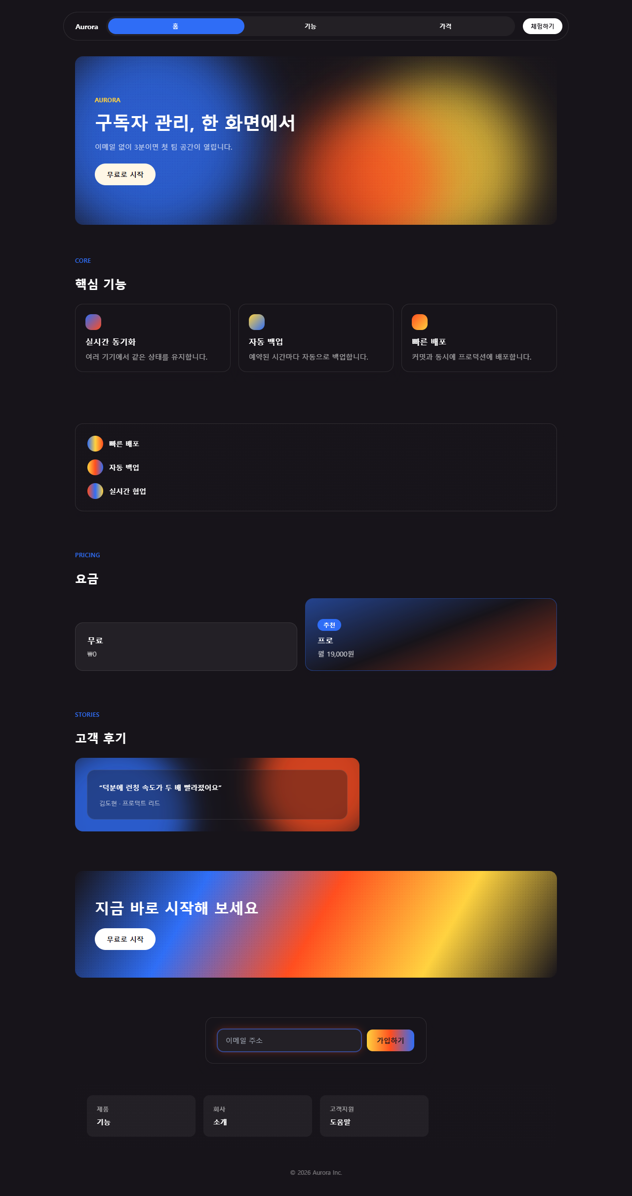
どこで壊れるか — 落とし穴
変化が小さすぎて見えない
オーロラの塊を滑らかなease曲線だけで動かすと、ぼかしの奥ではフレーム間の変化が小さすぎて、アニメーションがあってもないように見える瞬間が生まれます。05番のおすすめプランを最初につくったとき、opacityを0.55から1へ往復させるだけにしたところ、レンダー計測で変化の強度が0と出ました。振れ幅を0.3〜1に広げ、タイミングをsteps(4, jump-none)に変えてようやく6フレーム以上で検出されるようになりました。<ul>や<figure>・<blockquote>のようなセマンティックタグをそのまま使うのも落とし穴です。ブラウザ既定の余白が残っていると320px幅で縦にはみ出し、04番の機能一覧と06番のお客様の声カードが実際にこの問題を抱えていて、margin: 0を明示的に加えてからスクロールバーが消えました。9パーツとワンページ全体のソースをまとめた圧縮ファイルはパスワードu7eepwrpを入れないと開けませんが、下のボタンからダウンロードできます。
最後の落とし穴はコントラスト
最後の落とし穴はコントラストです。オーロラの彩度を下げたり背景を明るい色に変えたりすると、グレインと重なって文字のコントラストが崩れやすいので、文字を置く場所は常に濃いインク色の固定背景の上にするのが安全です。グレインを載せた大きな面がまるごと画像へ置き換わる瞬間は、背景を画像としてしか扱えないメルマガのデザインテンプレートではすでに日常です。
アクセシビリティ
動きを減らすと静止する
09番ボタンのグラデーションの流れと、01・06・07・08番のオーブの漂い・CTAの流れ・グレインのジャンプはすべてMDNのprefers-reduced-motionドキュメントが定義するメディアクエリで包んであり、動きを減らす設定を有効にした訪問者には静止したグラデーションと静止したグレインだけが見えます。
旧Safariへの併記
03番のカード枠のようにmask-compositeを使う項目はMDNのmask-compositeドキュメントを参考に、旧Safari向けの-webkit-mask-composite: xorも併記しています。
文字はグラデーションに乗せない
引用文やボタンの文字は常にインク色の背景に白文字、またはクリーム色の背景にインク色の文字で置き、グラデーションが流れている間もコントラストが崩れないようにしています。このスタイル以外のトレンドも見たい方はデザイントレンドカテゴリにまとめてあり、このサイト全体のコンセプトは紹介ページで確認できます。
FAQ
メッシュグラデーション css だけでつくれますか?
はい、この編の9パーツはすべてJS 0行です。09番ボタンのホバー反応も:hover・:focus-visible疑似クラスだけで処理しており、JavaScriptはデモを撮影するときにアニメーションを強制再生させる用途でしか使っていません。
グレインのテクスチャは画像ファイルが必要ですか?
いいえ。この編のグレインはごく小さなradial-gradientの点を2つ重ね、background-sizeを3〜5pxで密に繰り返す方式なので、画像リクエストは一度も発生しません。08番フッターのように点の位置をフレームごとにずらせば、フィルムグレイン特有のチラつきもCSSだけで再現できます。
暗い背景でなくてもメッシュグラデーションは使えますか?
明るい背景の上でもオーロラの塊自体はそのまま使えますが、この編の9パーツはすべて濃いインク色の背景を既定値にしています。明るい背景では、塊の不透明度を下げ、グレインの合成モードをoverlayからmultiplyに変えると同程度の質感を保てます。同じ光を金属の質感へ寄せると、Y2Kのクロム・ホログラフィックLPの輝く面の処理になります。
こんな記事もどうぞ
 デザイントレンド【コピペOK】ベントグリッド 今どきのLPパーツ9選
 デザイントレンド現場で使う ダークモード デザインシステム LPパーツ9選
 デザイントレンドキネティックタイポグラフィをコードで分解してみた
 デザイントレンドクレイモーフィズムとは?丸くてぷっくりしたLPパーツ9選
 デザイントレンドネオブルータリズム UI キット、影がにじまないLPパーツ9選
 デザイントレンドy2k webデザインとは?クロムとホログラフィックのLPパーツ9選
 デザイントレンドHUD デザインとは?画面に見つめ返される9パーツ
 デザイントレンドニューモーフィズム デザインとは?二重の影だけのLPパーツ9選
 デザイントレンドペーパーカット デザインのLPパーツ9選、コピペOK
 デザイントレンドコラージュ デザインのLPパーツ9選、コピペOK