【コピペOK】ベントグリッド 今どきのLPパーツ9選
ベントグリッドは、日本の弁当箱のように大きさの異なる区画を隙間なく組み合わせ、ランディングページ全体を一枚の格子に見せるレイアウト手法です。ヒーローから料金表まで、すべてのセクションが同じ角丸と影の強さの上に乗ります。
2025年ごろからSaaSのランディングページで急速に広まり、プロダクト系のスタートアップサイトやポートフォリオのカバーでもよく見かける並びです。特徴は主に五つで、角丸の半径を全タイルで統一すること、影の濃さだけで階層を作ること、タイル間のgutterを揃えること、強調したいタイルだけを大きくすること、写真をほとんど使わず色面だけで見せることです。まずは実際に組んだ一枚のページを眺めてください。 画面を暗くして組みたい場合はダークモード デザインシステムのLPパーツ9選が同じ格子の感覚を黒い背景へ移しており、タイルの文面がメールへ流れ込む仕事ならメルマガ デザイン 9種がその受け渡しを扱います。

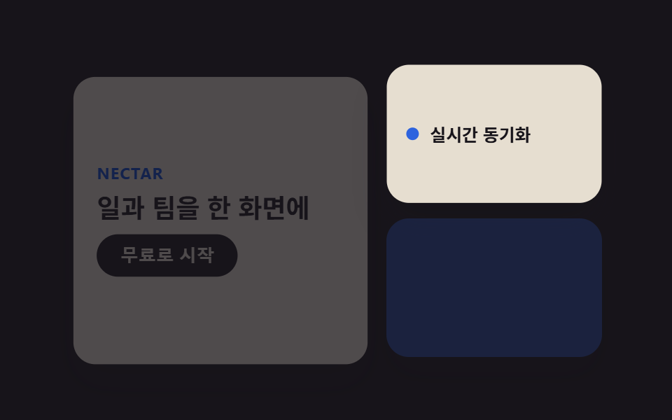 01 bento-grid-hero
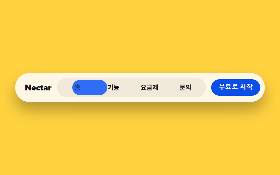 02 bento-grid-nav
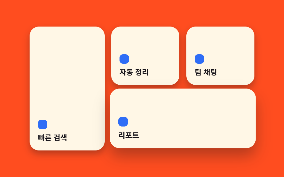 03 bento-grid-card-grid
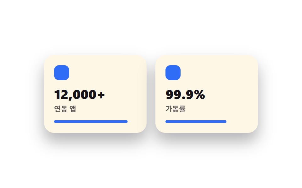 04 bento-grid-features
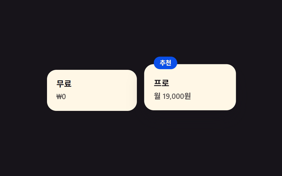 05 bento-grid-pricing
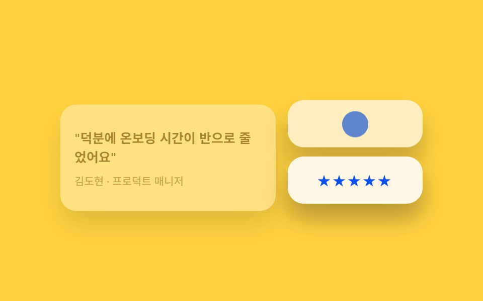 06 bento-grid-testimonials
 07 bento-grid-cta-band
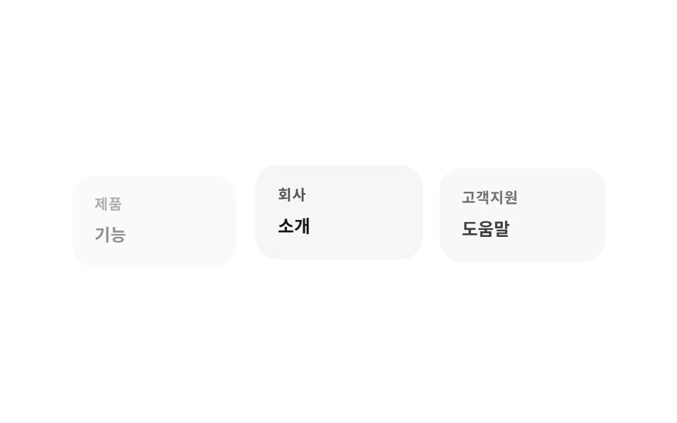 08 bento-grid-footer
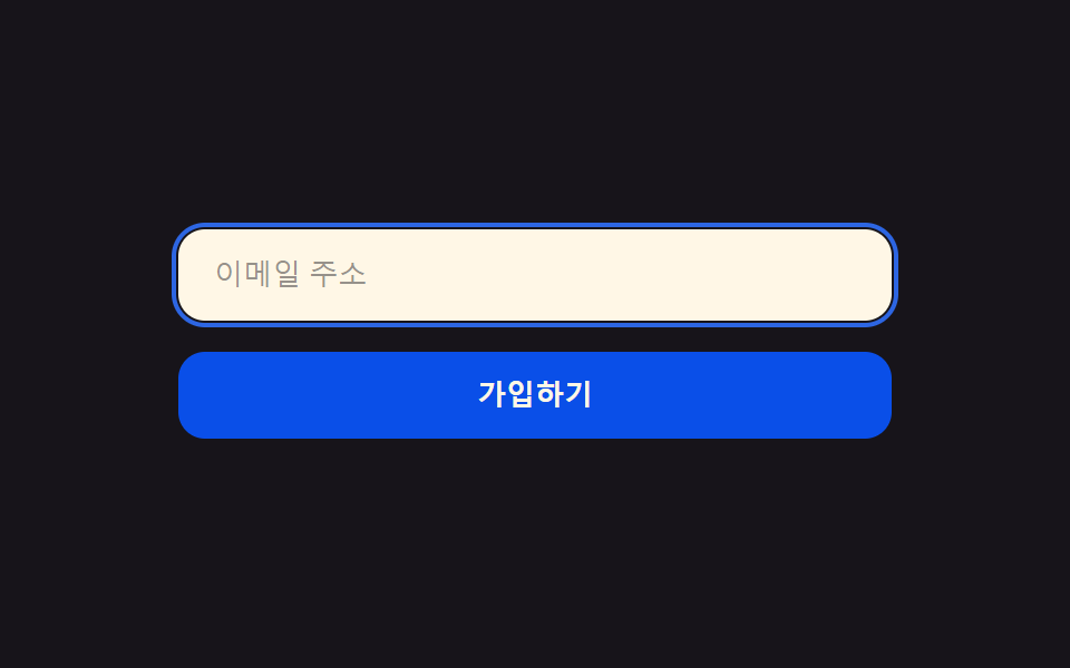 09 bento-grid-buttons-inputs
自動再生 · タイルを押すとその項目へ · すべて1つのzip
- 01 ベント型ヒーロー(2×2)
- 02 丸ピル型ナビ
- 03 コアとなるベントカードグリッド
- 04 アイコン+数字の機能カード
- 05 サイズで差をつけたプラン
- 06 引用カードを混在配置
- 07 横長CTAタイル
- 08 リンク群をタイル化
- 09 radius12のピルボタン
01ベント型ヒーロー(2×2)
何が起きるか
ヒーロー領域を一枚の大きな塊ではなく、大きさの異なる複数のタイルに分けて配置します。
<main class="stage">
  <section class="hero">
    <div class="hero__tile hero__tile--main is-demo">
      <p class="hero__eyebrow">Nectar</p>
      <h2 class="hero__title">仕事とチームを、ひとつの画面に</h2>
      <button class="hero__cta" type="button">無料で始める</button>
    </div>
    <div class="hero__tile hero__tile--stat is-demo">
      <span class="hero__dot" aria-hidden="true"></span>
      <span class="hero__stat-label">リアルタイム同期</span>
    </div>
    <div class="hero__tile hero__tile--visual is-demo" aria-hidden="true"></div>
  </section>
</main>
@use "../../../../site/static/demo-tokens" as *;
$duration: $dur-loop; // 카드가 뜨고 지는 한 주기
$easing: $ease-spring; // 등장 곡선
$color: $subject-blue; // 강조 색
@include stage($stage-ink);
.hero {
  width: clamp(240px, 82vw, 380px);
  height: clamp(160px, 46vw, 210px);
  display: grid;
  grid-template-columns: 1.4fr 1fr;
  grid-template-rows: 1fr 1fr;
  gap: clamp(8px, 2.4vw, 12px);
}
.hero__tile {
  border-radius: $r-card;
  background: $subject-cream;
  box-shadow: $shadow-raised;
  animation: heroIn $duration $easing infinite;
}
.hero__tile--main {
grid-row: 1 / 3;
display: flex;
flex-direction: column;
justify-content: center;
gap: clamp(6px, 1.6vw, 10px);
padding: clamp(12px, 3.6vw, 18px);
animation-delay: 0s;
}
.hero__tile--stat {
display: flex;
align-items: center;
gap: 8px;
padding: clamp(10px, 3vw, 14px);
animation-delay: -0.5s;
}
.hero__tile--visual {
background: $color;
opacity: .16;
animation-name: heroInFaint;
animation-delay: -1s;
}
.hero__eyebrow {
margin: 0;
color: $subject-blue-deep; // 밝은 면 위 파란 글자 — AA 4.5 (blog-design 글자 대비)
font-weight: 700; font-size: clamp(10px, 2.6vw, 12px); line-height: 1;
letter-spacing: .04em;
text-transform: uppercase;
}
.hero__title {
margin: 0;
color: $subject-ink;
font-weight: 700; font-size: clamp(15px, 4vw, 19px); line-height: 1.25;
}
.hero__cta {
align-self: flex-start;
border: 0;
border-radius: $r-pill;
background: $subject-ink;
color: $subject-cream;
padding: clamp(7px, 2vw, 9px) clamp(14px, 3.6vw, 18px);
font-weight: 600; font-size: clamp(11px, 2.8vw, 13px); line-height: 1;
}
.hero__dot {
width: 9px;
height: 9px;
border-radius: 50%;
background: $color;
flex: none;
}
.hero__stat-label {
color: $subject-ink;
font-weight: 600; font-size: clamp(10.5px, 2.6vw, 12.5px); line-height: 1.3;
}
// 데모: 세 칸이 살짝 다른 박자로 떠올랐다 가라앉는다 (WAAPI 시계가 잡을 수 있게 keyframes)
@keyframes heroIn {
0% { opacity: 0; transform: translateY(10px) scale(.97); }
22% { opacity: 1; transform: translateY(0) scale(1); }
78% { opacity: 1; transform: translateY(0) scale(1); }
100% { opacity: 0; transform: translateY(10px) scale(.97); }
}
@keyframes heroInFaint {
0% { opacity: 0; transform: translateY(10px) scale(.97); }
22% { opacity: .16; transform: translateY(0) scale(1); }
78% { opacity: .16; transform: translateY(0) scale(1); }
100% { opacity: 0; transform: translateY(10px) scale(.97); }
}
@media (prefers-reduced-motion: reduce) {
.hero__tile {
animation: none !important;
opacity: 1;
transform: none;
}
.hero__tile--visual { opacity: .16; }
}html, body {
margin: 0;
overflow: hidden;
}
.stage {
box-sizing: border-box;
min-height: 100vh;
display: grid;
place-items: center;
margin: 0;
background: #17141a;
font-family: -apple-system, "Segoe UI", "Noto Sans KR", sans-serif;
padding: clamp(8px, 4vw, 24px);
}
.hero {
width: clamp(240px, 82vw, 380px);
height: clamp(160px, 46vw, 210px);
display: grid;
grid-template-columns: 1.4fr 1fr;
grid-template-rows: 1fr 1fr;
gap: clamp(8px, 2.4vw, 12px);
}
.hero__tile {
border-radius: 16px;
background: #fff7e6;
box-shadow: 0 14px 24px rgba(23, 20, 26, 0.32);
animation: heroIn 2s cubic-bezier(0.2, 0.8, 0.2, 1) infinite;
}
.hero__tile--main {
grid-row: 1/3;
display: flex;
flex-direction: column;
justify-content: center;
gap: clamp(6px, 1.6vw, 10px);
padding: clamp(12px, 3.6vw, 18px);
animation-delay: 0s;
}
.hero__tile--stat {
display: flex;
align-items: center;
gap: 8px;
padding: clamp(10px, 3vw, 14px);
animation-delay: -0.5s;
}
.hero__tile--visual {
background: #2f6df6;
opacity: 0.16;
animation-name: heroInFaint;
animation-delay: -1s;
}
.hero__eyebrow {
margin: 0;
color: #0a4fe8;
font-weight: 700;
font-size: clamp(10px, 2.6vw, 12px);
line-height: 1;
letter-spacing: 0.04em;
text-transform: uppercase;
}
.hero__title {
margin: 0;
color: #17141a;
font-weight: 700;
font-size: clamp(15px, 4vw, 19px);
line-height: 1.25;
}
.hero__cta {
align-self: flex-start;
border: 0;
border-radius: 999px;
background: #17141a;
color: #fff7e6;
padding: clamp(7px, 2vw, 9px) clamp(14px, 3.6vw, 18px);
font-weight: 600;
font-size: clamp(11px, 2.8vw, 13px);
line-height: 1;
}
.hero__dot {
width: 9px;
height: 9px;
border-radius: 50%;
background: #2f6df6;
flex: none;
}
.hero__stat-label {
color: #17141a;
font-weight: 600;
font-size: clamp(10.5px, 2.6vw, 12.5px);
line-height: 1.3;
}
@keyframes heroIn {
0% {
opacity: 0;
transform: translateY(10px) scale(0.97);
}
22% {
opacity: 1;
transform: translateY(0) scale(1);
}
78% {
opacity: 1;
transform: translateY(0) scale(1);
}
100% {
opacity: 0;
transform: translateY(10px) scale(0.97);
}
}
@keyframes heroInFaint {
0% {
opacity: 0;
transform: translateY(10px) scale(0.97);
}
22% {
opacity: 0.16;
transform: translateY(0) scale(1);
}
78% {
opacity: 0.16;
transform: translateY(0) scale(1);
}
100% {
opacity: 0;
transform: translateY(10px) scale(0.97);
}
}
@media (prefers-reduced-motion: reduce) {
.hero__tile {
animation: none !important;
opacity: 1;
transform: none;
}
.hero__tile--visual {
opacity: 0.16;
}
}import type { CSSProperties } from "react";
import styles from "./BentoHero.module.scss";
export type BentoHeroProps = {
eyebrow?: string;
title?: string;
cta?: string;
stat?: string;
/** 한 주기(기본 2000ms) */
duration?: number;
easing?: string;
color?: string;
};
type Vars = CSSProperties & { "--duration"?: string; "--easing"?: string; "--color"?: string };
export default function BentoHero({
eyebrow = "Nectar",
title = "Your work and team, one screen",
cta = "Start for free",
stat = "Real-time sync",
duration = 2000,
easing = "cubic-bezier(.2,.8,.2,1)",
color = "#2f6df6",
}: BentoHeroProps) {
const vars: Vars = { "--duration": `${duration}ms`, "--easing": easing, "--color": color };
return (
<section className={styles.hero} style={vars}>
<div className={`${styles.tile} ${styles.tileMain}`}>
<p className={styles.eyebrow}>{eyebrow}</p>
<h2 className={styles.title}>{title}</h2>
<button type="button" className={styles.cta}>{cta}</button>
</div>
<div className={`${styles.tile} ${styles.tileStat}`}>
<span className={styles.dot} aria-hidden="true" />
<span className={styles.statLabel}>{stat}</span>
</div>
<div className={`${styles.tile} ${styles.tileVisual}`} aria-hidden="true" />
</section>
);
}01 · ベント型ヒーロー(2×2) — 計測 累積面積 53.267% · 動いたフレーム 16/23GODRICH オリジナル · SCSS と React は zip に同梱 · パスワードを見る
向いている場面
SaaSランディングの最初の画面や bento grid portfolio のカバーでよく使われ、見出しの隣に小さな実績タイルを添えるだけで情報量を増やせます。
.hero {
width: clamp(240px, 82vw, 380px);
height: clamp(160px, 46vw, 210px);
display: grid;
grid-template-columns: 1.4fr 1fr;
grid-template-rows: 1fr 1fr;
gap: clamp(8px, 2.4vw, 12px);
}
.hero__tile {
border-radius: $r-card;
background: $subject-cream;
box-shadow: $shadow-raised;
animation: heroIn $duration $easing infinite;
}
02丸ピル型ナビ
動きの内容
メニュー全体が一つのピル型に収まり、現在地を示す内側のチップが選択中の項目まで滑らかに追従します。
<main class="stage">
  <nav class="navbar">
    <span class="navbar__brand">Nectar</span>
    <div class="navbar__pill is-demo">
      <span class="navbar__indicator" aria-hidden="true"></span>
      <span class="navbar__item">ホーム</span>
      <span class="navbar__item">機能</span>
      <span class="navbar__item">料金</span>
      <span class="navbar__item">お問い合わせ</span>
    </div>
    <button class="navbar__cta" type="button">無料で始める</button>
  </nav>
</main>
@use "../../../../site/static/demo-tokens" as *;
$duration: $dur-loop; // 표시등이 네 항목을 도는 한 주기
$easing: $ease-spring; // 이동 곡선
$color: $subject-blue; // 표시등 색
@include stage($stage-yellow);
.navbar {
width: clamp(260px, 84vw, 420px);
display: flex;
align-items: center;
gap: clamp(8px, 2vw, 14px);
background: $subject-cream;
border-radius: $r-pill;
padding: 8px 8px 8px 16px;
box-shadow: $shadow-raised;
}
.navbar__brand {
color: $subject-ink;
font-weight: 800; font-size: clamp(12px, 3vw, 14px); line-height: 1;
flex: none;
}
.navbar__pill {
position: relative;
flex: 1;
display: grid;
grid-template-columns: repeat(4, 1fr);
background: rgba($subject-ink, .06);
border-radius: $r-pill;
padding: 4px;
}
.navbar__indicator {
  position: absolute;
  inset: 4px auto 4px 4px;
  width: calc(25% - 4px);
  border-radius: $r-pill;
  background: $color;
  animation: navSlide $duration $easing infinite;
}
.navbar__item {
  position: relative;
  z-index: 1;
  text-align: center;
  color: $subject-ink;
  font-weight: 600; font-size: clamp(9.5px, 2.3vw, 11.5px); line-height: 1;
  padding: clamp(6px, 1.6vw, 8px) 2px;
}
.navbar__cta {
flex: none;
border: 0;
border-radius: $r-pill;
background: $subject-blue-deep;
color: $subject-cream;
padding: clamp(7px, 1.8vw, 9px) clamp(12px, 2.6vw, 15px);
font-weight: 700; font-size: clamp(9.5px, 2.3vw, 11.5px); line-height: 1;
}
// 데모: 표시등이 홈 → 기능 → 요금제 → 문의 순으로 옮겨간 뒤 처음으로 돌아온다
@keyframes navSlide {
0% { transform: translateX(0%); }
12% { transform: translateX(0%); }
25% { transform: translateX(100%); }
37% { transform: translateX(100%); }
50% { transform: translateX(200%); }
62% { transform: translateX(200%); }
75% { transform: translateX(300%); }
87% { transform: translateX(300%); }
100% { transform: translateX(0%); }
}
@media (prefers-reduced-motion: reduce) {
.navbar__indicator {
animation: none !important;
transform: translateX(0%);
}
}html, body {
margin: 0;
overflow: hidden;
}
.stage {
box-sizing: border-box;
min-height: 100vh;
display: grid;
place-items: center;
margin: 0;
background: #ffd23f;
font-family: -apple-system, "Segoe UI", "Noto Sans KR", sans-serif;
padding: clamp(8px, 4vw, 24px);
}
.navbar {
width: clamp(260px, 84vw, 420px);
display: flex;
align-items: center;
gap: clamp(8px, 2vw, 14px);
background: #fff7e6;
border-radius: 999px;
padding: 8px 8px 8px 16px;
box-shadow: 0 14px 24px rgba(23, 20, 26, 0.32);
}
.navbar__brand {
color: #17141a;
font-weight: 800;
font-size: clamp(12px, 3vw, 14px);
line-height: 1;
flex: none;
}
.navbar__pill {
position: relative;
flex: 1;
display: grid;
grid-template-columns: repeat(4, 1fr);
background: rgba(23, 20, 26, 0.06);
border-radius: 999px;
padding: 4px;
}
.navbar__indicator {
position: absolute;
inset: 4px auto 4px 4px;
width: calc(25% - 4px);
border-radius: 999px;
background: #2f6df6;
animation: navSlide 2s cubic-bezier(0.2, 0.8, 0.2, 1) infinite;
}
.navbar__item {
position: relative;
z-index: 1;
text-align: center;
color: #17141a;
font-weight: 600;
font-size: clamp(9.5px, 2.3vw, 11.5px);
line-height: 1;
padding: clamp(6px, 1.6vw, 8px) 2px;
}
.navbar__cta {
flex: none;
border: 0;
border-radius: 999px;
background: #0a4fe8;
color: #fff7e6;
padding: clamp(7px, 1.8vw, 9px) clamp(12px, 2.6vw, 15px);
font-weight: 700;
font-size: clamp(9.5px, 2.3vw, 11.5px);
line-height: 1;
}
@keyframes navSlide {
0% {
transform: translateX(0%);
}
12% {
transform: translateX(0%);
}
25% {
transform: translateX(100%);
}
37% {
transform: translateX(100%);
}
50% {
transform: translateX(200%);
}
62% {
transform: translateX(200%);
}
75% {
transform: translateX(300%);
}
87% {
transform: translateX(300%);
}
100% {
transform: translateX(0%);
}
}
@media (prefers-reduced-motion: reduce) {
.navbar__indicator {
animation: none !important;
transform: translateX(0%);
}
}import type { CSSProperties } from "react";
import styles from "./BentoNav.module.scss";
export type BentoNavProps = {
brand?: string;
items?: string[];
cta?: string;
duration?: number;
easing?: string;
color?: string;
};
type Vars = CSSProperties & { "--duration"?: string; "--easing"?: string; "--color"?: string };
export default function BentoNav({
brand = "Nectar",
items = ["Home", "Features", "Pricing", "Contact"],
cta = "Start for free",
duration = 2000,
easing = "cubic-bezier(.2,.8,.2,1)",
color = "#2f6df6",
}: BentoNavProps) {
const vars: Vars = { "--duration": `${duration}ms`, "--easing": easing, "--color": color };
return (
<nav className={styles.navbar} style={vars}>
<span className={styles.brand}>{brand}</span>
<div className={styles.pill}>
<span className={styles.indicator} aria-hidden="true" />
{items.map((label) => (
<span key={label} className={styles.item}>{label}</span>
))}
</div>
<button type="button" className={styles.cta}>{cta}</button>
</nav>
);
}02 · 丸ピル型ナビ — 計測 累積面積 4.193% · 動いたフレーム 15/23GODRICH オリジナル · SCSS と React は zip に同梱 · パスワードを見る
使う場面
LP上部のバーやアプリ内のタブ切り替えに向いていて、線ではなく面の移動で位置を伝えます。
.navbar__indicator {
position: absolute;
inset: 4px auto 4px 4px;
width: calc(25% - 4px);
border-radius: $r-pill;
background: $color;
animation: navSlide $duration $easing infinite;
}
.navbar__item {
position: relative;
z-index: 1;
text-align: center;
color: $subject-ink;
font-weight: 600; font-size: clamp(9.5px, 2.3vw, 11.5px); line-height: 1;
padding: clamp(6px, 1.6vw, 8px) 2px;
}
03コアとなるベントカードグリッド
どんな動きか
このスタイルの核となる部分で、マスごとに列・行の幅を変えることで一目見たときに視線が一番大きなマスに止まるように誘導します。
<main class="stage">
  <section class="grid">
    <div class="grid__tile grid__tile--a is-demo">
      <span class="grid__dot" aria-hidden="true"></span>
      <p class="grid__label">高速検索</p>
    </div>
    <div class="grid__tile grid__tile--b is-demo">
      <span class="grid__dot" aria-hidden="true"></span>
      <p class="grid__label">自動整理</p>
    </div>
    <div class="grid__tile grid__tile--c is-demo">
      <span class="grid__dot" aria-hidden="true"></span>
      <p class="grid__label">チームチャット</p>
    </div>
    <div class="grid__tile grid__tile--d is-demo">
      <span class="grid__dot" aria-hidden="true"></span>
      <p class="grid__label">レポート</p>
    </div>
  </section>
</main>
@use "../../../../site/static/demo-tokens" as *;
$duration: $dur-loop; // 네 칸을 도는 한 주기
$easing: $ease-pop; // 살짝 튀는 곡선
$color: $subject-blue; // 점 강조 색
@include stage($stage-orange);
.grid {
  width: clamp(240px, 82vw, 380px);
  height: clamp(160px, 46vw, 210px);
  display: grid;
  grid-template-columns: 1.1fr 1fr 1fr;
  grid-template-rows: 1fr 1fr;
  gap: clamp(8px, 2.4vw, 12px);
}
.grid__tile {
  border-radius: $r-card;
  background: $subject-cream;
  box-shadow: $shadow-press;
  padding: clamp(10px, 3vw, 14px);
  display: flex;
  flex-direction: column;
  justify-content: flex-end;
  gap: 6px;
  animation: tileWave $duration $easing infinite;
}
.grid__tile--a { grid-row: 1 / 3; animation-delay: 0s; }
.grid__tile--b { grid-column: 2; grid-row: 1; animation-delay: -0.5s; }
.grid__tile--c { grid-column: 3; grid-row: 1; animation-delay: -1s; }
.grid__tile--d { grid-column: 2 / 4; grid-row: 2; animation-delay: -1.5s; }
.grid__dot {
width: 16px;
height: 16px;
border-radius: 6px;
background: $color;
}
.grid__label {
margin: 0;
color: $subject-ink;
font-weight: 600; font-size: clamp(10.5px, 2.6vw, 12.5px); line-height: 1.3;
}
// 데모: 칸마다 살짝 떠올랐다 가라앉는 물결이 시차를 두고 지나간다
@keyframes tileWave {
0% { transform: translateY(0) scale(1); box-shadow: $shadow-press; }
15% { transform: translateY(-5px) scale(1.02); box-shadow: $shadow-raised; }
30% { transform: translateY(0) scale(1); box-shadow: $shadow-press; }
100% { transform: translateY(0) scale(1); box-shadow: $shadow-press; }
}
@media (prefers-reduced-motion: reduce) {
.grid__tile {
animation: none !important;
transform: none;
box-shadow: $shadow-press;
}
}html, body {
margin: 0;
overflow: hidden;
}
.stage {
box-sizing: border-box;
min-height: 100vh;
display: grid;
place-items: center;
margin: 0;
background: #ff4d1f;
font-family: -apple-system, "Segoe UI", "Noto Sans KR", sans-serif;
padding: clamp(8px, 4vw, 24px);
}
.grid {
width: clamp(240px, 82vw, 380px);
height: clamp(160px, 46vw, 210px);
display: grid;
grid-template-columns: 1.1fr 1fr 1fr;
grid-template-rows: 1fr 1fr;
gap: clamp(8px, 2.4vw, 12px);
}
.grid__tile {
border-radius: 16px;
background: #fff7e6;
box-shadow: 0 6px 12px rgba(23, 20, 26, 0.32);
padding: clamp(10px, 3vw, 14px);
display: flex;
flex-direction: column;
justify-content: flex-end;
gap: 6px;
animation: tileWave 2s cubic-bezier(0.2, 1.4, 0.4, 1) infinite;
}
.grid__tile--a {
grid-row: 1/3;
animation-delay: 0s;
}
.grid__tile--b {
grid-column: 2;
grid-row: 1;
animation-delay: -0.5s;
}
.grid__tile--c {
grid-column: 3;
grid-row: 1;
animation-delay: -1s;
}
.grid__tile--d {
grid-column: 2/4;
grid-row: 2;
animation-delay: -1.5s;
}
.grid__dot {
width: 16px;
height: 16px;
border-radius: 6px;
background: #2f6df6;
}
.grid__label {
margin: 0;
color: #17141a;
font-weight: 600;
font-size: clamp(10.5px, 2.6vw, 12.5px);
line-height: 1.3;
}
@keyframes tileWave {
0% {
transform: translateY(0) scale(1);
box-shadow: 0 6px 12px rgba(23, 20, 26, 0.32);
}
15% {
transform: translateY(-5px) scale(1.02);
box-shadow: 0 14px 24px rgba(23, 20, 26, 0.32);
}
30% {
transform: translateY(0) scale(1);
box-shadow: 0 6px 12px rgba(23, 20, 26, 0.32);
}
100% {
transform: translateY(0) scale(1);
box-shadow: 0 6px 12px rgba(23, 20, 26, 0.32);
}
}
@media (prefers-reduced-motion: reduce) {
.grid__tile {
animation: none !important;
transform: none;
box-shadow: 0 6px 12px rgba(23, 20, 26, 0.32);
}
}import type { CSSProperties } from "react";
import styles from "./BentoCardGrid.module.scss";
export type BentoCardGridProps = {
labels?: [string, string, string, string];
duration?: number;
easing?: string;
color?: string;
};
type Vars = CSSProperties & { "--duration"?: string; "--easing"?: string; "--color"?: string };
export default function BentoCardGrid({
labels = ["Instant search", "Auto-organize", "Team chat", "Reports"],
duration = 2000,
easing = "cubic-bezier(.2,1.4,.4,1)",
color = "#2f6df6",
}: BentoCardGridProps) {
const vars: Vars = { "--duration": `${duration}ms`, "--easing": easing, "--color": color };
const cls = [styles.tileA, styles.tileB, styles.tileC, styles.tileD];
return (
<section className={styles.grid} style={vars}>
{labels.map((label, i) => (
<div key={label} className={`${styles.tile} ${cls[i]}`}>
<span className={styles.dot} aria-hidden="true" />
<p className={styles.label}>{label}</p>
</div>
))}
</section>
);
}03 · コアとなるベントカードグリッド — 計測 累積面積 17.204% · 動いたフレーム 20/23GODRICH オリジナル · SCSS と React は zip に同梱 · パスワードを見る
bento grid layout の使いどころ
機能紹介グリッドやダッシュボードの要約カードに向いていて、優先度の高い情報を自然に大きく見せられます。
.grid {
width: clamp(240px, 82vw, 380px);
height: clamp(160px, 46vw, 210px);
display: grid;
grid-template-columns: 1.1fr 1fr 1fr;
grid-template-rows: 1fr 1fr;
gap: clamp(8px, 2.4vw, 12px);
}
.grid__tile {
border-radius: $r-card;
background: $subject-cream;
box-shadow: $shadow-press;
padding: clamp(10px, 3vw, 14px);
display: flex;
flex-direction: column;
justify-content: flex-end;
gap: 6px;
animation: tileWave $duration $easing infinite;
}
.grid__tile--a { grid-row: 1 / 3; animation-delay: 0s; }
.grid__tile--b { grid-column: 2; grid-row: 1; animation-delay: -0.5s; }
.grid__tile--c { grid-column: 3; grid-row: 1; animation-delay: -1s; }
.grid__tile--d { grid-column: 2 / 4; grid-row: 2; animation-delay: -1.5s; }
04アイコン+数字の機能カード
何が起きるか
機能ごとにアイコンと強調した数字を一つ、カードの中に大きく配置してスキャンしやすくします。
<main class="stage">
  <section class="feat">
    <div class="feat__card is-demo">
      <span class="feat__icon" aria-hidden="true"></span>
      <p class="feat__num">12,000+</p>
      <p class="feat__label">連携アプリ</p>
      <span class="feat__bar" aria-hidden="true"></span>
    </div>
    <div class="feat__card feat__card--b is-demo">
      <span class="feat__icon" aria-hidden="true"></span>
      <p class="feat__num">99.9%</p>
      <p class="feat__label">稼働率</p>
      <span class="feat__bar" aria-hidden="true"></span>
    </div>
  </section>
</main>
@use "../../../../site/static/demo-tokens" as *;
$duration: $dur-loop; // 두 카드가 채워지는 한 주기
$easing: $ease-out; // 채우는 곡선
$color: $subject-blue; // 아이콘·바 색
@include stage($stage-paper);
.feat {
width: clamp(220px, 76vw, 340px);
display: flex;
gap: clamp(10px, 3vw, 16px);
}
.feat__card {
  flex: 1;
  border-radius: $r-card;
  background: $subject-cream;
  box-shadow: $shadow-raised;
  padding: clamp(12px, 3.4vw, 16px);
  display: flex;
  flex-direction: column;
  gap: 6px;
}
.feat__icon {
  width: 24px;
  height: 24px;
  border-radius: 8px;
  background: $color;
  margin-bottom: 4px;
}
.feat__num {
margin: 0;
color: $subject-ink;
font-weight: 800; font-size: clamp(17px, 4.6vw, 21px); line-height: 1.1;
}
.feat__label {
margin: 0;
color: $subject-ink;
opacity: .7;
font-weight: 600; font-size: clamp(10px, 2.4vw, 11.5px); line-height: 1.3;
}
.feat__bar {
display: block;
height: 4px;
border-radius: $r-pill;
background: $color;
margin-top: 4px;
transform-origin: left; // 규칙8: 왼쪽부터 차오르는 바
transform: scaleX(0);
animation: barFill $duration $easing infinite;
}
.feat__card--b .feat__bar { animation-delay: -1s; }
// 데모: 바가 왼쪽부터 차오르고, 다 차면 잠깐 머물다 비워진다
@keyframes barFill {
0% { transform: scaleX(0); }
40% { transform: scaleX(1); }
75% { transform: scaleX(1); }
100% { transform: scaleX(0); }
}
@media (prefers-reduced-motion: reduce) {
.feat__bar {
animation: none !important;
transform: scaleX(1);
}
}html, body {
margin: 0;
overflow: hidden;
}
.stage {
box-sizing: border-box;
min-height: 100vh;
display: grid;
place-items: center;
margin: 0;
background: #ffffff;
font-family: -apple-system, "Segoe UI", "Noto Sans KR", sans-serif;
padding: clamp(8px, 4vw, 24px);
}
.feat {
width: clamp(220px, 76vw, 340px);
display: flex;
gap: clamp(10px, 3vw, 16px);
}
.feat__card {
flex: 1;
border-radius: 16px;
background: #fff7e6;
box-shadow: 0 14px 24px rgba(23, 20, 26, 0.32);
padding: clamp(12px, 3.4vw, 16px);
display: flex;
flex-direction: column;
gap: 6px;
}
.feat__icon {
width: 24px;
height: 24px;
border-radius: 8px;
background: #2f6df6;
margin-bottom: 4px;
}
.feat__num {
margin: 0;
color: #17141a;
font-weight: 800;
font-size: clamp(17px, 4.6vw, 21px);
line-height: 1.1;
}
.feat__label {
margin: 0;
color: #17141a;
opacity: 0.7;
font-weight: 600;
font-size: clamp(10px, 2.4vw, 11.5px);
line-height: 1.3;
}
.feat__bar {
display: block;
height: 4px;
border-radius: 999px;
background: #2f6df6;
margin-top: 4px;
transform-origin: left;
transform: scaleX(0);
animation: barFill 2s ease-out infinite;
}
.feat__card--b .feat__bar {
animation-delay: -1s;
}
@keyframes barFill {
0% {
transform: scaleX(0);
}
40% {
transform: scaleX(1);
}
75% {
transform: scaleX(1);
}
100% {
transform: scaleX(0);
}
}
@media (prefers-reduced-motion: reduce) {
.feat__bar {
animation: none !important;
transform: scaleX(1);
}
}import type { CSSProperties } from "react";
import styles from "./BentoFeatures.module.scss";
export type BentoFeaturesProps = {
items?: { num: string; label: string }[];
duration?: number;
easing?: string;
color?: string;
};
type Vars = CSSProperties & { "--duration"?: string; "--easing"?: string; "--color"?: string };
export default function BentoFeatures({
items = [
{ num: "12,000+", label: "Connected apps" },
{ num: "99.9%", label: "Uptime" },
],
duration = 2000,
easing = "ease-out",
color = "#2f6df6",
}: BentoFeaturesProps) {
const vars: Vars = { "--duration": `${duration}ms`, "--easing": easing, "--color": color };
return (
<section className={styles.feat} style={vars}>
{items.map((it, i) => (
<div key={it.label} className={i === 1 ? `${styles.card} ${styles.cardB}` : styles.card}>
<span className={styles.icon} aria-hidden="true" />
<p className={styles.num}>{it.num}</p>
<p className={styles.label}>{it.label}</p>
<span className={styles.bar} aria-hidden="true" />
</div>
))}
</section>
);
}04 · アイコン+数字の機能カード — 計測 累積面積 0.728% · 動いたフレーム 23/23GODRICH オリジナル · SCSS と React は zip に同梱 · パスワードを見る
向いている場面
料金表の上の機能まとめやプロダクト紹介セクションに向いていて、細い進捗バーを添えると数値の説得力が増します。
.feat__card {
flex: 1;
border-radius: $r-card;
background: $subject-cream;
box-shadow: $shadow-raised;
padding: clamp(12px, 3.4vw, 16px);
display: flex;
flex-direction: column;
gap: 6px;
}
.feat__icon {
width: 24px;
height: 24px;
border-radius: 8px;
background: $color;
margin-bottom: 4px;
}
05サイズで差をつけたプラン
動きの内容
おすすめプランのタイルだけを大きくすることで、表を組まなくても何を推しているかが一目でわかります。
<main class="stage">
  <section class="pricing">
    <div class="pricing__tile pricing__tile--basic">
      <p class="pricing__plan">無料</p>
      <p class="pricing__price">₩0</p>
    </div>
    <div class="pricing__tile pricing__tile--pro is-demo">
      <span class="pricing__badge">おすすめ</span>
      <p class="pricing__plan">プロ</p>
      <p class="pricing__price">月19,000円</p>
    </div>
  </section>
</main>
@use "../../../../site/static/demo-tokens" as *;
$duration: $dur-loop; // 추천 칸이 숨쉬는 한 주기
$easing: $ease-spring; // 배지가 튀는 곡선
$color: $subject-blue-deep; // 배지 색 (크림 글자가 얹히므로 진한 파랑)
@include stage($stage-ink);
.pricing {
width: clamp(220px, 76vw, 320px);
display: flex;
align-items: flex-end;
gap: clamp(10px, 3vw, 14px);
}
.pricing__tile {
flex: 1;
border-radius: $r-card;
padding: clamp(12px, 3.4vw, 16px);
display: flex;
flex-direction: column;
gap: 4px;
}
.pricing__tile--basic {
background: $subject-cream;
box-shadow: $shadow-press;
}
.pricing__tile--pro {
position: relative;
background: $subject-cream;
box-shadow: $shadow-raised;
padding-top: clamp(20px, 5vw, 26px);
transform-origin: bottom center; // 규칙8: 바닥 붙은 채 위로 숨쉼
animation: proBreathe $duration $easing infinite;
}
.pricing__badge {
position: absolute;
top: -10px;
left: clamp(12px, 3.4vw, 16px);
background: $color;
color: $subject-cream;
border-radius: $r-pill;
padding: 3px 10px;
font-weight: 700; font-size: clamp(9px, 2.2vw, 10.5px); line-height: 1.4;
animation: badgeBounce $duration $easing infinite;
}
.pricing__plan {
margin: 0;
color: $subject-ink;
font-weight: 700; font-size: clamp(12px, 3vw, 14px); line-height: 1.2;
}
.pricing__price {
margin: 0;
color: $subject-ink;
opacity: .75;
font-weight: 600; font-size: clamp(11px, 2.6vw, 12.5px); line-height: 1.3;
}
// 데모: 추천 칸이 살짝 커졌다 돌아오고, 배지는 그 위에서 한 번 더 튄다
@keyframes proBreathe {
0%, 100% { transform: scale(1); }
50% { transform: scale(1.035); }
}
@keyframes badgeBounce {
0%, 100% { transform: translateY(0); }
45% { transform: translateY(-4px); }
55% { transform: translateY(-4px); }
}
@media (prefers-reduced-motion: reduce) {
.pricing__tile--pro,
.pricing__badge {
animation: none !important;
transform: none;
}
}html, body {
margin: 0;
overflow: hidden;
}
.stage {
box-sizing: border-box;
min-height: 100vh;
display: grid;
place-items: center;
margin: 0;
background: #17141a;
font-family: -apple-system, "Segoe UI", "Noto Sans KR", sans-serif;
padding: clamp(8px, 4vw, 24px);
}
.pricing {
width: clamp(220px, 76vw, 320px);
display: flex;
align-items: flex-end;
gap: clamp(10px, 3vw, 14px);
}
.pricing__tile {
flex: 1;
border-radius: 16px;
padding: clamp(12px, 3.4vw, 16px);
display: flex;
flex-direction: column;
gap: 4px;
}
.pricing__tile--basic {
background: #fff7e6;
box-shadow: 0 6px 12px rgba(23, 20, 26, 0.32);
}
.pricing__tile--pro {
position: relative;
background: #fff7e6;
box-shadow: 0 14px 24px rgba(23, 20, 26, 0.32);
padding-top: clamp(20px, 5vw, 26px);
transform-origin: bottom center;
animation: proBreathe 2s cubic-bezier(0.2, 0.8, 0.2, 1) infinite;
}
.pricing__badge {
position: absolute;
top: -10px;
left: clamp(12px, 3.4vw, 16px);
background: #0a4fe8;
color: #fff7e6;
border-radius: 999px;
padding: 3px 10px;
font-weight: 700;
font-size: clamp(9px, 2.2vw, 10.5px);
line-height: 1.4;
animation: badgeBounce 2s cubic-bezier(0.2, 0.8, 0.2, 1) infinite;
}
.pricing__plan {
margin: 0;
color: #17141a;
font-weight: 700;
font-size: clamp(12px, 3vw, 14px);
line-height: 1.2;
}
.pricing__price {
margin: 0;
color: #17141a;
opacity: 0.75;
font-weight: 600;
font-size: clamp(11px, 2.6vw, 12.5px);
line-height: 1.3;
}
@keyframes proBreathe {
0%, 100% {
transform: scale(1);
}
50% {
transform: scale(1.035);
}
}
@keyframes badgeBounce {
0%, 100% {
transform: translateY(0);
}
45% {
transform: translateY(-4px);
}
55% {
transform: translateY(-4px);
}
}
@media (prefers-reduced-motion: reduce) {
.pricing__tile--pro,
.pricing__badge {
animation: none !important;
transform: none;
}
}import type { CSSProperties } from "react";
import styles from "./BentoPricing.module.scss";
export type BentoPricingProps = {
basicLabel?: string;
basicPrice?: string;
proLabel?: string;
proPrice?: string;
badge?: string;
duration?: number;
easing?: string;
color?: string;
};
type Vars = CSSProperties & { "--duration"?: string; "--easing"?: string; "--color"?: string };
export default function BentoPricing({
basicLabel = "Free",
basicPrice = "$0",
proLabel = "Pro",
proPrice = "$19/mo",
badge = "Recommended",
duration = 2000,
easing = "cubic-bezier(.2,.8,.2,1)",
color = "#0a4fe8",
}: BentoPricingProps) {
const vars: Vars = { "--duration": `${duration}ms`, "--easing": easing, "--color": color };
return (
<section className={styles.pricing} style={vars}>
<div className={`${styles.tile} ${styles.basic}`}>
<p className={styles.plan}>{basicLabel}</p>
<p className={styles.price}>{basicPrice}</p>
</div>
<div className={`${styles.tile} ${styles.pro}`}>
<span className={styles.badge}>{badge}</span>
<p className={styles.plan}>{proLabel}</p>
<p className={styles.price}>{proPrice}</p>
</div>
</section>
);
}05 · サイズで差をつけたプラン — 計測 累積面積 1.839% · 動いたフレーム 21/23GODRICH オリジナル · SCSS と React は zip に同梱 · パスワードを見る
使う場面
3段階の料金プランや無料と有料の比較に向いていて、バッジの位置とタイルの拡大率をそろえると視線の流れが崩れません。
.pricing__tile--pro {
  position: relative;
  background: $subject-cream;
  box-shadow: $shadow-raised;
  padding-top: clamp(20px, 5vw, 26px);
  transform-origin: bottom center;
  animation: proBreathe $duration $easing infinite;
}
.pricing__badge {
  position: absolute;
  top: -10px;
  left: clamp(12px, 3.4vw, 16px);
  background: $color;
  color: $subject-cream;
  border-radius: $r-pill;
  padding: 3px 10px;
  font-weight: 700; font-size: clamp(9px, 2.2vw, 10.5px); line-height: 1.4;
  animation: badgeBounce $duration $easing infinite;
}
06引用カードを混在配置
どんな動きか
レビューカードをグリッドの間に混ぜて配置し、広告のように並んで見えないようにします。
<main class="stage">
  <section class="testi">
    <div class="testi__tile testi__tile--quote is-demo">
      <p class="testi__text">「おかげでオンボーディング時間が半分になりました。」</p>
      <p class="testi__by">キム・ドヒョン · プロダクトマネージャー</p>
    </div>
    <div class="testi__tile testi__tile--avatar is-demo" aria-hidden="true"></div>
    <div class="testi__tile testi__tile--stars is-demo" aria-hidden="true">★★★★★</div>
  </section>
</main>
@use "../../../../site/static/demo-tokens" as *;
$duration: $dur-loop; // 세 칸이 스치듯 들어오는 한 주기
$easing: $ease-spring; // 등장 곡선
$color: $subject-blue; // 별점 색
@include stage($stage-yellow);
.testi {
  width: clamp(240px, 82vw, 360px);
  display: grid;
  grid-template-columns: 1.6fr 1fr;
  grid-template-rows: 1fr 1fr;
  gap: clamp(8px, 2.4vw, 12px);
}
.testi__tile {
  border-radius: $r-card;
  background: $subject-cream;
  box-shadow: $shadow-raised;
  padding: clamp(10px, 3vw, 14px);
  animation: driftIn $duration $easing infinite;
}
.testi__tile--quote {
  grid-row: 1 / 3;
  display: flex;
  flex-direction: column;
  justify-content: center;
  gap: 8px;
  animation-delay: 0s;
}
.testi__tile--avatar {
position: relative;
animation-delay: -0.6s;
}
.testi__tile--avatar::before {
content: "";
position: absolute;
inset: 0;
margin: auto;
width: 26px;
height: 26px;
border-radius: 50%;
background: $color;
}
.testi__tile--stars {
display: grid;
place-items: center;
color: $subject-blue-deep; // 밝은 면 위 파란 글자 — AA 4.5 (blog-design 글자 대비)
letter-spacing: 2px;
font-size: clamp(11px, 2.8vw, 13px);
animation-delay: -1.2s;
}
.testi__text {
margin: 0;
color: $subject-ink;
font-weight: 600; font-size: clamp(11px, 2.8vw, 13px); line-height: 1.5;
}
.testi__by {
margin: 0;
color: $subject-ink;
opacity: .65;
font-weight: 500; font-size: clamp(9.5px, 2.2vw, 11px); line-height: 1.3;
}
// 데모: 세 칸이 아래서 살짝 미끄러져 들어왔다 멈췄다 사라진다 (시차)
@keyframes driftIn {
0% { opacity: 0; transform: translateY(12px); }
20% { opacity: 1; transform: translateY(0); }
70% { opacity: 1; transform: translateY(0); }
100% { opacity: 0; transform: translateY(12px); }
}
@media (prefers-reduced-motion: reduce) {
.testi__tile {
animation: none !important;
opacity: 1;
transform: none;
}
}html, body {
margin: 0;
overflow: hidden;
}
.stage {
box-sizing: border-box;
min-height: 100vh;
display: grid;
place-items: center;
margin: 0;
background: #ffd23f;
font-family: -apple-system, "Segoe UI", "Noto Sans KR", sans-serif;
padding: clamp(8px, 4vw, 24px);
}
.testi {
width: clamp(240px, 82vw, 360px);
display: grid;
grid-template-columns: 1.6fr 1fr;
grid-template-rows: 1fr 1fr;
gap: clamp(8px, 2.4vw, 12px);
}
.testi__tile {
border-radius: 16px;
background: #fff7e6;
box-shadow: 0 14px 24px rgba(23, 20, 26, 0.32);
padding: clamp(10px, 3vw, 14px);
animation: driftIn 2s cubic-bezier(0.2, 0.8, 0.2, 1) infinite;
}
.testi__tile--quote {
grid-row: 1/3;
display: flex;
flex-direction: column;
justify-content: center;
gap: 8px;
animation-delay: 0s;
}
.testi__tile--avatar {
position: relative;
animation-delay: -0.6s;
}
.testi__tile--avatar::before {
content: "";
position: absolute;
inset: 0;
margin: auto;
width: 26px;
height: 26px;
border-radius: 50%;
background: #2f6df6;
}
.testi__tile--stars {
display: grid;
place-items: center;
color: #0a4fe8;
letter-spacing: 2px;
font-size: clamp(11px, 2.8vw, 13px);
animation-delay: -1.2s;
}
.testi__text {
margin: 0;
color: #17141a;
font-weight: 600;
font-size: clamp(11px, 2.8vw, 13px);
line-height: 1.5;
}
.testi__by {
margin: 0;
color: #17141a;
opacity: 0.65;
font-weight: 500;
font-size: clamp(9.5px, 2.2vw, 11px);
line-height: 1.3;
}
@keyframes driftIn {
0% {
opacity: 0;
transform: translateY(12px);
}
20% {
opacity: 1;
transform: translateY(0);
}
70% {
opacity: 1;
transform: translateY(0);
}
100% {
opacity: 0;
transform: translateY(12px);
}
}
@media (prefers-reduced-motion: reduce) {
.testi__tile {
animation: none !important;
opacity: 1;
transform: none;
}
}import type { CSSProperties } from "react";
import styles from "./BentoTestimonials.module.scss";
export type BentoTestimonialsProps = {
quote?: string;
by?: string;
duration?: number;
easing?: string;
color?: string;
};
type Vars = CSSProperties & { "--duration"?: string; "--easing"?: string; "--color"?: string };
export default function BentoTestimonials({
quote = "Onboarding time dropped by half for us.",
by = "Kim Do-hyun · Product Manager",
duration = 2000,
easing = "cubic-bezier(.2,.8,.2,1)",
color = "#2f6df6",
}: BentoTestimonialsProps) {
const vars: Vars = { "--duration": `${duration}ms`, "--easing": easing, "--color": color };
return (
<section className={styles.testi} style={vars}>
<div className={`${styles.tile} ${styles.quote}`}>
<p className={styles.text}>“{quote}”</p>
<p className={styles.by}>{by}</p>
</div>
<div className={`${styles.tile} ${styles.avatar}`} aria-hidden="true" />
<div className={`${styles.tile} ${styles.stars}`} aria-hidden="true">★★★★★</div>
</section>
);
}06 · 引用カードを混在配置 — 計測 累積面積 33.467% · 動いたフレーム 16/23GODRICH オリジナル · SCSS と React は zip に同梱 · パスワードを見る
使いどころ
顧客の声やパートナーロゴと一緒に置くのに向いていて、引用カードだけを縦に長く取ると発言者の重みが出ます。
.testi {
width: clamp(240px, 82vw, 360px);
display: grid;
grid-template-columns: 1.6fr 1fr;
grid-template-rows: 1fr 1fr;
gap: clamp(8px, 2.4vw, 12px);
}
.testi__tile {
border-radius: $r-card;
background: $subject-cream;
box-shadow: $shadow-raised;
padding: clamp(10px, 3vw, 14px);
animation: driftIn $duration $easing infinite;
}
.testi__tile--quote {
grid-row: 1 / 3;
display: flex;
flex-direction: column;
justify-content: center;
gap: 8px;
animation-delay: 0s;
}
07横長CTAタイル
何が起きるか
グリッドの中で一枚だけ横幅いっぱいを占め、格子を一通り眺め終えた最後にそこへ視線が止まるようにします。
<main class="stage">
  <section class="cta">
    <span class="cta__glow is-demo" aria-hidden="true"></span>
    <h3 class="cta__title">今すぐチームを招待しましょう</h3>
    <button class="cta__btn is-demo" type="button">無料で始める</button>
  </section>
</main>
@use "../../../../site/static/demo-tokens" as *;
$duration: $dur-loop; // 은은한 빛이 숨쉬는 한 주기
$easing: $ease-out; // 번짐 곡선
$color: $subject-blue; // 강조 색
@include stage($stage-orange);
.cta {
position: relative;
width: clamp(260px, 86vw, 400px);
overflow: hidden;
border-radius: $r-card;
background: $subject-ink;
padding: clamp(20px, 5.6vw, 28px) clamp(16px, 5vw, 24px);
display: flex;
flex-direction: column;
align-items: flex-start;
gap: clamp(10px, 3vw, 14px);
}
.cta__glow {
position: absolute;
top: -40%;
right: -20%;
width: 60%;
aspect-ratio: 1;
border-radius: 50%;
background: $color;
filter: blur(2px);
opacity: .3;
animation: glowPulse $duration $easing infinite;
}
.cta__title {
position: relative;
margin: 0;
color: $subject-cream;
font-weight: 700; font-size: clamp(15px, 4vw, 19px); line-height: 1.35;
max-width: 80%;
}
.cta__btn {
position: relative;
border: 0;
border-radius: $r-pill;
background: $subject-cream;
color: $subject-ink;
padding: clamp(8px, 2.2vw, 10px) clamp(16px, 4vw, 20px);
font-weight: 700; font-size: clamp(11px, 2.8vw, 13px); line-height: 1;
animation: btnPulse $duration $easing infinite;
}
// 데모: 배경 빛이 커졌다 작아지고, 버튼이 그 박자에 맞춰 살짝 눌렸다 돌아온다
@keyframes glowPulse {
0%, 100% { transform: scale(1); opacity: .3; }
50% { transform: scale(1.25); opacity: .5; }
}
@keyframes btnPulse {
0%, 100% { transform: scale(1); }
50% { transform: scale(1.06); }
}
@media (prefers-reduced-motion: reduce) {
.cta__glow,
.cta__btn {
animation: none !important;
transform: none;
}
.cta__glow { opacity: .3; }
}html, body {
margin: 0;
overflow: hidden;
}
.stage {
box-sizing: border-box;
min-height: 100vh;
display: grid;
place-items: center;
margin: 0;
background: #ff4d1f;
font-family: -apple-system, "Segoe UI", "Noto Sans KR", sans-serif;
padding: clamp(8px, 4vw, 24px);
}
.cta {
position: relative;
width: clamp(260px, 86vw, 400px);
overflow: hidden;
border-radius: 16px;
background: #17141a;
padding: clamp(20px, 5.6vw, 28px) clamp(16px, 5vw, 24px);
display: flex;
flex-direction: column;
align-items: flex-start;
gap: clamp(10px, 3vw, 14px);
}
.cta__glow {
position: absolute;
top: -40%;
right: -20%;
width: 60%;
aspect-ratio: 1;
border-radius: 50%;
background: #2f6df6;
filter: blur(2px);
opacity: 0.3;
animation: glowPulse 2s ease-out infinite;
}
.cta__title {
position: relative;
margin: 0;
color: #fff7e6;
font-weight: 700;
font-size: clamp(15px, 4vw, 19px);
line-height: 1.35;
max-width: 80%;
}
.cta__btn {
position: relative;
border: 0;
border-radius: 999px;
background: #fff7e6;
color: #17141a;
padding: clamp(8px, 2.2vw, 10px) clamp(16px, 4vw, 20px);
font-weight: 700;
font-size: clamp(11px, 2.8vw, 13px);
line-height: 1;
animation: btnPulse 2s ease-out infinite;
}
@keyframes glowPulse {
0%, 100% {
transform: scale(1);
opacity: 0.3;
}
50% {
transform: scale(1.25);
opacity: 0.5;
}
}
@keyframes btnPulse {
0%, 100% {
transform: scale(1);
}
50% {
transform: scale(1.06);
}
}
@media (prefers-reduced-motion: reduce) {
.cta__glow,
.cta__btn {
animation: none !important;
transform: none;
}
.cta__glow {
opacity: 0.3;
}
}import type { CSSProperties } from "react";
import styles from "./BentoCtaBand.module.scss";
export type BentoCtaBandProps = {
title?: string;
cta?: string;
duration?: number;
easing?: string;
color?: string;
};
type Vars = CSSProperties & { "--duration"?: string; "--easing"?: string; "--color"?: string };
export default function BentoCtaBand({
title = "Bring your team in today",
cta = "Start for free",
duration = 2000,
easing = "ease-out",
color = "#2f6df6",
}: BentoCtaBandProps) {
const vars: Vars = { "--duration": `${duration}ms`, "--easing": easing, "--color": color };
return (
<section className={styles.cta} style={vars}>
<span className={styles.glow} aria-hidden="true" />
<h3 className={styles.title}>{title}</h3>
<button type="button" className={styles.btn}>{cta}</button>
</section>
);
}07 · 横長CTAタイル — 計測 累積面積 19.051% · 動いたフレーム 22/23GODRICH オリジナル · SCSS と React は zip に同梱 · パスワードを見る
向いている場面
登録誘導帯や無料トライアル開始のセクションに向いていて、内側の光の演出は控えめに保つのが要点です。
.cta {
  position: relative;
  width: clamp(260px, 86vw, 400px);
  overflow: hidden;
  border-radius: $r-card;
  background: $subject-ink;
  padding: clamp(20px, 5.6vw, 28px) clamp(18px, 5vw, 24px);
  display: flex;
  flex-direction: column;
  align-items: flex-start;
  gap: clamp(10px, 3vw, 14px);
}
08リンク群をタイル化
動きの内容
フッターのリンク群ごとに薄いタイルを一つ与え、ベントの様式をページの最後まで貫きます。
<main class="stage">
  <footer class="footer">
    <div class="footer__tile is-demo">
      <p class="footer__head">プロダクト</p>
      <p class="footer__link">機能</p>
    </div>
    <div class="footer__tile is-demo">
      <p class="footer__head">会社</p>
      <p class="footer__link">会社概要</p>
    </div>
    <div class="footer__tile is-demo">
      <p class="footer__head">サポート</p>
      <p class="footer__link">ヘルプセンター</p>
    </div>
  </footer>
</main>
@use "../../../../site/static/demo-tokens" as *;
$duration: $dur-loop; // 세 칸이 차례로 밝아지는 한 주기
$easing: $ease-out; // 등장 곡선
$color: $subject-blue; // 링크 강조 색
@include stage($stage-paper);
.footer {
  width: clamp(240px, 84vw, 380px);
  display: flex;
  gap: clamp(8px, 2.4vw, 12px);
}
.footer__tile {
  flex: 1;
  border-radius: $r-card;
  background: rgba($subject-ink, .04);
  padding: clamp(12px, 3.4vw, 16px);
  display: flex;
  flex-direction: column;
  gap: 8px;
  animation: tileReveal $duration $easing infinite;
}
.footer__tile:nth-child(2) { animation-delay: -0.66s; }
.footer__tile:nth-child(3) { animation-delay: -1.33s; }
.footer__head {
margin: 0;
color: $subject-ink;
opacity: .72; // AA 4.5 (blog-design 글자 대비)
font-weight: 700; font-size: clamp(9.5px, 2.2vw, 11px); line-height: 1;
text-transform: uppercase;
letter-spacing: .04em;
}
.footer__link {
margin: 0;
color: $subject-ink;
font-weight: 600; font-size: clamp(11px, 2.6vw, 12.5px); line-height: 1.3;
}
// 데모: 칸마다 살짝 떠오르며 나타났다가 가라앉는다 — 세 칸이 순서대로 (시차)
@keyframes tileReveal {
0% { opacity: .35; transform: translateY(8px) scale(.97); }
35% { opacity: 1; transform: translateY(0) scale(1); }
65% { opacity: 1; transform: translateY(0) scale(1); }
100% { opacity: .35; transform: translateY(8px) scale(.97); }
}
@media (prefers-reduced-motion: reduce) {
.footer__tile {
animation: none !important;
opacity: 1;
transform: none;
}
}html, body {
margin: 0;
overflow: hidden;
}
.stage {
box-sizing: border-box;
min-height: 100vh;
display: grid;
place-items: center;
margin: 0;
background: #ffffff;
font-family: -apple-system, "Segoe UI", "Noto Sans KR", sans-serif;
padding: clamp(8px, 4vw, 24px);
}
.footer {
width: clamp(240px, 84vw, 380px);
display: flex;
gap: clamp(8px, 2.4vw, 12px);
}
.footer__tile {
flex: 1;
border-radius: 16px;
background: rgba(23, 20, 26, 0.04);
padding: clamp(12px, 3.4vw, 16px);
display: flex;
flex-direction: column;
gap: 8px;
animation: tileReveal 2s ease-out infinite;
}
.footer__tile:nth-child(2) {
animation-delay: -0.66s;
}
.footer__tile:nth-child(3) {
animation-delay: -1.33s;
}
.footer__head {
margin: 0;
color: #17141a;
opacity: 0.72;
font-weight: 700;
font-size: clamp(9.5px, 2.2vw, 11px);
line-height: 1;
text-transform: uppercase;
letter-spacing: 0.04em;
}
.footer__link {
margin: 0;
color: #17141a;
font-weight: 600;
font-size: clamp(11px, 2.6vw, 12.5px);
line-height: 1.3;
}
@keyframes tileReveal {
0% {
opacity: 0.35;
transform: translateY(8px) scale(0.97);
}
35% {
opacity: 1;
transform: translateY(0) scale(1);
}
65% {
opacity: 1;
transform: translateY(0) scale(1);
}
100% {
opacity: 0.35;
transform: translateY(8px) scale(0.97);
}
}
@media (prefers-reduced-motion: reduce) {
.footer__tile {
animation: none !important;
opacity: 1;
transform: none;
}
}import type { CSSProperties } from "react";
import styles from "./BentoFooter.module.scss";
export type BentoFooterProps = {
groups?: { head: string; link: string }[];
duration?: number;
easing?: string;
color?: string;
};
type Vars = CSSProperties & { "--duration"?: string; "--easing"?: string; "--color"?: string };
export default function BentoFooter({
groups = [
{ head: "Product", link: "Features" },
{ head: "Company", link: "About" },
{ head: "Support", link: "Help center" },
],
duration = 2000,
easing = "ease-out",
color = "#2f6df6",
}: BentoFooterProps) {
const vars: Vars = { "--duration": `${duration}ms`, "--easing": easing, "--color": color };
return (
<footer className={styles.footer} style={vars}>
{groups.map((g, i) => (
<div key={g.head} className={styles.tile} style={{ animationDelay: `${-i * 0.66}s` }}>
<p className={styles.head}>{g.head}</p>
<p className={styles.link}>{g.link}</p>
</div>
))}
</footer>
);
}08 · リンク群をタイル化 — 計測 累積面積 1.765% · 動いたフレーム 23/23GODRICH オリジナル · SCSS と React は zip に同梱 · パスワードを見る
使う場面
マルチカラムフッターやサイトマップの整理に向いていて、区切り線を引かずタイルの余白だけでグループを分けます。
.footer {
width: clamp(240px, 84vw, 380px);
display: flex;
gap: clamp(8px, 2.4vw, 12px);
}
.footer__tile {
flex: 1;
border-radius: $r-card;
background: rgba($subject-ink, .04);
padding: clamp(12px, 3.4vw, 16px);
display: flex;
flex-direction: column;
gap: 8px;
animation: tileReveal $duration $easing infinite;
}
.footer__tile:nth-child(2) { animation-delay: -0.66s; }
.footer__tile:nth-child(3) { animation-delay: -1.33s; }
09radius12のピルボタン
どんな動きか
ボタンと入力欄の角をカードと同じ半径にそろえ、画面全体が一つの規格に見えるようにします。
<main class="stage">
  <form class="form">
    <label class="form__field is-demo">
      <span class="form__ring" aria-hidden="true"></span>
      <input class="form__input" type="email" placeholder="メールアドレス" readonly>
    </label>
    <button class="form__btn is-demo" type="button">登録する</button>
  </form>
</main>
@use "../../../../site/static/demo-tokens" as *;
$duration: $dur-loop; // 포커스 링과 버튼이 도는 한 주기
$easing: $ease-spring; // 눌리는 곡선
$color: $subject-blue; // 포커스 색
@include stage($stage-ink);
.form {
  width: clamp(220px, 76vw, 320px);
  display: flex;
  flex-direction: column;
  gap: clamp(10px, 3vw, 14px);
}
.form__field {
  position: relative;
  display: block;
  border-radius: $r-control;
  background: $subject-cream;
}
.form__ring {
position: absolute;
inset: -3px;
border-radius: calc(#{$r-control} + 3px);
border: 2px solid $color;
opacity: 0;
animation: ringPulse $duration $easing infinite;
}
.form__input {
width: 100%;
box-sizing: border-box;
border: 0;
border-radius: $r-control;
background: transparent;
padding: clamp(11px, 3vw, 13px) clamp(14px, 3.6vw, 16px);
color: $subject-ink;
font-weight: 500; font-size: clamp(11px, 2.8vw, 13px); line-height: 1;
}
.form__input::placeholder { color: rgba($subject-ink, .45); }
.form__btn {
border: 0;
border-radius: $r-control;
background: $subject-blue-deep;
color: $subject-cream;
padding: clamp(11px, 3vw, 13px);
font-weight: 700; font-size: clamp(11px, 2.8vw, 13px); line-height: 1;
animation: btnPress $duration $easing infinite;
}
// 데모: 입력창에 포커스 링이 떴다 사라지고, 이어서 버튼이 한 번 눌린다
@keyframes ringPulse {
0%, 20% { opacity: 0; }
32%, 55% { opacity: 1; }
68%, 100% { opacity: 0; }
}
@keyframes btnPress {
0%, 68% { transform: scale(1); }
78% { transform: scale(.96); }
88%, 100% { transform: scale(1); }
}
@media (prefers-reduced-motion: reduce) {
.form__ring,
.form__btn {
animation: none !important;
transform: none;
}
.form__ring { opacity: 0; }
}html, body {
margin: 0;
overflow: hidden;
}
.stage {
box-sizing: border-box;
min-height: 100vh;
display: grid;
place-items: center;
margin: 0;
background: #17141a;
font-family: -apple-system, "Segoe UI", "Noto Sans KR", sans-serif;
padding: clamp(8px, 4vw, 24px);
}
.form {
width: clamp(220px, 76vw, 320px);
display: flex;
flex-direction: column;
gap: clamp(10px, 3vw, 14px);
}
.form__field {
position: relative;
display: block;
border-radius: 12px;
background: #fff7e6;
}
.form__ring {
position: absolute;
inset: -3px;
border-radius: calc(12px + 3px);
border: 2px solid #2f6df6;
opacity: 0;
animation: ringPulse 2s cubic-bezier(0.2, 0.8, 0.2, 1) infinite;
}
.form__input {
width: 100%;
box-sizing: border-box;
border: 0;
border-radius: 12px;
background: transparent;
padding: clamp(11px, 3vw, 13px) clamp(14px, 3.6vw, 16px);
color: #17141a;
font-weight: 500;
font-size: clamp(11px, 2.8vw, 13px);
line-height: 1;
}
.form__input::placeholder {
color: rgba(23, 20, 26, 0.45);
}
.form__btn {
border: 0;
border-radius: 12px;
background: #0a4fe8;
color: #fff7e6;
padding: clamp(11px, 3vw, 13px);
font-weight: 700;
font-size: clamp(11px, 2.8vw, 13px);
line-height: 1;
animation: btnPress 2s cubic-bezier(0.2, 0.8, 0.2, 1) infinite;
}
@keyframes ringPulse {
0%, 20% {
opacity: 0;
}
32%, 55% {
opacity: 1;
}
68%, 100% {
opacity: 0;
}
}
@keyframes btnPress {
0%, 68% {
transform: scale(1);
}
78% {
transform: scale(0.96);
}
88%, 100% {
transform: scale(1);
}
}
@media (prefers-reduced-motion: reduce) {
.form__ring,
.form__btn {
animation: none !important;
transform: none;
}
.form__ring {
opacity: 0;
}
}import type { CSSProperties } from "react";
import styles from "./BentoButtonsInputs.module.scss";
export type BentoButtonsInputsProps = {
placeholder?: string;
cta?: string;
duration?: number;
easing?: string;
color?: string;
};
type Vars = CSSProperties & { "--duration"?: string; "--easing"?: string; "--color"?: string };
export default function BentoButtonsInputs({
placeholder = "Email address",
cta = "Sign up",
duration = 2000,
easing = "cubic-bezier(.2,.8,.2,1)",
color = "#2f6df6",
}: BentoButtonsInputsProps) {
const vars: Vars = { "--duration": `${duration}ms`, "--easing": easing, "--color": color };
return (
<form className={styles.form} style={vars}>
<label className={styles.field}>
<span className={styles.ring} aria-hidden="true" />
<input className={styles.input} type="email" placeholder={placeholder} readOnly />
</label>
<button type="button" className={styles.btn}>{cta}</button>
</form>
);
}09 · radius12のピルボタン — 計測 累積面積 2.1% · 動いたフレーム 10/23GODRICH オリジナル · SCSS と React は zip に同梱 · パスワードを見る
使いどころ
フォーム送信ボタンや検索・メール入力欄に向いていて、フォーカスリングの太さもタイルの影と同じ強さでそろえると統一感が出ます。
.form {
width: clamp(220px, 76vw, 320px);
display: flex;
flex-direction: column;
gap: clamp(10px, 3vw, 14px);
}
.form__field {
position: relative;
display: block;
border-radius: $r-control;
background: $subject-cream;
}
tailwind.config のカスタム
9つの部品はすべて同じ4つの値の組み合わせでできています。角丸はtile(20px)とpill(999px)の2種類しかなく、影はbentoとbento-hoverの濃淡だけで階層を作り、色はcream・ink・accent・lineの4色に絞られています。プロジェクトに取り込むときはtheme.extendをそのまま貼り付けてください。
tailwind.config = {
  theme: {
    extend: {
      colors: {
        cream: "#fff7e6",
        ink: "#17141a",
        accent: "#2f6df6",
        line: "rgba(23,20,26,.08)",
      },
      fontFamily: {
        display: ["'Plus Jakarta Sans'", "system-ui", "sans-serif"],
        body: ["'Inter'", "system-ui", "sans-serif"],
      },
      borderRadius: {
        tile: "20px",
        pill: "999px",
      },
      boxShadow: {
        bento: "0 14px 24px rgba(23,20,26,.10)",
        "bento-hover": "0 20px 32px rgba(23,20,26,.16)",
      },
      spacing: {
        gutter: "14px",
      },
    },
  },
};
バイブコーディング用プロンプト
上のconfigを自分のプロジェクトに入れたあとは、Claude CodeやCursorに次のような指示を渡すだけで、既存のランディングページをベントグリッドへ組み替えられます。全文はzipのprompt.mdにあり、ここでは冒頭のルールだけを抜き出します。
私のランディングページを bento grid スタイルで組み直して。

ルール:
1. ヒーローは一つの大きなブロックではなく、大きさの違うタイル複数枚(2x2の非対称モザイク)に分ける。
   いちばん大きいタイルにヘッドライン + CTA、小さいタイルにバッジ一つ・数値一つ。
2. すべてのカードに rounded-tile(20px) と shadow-bento を使う。ホバー時は shadow-bento-hover に変え、
   影だけを大きくする — 位置は動かさない。
実際にこのプロンプトをrun/010/demo/page/index.htmlへ適用し、1280×800のビューポートでページ全体をスクリーンショットして確認しました。
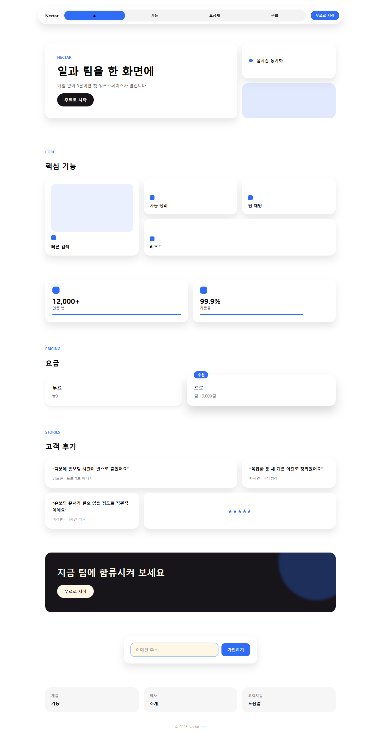
タイルの角丸・影・間隔がconfigの値どおりに出ているか、強調色がaccentひとつに絞られているかをこのスクリーンショットで確かめられます。
どこで壊れるか — 落とし穴
列数を減らす指定がない
一つ目の落とし穴は、実際に組んだ一枚のページ(demo/page/index.html)を見て気づいたものです。03のコア機能グリッドはgrid-cols-3 grid-rows-2のままで、狭い画面向けに列数を減らす指定が入っていません。スマートフォン幅で開くと3列のタイルが押しつぶされたように細くなり、大きいタイルに乗せたはずの見出しが折り返しだらけになります。
バッジがはみ出す
二つ目は05の推奨プラン(pro)タイルを組んでいるときに気づきました。バッジはleft: clamp(12px, 3.4vw, 16px)という固定位置で置かれていて、幅の制約がありません。プラン名を「プロフェッショナル」のように長くすると、バッジのテキストがタイルの右端を越えて隣のタイルに重なって見える瞬間がありました。バッジ側にmax-widthを足し、はみ出す分は省略記号ではなく文字サイズを一段階小さくする側で対処しています。実際に列数を切り替え、バッジの幅も直した版のコードを持っておきたい人は、その9ファイル一式を開く鍵になるj7zbg3efという文字列をここで確認してください。
タイルに載せた案内文を登録後に送るメールにも同じ姿で残したいときは、メールテンプレート デザイン9選がその文面の次の置き場所です。
アクセシビリティ
動きを減らす設定のとき
9つの部品はすべてprefers-reduced-motion: reduceで個々のtransformアニメーションが止まり、要素自体は消えずに静止した状態で残ります。01と03のタイルは浮き上がる動きが止まって最終位置のまま表示され、05のバッジは弾む動きをやめてバッジの文字だけが読める状態で止まります。詳しい仕組みはMDNのprefers-reduced-motionページにまとまっています。
色のコントラスト
色のコントラストにも注意が必要です。accent(#2f6df6)の文字をcream(#fff7e6)の背景に直接乗せると、コントラスト比は4.25:1にとどまり、太字の小さな見出し(text-xsクラスの「CORE」「PRICING」のようなラベル)ではWCAGの4.5:1という基準にわずかに届きません。そこでデモの小さなラベル(01のアイブロウ・06の星)は一段濃い青 #0a4fe8 に置き換え、cream の上で5.98:1、01のベージュ地(#f9f1e1)の上でも5.67:1を確保しています。アイコンやボタンの背景色としてaccentを使う分には問題ありませんが、小さな文字の色として使う場合はこのように濃い方へ寄せるか、フォントサイズを一段階上げてください。
@media (prefers-reduced-motion: reduce) {
  .hero__tile, .navbar__indicator, .grid__tile,
  .feat__bar, .pricing__tile--pro, .pricing__badge,
  .testi__tile, .cta__glow, .cta__btn,
  .footer__tile, .form__ring, .form__btn { animation: none !important; }
}
bento grid design 以外のCSSアニメーションはこちらのデザインカテゴリー一覧に、このサイトの成り立ちは紹介ページにまとめています。
FAQ
なぜ9つのタイルすべてで角丸や影の強さを揃える必要がありますか?
角丸(tile: 20px)と影(bento・bento-hover)の値を全タイルで固定しているのは、大きさの違うタイルが並んでも一つの規格でできていると感じさせるためです。タイルごとに角丸や影の濃さがばらつくと、格子ではなくただの寄せ集めに見えてしまい、視線が大きなタイルから自然に流れていきません。
Tailwindを使わなくても bento grid ui は組めますか?
はい、組めます。zipのtokens.cssには同じ色・角丸・影の値がCSS変数として入っていて、grid-template-columnsとgapを自分で書けばTailwindなしでも同じ見た目を再現できます。プロンプトのルールもクラス名の部分を読み替えるだけで通用します。 静止していたこのタイルにポインタを乗せたときの動きまで作り込みたい場合は、CSSベントグリッドホバーアニメーション9選がこのレイアウトの上にまさにその層を足します。
スマートフォンでもこのレイアウトはそのまま使えますか?
そのままでは崩れやすいです。落とし穴の項目で触れたとおり、03のコアグリッドは列数を減らす指定を持たないため、狭い画面では列が細くなりすぎます。@media (max-width: 640px)でgrid-template-columnsを1列に切り替える指定を自分のプロジェクト側で追加してください。
こんな記事もどうぞ
 デザイントレンド現場で使う ダークモード デザインシステム LPパーツ9選
 デザイントレンドキネティックタイポグラフィをコードで分解してみた
 デザイントレンドクレイモーフィズムとは?丸くてぷっくりしたLPパーツ9選
 デザイントレンドメッシュグラデーションの上に、あえてグレインを残す
 デザイントレンドネオブルータリズム UI キット、影がにじまないLPパーツ9選
 デザイントレンドy2k webデザインとは?クロムとホログラフィックのLPパーツ9選
 デザイントレンドHUD デザインとは?画面に見つめ返される9パーツ
 デザイントレンドニューモーフィズム デザインとは?二重の影だけのLPパーツ9選
 デザイントレンドペーパーカット デザインのLPパーツ9選、コピペOK
 デザイントレンドコラージュ デザインのLPパーツ9選、コピペOK