ニューモーフィズム デザインとは?二重の影だけのLPパーツ9選
ニューモーフィズム デザインとは、カードやボタンの背景色を画面の背景とほぼ同じにしたうえで、明るい影と暗い影を反対方向に重ねることで、色ではなく影だけで立体感を出すデザイン手法です。名前も作り方も知らなかった、あの「押し込まれたようにふくらんで見えるボタン」の正体がこれです。
ピンタレストなどでスクリーンショットとしてばかり出回るスタイルなので、ニューモーフィズム 作り方がそのまま分かるように、実際に組んだワンページのLPを下に載せています。ナビゲーションからフッターまで、まず一度通しでスクロールしてみてください。

上のページは9個の独立したセクションに分解し、この下に格子として並べ直しています。並び順は人気順ではなく、訪問者が実際に画面を上から下へ見ていく流れ——目に留まる、見て回る、料金を確かめる、信頼する、行動を起こす、登録する——に沿わせました。9個のうち3つ(埋め込みアイコンリスト・呼吸するグローCTA帯・ボタンと入力欄)は、同じ面ひとつが影の符号を反転させるだけで浮いても沈んでも見えることを、アニメーションでそのまま示しています。同じdesign柱で、この灰色のキャンバスを暗い計器盤へ替えたのがHUD デザインのパーツ、キャンディカラーへ明るく持ち上げたのがパステル デザイン LPキットです。ニューモーフィズムのキットを選ぶ物差しも同じで、部品の多さより、同じ面が影の符号ひとつで押された状態と浮いた状態をどれだけ安定して往復できるかが先に立ちます。
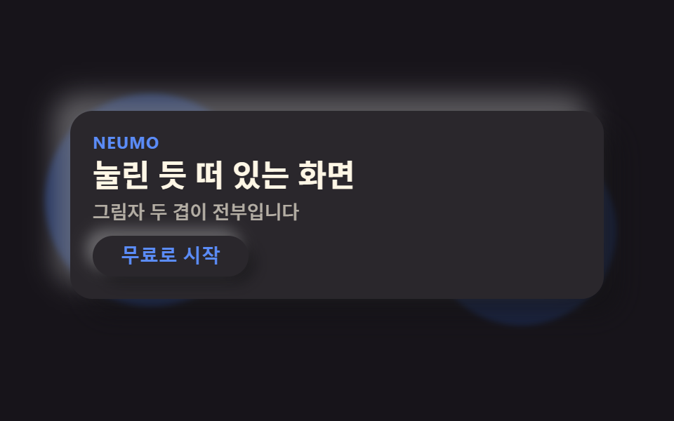 01 hero-neu
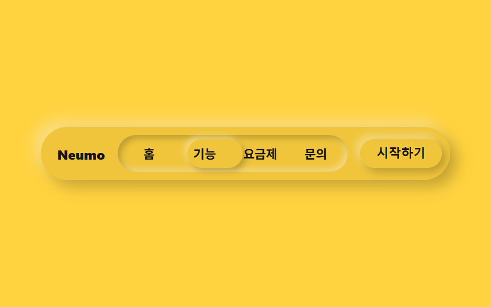 02 nav-neu
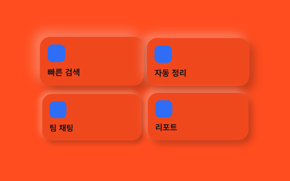 03 card-grid-neu
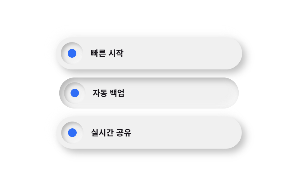 04 feature-list-neu
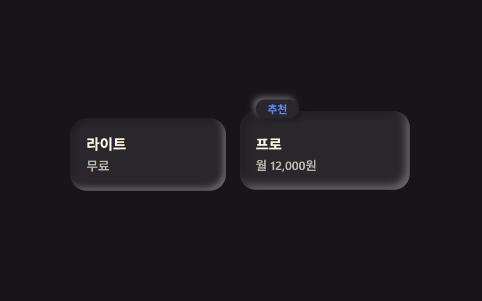 05 pricing-neu
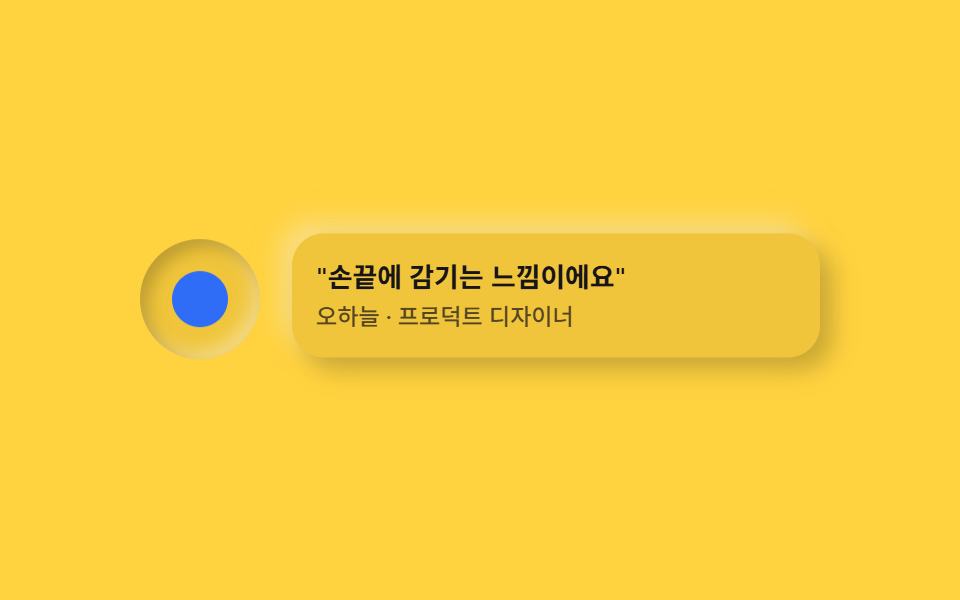 06 testimonial-neu
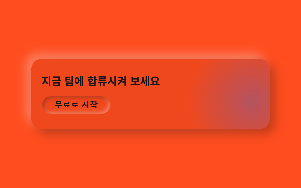 07 cta-band-neu
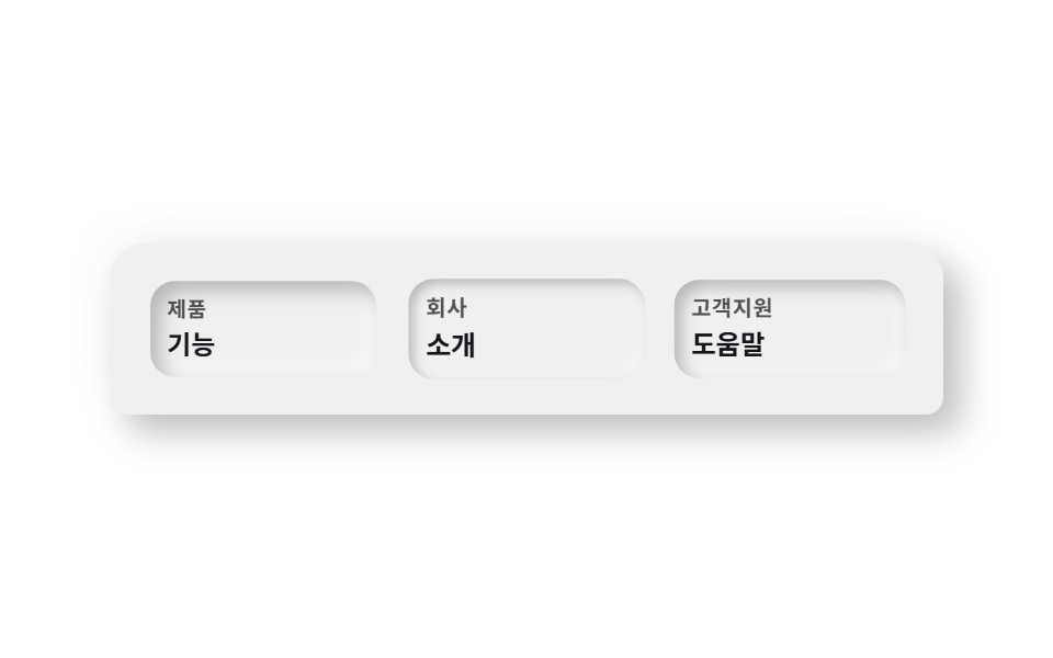 08 footer-neu
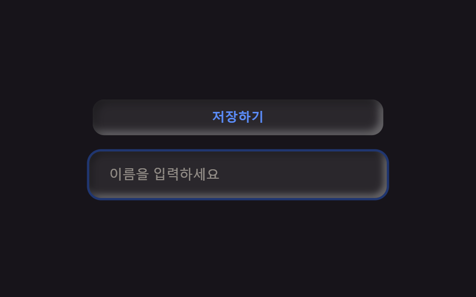 09 buttons-inputs-neu
自動再生 · タイルを押すとその項目へ · すべて1つのzip
- 01 浮き出たヒーロー
- 02 押し込みナビインジケーター
- 03 浮き彫りカードグリッド
- 04 埋め込みアイコンリスト
- 05 浮き出たおすすめプラン
- 06 くぼみアバター+吹き出し
- 07 呼吸するグローCTA帯
- 08 丸い上部フッター
- 09 ニューモーフィズムボタン・入力欄
01浮き出たヒーロー
何が動くか
カードの塗りは背後の舞台とほとんど同じ色で、反対方向を向く影のペアだけがそのカードを背景から浮かせて見せます。
<main class="stage">
  <section class="heroneu">
    <span class="heroneu__orb heroneu__orb--a is-demo" aria-hidden="true"></span>
    <span class="heroneu__orb heroneu__orb--b is-demo" aria-hidden="true"></span>
    <div class="heroneu__card is-demo">
      <p class="heroneu__eyebrow">Neumo</p>
      <h1 class="heroneu__title">浮き出たヒーロー</h1>
      <p class="heroneu__desc">影が二重にあるだけです</p>
      <button class="heroneu__cta" type="button">無料で始める</button>
    </div>
  </section>
</main>
@use "../../../../site/static/demo-tokens" as *;
$duration: $dur-loop; // 오브가 떠도는 한 주기
$easing: $ease-spring; // 떠오르는 곡선
$color: $subject-blue; // 강조 색 — 배경과 분리되는 유일한 색
@include stage($stage-ink);
// 뉴모피즘의 정의: 표면이 배경과 거의 같은 색이어야 그림자만으로 입체감이 생긴다.
// 완전히 같은 값이면 밝은 쪽 그림자가 갈 곳이 없어(검은 배경보다 밝힐 여지는 있다) 배경보다 살짝 밝게 둔다.
$neu-surface: mix($stage-ink, white, 92%);
$neu-light: rgba(mix($neu-surface, white, 40%), .5);
$neu-dark: rgba(mix($neu-surface, black, 40%), .5);
.heroneu {
position: relative;
width: clamp(240px, 82vw, 380px);
}
.heroneu__orb {
position: absolute;
width: clamp(90px, 34vw, 140px);
aspect-ratio: 1;
border-radius: 50%;
background: rgba($color, .3);
pointer-events: none;
filter: blur(2px);
}
.heroneu__orb--a {
top: -18px;
left: -18px;
animation: orbA $duration $easing infinite;
}
.heroneu__orb--b {
bottom: -20px;
right: -14px;
background: rgba($color, .18);
animation: orbB $duration $easing infinite;
animation-delay: -1s;
}
.heroneu__card {
position: relative;
box-sizing: border-box;
width: 100%;
display: flex;
flex-direction: column;
align-items: flex-start;
gap: $sp-1;
padding: $sp-4;
border-radius: $r-card;
background: $neu-surface;
box-shadow: 9px 9px 16px $neu-dark, -9px -9px 16px $neu-light;
animation: cardFloat $duration $easing infinite;
}
.heroneu__eyebrow {
margin: 0;
color: $subject-blue-light;
font-weight: 700; font-size: clamp(10px, 2.6vw, 12px); line-height: 1;
letter-spacing: .04em;
text-transform: uppercase;
}
.heroneu__title {
margin: 0;
color: $subject-cream;
font-weight: 700; font-size: clamp(18px, 4.6vw, 24px); line-height: 1.2;
}
.heroneu__desc {
margin: 0;
color: rgba($subject-cream, .65);
font-weight: 500; font-size: clamp(12px, 2.8vw, 14px); line-height: 1.4;
}
.heroneu__cta {
margin-top: $sp-1;
border: 0;
border-radius: $r-pill;
background: $neu-surface;
color: $subject-blue-light;
padding: $sp-2 $sp-5;
font-weight: 700; font-size: clamp(12px, 2.8vw, 14px); line-height: 1;
box-shadow: 5px 5px 10px $neu-dark, -5px -5px 10px $neu-light;
}
.heroneu__cta:focus-visible {
outline: 3px solid $color;
outline-offset: 2px;
}
// 데모: 오브 두 개가 반대 위상으로 떠돌고, 카드는 살짝 떠올랐다 가라앉는다 (WAAPI 시계가 잡을 수 있게 keyframes)
@keyframes orbA {
0%, 100% { transform: translate(0, 0) scale(1); }
50% { transform: translate(6%, 8%) scale(1.12); }
}
@keyframes orbB {
0%, 100% { transform: translate(0, 0) scale(1); }
50% { transform: translate(-6%, -6%) scale(.9); }
}
@keyframes cardFloat {
0%, 100% { transform: translateY(0); box-shadow: 9px 9px 16px $neu-dark, -9px -9px 16px $neu-light; }
50% { transform: translateY(-6px); box-shadow: 12px 12px 20px $neu-dark, -12px -12px 20px $neu-light; }
}
@media (prefers-reduced-motion: reduce) {
.heroneu__orb, .heroneu__card { animation: none !important; transform: none; }
}html, body {
margin: 0;
overflow: hidden;
}
.stage {
box-sizing: border-box;
min-height: 100vh;
display: grid;
place-items: center;
margin: 0;
background: #17141a;
font-family: -apple-system, "Segoe UI", "Noto Sans KR", sans-serif;
padding: clamp(8px, 4vw, 24px);
}
.heroneu {
position: relative;
width: clamp(240px, 82vw, 380px);
}
.heroneu__orb {
position: absolute;
width: clamp(90px, 34vw, 140px);
aspect-ratio: 1;
border-radius: 50%;
background: rgba(47, 109, 246, 0.3);
pointer-events: none;
filter: blur(2px);
}
.heroneu__orb--a {
top: -18px;
left: -18px;
animation: orbA 2s cubic-bezier(0.2, 0.8, 0.2, 1) infinite;
}
.heroneu__orb--b {
bottom: -20px;
right: -14px;
background: rgba(47, 109, 246, 0.18);
animation: orbB 2s cubic-bezier(0.2, 0.8, 0.2, 1) infinite;
animation-delay: -1s;
}
.heroneu__card {
position: relative;
box-sizing: border-box;
width: 100%;
display: flex;
flex-direction: column;
align-items: flex-start;
gap: 4px;
padding: 16px;
border-radius: 16px;
background: rgb(16.2980392157%, 15.2156862745%, 17.3803921569%);
box-shadow: 9px 9px 16px rgba(6.5192156863%, 6.0862745098%, 6.9521568627%, 0.5), -9px -9px 16px rgba(66.5192156863%, 66.0862745098%, 66.9521568627%, 0.5);
animation: cardFloat 2s cubic-bezier(0.2, 0.8, 0.2, 1) infinite;
}
.heroneu__eyebrow {
margin: 0;
color: #5b8cf8;
font-weight: 700;
font-size: clamp(10px, 2.6vw, 12px);
line-height: 1;
letter-spacing: 0.04em;
text-transform: uppercase;
}
.heroneu__title {
margin: 0;
color: #fff7e6;
font-weight: 700;
font-size: clamp(18px, 4.6vw, 24px);
line-height: 1.2;
}
.heroneu__desc {
margin: 0;
color: rgba(255, 247, 230, 0.65);
font-weight: 500;
font-size: clamp(12px, 2.8vw, 14px);
line-height: 1.4;
}
.heroneu__cta {
margin-top: 4px;
border: 0;
border-radius: 999px;
background: rgb(16.2980392157%, 15.2156862745%, 17.3803921569%);
color: #5b8cf8;
padding: 8px 20px;
font-weight: 700;
font-size: clamp(12px, 2.8vw, 14px);
line-height: 1;
box-shadow: 5px 5px 10px rgba(6.5192156863%, 6.0862745098%, 6.9521568627%, 0.5), -5px -5px 10px rgba(66.5192156863%, 66.0862745098%, 66.9521568627%, 0.5);
}
.heroneu__cta:focus-visible {
outline: 3px solid #2f6df6;
outline-offset: 2px;
}
@keyframes orbA {
0%, 100% {
transform: translate(0, 0) scale(1);
}
50% {
transform: translate(6%, 8%) scale(1.12);
}
}
@keyframes orbB {
0%, 100% {
transform: translate(0, 0) scale(1);
}
50% {
transform: translate(-6%, -6%) scale(0.9);
}
}
@keyframes cardFloat {
0%, 100% {
transform: translateY(0);
box-shadow: 9px 9px 16px rgba(6.5192156863%, 6.0862745098%, 6.9521568627%, 0.5), -9px -9px 16px rgba(66.5192156863%, 66.0862745098%, 66.9521568627%, 0.5);
}
50% {
transform: translateY(-6px);
box-shadow: 12px 12px 20px rgba(6.5192156863%, 6.0862745098%, 6.9521568627%, 0.5), -12px -12px 20px rgba(66.5192156863%, 66.0862745098%, 66.9521568627%, 0.5);
}
}
@media (prefers-reduced-motion: reduce) {
.heroneu__orb, .heroneu__card {
animation: none !important;
transform: none;
}
}import type { CSSProperties } from "react";
import styles from "./HeroNeu.module.scss";
export type HeroNeuProps = {
eyebrow?: string;
title?: string;
desc?: string;
cta?: string;
/** 한 주기(기본 2000ms) */
duration?: number;
easing?: string;
color?: string;
};
type Vars = CSSProperties & { "--duration"?: string; "--easing"?: string; "--color"?: string };
export default function HeroNeu({
eyebrow = "Neumo",
title = "눌린 듯 떠 있는 화면",
desc = "그림자 두 겹이 전부입니다",
cta = "무료로 시작",
duration = 2000,
easing = "cubic-bezier(.2,.8,.2,1)",
color = "#2f6df6",
}: HeroNeuProps) {
const vars: Vars = { "--duration": `${duration}ms`, "--easing": easing, "--color": color };
return (
<section className={styles.hero} style={vars}>
<span className={`${styles.orb} ${styles.orbA}`} aria-hidden="true" />
<span className={`${styles.orb} ${styles.orbB}`} aria-hidden="true" />
<div className={styles.card}>
<p className={styles.eyebrow}>{eyebrow}</p>
<h1 className={styles.title}>{title}</h1>
<p className={styles.desc}>{desc}</p>
<button type="button" className={styles.cta}>{cta}</button>
</div>
</section>
);
}01 · 浮き出たヒーロー — 計測 累積面積 16.376% · 動いたフレーム 12/23GODRICH オリジナル · SCSS と React は zip に同梱 · パスワードを見る
コードで見る所
パネル全体で唯一色が違うのは、後ろでゆっくり漂うアクセント色の丸2つだけです。
<div class="relative mx-auto max-w-xl flex flex-col items-start gap-4
            rounded-neu bg-surface p-10 shadow-neu-raised">
  <p class="text-xs font-bold uppercase text-accent">Neumo</p>
  <h1 class="text-4xl font-extrabold leading-tight">塗りではなく影で立ち上がる画面</h1>
  <button class="rounded-pill bg-surface px-6 py-3 text-sm font-bold text-accent
                 shadow-neu-raised">無料で始める</button>
</div>
02押し込みナビインジケーター
何が動くか
タブのトラック全体は内側にへこんだ影で沈んでおり、アクティブなタブだけが逆向きの浮き出た影をまとってその溝から飛び出して見えます。
<main class="stage">
  <nav class="navneu">
    <span class="navneu__brand">Neumo</span>
    <div class="navneu__track is-demo">
      <span class="navneu__indicator" aria-hidden="true"></span>
      <span class="navneu__item">ホーム</span>
      <span class="navneu__item">機能</span>
      <span class="navneu__item">料金プラン</span>
      <span class="navneu__item">お問い合わせ</span>
    </div>
    <button class="navneu__cta" type="button">はじめる</button>
  </nav>
</main>
@use "../../../../site/static/demo-tokens" as *;
$duration: $dur-loop; // 인디케이터가 4칸을 한 바퀴 도는 시간
$easing: $ease-spring; // 미끄러지는 곡선
$color: $subject-blue; // 강조 색
@include stage($stage-yellow);
$neu-surface: mix($stage-yellow, black, 94%);
$neu-light: rgba(mix($neu-surface, white, 40%), .6);
$neu-dark: rgba(mix($neu-surface, black, 40%), .35);
.navneu {
box-sizing: border-box;
width: clamp(260px, 84vw, 400px);
display: flex;
align-items: center;
gap: $sp-3;
border-radius: $r-pill;
background: $neu-surface;
padding: $sp-2;
box-shadow: 7px 7px 14px $neu-dark, -7px -7px 14px $neu-light;
}
.navneu__brand {
padding-left: $sp-2;
color: $subject-ink;
font-weight: 800; font-size: clamp(11px, 2.8vw, 13px); line-height: 1;
white-space: nowrap;
}
.navneu__track {
position: relative;
flex: 1;
display: flex;
border-radius: $r-pill;
background: $neu-surface;
padding: $sp-1;
// 눌린 트랙 — 안쪽으로 파인 뉴모피즘 인셋 그림자
box-shadow: inset 3px 3px 6px $neu-dark, inset -3px -3px 6px $neu-light;
}
.navneu__indicator {
position: absolute;
top: $sp-1;
bottom: $sp-1;
left: $sp-1;
width: calc((100% - #{$sp-1} * 2) / 4);
border-radius: $r-pill;
background: $neu-surface;
// 인디케이터만 볼록하게 — 트랙(오목)과 대비되는 유일한 볼록 표면
box-shadow: 3px 3px 6px $neu-dark, -3px -3px 6px $neu-light;
animation: navSlide $duration $easing infinite;
}
.navneu__item {
position: relative;
z-index: 1;
flex: 1;
text-align: center;
padding: $sp-2 0;
color: $subject-ink;
font-weight: 600; font-size: clamp(10.5px, 2.6vw, 12px); line-height: 1;
}
.navneu__cta {
border: 0;
border-radius: $r-pill;
background: $neu-surface;
color: $subject-ink;
padding: $sp-2 $sp-4;
font-weight: 700; font-size: clamp(10.5px, 2.6vw, 12px); line-height: 1;
white-space: nowrap;
box-shadow: 4px 4px 8px $neu-dark, -4px -4px 8px $neu-light;
}
.navneu__cta:focus-visible {
outline: 3px solid $color;
outline-offset: 2px;
}
// 데모: 캡슐 안 인디케이터가 4칸을 순서대로 돈다. width 25% 이므로 translateX(100%) = 제 폭만큼 = 한 칸
@keyframes navSlide {
0%, 15% { transform: translateX(0%); }
25%, 40% { transform: translateX(100%); }
50%, 65% { transform: translateX(200%); }
75%, 90% { transform: translateX(300%); }
100% { transform: translateX(0%); }
}
@media (prefers-reduced-motion: reduce) {
.navneu__indicator { animation: none !important; transform: translateX(0%); }
}html, body {
margin: 0;
overflow: hidden;
}
.stage {
box-sizing: border-box;
min-height: 100vh;
display: grid;
place-items: center;
margin: 0;
background: #ffd23f;
font-family: -apple-system, "Segoe UI", "Noto Sans KR", sans-serif;
padding: clamp(8px, 4vw, 24px);
}
.navneu {
box-sizing: border-box;
width: clamp(260px, 84vw, 400px);
display: flex;
align-items: center;
gap: 12px;
border-radius: 999px;
background: rgb(94%, 77.4117647059%, 23.2235294118%);
padding: 8px;
box-shadow: 7px 7px 14px rgba(37.6%, 30.9647058824%, 9.2894117647%, 0.35), -7px -7px 14px rgba(97.6%, 90.9647058824%, 69.2894117647%, 0.6);
}
.navneu__brand {
padding-left: 8px;
color: #17141a;
font-weight: 800;
font-size: clamp(11px, 2.8vw, 13px);
line-height: 1;
white-space: nowrap;
}
.navneu__track {
position: relative;
flex: 1;
display: flex;
border-radius: 999px;
background: rgb(94%, 77.4117647059%, 23.2235294118%);
padding: 4px;
box-shadow: inset 3px 3px 6px rgba(37.6%, 30.9647058824%, 9.2894117647%, 0.35), inset -3px -3px 6px rgba(97.6%, 90.9647058824%, 69.2894117647%, 0.6);
}
.navneu__indicator {
position: absolute;
top: 4px;
bottom: 4px;
left: 4px;
width: calc((100% - 4px * 2) / 4);
border-radius: 999px;
background: rgb(94%, 77.4117647059%, 23.2235294118%);
box-shadow: 3px 3px 6px rgba(37.6%, 30.9647058824%, 9.2894117647%, 0.35), -3px -3px 6px rgba(97.6%, 90.9647058824%, 69.2894117647%, 0.6);
animation: navSlide 2s cubic-bezier(0.2, 0.8, 0.2, 1) infinite;
}
.navneu__item {
position: relative;
z-index: 1;
flex: 1;
text-align: center;
padding: 8px 0;
color: #17141a;
font-weight: 600;
font-size: clamp(10.5px, 2.6vw, 12px);
line-height: 1;
}
.navneu__cta {
border: 0;
border-radius: 999px;
background: rgb(94%, 77.4117647059%, 23.2235294118%);
color: #17141a;
padding: 8px 16px;
font-weight: 700;
font-size: clamp(10.5px, 2.6vw, 12px);
line-height: 1;
white-space: nowrap;
box-shadow: 4px 4px 8px rgba(37.6%, 30.9647058824%, 9.2894117647%, 0.35), -4px -4px 8px rgba(97.6%, 90.9647058824%, 69.2894117647%, 0.6);
}
.navneu__cta:focus-visible {
outline: 3px solid #2f6df6;
outline-offset: 2px;
}
@keyframes navSlide {
0%, 15% {
transform: translateX(0%);
}
25%, 40% {
transform: translateX(100%);
}
50%, 65% {
transform: translateX(200%);
}
75%, 90% {
transform: translateX(300%);
}
100% {
transform: translateX(0%);
}
}
@media (prefers-reduced-motion: reduce) {
.navneu__indicator {
animation: none !important;
transform: translateX(0%);
}
}import type { CSSProperties } from "react";
import styles from "./NavNeu.module.scss";
export type NavNeuProps = {
brand?: string;
items?: string[];
cta?: string;
/** 인디케이터가 항목 전부를 한 바퀴 도는 시간(기본 2000ms) */
duration?: number;
easing?: string;
color?: string;
};
type Vars = CSSProperties & { "--duration"?: string; "--easing"?: string; "--color"?: string };
export default function NavNeu({
brand = "Neumo",
items = ["홈", "기능", "요금제", "문의"],
cta = "시작하기",
duration = 2000,
easing = "cubic-bezier(.2,.8,.2,1)",
color = "#2f6df6",
}: NavNeuProps) {
const vars: Vars = { "--duration": `${duration}ms`, "--easing": easing, "--color": color };
return (
<nav className={styles.nav} style={vars}>
<span className={styles.brand}>{brand}</span>
<div className={styles.track}>
<span className={styles.indicator} aria-hidden="true" style={{ width: `calc((100% - 8px) / ${items.length})` }} />
{items.map((label) => (
<span key={label} className={styles.item}>{label}</span>
))}
</div>
<button type="button" className={styles.cta}>{cta}</button>
</nav>
);
}02 · 押し込みナビインジケーター — 計測 累積面積 3.481% · 動いたフレーム 11/23GODRICH オリジナル · SCSS と React は zip に同梱 · パスワードを見る
コードで見る所
タブの幅をトラックの25%にしておけば、translateX(100%)一回で必ず隣の枠ひとつ分だけ動きます。
<nav class="flex items-center gap-4 rounded-pill bg-surface px-3 py-2
            shadow-neu-raised">
  <div class="relative flex flex-1 rounded-pill bg-surface p-1 shadow-neu-press">
    <span class="absolute inset-y-1 left-1 w-1/4 rounded-pill bg-surface
                 shadow-neu-raised"></span>
    <span class="relative z-10 flex-1 text-center text-xs font-semibold py-2">ホーム</span>
  </div>
</nav>
03浮き彫りカードグリッド
何が動くか
各タイルは背後のページとまったく同じ塗り色を保ったまま、影の深さとわずかな浮き上がりが一緒にループで膨らんだり収まったりします。色そのものは一度も変わらず、浮いて見える度合いだけが変化します。
<main class="stage">
  <div class="cardneu is-demo">
    <div class="cardneu__item cardneu__item--a">
      <span class="cardneu__icon" aria-hidden="true"></span>
      <p class="cardneu__label">高速検索</p>
    </div>
    <div class="cardneu__item cardneu__item--b">
      <span class="cardneu__icon" aria-hidden="true"></span>
      <p class="cardneu__label">自動整理</p>
    </div>
    <div class="cardneu__item cardneu__item--c">
      <span class="cardneu__icon" aria-hidden="true"></span>
      <p class="cardneu__label">チームチャット</p>
    </div>
    <div class="cardneu__item cardneu__item--d">
      <span class="cardneu__icon" aria-hidden="true"></span>
      <p class="cardneu__label">レポート</p>
    </div>
  </div>
</main>
@use "../../../../site/static/demo-tokens" as *;
$duration: $dur-loop; // 카드마다 솟아오르는 한 주기
$easing: $ease-spring; // 솟아오르는 곡선
$color: $subject-blue; // 아이콘 강조 색
@include stage($stage-orange);
$neu-surface: mix($stage-orange, black, 94%);
$neu-light: rgba(mix($neu-surface, white, 40%), .5);
$neu-dark: rgba(mix($neu-surface, black, 40%), .4);
.cardneu {
display: grid;
grid-template-columns: repeat(2, 1fr);
gap: $sp-3;
width: clamp(220px, 78vw, 340px);
}
.cardneu__item {
box-sizing: border-box;
display: flex;
flex-direction: column;
align-items: flex-start;
gap: $sp-2;
padding: $sp-3;
border-radius: $r-card;
background: $neu-surface;
box-shadow: 7px 7px 14px $neu-dark, -7px -7px 14px $neu-light;
animation: emboss $duration $easing infinite;
}
.cardneu__item--a { animation-delay: 0s; }
.cardneu__item--b { animation-delay: -0.5s; }
.cardneu__item--c { animation-delay: -1s; }
.cardneu__item--d { animation-delay: -1.5s; }
.cardneu__icon {
display: block;
width: clamp(20px, 8vw, 28px);
height: clamp(20px, 8vw, 28px);
border-radius: $r-sm;
background: $color;
}
.cardneu__label {
margin: 0;
color: $subject-ink;
font-weight: 700; font-size: clamp(11px, 2.8vw, 13px); line-height: 1.3;
}
// 데모: 네 칸이 서로 다른 박자로 그림자가 깊어지며 솟아올랐다 가라앉는다 (raised 정도 자체가 움직인다)
@keyframes emboss {
0%, 100% {
transform: scale(1) translateY(0);
box-shadow: 4px 4px 8px $neu-dark, -4px -4px 8px $neu-light;
}
50% {
transform: scale(1.05) translateY(-4px);
box-shadow: 9px 9px 18px $neu-dark, -9px -9px 18px $neu-light;
}
}
@media (prefers-reduced-motion: reduce) {
.cardneu__item { animation: none !important; transform: none; box-shadow: 7px 7px 14px $neu-dark, -7px -7px 14px $neu-light; }
}html, body {
margin: 0;
overflow: hidden;
}
.stage {
box-sizing: border-box;
min-height: 100vh;
display: grid;
place-items: center;
margin: 0;
background: #ff4d1f;
font-family: -apple-system, "Segoe UI", "Noto Sans KR", sans-serif;
padding: clamp(8px, 4vw, 24px);
}
.cardneu {
display: grid;
grid-template-columns: repeat(2, 1fr);
gap: 12px;
width: clamp(220px, 78vw, 340px);
}
.cardneu__item {
box-sizing: border-box;
display: flex;
flex-direction: column;
align-items: flex-start;
gap: 8px;
padding: 12px;
border-radius: 16px;
background: rgb(94%, 28.3843137255%, 11.4274509804%);
box-shadow: 7px 7px 14px rgba(37.6%, 11.3537254902%, 4.5709803922%, 0.4), -7px -7px 14px rgba(97.6%, 71.3537254902%, 64.5709803922%, 0.5);
animation: emboss 2s cubic-bezier(0.2, 0.8, 0.2, 1) infinite;
}
.cardneu__item--a {
animation-delay: 0s;
}
.cardneu__item--b {
animation-delay: -0.5s;
}
.cardneu__item--c {
animation-delay: -1s;
}
.cardneu__item--d {
animation-delay: -1.5s;
}
.cardneu__icon {
display: block;
width: clamp(20px, 8vw, 28px);
height: clamp(20px, 8vw, 28px);
border-radius: 8px;
background: #2f6df6;
}
.cardneu__label {
margin: 0;
color: #17141a;
font-weight: 700;
font-size: clamp(11px, 2.8vw, 13px);
line-height: 1.3;
}
@keyframes emboss {
0%, 100% {
transform: scale(1) translateY(0);
box-shadow: 4px 4px 8px rgba(37.6%, 11.3537254902%, 4.5709803922%, 0.4), -4px -4px 8px rgba(97.6%, 71.3537254902%, 64.5709803922%, 0.5);
}
50% {
transform: scale(1.05) translateY(-4px);
box-shadow: 9px 9px 18px rgba(37.6%, 11.3537254902%, 4.5709803922%, 0.4), -9px -9px 18px rgba(97.6%, 71.3537254902%, 64.5709803922%, 0.5);
}
}
@media (prefers-reduced-motion: reduce) {
.cardneu__item {
animation: none !important;
transform: none;
box-shadow: 7px 7px 14px rgba(37.6%, 11.3537254902%, 4.5709803922%, 0.4), -7px -7px 14px rgba(97.6%, 71.3537254902%, 64.5709803922%, 0.5);
}
}import type { CSSProperties } from "react";
import styles from "./CardGridNeu.module.scss";
export type CardGridNeuItem = { label: string };
export type CardGridNeuProps = {
items?: CardGridNeuItem[];
duration?: number;
easing?: string;
color?: string;
};
type Vars = CSSProperties & { "--duration"?: string; "--easing"?: string; "--color"?: string };
export default function CardGridNeu({
items = [{ label: "빠른 검색" }, { label: "자동 정리" }, { label: "팀 채팅" }, { label: "리포트" }],
duration = 2000,
easing = "cubic-bezier(.2,.8,.2,1)",
color = "#2f6df6",
}: CardGridNeuProps) {
const vars: Vars = { "--duration": `${duration}ms`, "--easing": easing, "--color": color };
return (
<div className={styles.grid} style={vars}>
{items.map((it, i) => (
<div key={it.label} className={styles.item} style={{ animationDelay: `${-i * 0.5}s` }}>
<span className={styles.icon} aria-hidden="true" />
<p className={styles.label}>{it.label}</p>
</div>
))}
</div>
);
}03 · 浮き彫りカードグリッド — 計測 累積面積 23.212% · 動いたフレーム 23/23GODRICH オリジナル · SCSS と React は zip に同梱 · パスワードを見る
コードで見る所
タイルごとに開始時刻をずらすと、4枚が波のように順番に立ち上がって見えます。
<div class="grid grid-cols-2 gap-4 sm:grid-cols-4">
  <div class="flex flex-col gap-3 rounded-neu bg-surface p-5 shadow-neu-raised">
    <span class="h-7 w-7 rounded-control bg-accent"></span>
    <p class="text-sm font-semibold">高速検索</p>
  </div>
</div>
04埋め込みアイコンリスト
何が動くか
錠剤型の行そのものは浮き出ていますが、その中のアイコンチップだけが内側に沈み込み、ひとつの行の中で浮き出しと沈み込みが同時に見えます。
<main class="stage">
  <ul class="listneu">
    <li class="listneu__row listneu__row--a is-demo">
      <span class="listneu__chip" aria-hidden="true"></span>
      <span class="listneu__text">クイックスタート</span>
    </li>
    <li class="listneu__row listneu__row--b is-demo">
      <span class="listneu__chip" aria-hidden="true"></span>
      <span class="listneu__text">自動バックアップ</span>
    </li>
    <li class="listneu__row listneu__row--c is-demo">
      <span class="listneu__chip" aria-hidden="true"></span>
      <span class="listneu__text">リアルタイム共有</span>
    </li>
  </ul>
</main>
@use "../../../../site/static/demo-tokens" as *;
$duration: $dur-loop; // 칩이 눌렸다 돌아오는 한 주기
$easing: $ease-pop; // 눌림 곡선
$color: $subject-blue; // 칩 강조 색
@include stage($stage-paper);
// 순백 배경은 밝은 쪽 그림자가 갈 곳이 없다(배경보다 밝힐 여지가 없음) — 6% 만큼 어둡게 눌러
// 두 방향 모두 보이게 한다. 실제 뉴모피즘 튜토리얼이 순백 대신 옅은 회색 캔버스에서 시작하는 이유다.
$neu-surface: mix($stage-paper, black, 94%);
$neu-light: rgba(mix($neu-surface, white, 40%), .85);
$neu-dark: rgba(mix($neu-surface, black, 40%), .4);
.listneu {
list-style: none;
margin: 0;
padding: 0;
display: flex;
flex-direction: column;
gap: $sp-3;
width: clamp(220px, 70vw, 300px);
}
.listneu__row {
box-sizing: border-box;
display: flex;
align-items: center;
gap: $sp-3;
padding: $sp-2 $sp-4 $sp-2 $sp-2;
border-radius: $r-pill;
background: $neu-surface;
box-shadow: 6px 6px 12px $neu-dark, -6px -6px 12px $neu-light;
}
.listneu__row--a { animation: chipPress $duration $easing infinite; animation-delay: 0s; }
.listneu__row--b { animation: chipPress $duration $easing infinite; animation-delay: -0.6s; }
.listneu__row--c { animation: chipPress $duration $easing infinite; animation-delay: -1.2s; }
.listneu__chip {
flex: none;
width: clamp(30px, 9vw, 36px);
height: clamp(30px, 9vw, 36px);
border-radius: $r-pill;
background: $neu-surface;
// 칩만 안쪽으로 파인 표면 — 튀어나온 알약 안에서 유일하게 눌려 있는 지점으로 대비를 만든다
box-shadow: inset 3px 3px 6px $neu-dark, inset -3px -3px 6px $neu-light;
position: relative;
}
.listneu__chip::after {
content: "";
position: absolute;
inset: 30%;
border-radius: 50%;
background: $color;
}
.listneu__text {
color: $subject-ink;
font-weight: 600; font-size: clamp(12px, 2.8vw, 14px); line-height: 1;
}
// 데모: 행 전체가 살짝 눌리며(scale) 그림자 부호가 raised→inset 으로 뒤집혔다가 돌아온다
@keyframes chipPress {
0%, 40%, 100% {
transform: scale(1);
box-shadow: 6px 6px 12px $neu-dark, -6px -6px 12px $neu-light;
}
70% {
transform: scale(.96);
box-shadow: inset 5px 5px 10px $neu-dark, inset -5px -5px 10px $neu-light;
}
}
@media (prefers-reduced-motion: reduce) {
.listneu__row { animation: none !important; transform: none; }
}html, body {
margin: 0;
overflow: hidden;
}
.stage {
box-sizing: border-box;
min-height: 100vh;
display: grid;
place-items: center;
margin: 0;
background: #ffffff;
font-family: -apple-system, "Segoe UI", "Noto Sans KR", sans-serif;
padding: clamp(8px, 4vw, 24px);
}
.listneu {
list-style: none;
margin: 0;
padding: 0;
display: flex;
flex-direction: column;
gap: 12px;
width: clamp(220px, 70vw, 300px);
}
.listneu__row {
box-sizing: border-box;
display: flex;
align-items: center;
gap: 12px;
padding: 8px 16px 8px 8px;
border-radius: 999px;
background: rgb(94%, 94%, 94%);
box-shadow: 6px 6px 12px rgba(37.6%, 37.6%, 37.6%, 0.4), -6px -6px 12px rgba(97.6%, 97.6%, 97.6%, 0.85);
}
.listneu__row--a {
animation: chipPress 2s cubic-bezier(0.2, 1.4, 0.4, 1) infinite;
animation-delay: 0s;
}
.listneu__row--b {
animation: chipPress 2s cubic-bezier(0.2, 1.4, 0.4, 1) infinite;
animation-delay: -0.6s;
}
.listneu__row--c {
animation: chipPress 2s cubic-bezier(0.2, 1.4, 0.4, 1) infinite;
animation-delay: -1.2s;
}
.listneu__chip {
flex: none;
width: clamp(30px, 9vw, 36px);
height: clamp(30px, 9vw, 36px);
border-radius: 999px;
background: rgb(94%, 94%, 94%);
box-shadow: inset 3px 3px 6px rgba(37.6%, 37.6%, 37.6%, 0.4), inset -3px -3px 6px rgba(97.6%, 97.6%, 97.6%, 0.85);
position: relative;
}
.listneu__chip::after {
content: "";
position: absolute;
inset: 30%;
border-radius: 50%;
background: #2f6df6;
}
.listneu__text {
color: #17141a;
font-weight: 600;
font-size: clamp(12px, 2.8vw, 14px);
line-height: 1;
}
@keyframes chipPress {
0%, 40%, 100% {
transform: scale(1);
box-shadow: 6px 6px 12px rgba(37.6%, 37.6%, 37.6%, 0.4), -6px -6px 12px rgba(97.6%, 97.6%, 97.6%, 0.85);
}
70% {
transform: scale(0.96);
box-shadow: inset 5px 5px 10px rgba(37.6%, 37.6%, 37.6%, 0.4), inset -5px -5px 10px rgba(97.6%, 97.6%, 97.6%, 0.85);
}
}
@media (prefers-reduced-motion: reduce) {
.listneu__row {
animation: none !important;
transform: none;
}
}import type { CSSProperties } from "react";
import styles from "./FeatureListNeu.module.scss";
export type FeatureListNeuProps = {
items?: string[];
duration?: number;
easing?: string;
color?: string;
};
type Vars = CSSProperties & { "--duration"?: string; "--easing"?: string; "--color"?: string };
export default function FeatureListNeu({
items = ["빠른 시작", "자동 백업", "실시간 공유"],
duration = 2000,
easing = "cubic-bezier(.2,1.4,.4,1)",
color = "#2f6df6",
}: FeatureListNeuProps) {
const vars: Vars = { "--duration": `${duration}ms`, "--easing": easing, "--color": color };
return (
<ul className={styles.list} style={vars}>
{items.map((label, i) => (
<li key={label} className={styles.row} style={{ animationDelay: `${-i * 0.6}s` }}>
<span className={styles.chip} aria-hidden="true" />
<span className={styles.text}>{label}</span>
</li>
))}
</ul>
);
}04 · 埋め込みアイコンリスト — 計測 累積面積 16.408% · 動いたフレーム 22/23GODRICH オリジナル · SCSS と React は zip に同梱 · パスワードを見る
コードで見る所
キャンバスは純白から6%だけ暗くずらしてあり、そのおかげで影の両方向がちゃんと見えます。
<li class="flex items-center gap-3 rounded-pill bg-surface p-2 pr-5
           shadow-neu-raised">
  <span class="h-9 w-9 flex-none rounded-pill bg-surface
               shadow-neu-press"></span>
  <span class="text-sm font-semibold">クイックスタート</span>
</li>
05浮き出たおすすめプラン
何が動くか
通常プランは沈み込んだままで、おすすめプランだけが深く浮き出た影をまとうので、比較表を出さなくても影の向きだけでどちらを推しているか伝わります。
<main class="stage">
  <div class="priceneu">
    <div class="priceneu__plan">
      <p class="priceneu__name">ライト</p>
      <p class="priceneu__cost">無料</p>
    </div>
    <div class="priceneu__plan priceneu__plan--pro is-demo">
      <span class="priceneu__badge">おすすめ</span>
      <p class="priceneu__name">プロ</p>
      <p class="priceneu__cost">月1,200円</p>
    </div>
  </div>
</main>
@use "../../../../site/static/demo-tokens" as *;
$duration: $dur-loop; // 추천 카드가 눌렸다 튀는 한 주기
$easing: $ease-pop; // 눌림·튐 곡선
$color: $subject-blue; // 배지 강조 색
@include stage($stage-ink);
$neu-surface: mix($stage-ink, white, 92%);
$neu-light: rgba(mix($neu-surface, white, 40%), .5);
$neu-dark: rgba(mix($neu-surface, black, 40%), .5);
.priceneu {
display: flex;
align-items: flex-end;
gap: $sp-3;
width: clamp(220px, 78vw, 340px);
}
.priceneu__plan {
box-sizing: border-box;
flex: 1;
padding: $sp-4;
border-radius: $r-card;
background: $neu-surface;
// 일반 플랜은 얕게 눌려 있어 존재감이 낮다
box-shadow: inset 3px 3px 6px $neu-dark, inset -3px -3px 6px $neu-light;
}
.priceneu__plan--pro {
position: relative;
flex: 1.15;
padding-top: $sp-6;
// 추천 플랜만 튀어나온 뉴모피즘 표면 — 더 깊은 raised 그림자로 위계를 만든다
box-shadow: 9px 9px 18px $neu-dark, -9px -9px 18px $neu-light;
animation: proPress $duration $easing infinite;
}
.priceneu__badge {
position: absolute;
top: -$sp-3;
left: $sp-4;
border-radius: $r-pill;
background: $neu-surface;
color: $subject-blue-light;
padding: $sp-1 $sp-3;
font-weight: 700; font-size: clamp(10px, 2.4vw, 11px); line-height: 1;
box-shadow: 3px 3px 6px $neu-dark, -3px -3px 6px $neu-light;
}
.priceneu__name {
margin: 0;
color: $subject-cream;
font-weight: 700; font-size: clamp(13px, 3vw, 15px); line-height: 1.3;
}
.priceneu__cost {
margin: $sp-1 0 0;
color: rgba($subject-cream, .7);
font-weight: 500; font-size: clamp(11px, 2.6vw, 13px); line-height: 1.4;
}
// 데모: 추천 카드만 눌렸다가(raised→press) 다시 튀어 오른다
@keyframes proPress {
0%, 55%, 100% {
transform: scale(1);
box-shadow: 9px 9px 18px $neu-dark, -9px -9px 18px $neu-light;
}
75% {
transform: scale(.97);
box-shadow: inset 4px 4px 8px $neu-dark, inset -4px -4px 8px $neu-light;
}
}
@media (prefers-reduced-motion: reduce) {
.priceneu__plan--pro { animation: none !important; transform: none; }
}html, body {
margin: 0;
overflow: hidden;
}
.stage {
box-sizing: border-box;
min-height: 100vh;
display: grid;
place-items: center;
margin: 0;
background: #17141a;
font-family: -apple-system, "Segoe UI", "Noto Sans KR", sans-serif;
padding: clamp(8px, 4vw, 24px);
}
.priceneu {
display: flex;
align-items: flex-end;
gap: 12px;
width: clamp(220px, 78vw, 340px);
}
.priceneu__plan {
box-sizing: border-box;
flex: 1;
padding: 16px;
border-radius: 16px;
background: rgb(16.2980392157%, 15.2156862745%, 17.3803921569%);
box-shadow: inset 3px 3px 6px rgba(6.5192156863%, 6.0862745098%, 6.9521568627%, 0.5), inset -3px -3px 6px rgba(66.5192156863%, 66.0862745098%, 66.9521568627%, 0.5);
}
.priceneu__plan--pro {
position: relative;
flex: 1.15;
padding-top: 24px;
box-shadow: 9px 9px 18px rgba(6.5192156863%, 6.0862745098%, 6.9521568627%, 0.5), -9px -9px 18px rgba(66.5192156863%, 66.0862745098%, 66.9521568627%, 0.5);
animation: proPress 2s cubic-bezier(0.2, 1.4, 0.4, 1) infinite;
}
.priceneu__badge {
position: absolute;
top: -12px;
left: 16px;
border-radius: 999px;
background: rgb(16.2980392157%, 15.2156862745%, 17.3803921569%);
color: #5b8cf8;
padding: 4px 12px;
font-weight: 700;
font-size: clamp(10px, 2.4vw, 11px);
line-height: 1;
box-shadow: 3px 3px 6px rgba(6.5192156863%, 6.0862745098%, 6.9521568627%, 0.5), -3px -3px 6px rgba(66.5192156863%, 66.0862745098%, 66.9521568627%, 0.5);
}
.priceneu__name {
margin: 0;
color: #fff7e6;
font-weight: 700;
font-size: clamp(13px, 3vw, 15px);
line-height: 1.3;
}
.priceneu__cost {
margin: 4px 0 0;
color: rgba(255, 247, 230, 0.7);
font-weight: 500;
font-size: clamp(11px, 2.6vw, 13px);
line-height: 1.4;
}
@keyframes proPress {
0%, 55%, 100% {
transform: scale(1);
box-shadow: 9px 9px 18px rgba(6.5192156863%, 6.0862745098%, 6.9521568627%, 0.5), -9px -9px 18px rgba(66.5192156863%, 66.0862745098%, 66.9521568627%, 0.5);
}
75% {
transform: scale(0.97);
box-shadow: inset 4px 4px 8px rgba(6.5192156863%, 6.0862745098%, 6.9521568627%, 0.5), inset -4px -4px 8px rgba(66.5192156863%, 66.0862745098%, 66.9521568627%, 0.5);
}
}
@media (prefers-reduced-motion: reduce) {
.priceneu__plan--pro {
animation: none !important;
transform: none;
}
}import type { CSSProperties } from "react";
import styles from "./PricingNeu.module.scss";
export type PricingNeuProps = {
liteName?: string;
liteCost?: string;
proName?: string;
proCost?: string;
badge?: string;
duration?: number;
easing?: string;
color?: string;
};
type Vars = CSSProperties & { "--duration"?: string; "--easing"?: string; "--color"?: string };
export default function PricingNeu({
liteName = "라이트",
liteCost = "무료",
proName = "프로",
proCost = "월 12,000원",
badge = "추천",
duration = 2000,
easing = "cubic-bezier(.2,1.4,.4,1)",
color = "#2f6df6",
}: PricingNeuProps) {
const vars: Vars = { "--duration": `${duration}ms`, "--easing": easing, "--color": color };
return (
<div className={styles.pricing} style={vars}>
<div className={styles.plan}>
<p className={styles.name}>{liteName}</p>
<p className={styles.cost}>{liteCost}</p>
</div>
<div className={`${styles.plan} ${styles.pro}`}>
<span className={styles.badge}>{badge}</span>
<p className={styles.name}>{proName}</p>
<p className={styles.cost}>{proCost}</p>
</div>
</div>
);
}05 · 浮き出たおすすめプラン — 計測 累積面積 4.956% · 動いたフレーム 9/23GODRICH オリジナル · SCSS と React は zip に同梱 · パスワードを見る
コードで見る所
バッジはカードの内側余白の中に置くとプラン名の文字と重なってしまうため、カードの外枠の外側にはみ出させる必要があります。
<div class="relative flex-[1.1] rounded-neu bg-surface p-6 pt-8
            shadow-neu-raised">
  <span class="absolute -top-3 left-6 rounded-pill bg-surface px-3 py-1
               text-xs font-bold text-accent shadow-neu-raised">おすすめ</span>
  <p class="font-bold">プロ</p>
</div>
06くぼみアバター+吹き出し
何が動くか
アバターは丸いくぼみに沈み込むように内向きの影をまとい、隣の吹き出しは逆に外向きの影で膨らんで見えます。
<main class="stage">
  <div class="testneu is-demo">
    <span class="testneu__avatar" aria-hidden="true"></span>
    <div class="testneu__bubble">
      <p class="testneu__quote">「指先に吸い付くような感触です」</p>
      <p class="testneu__who">オ・ハヌル · プロダクトデザイナー</p>
    </div>
  </div>
</main>
@use "../../../../site/static/demo-tokens" as *;
$duration: $dur-loop; // 아바타·말풍선이 어긋난 박자로 떠도는 한 주기
$easing: $ease-spring; // 떠오르는 곡선
$color: $subject-blue; // 아바타 강조 색
@include stage($stage-yellow);
$neu-surface: mix($stage-yellow, black, 94%);
$neu-light: rgba(mix($neu-surface, white, 40%), .6);
$neu-dark: rgba(mix($neu-surface, black, 40%), .35);
.testneu {
display: flex;
align-items: center;
gap: $sp-4;
width: clamp(220px, 78vw, 340px);
}
.testneu__avatar {
flex: none;
width: clamp(48px, 15vw, 60px);
height: clamp(48px, 15vw, 60px);
border-radius: 50%;
background: $neu-surface;
// 아바타는 소켓에 파묻힌 듯 안쪽 그림자 — 말풍선(볼록)과 대비되는 오목 표면
box-shadow: inset 4px 4px 8px $neu-dark, inset -4px -4px 8px $neu-light;
position: relative;
animation: bob $duration $easing infinite;
}
.testneu__avatar::after {
content: "";
position: absolute;
inset: 26%;
border-radius: 50%;
background: $color;
}
.testneu__bubble {
flex: 1;
box-sizing: border-box;
padding: $sp-3;
border-radius: $r-card;
background: $neu-surface;
box-shadow: 6px 6px 12px $neu-dark, -6px -6px 12px $neu-light;
animation: bob $duration $easing infinite;
animation-delay: -0.7s;
}
.testneu__quote {
margin: 0;
color: $subject-ink;
font-weight: 600; font-size: clamp(12px, 2.8vw, 14px); line-height: 1.4;
}
.testneu__who {
margin: $sp-1 0 0;
color: rgba($subject-ink, .72);
font-weight: 500; font-size: clamp(10.5px, 2.4vw, 12px); line-height: 1.3;
}
// 데모: 아바타와 말풍선이 서로 다른 시작 시각으로 살짝 떠오른다
@keyframes bob {
0%, 100% { transform: translateY(0); }
50% { transform: translateY(-5px); }
}
@media (prefers-reduced-motion: reduce) {
.testneu__avatar, .testneu__bubble { animation: none !important; transform: none; }
}html, body {
margin: 0;
overflow: hidden;
}
.stage {
box-sizing: border-box;
min-height: 100vh;
display: grid;
place-items: center;
margin: 0;
background: #ffd23f;
font-family: -apple-system, "Segoe UI", "Noto Sans KR", sans-serif;
padding: clamp(8px, 4vw, 24px);
}
.testneu {
display: flex;
align-items: center;
gap: 16px;
width: clamp(220px, 78vw, 340px);
}
.testneu__avatar {
flex: none;
width: clamp(48px, 15vw, 60px);
height: clamp(48px, 15vw, 60px);
border-radius: 50%;
background: rgb(94%, 77.4117647059%, 23.2235294118%);
box-shadow: inset 4px 4px 8px rgba(37.6%, 30.9647058824%, 9.2894117647%, 0.35), inset -4px -4px 8px rgba(97.6%, 90.9647058824%, 69.2894117647%, 0.6);
position: relative;
animation: bob 2s cubic-bezier(0.2, 0.8, 0.2, 1) infinite;
}
.testneu__avatar::after {
content: "";
position: absolute;
inset: 26%;
border-radius: 50%;
background: #2f6df6;
}
.testneu__bubble {
flex: 1;
box-sizing: border-box;
padding: 12px;
border-radius: 16px;
background: rgb(94%, 77.4117647059%, 23.2235294118%);
box-shadow: 6px 6px 12px rgba(37.6%, 30.9647058824%, 9.2894117647%, 0.35), -6px -6px 12px rgba(97.6%, 90.9647058824%, 69.2894117647%, 0.6);
animation: bob 2s cubic-bezier(0.2, 0.8, 0.2, 1) infinite;
animation-delay: -0.7s;
}
.testneu__quote {
margin: 0;
color: #17141a;
font-weight: 600;
font-size: clamp(12px, 2.8vw, 14px);
line-height: 1.4;
}
.testneu__who {
margin: 4px 0 0;
color: rgba(23, 20, 26, 0.72);
font-weight: 500;
font-size: clamp(10.5px, 2.4vw, 12px);
line-height: 1.3;
}
@keyframes bob {
0%, 100% {
transform: translateY(0);
}
50% {
transform: translateY(-5px);
}
}
@media (prefers-reduced-motion: reduce) {
.testneu__avatar, .testneu__bubble {
animation: none !important;
transform: none;
}
}import type { CSSProperties } from "react";
import styles from "./TestimonialNeu.module.scss";
export type TestimonialNeuProps = {
quote?: string;
who?: string;
duration?: number;
easing?: string;
color?: string;
};
type Vars = CSSProperties & { "--duration"?: string; "--easing"?: string; "--color"?: string };
export default function TestimonialNeu({
quote = '"손끝에 감기는 느낌이에요"',
who = "오하늘 · 프로덕트 디자이너",
duration = 2000,
easing = "cubic-bezier(.2,.8,.2,1)",
color = "#2f6df6",
}: TestimonialNeuProps) {
const vars: Vars = { "--duration": `${duration}ms`, "--easing": easing, "--color": color };
return (
<div className={styles.wrap} style={vars}>
<span className={styles.avatar} aria-hidden="true" />
<div className={styles.bubble}>
<p className={styles.quote}>{quote}</p>
<p className={styles.who}>{who}</p>
</div>
</div>
);
}06 · くぼみアバター+吹き出し — 計測 累積面積 8.492% · 動いたフレーム 23/23GODRICH オリジナル · SCSS と React は zip に同梱 · パスワードを見る
コードで見る所
それぞれの開始タイミングを少しずらすことで、ふたつの別々の物体として自然に映ります。
<div class="flex items-center gap-4">
  <span class="h-14 w-14 flex-none rounded-pill bg-surface
               shadow-neu-press"></span>
  <div class="flex-1 rounded-neu bg-surface p-5 shadow-neu-raised">
    <p class="text-sm font-semibold">「指先に吸い付くような感触です」</p>
  </div>
</div>
07呼吸するグローCTA帯
何が動くか
浮き出た帯の裏に隠れた円形の光がゆっくりと膨らんでは縮み、その上に乗るボタンは押し込まれては跳ね返る動きを繰り返します。
<main class="stage">
  <div class="ctaneu">
    <span class="ctaneu__glow is-demo" aria-hidden="true"></span>
    <h3 class="ctaneu__title">今すぐチームを招待しましょう</h3>
    <button class="ctaneu__btn is-demo" type="button">無料で始める</button>
  </div>
</main>
@use "../../../../site/static/demo-tokens" as *;
$duration: $dur-loop; // 글로우가 숨쉬듯 커졌다 작아지는 한 주기
$easing: $ease-out; // 번지는 곡선
$color: $subject-blue; // 글로우·버튼 강조 색
@include stage($stage-orange);
$neu-surface: mix($stage-orange, black, 94%);
$neu-light: rgba(mix($neu-surface, white, 40%), .5);
$neu-dark: rgba(mix($neu-surface, black, 40%), .4);
.ctaneu {
position: relative;
box-sizing: border-box;
width: clamp(240px, 84vw, 380px);
padding: $sp-6 $sp-4;
border-radius: $r-card;
background: $neu-surface;
box-shadow: 8px 8px 16px $neu-dark, -8px -8px 16px $neu-light;
overflow: hidden;
display: flex;
flex-direction: column;
align-items: flex-start;
gap: $sp-3;
}
.ctaneu__glow {
position: absolute;
top: -20%;
right: -16%;
width: clamp(120px, 40vw, 180px);
aspect-ratio: 1;
border-radius: 50%;
background: radial-gradient(circle, rgba($color, .35), rgba($color, 0) 70%);
animation: breathe $duration $easing infinite;
}
.ctaneu__title {
position: relative;
margin: 0;
max-width: 260px;
color: $subject-ink;
font-weight: 700; font-size: clamp(15px, 3.6vw, 19px); line-height: 1.3;
}
.ctaneu__btn {
position: relative;
border: 0;
border-radius: $r-pill;
background: $neu-surface;
color: $subject-ink;
padding: $sp-2 $sp-5;
font-weight: 700; font-size: clamp(12px, 2.8vw, 14px); line-height: 1;
box-shadow: 5px 5px 10px $neu-dark, -5px -5px 10px $neu-light;
animation: btnPulse $duration $easing infinite;
}
.ctaneu__btn:focus-visible {
outline: 3px solid $color;
outline-offset: 2px;
}
// 데모: 배경 글로우가 숨쉬듯 커졌다 작아지고, 버튼은 살짝 눌렸다 돌아온다
@keyframes breathe {
0%, 100% { transform: scale(1); opacity: .7; }
50% { transform: scale(1.25); opacity: 1; }
}
@keyframes btnPulse {
0%, 55%, 100% { box-shadow: 5px 5px 10px $neu-dark, -5px -5px 10px $neu-light; transform: scale(1); }
75% { box-shadow: inset 3px 3px 6px $neu-dark, inset -3px -3px 6px $neu-light; transform: scale(.96); }
}
@media (prefers-reduced-motion: reduce) {
.ctaneu__glow, .ctaneu__btn { animation: none !important; transform: none; }
}html, body {
margin: 0;
overflow: hidden;
}
.stage {
box-sizing: border-box;
min-height: 100vh;
display: grid;
place-items: center;
margin: 0;
background: #ff4d1f;
font-family: -apple-system, "Segoe UI", "Noto Sans KR", sans-serif;
padding: clamp(8px, 4vw, 24px);
}
.ctaneu {
position: relative;
box-sizing: border-box;
width: clamp(240px, 84vw, 380px);
padding: 24px 16px;
border-radius: 16px;
background: rgb(94%, 28.3843137255%, 11.4274509804%);
box-shadow: 8px 8px 16px rgba(37.6%, 11.3537254902%, 4.5709803922%, 0.4), -8px -8px 16px rgba(97.6%, 71.3537254902%, 64.5709803922%, 0.5);
overflow: hidden;
display: flex;
flex-direction: column;
align-items: flex-start;
gap: 12px;
}
.ctaneu__glow {
position: absolute;
top: -20%;
right: -16%;
width: clamp(120px, 40vw, 180px);
aspect-ratio: 1;
border-radius: 50%;
background: radial-gradient(circle, rgba(47, 109, 246, 0.35), rgba(47, 109, 246, 0) 70%);
animation: breathe 2s ease-out infinite;
}
.ctaneu__title {
position: relative;
margin: 0;
max-width: 260px;
color: #17141a;
font-weight: 700;
font-size: clamp(15px, 3.6vw, 19px);
line-height: 1.3;
}
.ctaneu__btn {
position: relative;
border: 0;
border-radius: 999px;
background: rgb(94%, 28.3843137255%, 11.4274509804%);
color: #17141a;
padding: 8px 20px;
font-weight: 700;
font-size: clamp(12px, 2.8vw, 14px);
line-height: 1;
box-shadow: 5px 5px 10px rgba(37.6%, 11.3537254902%, 4.5709803922%, 0.4), -5px -5px 10px rgba(97.6%, 71.3537254902%, 64.5709803922%, 0.5);
animation: btnPulse 2s ease-out infinite;
}
.ctaneu__btn:focus-visible {
outline: 3px solid #2f6df6;
outline-offset: 2px;
}
@keyframes breathe {
0%, 100% {
transform: scale(1);
opacity: 0.7;
}
50% {
transform: scale(1.25);
opacity: 1;
}
}
@keyframes btnPulse {
0%, 55%, 100% {
box-shadow: 5px 5px 10px rgba(37.6%, 11.3537254902%, 4.5709803922%, 0.4), -5px -5px 10px rgba(97.6%, 71.3537254902%, 64.5709803922%, 0.5);
transform: scale(1);
}
75% {
box-shadow: inset 3px 3px 6px rgba(37.6%, 11.3537254902%, 4.5709803922%, 0.4), inset -3px -3px 6px rgba(97.6%, 71.3537254902%, 64.5709803922%, 0.5);
transform: scale(0.96);
}
}
@media (prefers-reduced-motion: reduce) {
.ctaneu__glow, .ctaneu__btn {
animation: none !important;
transform: none;
}
}import type { CSSProperties } from "react";
import styles from "./CtaBandNeu.module.scss";
export type CtaBandNeuProps = {
title?: string;
cta?: string;
duration?: number;
easing?: string;
color?: string;
};
type Vars = CSSProperties & { "--duration"?: string; "--easing"?: string; "--color"?: string };
export default function CtaBandNeu({
title = "지금 팀에 합류시켜 보세요",
cta = "무료로 시작",
duration = 2000,
easing = "ease-out",
color = "#2f6df6",
}: CtaBandNeuProps) {
const vars: Vars = { "--duration": `${duration}ms`, "--easing": easing, "--color": color };
return (
<div className={styles.band} style={vars}>
<span className={styles.glow} aria-hidden="true" />
<h3 className={styles.title}>{title}</h3>
<button type="button" className={styles.btn}>{cta}</button>
</div>
);
}07 · 呼吸するグローCTA帯 — 計測 累積面積 11.604% · 動いたフレーム 10/23GODRICH オリジナル · SCSS と React は zip に同梱 · パスワードを見る
コードで見る所
帯にはoverflow: hiddenをかけて、光が角の外へはみ出さないようにしています。
<div class="relative overflow-hidden rounded-neu bg-surface px-10 py-12
            shadow-neu-raised">
  <span class="absolute -right-16 -top-24 h-64 w-64 rounded-pill
               bg-accent opacity-20 blur-md"></span>
  <h3 class="relative max-w-md text-3xl font-extrabold">今すぐチームを招待しましょう</h3>
</div>
08丸い上部フッター
何が動くか
フッターパネル自体はページより浮いて乗り、中の各カラムはそれぞれ少しずつ違う拍でへこみの深さが浅くなったり深くなったりします。
<main class="stage">
  <footer class="footneu is-demo">
    <div class="footneu__col footneu__col--a">
      <p class="footneu__label">プロダクト</p>
      <p class="footneu__link">機能</p>
    </div>
    <div class="footneu__col footneu__col--b">
      <p class="footneu__label">会社</p>
      <p class="footneu__link">紹介</p>
    </div>
    <div class="footneu__col footneu__col--c">
      <p class="footneu__label">カスタマーサポート</p>
      <p class="footneu__link">ヘルプ</p>
    </div>
  </footer>
</main>
@use "../../../../site/static/demo-tokens" as *;
$duration: $dur-loop; // 칸마다 눌렸다 돌아오는 파도 한 주기
$easing: $ease-spring; // 파도 곡선
$color: $subject-blue; // 강조 색
@include stage($stage-paper);
$neu-surface: mix($stage-paper, black, 94%);
$neu-light: rgba(mix($neu-surface, white, 40%), .85);
$neu-dark: rgba(mix($neu-surface, black, 40%), .4);
.footneu {
box-sizing: border-box;
display: grid;
grid-template-columns: repeat(3, 1fr);
gap: $sp-3;
width: clamp(240px, 84vw, 380px);
padding: $sp-4;
border-radius: $r-card $r-card $r-sm $r-sm;
background: $neu-surface;
box-shadow: 8px 8px 16px $neu-dark, -8px -8px 16px $neu-light;
}
.footneu__col {
box-sizing: border-box;
padding: $sp-2;
border-radius: $r-control;
background: $neu-surface;
box-shadow: inset 2px 2px 5px $neu-dark, inset -2px -2px 5px $neu-light;
animation: settle $duration $easing infinite;
}
.footneu__col--a { animation-delay: 0s; }
.footneu__col--b { animation-delay: -0.5s; }
.footneu__col--c { animation-delay: -1s; }
.footneu__label {
margin: 0;
color: rgba($subject-ink, .72);
font-weight: 700; font-size: clamp(9px, 2.2vw, 10px); line-height: 1;
text-transform: uppercase;
letter-spacing: .04em;
}
.footneu__link {
margin: $sp-1 0 0;
color: $subject-ink;
font-weight: 600; font-size: clamp(11px, 2.6vw, 12.5px); line-height: 1.3;
}
// 데모: 칸마다 눌린 깊이가 다른 박자로 얕아졌다 깊어지며, 살짝 오그라들었다 편다
@keyframes settle {
0%, 100% { transform: scale(1); box-shadow: inset 2px 2px 5px $neu-dark, inset -2px -2px 5px $neu-light; }
50% { transform: scale(.93); box-shadow: inset 6px 6px 11px $neu-dark, inset -6px -6px 11px $neu-light; }
}
@media (prefers-reduced-motion: reduce) {
.footneu__col { animation: none !important; transform: none; }
}html, body {
margin: 0;
overflow: hidden;
}
.stage {
box-sizing: border-box;
min-height: 100vh;
display: grid;
place-items: center;
margin: 0;
background: #ffffff;
font-family: -apple-system, "Segoe UI", "Noto Sans KR", sans-serif;
padding: clamp(8px, 4vw, 24px);
}
.footneu {
box-sizing: border-box;
display: grid;
grid-template-columns: repeat(3, 1fr);
gap: 12px;
width: clamp(240px, 84vw, 380px);
padding: 16px;
border-radius: 16px 16px 8px 8px;
background: rgb(94%, 94%, 94%);
box-shadow: 8px 8px 16px rgba(37.6%, 37.6%, 37.6%, 0.4), -8px -8px 16px rgba(97.6%, 97.6%, 97.6%, 0.85);
}
.footneu__col {
box-sizing: border-box;
padding: 8px;
border-radius: 12px;
background: rgb(94%, 94%, 94%);
box-shadow: inset 2px 2px 5px rgba(37.6%, 37.6%, 37.6%, 0.4), inset -2px -2px 5px rgba(97.6%, 97.6%, 97.6%, 0.85);
animation: settle 2s cubic-bezier(0.2, 0.8, 0.2, 1) infinite;
}
.footneu__col--a {
animation-delay: 0s;
}
.footneu__col--b {
animation-delay: -0.5s;
}
.footneu__col--c {
animation-delay: -1s;
}
.footneu__label {
margin: 0;
color: rgba(23, 20, 26, 0.72);
font-weight: 700;
font-size: clamp(9px, 2.2vw, 10px);
line-height: 1;
text-transform: uppercase;
letter-spacing: 0.04em;
}
.footneu__link {
margin: 4px 0 0;
color: #17141a;
font-weight: 600;
font-size: clamp(11px, 2.6vw, 12.5px);
line-height: 1.3;
}
@keyframes settle {
0%, 100% {
transform: scale(1);
box-shadow: inset 2px 2px 5px rgba(37.6%, 37.6%, 37.6%, 0.4), inset -2px -2px 5px rgba(97.6%, 97.6%, 97.6%, 0.85);
}
50% {
transform: scale(0.93);
box-shadow: inset 6px 6px 11px rgba(37.6%, 37.6%, 37.6%, 0.4), inset -6px -6px 11px rgba(97.6%, 97.6%, 97.6%, 0.85);
}
}
@media (prefers-reduced-motion: reduce) {
.footneu__col {
animation: none !important;
transform: none;
}
}import type { CSSProperties } from "react";
import styles from "./FooterNeu.module.scss";
export type FooterNeuCol = { label: string; link: string };
export type FooterNeuProps = {
cols?: FooterNeuCol[];
duration?: number;
easing?: string;
color?: string;
};
type Vars = CSSProperties & { "--duration"?: string; "--easing"?: string; "--color"?: string };
export default function FooterNeu({
cols = [
{ label: "제품", link: "기능" },
{ label: "회사", link: "소개" },
{ label: "고객지원", link: "도움말" },
],
duration = 2000,
easing = "cubic-bezier(.2,.8,.2,1)",
color = "#2f6df6",
}: FooterNeuProps) {
const vars: Vars = { "--duration": `${duration}ms`, "--easing": easing, "--color": color };
return (
<footer className={styles.footer} style={vars}>
{cols.map((c, i) => (
<div key={c.label} className={styles.col} style={{ animationDelay: `${-i * 0.5}s` }}>
<p className={styles.label}>{c.label}</p>
<p className={styles.link}>{c.link}</p>
</div>
))}
</footer>
);
}08 · 丸い上部フッター — 計測 累積面積 4.024% · 動いたフレーム 23/23GODRICH オリジナル · SCSS と React は zip に同梱 · パスワードを見る
コードで見る所
区切り線を一切置かなくても、影だけでカラムの境目が分かります。
<footer class="grid grid-cols-3 gap-4 rounded-t-neu bg-surface px-4
               pt-8 pb-6 shadow-neu-raised">
  <div class="rounded-control bg-surface p-5 shadow-neu-press">
    <p class="text-xs font-bold uppercase text-ink/50">プロダクト</p>
    <p class="text-sm font-semibold">機能</p>
  </div>
</footer>
09ニューモーフィズムボタン・入力欄
何が動くか
ボタンは押すと影の符号がraisedからinsetへ反転して沈み込み、入力欄は常にinsetのままフォーカス時だけ高コントラストのリングが加わります。
<main class="stage">
  <div class="uineu">
    <button class="uineu__btn is-demo" type="button">保存する</button>
    <label class="uineu__field is-demo">
      <input class="uineu__input" type="text" placeholder="名前を入力してください" readonly>
    </label>
  </div>
</main>
@use "../../../../site/static/demo-tokens" as *;
$duration: $dur-loop; // 눌림·포커스 전환의 한 주기
$easing: $ease-pop; // 눌림 곡선
$color: $subject-blue; // 포커스 글로우·강조 색
@include stage($stage-ink);
$neu-surface: mix($stage-ink, white, 92%);
$neu-light: rgba(mix($neu-surface, white, 40%), .5);
$neu-dark: rgba(mix($neu-surface, black, 40%), .5);
.uineu {
display: flex;
flex-direction: column;
gap: $sp-4;
width: clamp(220px, 70vw, 300px);
}
// 이 항목이 뉴모피즘의 핵심 원리다: 같은 표면(surface)이 튀어나온 것처럼도(raised),
// 파인 것처럼도(inset) 보일 수 있는 건 box-shadow 값 하나 때문이다.
// 라이트-다크 그림자 쌍의 offset 부호만 뒤집으면(raised → inset) 촉감이 반전된다.
.uineu__btn {
border: 0;
border-radius: $r-control;
background: $neu-surface;
color: $subject-blue-light;
padding: $sp-3 $sp-5;
font-weight: 700; font-size: clamp(12px, 2.8vw, 14px); line-height: 1;
box-shadow: 6px 6px 12px $neu-dark, -6px -6px 12px $neu-light;
animation: btnPress $duration $easing infinite;
}
.uineu__btn:focus-visible {
// 뉴모피즘은 표면과 배경이 거의 같은 색이라 대기 상태의 테두리 대비가 사실상 0에 가깝다(WCAG 1.4.11 비텍스트 대비 미달).
// 그림자만으로는 키보드 사용자·저시력 사용자에게 초점 위치가 안 보이므로, 포커스만은 고대비 링으로 별도 표시한다.
outline: 3px solid $color;
outline-offset: 2px;
}
.uineu__field {
position: relative;
display: block;
border-radius: $r-control;
background: $neu-surface;
padding: $sp-1;
box-shadow: inset 4px 4px 8px $neu-dark, inset -4px -4px 8px $neu-light;
animation: focusGlow $duration $easing infinite;
}
.uineu__input {
width: 100%;
box-sizing: border-box;
border: 0;
background: transparent;
border-radius: $r-control;
padding: $sp-3 $sp-4;
color: $subject-cream;
font-weight: 500; font-size: clamp(12px, 2.8vw, 14px); line-height: 1;
outline: none;
}
.uineu__input::placeholder { color: rgba($subject-cream, .5); }
// 데모: 버튼은 raised → inset 로 눌리며 그림자가 안으로 뒤집히고, 입력창은 포커스 글로우가 켜졌다 꺼진다
@keyframes btnPress {
0%, 55%, 100% {
box-shadow: 6px 6px 12px $neu-dark, -6px -6px 12px $neu-light;
transform: scale(1);
}
75% {
box-shadow: inset 4px 4px 8px $neu-dark, inset -4px -4px 8px $neu-light;
transform: scale(.97);
}
}
@keyframes focusGlow {
0%, 55%, 100% {
box-shadow: inset 4px 4px 8px $neu-dark, inset -4px -4px 8px $neu-light;
}
75% {
box-shadow: inset 3px 3px 6px $neu-dark, inset -3px -3px 6px $neu-light, 0 0 0 3px rgba($color, .5);
}
}
@media (prefers-reduced-motion: reduce) {
.uineu__btn, .uineu__field { animation: none !important; transform: none; }
}html, body {
margin: 0;
overflow: hidden;
}
.stage {
box-sizing: border-box;
min-height: 100vh;
display: grid;
place-items: center;
margin: 0;
background: #17141a;
font-family: -apple-system, "Segoe UI", "Noto Sans KR", sans-serif;
padding: clamp(8px, 4vw, 24px);
}
.uineu {
display: flex;
flex-direction: column;
gap: 16px;
width: clamp(220px, 70vw, 300px);
}
.uineu__btn {
border: 0;
border-radius: 12px;
background: rgb(16.2980392157%, 15.2156862745%, 17.3803921569%);
color: #5b8cf8;
padding: 12px 20px;
font-weight: 700;
font-size: clamp(12px, 2.8vw, 14px);
line-height: 1;
box-shadow: 6px 6px 12px rgba(6.5192156863%, 6.0862745098%, 6.9521568627%, 0.5), -6px -6px 12px rgba(66.5192156863%, 66.0862745098%, 66.9521568627%, 0.5);
animation: btnPress 2s cubic-bezier(0.2, 1.4, 0.4, 1) infinite;
}
.uineu__btn:focus-visible {
outline: 3px solid #2f6df6;
outline-offset: 2px;
}
.uineu__field {
position: relative;
display: block;
border-radius: 12px;
background: rgb(16.2980392157%, 15.2156862745%, 17.3803921569%);
padding: 4px;
box-shadow: inset 4px 4px 8px rgba(6.5192156863%, 6.0862745098%, 6.9521568627%, 0.5), inset -4px -4px 8px rgba(66.5192156863%, 66.0862745098%, 66.9521568627%, 0.5);
animation: focusGlow 2s cubic-bezier(0.2, 1.4, 0.4, 1) infinite;
}
.uineu__input {
width: 100%;
box-sizing: border-box;
border: 0;
background: transparent;
border-radius: 12px;
padding: 12px 16px;
color: #fff7e6;
font-weight: 500;
font-size: clamp(12px, 2.8vw, 14px);
line-height: 1;
outline: none;
}
.uineu__input::placeholder {
color: rgba(255, 247, 230, 0.5);
}
@keyframes btnPress {
0%, 55%, 100% {
box-shadow: 6px 6px 12px rgba(6.5192156863%, 6.0862745098%, 6.9521568627%, 0.5), -6px -6px 12px rgba(66.5192156863%, 66.0862745098%, 66.9521568627%, 0.5);
transform: scale(1);
}
75% {
box-shadow: inset 4px 4px 8px rgba(6.5192156863%, 6.0862745098%, 6.9521568627%, 0.5), inset -4px -4px 8px rgba(66.5192156863%, 66.0862745098%, 66.9521568627%, 0.5);
transform: scale(0.97);
}
}
@keyframes focusGlow {
0%, 55%, 100% {
box-shadow: inset 4px 4px 8px rgba(6.5192156863%, 6.0862745098%, 6.9521568627%, 0.5), inset -4px -4px 8px rgba(66.5192156863%, 66.0862745098%, 66.9521568627%, 0.5);
}
75% {
box-shadow: inset 3px 3px 6px rgba(6.5192156863%, 6.0862745098%, 6.9521568627%, 0.5), inset -3px -3px 6px rgba(66.5192156863%, 66.0862745098%, 66.9521568627%, 0.5), 0 0 0 3px rgba(47, 109, 246, 0.5);
}
}
@media (prefers-reduced-motion: reduce) {
.uineu__btn, .uineu__field {
animation: none !important;
transform: none;
}
}import type { CSSProperties } from "react";
import styles from "./ButtonsInputsNeu.module.scss";
export type ButtonsInputsNeuProps = {
buttonLabel?: string;
placeholder?: string;
duration?: number;
easing?: string;
color?: string;
};
type Vars = CSSProperties & { "--duration"?: string; "--easing"?: string; "--color"?: string };
export default function ButtonsInputsNeu({
buttonLabel = "저장하기",
placeholder = "이름을 입력하세요",
duration = 2000,
easing = "cubic-bezier(.2,1.4,.4,1)",
color = "#2f6df6",
}: ButtonsInputsNeuProps) {
const vars: Vars = { "--duration": `${duration}ms`, "--easing": easing, "--color": color };
return (
<div className={styles.wrap} style={vars}>
<button type="button" className={styles.btn}>{buttonLabel}</button>
<label className={styles.field}>
<input className={styles.input} type="text" placeholder={placeholder} />
</label>
</div>
);
}09 · ニューモーフィズムボタン・入力欄 — 計測 累積面積 6.993% · 動いたフレーム 7/23GODRICH オリジナル · SCSS と React は zip に同梱 · パスワードを見る
コードで見る所
この組み合わせひとつに、このスタイルの原理がすべて詰まっています——同じ面でも影の符号を入れ替えるだけで、浮いても沈んでも見えるのです。
<button class="rounded-control bg-surface px-5 py-3 text-sm font-bold
               text-accent shadow-neu-raised">保存する</button>
<label class="relative block rounded-control bg-surface p-1
              shadow-neu-press">
  <input class="w-full rounded-control bg-transparent px-4 py-3
                text-sm outline-none" type="text">
</label>
tailwind.config カスタム
色・角丸・影の値をこの一箇所にまとめておくと、ワンページと部品9個のすべてが同じ表面色に揃います。raisedとpressの影ペアもそれぞれshadow-neu-raised・shadow-neu-pressという名前ひとつで呼び出せます。
theme: {
  extend: {
    colors: {
      surface: "#e0e5ec",
      ink: "#3d4457",
      accent: "#2f6df6",
    },
    borderRadius: {
      neu: "20px",
      control: "12px",
    },
    boxShadow: {
      "neu-raised": "9px 9px 16px rgba(163,177,198,.6), -9px -9px 16px rgba(255,255,255,.6)",
      "neu-press": "inset 6px 6px 10px rgba(163,177,198,.5), inset -6px -6px 10px rgba(255,255,255,.6)",
    },
  },
},
バイブコーディング プロンプト
上の設定ファイルをプロジェクトに置いたまま、Claude CodeやCursorには下の指示文だけを渡してください。全文はzip内のprompt.mdにそのまま入っています。
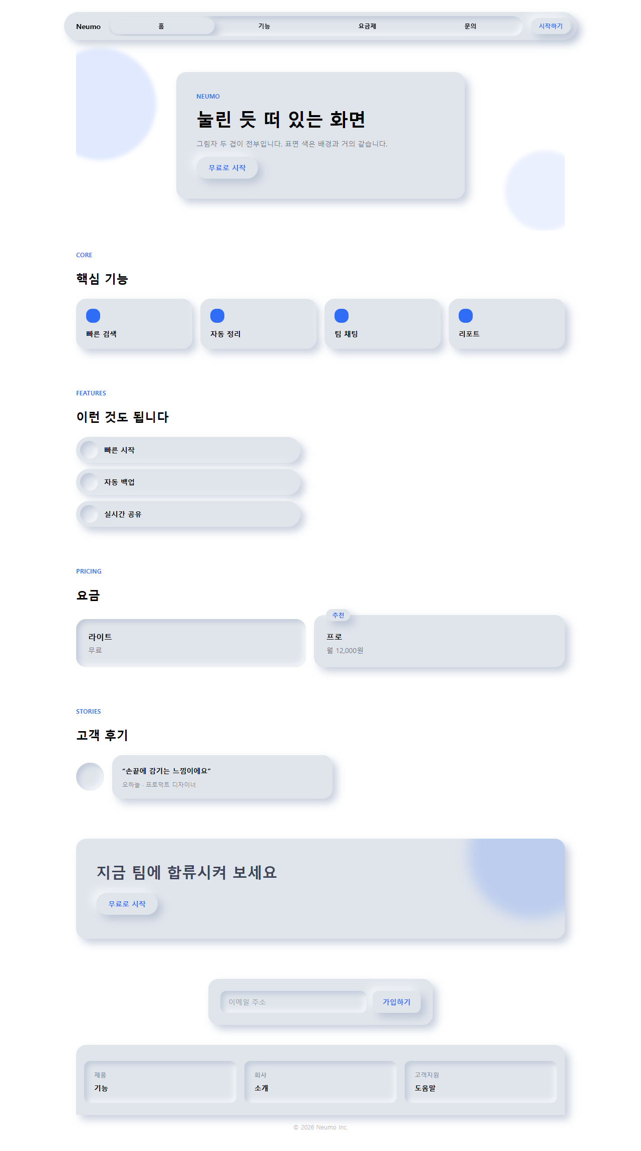
カード・ボタン・入力欄の背景色はすべて surface(#e0e5ec) ひとつに統一する。立体感は
色ではなく影だけで出す。浮いて見せたい要素には shadow-neu-raised、沈んで見せたい
要素には shadow-neu-press を使い、背景を純白にはしない——明るい側の影が白より
明るくなれず消えてしまう。:focus-visible の状態にはアクセント色の輪郭を別途描く。
この指示文をpage/index.htmlに反映してレンダリングした画面を、1280pxのビューポートでページ全体キャプチャしたものが下の画像です。
どこで壊れるか — 落とし穴
ニューモーフィズム css、どこで壊れるか?
狭い画面でのテストでまず見つかった問題は、ヒーロー・料金・CTA帯の3つがカード内側の余白を固定px値にしていたことでした。320px幅ではみ出し、そのうえ料金カードはおすすめプランのバッジ文字までカードの外へはみ出しました。余白(と料金カードのバッジのオフセット)をclamp()に置き換えてようやくどの項目も320pxで収まりました。
次に引っかかった所
二つ目の落とし穴は、おすすめプランのバッジの位置です。バッジをカードの内側余白の中に置くとプラン名の文字と重なって隠れてしまうため、カードの上端の外側に半分かかるように浮かせる必要があります。この二つはどちらもレイアウトの崩れという同じ種類の問題でしたが、三つ目はレイアウトではなく色そのものの問題で、しかも一番気づきにくいものでした。背景を純白(#ffffff)にしたときに現れました。影の明るい側は背景より明るくないとハイライトとして映らないため、背景がすでに純白だとその明るい側がまるごと消え、暗い側の影だけが残って立体感が半分になってしまいます。この柔らかい二重の影をメールアプリのレンダリングエンジンで再現しようとすると別の壁に当たります。その壁はメールテンプレート デザイン9選の落とし穴の節に書き残してあります。パスワードjuzcd872のzipには、背景を純白より6%ほど暗く落とした修正版がそのまま入っていて、両方向の影が見えることを確認できます。
9個のデモはすべてMDNのprefers-reduced-motionのドキュメントが定義するメディア特性を検知すると動きを止め、各面をその時点の状態(浮いたカードは浮いたまま、ボタンは押される前のまま)で固定します。この設定をオンにした訪問者からは、呼吸するグローや押し込みの動きだけが消え、カード・ボタン・入力欄そのものはそのまま残るので情報は欠けません。
アクセシビリティ
押さえた点
ニューモーフィズムには、よく知られたアクセシビリティ上の批判が付いて回ります。表面の塗りが背景とほとんど同じ色であるため、静止した状態のボタンやカードは背景との境界コントラストがほぼゼロに近く、WCAG 1.4.11の非テキストコントラストの基準を実質満たせません。「これは押せるボタンだ」という手がかりを影だけに頼る設計は、弱視の方や色覚特性のある方にとってその手がかり自体が見えないおそれがあるということです。この記事のキットはその限界を解消してはいませんが、範囲は狭めています——文字色は必ずink(#3d4457)にして背景とのコントラストを確保し、:focus-visibleには影とは無関係のアクセント色のリングを別に描くことで、少なくともキーボード利用者がフォーカス位置を見失わないようにしました。MDNのbox-shadowドキュメントが案内するinsetの有無で浮き出しと沈み込みを切り替えるこの技法自体は正しく動きますが、実務では決済ボタンのような絶対に見逃せない要素にはこのスタイルを使わない方が安全です。
次に見る所
他のデザイントレンドはデザイントレンドカテゴリーにまとめてあり、このサイト全体の狙いは紹介ページに書いてあります。
FAQ
ニューモーフィズムとは何か、クレイモーフィズムと何が違いますか?
ニューモーフィズムは表面の色を背景とほぼ同じにして影だけで立体感を出しますが、クレイモーフィズムはカードの色を背景とはっきり変えたうえで太い角丸まで足すので、対比と立体感を同時に強められます。結果としてカードの輪郭が見える分だけ、クレイモーフィズムのほうがボタンなど操作要素のコントラストを保ちやすくなります。
なぜ純白や純黒の背景では成立しないのですか?
影の明るい側は周りの面より明るい色を使って初めてハイライトとして機能し、暗い側は周りの面より暗い色を使って初めて陰として機能します。背景が純白(#ffffff)だとそれより明るい色が、純黒だとそれより暗い色が存在しないため、その方向の影が消えてしまいます。この記事のキットが背景を純白ぴったりではなく、そこから数%だけ落とした色にしているのはそのためです。
ダークモードでもニューモーフィズムは成立しますか?
成立します。ただしライトモードの値をそのまま反転させるのではなく、暗いキャンバスでは明るいハイライト側の不透明度を大きく下げ、暗い影側はむしろ濃くする必要があります。そうしないと表面が背景に溶け込んでしまい、わずかな浮き上がりすら感じられなくなります。暗いキャンバスの上に最初の画面を置く別の道はファーストビュー デザイン 9パターンにまとめてあります。
こんな記事もどうぞ
 デザイントレンド【コピペOK】ベントグリッド 今どきのLPパーツ9選
 デザイントレンド現場で使う ダークモード デザインシステム LPパーツ9選
 デザイントレンドキネティックタイポグラフィをコードで分解してみた
 デザイントレンドクレイモーフィズムとは?丸くてぷっくりしたLPパーツ9選
 デザイントレンドメッシュグラデーションの上に、あえてグレインを残す
 デザイントレンドネオブルータリズム UI キット、影がにじまないLPパーツ9選
 デザイントレンドy2k webデザインとは?クロムとホログラフィックのLPパーツ9選
 デザイントレンドHUD デザインとは?画面に見つめ返される9パーツ
 デザイントレンドペーパーカット デザインのLPパーツ9選、コピペOK
 デザイントレンドコラージュ デザインのLPパーツ9選、コピペOK