メンフィス デザインのLPパーツ9選、コピペOK
メンフィス デザインとは、1980年代のミラノ生まれの、水玉・波線・ジグザグなどの幾何学形を明るい色の上に繰り返すスタイルです。画像を一枚も使わず、CSSグラデーションのタイルと図形だけでこのパターンを再現し、ランディングのセクション9つにまとめました。
Pinterestで「memphis pattern」として保存される画面のほとんどはイラストの書き出しです。ページが重くなり、色を変えるたびに描き直すことになります。ここでは模様のすべてをグラデーション1行ずつで作り、色の値を変えればパターン全体がまとめて変わるようにしました。下の1ページをスクロールして、どこで模様が現れるか、まず探してみてください。

あのページを構成する部品9つを切り出して格子に並べました。順番は、画面に模様が染み込んでいく順序です。背景が模様の海になり、形が居場所を決め、模様が流れ始め、箱に収まり、シールが証言し、値段が付き、境界がギザギザに切られ、帯が流れていき、最後に波が押し出します。メンフィス デザイン 家具 で先に見慣れた色と形が画面へ移ってきたものなので、模様はレイアウトより先に居場所を決めます。質感を主役にした隣人はスキューモーフィズムの質感パーツ、光で画面を染める隣人は光るオーブのLPキットです。模様・質感・光のどれで染めるかは、3つのキットを見比べればすぐ決まります。
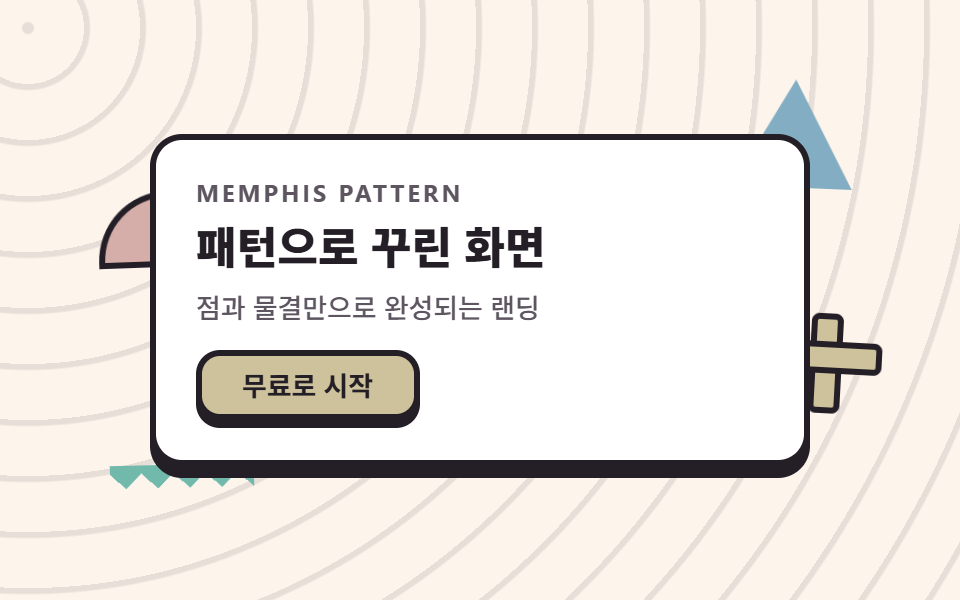 01 hero-memphis
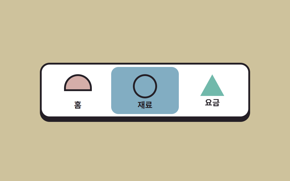 02 nav-memphis
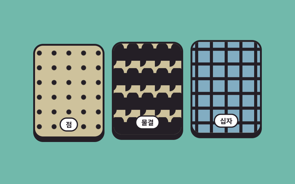 03 pattern-band-memphis
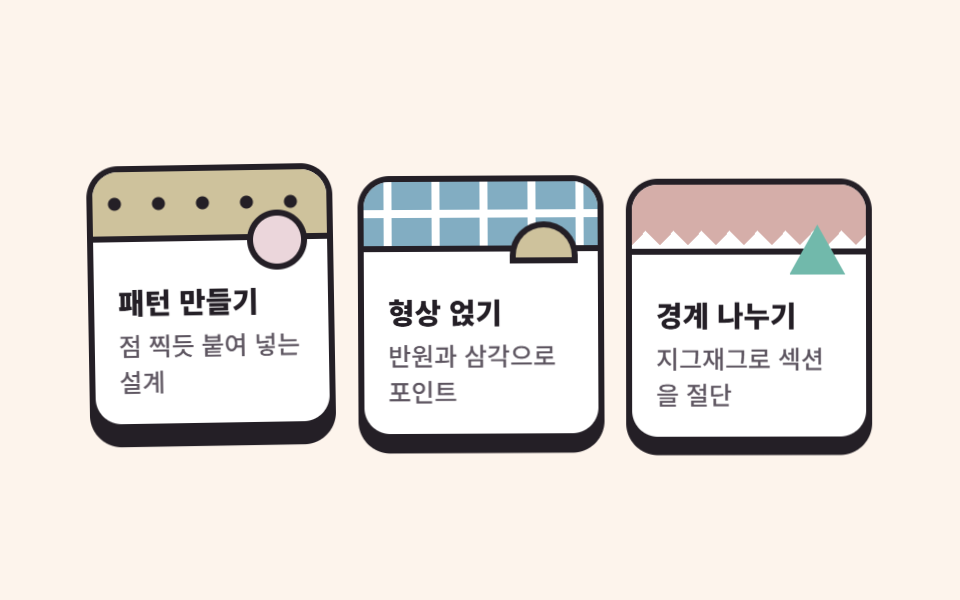 04 card-grid-memphis
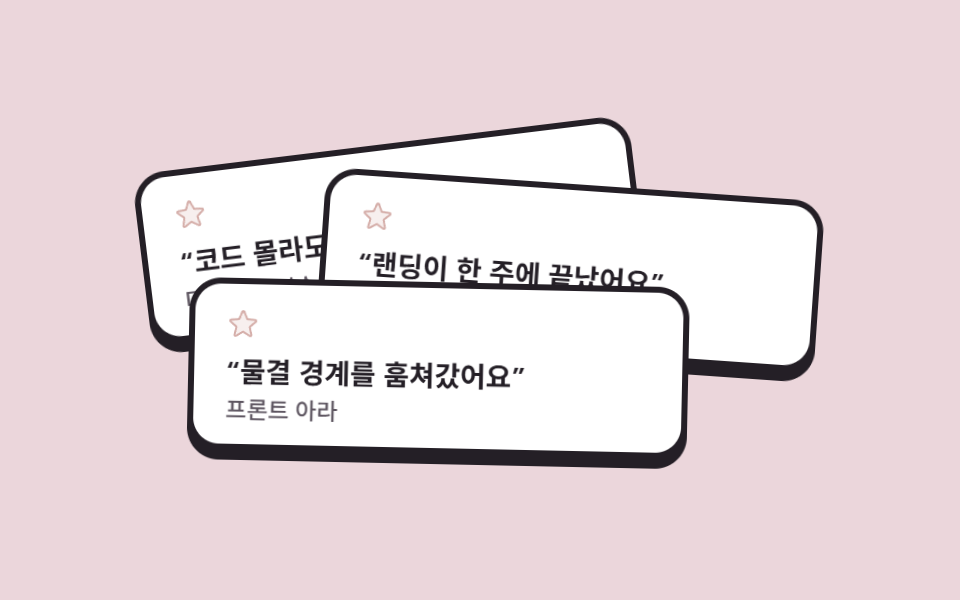 05 sticker-testimonial-memphis
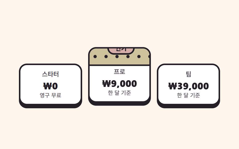 06 pricing-memphis
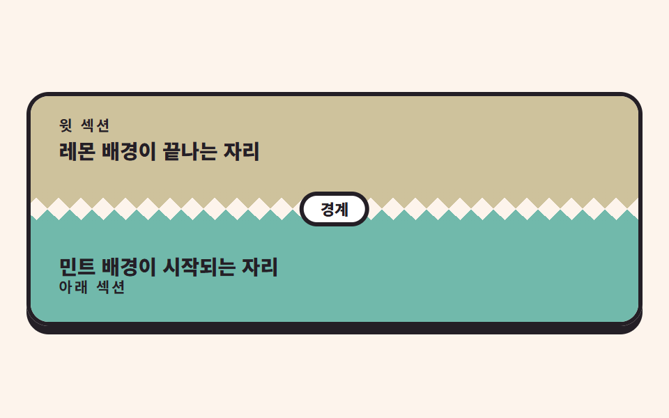 07 zigzag-divider-memphis
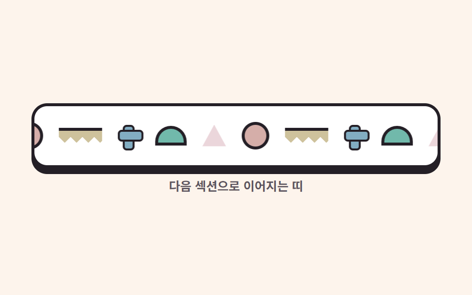 08 marquee-band-memphis
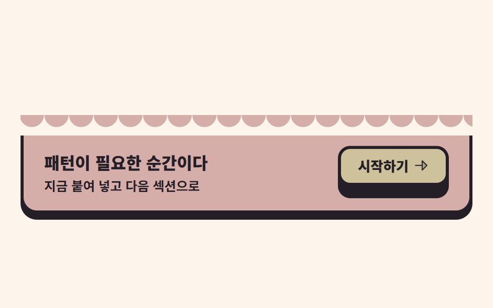 09 cta-wave-memphis
自動再生 · タイルを押すとその項目へ · すべて1つのzip
- 01 パターンだらけのヒーロー
- 02 形バッジのナビ
- 03 反復パターンの帯
- 04 黒い枠のカードグリッド
- 05 シールのレビュー重ね
- 06 パターン帯の料金プラン
- 07 ジグザグの仕切り線
- 08 パターンのマーキー帯
- 09 波打つCTA帯
01パターンだらけのヒーロー
何が見えるか
舞台そのものが、repeating-radial-gradient 1行で描いた同心円のさざ波です。白いパネルは静止したまま、半円・三角・十字・ギザギザの4つが周囲を漂います。周期は全部同じ2秒で、負の遅延(delay)で位相だけをずらしました。周期を混ぜると2秒のループが一周したときにどれかが別の区間にいるため、画面が飛んでしまいます。
<main class="stage">
  <section class="herom">
    <span class="herom__shape herom__shape--half" aria-hidden="true"></span>
    <span class="herom__shape herom__shape--tri" aria-hidden="true"></span>
    <span class="herom__shape herom__shape--cross" aria-hidden="true"></span>
    <span class="herom__shape herom__shape--zig" aria-hidden="true"></span>
    <div class="herom__panel">
      <p class="herom__eyebrow">Memphis pattern</p>
      <h1 class="herom__title">パターンで飾った画面</h1>
      <p class="herom__desc">水玉と波だけでできるLP</p>
      <button class="herom__cta" type="button">無料で始める</button>
    </div>
  </section>
</main>
@use "../../../../site/static/demo-tokens" as *;
// 멤피스 팔레트 — 밝은 코랄·레몬·스카이. 글자는 전부 잉크(밝은 면 위 검은 글자가 멤피스의 원칙).
// 대비 실측(WCAG 상대휘도 공식): ink/base 14.88:1 · ink/sheet 16.17:1 · stone/base 6.59:1 · ink/coral 5.29:1
$mem-base: #fdf4ec;
$mem-sheet: #ffffff;
$mem-ink: #241f26;
$mem-stone: #5d5560;
$mem-coral: #d5aea9;
$mem-lemon: #cec29c;
$mem-sky: #82adc2;
$mem-mint: #71b9ab;
$mem-pink: #ebd6db;
$duration: $dur-loop; // 도형 하나가 바다에서 떠오르는 한 주기
$easing: $ease-out; // 부유는 튀지 않고 같은 속도로 왕복한다
$color: $mem-coral; // 반원 형상의 대표색
@include stage($mem-base);
// 무대 자체가 점 무늬 바다 — 반복 반경 그라디언트 한 줄로 타일을 만든다
.stage {
background-image: repeating-radial-gradient(circle at 14px 14px, rgba($mem-ink, .1) 0 2.5px, transparent 3.5px 28px);
}
.herom {
position: relative;
width: clamp(224px, 72vw, 330px);
isolation: isolate;
}
// 판 주변의 멤피스 형상 — 같은 2초 주기에 서로 다른 위상(음수 delay)으로 부유한다
.herom__shape {
position: absolute;
z-index: 0;
animation: shapeFloat $duration $easing infinite;
}
.herom__shape--half {
left: -26px;
top: 30px;
width: 64px;
height: 32px;
border-radius: $r-pill $r-pill 0 0; // 반원 — 파일 값은 알약 토큰
background: $color;
border: 3px solid $mem-ink;
animation-delay: -.5s;
}
.herom__shape--tri {
right: -22px;
top: -18px;
width: 60px;
height: 54px;
background: $mem-sky;
clip-path: polygon(50% 0, 100% 100%, 0 100%); // 삼각형 — 외곽선 대신 면이 주역
animation-delay: -1s;
}
// 십자 — 가로·세로 막대 두 개로 만든다(손그림 아이콘이 아니라 순수 장식 도형)
.herom__shape--cross {
right: -30px;
bottom: 22px;
width: 44px;
height: 44px;
animation-delay: -1.5s;
}
.herom__shape--cross::before,
.herom__shape--cross::after {
content: "";
position: absolute;
background: $mem-lemon;
border: 3px solid $mem-ink;
border-radius: $r-xs;
}
.herom__shape--cross::before { left: 50%; top: 0; width: 10px; height: 100%; transform: translateX(-50%); }
.herom__shape--cross::after { top: 50%; left: 0; height: 10px; width: 100%; transform: translateY(-50%); }
// 지그재그 줄 — 원뿔 그라디언트 톱니 한 줄(07 구분선과 같은 재료)
.herom__shape--zig {
left: -20px;
bottom: -14px;
width: 72px;
height: 12px;
background: conic-gradient(from 315deg at 50% 100%, $mem-mint 0 90deg, transparent 90deg 360deg) 0 0 / 16px 12px repeat-x;
}
// 흰 안내판 — 무늬 바다 위 본문은 반드시 흰 판 위에 올린다(대비 확보)
.herom__panel {
position: relative;
z-index: 1;
box-sizing: border-box;
display: flex;
flex-direction: column;
align-items: flex-start;
gap: $sp-2;
padding: $sp-5;
border-radius: $r-card;
background: $mem-sheet;
border: 3px solid $mem-ink;
box-shadow: 0 6px 0 $mem-ink; // 딱 붙은 그림자 = 멤피스의 두께
}
.herom__eyebrow {
margin: 0;
color: $mem-stone;
font-weight: 700; font-size: clamp(10px, 2.6vw, 12px); line-height: 1;
font-family: inherit;
letter-spacing: .12em;
text-transform: uppercase;
}
.herom__title {
margin: 0;
color: $mem-ink;
font-weight: 800; font-size: clamp(18px, 4.6vw, 27px); line-height: 1.2;
font-family: inherit;
}
.herom__desc {
margin: 0;
color: $mem-stone;
font-weight: 500; font-size: clamp(12px, 2.8vw, 14px); line-height: 1.4;
font-family: inherit;
}
.herom__cta {
margin-top: $sp-1;
border: 3px solid $mem-ink;
border-radius: $r-control;
background: $mem-lemon;
color: $mem-ink;
padding: $sp-2 $sp-5;
font-weight: 700; font-size: clamp(12px, 2.8vw, 14px); line-height: 1;
font-family: inherit;
box-shadow: 0 4px 0 $mem-ink;
}
.herom__cta:active { transform: translateY(4px); box-shadow: 0 0 0 $mem-ink; }
.herom__cta:focus-visible { outline: 3px solid $mem-sky; outline-offset: 2px; }
// 데모: 네 형상이 서로 반대 위상으로 왕복한다 — 바다 위에서 서로 엇갈려 떠다니는 것처럼 보인다
@keyframes shapeFloat {
0%, 100% { transform: translateY(0) rotate(-3deg); }
50% { transform: translateY(-12px) rotate(4deg); }
}
@media (max-width: 340px), (max-height: 220px) {
.herom { width: 208px; }
.herom__panel { padding: $sp-3 $sp-4; gap: $sp-1; }
.herom__eyebrow { display: none; }
.herom__title { font-size: 17px; line-height: 1.15; }
.herom__desc { display: none; }
.herom__cta { padding: $sp-1 $sp-4; margin-top: 0; }
.herom__shape--half { width: 44px; height: 22px; left: -14px; top: 24px; }
.herom__shape--tri { width: 44px; height: 40px; right: -14px; top: -12px; }
.herom__shape--cross { width: 32px; height: 32px; right: -18px; bottom: 16px; }
.herom__shape--zig { width: 56px; height: 10px; left: -12px; bottom: -10px;
background: conic-gradient(from 315deg at 50% 100%, $mem-mint 0 90deg, transparent 90deg 360deg) 0 0 / 13px 10px repeat-x;
}
}
@media (prefers-reduced-motion: reduce) {
.herom__shape { animation: none !important; transform: none; }
}html, body {
margin: 0;
overflow: hidden;
}
.stage {
box-sizing: border-box;
min-height: 100vh;
display: grid;
place-items: center;
margin: 0;
background: #fdf4ec;
font-family: -apple-system, "Segoe UI", "Noto Sans KR", sans-serif;
padding: clamp(8px, 4vw, 24px);
}
.stage {
background-image: repeating-radial-gradient(circle at 14px 14px, rgba(36, 31, 38, 0.1) 0 2.5px, transparent 3.5px 28px);
}
.herom {
position: relative;
width: clamp(224px, 72vw, 330px);
isolation: isolate;
}
.herom__shape {
position: absolute;
z-index: 0;
animation: shapeFloat 2s ease-out infinite;
}
.herom__shape--half {
left: -26px;
top: 30px;
width: 64px;
height: 32px;
border-radius: 999px 999px 0 0;
background: #d5aea9;
border: 3px solid #241f26;
animation-delay: -0.5s;
}
.herom__shape--tri {
right: -22px;
top: -18px;
width: 60px;
height: 54px;
background: #82adc2;
clip-path: polygon(50% 0, 100% 100%, 0 100%);
animation-delay: -1s;
}
.herom__shape--cross {
right: -30px;
bottom: 22px;
width: 44px;
height: 44px;
animation-delay: -1.5s;
}
.herom__shape--cross::before,
.herom__shape--cross::after {
content: "";
position: absolute;
background: #cec29c;
border: 3px solid #241f26;
border-radius: 4px;
}
.herom__shape--cross::before {
left: 50%;
top: 0;
width: 10px;
height: 100%;
transform: translateX(-50%);
}
.herom__shape--cross::after {
top: 50%;
left: 0;
height: 10px;
width: 100%;
transform: translateY(-50%);
}
.herom__shape--zig {
left: -20px;
bottom: -14px;
width: 72px;
height: 12px;
background: conic-gradient(from 315deg at 50% 100%, #71b9ab 0 90deg, transparent 90deg 360deg) 0 0/16px 12px repeat-x;
}
.herom__panel {
position: relative;
z-index: 1;
box-sizing: border-box;
display: flex;
flex-direction: column;
align-items: flex-start;
gap: 8px;
padding: 20px;
border-radius: 16px;
background: #ffffff;
border: 3px solid #241f26;
box-shadow: 0 6px 0 #241f26;
}
.herom__eyebrow {
margin: 0;
color: #5d5560;
font-weight: 700;
font-size: clamp(10px, 2.6vw, 12px);
line-height: 1;
font-family: inherit;
letter-spacing: 0.12em;
text-transform: uppercase;
}
.herom__title {
margin: 0;
color: #241f26;
font-weight: 800;
font-size: clamp(18px, 4.6vw, 27px);
line-height: 1.2;
font-family: inherit;
}
.herom__desc {
margin: 0;
color: #5d5560;
font-weight: 500;
font-size: clamp(12px, 2.8vw, 14px);
line-height: 1.4;
font-family: inherit;
}
.herom__cta {
margin-top: 4px;
border: 3px solid #241f26;
border-radius: 12px;
background: #cec29c;
color: #241f26;
padding: 8px 20px;
font-weight: 700;
font-size: clamp(12px, 2.8vw, 14px);
line-height: 1;
font-family: inherit;
box-shadow: 0 4px 0 #241f26;
}
.herom__cta:active {
transform: translateY(4px);
box-shadow: 0 0 0 #241f26;
}
.herom__cta:focus-visible {
outline: 3px solid #82adc2;
outline-offset: 2px;
}
@keyframes shapeFloat {
0%, 100% {
transform: translateY(0) rotate(-3deg);
}
50% {
transform: translateY(-12px) rotate(4deg);
}
}
@media (max-width: 340px), (max-height: 220px) {
.herom {
width: 208px;
}
.herom__panel {
padding: 12px 16px;
gap: 4px;
}
.herom__eyebrow {
display: none;
}
.herom__title {
font-size: 17px;
line-height: 1.15;
}
.herom__desc {
display: none;
}
.herom__cta {
padding: 4px 16px;
margin-top: 0;
}
.herom__shape--half {
width: 44px;
height: 22px;
left: -14px;
top: 24px;
}
.herom__shape--tri {
width: 44px;
height: 40px;
right: -14px;
top: -12px;
}
.herom__shape--cross {
width: 32px;
height: 32px;
right: -18px;
bottom: 16px;
}
.herom__shape--zig {
width: 56px;
height: 10px;
left: -12px;
bottom: -10px;
background: conic-gradient(from 315deg at 50% 100%, #71b9ab 0 90deg, transparent 90deg 360deg) 0 0/13px 10px repeat-x;
}
}
@media (prefers-reduced-motion: reduce) {
.herom__shape {
animation: none !important;
transform: none;
}
}import type { CSSProperties } from "react";
import styles from "./HeroMemphis.module.scss";
export type HeroMemphisProps = {
eyebrow?: string;
title?: string;
desc?: string;
cta?: string;
/** 한 주기(기본 2000ms) */
duration?: number;
easing?: string;
/** 반원 형상의 대표색 */
color?: string;
};
type Vars = CSSProperties & { "--duration"?: string; "--easing"?: string; "--color"?: string };
export default function HeroMemphis({
eyebrow = "Memphis pattern",
title = "패턴으로 꾸린 화면",
desc = "점과 물결만으로 완성되는 랜딩",
cta = "무료로 시작",
duration = 2000,
easing = "ease-out",
color = "#ff5c47",
}: HeroMemphisProps) {
const vars: Vars = { "--duration": `${duration}ms`, "--easing": easing, "--color": color };
return (
<section className={styles.herom} style={vars}>
<span className={`${styles.shape} ${styles.shapeHalf}`} aria-hidden="true" />
<span className={`${styles.shape} ${styles.shapeTri}`} aria-hidden="true" />
<span className={`${styles.shape} ${styles.shapeCross}`} aria-hidden="true" />
<span className={`${styles.shape} ${styles.shapeZig}`} aria-hidden="true" />
<div className={styles.panel}>
<p className={styles.eyebrow}>{eyebrow}</p>
<h1 className={styles.title}>{title}</h1>
<p className={styles.desc}>{desc}</p>
<button className={styles.cta} type="button">{cta}</button>
</div>
</section>
);
}01 · パターンだらけのヒーロー — 計測 累積面積 2.806% · 動いたフレーム 23/23GODRICH オリジナル · SCSS と React は zip に同梱 · パスワードを見る
コードのどこを見るか
計測では累積面積2.806%、動いたフレーム23/23でした。
// 同心円のさざ波 — 原点を1つに持つ半径グラデーションの反復
.stage {
  background-image: repeating-radial-gradient(circle at 14px 14px, rgba(36, 31, 38, .1) 0 2.5px, transparent 3.5px 28px);
}
// 4つの形は同じ2秒、違う位相
.herom__shape       { animation: shapeFloat 2s ease-out infinite; }
.herom__shape--half { animation-delay: -.5s; }
.herom__shape--tri  { animation-delay: -1s; }
@keyframes shapeFloat {
  0%, 100% { transform: translateY(0) rotate(-3deg); }
  50%      { transform: translateY(-12px) rotate(4deg); }
}
02形バッジのナビ
メンフィス デザイン 作り方 の形バッジはナビでどう見えるか
メニュー3項目が円・半円・三角のバッジを持ち、アクティブな項目が交代で変わります。切り替えは steps(1, end) タイミングで1フレームのカットです。フェードで混ぜると2色が半透明で重なるゴーストフレームが数枚紛れ込みます。カットで交代させ、生きている動きはバッジが上へ跳ねるtransformだけに任せました。
<main class="stage">
  <nav class="navm" aria-label="デモナビゲーション">
    <a class="navm__tab" href="#">
      <span class="navm__badge navm__badge--half" aria-hidden="true"></span>
      <span class="navm__label">ホーム</span>
    </a>
    <a class="navm__tab" href="#">
      <span class="navm__badge navm__badge--circle" aria-hidden="true"></span>
      <span class="navm__label">素材</span>
    </a>
    <a class="navm__tab" href="#">
      <span class="navm__badge navm__badge--tri" aria-hidden="true"></span>
      <span class="navm__label">料金</span>
    </a>
  </nav>
</main>
@use "../../../../site/static/demo-tokens" as *;
// 멤피스 팔레트 — 01 과 같은 값 (대비 실측치는 01 참고)
$mem-base: #fdf4ec;
$mem-sheet: #ffffff;
$mem-ink: #241f26;
$mem-stone: #5d5560;
$mem-coral: #d5aea9;
$mem-lemon: #cec29c;
$mem-sky: #82adc2;
$mem-mint: #71b9ab;
$mem-pink: #ebd6db;
$duration: $dur-loop; // 활성 칸이 세 개를 한 바퀴 도는 주기
$easing: $ease-pop; // 배지가 튀어 오를 때만 튕긴다
$color: $mem-lemon; // 무대(레몬)
@include stage($mem-lemon);
.navm {
box-sizing: border-box;
display: grid;
grid-template-columns: repeat(3, 1fr); // 칸 폭은 그리드가 정한다 — 고정 px 인디케이터가 없다(BD19 무관)
width: clamp(232px, 76vw, 348px);
padding: $sp-1;
border-radius: $r-card;
background: $mem-sheet;
border: 3px solid $mem-ink;
box-shadow: 0 6px 0 $mem-ink;
}
.navm__tab {
--on: #{$mem-coral};
position: relative;
box-sizing: border-box;
display: flex;
flex-direction: column;
align-items: center;
gap: $sp-1;
padding: $sp-3 $sp-2 $sp-2;
border-radius: $r-control;
text-decoration: none;
}
.navm__tab:nth-child(1) { --on: #{$mem-coral}; }
.navm__tab:nth-child(2) { --on: #{$mem-sky}; }
.navm__tab:nth-child(3) { --on: #{$mem-mint}; }
// 활성 칸은 한 프레임 컷(steps)으로 바뀐다 — 반투명 유령 프레임이 생기지 않는다
.navm__tab {
animation: tabFill $duration steps(1, end) infinite;
}
.navm__tab:nth-child(2) { animation-delay: -.6667s; }
.navm__tab:nth-child(3) { animation-delay: -1.3333s; }
.navm__tab:focus-visible {
outline: 3px solid $mem-ink;
outline-offset: 2px;
}
// 형상 배지 — 원·반원·삼각. 활성 칸 차례에 위로 튀어 오른다
.navm__badge {
display: block;
width: 34px;
height: 34px;
animation: badgePop $duration $easing infinite;
}
.navm__tab:nth-child(2) .navm__badge { animation-delay: -.6667s; }
.navm__tab:nth-child(3) .navm__badge { animation-delay: -1.3333s; }
.navm__badge--circle {
border-radius: 50%;
background: var(--on);
border: 3px solid $mem-ink;
}
.navm__badge--half {
width: 40px;
height: 22px;
margin-bottom: 12px; // 반원 높이를 원과 맞춘다
border-radius: $r-pill $r-pill 0 0;
background: var(--on);
border: 3px solid $mem-ink;
}
.navm__badge--tri {
width: 40px;
height: 36px;
background: var(--on);
clip-path: polygon(50% 0, 100% 100%, 0 100%);
}
.navm__label {
color: $mem-ink;
font-weight: 700; font-size: clamp(12px, 2.8vw, 14px); line-height: 1;
font-family: inherit;
}
// 활성 창(0~33%) 동안: 칸 배경 = 자기 색(컷 교체), 배지 = translateY 팝(부드럽게)
@keyframes tabFill {
0%, 33.32% { background: var(--on); }
33.33%, 100% { background: transparent; }
}
@keyframes badgePop {
0% { transform: translateY(0); }
6%, 28% { transform: translateY(-7px); }
33.33%, 100% { transform: translateY(0); }
}
@media (max-width: 340px), (max-height: 220px) {
.navm { width: 220px; }
.navm__tab { padding: $sp-2 $sp-1; }
.navm__badge { width: 26px; height: 26px; }
.navm__badge--half { width: 30px; height: 16px; margin-bottom: $sp-2; }
.navm__badge--tri { width: 30px; height: 27px; }
.navm__label { font-size: 11px; }
}
@media (prefers-reduced-motion: reduce) {
.navm__tab, .navm__badge { animation: none !important; }
// 움직임을 끊은 뒤에도 활성 상태 하나는 보여 준다 — 두 번째 칸
.navm__tab:nth-child(2) { background: $mem-sky; }
}html, body {
margin: 0;
overflow: hidden;
}
.stage {
box-sizing: border-box;
min-height: 100vh;
display: grid;
place-items: center;
margin: 0;
background: #cec29c;
font-family: -apple-system, "Segoe UI", "Noto Sans KR", sans-serif;
padding: clamp(8px, 4vw, 24px);
}
.navm {
box-sizing: border-box;
display: grid;
grid-template-columns: repeat(3, 1fr);
width: clamp(232px, 76vw, 348px);
padding: 4px;
border-radius: 16px;
background: #ffffff;
border: 3px solid #241f26;
box-shadow: 0 6px 0 #241f26;
}
.navm__tab {
--on: #d5aea9;
position: relative;
box-sizing: border-box;
display: flex;
flex-direction: column;
align-items: center;
gap: 4px;
padding: 12px 8px 8px;
border-radius: 12px;
text-decoration: none;
}
.navm__tab:nth-child(1) {
--on: #d5aea9;
}
.navm__tab:nth-child(2) {
--on: #82adc2;
}
.navm__tab:nth-child(3) {
--on: #71b9ab;
}
.navm__tab {
animation: tabFill 2s steps(1, end) infinite;
}
.navm__tab:nth-child(2) {
animation-delay: -0.6667s;
}
.navm__tab:nth-child(3) {
animation-delay: -1.3333s;
}
.navm__tab:focus-visible {
outline: 3px solid #241f26;
outline-offset: 2px;
}
.navm__badge {
display: block;
width: 34px;
height: 34px;
animation: badgePop 2s cubic-bezier(0.2, 1.4, 0.4, 1) infinite;
}
.navm__tab:nth-child(2) .navm__badge {
animation-delay: -0.6667s;
}
.navm__tab:nth-child(3) .navm__badge {
animation-delay: -1.3333s;
}
.navm__badge--circle {
border-radius: 50%;
background: var(--on);
border: 3px solid #241f26;
}
.navm__badge--half {
width: 40px;
height: 22px;
margin-bottom: 12px;
border-radius: 999px 999px 0 0;
background: var(--on);
border: 3px solid #241f26;
}
.navm__badge--tri {
width: 40px;
height: 36px;
background: var(--on);
clip-path: polygon(50% 0, 100% 100%, 0 100%);
}
.navm__label {
color: #241f26;
font-weight: 700;
font-size: clamp(12px, 2.8vw, 14px);
line-height: 1;
font-family: inherit;
}
@keyframes tabFill {
0%, 33.32% {
background: var(--on);
}
33.33%, 100% {
background: transparent;
}
}
@keyframes badgePop {
0% {
transform: translateY(0);
}
6%, 28% {
transform: translateY(-7px);
}
33.33%, 100% {
transform: translateY(0);
}
}
@media (max-width: 340px), (max-height: 220px) {
.navm {
width: 220px;
}
.navm__tab {
padding: 8px 4px;
}
.navm__badge {
width: 26px;
height: 26px;
}
.navm__badge--half {
width: 30px;
height: 16px;
margin-bottom: 8px;
}
.navm__badge--tri {
width: 30px;
height: 27px;
}
.navm__label {
font-size: 11px;
}
}
@media (prefers-reduced-motion: reduce) {
.navm__tab, .navm__badge {
animation: none !important;
}
.navm__tab:nth-child(2) {
background: #82adc2;
}
}import type { CSSProperties } from "react";
import styles from "./NavMemphis.module.scss";
export type NavMemphisProps = {
/** 탭 이름 3개 */
tabs?: string[];
/** 한 주기(기본 2000ms) */
duration?: number;
easing?: string;
/** 데모 무대 색(참고용 — 칸마다 색은 고정) */
color?: string;
};
type Vars = CSSProperties & { "--duration"?: string; "--easing"?: string; "--color"?: string };
export default function NavMemphis({
tabs = ["홈", "재료", "요금"],
duration = 2000,
easing = "cubic-bezier(.2,1.4,.4,1)",
color = "#ffcf33",
}: NavMemphisProps) {
const vars: Vars = { "--duration": `${duration}ms`, "--easing": easing, "--color": color };
/* 배지 모양은 칸 순서대로 고정 — 반원 · 원 · 삼각 */
const badges = [styles.badgeHalf, styles.badgeCircle, styles.badgeTri];
return (
<nav className={styles.navm} style={vars} aria-label="데모 내비게이션">
{tabs.map((t, i) => (
<a key={t} className={styles.tab} href="#">
<span className={`${styles.badge} ${badges[i % badges.length]}`} aria-hidden="true" />
<span className={styles.label}>{t}</span>
</a>
))}
</nav>
);
}02 · 形バッジのナビ — 計測 累積面積 16.499% · 動いたフレーム 9/23GODRICH オリジナル · SCSS と React は zip に同梱 · パスワードを見る
コードの読み方
カットのぶん、変化のあるフレームは9/23と少ないですが、面積と強度は十分です。
.navm__tab {
  --on: #ff5c47;                     // 項目ごとに自分の色
  animation: tabFill 2s steps(1, end) infinite;
}
.navm__tab:nth-child(2) { animation-delay: -.6667s; }
.navm__tab:nth-child(3) { animation-delay: -1.3333s; }
@keyframes tabFill {
  0%, 33.32%   { background: var(--on); }   // アクティブ窓のあいだは色を保つ
  33.33%, 100% { background: transparent; }
}
@keyframes badgePop {
  0%           { transform: translateY(0); }
  6%, 28%      { transform: translateY(-7px); }
  33.33%, 100% { transform: translateY(0); }
}
03反復パターンの帯
どんな動きか
水玉・波・十字の3枚が並び、それぞれの模様の層が横へ流れます。模様の層は幅をタイル(24px)の整数倍である240pxに固定し、translateX(-120px)、つまりタイル5個ぶんだけ動かします。120は24の倍数なので、動かし終わった瞬間の模様は最初とピクセル単位で同じになり、継ぎ目が出ません。3枚は0.22秒ずつずれて持ち上がって戻ります。
<main class="stage">
  <section class="bandm">
    <article class="bandm__panel bandm__panel--dots">
      <div class="bandm__fill bandm__fill--dots" aria-hidden="true"></div>
      <span class="bandm__name">水玉</span>
    </article>
    <article class="bandm__panel bandm__panel--wave">
      <div class="bandm__fill bandm__fill--wave" aria-hidden="true"></div>
      <span class="bandm__name">波</span>
    </article>
    <article class="bandm__panel bandm__panel--cross">
      <div class="bandm__fill bandm__fill--cross" aria-hidden="true"></div>
      <span class="bandm__name">十字</span>
    </article>
  </section>
</main>
@use "../../../../site/static/demo-tokens" as *;
// 멤피스 팔레트 — 01 과 같은 값
$mem-base: #fdf4ec;
$mem-sheet: #ffffff;
$mem-ink: #241f26;
$mem-stone: #5d5560;
$mem-coral: #d5aea9;
$mem-lemon: #cec29c;
$mem-sky: #82adc2;
$mem-mint: #71b9ab;
$mem-pink: #ebd6db;
$duration: $dur-loop; // 무늬 바닥이 자기 폭의 절반만큼 흐르는 주기
$easing: linear; // 흐름은 일정 속도 — 이음매가 보이지 않는다
$color: $mem-mint; // 무대(민트)
@include stage($mem-mint);
.bandm {
box-sizing: border-box;
display: flex;
gap: $sp-3;
width: clamp(252px, 82vw, 372px);
}
// 무늬 판 — 흰 테두리판 안에 무늬 바닥이 들어 있다
.bandm__panel {
position: relative;
flex: 1 1 0;
height: clamp(148px, 46vh, 208px);
border-radius: $r-card;
background: $mem-lemon;
border: 3px solid $mem-ink;
box-shadow: 0 6px 0 $mem-ink;
overflow: hidden;
animation: panelLift $duration $ease-out infinite;
}
.bandm__panel:nth-child(2) { animation-delay: -.22s; }
.bandm__panel:nth-child(3) { animation-delay: -.44s; }
// 무늬 바닥 — 폭을 타일의 정수배(240px = 20칸 × 12px)로 고정하고 절반을 민다
.bandm__fill {
position: absolute;
inset: 0 auto 0 0;
width: 240px;
animation: fillFlow $duration $easing infinite;
}
// 점 — 반경 그라디언트 원을 타일로 찍는다
.bandm__fill--dots {
background-image: radial-gradient(circle at 12px 12px, $mem-ink 3.5px, transparent 4.5px);
background-size: 24px 24px;
}
// 물결 — 잉크 리본(타일 안 y8~28)의 위 가장자리에 산을, 아래 가장자리 경계에 골을 만든다
.bandm__fill--wave {
background-image:
linear-gradient(to bottom, transparent 8px, $mem-ink 8px 28px, transparent 28px),
radial-gradient(circle 10px at 12px 8px, $mem-ink 0 9.5px, transparent 10px),
radial-gradient(circle 10px at 0 28px, $mem-ink 0 9.5px, transparent 10px);
background-size: 24px 40px;
background-repeat: repeat;
}
// 십자 — 타일(24px) 안에 세로 막대(x 9.5~14.5)와 가로 막대(y 9.5~14.5)를 얹는다
.bandm__fill--cross {
background-color: $mem-sky;
background-image:
linear-gradient(to right, transparent 9.5px, $mem-ink 9.5px 14.5px, transparent 14.5px),
linear-gradient(to bottom, transparent 9.5px, $mem-ink 9.5px 14.5px, transparent 14.5px);
background-size: 24px 24px;
background-repeat: repeat;
}
// 이름표 — 무늬 위 글자는 흰 알약 하나에 잉크로만
.bandm__name {
position: absolute;
left: 50%;
bottom: $sp-2;
transform: translateX(-50%);
padding: $sp-1 $sp-2;
border-radius: $r-pill;
background: $mem-sheet;
border: 2px solid $mem-ink;
color: $mem-ink;
font-weight: 700; font-size: 11px; line-height: 1;
font-family: inherit;
}
// 절반(120px = 타일 10칸)만 밀면 한 바퀴 — 무늬가 주기적이므로 이음매가 없다
@keyframes fillFlow {
from { transform: translateX(0); }
to { transform: translateX(-120px); }
}
// 세 판이 0.22초씩 어긋나 들렸다 내려앉는다
@keyframes panelLift {
0%, 100% { transform: translateY(0); }
45% { transform: translateY(-10px); }
}
@media (max-width: 340px), (max-height: 220px) {
.bandm { width: 232px; gap: $sp-2; }
.bandm__panel { height: 128px; }
.bandm__name { bottom: $sp-1; font-size: 10px; }
}
@media (prefers-reduced-motion: reduce) {
.bandm__fill, .bandm__panel { animation: none !important; transform: none; }
}html, body {
margin: 0;
overflow: hidden;
}
.stage {
box-sizing: border-box;
min-height: 100vh;
display: grid;
place-items: center;
margin: 0;
background: #71b9ab;
font-family: -apple-system, "Segoe UI", "Noto Sans KR", sans-serif;
padding: clamp(8px, 4vw, 24px);
}
.bandm {
box-sizing: border-box;
display: flex;
gap: 12px;
width: clamp(252px, 82vw, 372px);
}
.bandm__panel {
position: relative;
flex: 1 1 0;
height: clamp(148px, 46vh, 208px);
border-radius: 16px;
background: #cec29c;
border: 3px solid #241f26;
box-shadow: 0 6px 0 #241f26;
overflow: hidden;
animation: panelLift 2s ease-out infinite;
}
.bandm__panel:nth-child(2) {
animation-delay: -0.22s;
}
.bandm__panel:nth-child(3) {
animation-delay: -0.44s;
}
.bandm__fill {
position: absolute;
inset: 0 auto 0 0;
width: 240px;
animation: fillFlow 2s linear infinite;
}
.bandm__fill--dots {
background-image: radial-gradient(circle at 12px 12px, #241f26 3.5px, transparent 4.5px);
background-size: 24px 24px;
}
.bandm__fill--wave {
background-image: linear-gradient(to bottom, transparent 8px, #241f26 8px 28px, transparent 28px), radial-gradient(circle 10px at 12px 8px, #241f26 0 9.5px, transparent 10px), radial-gradient(circle 10px at 0 28px, #241f26 0 9.5px, transparent 10px);
background-size: 24px 40px;
background-repeat: repeat;
}
.bandm__fill--cross {
background-color: #82adc2;
background-image: linear-gradient(to right, transparent 9.5px, #241f26 9.5px 14.5px, transparent 14.5px), linear-gradient(to bottom, transparent 9.5px, #241f26 9.5px 14.5px, transparent 14.5px);
background-size: 24px 24px;
background-repeat: repeat;
}
.bandm__name {
position: absolute;
left: 50%;
bottom: 8px;
transform: translateX(-50%);
padding: 4px 8px;
border-radius: 999px;
background: #ffffff;
border: 2px solid #241f26;
color: #241f26;
font-weight: 700;
font-size: 11px;
line-height: 1;
font-family: inherit;
}
@keyframes fillFlow {
from {
transform: translateX(0);
}
to {
transform: translateX(-120px);
}
}
@keyframes panelLift {
0%, 100% {
transform: translateY(0);
}
45% {
transform: translateY(-10px);
}
}
@media (max-width: 340px), (max-height: 220px) {
.bandm {
width: 232px;
gap: 8px;
}
.bandm__panel {
height: 128px;
}
.bandm__name {
bottom: 4px;
font-size: 10px;
}
}
@media (prefers-reduced-motion: reduce) {
.bandm__fill, .bandm__panel {
animation: none !important;
transform: none;
}
}import type { CSSProperties } from "react";
import styles from "./PatternBandMemphis.module.scss";
export type PatternBandMemphisProps = {
/** 판 이름 3개 (점 · 물결 · 십자 순서로 무늬가 고정) */
names?: string[];
/** 한 주기(기본 2000ms) */
duration?: number;
easing?: string;
/** 데모 무대 색(참고용 — 판 배경은 고정) */
color?: string;
};
type Vars = CSSProperties & { "--duration"?: string; "--easing"?: string; "--color"?: string };
export default function PatternBandMemphis({
names = ["점", "물결", "십자"],
duration = 2000,
easing = "linear",
color = "#2ec4a6",
}: PatternBandMemphisProps) {
const vars: Vars = { "--duration": `${duration}ms`, "--easing": easing, "--color": color };
/* 무늬는 순서대로 고정 — 점 · 물결 · 십자 */
const fills = [
[styles.panelDots, styles.fillDots],
[styles.panelWave, styles.fillWave],
[styles.panelCross, styles.fillCross],
];
return (
<section className={styles.bandm} style={vars}>
{names.map((n, i) => {
const [panel, fill] = fills[i % fills.length];
return (
<article key={n} className={`${styles.panel} ${panel}`}>
<div className={`${styles.fill} ${fill}`} aria-hidden="true" />
<span className={styles.name}>{n}</span>
</article>
);
})}
</section>
);
}03 · 反復パターンの帯 — 計測 累積面積 33.612% · 動いたフレーム 23/23GODRICH オリジナル · SCSS と React は zip に同梱 · パスワードを見る
どこを変えるか
累積面積33.612%は9つの中で最も広い動きです。
.bandm__fill {
  position: absolute; inset: 0 auto 0 0;
  width: 240px;                       // 24pxタイル × 10 — 半分はちょうど5タイル
  animation: fillFlow 2s linear infinite;
}
// 波のリボン — タイル(24×40)の中に帯(y 8〜28)と上下のふちの半円
.bandm__fill--wave {
  background-image:
    linear-gradient(to bottom, transparent 8px, #241f26 8px 28px, transparent 28px),
    radial-gradient(circle 10px at 12px 8px, #241f26 0 9.5px, transparent 10px),
    radial-gradient(circle 10px at 0 28px, #241f26 0 9.5px, transparent 10px);
  background-size: 24px 40px;
}
@keyframes fillFlow { from { transform: translateX(0); } to { transform: translateX(-120px); } }
04黒い枠のカードグリッド
何が見えるか
白いカードにインクの枠3pxと、ぼかし0の影 0 6px 0 をペアで与えます。この組み合わせはネオブルータリズムに似ていますが、ここでは枠が主役ではなく、頭の帯を入れる額縁です。3枚のカードは水玉・十字・ギザギザの帯を頭に載せ、0.22秒ずつずれて持ち上がり、浮いているあいだは影の厚みが6pxから10pxへ増えます。
<main class="stage">
  <section class="gridm">
    <article class="gridm__card">
      <span class="gridm__sticker gridm__sticker--circle" aria-hidden="true"></span>
      <div class="gridm__band gridm__band--dots" aria-hidden="true"></div>
      <h2 class="gridm__title">パターンづくり</h2>
      <p class="gridm__desc">水玉を打つように貼る設計</p>
    </article>
    <article class="gridm__card">
      <span class="gridm__sticker gridm__sticker--half" aria-hidden="true"></span>
      <div class="gridm__band gridm__band--cross" aria-hidden="true"></div>
      <h2 class="gridm__title">形を重ねる</h2>
      <p class="gridm__desc">半円と三角でアクセント</p>
    </article>
    <article class="gridm__card">
      <span class="gridm__sticker gridm__sticker--tri" aria-hidden="true"></span>
      <div class="gridm__band gridm__band--zig" aria-hidden="true"></div>
      <h2 class="gridm__title">境界を分ける</h2>
      <p class="gridm__desc">ジグザグでセクションを切る</p>
    </article>
  </section>
</main>
@use "../../../../site/static/demo-tokens" as *;
// 멤피스 팔레트 — 01 과 같은 값
$mem-base: #fdf4ec;
$mem-sheet: #ffffff;
$mem-ink: #241f26;
$mem-stone: #5d5560;
$mem-coral: #d5aea9;
$mem-lemon: #cec29c;
$mem-sky: #82adc2;
$mem-mint: #71b9ab;
$mem-pink: #ebd6db;
$duration: $dur-loop; // 카드가 들렸다 내려앉는 한 주기
$easing: $ease-spring; // 스티커가 붙는 끝에 살짝 튕긴다
$color: $mem-ink; // 이번 편의 주역은 굵은 잉크 테두리
@include stage($mem-base);
.gridm {
box-sizing: border-box;
display: flex;
gap: $sp-3;
width: clamp(268px, 86vw, 392px);
padding-top: $sp-3;
}
// 흰 카드 — 3px 잉크 테두리 + 딱 붙은 잉크 그림자. 무늬는 머리띠에만(네오브루탈과의 차이)
.gridm__card {
position: relative;
flex: 1 1 0;
box-sizing: border-box;
padding: $sp-12 $sp-3 $sp-3;
border-radius: $r-card;
background: $mem-sheet;
border: 3px solid $mem-ink;
box-shadow: 0 6px 0 $mem-ink;
overflow: hidden;
animation: cardRise $duration $easing infinite;
}
.gridm__card:nth-child(2) { animation-delay: -.22s; }
.gridm__card:nth-child(3) { animation-delay: -.44s; }
// 무늬 머리띠 — 카드의 맨 꼭대기를 채운다(테두리 안쪽)
.gridm__band {
position: absolute;
left: 0;
right: 0;
top: 0;
height: 32px;
border-bottom: 3px solid $mem-ink;
}
.gridm__band--dots {
background-color: $mem-lemon;
background-image: radial-gradient(circle at 11px 16px, $mem-ink 0 3px, transparent 3.5px);
background-size: 22px 22px;
}
.gridm__band--cross {
background-color: $mem-sky;
background-image:
linear-gradient(to right, transparent 10px, $mem-sheet 10px 14px, transparent 14px),
linear-gradient(to bottom, transparent 14px, $mem-sheet 14px 18px, transparent 18px);
background-size: 24px 32px;
background-repeat: repeat;
}
.gridm__band--zig {
background-color: $mem-coral;
background-image: conic-gradient(from 135deg at 50% 0%, $mem-sheet 0 90deg, transparent 90deg 360deg);
background-size: 14px 9px;
background-position: 0 100%;
background-repeat: repeat-x;
}
// 귀퉁이 스티커 — 테두리를 걸터앉은 형상 하나
.gridm__sticker {
position: absolute;
z-index: 1;
top: 20px;
right: 10px;
}
.gridm__sticker--circle {
width: 24px;
height: 24px;
border-radius: 50%;
background: $mem-pink;
border: 3px solid $mem-ink;
}
.gridm__sticker--half {
width: 28px;
height: 15px;
border-radius: $r-pill $r-pill 0 0;
background: $mem-lemon;
border: 3px solid $mem-ink;
}
.gridm__sticker--tri {
width: 28px;
height: 25px;
background: $mem-mint;
clip-path: polygon(50% 0, 100% 100%, 0 100%);
}
.gridm__title {
margin: $sp-2 0 0;
color: $mem-ink;
font-weight: 800; font-size: clamp(13px, 3vw, 16px); line-height: 1.25;
font-family: inherit;
}
.gridm__desc {
margin: $sp-1 0 0;
color: $mem-stone;
font-weight: 500; font-size: clamp(11px, 2.6vw, 12.5px); line-height: 1.45;
font-family: inherit;
}
// 세 장이 0.22초씩 어긋나 들렸다 앉는다 — 딱 붙은 그림자가 살짝 늘어난다
@keyframes cardRise {
0%, 100% { transform: translateY(0) rotate(0deg); box-shadow: 0 6px 0 $mem-ink; }
45% { transform: translateY(-12px) rotate(-1.5deg); box-shadow: 0 10px 0 $mem-ink; }
}
@media (max-width: 340px), (max-height: 220px) {
.gridm { width: 240px; gap: $sp-2; }
.gridm__card { padding: $sp-10 $sp-2 $sp-2; }
.gridm__title { font-size: 12px; }
.gridm__desc { font-size: 10.5px; }
.gridm__band { height: 26px; }
.gridm__sticker { top: 16px; right: 6px; }
}
@media (prefers-reduced-motion: reduce) {
.gridm__card { animation: none !important; transform: none; box-shadow: 0 6px 0 $mem-ink; }
}html, body {
margin: 0;
overflow: hidden;
}
.stage {
box-sizing: border-box;
min-height: 100vh;
display: grid;
place-items: center;
margin: 0;
background: #fdf4ec;
font-family: -apple-system, "Segoe UI", "Noto Sans KR", sans-serif;
padding: clamp(8px, 4vw, 24px);
}
.gridm {
box-sizing: border-box;
display: flex;
gap: 12px;
width: clamp(268px, 86vw, 392px);
padding-top: 12px;
}
.gridm__card {
position: relative;
flex: 1 1 0;
box-sizing: border-box;
padding: 48px 12px 12px;
border-radius: 16px;
background: #ffffff;
border: 3px solid #241f26;
box-shadow: 0 6px 0 #241f26;
overflow: hidden;
animation: cardRise 2s cubic-bezier(0.2, 0.8, 0.2, 1) infinite;
}
.gridm__card:nth-child(2) {
animation-delay: -0.22s;
}
.gridm__card:nth-child(3) {
animation-delay: -0.44s;
}
.gridm__band {
position: absolute;
left: 0;
right: 0;
top: 0;
height: 32px;
border-bottom: 3px solid #241f26;
}
.gridm__band--dots {
background-color: #cec29c;
background-image: radial-gradient(circle at 11px 16px, #241f26 0 3px, transparent 3.5px);
background-size: 22px 22px;
}
.gridm__band--cross {
background-color: #82adc2;
background-image: linear-gradient(to right, transparent 10px, #ffffff 10px 14px, transparent 14px), linear-gradient(to bottom, transparent 14px, #ffffff 14px 18px, transparent 18px);
background-size: 24px 32px;
background-repeat: repeat;
}
.gridm__band--zig {
background-color: #d5aea9;
background-image: conic-gradient(from 135deg at 50% 0%, #ffffff 0 90deg, transparent 90deg 360deg);
background-size: 14px 9px;
background-position: 0 100%;
background-repeat: repeat-x;
}
.gridm__sticker {
position: absolute;
z-index: 1;
top: 20px;
right: 10px;
}
.gridm__sticker--circle {
width: 24px;
height: 24px;
border-radius: 50%;
background: #ebd6db;
border: 3px solid #241f26;
}
.gridm__sticker--half {
width: 28px;
height: 15px;
border-radius: 999px 999px 0 0;
background: #cec29c;
border: 3px solid #241f26;
}
.gridm__sticker--tri {
width: 28px;
height: 25px;
background: #71b9ab;
clip-path: polygon(50% 0, 100% 100%, 0 100%);
}
.gridm__title {
margin: 8px 0 0;
color: #241f26;
font-weight: 800;
font-size: clamp(13px, 3vw, 16px);
line-height: 1.25;
font-family: inherit;
}
.gridm__desc {
margin: 4px 0 0;
color: #5d5560;
font-weight: 500;
font-size: clamp(11px, 2.6vw, 12.5px);
line-height: 1.45;
font-family: inherit;
}
@keyframes cardRise {
0%, 100% {
transform: translateY(0) rotate(0deg);
box-shadow: 0 6px 0 #241f26;
}
45% {
transform: translateY(-12px) rotate(-1.5deg);
box-shadow: 0 10px 0 #241f26;
}
}
@media (max-width: 340px), (max-height: 220px) {
.gridm {
width: 240px;
gap: 8px;
}
.gridm__card {
padding: 40px 8px 8px;
}
.gridm__title {
font-size: 12px;
}
.gridm__desc {
font-size: 10.5px;
}
.gridm__band {
height: 26px;
}
.gridm__sticker {
top: 16px;
right: 6px;
}
}
@media (prefers-reduced-motion: reduce) {
.gridm__card {
animation: none !important;
transform: none;
box-shadow: 0 6px 0 #241f26;
}
}import type { CSSProperties } from "react";
import styles from "./CardGridMemphis.module.scss";
export type CardGridMemphisCard = { title: string; desc: string };
export type CardGridMemphisProps = {
/** 카드 3장 (스티커·머리띠 무늬는 순서대로 고정) */
cards?: CardGridMemphisCard[];
/** 한 주기(기본 2000ms) */
duration?: number;
easing?: string;
/** 이번 편의 주역 — 굵은 잉크 테두리색 */
color?: string;
};
type Vars = CSSProperties & { "--duration"?: string; "--easing"?: string; "--color"?: string };
export default function CardGridMemphis({
cards = [
{ title: "패턴 만들기", desc: "점 찍듯 붙여 넣는 설계" },
{ title: "형상 얹기", desc: "반원과 삼각으로 포인트" },
{ title: "경계 나누기", desc: "지그재그로 섹션을 절단" },
],
duration = 2000,
easing = "cubic-bezier(.2,.8,.2,1)",
color = "#241f26",
}: CardGridMemphisProps) {
const vars: Vars = { "--duration": `${duration}ms`, "--easing": easing, "--color": color };
/* 귀퉁이 스티커와 머리띠 무늬는 카드 순서대로 고정 */
const deco = [
[styles.stickerCircle, styles.bandDots],
[styles.stickerHalf, styles.bandCross],
[styles.stickerTri, styles.bandZig],
];
return (
<section className={styles.gridm} style={vars}>
{cards.map((c, i) => {
const [sticker, band] = deco[i % deco.length];
return (
<article key={c.title} className={styles.card}>
<span className={`${styles.sticker} ${sticker}`} aria-hidden="true" />
<div className={`${styles.band} ${band}`} aria-hidden="true" />
<h2 className={styles.title}>{c.title}</h2>
<p className={styles.desc}>{c.desc}</p>
</article>
);
})}
</section>
);
}04 · 黒い枠のカードグリッド — 計測 累積面積 24.256% · 動いたフレーム 23/23GODRICH オリジナル · SCSS と React は zip に同梱 · パスワードを見る
コードのどこを見るか
累積面積24.256%。
.gridm__card {
  border: 3px solid #241f26;
  box-shadow: 0 6px 0 #241f26;         // くっついた影 = 厚み
  animation: cardRise 2s cubic-bezier(.2, .8, .2, 1) infinite;
}
.gridm__card:nth-child(2) { animation-delay: -.22s; }
.gridm__card:nth-child(3) { animation-delay: -.44s; }
@keyframes cardRise {
  0%, 100% { transform: translateY(0) rotate(0);           box-shadow: 0 6px 0 #241f26; }
  45%      { transform: translateY(-12px) rotate(-1.5deg); box-shadow: 0 10px 0 #241f26; }
}
05シールのレビュー重ね
画面で起きること
レビューシール3枚が斜めに重なって積まれ、自分の番に1枚ずつ前へ出ます。出る枚は傾きが0度にまっすぐになり8px浮き、番が終わると自分の角度へ戻ります。重なる順(z-index)は固定し、前へ出ることを浮きと角度だけに託しました。z-indexをアニメーションすると値が階段状に飛んで、カードがまたたくためです。
<main class="stage">
  <section class="stickm">
    <article class="stickm__card stickm__card--one">
      <p class="stickm__stars" aria-label="星5つ中5つ">
        <svg xmlns="http://www.w3.org/2000/svg" width="1em" height="1em" viewBox="0 0 256 256" aria-hidden="true" focusable="false"><g fill="currentColor"><path d="m229.06 108.79l-48.7 42l14.88 62.79a8.4 8.4 0 0 1-12.52 9.17L128 189.09l-54.72 33.65a8.4 8.4 0 0 1-12.52-9.17l14.88-62.79l-48.7-42A8.46 8.46 0 0 1 31.73 94l63.91-5.2l24.62-59.6a8.36 8.36 0 0 1 15.48 0l24.62 59.6l63.91 5.2a8.46 8.46 0 0 1 4.79 14.79" opacity=".2"/><path d="M239.18 97.26A16.38 16.38 0 0 0 224.92 86l-59-4.76l-22.78-55.09a16.36 16.36 0 0 0-30.27 0L90.11 81.23L31.08 86a16.46 16.46 0 0 0-9.37 28.86l45 38.83L53 211.75a16.38 16.38 0 0 0 24.5 17.82l50.5-31.08l50.53 31.08A16.4 16.4 0 0 0 203 211.75l-13.76-58.07l45-38.83a16.43 16.43 0 0 0 4.94-17.59m-15.34 5.47l-48.7 42a8 8 0 0 0-2.56 7.91l14.88 62.8a.37.37 0 0 1-.17.48c-.18.14-.23.11-.38 0l-54.72-33.65a8 8 0 0 0-8.38 0l-54.72 33.67c-.15.09-.19.12-.38 0a.37.37 0 0 1-.17-.48l14.88-62.8a8 8 0 0 0-2.56-7.91l-48.7-42c-.12-.1-.23-.19-.13-.5s.18-.27.33-.29l63.92-5.16a8 8 0 0 0 6.72-4.94l24.62-59.61c.08-.17.11-.25.35-.25s.27.08.35.25L153 91.86a8 8 0 0 0 6.75 4.92l63.92 5.16c.15 0 .24 0 .33.29s0 .4-.16.5"/></g></svg>
      </p>
      <p class="stickm__quote">「コードが分からなくても貼ってできました」</p>
      <p class="stickm__name">デザイナー・ジス</p>
    </article>
    <article class="stickm__card stickm__card--two">
      <p class="stickm__stars" aria-label="星5つ中5つ">
        <svg xmlns="http://www.w3.org/2000/svg" width="1em" height="1em" viewBox="0 0 256 256" aria-hidden="true" focusable="false"><g fill="currentColor"><path d="m229.06 108.79l-48.7 42l14.88 62.79a8.4 8.4 0 0 1-12.52 9.17L128 189.09l-54.72 33.65a8.4 8.4 0 0 1-12.52-9.17l14.88-62.79l-48.7-42A8.46 8.46 0 0 1 31.73 94l63.91-5.2l24.62-59.6a8.36 8.36 0 0 1 15.48 0l24.62 59.6l63.91 5.2a8.46 8.46 0 0 1 4.79 14.79" opacity=".2"/><path d="M239.18 97.26A16.38 16.38 0 0 0 224.92 86l-59-4.76l-22.78-55.09a16.36 16.36 0 0 0-30.27 0L90.11 81.23L31.08 86a16.46 16.46 0 0 0-9.37 28.86l45 38.83L53 211.75a16.38 16.38 0 0 0 24.5 17.82l50.5-31.08l50.53 31.08A16.4 16.4 0 0 0 203 211.75l-13.76-58.07l45-38.83a16.43 16.43 0 0 0 4.94-17.59m-15.34 5.47l-48.7 42a8 8 0 0 0-2.56 7.91l14.88 62.8a.37.37 0 0 1-.17.48c-.18.14-.23.11-.38 0l-54.72-33.65a8 8 0 0 0-8.38 0l-54.72 33.67c-.15.09-.19.12-.38 0a.37.37 0 0 1-.17-.48l14.88-62.8a8 8 0 0 0-2.56-7.91l-48.7-42c-.12-.1-.23-.19-.13-.5s.18-.27.33-.29l63.92-5.16a8 8 0 0 0 6.72-4.94l24.62-59.61c.08-.17.11-.25.35-.25s.27.08.35.25L153 91.86a8 8 0 0 0 6.75 4.92l63.92 5.16c.15 0 .24 0 .33.29s0 .4-.16.5"/></g></svg>
      </p>
      <p class="stickm__quote">「LPが1週間で終わりました」</p>
      <p class="stickm__name">創業者・ミンジュン</p>
    </article>
    <article class="stickm__card stickm__card--three">
      <p class="stickm__stars" aria-label="星5つ中5つ">
        <svg xmlns="http://www.w3.org/2000/svg" width="1em" height="1em" viewBox="0 0 256 256" aria-hidden="true" focusable="false"><g fill="currentColor"><path d="m229.06 108.79l-48.7 42l14.88 62.79a8.4 8.4 0 0 1-12.52 9.17L128 189.09l-54.72 33.65a8.4 8.4 0 0 1-12.52-9.17l14.88-62.79l-48.7-42A8.46 8.46 0 0 1 31.73 94l63.91-5.2l24.62-59.6a8.36 8.36 0 0 0 15.48 0l24.62 59.6l63.91 5.2a8.46 8.46 0 0 1 4.79 14.79" opacity=".2"/><path d="M239.18 97.26A16.38 16.38 0 0 0 224.92 86l-59-4.76l-22.78-55.09a16.36 16.36 0 0 0-30.27 0L90.11 81.23L31.08 86a16.46 16.46 0 0 0-9.37 28.86l45 38.83L53 211.75a16.38 16.38 0 0 0 24.5 17.82l50.5-31.08l50.53 31.08A16.4 16.4 0 0 0 203 211.75l-13.76-58.07l45-38.83a16.43 16.43 0 0 0 4.94-17.59m-15.34 5.47l-48.7 42a8 8 0 0 0-2.56 7.91l14.88 62.8a.37.37 0 0 1-.17.48c-.18.14-.23.11-.38 0l-54.72-33.65a8 8 0 0 0-8.38 0l-54.72 33.67c-.15.09-.19.12-.38 0a.37.37 0 0 1-.17-.48l14.88-62.8a8 8 0 0 0-2.56-7.91l-48.7-42c-.12-.1-.23-.19-.13-.5s.18-.27.33-.29l63.92-5.16a8 8 0 0 0 6.72-4.94l24.62-59.61c.08-.17.11-.25.35-.25s.27.08.35.25L153 91.86a8 8 0 0 0 6.75 4.92l63.92 5.16c.15 0 .24 0 .33.29s0 .4-.16.5"/></g></svg>
      </p>
      <p class="stickm__quote">「波の境界を盗んで帰りました」</p>
      <p class="stickm__name">フロントエンド・アラ</p>
    </article>
  </section>
</main>@use "../../../../site/static/demo-tokens" as *;
// 멤피스 팔레트 — 01 과 같은 값
$mem-base: #fdf4ec;
$mem-sheet: #ffffff;
$mem-ink: #241f26;
$mem-stone: #5d5560;
$mem-coral: #d5aea9;
$mem-lemon: #cec29c;
$mem-sky: #82adc2;
$mem-mint: #71b9ab;
$mem-pink: #ebd6db;
$duration: $dur-loop; // 스티커 세 장이 한 바퀴 도는 주기
$easing: $ease-out; // 앞으로 나올 때도 물러날 때도 같은 속도로
$color: $mem-pink; // 무대(핑크)
@include stage($mem-pink);
.stickm {
position: relative;
width: clamp(240px, 76vw, 340px);
height: clamp(168px, 52vh, 232px);
}
// 후기 스티커 — 세 장이 비스듬히 겹쳐 쌓여 있다
.stickm__card {
position: absolute;
box-sizing: border-box;
width: clamp(176px, 56vw, 250px);
padding: $sp-3 $sp-4;
border-radius: $r-card;
background: $mem-sheet;
border: 3px solid $mem-ink;
box-shadow: 0 5px 0 $mem-ink;
animation: toFront $duration $easing infinite;
}
.stickm__card--one {
left: 0;
top: 6px;
z-index: 1;
--tilt: -7deg;
}
.stickm__card--two {
right: 0;
top: 26px;
z-index: 2;
--tilt: 4deg;
animation-delay: -.6667s;
}
.stickm__card--three {
left: 24px;
bottom: 0;
z-index: 3;
--tilt: 9deg;
animation-delay: -1.3333s;
}
.stickm__stars {
margin: 0 0 $sp-1;
color: $mem-coral;
font-size: 16px;
line-height: 1;
}
.stickm__quote {
margin: 0;
color: $mem-ink;
font-weight: 700; font-size: clamp(12px, 2.9vw, 14.5px); line-height: 1.35;
font-family: inherit;
}
.stickm__name {
margin: $sp-1 0 0;
color: $mem-stone;
font-weight: 500; font-size: clamp(10px, 2.4vw, 11.5px); line-height: 1;
font-family: inherit;
}
// 제 차례(자기 1/3 창)에 기울기가 펴지며 8px 들어와 앞으로 나오고, 창이 끝나면 제 각도로 물러난다
@keyframes toFront {
0% { transform: rotate(var(--tilt)) translateY(0); }
6%, 28% { transform: rotate(0deg) translateY(-8px); }
34%, 100% { transform: rotate(var(--tilt)) translateY(0); }
}
@media (max-width: 340px), (max-height: 220px) {
.stickm { width: 216px; height: 156px; }
.stickm__card { width: 160px; padding: $sp-2 $sp-3; }
.stickm__card--two { top: 22px; }
.stickm__card--three { left: 16px; }
.stickm__stars { font-size: 13px; }
.stickm__quote { font-size: 11px; }
.stickm__name { font-size: 9.5px; }
}
@media (prefers-reduced-motion: reduce) {
.stickm__card { animation: none !important; transform: rotate(var(--tilt)); }
}html, body {
margin: 0;
overflow: hidden;
}
.stage {
box-sizing: border-box;
min-height: 100vh;
display: grid;
place-items: center;
margin: 0;
background: #ebd6db;
font-family: -apple-system, "Segoe UI", "Noto Sans KR", sans-serif;
padding: clamp(8px, 4vw, 24px);
}
.stickm {
position: relative;
width: clamp(240px, 76vw, 340px);
height: clamp(168px, 52vh, 232px);
}
.stickm__card {
position: absolute;
box-sizing: border-box;
width: clamp(176px, 56vw, 250px);
padding: 12px 16px;
border-radius: 16px;
background: #ffffff;
border: 3px solid #241f26;
box-shadow: 0 5px 0 #241f26;
animation: toFront 2s ease-out infinite;
}
.stickm__card--one {
left: 0;
top: 6px;
z-index: 1;
--tilt: -7deg;
}
.stickm__card--two {
right: 0;
top: 26px;
z-index: 2;
--tilt: 4deg;
animation-delay: -0.6667s;
}
.stickm__card--three {
left: 24px;
bottom: 0;
z-index: 3;
--tilt: 9deg;
animation-delay: -1.3333s;
}
.stickm__stars {
margin: 0 0 4px;
color: #d5aea9;
font-size: 16px;
line-height: 1;
}
.stickm__quote {
margin: 0;
color: #241f26;
font-weight: 700;
font-size: clamp(12px, 2.9vw, 14.5px);
line-height: 1.35;
font-family: inherit;
}
.stickm__name {
margin: 4px 0 0;
color: #5d5560;
font-weight: 500;
font-size: clamp(10px, 2.4vw, 11.5px);
line-height: 1;
font-family: inherit;
}
@keyframes toFront {
0% {
transform: rotate(var(--tilt)) translateY(0);
}
6%, 28% {
transform: rotate(0deg) translateY(-8px);
}
34%, 100% {
transform: rotate(var(--tilt)) translateY(0);
}
}
@media (max-width: 340px), (max-height: 220px) {
.stickm {
width: 216px;
height: 156px;
}
.stickm__card {
width: 160px;
padding: 8px 12px;
}
.stickm__card--two {
top: 22px;
}
.stickm__card--three {
left: 16px;
}
.stickm__stars {
font-size: 13px;
}
.stickm__quote {
font-size: 11px;
}
.stickm__name {
font-size: 9.5px;
}
}
@media (prefers-reduced-motion: reduce) {
.stickm__card {
animation: none !important;
transform: rotate(var(--tilt));
}
}import type { CSSProperties, ReactNode } from "react";
import styles from "./StickerTestimonialMemphis.module.scss";
export type StickerTestimonialMemphisItem = { quote: string; name: string };
export type StickerTestimonialMemphisProps = {
/** 후기 스티커 3장 */
items?: StickerTestimonialMemphisItem[];
/** 별점 스크린리더 라벨 */
starsLabel?: string;
/** 한 주기(기본 2000ms) */
duration?: number;
easing?: string;
/** 데모 무대 색(참고용) */
color?: string;
};
type Vars = CSSProperties & { "--duration"?: string; "--easing"?: string; "--color"?: string };
/* Phosphor duotone 별 — 색은 currentColor(코랄) */
const STAR: ReactNode = (
<svg xmlns="http://www.w3.org/2000/svg" width="1em" height="1em" viewBox="0 0 256 256" aria-hidden="true" focusable="false"><g fill="currentColor"><path d="m229.06 108.79l-48.7 42l14.88 62.79a8.4 8.4 0 0 1-12.52 9.17L128 189.09l-54.72 33.65a8.4 8.4 0 0 1-12.52-9.17l14.88-62.79l-48.7-42A8.46 8.46 0 0 1 31.73 94l63.91-5.2l24.62-59.6a8.36 8.36 0 0 1 15.48 0l24.62 59.6l63.91 5.2a8.46 8.46 0 0 1 4.79 14.79" opacity=".2"/><path d="M239.18 97.26A16.38 16.38 0 0 0 224.92 86l-59-4.76l-22.78-55.09a16.36 16.36 0 0 0-30.27 0L90.11 81.23L31.08 86a16.46 16.46 0 0 0-9.37 28.86l45 38.83L53 211.75a16.38 16.38 0 0 0 24.5 17.82l50.5-31.08l50.53 31.08A16.4 16.4 0 0 0 203 211.75l-13.76-58.07l45-38.83a16.43 16.43 0 0 0 4.94-17.59m-15.34 5.47l-48.7 42a8 8 0 0 0-2.56 7.91l14.88 62.8a.37.37 0 0 1-.17.48c-.18.14-.23.11-.38 0l-54.72-33.65a8 8 0 0 0-8.38 0l-54.72 33.67c-.15.09-.19.12-.38 0a.37.37 0 0 1-.17-.48l14.88-62.8a8 8 0 0 0-2.56-7.91l-48.7-42c-.12-.1-.23-.19-.13-.5s.18-.27.33-.29l63.92-5.16a8 8 0 0 0 6.72-4.94l24.62-59.61c.08-.17.11-.25.35-.25s.27.08.35.25L153 91.86a8 8 0 0 0 6.75 4.92l63.92 5.16c.15 0 .24 0 .33.29s0 .4-.16.5"/></g></svg>
);
const CARDS = [styles.cardOne, styles.cardTwo, styles.cardThree];
export default function StickerTestimonialMemphis({
items = [
{ quote: "“코드 몰라도 붙여서 됐어요”", name: "디자이너 지수" },
{ quote: "“랜딩이 한 주에 끝났어요”", name: "창업자 민준" },
{ quote: "“물결 경계를 훔쳐갔어요”", name: "프론트 아라" },
],
starsLabel = "별 5개 중 5개",
duration = 2000,
easing = "ease-out",
color = "#ff8fab",
}: StickerTestimonialMemphisProps) {
const vars: Vars = { "--duration": `${duration}ms`, "--easing": easing, "--color": color };
return (
<section className={styles.stickm} style={vars}>
{items.map((it, i) => (
<article key={it.name} className={`${styles.card} ${CARDS[i % CARDS.length]}`}>
<p className={styles.stars} aria-label={starsLabel}>{STAR}</p>
<p className={styles.quote}>{it.quote}</p>
<p className={styles.name}>{it.name}</p>
</article>
))}
</section>
);
}05 · シールのレビュー重ね — 計測 累積面積 15.901% · 動いたフレーム 11/23GODRICH オリジナル · SCSS と React は zip に同梱 · パスワードを見る
コードの読み方
動いたフレームは11/23。
.stickm__card {
  --tilt: -7deg;                       // 定位置の角度
  animation: toFront 2s ease-out infinite;
}
.stickm__card--two   { animation-delay: -.6667s; }
.stickm__card--three { animation-delay: -1.3333s; }
@keyframes toFront {
  0%        { transform: rotate(var(--tilt)) translateY(0); }
  6%, 28%   { transform: rotate(0deg) translateY(-8px); }
  34%, 100% { transform: rotate(var(--tilt)) translateY(0); }
}
06パターン帯の料金プラン
どんな動きか
中央のおすすめプランだけが水玉の帯とバッジを付けています。プランが6px浮いたり沈んだりするあいだ、バッジは半周期の遅延で逆位相に脈打ち、プランが最も高いときバッジは最も小さく、プランが着地するときバッジは膨らみます。2つの動きが交差すると、カード1枚が動くより生きている印象になります。
<main class="stage">
  <section class="pricem">
    <article class="pricem__plan">
      <h2 class="pricem__tier">スターター</h2>
      <p class="pricem__price">₩0</p>
      <p class="pricem__per">ずっと無料</p>
    </article>
    <article class="pricem__plan pricem__plan--best">
      <span class="pricem__badge">人気</span>
      <h2 class="pricem__tier">プロ</h2>
      <p class="pricem__price">₩9,000</p>
      <p class="pricem__per">月あたり</p>
    </article>
    <article class="pricem__plan">
      <h2 class="pricem__tier">チーム</h2>
      <p class="pricem__price">₩39,000</p>
      <p class="pricem__per">月あたり</p>
    </article>
  </section>
</main>
@use "../../../../site/static/demo-tokens" as *;
// 멤피스 팔레트 — 01 과 같은 값
$mem-base: #fdf4ec;
$mem-sheet: #ffffff;
$mem-ink: #241f26;
$mem-stone: #5d5560;
$mem-coral: #d5aea9;
$mem-lemon: #cec29c;
$mem-sky: #82adc2;
$mem-mint: #71b9ab;
$mem-pink: #ebd6db;
$duration: $dur-loop; // 추천 플랜이 들렀다 앉는 한 주기
$easing: $ease-out; // 둥실 — 튕기지 않는다
$color: $mem-lemon; // 추천 플랜의 점 무늬 머리띠 색
@include stage($mem-base);
.pricem {
box-sizing: border-box;
display: flex;
align-items: flex-end;
gap: $sp-3;
width: clamp(280px, 88vw, 404px);
padding-top: $sp-3;
}
.pricem__plan {
position: relative;
box-sizing: border-box;
flex: 1 1 0;
padding: $sp-3 $sp-2 $sp-3;
border-radius: $r-card;
background: $mem-sheet;
border: 3px solid $mem-ink;
box-shadow: 0 6px 0 $mem-ink;
text-align: center;
}
// 추천 플랜 — 점 무늬 머리띠(반경 그라디언트)를 이고 혼자서 둥실 뜬다
.pricem__plan--best {
padding-top: $sp-10;
overflow: hidden;
animation: bestFloat $duration $easing infinite;
}
.pricem__plan--best::before {
content: "";
position: absolute;
left: 0;
right: 0;
top: 0;
height: 32px;
border-bottom: 3px solid $mem-ink;
background-color: $color;
background-image: radial-gradient(circle at 11px 16px, $mem-ink 0 3px, transparent 3.5px);
background-size: 22px 22px;
}
// 인기 배지 — 머리띠 위에 걸터앉은 동그라미. 플랜과 반대 위상으로 맥박친다
.pricem__badge {
position: absolute;
z-index: 1;
top: -14px;
left: 50%;
margin-left: -24px;
width: 48px;
padding: $sp-1 0;
border-radius: $r-pill;
background: $mem-coral;
border: 3px solid $mem-ink;
color: $mem-ink;
font-weight: 800; font-size: 12px; line-height: 1;
font-family: inherit;
animation: badgePulse $duration $easing infinite;
animation-delay: -1s; // 반 주기 딜레이 = 플랜과 반대 위상
}
.pricem__tier {
margin: 0;
color: $mem-stone;
font-weight: 700; font-size: clamp(11px, 2.6vw, 13px); line-height: 1;
font-family: inherit;
}
.pricem__price {
margin: $sp-2 0 0;
color: $mem-ink;
font-weight: 800; font-size: clamp(16px, 4vw, 22px); line-height: 1;
font-family: inherit;
}
.pricem__per {
margin: $sp-1 0 0;
color: $mem-stone;
font-weight: 500; font-size: clamp(10px, 2.4vw, 11px); line-height: 1;
font-family: inherit;
}
// 플랜은 6px 둥실, 배지는 그 반대 위상(반 주기 딜레이)으로 크기 맥박
@keyframes bestFloat {
0%, 100% { transform: translateY(0); }
50% { transform: translateY(-6px); }
}
@keyframes badgePulse {
0%, 100% { transform: scale(1); }
50% { transform: scale(1.12); }
}
@media (max-width: 340px), (max-height: 220px) {
.pricem { width: 248px; gap: $sp-2; }
.pricem__plan { padding: $sp-2 $sp-1; }
.pricem__plan--best { padding-top: $sp-8; }
.pricem__plan--best::before { height: 26px; }
.pricem__badge { width: 40px; margin-left: -20px; top: -12px; font-size: 10px; }
.pricem__price { font-size: 14px; }
}
@media (prefers-reduced-motion: reduce) {
.pricem__plan--best, .pricem__badge { animation: none !important; transform: none; }
}html, body {
margin: 0;
overflow: hidden;
}
.stage {
box-sizing: border-box;
min-height: 100vh;
display: grid;
place-items: center;
margin: 0;
background: #fdf4ec;
font-family: -apple-system, "Segoe UI", "Noto Sans KR", sans-serif;
padding: clamp(8px, 4vw, 24px);
}
.pricem {
box-sizing: border-box;
display: flex;
align-items: flex-end;
gap: 12px;
width: clamp(280px, 88vw, 404px);
padding-top: 12px;
}
.pricem__plan {
position: relative;
box-sizing: border-box;
flex: 1 1 0;
padding: 12px 8px 12px;
border-radius: 16px;
background: #ffffff;
border: 3px solid #241f26;
box-shadow: 0 6px 0 #241f26;
text-align: center;
}
.pricem__plan--best {
padding-top: 40px;
overflow: hidden;
animation: bestFloat 2s ease-out infinite;
}
.pricem__plan--best::before {
content: "";
position: absolute;
left: 0;
right: 0;
top: 0;
height: 32px;
border-bottom: 3px solid #241f26;
background-color: #cec29c;
background-image: radial-gradient(circle at 11px 16px, #241f26 0 3px, transparent 3.5px);
background-size: 22px 22px;
}
.pricem__badge {
position: absolute;
z-index: 1;
top: -14px;
left: 50%;
margin-left: -24px;
width: 48px;
padding: 4px 0;
border-radius: 999px;
background: #d5aea9;
border: 3px solid #241f26;
color: #241f26;
font-weight: 800;
font-size: 12px;
line-height: 1;
font-family: inherit;
animation: badgePulse 2s ease-out infinite;
animation-delay: -1s;
}
.pricem__tier {
margin: 0;
color: #5d5560;
font-weight: 700;
font-size: clamp(11px, 2.6vw, 13px);
line-height: 1;
font-family: inherit;
}
.pricem__price {
margin: 8px 0 0;
color: #241f26;
font-weight: 800;
font-size: clamp(16px, 4vw, 22px);
line-height: 1;
font-family: inherit;
}
.pricem__per {
margin: 4px 0 0;
color: #5d5560;
font-weight: 500;
font-size: clamp(10px, 2.4vw, 11px);
line-height: 1;
font-family: inherit;
}
@keyframes bestFloat {
0%, 100% {
transform: translateY(0);
}
50% {
transform: translateY(-6px);
}
}
@keyframes badgePulse {
0%, 100% {
transform: scale(1);
}
50% {
transform: scale(1.12);
}
}
@media (max-width: 340px), (max-height: 220px) {
.pricem {
width: 248px;
gap: 8px;
}
.pricem__plan {
padding: 8px 4px;
}
.pricem__plan--best {
padding-top: 32px;
}
.pricem__plan--best::before {
height: 26px;
}
.pricem__badge {
width: 40px;
margin-left: -20px;
top: -12px;
font-size: 10px;
}
.pricem__price {
font-size: 14px;
}
}
@media (prefers-reduced-motion: reduce) {
.pricem__plan--best, .pricem__badge {
animation: none !important;
transform: none;
}
}import type { CSSProperties } from "react";
import styles from "./PricingMemphis.module.scss";
export type PricingMemphisPlan = { tier: string; price: string; per: string; best?: boolean };
export type PricingMemphisProps = {
/** 플랜 3개. best 가 true 인 플랜이 점 무늬 머리띠를 이고 뜬다 */
plans?: PricingMemphisPlan[];
/** 추천 플랜 배지 글자 */
badge?: string;
/** 한 주기(기본 2000ms) */
duration?: number;
easing?: string;
/** 추천 플랜의 점 무늬 머리띠 색 */
color?: string;
};
type Vars = CSSProperties & { "--duration"?: string; "--easing"?: string; "--color"?: string };
export default function PricingMemphis({
plans = [
{ tier: "스타터", price: "₩0", per: "영구 무료" },
{ tier: "프로", price: "₩9,000", per: "한 달 기준", best: true },
{ tier: "팀", price: "₩39,000", per: "한 달 기준" },
],
badge = "인기",
duration = 2000,
easing = "ease-out",
color = "#ffcf33",
}: PricingMemphisProps) {
const vars: Vars = { "--duration": `${duration}ms`, "--easing": easing, "--color": color };
return (
<section className={styles.pricem} style={vars}>
{plans.map((p) => (
<article
key={p.tier}
className={p.best ? `${styles.plan} ${styles.planBest}` : styles.plan}
>
{p.best ? <span className={styles.badge}>{badge}</span> : null}
<h2 className={styles.tier}>{p.tier}</h2>
<p className={styles.price}>{p.price}</p>
<p className={styles.per}>{p.per}</p>
</article>
))}
</section>
);
}06 · パターン帯の料金プラン — 計測 累積面積 5.376% · 動いたフレーム 23/23GODRICH オリジナル · SCSS と React は zip に同梱 · パスワードを見る
どこを変えるか
累積面積5.376%、フレーム23/23。
.pricem__plan--best { animation: bestFloat 2s ease-out infinite; }
.pricem__badge {
  animation: badgePulse 2s ease-out infinite;
  animation-delay: -1s;                // 半周期 = 逆位相
}
@keyframes bestFloat { 0%, 100% { transform: translateY(0); } 50% { transform: translateY(-6px); } }
@keyframes badgePulse { 0%, 100% { transform: scale(1); } 50% { transform: scale(1.12); } }
07ジグザグの仕切り線
何が見えるか
2つのセクションの間にギザギザ2本を流し、互いに逆方向へ動かしてジッパーのように噛み合わせます。歯1本は conic-gradient のくさびです。下向きの歯は頂点をタイルの下辺に置いて from 315deg、上向きの歯は上辺に置いて from 135deg に半タイル(8px)のオフセットを与えます。流れはタイル2個ぶん(32px)の移動で、模様が周期的なので折り返し点に継ぎ目はありません。
<main class="stage">
  <section class="zzm">
    <header class="zzm__sec zzm__sec--top">
      <p class="zzm__kicker">上のセクション</p>
      <h2 class="zzm__head">レモン背景が終わる場所</h2>
    </header>
    <div class="zzm__zip" aria-hidden="true">
      <span class="zzm__teeth zzm__teeth--down"></span>
      <span class="zzm__teeth zzm__teeth--up"></span>
      <span class="zzm__chip">境界</span>
    </div>
    <footer class="zzm__sec zzm__sec--bottom">
      <h2 class="zzm__head">ミント背景が始まる場所</h2>
      <p class="zzm__kicker">下のセクション</p>
    </footer>
  </section>
</main>
@use "../../../../site/static/demo-tokens" as *;
// 멤피스 팔레트 — 01 과 같은 값
$mem-base: #fdf4ec;
$mem-sheet: #ffffff;
$mem-ink: #241f26;
$mem-stone: #5d5560;
$mem-coral: #d5aea9;
$mem-lemon: #cec29c;
$mem-sky: #82adc2;
$mem-mint: #71b9ab;
$mem-pink: #ebd6db;
$tile: 16px; // 톱니 하나의 폭 — 두 줄이 같아야 맞물린다
$duration: $dur-loop; // 톱니가 타일 두 칸만큼 흐르는 주기
$easing: linear; // 맞물림은 일정 속도로 흘러야 쉬지 않고 물려 있다
$color: $mem-lemon; // 윗 섹션 색
@include stage($mem-base);
.zzm {
box-sizing: border-box;
width: clamp(280px, 92vw, 448px);
border: 3px solid $mem-ink;
border-radius: $r-card;
overflow: hidden;
box-shadow: 0 6px 0 $mem-ink;
}
.zzm__sec {
box-sizing: border-box;
padding: $sp-4 $sp-5;
}
.zzm__sec--top { background: $mem-lemon; }
.zzm__sec--bottom { background: $mem-mint; }
.zzm__kicker {
margin: 0 0 $sp-1;
color: $mem-ink;
font-weight: 700; font-size: clamp(9px, 2.2vw, 10.5px); line-height: 1;
font-family: inherit;
letter-spacing: .14em;
}
.zzm__head {
margin: 0;
color: $mem-ink;
font-weight: 800; font-size: clamp(13px, 3vw, 16px); line-height: 1.3;
font-family: inherit;
}
// 지퍼 띠 — 높이 32px(톱니 16 + 겹침 16). 두 줄이 반대 방향으로 흘러 맞물린다
.zzm__zip {
position: relative;
height: 32px;
background: $mem-base; // 맞물림 사이로 보이는 바탕
}
.zzm__teeth {
position: absolute;
top: 0;
left: 0;
width: 200%;
height: 32px;
}
// 윗 색의 이 — 아래로 뻗는 쐐기(꼭짓점이 타일 아래쪽 변). 타일 16px
.zzm__teeth--down {
background: conic-gradient(from 315deg at 50% 100%, $mem-lemon 0 90deg, transparent 90deg 360deg);
background-size: $tile $tile;
background-repeat: repeat-x;
animation: teethFlow $duration $easing infinite;
}
// 아랫 색의 이 — 위로 뻗되 타일 절반(8px) 옆으로 밀려 옆 이와 빈틈없이 물린다
.zzm__teeth--up {
top: 16px;
background: conic-gradient(from 135deg at 50% 0%, $mem-mint 0 90deg, transparent 90deg 360deg);
background-size: $tile $tile;
background-repeat: repeat-x;
background-position: 8px 0;
animation: teethFlow $duration $easing infinite reverse; // reverse = 반대 방향
}
// 가운데 알약 — 경계임을 알리는 표식(정지)
.zzm__chip {
position: absolute;
z-index: 1;
top: 50%;
left: 50%;
transform: translate(-50%, -50%);
padding: $sp-1 $sp-3;
border-radius: $r-pill;
background: $mem-sheet;
border: 3px solid $mem-ink;
color: $mem-ink;
font-weight: 800; font-size: 11px; line-height: 1;
font-family: inherit;
}
// 타일 두 칸(32px)만큼 흐른 뒤 처음과 같은 무늬 — 이동 거리가 주기의 배수라 텔레포트가 없다
@keyframes teethFlow {
from { transform: translateX(0); }
to { transform: translateX(-2 * $tile); }
}
@media (max-width: 340px), (max-height: 220px) {
.zzm { width: 244px; }
.zzm__sec { padding: $sp-3 $sp-4; }
.zzm__head { font-size: 12px; }
}
@media (prefers-reduced-motion: reduce) {
.zzm__teeth { animation: none !important; transform: none; }
}html, body {
margin: 0;
overflow: hidden;
}
.stage {
box-sizing: border-box;
min-height: 100vh;
display: grid;
place-items: center;
margin: 0;
background: #fdf4ec;
font-family: -apple-system, "Segoe UI", "Noto Sans KR", sans-serif;
padding: clamp(8px, 4vw, 24px);
}
.zzm {
box-sizing: border-box;
width: clamp(280px, 92vw, 448px);
border: 3px solid #241f26;
border-radius: 16px;
overflow: hidden;
box-shadow: 0 6px 0 #241f26;
}
.zzm__sec {
box-sizing: border-box;
padding: 16px 20px;
}
.zzm__sec--top {
background: #cec29c;
}
.zzm__sec--bottom {
background: #71b9ab;
}
.zzm__kicker {
margin: 0 0 4px;
color: #241f26;
font-weight: 700;
font-size: clamp(9px, 2.2vw, 10.5px);
line-height: 1;
font-family: inherit;
letter-spacing: 0.14em;
}
.zzm__head {
margin: 0;
color: #241f26;
font-weight: 800;
font-size: clamp(13px, 3vw, 16px);
line-height: 1.3;
font-family: inherit;
}
.zzm__zip {
position: relative;
height: 32px;
background: #fdf4ec;
}
.zzm__teeth {
position: absolute;
top: 0;
left: 0;
width: 200%;
height: 32px;
}
.zzm__teeth--down {
background: conic-gradient(from 315deg at 50% 100%, #cec29c 0 90deg, transparent 90deg 360deg);
background-size: 16px 16px;
background-repeat: repeat-x;
animation: teethFlow 2s linear infinite;
}
.zzm__teeth--up {
top: 16px;
background: conic-gradient(from 135deg at 50% 0%, #71b9ab 0 90deg, transparent 90deg 360deg);
background-size: 16px 16px;
background-repeat: repeat-x;
background-position: 8px 0;
animation: teethFlow 2s linear infinite reverse;
}
.zzm__chip {
position: absolute;
z-index: 1;
top: 50%;
left: 50%;
transform: translate(-50%, -50%);
padding: 4px 12px;
border-radius: 999px;
background: #ffffff;
border: 3px solid #241f26;
color: #241f26;
font-weight: 800;
font-size: 11px;
line-height: 1;
font-family: inherit;
}
@keyframes teethFlow {
from {
transform: translateX(0);
}
to {
transform: translateX(-32px);
}
}
@media (max-width: 340px), (max-height: 220px) {
.zzm {
width: 244px;
}
.zzm__sec {
padding: 12px 16px;
}
.zzm__head {
font-size: 12px;
}
}
@media (prefers-reduced-motion: reduce) {
.zzm__teeth {
animation: none !important;
transform: none;
}
}import type { CSSProperties } from "react";
import styles from "./ZigzagDividerMemphis.module.scss";
export type ZigzagDividerMemphisProps = {
topKicker?: string;
topHead?: string;
bottomHead?: string;
bottomKicker?: string;
chip?: string;
/** 한 주기(기본 2000ms) */
duration?: number;
easing?: string;
/** 윗 섹션 색(데모 기준값 — 톱니 색은 고정) */
color?: string;
};
type Vars = CSSProperties & { "--duration"?: string; "--easing"?: string; "--color"?: string };
export default function ZigzagDividerMemphis({
topKicker = "윗 섹션",
topHead = "레몬 배경이 끝나는 자리",
bottomHead = "민트 배경이 시작되는 자리",
bottomKicker = "아래 섹션",
chip = "경계",
duration = 2000,
easing = "linear",
color = "#ffcf33",
}: ZigzagDividerMemphisProps) {
const vars: Vars = { "--duration": `${duration}ms`, "--easing": easing, "--color": color };
return (
<section className={styles.zzm} style={vars}>
<header className={`${styles.sec} ${styles.secTop}`}>
<p className={styles.kicker}>{topKicker}</p>
<h2 className={styles.head}>{topHead}</h2>
</header>
<div className={styles.zip} aria-hidden="true">
<span className={`${styles.teeth} ${styles.teethDown}`} />
<span className={`${styles.teeth} ${styles.teethUp}`} />
<span className={styles.chip}>{chip}</span>
</div>
<footer className={`${styles.sec} ${styles.secBottom}`}>
<h2 className={styles.head}>{bottomHead}</h2>
<p className={styles.kicker}>{bottomKicker}</p>
</footer>
</section>
);
}07 · ジグザグの仕切り線 — 計測 累積面積 3.781% · 動いたフレーム 23/23GODRICH オリジナル · SCSS と React は zip に同梱 · パスワードを見る
コードのどこを見るか
2本が同じタイル幅(16px)を使うのが噛み合いの条件です。
.zzm__teeth--down {
  height: 32px;
  background: conic-gradient(from 315deg at 50% 100%, #ffcf33 0 90deg, transparent 90deg 360deg);
  background-size: 16px 16px; background-repeat: repeat-x;
  animation: teethFlow 2s linear infinite;
}
.zzm__teeth--up {
  top: 16px;
  background: conic-gradient(from 135deg at 50% 0%, #2ec4a6 0 90deg, transparent 90deg 360deg);
  background-size: 16px 16px; background-repeat: repeat-x; background-position: 8px 0;
  animation: teethFlow 2s linear infinite reverse;   // 逆方向
}
@keyframes teethFlow { from { transform: translateX(0); } to { transform: translateX(-32px); } }
08パターンのマーキー帯
画面で起きること
水玉・波・十字・半円・三角の5部品で1組を作り、そのまま2組並べます。実測したトラックの幅は460px、1組(部品5つと右余白5つ)はちょうど230pxで半分なので、translateX(-50%) は230pxの移動と同じになり、一周が終わる瞬間に画面は最初のフレームと一致します。
<main class="stage">
  <section class="marqm" aria-label="パターン・マーキー帯">
    <div class="marqm__viewport">
      <div class="marqm__track">
        <span class="marqm__tok marqm__tok--dot"></span>
        <span class="marqm__tok marqm__tok--squig"></span>
        <span class="marqm__tok marqm__tok--cross"></span>
        <span class="marqm__tok marqm__tok--half"></span>
        <span class="marqm__tok marqm__tok--tri"></span>
        <span class="marqm__tok marqm__tok--dot"></span>
        <span class="marqm__tok marqm__tok--squig"></span>
        <span class="marqm__tok marqm__tok--cross"></span>
        <span class="marqm__tok marqm__tok--half"></span>
        <span class="marqm__tok marqm__tok--tri"></span>
      </div>
    </div>
    <p class="marqm__hint">次のセクションへ続く帯</p>
  </section>
</main>
@use "../../../../site/static/demo-tokens" as *;
// 멤피스 팔레트 — 01 과 같은 값
$mem-base: #fdf4ec;
$mem-sheet: #ffffff;
$mem-ink: #241f26;
$mem-stone: #5d5560;
$mem-coral: #d5aea9;
$mem-lemon: #cec29c;
$mem-sky: #82adc2;
$mem-mint: #71b9ab;
$mem-pink: #ebd6db;
$duration: $dur-loop; // 조각 한 벌이 띠를 한 바퀴 도는 주기
$easing: linear; // 흐름은 일정 속도 — 절반 지점과 한 바퀴 지점이 픽셀까지 같아야 한다
$color: $mem-coral; // 점 조각의 색
@include stage($mem-base);
.marqm {
box-sizing: border-box;
width: clamp(272px, 90vw, 416px);
}
.marqm__viewport {
overflow: hidden;
border-radius: $r-card;
background: $mem-sheet;
border: 3px solid $mem-ink;
box-shadow: 0 6px 0 $mem-ink;
}
// 트랙 — 같은 다섯 조각을 두 벌 깐다. 간격은 gap 이 아니라 margin-right(2N 개 사이 gap 은 2N-1 개라 -50% 가 어긋난다)
.marqm__track {
display: flex;
width: max-content;
align-items: center;
padding: $sp-4 0;
animation: trackFlow $duration $easing infinite;
}
.marqm__tok {
margin-right: $sp-4;
}
// 점 — 동그라미 하나
.marqm__tok--dot {
width: 22px;
height: 22px;
border-radius: 50%;
background: $color;
border: 3px solid $mem-ink;
}
// 물결 — 톱니 원뿔 한 줄짜리 리본
.marqm__tok--squig {
width: 44px;
height: 12px;
background: conic-gradient(from 315deg at 50% 100%, $mem-lemon 0 90deg, transparent 90deg 360deg) 0 0 / 12px 12px repeat-x;
border-top: 3px solid $mem-ink;
}
// 십자 — 막대 두 개
.marqm__tok--cross {
position: relative;
width: 22px;
height: 22px;
}
.marqm__tok--cross::before,
.marqm__tok--cross::after {
content: "";
position: absolute;
background: $mem-sky;
border: 2px solid $mem-ink;
border-radius: $r-xs;
}
.marqm__tok--cross::before { left: 50%; top: 0; width: 8px; height: 100%; transform: translateX(-50%); }
.marqm__tok--cross::after { top: 50%; left: 0; height: 8px; width: 100%; transform: translateY(-50%); }
// 반원
.marqm__tok--half {
width: 26px;
height: 14px;
border-radius: $r-pill $r-pill 0 0;
background: $mem-mint;
border: 3px solid $mem-ink;
}
// 삼각
.marqm__tok--tri {
width: 24px;
height: 22px;
background: $mem-pink;
clip-path: polygon(50% 0, 100% 100%, 0 100%);
}
.marqm__hint {
margin: $sp-3 0 0;
color: $mem-stone;
font-weight: 600; font-size: clamp(11px, 2.6vw, 13px); line-height: 1;
font-family: inherit;
text-align: center;
}
// 한 벌만큼(-50%) 민다 — 두 벌이 픽셀 단위로 같으므로 이음매가 없다
@keyframes trackFlow {
from { transform: translateX(0); }
to { transform: translateX(-50%); }
}
@media (max-width: 340px), (max-height: 220px) {
.marqm { width: 240px; }
.marqm__track { padding: $sp-3 0; }
.marqm__tok { margin-right: $sp-3; }
.marqm__tok--dot { width: 18px; height: 18px; }
.marqm__tok--squig { width: 36px; }
.marqm__tok--cross { width: 18px; height: 18px; }
.marqm__tok--half { width: 22px; height: 12px; }
.marqm__tok--tri { width: 20px; height: 18px; }
.marqm__hint { margin-top: $sp-2; font-size: 10px; }
}
@media (prefers-reduced-motion: reduce) {
.marqm__track { animation: none !important; transform: none; }
}html, body {
margin: 0;
overflow: hidden;
}
.stage {
box-sizing: border-box;
min-height: 100vh;
display: grid;
place-items: center;
margin: 0;
background: #fdf4ec;
font-family: -apple-system, "Segoe UI", "Noto Sans KR", sans-serif;
padding: clamp(8px, 4vw, 24px);
}
.marqm {
box-sizing: border-box;
width: clamp(272px, 90vw, 416px);
}
.marqm__viewport {
overflow: hidden;
border-radius: 16px;
background: #ffffff;
border: 3px solid #241f26;
box-shadow: 0 6px 0 #241f26;
}
.marqm__track {
display: flex;
width: max-content;
align-items: center;
padding: 16px 0;
animation: trackFlow 2s linear infinite;
}
.marqm__tok {
margin-right: 16px;
}
.marqm__tok--dot {
width: 22px;
height: 22px;
border-radius: 50%;
background: #d5aea9;
border: 3px solid #241f26;
}
.marqm__tok--squig {
width: 44px;
height: 12px;
background: conic-gradient(from 315deg at 50% 100%, #cec29c 0 90deg, transparent 90deg 360deg) 0 0/12px 12px repeat-x;
border-top: 3px solid #241f26;
}
.marqm__tok--cross {
position: relative;
width: 22px;
height: 22px;
}
.marqm__tok--cross::before,
.marqm__tok--cross::after {
content: "";
position: absolute;
background: #82adc2;
border: 2px solid #241f26;
border-radius: 4px;
}
.marqm__tok--cross::before {
left: 50%;
top: 0;
width: 8px;
height: 100%;
transform: translateX(-50%);
}
.marqm__tok--cross::after {
top: 50%;
left: 0;
height: 8px;
width: 100%;
transform: translateY(-50%);
}
.marqm__tok--half {
width: 26px;
height: 14px;
border-radius: 999px 999px 0 0;
background: #71b9ab;
border: 3px solid #241f26;
}
.marqm__tok--tri {
width: 24px;
height: 22px;
background: #ebd6db;
clip-path: polygon(50% 0, 100% 100%, 0 100%);
}
.marqm__hint {
margin: 12px 0 0;
color: #5d5560;
font-weight: 600;
font-size: clamp(11px, 2.6vw, 13px);
line-height: 1;
font-family: inherit;
text-align: center;
}
@keyframes trackFlow {
from {
transform: translateX(0);
}
to {
transform: translateX(-50%);
}
}
@media (max-width: 340px), (max-height: 220px) {
.marqm {
width: 240px;
}
.marqm__track {
padding: 12px 0;
}
.marqm__tok {
margin-right: 12px;
}
.marqm__tok--dot {
width: 18px;
height: 18px;
}
.marqm__tok--squig {
width: 36px;
}
.marqm__tok--cross {
width: 18px;
height: 18px;
}
.marqm__tok--half {
width: 22px;
height: 12px;
}
.marqm__tok--tri {
width: 20px;
height: 18px;
}
.marqm__hint {
margin-top: 8px;
font-size: 10px;
}
}
@media (prefers-reduced-motion: reduce) {
.marqm__track {
animation: none !important;
transform: none;
}
}import type { CSSProperties } from "react";
import styles from "./MarqueeBandMemphis.module.scss";
export type MarqueeBandMemphisProps = {
hint?: string;
/** 한 주기(기본 2000ms) */
duration?: number;
easing?: string;
/** 점 조각의 색 */
color?: string;
};
type Vars = CSSProperties & { "--duration"?: string; "--easing"?: string; "--color"?: string };
/* 같은 다섯 조각(점·물결·십자·반원·삼각)을 두 벌 깐다 */
const TOKS = [styles.tokDot, styles.tokSquig, styles.tokCross, styles.tokHalf, styles.tokTri];
export default function MarqueeBandMemphis({
hint = "다음 섹션으로 이어지는 띠",
duration = 2000,
easing = "linear",
color = "#ff5c47",
}: MarqueeBandMemphisProps) {
const vars: Vars = { "--duration": `${duration}ms`, "--easing": easing, "--color": color };
const track = [...TOKS, ...TOKS];
return (
<section className={styles.marqm} style={vars} aria-label="패턴 마퀴 띠">
<div className={styles.viewport}>
<div className={styles.track}>
{track.map((t, i) => (
<span key={i} className={`${styles.tok} ${t}`} />
))}
</div>
</div>
<p className={styles.hint}>{hint}</p>
</section>
);
}08 · パターンのマーキー帯 — 計測 累積面積 7.698% · 動いたフレーム 23/23GODRICH オリジナル · SCSS と React は zip に同梱 · パスワードを見る
コードの読み方
部品間の間隔をflexの gap にすると2組の間にgapが1個足りず、-50%が毎周8pxずつずれるため、margin-right で与えます。
.marqm__track {
  display: flex;
  width: max-content;          // 実測460px = 1組230px × 2
  animation: trackFlow 2s linear infinite;
}
.marqm__tok { margin-right: 16px; }   // gapは2N個の間に2N-1個しかなく、-50%がずれる
@keyframes trackFlow {
  from { transform: translateX(0); }
  to   { transform: translateX(-50%); }
}
09波打つCTA帯
どんな動きか
コーラルの帯の上端が、半円の波頭の連なりです。波頭は半径12pxの円をタイルの上辺に繰り返して描き、層の幅はタイルの20倍(480px)にして translateX(-24px)、つまり1タイルぶんだけ流します。帯の中のボタンは8px浮いてから着地し、くっついた影が13pxから5pxへ縮みます。
<main class="stage">
  <section class="ctam">
    <div class="ctam__crest" aria-hidden="true"><span class="ctam__wave"></span></div>
    <div class="ctam__body">
      <div class="ctam__text">
        <h2 class="ctam__head">パターンが必要な瞬間です</h2>
        <p class="ctam__sub">今すぐ貼って次のセクションへ</p>
      </div>
      <button class="ctam__btn" type="button">
        始める
        <svg xmlns="http://www.w3.org/2000/svg" width="1em" height="1em" viewBox="0 0 256 256" aria-hidden="true" focusable="false"><g fill="currentColor"><path d="m216 128l-72 72V56Z" opacity=".2"/><path d="m221.66 122.34l-72-72A8 8 0 0 0 136 56v64H40a8 8 0 0 0 0 16h96v64a8 8 0 0 0 13.66 5.66l72-72a8 8 0 0 0 0-11.32M152 180.69V75.31L204.69 128Z"/></g></svg>
      </button>
    </div>
  </section>
</main>
@use "../../../../site/static/demo-tokens" as *;
// 멤피스 팔레트 — 01 과 같은 값
$mem-base: #fdf4ec;
$mem-sheet: #ffffff;
$mem-ink: #241f26;
$mem-stone: #5d5560;
$mem-coral: #d5aea9;
$mem-lemon: #cec29c;
$mem-sky: #82adc2;
$mem-mint: #71b9ab;
$mem-pink: #ebd6db;
$duration: $dur-loop; // 물결이 한 칸(타일 폭) 흐르는 주기
$easing: $ease-out; // 버튼의 들렀다 앉음은 부드럽게
$color: $mem-coral; // 밴드 색 — 그 위 글자는 잉크(5.29:1)
@include stage($mem-base);
.ctam {
box-sizing: border-box;
width: clamp(288px, 92vw, 440px);
padding-top: $sp-5; // 물결 마루가 차지하는 높이(간격이 아니라 무늬 영역)
}
// 물결 마루 — 반경 그라디언트 반원이 도는 볏. 트랙은 타일 정수배 폭으로 넓혀 놓는다
.ctam__crest {
position: relative;
height: 20px;
overflow: hidden;
}
.ctam__wave {
position: absolute;
top: 0;
left: 0;
width: 480px; // 타일 24px 의 20배 — 24px 만 흐르면 처음과 같은 무늬
height: 20px;
background: radial-gradient(circle 12px at 12px 0, $color 0 11.5px, transparent 12px);
background-size: 24px 24px;
background-repeat: repeat-x;
animation: waveDrift $duration linear infinite;
}
// 밴드 본체 — 코랄에 잉크 글자(밝은 면 위 검은 글자가 멤피스의 원칙)
.ctam__body {
box-sizing: border-box;
display: flex;
align-items: center;
justify-content: space-between;
gap: $sp-3;
padding: $sp-4 $sp-5;
border-radius: 0 0 $r-card $r-card;
background: $color;
border: 3px solid $mem-ink;
border-top: 0;
box-shadow: 0 6px 0 $mem-ink;
}
.ctam__head {
margin: 0;
color: $mem-ink;
font-weight: 800; font-size: clamp(14px, 3.4vw, 18px); line-height: 1.25;
font-family: inherit;
}
.ctam__sub {
margin: $sp-1 0 0;
color: $mem-ink;
font-weight: 600; font-size: clamp(11px, 2.6vw, 13px); line-height: 1.3;
font-family: inherit;
}
// 버튼 — 레몬 면에 잉크 글자. 들렀다 바닥에 앉으면서 딱 붙은 그림자가 줄어든다
.ctam__btn {
display: inline-flex;
align-items: center;
gap: $sp-1;
flex: 0 0 auto;
padding: $sp-2 $sp-4;
border-radius: $r-control;
background: $mem-lemon;
border: 3px solid $mem-ink;
color: $mem-ink;
font-weight: 800; font-size: clamp(12px, 2.8vw, 14px); line-height: 1;
font-family: inherit;
box-shadow: 0 5px 0 $mem-ink;
animation: btnFloat $duration $easing infinite;
}
.ctam__btn svg { font-size: 1.2em; }
.ctam__btn:focus-visible { outline: 3px solid $mem-sheet; outline-offset: 2px; }
// 물결은 한 타일(24px)만 옆으로 — 무늬가 주기적이므로 이음매가 없다
@keyframes waveDrift {
from { transform: translateX(0); }
to { transform: translateX(-24px); }
}
// 버튼은 8px 들었다가 앉는다 — 그림자 두께가 사라지는 쪽으로 같이 줄어든다
@keyframes btnFloat {
0%, 100% { transform: translateY(-8px); box-shadow: 0 13px 0 $mem-ink; }
50% { transform: translateY(0); box-shadow: 0 5px 0 $mem-ink; }
}
@media (max-width: 340px), (max-height: 220px) {
.ctam { width: 248px; padding-top: $sp-4; }
.ctam__crest { height: 16px; }
.ctam__wave {
width: 480px;
height: 16px;
background: radial-gradient(circle 10px at 10px 0, $color 0 9.5px, transparent 10px);
background-size: 20px 20px;
background-repeat: repeat-x;
}
.ctam__body { flex-direction: column; align-items: flex-start; gap: $sp-2; padding: $sp-3 $sp-4; }
.ctam__head { font-size: 13px; }
}
@media (prefers-reduced-motion: reduce) {
.ctam__wave, .ctam__btn { animation: none !important; transform: none; }
.ctam__btn { box-shadow: 0 5px 0 $mem-ink; }
}html, body {
margin: 0;
overflow: hidden;
}
.stage {
box-sizing: border-box;
min-height: 100vh;
display: grid;
place-items: center;
margin: 0;
background: #fdf4ec;
font-family: -apple-system, "Segoe UI", "Noto Sans KR", sans-serif;
padding: clamp(8px, 4vw, 24px);
}
.ctam {
box-sizing: border-box;
width: clamp(288px, 92vw, 440px);
padding-top: 20px;
}
.ctam__crest {
position: relative;
height: 20px;
overflow: hidden;
}
.ctam__wave {
position: absolute;
top: 0;
left: 0;
width: 480px;
height: 20px;
background: radial-gradient(circle 12px at 12px 0, #d5aea9 0 11.5px, transparent 12px);
background-size: 24px 24px;
background-repeat: repeat-x;
animation: waveDrift 2s linear infinite;
}
.ctam__body {
box-sizing: border-box;
display: flex;
align-items: center;
justify-content: space-between;
gap: 12px;
padding: 16px 20px;
border-radius: 0 0 16px 16px;
background: #d5aea9;
border: 3px solid #241f26;
border-top: 0;
box-shadow: 0 6px 0 #241f26;
}
.ctam__head {
margin: 0;
color: #241f26;
font-weight: 800;
font-size: clamp(14px, 3.4vw, 18px);
line-height: 1.25;
font-family: inherit;
}
.ctam__sub {
margin: 4px 0 0;
color: #241f26;
font-weight: 600;
font-size: clamp(11px, 2.6vw, 13px);
line-height: 1.3;
font-family: inherit;
}
.ctam__btn {
display: inline-flex;
align-items: center;
gap: 4px;
flex: 0 0 auto;
padding: 8px 16px;
border-radius: 12px;
background: #cec29c;
border: 3px solid #241f26;
color: #241f26;
font-weight: 800;
font-size: clamp(12px, 2.8vw, 14px);
line-height: 1;
font-family: inherit;
box-shadow: 0 5px 0 #241f26;
animation: btnFloat 2s ease-out infinite;
}
.ctam__btn svg {
font-size: 1.2em;
}
.ctam__btn:focus-visible {
outline: 3px solid #ffffff;
outline-offset: 2px;
}
@keyframes waveDrift {
from {
transform: translateX(0);
}
to {
transform: translateX(-24px);
}
}
@keyframes btnFloat {
0%, 100% {
transform: translateY(-8px);
box-shadow: 0 13px 0 #241f26;
}
50% {
transform: translateY(0);
box-shadow: 0 5px 0 #241f26;
}
}
@media (max-width: 340px), (max-height: 220px) {
.ctam {
width: 248px;
padding-top: 16px;
}
.ctam__crest {
height: 16px;
}
.ctam__wave {
width: 480px;
height: 16px;
background: radial-gradient(circle 10px at 10px 0, #d5aea9 0 9.5px, transparent 10px);
background-size: 20px 20px;
background-repeat: repeat-x;
}
.ctam__body {
flex-direction: column;
align-items: flex-start;
gap: 8px;
padding: 12px 16px;
}
.ctam__head {
font-size: 13px;
}
}
@media (prefers-reduced-motion: reduce) {
.ctam__wave, .ctam__btn {
animation: none !important;
transform: none;
}
.ctam__btn {
box-shadow: 0 5px 0 #241f26;
}
}import type { CSSProperties } from "react";
import styles from "./CtaWaveMemphis.module.scss";
export type CtaWaveMemphisProps = {
head?: string;
sub?: string;
cta?: string;
/** 한 주기(기본 2000ms) */
duration?: number;
easing?: string;
/** 밴드 색 — 그 위 글자는 잉크 */
color?: string;
};
type Vars = CSSProperties & { "--duration"?: string; "--easing"?: string; "--color"?: string };
export default function CtaWaveMemphis({
head = "패턴이 필요한 순간이다",
sub = "지금 붙여 넣고 다음 섹션으로",
cta = "시작하기",
duration = 2000,
easing = "ease-out",
color = "#ff5c47",
}: CtaWaveMemphisProps) {
const vars: Vars = { "--duration": `${duration}ms`, "--easing": easing, "--color": color };
return (
<section className={styles.ctam} style={vars}>
<div className={styles.crest} aria-hidden="true"><span className={styles.wave} /></div>
<div className={styles.body}>
<div className={styles.text}>
<h2 className={styles.head}>{head}</h2>
<p className={styles.sub}>{sub}</p>
</div>
<button className={styles.btn} type="button">
{cta}
<svg xmlns="http://www.w3.org/2000/svg" width="1em" height="1em" viewBox="0 0 256 256" aria-hidden="true" focusable="false"><g fill="currentColor"><path d="m216 128l-72 72V56Z" opacity=".2"/><path d="m221.66 122.34l-72-72A8 8 0 0 0 136 56v64H40a8 8 0 0 0 0 16h96v64a8 8 0 0 0 13.66 5.66l72-72a8 8 0 0 0 0-11.32M152 180.69V75.31L204.69 128Z"/></g></svg>
</button>
</div>
</section>
);
}09 · 波打つCTA帯 — 計測 累積面積 5.55% · 動いたフレーム 23/23GODRICH オリジナル · SCSS と React は zip に同梱 · パスワードを見る
どこを変えるか
累積面積5.550%。
.ctam__wave {
  width: 480px; height: 20px;   // 24pxタイル × 20
  background: radial-gradient(circle 12px at 12px 0, #ff5c47 0 11.5px, transparent 12px);
  background-size: 24px 24px; background-repeat: repeat-x;
  animation: waveDrift 2s linear infinite;
}
@keyframes waveDrift { from { transform: translateX(0); } to { transform: translateX(-24px); } }
@keyframes btnFloat {
  0%, 100% { transform: translateY(-8px); box-shadow: 0 13px 0 #241f26; }
  50%      { transform: translateY(0);    box-shadow: 0 5px 0 #241f26; }
}
tailwind.config カスタム
このトレンドで1か所にまとめるべきなのは色ではなく、模様のタイルと厚みです。タイル幅が部品ごとに違うと、継ぎ目なく流す移動量がばらばらになります。影にぼかしが入ると、メンフィスの平らな力強さが消えます。
theme: {
  extend: {
    colors: {
      base: "#fdf4ec", sheet: "#ffffff", ink: "#241f26", stone: "#5d5560",
      coral: "#ff5c47", lemon: "#ffcf33", sky: "#2fa3dd",
      mint: "#2ec4a6", pink: "#ff8fab",
    },
    borderRadius: { card: "16px", control: "12px", chip: "4px", pill: "999px" },
    boxShadow: {
      hard: "0 6px 0 #241f26",      // くっついた影 = 厚み
      "hard-sm": "0 4px 0 #241f26",
      lift: "0 10px 0 #241f26",     // 浮いているあいだは厚みが増える
    },
  },
},
| 役割 | トークン | いつ |
|---|---|---|
| 厚み | shadow-hard |
カード・帯が床についているとき |
| 浮上 | shadow-lift |
カードが浮いているあいだだけ |
| 枠 | border 3px ink |
形もカードも — この2つはセット |
バイブコーディング プロンプト
設定を置いたら、Claude Code や Cursor に渡す指示は下のひとかたまりで足ります。色の並びより模様の作り方が先に来る、この順序が重要です。省略しない原文とバリエーション3つは、zipの中の prompt.md にあります。
模様はすべてCSSグラデーションのタイルで作る。画像は1枚も使わない。水玉は
radial-gradient(circle at 12px 16px, #241f26 0 3px, transparent 3.5px) を24px
タイルで反復する。ギザギザは conic-gradient(from 315deg at 50% 100%, 色 0 90deg,
transparent 90deg) を24pxタイルで repeat-x に並べる。模様を流すときの移動量は
タイル幅の整数倍だけにする。そうすると1周したときの模様が最初とピクセル単位で
同じになる。カードと形には3pxのインク枠と 0 6px 0 #241f26 の影をセットで与える。
この指示どおりに page/index.html を作り、1280・768・390pxの3幅で描画したのが下の図です。3幅とも横のはみ出し0を実測しました。
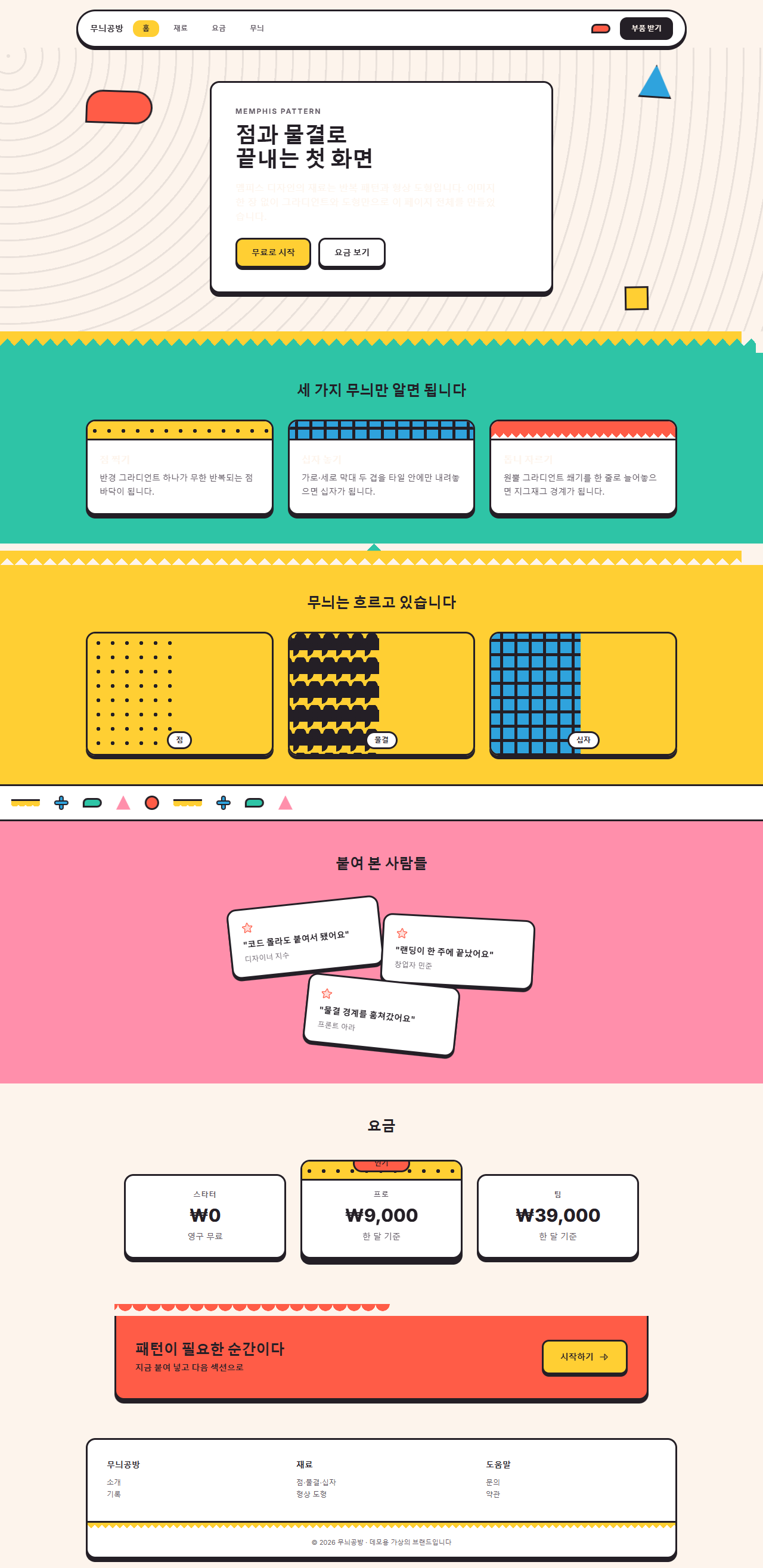
どこで壊れるか — 落とし穴
いちばん時間がかかったのは十字の模様でした。棒2本を重ねれば十字になるので、linear-gradient(#241f26, #241f26) を2枚、background-size: 5px 17px で指定したところ、描画された3枚目のパネルは空色ではなく、インク1色に塗られた板でした。棒用のグラデーションは棒の幅そのもの(5px)で反復するため、縦の棒が画面全体に5px間隔で並んだのです。十字にするには、まずタイル(24px)を定義し、その中で transparent 9.5px, インク 9.5px 14.5px, transparent 14.5px のように棒の位置を指定します。同じ間違いがカードの帯にも隠れていたので、2か所を一緒に直しました。
2つ目は歯の向きです。コーングラデーションで頂点を at 50% 100% に置き from 135deg を与えると、くさびは下側、つまりタイルの外へ開いて何も描かれません。下向きの歯は from 315deg から始めて、頂点から上へ開くようにします。向きが逆でもコンパイルもコンソールも静かなので、最初の描画ではジグザグの帯がただの空き帯にしか見えませんでした。3つ目として、マーキーはトラックの実測460pxが1組230pxのちょうど2倍かを、Playwright の offsetWidth で確かめてから先へ進みました。描かれないのに黙っているこの種の失敗は、ダークモードで色が反転するメールアプリでも同じ顔で現れます。メールテンプレート デザインがそこで二度確認を欠かさないのはそのためです。この3つを直した部品と1ページ全体は、圧縮パスワード yqayt28g で開くzipにそのまま入っています。
アクセシビリティ
メンフィスの明るい色は、どれも白い文字を載せられません。WCAG 2.1 のコントラスト基準の相対輝度の式で直接計算すると、最も暗いコーラル #ff5c47 でも白文字との比は3.06:1で、本文の基準4.5:1に届きません。そこでこのキットは、面ごとに色を選ぶ代わりに文字色を1つに決めました。インク(#241f26)ならどの面でも基準を上回ります。
| 手前 | 背景 | 実測コントラスト | 本文の基準 |
|---|---|---|---|
| インク #241f26 | 白 #ffffff | 16.17:1 | 合格 |
| インク #241f26 | クリーム #fdf4ec | 14.88:1 | 合格 |
| インク #241f26 | レモン #ffcf33 | 10.95:1 | 合格 |
| インク #241f26 | ミント #2ec4a6 | 7.36:1 | 合格 |
| インク #241f26 | 空 #2fa3dd | 5.7:1 | 合格 |
| インク #241f26 | コーラル #ff5c47 | 5.29:1 | 合格 |
| 白文字 | コーラル #ff5c47 | 3.06:1 | 不合格 — 使わない |
文字を模様の上に直接置かず、必ず白いパネルを1枚敷いて、その上にインクで書きました。模様の明るさはマス目ごとに違うため、文字がどの位置に来るかで比が変わってしまうのを、パネルで遮断します。動きについては MDN の prefers-reduced-motion のメディアクエリを9部品すべてに入れ、動きを減らす設定の訪問者には静止した状態だけを見せます。形バッジのナビは、動きが消えたあとも2番目の項目がアクティブに見える静的ルールを残しました。マーキーや波が止まっても、それは壊れではなく完成した壁紙の帯です。
このスタイルが気に入ったらデザイントレンドの一覧で隣のスタイルも見てみてください。このサイトが何を配っているかは紹介ページにまとめてあります。
FAQ
メンフィス デザイン とは ネオブルータリズムと何が違いますか?
どちらも太い黒枠を使いますが、主役が違います。ネオブルータリズムは枠とオフセットの影そのものがアイデンティティで、色は2〜3色あれば成立します。メンフィスでは枠は額縁にすぎず、水玉・波・ギザギザ・幾何学形が反復するパターンの塗りが主役です。この記事の04番のカードで、枠はそのままに頭の帯の模様を抜くとメンフィスでなくなります。それが確かめ方です。模様を告知に回す別の結びつきは、イベントLPのセクションに形で置いてあります。
模様の背景は読みにくくならないですか?
本文を模様のすぐ上に置かなければ大丈夫です。このキットの本文はすべて白いパネルの上にインクで書き、模様はパネルの外、つまり舞台と頭の帯と境界にだけ置きます。コントラスト表の数値はこの原則を守った画面で測ったものです。パネルを外して文字を模様に直接置くと、比は文字が載ったマスの明るさ次第でばらつきます。
堅いブランドには遊びすぎではないですか?
パレットをインクとクリームの2色に絞ると、構造は残ったまま遊びが抜けます。zipの中のバリエーション表にあるモノ・メンフィスがその状態です。逆に形を小さくしてタイルの間隔を広げると、模様は背景のノイズ程度に落ち着くので、明るい色を1〜2色残してもコーポレートのトーンを保てます。
こんな記事もどうぞ
 デザイントレンド手書き風 デザイン LPキット、クレヨン風セクション9選
 デザイントレンド【コピペOK】ベントグリッド 今どきのLPパーツ9選
 デザイントレンド現場で使う ダークモード デザインシステム LPパーツ9選
 デザイントレンドキネティックタイポグラフィをコードで分解してみた
 デザイントレンドクレイモーフィズムとは?丸くてぷっくりしたLPパーツ9選
 デザイントレンドメッシュグラデーションの上に、あえてグレインを残す
 デザイントレンドネオブルータリズム UI キット、影がにじまないLPパーツ9選
 デザイントレンドy2k webデザインとは?クロムとホログラフィックのLPパーツ9選
 デザイントレンドHUD デザインとは?画面に見つめ返される9パーツ
 デザイントレンドニューモーフィズム デザインとは?二重の影だけのLPパーツ9選