現場で使う ダークモード デザインシステム LPパーツ9選
今、Pinterestで保存され続けているダークモード デザインシステムは、開発者向けツールLinear.appの画面をきっかけに広まった配色のルールで、濃いインク色の背景に青いグローや枠線のハイライトだけで階層を表現します。この記事では同じ配色で組んだ9パーツを、そのまま貼り付けられるコードごと紹介します。
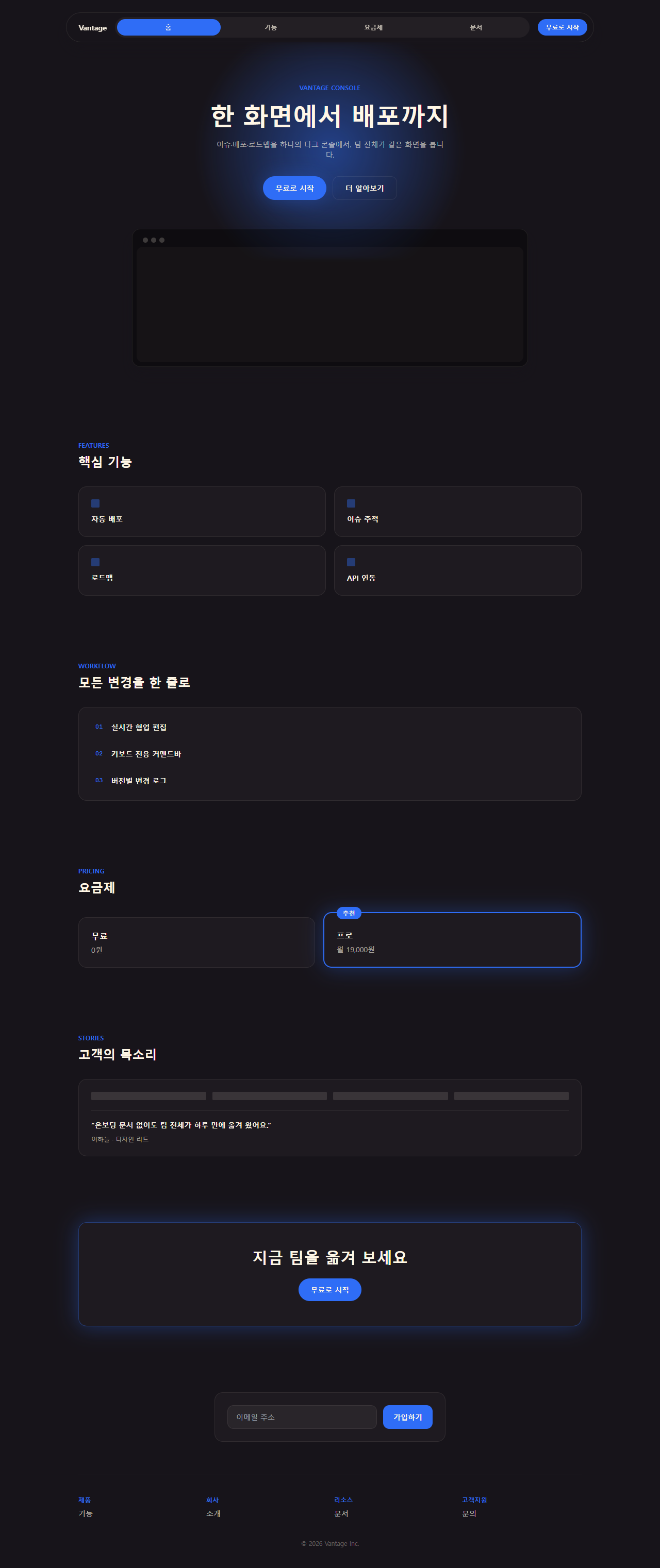
まずはこの配色だけで組んだ一枚のランディングページを、上から下まで実際にスクロールしてみてください。ヒーローからフッターまで明るさが一度も揺れずに保たれているかが、このスタイルを見分ける一番の手がかりです。

上の画面を組み立てた9つの部品は、ひとつのダークテーマ デザインとしてつながっていて、下のグリッドでひとつずつ個別に開いて確認できます。並び順は、訪問者が実際にページを追う流れ——最初に目を引かれ、ざっと見渡し、値段を確かめ、信頼できるか判断し、行動へ移り、登録する——そのままにしてあります。同じダークな色調をタイルへ分けて収めればベントグリッドのLPパーツになり、文字そのものが動いて色調を引っ張ればキネティックタイポグラフィのLPが続きます。
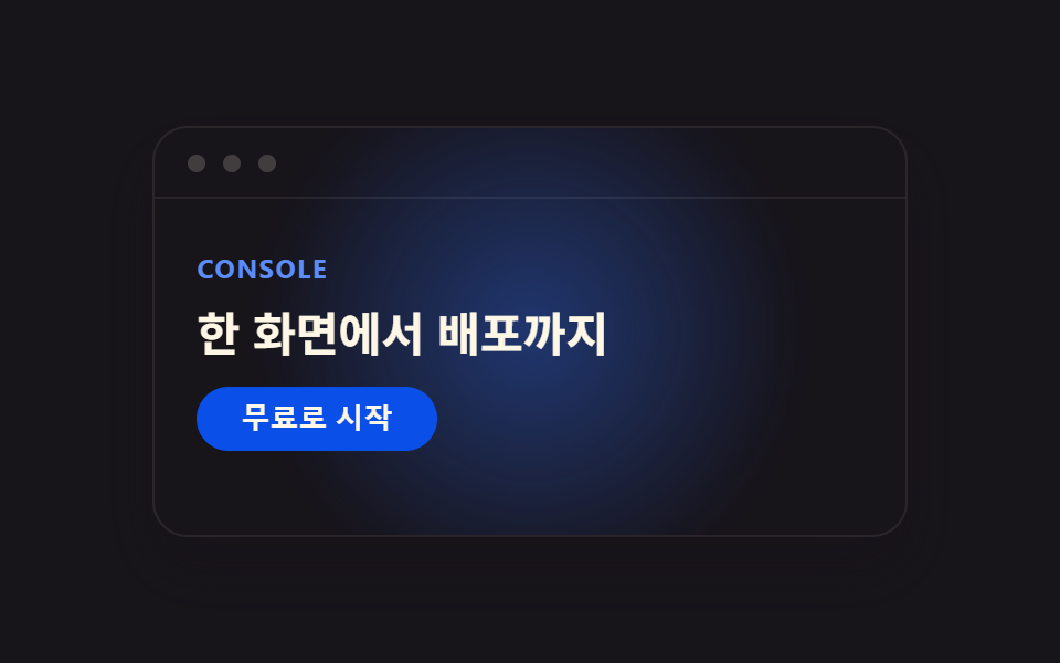 01 hero-linear
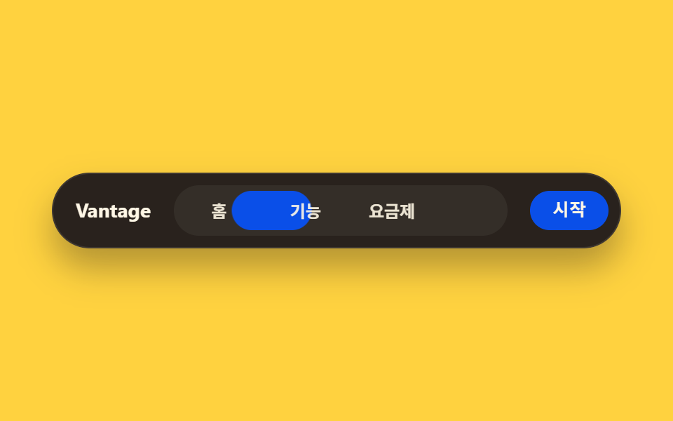 02 nav-linear
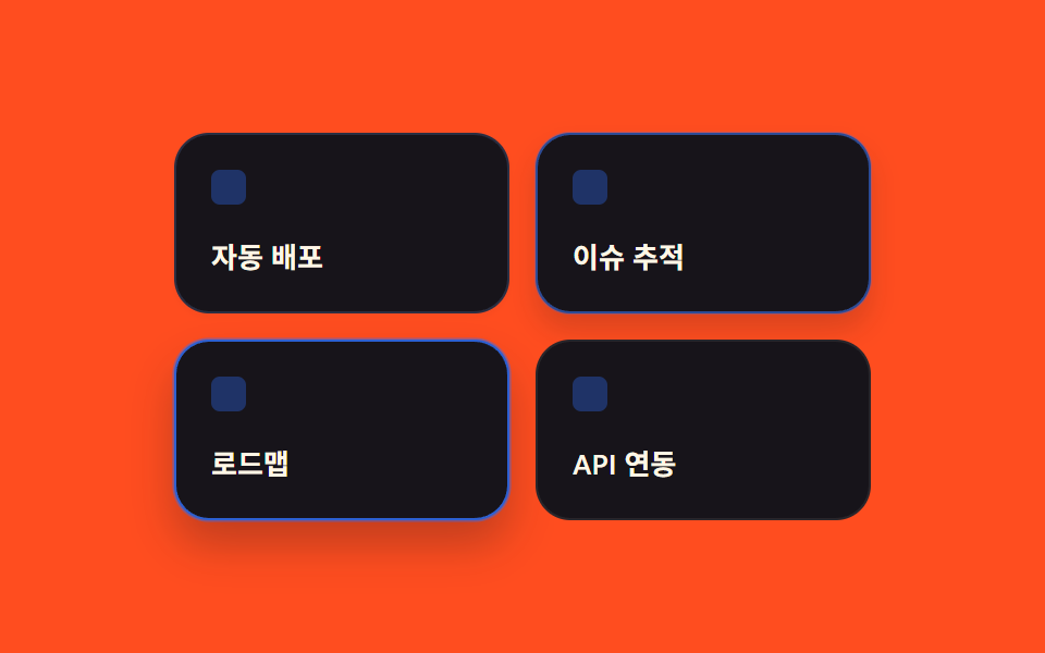 03 card-grid-linear
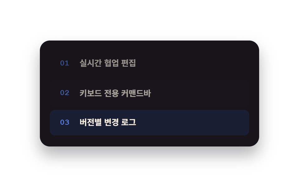 04 feature-list-linear
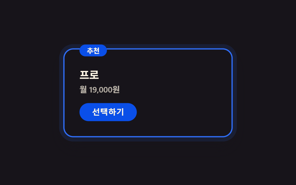 05 pricing-linear
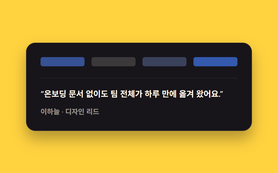 06 testimonial-linear
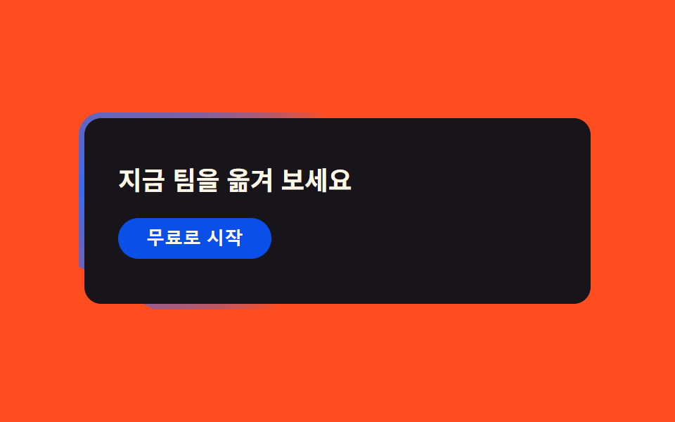 07 cta-band-linear
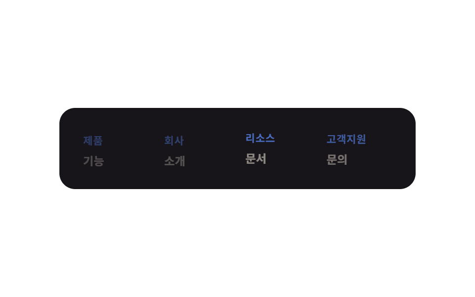 08 footer-linear
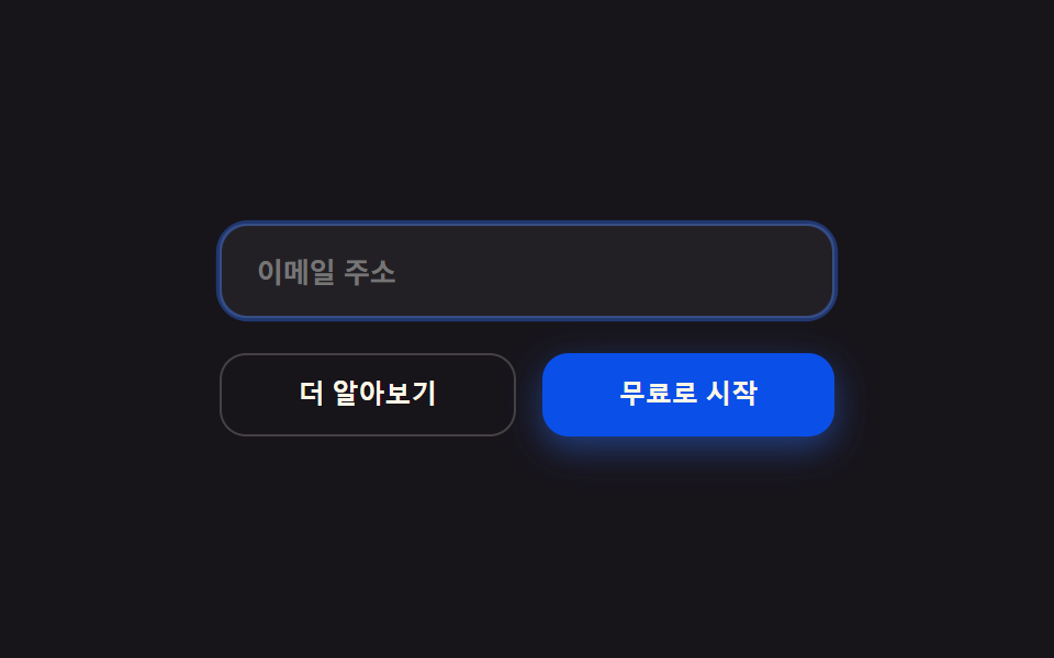 09 buttons-inputs-linear
自動再生 · タイルを押すとその項目へ · すべて1つのzip
- 01 製品モックアップ+グローヒーロー
- 02 ブラースティッキーナビ
- 03 枠ハイライトカード
- 04 モノスペースラベルリスト
- 05 強調プランのグロー
- 06 ロゴウォール+引用
- 07 グラデーション枠帯
- 08 4列ダークフッター
- 09 ゴースト/プライマリボタン
01ヒーロー
モックアップと青いグロー
濃いインク色の背景の上にブラウザクロームを模したモックアップウィンドウを浮かべ、その奥に青いグローをひとつだけ静かに滲ませます。
<main class="stage">
  <section class="mock is-demo">
    <span class="mock__glow" aria-hidden="true"></span>
    <div class="mock__bar">
      <span class="mock__dot"></span>
      <span class="mock__dot"></span>
      <span class="mock__dot"></span>
    </div>
    <div class="mock__body">
      <p class="mock__eyebrow">Console</p>
      <h2 class="mock__title">ひとつの画面からデプロイまで</h2>
      <button class="mock__cta" type="button">無料で始める</button>
    </div>
  </section>
</main>
@use "../../../../site/static/demo-tokens" as *;
$duration: $dur-loop; // 목업이 뜨고 가라앉는 한 주기
$easing: $ease-spring; // 등장 곡선
$color: $subject-blue; // 글로우 색
@include stage($stage-ink);
.mock {
position: relative;
width: clamp(220px, 78vw, 340px);
border-radius: $r-card;
background: $subject-ink;
border: 1px solid rgba($subject-cream, .08);
box-shadow: $shadow-raised;
overflow: hidden;
}
.mock__glow {
position: absolute;
left: 50%;
top: -20%;
width: 70%;
height: 140%;
transform: translateX(-50%);
background: radial-gradient(circle, rgba($color, .55) 0%, rgba($color, 0) 70%);
filter: blur(6px);
animation: glowPulse $duration $easing infinite;
pointer-events: none;
}
.mock__bar {
position: relative;
display: flex;
gap: $sp-2;
padding: clamp(8px, 2.4vw, $sp-3) clamp(12px, 3.2vw, $sp-4);
border-bottom: 1px solid rgba($subject-cream, .08);
}
.mock__dot {
width: $sp-2;
height: $sp-2;
border-radius: 50%;
background: rgba($subject-cream, .18);
}
.mock__body {
position: relative;
display: flex;
flex-direction: column;
align-items: flex-start;
gap: clamp(8px, 2.4vw, $sp-3);
padding: clamp(16px, 6vw, $sp-8) clamp(12px, 4vw, $sp-6) clamp(20px, 7vw, $sp-10);
animation: bodyRise $duration $easing infinite;
}
.mock__eyebrow {
margin: 0;
color: $subject-blue-light; // 먹 면 위 파란 글자 — AA 4.5 (blog-design 글자 대비)
font: 700 clamp(10px, 2.6vw, 12px)/1 -apple-system, "Segoe UI", "Noto Sans KR", sans-serif;
letter-spacing: .06em;
text-transform: uppercase;
}
.mock__title {
margin: 0;
color: $subject-cream;
font: 700 clamp(15px, 4.4vw, 22px)/1.2 -apple-system, "Segoe UI", "Noto Sans KR", sans-serif;
}
.mock__cta {
border: 0;
border-radius: $r-pill;
background: $subject-blue-deep;
color: $subject-cream;
padding: $sp-2 $sp-5;
font-weight: 600; font-size: clamp(11px, 2.8vw, 13px); line-height: 1;
}
@keyframes glowPulse {
0%, 100% { opacity: .45; transform: translateX(-50%) scale(.94); }
50% { opacity: .85; transform: translateX(-50%) scale(1.04); }
}
@keyframes bodyRise {
0%, 100% { transform: translateY(0); }
50% { transform: translateY(-6px); }
}
@media (prefers-reduced-motion: reduce) {
.mock__glow, .mock__body { animation: none !important; opacity: .65; transform: none; }
}html, body {
margin: 0;
overflow: hidden;
}
.stage {
box-sizing: border-box;
min-height: 100vh;
display: grid;
place-items: center;
margin: 0;
background: #17141a;
font-family: -apple-system, "Segoe UI", "Noto Sans KR", sans-serif;
padding: clamp(8px, 4vw, 24px);
}
.mock {
position: relative;
width: clamp(220px, 78vw, 340px);
border-radius: 16px;
background: #17141a;
border: 1px solid rgba(255, 247, 230, 0.08);
box-shadow: 0 14px 24px rgba(23, 20, 26, 0.32);
overflow: hidden;
}
.mock__glow {
position: absolute;
left: 50%;
top: -20%;
width: 70%;
height: 140%;
transform: translateX(-50%);
background: radial-gradient(circle, rgba(47, 109, 246, 0.55) 0%, rgba(47, 109, 246, 0) 70%);
filter: blur(6px);
animation: glowPulse 2s cubic-bezier(0.2, 0.8, 0.2, 1) infinite;
pointer-events: none;
}
.mock__bar {
position: relative;
display: flex;
gap: 8px;
padding: clamp(8px, 2.4vw, 12px) clamp(12px, 3.2vw, 16px);
border-bottom: 1px solid rgba(255, 247, 230, 0.08);
}
.mock__dot {
width: 8px;
height: 8px;
border-radius: 50%;
background: rgba(255, 247, 230, 0.18);
}
.mock__body {
position: relative;
display: flex;
flex-direction: column;
align-items: flex-start;
gap: clamp(8px, 2.4vw, 12px);
padding: clamp(16px, 6vw, 32px) clamp(12px, 4vw, 24px) clamp(20px, 7vw, 40px);
animation: bodyRise 2s cubic-bezier(0.2, 0.8, 0.2, 1) infinite;
}
.mock__eyebrow {
margin: 0;
color: #5b8cf8;
font: 700 clamp(10px, 2.6vw, 12px)/1 -apple-system, "Segoe UI", "Noto Sans KR", sans-serif;
letter-spacing: 0.06em;
text-transform: uppercase;
}
.mock__title {
margin: 0;
color: #fff7e6;
font: 700 clamp(15px, 4.4vw, 22px)/1.2 -apple-system, "Segoe UI", "Noto Sans KR", sans-serif;
}
.mock__cta {
border: 0;
border-radius: 999px;
background: #0a4fe8;
color: #fff7e6;
padding: 8px 20px;
font-weight: 600;
font-size: clamp(11px, 2.8vw, 13px);
line-height: 1;
}
@keyframes glowPulse {
0%, 100% {
opacity: 0.45;
transform: translateX(-50%) scale(0.94);
}
50% {
opacity: 0.85;
transform: translateX(-50%) scale(1.04);
}
}
@keyframes bodyRise {
0%, 100% {
transform: translateY(0);
}
50% {
transform: translateY(-6px);
}
}
@media (prefers-reduced-motion: reduce) {
.mock__glow, .mock__body {
animation: none !important;
opacity: 0.65;
transform: none;
}
}import type { CSSProperties } from "react";
import styles from "./HeroLinear.module.scss";
export type HeroLinearProps = {
eyebrow?: string;
title?: string;
cta?: string;
/** 한 주기(기본 2000ms) */
duration?: number;
easing?: string;
color?: string;
};
type Vars = CSSProperties & { "--duration"?: string; "--easing"?: string; "--color"?: string };
export default function HeroLinear({
eyebrow = "Console",
title = "From one screen to deploy",
cta = "Start for free",
duration = 2000,
easing = "cubic-bezier(.2,1.4,.4,1)",
color = "#2f6df6",
}: HeroLinearProps) {
const vars: Vars = { "--duration": `${duration}ms`, "--easing": easing, "--color": color };
return (
<section className={styles.mock} style={vars}>
<span className={styles.glow} aria-hidden="true" />
<div className={styles.bar}>
<span className={styles.dot} />
<span className={styles.dot} />
<span className={styles.dot} />
</div>
<div className={styles.body}>
<p className={styles.eyebrow}>{eyebrow}</p>
<h2 className={styles.title}>{title}</h2>
<button type="button" className={styles.cta}>{cta}</button>
</div>
</section>
);
}01 · 製品モックアップ+グローヒーロー — 計測 累積面積 24.265% · 動いたフレーム 18/23GODRICH オリジナル · SCSS と React は zip に同梱 · パスワードを見る
視線を中央へ集める
ウィンドウの中の見出しとCTAボタンも一緒にゆっくり浮き上がっては沈み、視線を画面の中央へ集めます。
<section class="relative overflow-hidden rounded-card border border-line bg-ink p-2 shadow-raised">
  <span class="glow pointer-events-none absolute left-1/2 top-0 h-96 w-96
               -translate-x-1/2"></span>
  <div class="flex gap-1.5 px-3 py-2">
    <span class="h-2.5 w-2.5 rounded-full bg-cream/20"></span>
    <span class="h-2.5 w-2.5 rounded-full bg-cream/20"></span>
  </div>
  <div class="relative flex flex-col gap-3 px-6 pb-10 pt-8">
    <p class="text-xs font-bold uppercase tracking-wide text-accent">Console</p>
    <h2 class="text-2xl font-bold text-cream">ひとつの画面からデプロイまで</h2>
    <button class="w-fit rounded-pill bg-accent px-5 py-2 text-sm font-bold text-cream">
      無料で始める
    </button>
  </div>
</section>
02ナビゲーション
ぼかしたナビバーのピル
backdrop-filterでぼかした丸みの強いナビバーの中で、現在地を示す小さなピルがメニュー項目の間を静かに滑ります。
<main class="stage">
  <nav class="navbar">
    <span class="navbar__brand">Vantage</span>
    <div class="navbar__items is-demo">
      <span class="navbar__pill" aria-hidden="true"></span>
      <span class="navbar__item">ホーム</span>
      <span class="navbar__item">機能</span>
      <span class="navbar__item">料金</span>
    </div>
    <button class="navbar__cta" type="button">開始</button>
  </nav>
</main>
@use "../../../../site/static/demo-tokens" as *;
$duration: $dur-loop; // 필이 두 항목 사이를 오가는 한 주기
$easing: $ease-spring;
$color: $subject-blue;
@include stage($stage-yellow);
$item-gap: $sp-1;
.navbar {
--item-w: clamp(32px, 12vw, 64px); // 3개 항목이 320px 폭에서도 브랜드·CTA 와 함께 들어가도록 반응형
display: flex;
align-items: center;
gap: $sp-4;
width: clamp(240px, 84vw, 380px);
border-radius: $r-pill;
background: rgba($subject-ink, .92);
border: 1px solid rgba($subject-cream, .1);
box-shadow: $shadow-raised;
padding: $sp-2 $sp-2 $sp-2 $sp-4;
backdrop-filter: blur(10px);
}
.navbar__brand {
flex: 0 0 auto;
color: $subject-cream;
font: 700 clamp(12px, 3vw, 14px)/1 -apple-system, "Segoe UI", "Noto Sans KR", sans-serif;
}
.navbar__items {
position: relative;
display: flex;
gap: $item-gap;
flex: 1 1 auto;
background: rgba($subject-cream, .05);
border-radius: $r-pill;
padding: $sp-1;
}
.navbar__pill {
position: absolute;
left: $sp-1;
top: $sp-1;
bottom: $sp-1;
width: var(--item-w);
border-radius: $r-pill;
background: $subject-blue-deep;
animation: pillMove $duration $easing infinite;
}
.navbar__item {
position: relative;
z-index: 1;
flex: 0 0 var(--item-w);
width: var(--item-w);
text-align: center;
padding: $sp-2 0;
color: rgba($subject-cream, .9); // 파란 알약($subject-blue-deep) 위에서 .7 은 3.68:1 이었다 — AA 4.5 (5.10:1)
font-weight: 600; font-size: clamp(10.5px, 2.6vw, 12px); line-height: 1;
}
.navbar__cta {
flex: 0 0 auto;
border: 0;
border-radius: $r-pill;
background: $subject-blue-deep;
color: $subject-cream;
padding: $sp-2 $sp-4;
font-weight: 600; font-size: clamp(10.5px, 2.6vw, 12px); line-height: 1;
}
@keyframes pillMove {
0%, 20% { transform: translateX(0); }
50%, 70% { transform: translateX(calc(var(--item-w) + #{$item-gap})); }
100% { transform: translateX(0); }
}
@media (prefers-reduced-motion: reduce) {
.navbar__pill { animation: none !important; transform: translateX(0); }
}html, body {
margin: 0;
overflow: hidden;
}
.stage {
box-sizing: border-box;
min-height: 100vh;
display: grid;
place-items: center;
margin: 0;
background: #ffd23f;
font-family: -apple-system, "Segoe UI", "Noto Sans KR", sans-serif;
padding: clamp(8px, 4vw, 24px);
}
.navbar {
--item-w: clamp(32px, 12vw, 64px);
display: flex;
align-items: center;
gap: 16px;
width: clamp(240px, 84vw, 380px);
border-radius: 999px;
background: rgba(23, 20, 26, 0.92);
border: 1px solid rgba(255, 247, 230, 0.1);
box-shadow: 0 14px 24px rgba(23, 20, 26, 0.32);
padding: 8px 8px 8px 16px;
backdrop-filter: blur(10px);
}
.navbar__brand {
flex: 0 0 auto;
color: #fff7e6;
font: 700 clamp(12px, 3vw, 14px)/1 -apple-system, "Segoe UI", "Noto Sans KR", sans-serif;
}
.navbar__items {
position: relative;
display: flex;
gap: 4px;
flex: 1 1 auto;
background: rgba(255, 247, 230, 0.05);
border-radius: 999px;
padding: 4px;
}
.navbar__pill {
position: absolute;
left: 4px;
top: 4px;
bottom: 4px;
width: var(--item-w);
border-radius: 999px;
background: #0a4fe8;
animation: pillMove 2s cubic-bezier(0.2, 0.8, 0.2, 1) infinite;
}
.navbar__item {
position: relative;
z-index: 1;
flex: 0 0 var(--item-w);
width: var(--item-w);
text-align: center;
padding: 8px 0;
color: rgba(255, 247, 230, 0.9);
font-weight: 600;
font-size: clamp(10.5px, 2.6vw, 12px);
line-height: 1;
}
.navbar__cta {
flex: 0 0 auto;
border: 0;
border-radius: 999px;
background: #0a4fe8;
color: #fff7e6;
padding: 8px 16px;
font-weight: 600;
font-size: clamp(10.5px, 2.6vw, 12px);
line-height: 1;
}
@keyframes pillMove {
0%, 20% {
transform: translateX(0);
}
50%, 70% {
transform: translateX(calc(var(--item-w) + 4px));
}
100% {
transform: translateX(0);
}
}
@media (prefers-reduced-motion: reduce) {
.navbar__pill {
animation: none !important;
transform: translateX(0);
}
}import type { CSSProperties } from "react";
import styles from "./NavLinear.module.scss";
export type NavLinearProps = {
brand?: string;
items?: [string, string, string];
cta?: string;
/** 필이 두 항목 사이를 오가는 한 주기(기본 2000ms) */
duration?: number;
easing?: string;
color?: string;
};
type Vars = CSSProperties & { "--duration"?: string; "--easing"?: string; "--color"?: string };
export default function NavLinear({
brand = "Vantage",
items = ["홈", "기능", "요금제"],
cta = "시작",
duration = 2000,
easing = "cubic-bezier(.2,1.4,.4,1)",
color = "#0a4fe8",
}: NavLinearProps) {
const vars: Vars = { "--duration": `${duration}ms`, "--easing": easing, "--color": color };
return (
<nav className={styles.navbar} style={vars}>
<span className={styles.brand}>{brand}</span>
<div className={styles.items}>
<span className={styles.pill} aria-hidden="true" />
{items.map((label) => (
<span key={label} className={styles.item}>{label}</span>
))}
</div>
<button type="button" className={styles.cta}>{cta}</button>
</nav>
);
}02 · ブラースティッキーナビ — 計測 累積面積 2.219% · 動いたフレーム 15/23GODRICH オリジナル · SCSS と React は zip に同梱 · パスワードを見る
動くのはピルだけ
ブランド名とCTAボタンはバーの両端に固定されており、ピルだけが動く構成です。
<nav class="flex items-center gap-4 rounded-pill bg-ink/90 border border-line
            backdrop-blur px-3 py-2 shadow-raised">
  <span class="pl-3 font-display font-extrabold text-sm text-cream">Vantage</span>
  <div class="relative flex flex-1 rounded-pill bg-cream/5 p-1">
    <span class="absolute inset-y-1 left-1 w-1/4 rounded-pill bg-accent"></span>
    <span class="relative z-10 flex-1 text-center text-xs font-semibold py-2 text-cream">ホーム</span>
    <span class="relative z-10 flex-1 text-center text-xs py-2 text-cream/70">機能</span>
  </div>
  <button class="rounded-pill bg-accent px-4 py-2 text-xs font-bold text-cream">開始</button>
</nav>
03カードグリッド
枠線が順に明るくなる
ダークカードを並べたグリッドで、枠線がカードごとに順に青く明るくなっては沈み、視線をグリッドの端まで導きます。
<main class="stage">
  <section class="grid is-demo">
    <article class="grid__card grid__card--1">
      <span class="grid__dot" aria-hidden="true"></span>
      <p class="grid__label">自動デプロイ</p>
    </article>
    <article class="grid__card grid__card--2">
      <span class="grid__dot" aria-hidden="true"></span>
      <p class="grid__label">イシュー管理</p>
    </article>
    <article class="grid__card grid__card--3">
      <span class="grid__dot" aria-hidden="true"></span>
      <p class="grid__label">ロードマップ</p>
    </article>
    <article class="grid__card grid__card--4">
      <span class="grid__dot" aria-hidden="true"></span>
      <p class="grid__label">API連携</p>
    </article>
  </section>
</main>
@use "../../../../site/static/demo-tokens" as *;
$duration: $dur-loop; // 카드 한 장이 밝아졌다 가라앉는 한 주기
$easing: $ease-out;
$color: $subject-blue;
@include stage($stage-orange);
.grid {
display: grid;
grid-template-columns: repeat(2, 1fr);
gap: $sp-3;
width: clamp(220px, 76vw, 320px);
}
.grid__card {
border-radius: $r-card;
background: $subject-ink;
border: 1px solid rgba($subject-cream, .08);
padding: $sp-4;
display: flex;
flex-direction: column;
gap: $sp-4;
animation-name: cardGlow;
animation-duration: $duration;
animation-timing-function: $easing;
animation-iteration-count: infinite;
}
.grid__card--1 { animation-delay: 0s; }
.grid__card--2 { animation-delay: $duration * -0.75; }
.grid__card--3 { animation-delay: $duration * -0.5; }
.grid__card--4 { animation-delay: $duration * -0.25; }
.grid__dot {
width: $sp-4;
height: $sp-4;
border-radius: $r-xs;
background: rgba($color, .35);
}
.grid__label {
margin: 0;
color: $subject-cream;
font: 600 clamp(11px, 2.8vw, 13px)/1.3 -apple-system, "Segoe UI", "Noto Sans KR", sans-serif;
}
@keyframes cardGlow {
0%, 76%, 100% { border-color: rgba($subject-cream, .08); box-shadow: none; }
13% { border-color: $color; box-shadow: 0 0 0 1px rgba($color, .5), $shadow-raised; }
}
@media (prefers-reduced-motion: reduce) {
.grid__card { animation: none !important; border-color: rgba($subject-cream, .08); box-shadow: none; }
}html, body {
margin: 0;
overflow: hidden;
}
.stage {
box-sizing: border-box;
min-height: 100vh;
display: grid;
place-items: center;
margin: 0;
background: #ff4d1f;
font-family: -apple-system, "Segoe UI", "Noto Sans KR", sans-serif;
padding: clamp(8px, 4vw, 24px);
}
.grid {
display: grid;
grid-template-columns: repeat(2, 1fr);
gap: 12px;
width: clamp(220px, 76vw, 320px);
}
.grid__card {
border-radius: 16px;
background: #17141a;
border: 1px solid rgba(255, 247, 230, 0.08);
padding: 16px;
display: flex;
flex-direction: column;
gap: 16px;
animation-name: cardGlow;
animation-duration: 2s;
animation-timing-function: ease-out;
animation-iteration-count: infinite;
}
.grid__card--1 {
animation-delay: 0s;
}
.grid__card--2 {
animation-delay: -1.5s;
}
.grid__card--3 {
animation-delay: -1s;
}
.grid__card--4 {
animation-delay: -0.5s;
}
.grid__dot {
width: 16px;
height: 16px;
border-radius: 4px;
background: rgba(47, 109, 246, 0.35);
}
.grid__label {
margin: 0;
color: #fff7e6;
font: 600 clamp(11px, 2.8vw, 13px)/1.3 -apple-system, "Segoe UI", "Noto Sans KR", sans-serif;
}
@keyframes cardGlow {
0%, 76%, 100% {
border-color: rgba(255, 247, 230, 0.08);
box-shadow: none;
}
13% {
border-color: #2f6df6;
box-shadow: 0 0 0 1px rgba(47, 109, 246, 0.5), 0 14px 24px rgba(23, 20, 26, 0.32);
}
}
@media (prefers-reduced-motion: reduce) {
.grid__card {
animation: none !important;
border-color: rgba(255, 247, 230, 0.08);
box-shadow: none;
}
}import type { CSSProperties } from "react";
import styles from "./CardGridLinear.module.scss";
export type CardGridLinearProps = {
labels?: [string, string, string, string];
/** 카드 한 장이 밝아졌다 가라앉는 한 주기(기본 2000ms) */
duration?: number;
easing?: string;
color?: string;
};
type Vars = CSSProperties & { "--duration"?: string; "--easing"?: string; "--color"?: string };
export default function CardGridLinear({
labels = ["자동 배포", "이슈 추적", "로드맵", "API 연동"],
duration = 2000,
easing = "ease-out",
color = "#2f6df6",
}: CardGridLinearProps) {
const vars: Vars = { "--duration": `${duration}ms`, "--easing": easing, "--color": color };
const delays = ["0s", `${-duration * 0.75}ms`, `${-duration * 0.5}ms`, `${-duration * 0.25}ms`];
return (
<section className={styles.grid} style={vars}>
{labels.map((label, i) => (
<article key={label} className={styles.card} style={{ animationDelay: delays[i] }}>
<span className={styles.dot} aria-hidden="true" />
<p className={styles.label}>{label}</p>
</article>
))}
</section>
);
}03 · 枠ハイライトカード — 計測 累積面積 12.578% · 動いたフレーム 23/23GODRICH オリジナル · SCSS と React は zip に同梱 · パスワードを見る
同時に光らせない理由
全部のカードが同時に光るのではなく、一つずつ順番に回る点がこの部品の要点です。
<div class="grid grid-cols-2 gap-gutter">
  <div class="rounded-card border border-line bg-cream/[.03] p-6
              transition-colors hover:border-accent">
    <span class="mb-3 block h-4 w-4 rounded-sm bg-accent/40"></span>
    <p class="text-sm font-semibold text-cream">自動デプロイ</p>
  </div>
  <div class="rounded-card border border-line bg-cream/[.03] p-6
              transition-colors hover:border-accent">
    <span class="mb-3 block h-4 w-4 rounded-sm bg-accent/40"></span>
    <p class="text-sm font-semibold text-cream">イシュー管理</p>
  </div>
</div>
04機能一覧
モノスペースの番号ラベル
機能ごとにモノスペース書体の番号ラベルを添え、リストの行が下からひとつずつ、せり上がるように現れます。
<main class="stage">
  <ul class="list is-demo">
    <li class="list__row list__row--1"><span class="list__num">01</span><span class="list__text">リアルタイム共同編集</span></li>
    <li class="list__row list__row--2"><span class="list__num">02</span><span class="list__text">キーボード専用コマンドバー</span></li>
    <li class="list__row list__row--3"><span class="list__num">03</span><span class="list__text">バージョン別変更ログ</span></li>
  </ul>
</main>
@use "../../../../site/static/demo-tokens" as *;
$duration: $dur-loop; // 줄 하나가 스치듯 나타났다 사라지는 한 주기
$easing: $ease-out;
$color: $subject-blue;
@include stage($stage-paper);
.list {
list-style: none;
margin: 0;
padding: $sp-4;
display: flex;
flex-direction: column;
gap: $sp-2;
width: clamp(220px, 76vw, 320px);
background: $subject-ink;
border-radius: $r-card;
box-shadow: $shadow-raised;
}
.list__row {
display: flex;
align-items: center;
gap: $sp-4;
padding: $sp-3 $sp-4;
border-radius: $r-sm;
// 데모 루프는 .is-demo 안에서만 — 정적(실사용) 상태는 opacity 1 이라야 글자 대비가 산다
.list.is-demo & { animation-name: rowSweep; }
animation-duration: $duration;
animation-timing-function: $easing;
animation-iteration-count: infinite;
}
.list__row--1 { animation-delay: 0s; }
.list__row--2 { animation-delay: $duration * -0.67; }
.list__row--3 { animation-delay: $duration * -0.34; }
.list__num {
font: 700 clamp(11px, 2.8vw, 13px)/1 "Courier New", ui-monospace, monospace;
color: $subject-blue-light; // 먹 면 위 파란 글자 — AA 4.5 (blog-design 글자 대비)
}
.list__text {
color: $subject-cream;
font: 600 clamp(11px, 2.8vw, 13px)/1.3 -apple-system, "Segoe UI", "Noto Sans KR", sans-serif;
}
@keyframes rowSweep {
0%, 62%, 100% { opacity: .55; background: transparent; transform: translateY(0); }
17% { opacity: 1; background: rgba($color, .12); transform: translateY(-2px); }
}
@media (prefers-reduced-motion: reduce) {
.list__row { animation: none !important; opacity: .85; background: transparent; transform: none; }
}html, body {
margin: 0;
overflow: hidden;
}
.stage {
box-sizing: border-box;
min-height: 100vh;
display: grid;
place-items: center;
margin: 0;
background: #ffffff;
font-family: -apple-system, "Segoe UI", "Noto Sans KR", sans-serif;
padding: clamp(8px, 4vw, 24px);
}
.list {
list-style: none;
margin: 0;
padding: 16px;
display: flex;
flex-direction: column;
gap: 8px;
width: clamp(220px, 76vw, 320px);
background: #17141a;
border-radius: 16px;
box-shadow: 0 14px 24px rgba(23, 20, 26, 0.32);
}
.list__row {
display: flex;
align-items: center;
gap: 16px;
padding: 12px 16px;
border-radius: 8px;
}
.list.is-demo .list__row {
animation-name: rowSweep;
}
.list__row {
animation-duration: 2s;
animation-timing-function: ease-out;
animation-iteration-count: infinite;
}
.list__row--1 {
animation-delay: 0s;
}
.list__row--2 {
animation-delay: -1.34s;
}
.list__row--3 {
animation-delay: -0.68s;
}
.list__num {
font: 700 clamp(11px, 2.8vw, 13px)/1 "Courier New", ui-monospace, monospace;
color: #5b8cf8;
}
.list__text {
color: #fff7e6;
font: 600 clamp(11px, 2.8vw, 13px)/1.3 -apple-system, "Segoe UI", "Noto Sans KR", sans-serif;
}
@keyframes rowSweep {
0%, 62%, 100% {
opacity: 0.55;
background: transparent;
transform: translateY(0);
}
17% {
opacity: 1;
background: rgba(47, 109, 246, 0.12);
transform: translateY(-2px);
}
}
@media (prefers-reduced-motion: reduce) {
.list__row {
animation: none !important;
opacity: 0.85;
background: transparent;
transform: none;
}
}import type { CSSProperties } from "react";
import styles from "./FeatureListLinear.module.scss";
export type FeatureListLinearProps = {
rows?: [string, string, string];
/** 줄 하나가 스치듯 나타났다 사라지는 한 주기(기본 2000ms) */
duration?: number;
easing?: string;
color?: string;
};
type Vars = CSSProperties & { "--duration"?: string; "--easing"?: string; "--color"?: string };
export default function FeatureListLinear({
rows = ["실시간 협업 편집", "키보드 전용 커맨드바", "버전별 변경 로그"],
duration = 2000,
easing = "ease-out",
color = "#2f6df6",
}: FeatureListLinearProps) {
const vars: Vars = { "--duration": `${duration}ms`, "--easing": easing, "--color": color };
const delays = ["0s", `${-duration * 0.67}ms`, `${-duration * 0.34}ms`];
return (
<ul className={styles.list} style={vars}>
{rows.map((text, i) => (
<li key={text} className={styles.row} style={{ animationDelay: delays[i] }}>
<span className={styles.num}>{String(i + 1).padStart(2, "0")}</span>
<span className={styles.text}>{text}</span>
</li>
))}
</ul>
);
}04 · モノスペースラベルリスト — 計測 累積面積 27.006% · 動いたフレーム 19/23GODRICH オリジナル · SCSS と React は zip に同梱 · パスワードを見る
行番号のように見せる
番号がコードエディターの行番号のように見えるため、開発者向けツールという印象が強まります。
<ul class="flex flex-col gap-2 rounded-card border border-line bg-cream/[.03] p-4">
  <li class="flex items-center gap-4 rounded-control px-4 py-3 hover:bg-accent/10">
    <span class="font-mono text-xs font-bold text-accent">01</span>
    <span class="text-sm font-semibold text-cream">リアルタイム共同編集</span>
  </li>
  <li class="flex items-center gap-4 rounded-control px-4 py-3 hover:bg-accent/10">
    <span class="font-mono text-xs font-bold text-accent">02</span>
    <span class="text-sm font-semibold text-cream">キーボード専用コマンドバー</span>
  </li>
</ul>
05料金
おすすめプランだけ呼吸する
おすすめプランのカードだけに青いグローの枠を巻き、静かに膨らんでは縮む、呼吸のような動きを与えます。
<main class="stage">
  <section class="plan is-demo">
    <span class="plan__badge">おすすめ</span>
    <p class="plan__name">プロ</p>
    <p class="plan__price">月19,000円</p>
    <button class="plan__cta" type="button">プランを選ぶ</button>
  </section>
</main>
@use "../../../../site/static/demo-tokens" as *;
$duration: $dur-loop; // 글로우 테두리가 숨 쉬는 한 주기
$easing: $ease-spring;
$color: $subject-blue;
@include stage($stage-ink);
.plan {
position: relative;
width: clamp(180px, 60vw, 220px);
border-radius: $r-card;
background: $subject-ink;
border: 2px solid $color;
padding: $sp-8 $sp-6 $sp-6;
display: flex;
flex-direction: column;
align-items: flex-start;
gap: $sp-2;
animation: planBreathe $duration $easing infinite;
}
.plan__badge {
position: absolute;
top: $sp-1 * -2;
left: $sp-6;
border-radius: $r-pill;
background: $subject-blue-deep;
color: $subject-cream;
padding: $sp-1 $sp-3;
font: 700 clamp(9.5px, 2.4vw, 11px)/1 -apple-system, "Segoe UI", "Noto Sans KR", sans-serif;
}
.plan__name {
margin: 0;
color: $subject-cream;
font: 700 clamp(14px, 3.6vw, 17px)/1 -apple-system, "Segoe UI", "Noto Sans KR", sans-serif;
}
.plan__price {
margin: 0;
color: rgba($subject-cream, .7);
font-weight: 600; font-size: clamp(11px, 2.8vw, 13px); line-height: 1;
}
.plan__cta {
margin-top: $sp-2;
border: 0;
border-radius: $r-pill;
background: $subject-blue-deep;
color: $subject-cream;
padding: $sp-2 $sp-5;
font-weight: 600; font-size: clamp(11px, 2.8vw, 13px); line-height: 1;
}
@keyframes planBreathe {
0%, 100% { box-shadow: 0 0 0 0 rgba($color, .35), $shadow-raised; transform: scale(1); }
50% { box-shadow: 0 0 0 10px rgba($color, 0), $shadow-raised; transform: scale(1.015); }
}
@media (prefers-reduced-motion: reduce) {
.plan { animation: none !important; box-shadow: 0 0 0 4px rgba($color, .2), $shadow-raised; transform: none; }
}html, body {
margin: 0;
overflow: hidden;
}
.stage {
box-sizing: border-box;
min-height: 100vh;
display: grid;
place-items: center;
margin: 0;
background: #17141a;
font-family: -apple-system, "Segoe UI", "Noto Sans KR", sans-serif;
padding: clamp(8px, 4vw, 24px);
}
.plan {
position: relative;
width: clamp(180px, 60vw, 220px);
border-radius: 16px;
background: #17141a;
border: 2px solid #2f6df6;
padding: 32px 24px 24px;
display: flex;
flex-direction: column;
align-items: flex-start;
gap: 8px;
animation: planBreathe 2s cubic-bezier(0.2, 0.8, 0.2, 1) infinite;
}
.plan__badge {
position: absolute;
top: -8px;
left: 24px;
border-radius: 999px;
background: #0a4fe8;
color: #fff7e6;
padding: 4px 12px;
font: 700 clamp(9.5px, 2.4vw, 11px)/1 -apple-system, "Segoe UI", "Noto Sans KR", sans-serif;
}
.plan__name {
margin: 0;
color: #fff7e6;
font: 700 clamp(14px, 3.6vw, 17px)/1 -apple-system, "Segoe UI", "Noto Sans KR", sans-serif;
}
.plan__price {
margin: 0;
color: rgba(255, 247, 230, 0.7);
font-weight: 600;
font-size: clamp(11px, 2.8vw, 13px);
line-height: 1;
}
.plan__cta {
margin-top: 8px;
border: 0;
border-radius: 999px;
background: #0a4fe8;
color: #fff7e6;
padding: 8px 20px;
font-weight: 600;
font-size: clamp(11px, 2.8vw, 13px);
line-height: 1;
}
@keyframes planBreathe {
0%, 100% {
box-shadow: 0 0 0 0 rgba(47, 109, 246, 0.35), 0 14px 24px rgba(23, 20, 26, 0.32);
transform: scale(1);
}
50% {
box-shadow: 0 0 0 10px rgba(47, 109, 246, 0), 0 14px 24px rgba(23, 20, 26, 0.32);
transform: scale(1.015);
}
}
@media (prefers-reduced-motion: reduce) {
.plan {
animation: none !important;
box-shadow: 0 0 0 4px rgba(47, 109, 246, 0.2), 0 14px 24px rgba(23, 20, 26, 0.32);
transform: none;
}
}import type { CSSProperties } from "react";
import styles from "./PricingLinear.module.scss";
export type PricingLinearProps = {
badge?: string;
name?: string;
price?: string;
cta?: string;
/** 글로우 테두리가 숨 쉬는 한 주기(기본 2000ms) */
duration?: number;
easing?: string;
color?: string;
};
type Vars = CSSProperties & { "--duration"?: string; "--easing"?: string; "--color"?: string };
export default function PricingLinear({
badge = "추천",
name = "프로",
price = "$19/mo",
cta = "선택하기",
duration = 2000,
easing = "cubic-bezier(.2,1.4,.4,1)",
color = "#2f6df6",
}: PricingLinearProps) {
const vars: Vars = { "--duration": `${duration}ms`, "--easing": easing, "--color": color };
return (
<section className={styles.plan} style={vars}>
<span className={styles.badge}>{badge}</span>
<p className={styles.name}>{name}</p>
<p className={styles.price}>{price}</p>
<button type="button" className={styles.cta}>{cta}</button>
</section>
);
}05 · 強調プランのグロー — 計測 累積面積 6.678% · 動いたフレーム 19/23GODRICH オリジナル · SCSS と React は zip に同梱 · パスワードを見る
表を組まずに伝える
表を組まなくても、どのプランを推しているかが一目で伝わります。
<div class="relative flex-[1.1] rounded-card border-2 border-accent
            bg-cream/[.03] p-6 pt-8 shadow-glow">
  <span class="absolute -top-3 left-6 rounded-pill bg-accent px-3 py-1
               text-xs font-bold text-cream">おすすめ</span>
  <p class="font-bold text-cream">プロ</p>
  <p class="mt-1 text-sm text-cream/60">月19,000円</p>
</div>
06お客様の声
薄くしたロゴの列
薄くしたパートナーロゴの列の下に引用カードをひとつ置き、ロゴが順番に明るくなっては薄くなることで信頼を積み重ねます。
<main class="stage">
  <section class="panel">
    <div class="panel__logos is-demo" aria-hidden="true">
      <span class="panel__logo panel__logo--1"></span>
      <span class="panel__logo panel__logo--2"></span>
      <span class="panel__logo panel__logo--3"></span>
      <span class="panel__logo panel__logo--4"></span>
    </div>
    <blockquote class="panel__quote">
      <p>「オンボーディング資料なしで、チーム全員が1日で移行できました。」</p>
      <cite>イ・ハヌル · デザインリード</cite>
    </blockquote>
  </section>
</main>
@use "../../../../site/static/demo-tokens" as *;
$duration: $dur-loop; // 로고 한 개가 밝아졌다 옅어지는 한 주기
$easing: $ease-out;
$color: $subject-blue;
@include stage($stage-yellow);
.panel {
width: clamp(230px, 80vw, 340px);
border-radius: $r-card;
background: $subject-ink;
border: 1px solid rgba($subject-cream, .08);
box-shadow: $shadow-raised;
padding: $sp-6;
display: flex;
flex-direction: column;
gap: $sp-5;
}
.panel__logos {
display: flex;
justify-content: space-between;
gap: $sp-3;
}
.panel__logo {
flex: 1 1 0;
height: $sp-4;
border-radius: $r-xs;
background: rgba($subject-cream, .16);
animation-name: logoShine;
animation-duration: $duration;
animation-timing-function: $easing;
animation-iteration-count: infinite;
}
.panel__logo--1 { animation-delay: 0s; }
.panel__logo--2 { animation-delay: $duration * -0.75; }
.panel__logo--3 { animation-delay: $duration * -0.5; }
.panel__logo--4 { animation-delay: $duration * -0.25; }
.panel__quote {
margin: 0;
padding-top: $sp-4;
border-top: 1px solid rgba($subject-cream, .08);
}
.panel__quote p {
margin: 0 0 $sp-2;
color: $subject-cream;
font: 600 clamp(12px, 3vw, 14px)/1.5 -apple-system, "Segoe UI", "Noto Sans KR", sans-serif;
}
.panel__quote cite {
color: rgba($subject-cream, .55);
font-weight: 600; font-size: clamp(10.5px, 2.6vw, 12px); line-height: 1;
font-style: normal;
}
@keyframes logoShine {
0%, 76%, 100% { background: rgba($subject-cream, .16); }
13% { background: $color; }
}
@media (prefers-reduced-motion: reduce) {
.panel__logo { animation: none !important; background: rgba($subject-cream, .16); }
}html, body {
margin: 0;
overflow: hidden;
}
.stage {
box-sizing: border-box;
min-height: 100vh;
display: grid;
place-items: center;
margin: 0;
background: #ffd23f;
font-family: -apple-system, "Segoe UI", "Noto Sans KR", sans-serif;
padding: clamp(8px, 4vw, 24px);
}
.panel {
width: clamp(230px, 80vw, 340px);
border-radius: 16px;
background: #17141a;
border: 1px solid rgba(255, 247, 230, 0.08);
box-shadow: 0 14px 24px rgba(23, 20, 26, 0.32);
padding: 24px;
display: flex;
flex-direction: column;
gap: 20px;
}
.panel__logos {
display: flex;
justify-content: space-between;
gap: 12px;
}
.panel__logo {
flex: 1 1 0;
height: 16px;
border-radius: 4px;
background: rgba(255, 247, 230, 0.16);
animation-name: logoShine;
animation-duration: 2s;
animation-timing-function: ease-out;
animation-iteration-count: infinite;
}
.panel__logo--1 {
animation-delay: 0s;
}
.panel__logo--2 {
animation-delay: -1.5s;
}
.panel__logo--3 {
animation-delay: -1s;
}
.panel__logo--4 {
animation-delay: -0.5s;
}
.panel__quote {
margin: 0;
padding-top: 16px;
border-top: 1px solid rgba(255, 247, 230, 0.08);
}
.panel__quote p {
margin: 0 0 8px;
color: #fff7e6;
font: 600 clamp(12px, 3vw, 14px)/1.5 -apple-system, "Segoe UI", "Noto Sans KR", sans-serif;
}
.panel__quote cite {
color: rgba(255, 247, 230, 0.55);
font-weight: 600;
font-size: clamp(10.5px, 2.6vw, 12px);
line-height: 1;
font-style: normal;
}
@keyframes logoShine {
0%, 76%, 100% {
background: rgba(255, 247, 230, 0.16);
}
13% {
background: #2f6df6;
}
}
@media (prefers-reduced-motion: reduce) {
.panel__logo {
animation: none !important;
background: rgba(255, 247, 230, 0.16);
}
}import type { CSSProperties } from "react";
import styles from "./TestimonialLinear.module.scss";
export type TestimonialLinearProps = {
quote?: string;
cite?: string;
logoCount?: number;
/** 로고 한 개가 밝아졌다 옅어지는 한 주기(기본 2000ms) */
duration?: number;
easing?: string;
color?: string;
};
type Vars = CSSProperties & { "--duration"?: string; "--easing"?: string; "--color"?: string };
export default function TestimonialLinear({
quote = "Our whole team switched over in a day, no onboarding docs needed.",
cite = "Lee Ha-neul · Design Lead",
logoCount = 4,
duration = 2000,
easing = "ease-out",
color = "#2f6df6",
}: TestimonialLinearProps) {
const vars: Vars = { "--duration": `${duration}ms`, "--easing": easing, "--color": color };
const delays = Array.from({ length: logoCount }, (_, i) => `${-duration * (0.75 - i * 0.25)}ms`);
return (
<section className={styles.panel} style={vars}>
<div className={styles.logos} aria-hidden="true">
{delays.map((delay, i) => (
<span key={i} className={styles.logo} style={{ animationDelay: i === 0 ? "0s" : delay }} />
))}
</div>
<blockquote className={styles.quote}>
<p>“{quote}”</p>
<cite>{cite}</cite>
</blockquote>
</section>
);
}06 · ロゴウォール+引用 — 計測 累積面積 3.367% · 動いたフレーム 23/23GODRICH オリジナル · SCSS と React は zip に同梱 · パスワードを見る
なぜ明るさ16%か
ロゴを完全な色のまま並べると広告バナーのように見えるため、あえて明るさを16%まで落としてあります。
<div class="rounded-card border border-line bg-cream/[.03] p-6">
  <div class="mb-5 flex justify-between gap-3 opacity-60">
    <span class="h-4 flex-1 rounded-sm bg-cream/20"></span>
    <span class="h-4 flex-1 rounded-sm bg-cream/20"></span>
  </div>
  <blockquote class="border-t border-line pt-4">
    <p class="text-sm font-semibold text-cream">
      「オンボーディング資料なしで、チーム全員が1日で移行できました。」
    </p>
  </blockquote>
</div>
07CTA帯
回転するグラデーション線
CTA帯の枠を包むグラデーションの線がゆっくり回転し、縁だけが光るバッジのように見えます。
<main class="stage">
  <section class="band">
    <div class="band__inner is-demo">
      <h3 class="band__title">今すぐチームを移行しましょう</h3>
      <button class="band__cta" type="button">無料で始める</button>
    </div>
  </section>
</main>
@use "../../../../site/static/demo-tokens" as *;
$duration: $dur-loop; // 테두리 그라디언트가 한 바퀴 도는 시간
$easing: linear; // 회전은 일정 속도가 자연스럽다 (spring·pop 은 회전에 안 맞는다)
$color: $subject-blue;
@include stage($stage-orange);
.band {
position: relative;
width: clamp(240px, 84vw, 360px);
border-radius: $r-card;
padding: $sp-1;
overflow: hidden;
isolation: isolate;
}
.band::before {
content: "";
position: absolute;
inset: -40%;
background: conic-gradient(from 0deg, transparent 0%, rgba($color, .95) 18%, transparent 40%);
animation: bandSpin $duration $easing infinite;
}
.band__inner {
position: relative;
z-index: 1;
border-radius: calc(#{$r-card} - $sp-1);
background: $subject-ink;
padding: $sp-8 $sp-6;
display: flex;
flex-direction: column;
align-items: flex-start;
gap: $sp-4;
}
.band__title {
margin: 0;
color: $subject-cream;
font: 700 clamp(15px, 3.8vw, 19px)/1.3 -apple-system, "Segoe UI", "Noto Sans KR", sans-serif;
}
.band__cta {
border: 0;
border-radius: $r-pill;
background: $subject-blue-deep;
color: $subject-cream;
padding: $sp-2 $sp-5;
font-weight: 600; font-size: clamp(11px, 2.8vw, 13px); line-height: 1;
}
@keyframes bandSpin {
from { transform: rotate(0deg); }
to { transform: rotate(360deg); }
}
@media (prefers-reduced-motion: reduce) {
.band::before { animation: none !important; }
}html, body {
margin: 0;
overflow: hidden;
}
.stage {
box-sizing: border-box;
min-height: 100vh;
display: grid;
place-items: center;
margin: 0;
background: #ff4d1f;
font-family: -apple-system, "Segoe UI", "Noto Sans KR", sans-serif;
padding: clamp(8px, 4vw, 24px);
}
.band {
position: relative;
width: clamp(240px, 84vw, 360px);
border-radius: 16px;
padding: 4px;
overflow: hidden;
isolation: isolate;
}
.band::before {
content: "";
position: absolute;
inset: -40%;
background: conic-gradient(from 0deg, transparent 0%, rgba(47, 109, 246, 0.95) 18%, transparent 40%);
animation: bandSpin 2s linear infinite;
}
.band__inner {
position: relative;
z-index: 1;
border-radius: calc(16px - 4px);
background: #17141a;
padding: 32px 24px;
display: flex;
flex-direction: column;
align-items: flex-start;
gap: 16px;
}
.band__title {
margin: 0;
color: #fff7e6;
font: 700 clamp(15px, 3.8vw, 19px)/1.3 -apple-system, "Segoe UI", "Noto Sans KR", sans-serif;
}
.band__cta {
border: 0;
border-radius: 999px;
background: #0a4fe8;
color: #fff7e6;
padding: 8px 20px;
font-weight: 600;
font-size: clamp(11px, 2.8vw, 13px);
line-height: 1;
}
@keyframes bandSpin {
from {
transform: rotate(0deg);
}
to {
transform: rotate(360deg);
}
}
@media (prefers-reduced-motion: reduce) {
.band::before {
animation: none !important;
}
}import type { CSSProperties } from "react";
import styles from "./CtaBandLinear.module.scss";
export type CtaBandLinearProps = {
title?: string;
cta?: string;
/** 테두리 그라디언트가 한 바퀴 도는 시간(기본 2000ms) */
duration?: number;
easing?: string;
color?: string;
};
type Vars = CSSProperties & { "--duration"?: string; "--easing"?: string; "--color"?: string };
export default function CtaBandLinear({
title = "Move your team over today",
cta = "Start for free",
duration = 2000,
easing = "linear",
color = "#2f6df6",
}: CtaBandLinearProps) {
const vars: Vars = { "--duration": `${duration}ms`, "--easing": easing, "--color": color };
return (
<section className={styles.band} style={vars}>
<div className={styles.inner}>
<h3 className={styles.title}>{title}</h3>
<button type="button" className={styles.cta}>{cta}</button>
</div>
</section>
);
}07 · グラデーション枠帯 — 計測 累積面積 2.754% · 動いたフレーム 23/23GODRICH オリジナル · SCSS と React は zip に同梱 · パスワードを見る
2pxだけ残す仕組み
conic-gradientを枠より大きく敷いて回転させ、内側のカードで2pxだけ残して隠す仕組みです。
<div class="relative overflow-hidden rounded-card border border-accent/40
            bg-cream/[.03] px-10 py-12 text-center shadow-glow">
  <h3 class="mx-auto max-w-md text-3xl font-extrabold text-cream">
    今すぐチームを移行しましょう
  </h3>
  <button class="mt-6 rounded-pill bg-accent px-6 py-3 text-sm font-bold text-cream">
    無料で始める
  </button>
</div>
08フッター
左から順に浮かぶ4列
4列に分けたリンク群が左から順に薄く浮かび上がり、暗いフッターを埋めていきます。
<main class="stage">
  <footer class="footer is-demo">
    <div class="footer__col footer__col--1">
      <p class="footer__head">プロダクト</p>
      <p class="footer__link">機能</p>
    </div>
    <div class="footer__col footer__col--2">
      <p class="footer__head">会社</p>
      <p class="footer__link">会社概要</p>
    </div>
    <div class="footer__col footer__col--3">
      <p class="footer__head">リソース</p>
      <p class="footer__link">ドキュメント</p>
    </div>
    <div class="footer__col footer__col--4">
      <p class="footer__head">サポート</p>
      <p class="footer__link">お問い合わせ</p>
    </div>
  </footer>
</main>
@use "../../../../site/static/demo-tokens" as *;
$duration: $dur-loop; // 열 하나가 떠오르는 한 주기
$easing: $ease-out;
$color: $subject-blue;
@include stage($stage-paper);
.footer {
box-sizing: border-box; // width 에 padding 을 포함시켜 320px 에서 넘치지 않게
display: grid;
grid-template-columns: repeat(4, 1fr);
gap: $sp-4;
width: clamp(240px, 86vw, 360px);
background: $subject-ink;
border-radius: $r-card;
padding: $sp-6;
}
.footer__col {
display: flex;
flex-direction: column;
gap: $sp-2;
// 데모 루프는 .is-demo 안에서만 — 정적(실사용) 상태는 opacity 1 이라야 글자 대비가 산다
.footer.is-demo & { animation-name: colRise; }
animation-duration: $duration;
animation-timing-function: $easing;
animation-iteration-count: infinite;
}
.footer__col--1 { animation-delay: 0s; }
.footer__col--2 { animation-delay: $duration * -0.75; }
.footer__col--3 { animation-delay: $duration * -0.5; }
.footer__col--4 { animation-delay: $duration * -0.25; }
.footer__head {
margin: 0;
color: $subject-blue-light; // 먹 면 위 파란 글자 — AA 4.5 (blog-design 글자 대비)
font: 700 clamp(9px, 2.2vw, 10.5px)/1 -apple-system, "Segoe UI", "Noto Sans KR", sans-serif;
text-transform: uppercase;
letter-spacing: .04em;
}
.footer__link {
margin: 0;
color: rgba($subject-cream, .7);
font-weight: 600; font-size: clamp(10px, 2.4vw, 11.5px); line-height: 1.4;
}
@keyframes colRise {
0%, 62%, 100% { opacity: .35; transform: translateY(4px); }
17% { opacity: 1; transform: translateY(0); }
}
@media (prefers-reduced-motion: reduce) {
.footer__col { animation: none !important; opacity: 1; transform: none; }
}html, body {
margin: 0;
overflow: hidden;
}
.stage {
box-sizing: border-box;
min-height: 100vh;
display: grid;
place-items: center;
margin: 0;
background: #ffffff;
font-family: -apple-system, "Segoe UI", "Noto Sans KR", sans-serif;
padding: clamp(8px, 4vw, 24px);
}
.footer {
box-sizing: border-box;
display: grid;
grid-template-columns: repeat(4, 1fr);
gap: 16px;
width: clamp(240px, 86vw, 360px);
background: #17141a;
border-radius: 16px;
padding: 24px;
}
.footer__col {
display: flex;
flex-direction: column;
gap: 8px;
}
.footer.is-demo .footer__col {
animation-name: colRise;
}
.footer__col {
animation-duration: 2s;
animation-timing-function: ease-out;
animation-iteration-count: infinite;
}
.footer__col--1 {
animation-delay: 0s;
}
.footer__col--2 {
animation-delay: -1.5s;
}
.footer__col--3 {
animation-delay: -1s;
}
.footer__col--4 {
animation-delay: -0.5s;
}
.footer__head {
margin: 0;
color: #5b8cf8;
font: 700 clamp(9px, 2.2vw, 10.5px)/1 -apple-system, "Segoe UI", "Noto Sans KR", sans-serif;
text-transform: uppercase;
letter-spacing: 0.04em;
}
.footer__link {
margin: 0;
color: rgba(255, 247, 230, 0.7);
font-weight: 600;
font-size: clamp(10px, 2.4vw, 11.5px);
line-height: 1.4;
}
@keyframes colRise {
0%, 62%, 100% {
opacity: 0.35;
transform: translateY(4px);
}
17% {
opacity: 1;
transform: translateY(0);
}
}
@media (prefers-reduced-motion: reduce) {
.footer__col {
animation: none !important;
opacity: 1;
transform: none;
}
}import type { CSSProperties } from "react";
import styles from "./FooterLinear.module.scss";
export type FooterLinearProps = {
columns?: { head: string; link: string }[];
/** 열 하나가 떠오르는 한 주기(기본 2000ms) */
duration?: number;
easing?: string;
color?: string;
};
type Vars = CSSProperties & { "--duration"?: string; "--easing"?: string; "--color"?: string };
const DEFAULT_COLUMNS = [
{ head: "제품", link: "기능" },
{ head: "회사", link: "소개" },
{ head: "리소스", link: "문서" },
{ head: "고객지원", link: "문의" },
];
export default function FooterLinear({
columns = DEFAULT_COLUMNS,
duration = 2000,
easing = "ease-out",
color = "#2f6df6",
}: FooterLinearProps) {
const vars: Vars = { "--duration": `${duration}ms`, "--easing": easing, "--color": color };
const delays = columns.map((_, i) => `${-duration * (0.75 - i * 0.25)}ms`);
return (
<footer className={styles.footer} style={vars}>
{columns.map((col, i) => (
<div key={col.head} className={styles.col} style={{ animationDelay: i === 0 ? "0s" : delays[i] }}>
<p className={styles.head}>{col.head}</p>
<p className={styles.link}>{col.link}</p>
</div>
))}
</footer>
);
}08 · 4列ダークフッター — 計測 累積面積 1.578% · 動いたフレーム 23/23GODRICH オリジナル · SCSS と React は zip に同梱 · パスワードを見る
区切り線を引かない
区切り線を引かず、列と列の余白だけで領域を分けています。
<footer class="grid grid-cols-4 gap-gutter border-t border-line py-10">
  <div>
    <p class="mb-2 text-xs font-bold uppercase tracking-wide text-accent">プロダクト</p>
    <p class="text-sm text-cream/70">機能</p>
  </div>
  <div>
    <p class="mb-2 text-xs font-bold uppercase tracking-wide text-accent">会社</p>
    <p class="text-sm text-cream/70">会社概要</p>
  </div>
</footer>
09ボタン・入力
ダークモード ボタン デザインで何が動くか
プライマリボタンの青いグローと入力欄のフォーカスリング状の枠は、ホバーやフォーカスに関係なく自動で大きくなったり小さくなったりを繰り返し、ゴーストボタンだけは枠線をまとったまま動きません。
<main class="stage">
  <form class="form is-demo">
    <label class="form__field">
      <input class="form__input" type="email" placeholder="メールアドレス" readonly>
    </label>
    <div class="form__row">
      <button class="form__ghost" type="button">詳しく見る</button>
      <button class="form__primary" type="button">無料で始める</button>
    </div>
  </form>
</main>
@use "../../../../site/static/demo-tokens" as *;
$duration: $dur-loop; // 글로우·포커스 링이 커졌다 작아지는 한 주기
$easing: $ease-out;
$color: $subject-blue;
@include stage($stage-ink);
.form {
display: flex;
flex-direction: column;
gap: $sp-4;
width: clamp(210px, 74vw, 280px);
}
.form__field {
display: block;
border-radius: $r-control;
background: rgba($subject-cream, .05);
border: 1px solid rgba($subject-cream, .12);
}
.form__input {
width: 100%;
box-sizing: border-box;
background: transparent;
border: 0;
outline: none;
padding: $sp-3 $sp-4;
color: $subject-cream;
font: 600 clamp(11px, 2.8vw, 13px)/1 -apple-system, "Segoe UI", "Noto Sans KR", sans-serif;
border-radius: $r-control;
animation: inputRing $duration $easing infinite;
}
.form__row {
display: flex;
gap: $sp-3;
}
.form__ghost {
flex: 1 1 0;
border-radius: $r-control;
background: transparent;
border: 1px solid rgba($subject-cream, .2);
color: $subject-cream;
padding: $sp-3 $sp-4;
font-weight: 600; font-size: clamp(10.5px, 2.6vw, 12px); line-height: 1;
}
.form__primary {
flex: 1 1 0;
border-radius: $r-control;
border: 0;
background: $subject-blue-deep;
color: $subject-cream;
padding: $sp-3 $sp-4;
font-weight: 600; font-size: clamp(10.5px, 2.6vw, 12px); line-height: 1;
animation: btnGlow $duration $easing infinite;
}
@keyframes inputRing {
0%, 100% { box-shadow: 0 0 0 0 rgba($color, 0); }
50% { box-shadow: 0 0 0 3px rgba($color, .45); }
}
@keyframes btnGlow {
0%, 100% { box-shadow: 0 0 0 0 rgba($color, 0); }
50% { box-shadow: 0 6px 18px rgba($color, .55); }
}
@media (prefers-reduced-motion: reduce) {
.form__input, .form__primary { animation: none !important; box-shadow: none; }
}html, body {
margin: 0;
overflow: hidden;
}
.stage {
box-sizing: border-box;
min-height: 100vh;
display: grid;
place-items: center;
margin: 0;
background: #17141a;
font-family: -apple-system, "Segoe UI", "Noto Sans KR", sans-serif;
padding: clamp(8px, 4vw, 24px);
}
.form {
display: flex;
flex-direction: column;
gap: 16px;
width: clamp(210px, 74vw, 280px);
}
.form__field {
display: block;
border-radius: 12px;
background: rgba(255, 247, 230, 0.05);
border: 1px solid rgba(255, 247, 230, 0.12);
}
.form__input {
width: 100%;
box-sizing: border-box;
background: transparent;
border: 0;
outline: none;
padding: 12px 16px;
color: #fff7e6;
font: 600 clamp(11px, 2.8vw, 13px)/1 -apple-system, "Segoe UI", "Noto Sans KR", sans-serif;
border-radius: 12px;
animation: inputRing 2s ease-out infinite;
}
.form__row {
display: flex;
gap: 12px;
}
.form__ghost {
flex: 1 1 0;
border-radius: 12px;
background: transparent;
border: 1px solid rgba(255, 247, 230, 0.2);
color: #fff7e6;
padding: 12px 16px;
font-weight: 600;
font-size: clamp(10.5px, 2.6vw, 12px);
line-height: 1;
}
.form__primary {
flex: 1 1 0;
border-radius: 12px;
border: 0;
background: #0a4fe8;
color: #fff7e6;
padding: 12px 16px;
font-weight: 600;
font-size: clamp(10.5px, 2.6vw, 12px);
line-height: 1;
animation: btnGlow 2s ease-out infinite;
}
@keyframes inputRing {
0%, 100% {
box-shadow: 0 0 0 0 rgba(47, 109, 246, 0);
}
50% {
box-shadow: 0 0 0 3px rgba(47, 109, 246, 0.45);
}
}
@keyframes btnGlow {
0%, 100% {
box-shadow: 0 0 0 0 rgba(47, 109, 246, 0);
}
50% {
box-shadow: 0 6px 18px rgba(47, 109, 246, 0.55);
}
}
@media (prefers-reduced-motion: reduce) {
.form__input, .form__primary {
animation: none !important;
box-shadow: none;
}
}import type { CSSProperties } from "react";
import styles from "./ButtonsInputsLinear.module.scss";
export type ButtonsInputsLinearProps = {
placeholder?: string;
ghostLabel?: string;
primaryLabel?: string;
/** 글로우·포커스 링이 커졌다 작아지는 한 주기(기본 2000ms) */
duration?: number;
easing?: string;
color?: string;
};
type Vars = CSSProperties & { "--duration"?: string; "--easing"?: string; "--color"?: string };
export default function ButtonsInputsLinear({
placeholder = "Email address",
ghostLabel = "Learn more",
primaryLabel = "Start for free",
duration = 2000,
easing = "ease-out",
color = "#2f6df6",
}: ButtonsInputsLinearProps) {
const vars: Vars = { "--duration": `${duration}ms`, "--easing": easing, "--color": color };
return (
<form className={styles.form} style={vars}>
<label className={styles.field}>
<input className={styles.input} type="email" placeholder={placeholder} readOnly />
</label>
<div className={styles.row}>
<button type="button" className={styles.ghost}>{ghostLabel}</button>
<button type="button" className={styles.primary}>{primaryLabel}</button>
</div>
</form>
);
}09 · ゴースト/プライマリボタン — 計測 累積面積 4.033% · 動いたフレーム 17/23GODRICH オリジナル · SCSS と React は zip に同梱 · パスワードを見る
角丸をカードとそろえる
三つの角丸をカードと同じ値にそろえ、画面全体を一つの規格に見せています。
<form class="mx-auto flex max-w-md flex-col gap-3 rounded-card border
            border-line bg-cream/[.03] p-6 sm:flex-row">
  <label class="relative flex-1 rounded-control border border-line bg-cream/5">
    <input class="w-full rounded-control bg-transparent px-4 py-3 text-sm
                  text-cream outline-none" type="email" placeholder="メールアドレス">
  </label>
  <button class="rounded-control bg-accent px-5 py-3 text-sm font-bold text-cream">
    登録する
  </button>
</form>
tailwind.config カスタム
参照先はひとつだけ
上で見た9つの部品と一枚のランディングページは、すべて下のtheme.extendひとつだけを参照しています。
色調が一度に変わる
背景・強調色・角丸・影の値をここで書き換えると、画面全体の色調が一度に揃って変わります。
theme: {
  extend: {
    colors: {
      ink: "#17141a",
      cream: "#fff7e6",
      accent: "#2f6df6",
      line: "rgba(255,247,230,.08)",
    },
    fontFamily: {
      display: ["'Inter'", "system-ui", "sans-serif"],
      body: ["'Inter'", "system-ui", "sans-serif"],
    },
    borderRadius: { control: "12px", card: "16px", pill: "999px" },
    boxShadow: {
      raised: "0 14px 24px rgba(23,20,26,.32)",
      glow: "0 0 40px rgba(47,109,246,.35)",
    },
    spacing: { gutter: "16px" },
  },
},
バイブコーディング プロンプト
短い指示で足りる
上の設定をプロジェクトに貼り付けたあとは、Claude CodeやCursorに次のような短い指示を渡すだけで十分です。プロンプトの全文はzipのprompt.mdに入っています。
背景は ink(#17141a) ひとつだけ。カードも純白ではなく、ink の上に薄い cream のオーバーレイ(3~5%)で作る。
強調が要る所(ボタン・おすすめバッジ・フォーカスリング)にだけ accent(#2f6df6) を使う。
二つ目の強調色は入れない。角丸は rounded-card・rounded-pill・rounded-control の三つの値だけを使う。
実際に出た結果
この指示をそのままpage/index.htmlへ適用し、1280pxのビューポートでページ全体をキャプチャした結果を残しました。
どこで壊れるか — 落とし穴
theme() が白に戻る
このスタイルでいちばん多い落とし穴は、背景色をtheme()関数で直接指定することです。Tailwind Play CDNはbg-inkのようにコンパイル済みのユーティリティクラスの中にあるtheme()の値は正しく扱いますが、<style>タグの中に直接書いたbackground: theme('colors.ink')は無視され、既定の白背景へ黙って戻ってしまいます。
白背景のまま残るところだった
このプロジェクトも最初は<body>の背景を<style>タグのtheme()で指定していたため、一枚のランディングページ全体が白背景でレンダリングされ、料金カードのtext-cream/60の文字がほとんど読めない状態でスクリーンショットに残るところでした。<body class="bg-ink">のようにコンパイルされるユーティリティクラスへ書き換えてから、ようやくインク色の背景が正しく適用されました。暗い面が明るい文字を飲み込む現象は、色が逆へ反転するトランザクションメールのテンプレートでダークモード未対応の失敗として繰り返されます。
角丸の値がそろわないとき
二つ目の落とし穴は角丸の値です。カードごとにrounded-card・rounded-pill・rounded-controlから外れた任意のpx値を使うと、画面全体が一つのシステムではなく、複数のサイトを継ぎ足したように見えてしまいます。9つの部品と一枚のランディングページを丸ごと収めたzipには鍵がかかっていて、そのパスワードはwdu6yd23です。本文の下にあるボタンから、そのままダウンロードできます。
320pxの狭い画面
三つ目の落とし穴は320pxのような狭い画面です。01のヒーローモックアップの内側の余白を固定pxで指定すると、狭い画面ではカードの高さがビューポートを超えて縦スクロールバーが現れます。余白をclamp()に置き換えると、幅に応じて自然に縮むようになります。
アクセシビリティ
動きを減らすと最終状態だけ
9つのデモはすべてMDNのprefers-reduced-motionのページが定めるメディアクエリで包んであり、動作を減らす設定を有効にした訪問者には回転・グロー・スライドのような動きの代わりに、静止した最終状態だけが見えます。
部品ごとに残る形
02のピルはtranslateX(0)、05のグローの枠は薄さ20%、07の回転は止まった状態のグラデーション枠というように、部品ごとに残る最終状態はそれぞれ異なります。
色だけに頼らない
色だけで意味を伝える02のピルや06のロゴブロックにはaria-hidden属性を付けて装飾として扱い、現在地やパートナー名といった実際の意味は必ずテキストとして隣に置いています。
ほかのランディングページ デザイン 参考が気になる場合はデザイントレンドのカテゴリーを、このサイトがどんな場所かはサイト紹介ページにまとめてあります。
FAQ
Linearのロゴや商標をそのまま使ってもいいですか?
いいえ。ここで紹介した部品はLinear.appのロゴ・商標・実際の画面をコピーしたものではなく、濃い背景と青い強調色、モノスペースのラベルといった一般的な配色とレイアウトの考え方だけを参考にしています。デモに登場するブランド名はすべて架空の名前(Vantage)に置き換えてあります。
ダークモード ui デザインをライトモードでも使えますか?
使えます。inkとcreamの役割を入れ替えるだけで成立しますが、accentという強調色をひとつだけに絞るという考え方は、背景が明るくても暗くても変えないでください。強調色を二つ以上使うと、どの要素が重要なのか伝わらなくなります。
Tailwindを使わずに素のCSSだけで再現できますか?
はい。zipに入っているtokens.cssを読み込むだけで再現できます。このファイルはtailwind.config.jsと同じ値を--color-inkや--color-accentのようなCSS変数へ書き出したもので、クラス名の代わりにvar(--color-accent)と直接参照すれば同じ配色を保てます。割引の文面や締め切り時刻まで載せた販促区間が要るなら、プロモLPのテンプレートがその組立図です。
こんな記事もどうぞ
 デザイントレンド【コピペOK】ベントグリッド 今どきのLPパーツ9選
 デザイントレンドキネティックタイポグラフィをコードで分解してみた
 デザイントレンドクレイモーフィズムとは?丸くてぷっくりしたLPパーツ9選
 デザイントレンドメッシュグラデーションの上に、あえてグレインを残す
 デザイントレンドネオブルータリズム UI キット、影がにじまないLPパーツ9選
 デザイントレンドy2k webデザインとは?クロムとホログラフィックのLPパーツ9選
 デザイントレンドHUD デザインとは?画面に見つめ返される9パーツ
 デザイントレンドニューモーフィズム デザインとは?二重の影だけのLPパーツ9選
 デザイントレンドペーパーカット デザインのLPパーツ9選、コピペOK
 デザイントレンドコラージュ デザインのLPパーツ9選、コピペOK