04アイコン+数字の機能カード
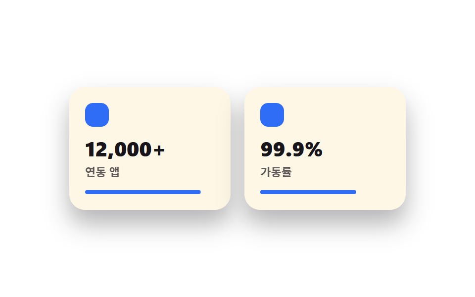
機能ごとにアイコンと強調した数字を一つ、カードの中に大きく配置してスキャンしやすくする。
使いどころ料金表の上の機能まとめ・プロダクト紹介セクション
숫자 강조아이콘 40px호버 살짝 뜸
<main class="stage">
  <section class="feat">
    <div class="feat__card is-demo">
      <span class="feat__icon" aria-hidden="true"></span>
      <p class="feat__num">12,000+</p>
      <p class="feat__label">連携アプリ</p>
      <span class="feat__bar" aria-hidden="true"></span>
    </div>
    <div class="feat__card feat__card--b is-demo">
      <span class="feat__icon" aria-hidden="true"></span>
      <p class="feat__num">99.9%</p>
      <p class="feat__label">稼働率</p>
      <span class="feat__bar" aria-hidden="true"></span>
    </div>
  </section>
</main>
@use "../../../../site/static/demo-tokens" as *;
$duration: $dur-loop; // 두 카드가 채워지는 한 주기
$easing: $ease-out; // 채우는 곡선
$color: $subject-blue; // 아이콘·바 색
@include stage($stage-paper);
.feat {
width: clamp(220px, 76vw, 340px);
display: flex;
gap: clamp(10px, 3vw, 16px);
}
.feat__card {
flex: 1;
border-radius: $r-card;
background: $subject-cream;
box-shadow: $shadow-raised;
padding: clamp(12px, 3.4vw, 16px);
display: flex;
flex-direction: column;
gap: 6px;
}
.feat__icon {
width: 24px;
height: 24px;
border-radius: 8px;
background: $color;
margin-bottom: 4px;
}
.feat__num {
margin: 0;
color: $subject-ink;
font-weight: 800; font-size: clamp(17px, 4.6vw, 21px); line-height: 1.1;
}
.feat__label {
margin: 0;
color: $subject-ink;
opacity: .7;
font-weight: 600; font-size: clamp(10px, 2.4vw, 11.5px); line-height: 1.3;
}
.feat__bar {
display: block;
height: 4px;
border-radius: $r-pill;
background: $color;
margin-top: 4px;
transform-origin: left; // 규칙8: 왼쪽부터 차오르는 바
transform: scaleX(0);
animation: barFill $duration $easing infinite;
}
.feat__card--b .feat__bar { animation-delay: -1s; }
// 데모: 바가 왼쪽부터 차오르고, 다 차면 잠깐 머물다 비워진다
@keyframes barFill {
0% { transform: scaleX(0); }
40% { transform: scaleX(1); }
75% { transform: scaleX(1); }
100% { transform: scaleX(0); }
}
@media (prefers-reduced-motion: reduce) {
.feat__bar {
animation: none !important;
transform: scaleX(1);
}
}html, body {
margin: 0;
overflow: hidden;
}
.stage {
box-sizing: border-box;
min-height: 100vh;
display: grid;
place-items: center;
margin: 0;
background: #ffffff;
font-family: -apple-system, "Segoe UI", "Noto Sans KR", sans-serif;
padding: clamp(8px, 4vw, 24px);
}
.feat {
width: clamp(220px, 76vw, 340px);
display: flex;
gap: clamp(10px, 3vw, 16px);
}
.feat__card {
flex: 1;
border-radius: 16px;
background: #fff7e6;
box-shadow: 0 14px 24px rgba(23, 20, 26, 0.32);
padding: clamp(12px, 3.4vw, 16px);
display: flex;
flex-direction: column;
gap: 6px;
}
.feat__icon {
width: 24px;
height: 24px;
border-radius: 8px;
background: #2f6df6;
margin-bottom: 4px;
}
.feat__num {
margin: 0;
color: #17141a;
font-weight: 800;
font-size: clamp(17px, 4.6vw, 21px);
line-height: 1.1;
}
.feat__label {
margin: 0;
color: #17141a;
opacity: 0.7;
font-weight: 600;
font-size: clamp(10px, 2.4vw, 11.5px);
line-height: 1.3;
}
.feat__bar {
display: block;
height: 4px;
border-radius: 999px;
background: #2f6df6;
margin-top: 4px;
transform-origin: left;
transform: scaleX(0);
animation: barFill 2s ease-out infinite;
}
.feat__card--b .feat__bar {
animation-delay: -1s;
}
@keyframes barFill {
0% {
transform: scaleX(0);
}
40% {
transform: scaleX(1);
}
75% {
transform: scaleX(1);
}
100% {
transform: scaleX(0);
}
}
@media (prefers-reduced-motion: reduce) {
.feat__bar {
animation: none !important;
transform: scaleX(1);
}
}import type { CSSProperties } from "react";
import styles from "./BentoFeatures.module.scss";
export type BentoFeaturesProps = {
items?: { num: string; label: string }[];
duration?: number;
easing?: string;
color?: string;
};
type Vars = CSSProperties & { "--duration"?: string; "--easing"?: string; "--color"?: string };
export default function BentoFeatures({
items = [
{ num: "12,000+", label: "Connected apps" },
{ num: "99.9%", label: "Uptime" },
],
duration = 2000,
easing = "ease-out",
color = "#2f6df6",
}: BentoFeaturesProps) {
const vars: Vars = { "--duration": `${duration}ms`, "--easing": easing, "--color": color };
return (
<section className={styles.feat} style={vars}>
{items.map((it, i) => (
<div key={it.label} className={i === 1 ? `${styles.card} ${styles.cardB}` : styles.card}>
<span className={styles.icon} aria-hidden="true" />
<p className={styles.num}>{it.num}</p>
<p className={styles.label}>{it.label}</p>
<span className={styles.bar} aria-hidden="true" />
</div>
))}
</section>
);
}04 アイコン+数字の機能カード — 計測 累積面積 0.728% · 動いたフレーム 23/23GODRICH オリジナル · SCSS と React は zip に同梱 · 【コピペOK】ベントグリッド 今どきのLPパーツ9選
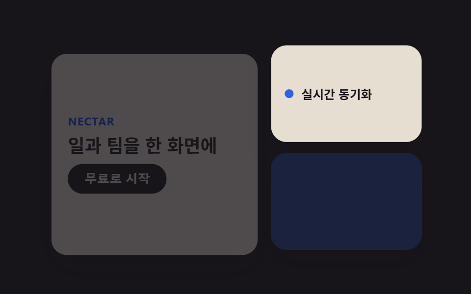
このデモが属する記事
 【コピペOK】ベントグリッド 今どきのLPパーツ9選ベントグリッドは、日本の弁当箱のように大きさの異なる区画を隙間なく組み合わせ、ランディングページ全体を一枚の格子に見せるレイアウト手法です。ヒーローから料金表まで、すべてのセクションが同じ角丸と影の強さの上に乗ります。 この記事のデモをすべて見る