04背景が左から右に満ちる引用ボックス
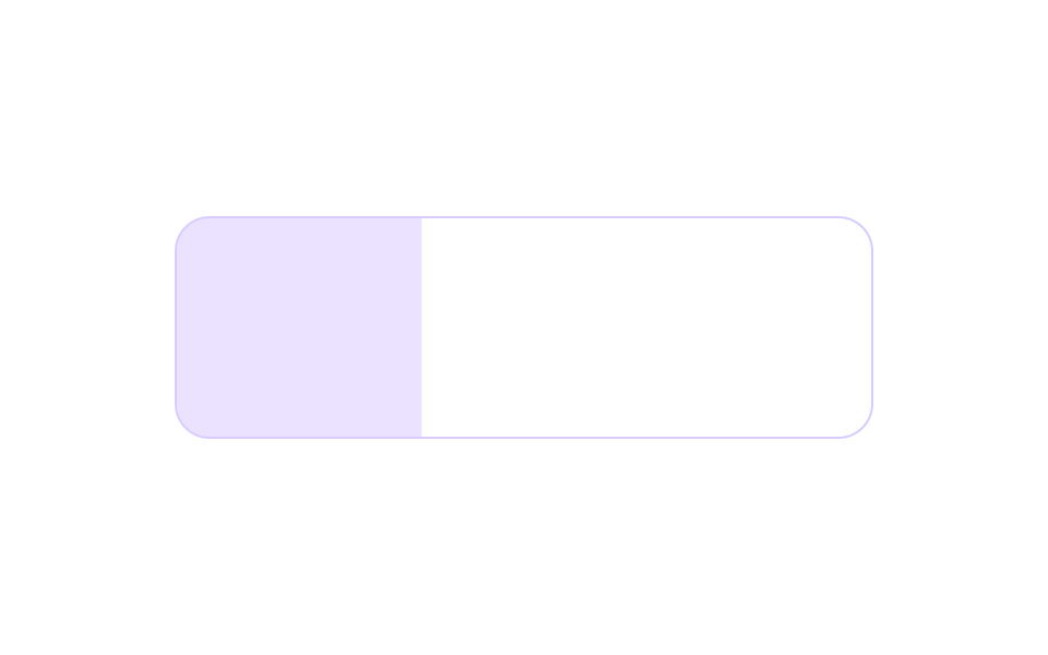
淡い色の背景が左端から右へ満ちていき、満ちた分だけ引用文が後から現れます。
使いどころポイント・ヒントボックスの引用
scaleXtransform-origintransition-delay
<main class="stage">
  <figure class="qt is-demo" aria-label="背景が満ちる引用ボックス">
    <figcaption class="qt__label">作業のポイント</figcaption>
    <blockquote class="qt__body">値を変える前に、<br>まず画面にある値を読め。</blockquote>
  </figure>
</main>
@use "../../../../site/static/demo-tokens" as *;
// 요점 박스형 인용구 — ::before 로 깔린 옅은 배경이 scaleX(transform-origin: left) 로 좌에서 우로 차오르고,
// 채워진 만큼 문장이 뒤따라 드러난다. 실사용에서는 상자에 손을 올리면 라벨 색이 한 박자 늦게 깊어진다
// (transition-delay — 채워지는 리듬을 호버에서도 유지하는 소질).
// 복귀: 배경은 우에서 좌로 scaleX 로 흘러 나가고(컷 아님 — 한 프레임 면적이 입장보다 작게),
// 라벨·문장은 서로 다른 지점에 컷. 입장(배경 채움+문장 등장이 겹치는 구간)이 최대 변화 프레임.
$duration: $dur-loop;
$easing: $ease-out;
$color: $subject-lilac;
@include stage($stage-paper);
.qt {
box-sizing: border-box;
position: relative;
width: min(320px, 92vw);
margin: 0;
padding: $sp-4 $sp-5;
border: 1px solid rgba(185, 160, 255, .55);
border-radius: $r-card;
overflow: hidden;
font-family: inherit;
isolation: isolate;
}
.qt * { box-sizing: border-box; }
// 차오르는 배경 — 내용보다 아래 층에 깔고 z-index 로 순서를 못박는다
.qt::before {
content: "";
position: absolute;
inset: 0;
z-index: 0;
background: $color;
opacity: .3;
}
.qt__label,
.qt__body {
position: relative;
z-index: 1;
margin: 0;
display: block;
}
.qt__label {
font-size: 11px;
font-weight: 700;
line-height: 1.4;
letter-spacing: .08em;
color: rgba(85, 55, 180, .9);
transition-property: color;
transition-duration: 140ms;
transition-delay: 80ms;
}
.qt__body {
margin-top: $sp-2;
font-size: 14px;
font-weight: 600;
line-height: 1.6;
color: $subject-ink;
}
// 실사용 호버 — 라벨이 채워지는 리듬처럼 한 박자 늦게 깊어진다
.qt:hover .qt__label { color: rgba(60, 30, 150, 1); }
// ── 미리보기 루프 ─────────────────
.qt.is-demo::before {
transform-origin: left center; // 규칙8: 채움 방향 — 옅은 배경이 왼쪽 변에서 scaleX 로 차오른다
animation-name: qtFill;
animation-duration: $duration;
animation-timing-function: $easing;
animation-iteration-count: infinite;
}
.qt.is-demo .qt__label {
animation-name: qtLabel;
animation-duration: $duration;
animation-timing-function: steps(1, end);
animation-iteration-count: infinite;
}
.qt.is-demo .qt__body {
animation-name: qtBody;
animation-duration: $duration;
animation-timing-function: $easing;
animation-iteration-count: infinite;
}
// 배경: 0~18% 좌→우 채움(입장이 프레임당 더 넓게), 74~96% 우에서 좌로 흘러 나가감(컷 아님)
@keyframes qtFill {
0% { transform: scaleX(0); }
18%, 74% { transform: scaleX(1); }
96%, 100% { transform: scaleX(0); }
}
// 라벨: 채움이 절반 지날 때 컷 — 채우는 프레임과 겹쳐 입장이 최대 변화가 되게
@keyframes qtLabel {
0%, 7% { opacity: 0; }
8%, 68% { opacity: 1; }
72%, 100% { opacity: 0; }
}
// 문장: 채움을 따라 슬라이드하며 드러남
@keyframes qtBody {
0%, 10% { opacity: 0; transform: translateX(-10px); }
26%, 70% { opacity: 1; transform: translateX(0); }
76%, 100% { opacity: 0; }
}
@media (prefers-reduced-motion: reduce) {
.qt.is-demo::before,
.qt.is-demo .qt__label,
.qt.is-demo .qt__body {
animation: none !important;
}
}
@media (max-width: 340px) {
.qt { padding: $sp-3 $sp-4; }
.qt__body { font-size: 13px; }
}html, body {
margin: 0;
overflow: hidden;
}
.stage {
box-sizing: border-box;
min-height: 100vh;
display: grid;
place-items: center;
margin: 0;
background: #ffffff;
font-family: -apple-system, "Segoe UI", "Noto Sans KR", sans-serif;
padding: clamp(8px, 4vw, 24px);
}
.qt {
box-sizing: border-box;
position: relative;
width: min(320px, 92vw);
margin: 0;
padding: 16px 20px;
border: 1px solid rgba(185, 160, 255, 0.55);
border-radius: 16px;
overflow: hidden;
font-family: inherit;
isolation: isolate;
}
.qt * {
box-sizing: border-box;
}
.qt::before {
content: "";
position: absolute;
inset: 0;
z-index: 0;
background: #b9a0ff;
opacity: 0.3;
}
.qt__label,
.qt__body {
position: relative;
z-index: 1;
margin: 0;
display: block;
}
.qt__label {
font-size: 11px;
font-weight: 700;
line-height: 1.4;
letter-spacing: 0.08em;
color: rgba(85, 55, 180, 0.9);
transition-property: color;
transition-duration: 140ms;
transition-delay: 80ms;
}
.qt__body {
margin-top: 8px;
font-size: 14px;
font-weight: 600;
line-height: 1.6;
color: #17141a;
}
.qt:hover .qt__label {
color: rgb(60, 30, 150);
}
.qt.is-demo::before {
transform-origin: left center;
animation-name: qtFill;
animation-duration: 2s;
animation-timing-function: ease-out;
animation-iteration-count: infinite;
}
.qt.is-demo .qt__label {
animation-name: qtLabel;
animation-duration: 2s;
animation-timing-function: steps(1, end);
animation-iteration-count: infinite;
}
.qt.is-demo .qt__body {
animation-name: qtBody;
animation-duration: 2s;
animation-timing-function: ease-out;
animation-iteration-count: infinite;
}
@keyframes qtFill {
0% {
transform: scaleX(0);
}
18%, 74% {
transform: scaleX(1);
}
96%, 100% {
transform: scaleX(0);
}
}
@keyframes qtLabel {
0%, 7% {
opacity: 0;
}
8%, 68% {
opacity: 1;
}
72%, 100% {
opacity: 0;
}
}
@keyframes qtBody {
0%, 10% {
opacity: 0;
transform: translateX(-10px);
}
26%, 70% {
opacity: 1;
transform: translateX(0);
}
76%, 100% {
opacity: 0;
}
}
@media (prefers-reduced-motion: reduce) {
.qt.is-demo::before,
.qt.is-demo .qt__label,
.qt.is-demo .qt__body {
animation: none !important;
}
}
@media (max-width: 340px) {
.qt {
padding: 12px 16px;
}
.qt__body {
font-size: 13px;
}
}// QuoteTintFill — vanilla 판(run/282/demo/04-quote-tint-fill) 의 React 포트.
import { useState } from "react";
import type { CSSProperties } from "react";
import styles from "./QuoteTintFill.module.scss";
export type QuoteTintFillProps = {
label?: string;
line1?: string;
line2?: string;
groupLabel?: string;
demo?: boolean;
duration?: number;
easing?: string;
color?: string;
};
type Vars = CSSProperties & { "--duration"?: string; "--easing"?: string; "--color"?: string };
export default function QuoteTintFill({
label = "작업 요점",
line1 = "값을 바꾸기 전에",
line2 = "먼저 화면에 있는 값을 읽어라.",
groupLabel = "배경이 차오르는 인용 박스",
demo = true,
duration = 2000,
easing = "ease-out",
color = "#b9a0ff",
}: QuoteTintFillProps) {
const [live, setLive] = useState(demo);
const vars: Vars = { "--duration": `${duration}ms`, "--easing": easing, "--color": color };
function onEnter() {
setLive(false);
}
const cls = [styles.qt, live ? styles.isDemo : ""].filter(Boolean).join(" ");
return (
<figure className={cls} style={vars} aria-label={groupLabel} onMouseEnter={onEnter}>
<figcaption className={styles.label}>{label}</figcaption>
<blockquote className={styles.body}>{line1}<br />{line2}</blockquote>
</figure>
);
}04 背景が左から右に満ちる引用ボックス — 計測 累積面積 21.95% · 動いたフレーム 14/23GODRICH オリジナル · SCSS と React は zip に同梱 · 引用 デザイン CSS 9選 — コピペで決まる引用ブロック
このデモが属する記事
 引用 デザイン CSS 9選 — コピペで決まる引用ブロック引用 デザインとは、他人の一文を自分の文章の中にきれいに座らせるための引用ブロックのことです。このページにはそのブロックを9種、実際に動いた状態で並べてあり、グリッドの下のコードはそっくりコピーしてブログにコピペで決まる形にしてあります。左 この記事のデモをすべて見る