引用 デザイン CSS 9選 — コピペで決まる引用ブロック
引用 デザインとは、他人の一文を自分の文章の中にきれいに座らせるための引用ブロックのことです。このページにはそのブロックを9種、実際に動いた状態で並べてあり、グリッドの下のコードはそっくりコピーしてブログにコピペで決まる形にしてあります。
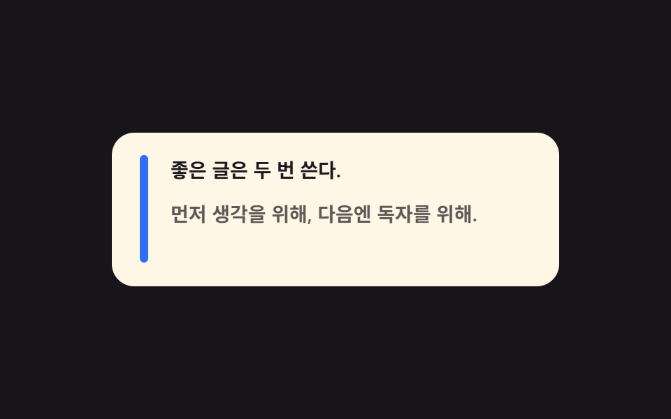 01 quote-bar-rise
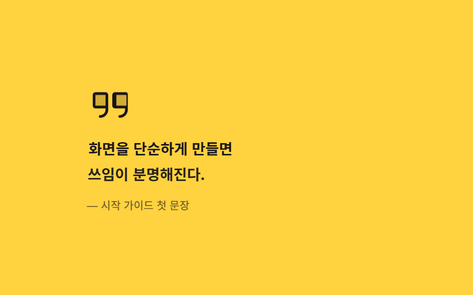 02 quote-mark-pop
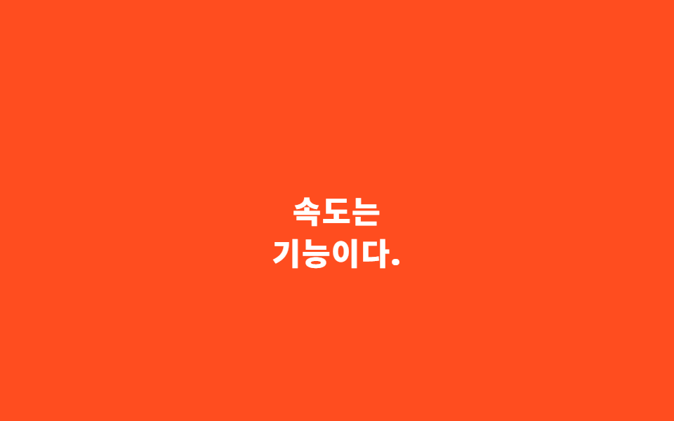 03 quote-pull-center
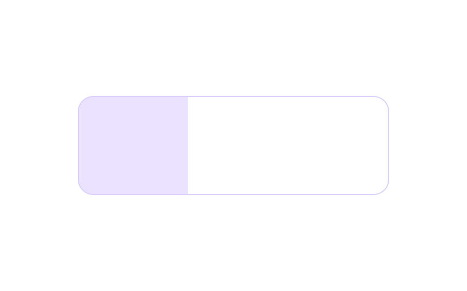 04 quote-tint-fill
 05 quote-bracket-slide
 06 quote-cite-reveal
 07 quote-ink-invert
 08 quote-watermark-fade
 09 quote-hover-swap
自動再生 · タイルを押すとその項目へ · すべて1つのzip
- 01 横バーが伸びて開く引用
- 02 大きな引用符が跳び出す引用
- 03 本文の真ん中に降りてくるプルクオート
- 04 背景が左から右に満ちる引用ボックス
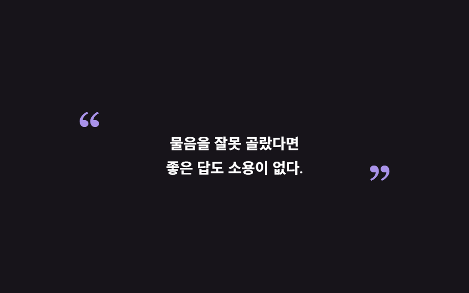
- 05 両端の引用符が内側へ滑り込む引用
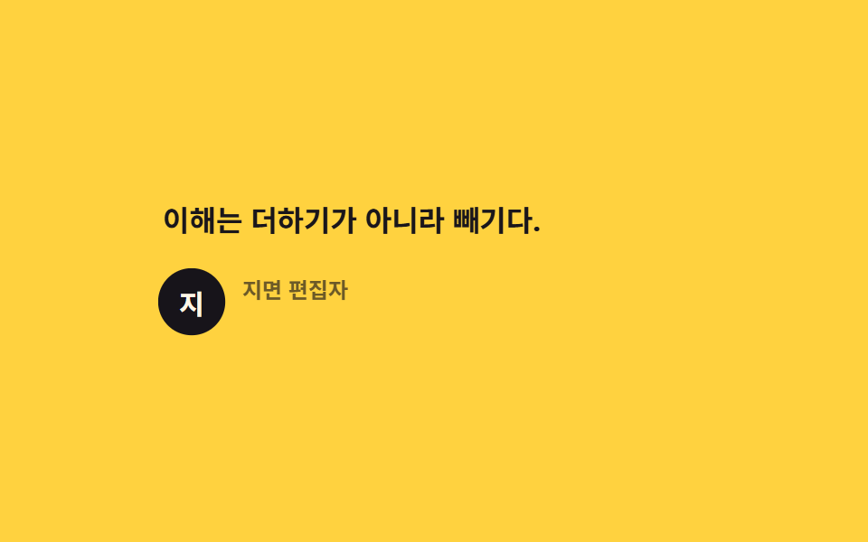
- 06 話し手が一拍遅れて現れる出典行
- 07 インクの塊へ反転する引用
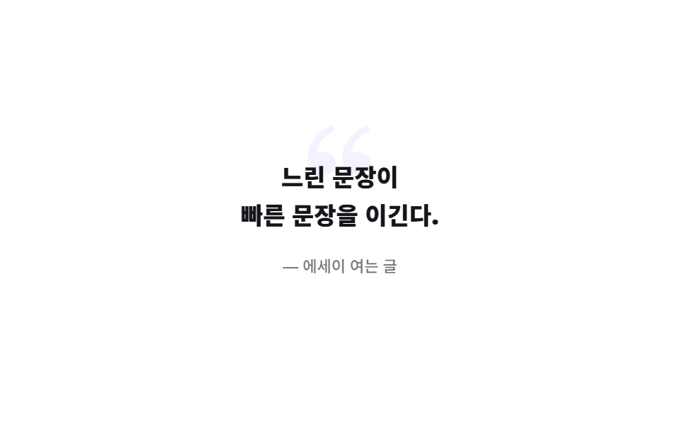
- 08 背後に大きな引用符が浮かぶ引用
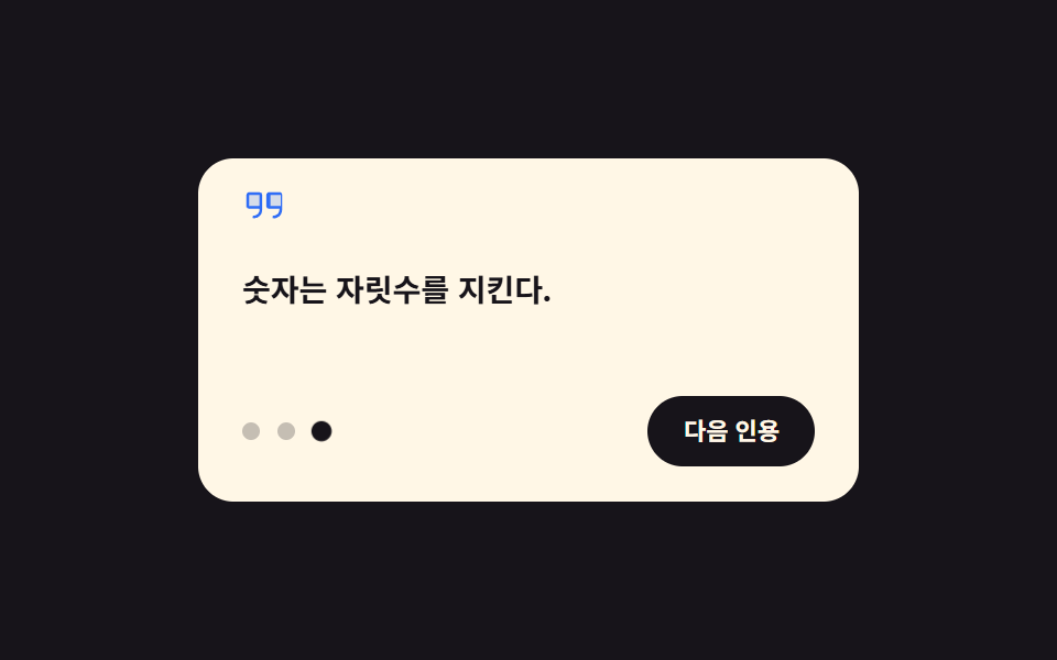
- 09 ホバーで次の文に変わる引用
9つは ブログ 引用 デザイン の難易度順ではなく、引用が文章の中で果たす仕事の順に並べてあります。読者が最初に出会う基本形の左バー(01)から始まり、飾りが文より先に出て(02)、文が本文を横切って(03)、箱が色で満ち(04)、両端から枠が締まり(05)、話し手が一拍遅れて現れ(06)、色がまるごと反転して重みが乗り(07)、背景が深くなった末に(08)、最後にだけ手に応えて動きます(09)。9種とも同じ色・間隔・イージングのトークンを分け合うので、1つの記事にいくつ混ぜてもトーンはずれません。引用が一文から人の言葉へ育てばお客様の声 デザインになり、同じ紙の箱を切って特典を入れればクーポン デザインになります。
01横バーが伸びて開く引用
blockquote デザイン で何が見えるか
ブログ本文の基本の引用です。左の太いバーが scaleY で上から下へ満ちて場所を作ると、文が2行、出典が一拍ずつずれて落ち着きます。
<main class="stage">
  <figure class="qb is-demo" aria-label="横バーが伸びて開く引用">
    <span class="qb__bar" aria-hidden="true"></span>
    <div class="qb__content">
      <blockquote class="qb__body">
        <p class="qb__l1">いい文章は二度書く。</p>
        <p class="qb__l2">まず考えのために、次に読者のために。</p>
      </blockquote>
      <figcaption class="qb__cite">— 編集室の心得</figcaption>
    </div>
  </figure>
</main>
@use "../../../../site/static/demo-tokens" as *;
// 블로그 본문 기본 인용구 — 왼쪽 굵은 막대가 scaleY 로 위에서 아래로 자라며 자리를 만들고,
// 문장 둘과 출처가 한 박자씩 차이 나게 내려앉는다. 실제 글에서는 화면에 들어올 때 한 번 재생.
// 격자 미리보기는 .is-demo 가 2초 루프로 돌리고, 복귀는 요소별로 잘게 나눠 흘린다(273-01 선례) —
// 막대+문장이 동시에 움직이는 입장 순간이 최대 변화 프레임으로 남아야 대표 이미지가 산다.
$duration: $dur-loop;
$easing: $ease-spring;
$color: $subject-blue;
@include stage($stage-ink);
.qb {
box-sizing: border-box;
width: min(320px, 92vw);
margin: 0;
padding: $sp-4 $sp-5;
border-radius: $r-card;
background: $subject-cream;
color: $subject-ink;
display: grid;
grid-template-columns: 6px 1fr;
gap: $sp-4;
font-family: inherit;
}
.qb * { box-sizing: border-box; }
.qb__bar {
border-radius: $r-pill;
background: $color;
}
.qb__content { display: grid; }
.qb__body {
margin: 0;
display: grid;
gap: $sp-2;
}
.qb__l1,
.qb__l2 {
margin: 0;
font-size: 14px;
font-weight: 600;
line-height: 1.5;
}
.qb__cite {
margin: $sp-3 0 0;
font-size: 11px;
font-weight: 500;
line-height: 1.4;
color: rgba(23, 20, 26, .62);
}
// ── 미리보기 루프(정적 규칙 먼저, 그 위에 덧씌움) ─────────────────
.qb.is-demo .qb__bar {
transform-origin: top center; // 규칙8: 채움 방향 — 인용 막대는 위에서 아래로 scaleY 로 차오른다(중심이면 가운데서 벌어진다)
animation-name: qbBar;
animation-duration: $duration;
animation-timing-function: $easing;
animation-iteration-count: infinite;
}
.qb.is-demo .qb__l1 {
animation-name: qbLine1;
animation-duration: $duration;
animation-timing-function: $easing;
animation-iteration-count: infinite;
}
.qb.is-demo .qb__l2 {
animation-name: qbLine2;
animation-duration: $duration;
animation-timing-function: $easing;
animation-iteration-count: infinite;
}
.qb.is-demo .qb__cite {
animation-name: qbCite;
animation-duration: $duration;
animation-timing-function: $easing;
animation-iteration-count: infinite;
}
// 막대: 0~26% 자람 → 80~90% 걷어냄(한 프레임 컷이 아니라 scaleY 로 흘려 면적 분할)
@keyframes qbBar {
0% { transform: scaleY(0); }
26%, 80% { transform: scaleY(1); }
90%, 100% { transform: scaleY(0); }
}
// 문장 1: 막대가 반쯤 찬 10%부터 출발
@keyframes qbLine1 {
0%, 10% { opacity: 0; transform: translateY(8px); }
34%, 76% { opacity: 1; transform: translateY(0); }
80%, 100% { opacity: 0; }
}
// 문장 2: 한 박자 뒤(20%)
@keyframes qbLine2 {
0%, 20% { opacity: 0; transform: translateY(8px); }
44%, 72% { opacity: 1; transform: translateY(0); }
76%, 100% { opacity: 0; }
}
// 출처: 마지막에 짧게
@keyframes qbCite {
0%, 30% { opacity: 0; transform: translateY(6px); }
52%, 68% { opacity: 1; transform: translateY(0); }
72%, 100% { opacity: 0; }
}
@media (prefers-reduced-motion: reduce) {
.qb.is-demo .qb__bar,
.qb.is-demo .qb__l1,
.qb.is-demo .qb__l2,
.qb.is-demo .qb__cite {
animation: none !important;
}
}
@media (max-width: 340px) {
.qb { padding: $sp-3 $sp-4; }
.qb__l1, .qb__l2 { font-size: 13px; }
.qb__cite { margin-top: $sp-2; }
}html, body {
margin: 0;
overflow: hidden;
}
.stage {
box-sizing: border-box;
min-height: 100vh;
display: grid;
place-items: center;
margin: 0;
background: #17141a;
font-family: -apple-system, "Segoe UI", "Noto Sans KR", sans-serif;
padding: clamp(8px, 4vw, 24px);
}
.qb {
box-sizing: border-box;
width: min(320px, 92vw);
margin: 0;
padding: 16px 20px;
border-radius: 16px;
background: #fff7e6;
color: #17141a;
display: grid;
grid-template-columns: 6px 1fr;
gap: 16px;
font-family: inherit;
}
.qb * {
box-sizing: border-box;
}
.qb__bar {
border-radius: 999px;
background: #2f6df6;
}
.qb__content {
display: grid;
}
.qb__body {
margin: 0;
display: grid;
gap: 8px;
}
.qb__l1,
.qb__l2 {
margin: 0;
font-size: 14px;
font-weight: 600;
line-height: 1.5;
}
.qb__cite {
margin: 12px 0 0;
font-size: 11px;
font-weight: 500;
line-height: 1.4;
color: rgba(23, 20, 26, 0.62);
}
.qb.is-demo .qb__bar {
transform-origin: top center;
animation-name: qbBar;
animation-duration: 2s;
animation-timing-function: cubic-bezier(0.2, 0.8, 0.2, 1);
animation-iteration-count: infinite;
}
.qb.is-demo .qb__l1 {
animation-name: qbLine1;
animation-duration: 2s;
animation-timing-function: cubic-bezier(0.2, 0.8, 0.2, 1);
animation-iteration-count: infinite;
}
.qb.is-demo .qb__l2 {
animation-name: qbLine2;
animation-duration: 2s;
animation-timing-function: cubic-bezier(0.2, 0.8, 0.2, 1);
animation-iteration-count: infinite;
}
.qb.is-demo .qb__cite {
animation-name: qbCite;
animation-duration: 2s;
animation-timing-function: cubic-bezier(0.2, 0.8, 0.2, 1);
animation-iteration-count: infinite;
}
@keyframes qbBar {
0% {
transform: scaleY(0);
}
26%, 80% {
transform: scaleY(1);
}
90%, 100% {
transform: scaleY(0);
}
}
@keyframes qbLine1 {
0%, 10% {
opacity: 0;
transform: translateY(8px);
}
34%, 76% {
opacity: 1;
transform: translateY(0);
}
80%, 100% {
opacity: 0;
}
}
@keyframes qbLine2 {
0%, 20% {
opacity: 0;
transform: translateY(8px);
}
44%, 72% {
opacity: 1;
transform: translateY(0);
}
76%, 100% {
opacity: 0;
}
}
@keyframes qbCite {
0%, 30% {
opacity: 0;
transform: translateY(6px);
}
52%, 68% {
opacity: 1;
transform: translateY(0);
}
72%, 100% {
opacity: 0;
}
}
@media (prefers-reduced-motion: reduce) {
.qb.is-demo .qb__bar,
.qb.is-demo .qb__l1,
.qb.is-demo .qb__l2,
.qb.is-demo .qb__cite {
animation: none !important;
}
}
@media (max-width: 340px) {
.qb {
padding: 12px 16px;
}
.qb__l1, .qb__l2 {
font-size: 13px;
}
.qb__cite {
margin-top: 8px;
}
}// QuoteBarRise — vanilla 판(run/282/demo/01-quote-bar-rise) 의 React 포트.
// 변수 3개(duration·easing·color)는 props 로 받아 CSS 변수(var(--duration) 등)로 들어온다.
import { useState } from "react";
import type { CSSProperties, MouseEvent as ReactMouseEvent } from "react";
import styles from "./QuoteBarRise.module.scss";
export type QuoteBarRiseProps = {
line1?: string;
line2?: string;
cite?: string;
groupLabel?: string;
/** 격자 미리보기용 2초 자동 루프. 사람이 손대면 꺼진다 */
demo?: boolean;
duration?: number;
easing?: string;
color?: string;
};
type Vars = CSSProperties & { "--duration"?: string; "--easing"?: string; "--color"?: string };
export default function QuoteBarRise({
line1 = "좋은 글은 두 번 쓴다.",
line2 = "먼저 생각을 위해, 다음엔 독자를 위해.",
cite = "— 편집실 수칙",
groupLabel = "막대가 자라며 열리는 인용구",
demo = true,
duration = 2000,
easing = "cubic-bezier(.2, .8, .2, 1)",
color = "#2f6df6",
}: QuoteBarRiseProps) {
const [live, setLive] = useState(demo);
const vars: Vars = { "--duration": `${duration}ms`, "--easing": easing, "--color": color };
// 실사용에서는 카드에 손을 얹는 순간 루프를 뗀다(정적 상태 = 완성된 인용구)
function onEnter() {
setLive(false);
}
const cls = [styles.qb, live ? styles.isDemo : ""].filter(Boolean).join(" ");
return (
<figure className={cls} style={vars} aria-label={groupLabel} onMouseEnter={onEnter}>
<span className={styles.bar} aria-hidden="true"></span>
<div className={styles.content}>
<blockquote className={styles.body}>
<p className={styles.l1}>{line1}</p>
<p className={styles.l2}>{line2}</p>
</blockquote>
<figcaption className={styles.cite}>{cite}</figcaption>
</div>
</figure>
);
}01 · 横バーが伸びて開く引用 — 計測 累積面積 3.683% · 動いたフレーム 17/23GODRICH オリジナル · SCSS と React は zip に同梱 · パスワードを見る
コードのどこを見るか
バーと文が同時に動く区間の累積変化面積は画面の 3.683% として測れました — 雑誌記事にそのまま使える無難な1枚です。
// バー — 上から下へ伸びる(scaleY)。カットではなくスケールなので面積がフレームごとに分かれて入る
.qb__bar {
  border-radius: $r-pill;
  background: $color;
}
.qb.is-demo .qb__bar {
  transform-origin: top center;
  animation-name: qbBar;
  animation-duration: $duration;   // 2s ループ
  animation-timing-function: $easing;
  animation-iteration-count: infinite;
}
@keyframes qbBar {
  0%        { transform: scaleY(0); }
  26%, 80%  { transform: scaleY(1); }
  90%, 100% { transform: scaleY(0); }
}
// 文2行は同じ keyframes で百分率だけずらす — animation-delay 無しで一拍差が出る
@keyframes qbLine1 {
  0%, 10%   { opacity: 0; transform: translateY(8px); }
  34%, 76%  { opacity: 1; transform: translateY(0); }
  80%, 100% { opacity: 0; }
}
02大きな引用符が跳び出す引用
画面で起きること
ヘルプやガイドの冒頭に合う1枚です。文の左の大きな引用符が cubic-bezier(.2, 1.4, .4, 1) のカーブで一度跳ねて 1.14 倍まで行き過ぎてから着地し、本文2行が左から滑り込んできます(累積面積 3.828% ・強度 71.7)。
<main class="stage">
  <figure class="qm is-demo" aria-label="引用符が跳び出す引用">
    <svg class="qm__mark" viewBox="0 0 256 256" width="44" height="44" fill="currentColor" aria-hidden="true"><g><path d="M108 72v72H40a8 8 0 0 1-8-8V72a8 8 0 0 1 8-8h60a8 8 0 0 1 8 8m108-8h-60a8 8 0 0 0-8 8v64a8 8 0 0 0 8 8h68V72a8 8 0 0 0-8-8" opacity=".2"/><path d="M100 56H40a16 16 0 0 0-16 16v64a16 16 0 0 0 16 16h60v8a32 32 0 0 1-32 32a8 8 0 0 0 0 16a48.05 48.05 0 0 0 48-48V72a16 16 0 0 0-16-16m0 80H40V72h60Zm116-80h-60a16 16 0 0 0-16 16v64a16 16 0 0 0 16 16h60v8a32 32 0 0 1-32 32a8 8 0 0 0 0 16a48.05 48.05 0 0 0 48-48V72a16 16 0 0 0-8-16m0 80h-60V72h60Z"/></g></svg>
    <blockquote class="qm__body">
      <p class="qm__l1">画面をシンプルにすると、</p>
      <p class="qm__l2">使い道がはっきりする。</p>
    </blockquote>
    <figcaption class="qm__cite">— 始め方ガイドの一文</figcaption>
  </figure>
</main>
@use "../../../../site/static/demo-tokens" as *;
// 큰따옴표 아이콘(Phosphor Duotone quotes)이 scale 로 한 번 튀어 올라 자리를 잡고,
// 본문 두 줄이 오른쪽에서 밀려 들어오는 도움말 첫머리용 인용구.
// 아이콘의 overshoot 는 $ease-pop(cubic-bezier(.2,1.4,.4,1)) — y 가 1을 넘는 커브로 튕김을 만든다.
// 복귀는 아이콘 걷어냄+문장 컷을 서로 다른 지점에 두고, 입장(튐+슬라이드 동시)이 최대 변화로 남게.
$duration: $dur-loop;
$easing: $ease-spring;
$color: $subject-ink;
@include stage($stage-yellow);
.qm {
box-sizing: border-box;
width: min(300px, 92vw);
margin: 0;
display: grid;
justify-items: start;
gap: $sp-3;
color: $color;
font-family: inherit;
}
.qm * { box-sizing: border-box; }
.qm__mark {
display: block;
color: $subject-ink;
}
.qm__body {
margin: 0;
display: grid;
gap: $sp-1;
}
.qm__l1,
.qm__l2 {
margin: 0;
font-size: 15px;
font-weight: 700;
line-height: 1.5;
}
.qm__cite {
margin: 0;
font-size: 11px;
font-weight: 500;
line-height: 1.4;
color: rgba($subject-ink, .72);
}
// ── 미리보기 루프 ─────────────────
.qm.is-demo .qm__mark {
transform-origin: left bottom; // 규칙8: 붙는 지점 — 본문과 공유하는 왼쪽 정렬선·본문 위 모서리에 뿌리박은 채 1.14 로 튄다(중심이면 작을 때 정렬선에서 떠오르고 overshoot 에서 정렬선을 왼쪽으로 넘는다)
animation-name: qmMark;
animation-duration: $duration;
animation-timing-function: $ease-pop;
animation-iteration-count: infinite;
}
.qm.is-demo .qm__l1,
.qm.is-demo .qm__l2 {
animation-name: qmLine;
animation-duration: $duration;
animation-timing-function: $easing;
animation-iteration-count: infinite;
}
.qm.is-demo .qm__l1 { animation-delay: 80ms; animation-fill-mode: backwards; }
.qm.is-demo .qm__l2 { animation-delay: 180ms; animation-fill-mode: backwards; }
.qm.is-demo .qm__cite {
animation-name: qmCite;
animation-duration: $duration;
animation-timing-function: $easing;
animation-iteration-count: infinite;
}
// 아이콘: 0~6% 나타나며 22%까지 1.14 배로 튀었다가 30%에 1 로 착지 → 78~90% 걷어냄
@keyframes qmMark {
0% { opacity: 0; transform: scale(.2); }
6% { opacity: 1; transform: scale(.92); }
22% { transform: scale(1.14); }
30%, 78% { opacity: 1; transform: scale(1); }
90%, 100% { opacity: 0; transform: scale(.9); }
}
// 본문: 왼쪽에서 밀려 들어옴(delay 로 한 박자 차이 — 무한 루프에서도 위상이 그대로 유지된다)
@keyframes qmLine {
0%, 4% { opacity: 0; transform: translateX(-14px); }
30%, 74% { opacity: 1; transform: translateX(0); }
80%, 100% { opacity: 0; }
}
@keyframes qmCite {
0%, 18% { opacity: 0; transform: translateX(-10px); }
42%, 70% { opacity: 1; transform: translateX(0); }
76%, 100% { opacity: 0; }
}
@media (prefers-reduced-motion: reduce) {
.qm.is-demo .qm__mark,
.qm.is-demo .qm__l1,
.qm.is-demo .qm__l2,
.qm.is-demo .qm__cite {
animation: none !important;
}
}
@media (max-width: 340px) {
.qm { gap: $sp-2; }
.qm__l1, .qm__l2 { font-size: 14px; }
.qm__mark { width: 36px; height: 36px; }
}html, body {
margin: 0;
overflow: hidden;
}
.stage {
box-sizing: border-box;
min-height: 100vh;
display: grid;
place-items: center;
margin: 0;
background: #ffd23f;
font-family: -apple-system, "Segoe UI", "Noto Sans KR", sans-serif;
padding: clamp(8px, 4vw, 24px);
}
.qm {
box-sizing: border-box;
width: min(300px, 92vw);
margin: 0;
display: grid;
justify-items: start;
gap: 12px;
color: #17141a;
font-family: inherit;
}
.qm * {
box-sizing: border-box;
}
.qm__mark {
display: block;
color: #17141a;
}
.qm__body {
margin: 0;
display: grid;
gap: 4px;
}
.qm__l1,
.qm__l2 {
margin: 0;
font-size: 15px;
font-weight: 700;
line-height: 1.5;
}
.qm__cite {
margin: 0;
font-size: 11px;
font-weight: 500;
line-height: 1.4;
color: rgba(23, 20, 26, 0.72);
}
.qm.is-demo .qm__mark {
transform-origin: left bottom;
animation-name: qmMark;
animation-duration: 2s;
animation-timing-function: cubic-bezier(0.2, 1.4, 0.4, 1);
animation-iteration-count: infinite;
}
.qm.is-demo .qm__l1,
.qm.is-demo .qm__l2 {
animation-name: qmLine;
animation-duration: 2s;
animation-timing-function: cubic-bezier(0.2, 0.8, 0.2, 1);
animation-iteration-count: infinite;
}
.qm.is-demo .qm__l1 {
animation-delay: 80ms;
animation-fill-mode: backwards;
}
.qm.is-demo .qm__l2 {
animation-delay: 180ms;
animation-fill-mode: backwards;
}
.qm.is-demo .qm__cite {
animation-name: qmCite;
animation-duration: 2s;
animation-timing-function: cubic-bezier(0.2, 0.8, 0.2, 1);
animation-iteration-count: infinite;
}
@keyframes qmMark {
0% {
opacity: 0;
transform: scale(0.2);
}
6% {
opacity: 1;
transform: scale(0.92);
}
22% {
transform: scale(1.14);
}
30%, 78% {
opacity: 1;
transform: scale(1);
}
90%, 100% {
opacity: 0;
transform: scale(0.9);
}
}
@keyframes qmLine {
0%, 4% {
opacity: 0;
transform: translateX(-14px);
}
30%, 74% {
opacity: 1;
transform: translateX(0);
}
80%, 100% {
opacity: 0;
}
}
@keyframes qmCite {
0%, 18% {
opacity: 0;
transform: translateX(-10px);
}
42%, 70% {
opacity: 1;
transform: translateX(0);
}
76%, 100% {
opacity: 0;
}
}
@media (prefers-reduced-motion: reduce) {
.qm.is-demo .qm__mark,
.qm.is-demo .qm__l1,
.qm.is-demo .qm__l2,
.qm.is-demo .qm__cite {
animation: none !important;
}
}
@media (max-width: 340px) {
.qm {
gap: 8px;
}
.qm__l1, .qm__l2 {
font-size: 14px;
}
.qm__mark {
width: 36px;
height: 36px;
}
}// QuoteMarkPop — vanilla 판(run/282/demo/02-quote-mark-pop) 의 React 포트.
import { useState } from "react";
import type { CSSProperties } from "react";
import styles from "./QuoteMarkPop.module.scss";
export type QuoteMarkPopProps = {
line1?: string;
line2?: string;
cite?: string;
groupLabel?: string;
demo?: boolean;
duration?: number;
easing?: string;
color?: string;
};
type Vars = CSSProperties & { "--duration"?: string; "--easing"?: string; "--color"?: string };
function QuotesMark() {
return (
<svg className={styles.mark} viewBox="0 0 256 256" width="44" height="44" fill="currentColor" aria-hidden="true"><g><path d="M108 72v72H40a8 8 0 0 1-8-8V72a8 8 0 0 1 8-8h60a8 8 0 0 1 8 8m108-8h-60a8 8 0 0 0-8 8v64a8 8 0 0 0 8 8h68V72a8 8 0 0 0-8-8" opacity=".2"/><path d="M100 56H40a16 16 0 0 0-16 16v64a16 16 0 0 0 16 16h60v8a32 32 0 0 1-32 32a8 8 0 0 0 0 16a48.05 48.05 0 0 0 48-48V72a16 16 0 0 0-16-16m0 80H40V72h60Zm116-80h-60a16 16 0 0 0-16 16v64a16 16 0 0 0 16 16h60v8a32 32 0 0 1-32 32a8 8 0 0 0 0 16a48.05 48.05 0 0 0 48-48V72a16 16 0 0 0-8-16m0 80h-60V72h60Z"/></g></svg>
);
}
export default function QuoteMarkPop({
line1 = "화면을 단순하게 만들면",
line2 = "쓰임이 분명해진다.",
cite = "— 시작 가이드 첫 문장",
groupLabel = "따옴표가 튀어나오는 인용구",
demo = true,
duration = 2000,
easing = "cubic-bezier(.2, .8, .2, 1)",
color = "#17141a",
}: QuoteMarkPopProps) {
const [live, setLive] = useState(demo);
const vars: Vars = { "--duration": `${duration}ms`, "--easing": easing, "--color": color };
function onEnter() {
setLive(false);
}
const cls = [styles.qm, live ? styles.isDemo : ""].filter(Boolean).join(" ");
return (
<figure className={cls} style={vars} aria-label={groupLabel} onMouseEnter={onEnter}>
<QuotesMark />
<blockquote className={styles.body}>
<p className={styles.l1}>{line1}</p>
<p className={styles.l2}>{line2}</p>
</blockquote>
<figcaption className={styles.cite}>{cite}</figcaption>
</figure>
);
}02 · 大きな引用符が跳び出す引用 — 計測 累積面積 3.84% · 動いたフレーム 14/23GODRICH オリジナル · SCSS と React は zip に同梱 · パスワードを見る
コードの読み方
跳ねるカーブは y が 1 を超える特殊なイージングなので、transform-origin: left bottom を併せて根元が動かないようにします。
// アイコンのポップ — 1を超えて戻ってくるカーブ(オーバーシュート)
.qm.is-demo .qm__mark {
  transform-origin: left bottom;
  animation-name: qmMark;
  animation-duration: $duration;
  animation-timing-function: $ease-pop;   // cubic-bezier(.2, 1.4, .4, 1)
  animation-iteration-count: infinite;
}
@keyframes qmMark {
  0%        { opacity: 0; transform: scale(.2); }
  6%        { opacity: 1; transform: scale(.92); }
  22%       { transform: scale(1.14); }   // 着地前に一度行き過ぎる点
  30%, 78%  { opacity: 1; transform: scale(1); }
  90%, 100% { opacity: 0; transform: scale(.9); }
}
// 本文のずれ入りは animation-delay — 無限ループでも位相はそのまま保たれる
.qm.is-demo .qm__l2 { animation-delay: 180ms; animation-fill-mode: backwards; }
03本文の真ん中に降りてくるプルクオート
どんな動きか
雑誌が本文の間に差し込む大きな文です。前後の小さな地の文は steps(1, end) のカットで先に敷かれ、大きな文2行が animation-delay 60ms・160ms の差で降りてきます(累積面積 4.747% ・強度 119.7)。
<main class="stage">
  <section class="qp is-demo" aria-label="本文の真ん中に降りてくる強調文">
    <p class="qp__ctx qp__ctx--pre">文書を読む人は上から下へ一行ずつ降りてくる。</p>
    <blockquote class="qp__pull" >
      <span class="qp__a">速さは</span>
      <span class="qp__b">機能である。</span>
    </blockquote>
    <p class="qp__ctx qp__ctx--post">その流れの中で大きな一文が息を整える。</p>
  </section>
</main>
@use "../../../../site/static/demo-tokens" as *;
// 매거진 pull quote — 본문 사이에 낀 큰 문장 두 줄이 animation-delay 로 한 박자씩 차이 나게 내려앉는다.
// 지연은 무한 루프에서도 위상차로 유지되고, animation-fill-mode: backwards 로 지연 구간에 첫 프레임(숨김)을 채운다
// (252-08 함정: fill 이 없으면 완성 상태가 0프레임에 번쩍한다).
$duration: $dur-loop;
$easing: $ease-spring;
$color: $stage-paper;
@include stage($stage-orange);
.qp {
box-sizing: border-box;
width: min(320px, 92vw);
margin: 0;
display: grid;
gap: $sp-4;
text-align: center;
font-family: inherit;
}
.qp * { box-sizing: border-box; }
.qp__ctx {
margin: 0;
font-size: 11px;
font-weight: 400;
line-height: 1.6;
color: $subject-ink;
}
.qp__pull {
margin: 0;
display: grid;
gap: $sp-1;
}
.qp__a,
.qp__b {
display: block;
font-size: 22px;
font-weight: 800;
line-height: 1.35;
color: $color;
letter-spacing: .04em;
}
// ── 미리보기 루프 ─────────────────
.qp.is-demo .qp__a,
.qp.is-demo .qp__b {
animation-duration: $duration;
animation-timing-function: $easing;
animation-iteration-count: infinite;
animation-fill-mode: backwards;
}
.qp.is-demo .qp__a { animation-name: qpDropA; animation-delay: 60ms; }
.qp.is-demo .qp__b { animation-name: qpDropB; animation-delay: 160ms; }
// 맥락 줄(앞·뒤 지문)은 steps 컷 — 페이드 중간값이 poster 에 반투명 유령으로 남는다(237 함정)
.qp.is-demo .qp__ctx {
animation-duration: $duration;
animation-timing-function: steps(1, end);
animation-iteration-count: infinite;
animation-fill-mode: backwards;
}
.qp.is-demo .qp__ctx--pre { animation-name: qpCtxPre; }
.qp.is-demo .qp__ctx--post { animation-name: qpCtxPost; }
// 큰 문장 두 줄은 opacity 램프 없이 translateY 로만 내려앉는다(처음부터 불투명 — 텍스트 페이드의
// 중간값이 poster 에 유령으로 남는다). 두 줄이 겹쳐 내려오는 입장(60~400ms)이 최대 변화 프레임.
// 복귀는 다시 위로 올라갔다가 줄마다 다른 지점(86%·90%)에 멈춘다 — 마지막 샘플(95.8%) 전에 끝난다.
@keyframes qpDropA {
0%, 2% { opacity: 1; transform: translateY(18px); }
16%, 80% { opacity: 1; transform: translateY(0); }
86%, 100% { opacity: 1; transform: translateY(18px); }
}
@keyframes qpDropB {
0%, 6% { opacity: 1; transform: translateY(18px); }
22%, 76% { opacity: 1; transform: translateY(0); }
90%, 100% { opacity: 1; transform: translateY(18px); }
}
// 앞 지문: 큰 문장이 자리 잡기 전 컷, 큰 문장보다 먼저 물러난다
@keyframes qpCtxPre {
0%, 8% { opacity: 0; }
9%, 56% { opacity: 1; }
57%, 100% { opacity: 0; }
}
// 뒷 지문: 큰 문장이 다 내려앉은 뒤 컷, 앞 지문 다음에 물러난다
@keyframes qpCtxPost {
0%, 26% { opacity: 0; }
27%, 50% { opacity: 1; }
51%, 100% { opacity: 0; }
}
@media (prefers-reduced-motion: reduce) {
.qp.is-demo .qp__a,
.qp.is-demo .qp__b,
.qp.is-demo .qp__ctx {
animation: none !important;
}
}
@media (max-width: 340px) {
.qp { gap: $sp-3; }
.qp__a, .qp__b { font-size: 20px; }
.qp__ctx { font-size: 10px; }
}html, body {
margin: 0;
overflow: hidden;
}
.stage {
box-sizing: border-box;
min-height: 100vh;
display: grid;
place-items: center;
margin: 0;
background: #ff4d1f;
font-family: -apple-system, "Segoe UI", "Noto Sans KR", sans-serif;
padding: clamp(8px, 4vw, 24px);
}
.qp {
box-sizing: border-box;
width: min(320px, 92vw);
margin: 0;
display: grid;
gap: 16px;
text-align: center;
font-family: inherit;
}
.qp * {
box-sizing: border-box;
}
.qp__ctx {
margin: 0;
font-size: 11px;
font-weight: 400;
line-height: 1.6;
color: #17141a;
}
.qp__pull {
margin: 0;
display: grid;
gap: 4px;
}
.qp__a,
.qp__b {
display: block;
font-size: 22px;
font-weight: 800;
line-height: 1.35;
color: #ffffff;
letter-spacing: 0.04em;
}
.qp.is-demo .qp__a,
.qp.is-demo .qp__b {
animation-duration: 2s;
animation-timing-function: cubic-bezier(0.2, 0.8, 0.2, 1);
animation-iteration-count: infinite;
animation-fill-mode: backwards;
}
.qp.is-demo .qp__a {
animation-name: qpDropA;
animation-delay: 60ms;
}
.qp.is-demo .qp__b {
animation-name: qpDropB;
animation-delay: 160ms;
}
.qp.is-demo .qp__ctx {
animation-duration: 2s;
animation-timing-function: steps(1, end);
animation-iteration-count: infinite;
animation-fill-mode: backwards;
}
.qp.is-demo .qp__ctx--pre {
animation-name: qpCtxPre;
}
.qp.is-demo .qp__ctx--post {
animation-name: qpCtxPost;
}
@keyframes qpDropA {
0%, 2% {
opacity: 1;
transform: translateY(18px);
}
16%, 80% {
opacity: 1;
transform: translateY(0);
}
86%, 100% {
opacity: 1;
transform: translateY(18px);
}
}
@keyframes qpDropB {
0%, 6% {
opacity: 1;
transform: translateY(18px);
}
22%, 76% {
opacity: 1;
transform: translateY(0);
}
90%, 100% {
opacity: 1;
transform: translateY(18px);
}
}
@keyframes qpCtxPre {
0%, 8% {
opacity: 0;
}
9%, 56% {
opacity: 1;
}
57%, 100% {
opacity: 0;
}
}
@keyframes qpCtxPost {
0%, 26% {
opacity: 0;
}
27%, 50% {
opacity: 1;
}
51%, 100% {
opacity: 0;
}
}
@media (prefers-reduced-motion: reduce) {
.qp.is-demo .qp__a,
.qp.is-demo .qp__b,
.qp.is-demo .qp__ctx {
animation: none !important;
}
}
@media (max-width: 340px) {
.qp {
gap: 12px;
}
.qp__a, .qp__b {
font-size: 20px;
}
.qp__ctx {
font-size: 10px;
}
}// QuotePullCenter — vanilla 판(run/282/demo/03-quote-pull-center) 의 React 포트.
import { useState } from "react";
import type { CSSProperties } from "react";
import styles from "./QuotePullCenter.module.scss";
export type QuotePullCenterProps = {
preContext?: string;
pullA?: string;
pullB?: string;
postContext?: string;
groupLabel?: string;
demo?: boolean;
duration?: number;
easing?: string;
color?: string;
};
type Vars = CSSProperties & { "--duration"?: string; "--easing"?: string; "--color"?: string };
export default function QuotePullCenter({
preContext = "문서를 읽는 사람은 위에서 아래로 한 줄씩 내려온다.",
pullA = "속도는",
pullB = "기능이다.",
postContext = "그 흐름 속에서 큰 문장 하나가 숨을 고르게 한다.",
groupLabel = "본문 한가운데 내려앉는 강조 문장",
demo = true,
duration = 2000,
easing = "cubic-bezier(.2, .8, .2, 1)",
color = "#ffffff",
}: QuotePullCenterProps) {
const [live, setLive] = useState(demo);
const vars: Vars = { "--duration": `${duration}ms`, "--easing": easing, "--color": color };
function onEnter() {
setLive(false);
}
const cls = [styles.qp, live ? styles.isDemo : ""].filter(Boolean).join(" ");
return (
<section className={cls} style={vars} aria-label={groupLabel} onMouseEnter={onEnter}>
<p className={[styles.ctx, styles.ctxPre].join(" ")}>{preContext}</p>
<blockquote className={styles.pull}>
<span className={styles.a}>{pullA}</span>
<span className={styles.b}>{pullB}</span>
</blockquote>
<p className={[styles.ctx, styles.ctxPost].join(" ")}>{postContext}</p>
</section>
);
}03 · 本文の真ん中に降りてくるプルクオート — 計測 累積面積 4.517% · 動いたフレーム 12/23GODRICH オリジナル · SCSS と React は zip に同梱 · パスワードを見る
どこを変えるか
大きな文はどちらも opacity のランプを使わず translateY だけで動きます — その理由は落とし穴の節で測定値とともに書きます。
// 大きな文 — 最初から不透明のまま18px上から降りる(フェードの中間値がない)
.qp.is-demo .qp__a { animation-name: qpDropA; animation-delay: 60ms; }
.qp.is-demo .qp__b { animation-name: qpDropB; animation-delay: 160ms; }
.qp.is-demo .qp__a,
.qp.is-demo .qp__b {
  animation-duration: $duration;
  animation-timing-function: $easing;
  animation-iteration-count: infinite;
  animation-fill-mode: backwards;   // 遅延の間も先頭フレームを敷く
}
@keyframes qpDropA {
  0%, 2%    { opacity: 1; transform: translateY(18px); }
  16%, 80%  { opacity: 1; transform: translateY(0); }
  86%, 100% { opacity: 1; transform: translateY(18px); }
}
04背景が左から右に満ちる引用ボックス
何が見えるか
ポイント・ヒントの箱に近い1枚です。::before で敷いた淡い背景が scaleX に transform-origin: left を組み、左端から右へ満ちていき、ラベルは充填が半ばのときにカットで、文は充填を追って滑りながら現れます(充填の面積が大きく、累積面積は 21.95% で9種中最大)。
<main class="stage">
  <figure class="qt is-demo" aria-label="背景が満ちる引用ボックス">
    <figcaption class="qt__label">作業のポイント</figcaption>
    <blockquote class="qt__body">値を変える前に、<br>まず画面にある値を読め。</blockquote>
  </figure>
</main>
@use "../../../../site/static/demo-tokens" as *;
// 요점 박스형 인용구 — ::before 로 깔린 옅은 배경이 scaleX(transform-origin: left) 로 좌에서 우로 차오르고,
// 채워진 만큼 문장이 뒤따라 드러난다. 실사용에서는 상자에 손을 올리면 라벨 색이 한 박자 늦게 깊어진다
// (transition-delay — 채워지는 리듬을 호버에서도 유지하는 소질).
// 복귀: 배경은 우에서 좌로 scaleX 로 흘러 나가고(컷 아님 — 한 프레임 면적이 입장보다 작게),
// 라벨·문장은 서로 다른 지점에 컷. 입장(배경 채움+문장 등장이 겹치는 구간)이 최대 변화 프레임.
$duration: $dur-loop;
$easing: $ease-out;
$color: $subject-lilac;
@include stage($stage-paper);
.qt {
box-sizing: border-box;
position: relative;
width: min(320px, 92vw);
margin: 0;
padding: $sp-4 $sp-5;
border: 1px solid rgba(185, 160, 255, .55);
border-radius: $r-card;
overflow: hidden;
font-family: inherit;
isolation: isolate;
}
.qt * { box-sizing: border-box; }
// 차오르는 배경 — 내용보다 아래 층에 깔고 z-index 로 순서를 못박는다
.qt::before {
content: "";
position: absolute;
inset: 0;
z-index: 0;
background: $color;
opacity: .3;
}
.qt__label,
.qt__body {
position: relative;
z-index: 1;
margin: 0;
display: block;
}
.qt__label {
font-size: 11px;
font-weight: 700;
line-height: 1.4;
letter-spacing: .08em;
color: rgba(85, 55, 180, .9);
transition-property: color;
transition-duration: 140ms;
transition-delay: 80ms;
}
.qt__body {
margin-top: $sp-2;
font-size: 14px;
font-weight: 600;
line-height: 1.6;
color: $subject-ink;
}
// 실사용 호버 — 라벨이 채워지는 리듬처럼 한 박자 늦게 깊어진다
.qt:hover .qt__label { color: rgba(60, 30, 150, 1); }
// ── 미리보기 루프 ─────────────────
.qt.is-demo::before {
transform-origin: left center; // 규칙8: 채움 방향 — 옅은 배경이 왼쪽 변에서 scaleX 로 차오른다
animation-name: qtFill;
animation-duration: $duration;
animation-timing-function: $easing;
animation-iteration-count: infinite;
}
.qt.is-demo .qt__label {
animation-name: qtLabel;
animation-duration: $duration;
animation-timing-function: steps(1, end);
animation-iteration-count: infinite;
}
.qt.is-demo .qt__body {
animation-name: qtBody;
animation-duration: $duration;
animation-timing-function: $easing;
animation-iteration-count: infinite;
}
// 배경: 0~18% 좌→우 채움(입장이 프레임당 더 넓게), 74~96% 우에서 좌로 흘러 나가감(컷 아님)
@keyframes qtFill {
0% { transform: scaleX(0); }
18%, 74% { transform: scaleX(1); }
96%, 100% { transform: scaleX(0); }
}
// 라벨: 채움이 절반 지날 때 컷 — 채우는 프레임과 겹쳐 입장이 최대 변화가 되게
@keyframes qtLabel {
0%, 7% { opacity: 0; }
8%, 68% { opacity: 1; }
72%, 100% { opacity: 0; }
}
// 문장: 채움을 따라 슬라이드하며 드러남
@keyframes qtBody {
0%, 10% { opacity: 0; transform: translateX(-10px); }
26%, 70% { opacity: 1; transform: translateX(0); }
76%, 100% { opacity: 0; }
}
@media (prefers-reduced-motion: reduce) {
.qt.is-demo::before,
.qt.is-demo .qt__label,
.qt.is-demo .qt__body {
animation: none !important;
}
}
@media (max-width: 340px) {
.qt { padding: $sp-3 $sp-4; }
.qt__body { font-size: 13px; }
}html, body {
margin: 0;
overflow: hidden;
}
.stage {
box-sizing: border-box;
min-height: 100vh;
display: grid;
place-items: center;
margin: 0;
background: #ffffff;
font-family: -apple-system, "Segoe UI", "Noto Sans KR", sans-serif;
padding: clamp(8px, 4vw, 24px);
}
.qt {
box-sizing: border-box;
position: relative;
width: min(320px, 92vw);
margin: 0;
padding: 16px 20px;
border: 1px solid rgba(185, 160, 255, 0.55);
border-radius: 16px;
overflow: hidden;
font-family: inherit;
isolation: isolate;
}
.qt * {
box-sizing: border-box;
}
.qt::before {
content: "";
position: absolute;
inset: 0;
z-index: 0;
background: #b9a0ff;
opacity: 0.3;
}
.qt__label,
.qt__body {
position: relative;
z-index: 1;
margin: 0;
display: block;
}
.qt__label {
font-size: 11px;
font-weight: 700;
line-height: 1.4;
letter-spacing: 0.08em;
color: rgba(85, 55, 180, 0.9);
transition-property: color;
transition-duration: 140ms;
transition-delay: 80ms;
}
.qt__body {
margin-top: 8px;
font-size: 14px;
font-weight: 600;
line-height: 1.6;
color: #17141a;
}
.qt:hover .qt__label {
color: rgb(60, 30, 150);
}
.qt.is-demo::before {
transform-origin: left center;
animation-name: qtFill;
animation-duration: 2s;
animation-timing-function: ease-out;
animation-iteration-count: infinite;
}
.qt.is-demo .qt__label {
animation-name: qtLabel;
animation-duration: 2s;
animation-timing-function: steps(1, end);
animation-iteration-count: infinite;
}
.qt.is-demo .qt__body {
animation-name: qtBody;
animation-duration: 2s;
animation-timing-function: ease-out;
animation-iteration-count: infinite;
}
@keyframes qtFill {
0% {
transform: scaleX(0);
}
18%, 74% {
transform: scaleX(1);
}
96%, 100% {
transform: scaleX(0);
}
}
@keyframes qtLabel {
0%, 7% {
opacity: 0;
}
8%, 68% {
opacity: 1;
}
72%, 100% {
opacity: 0;
}
}
@keyframes qtBody {
0%, 10% {
opacity: 0;
transform: translateX(-10px);
}
26%, 70% {
opacity: 1;
transform: translateX(0);
}
76%, 100% {
opacity: 0;
}
}
@media (prefers-reduced-motion: reduce) {
.qt.is-demo::before,
.qt.is-demo .qt__label,
.qt.is-demo .qt__body {
animation: none !important;
}
}
@media (max-width: 340px) {
.qt {
padding: 12px 16px;
}
.qt__body {
font-size: 13px;
}
}// QuoteTintFill — vanilla 판(run/282/demo/04-quote-tint-fill) 의 React 포트.
import { useState } from "react";
import type { CSSProperties } from "react";
import styles from "./QuoteTintFill.module.scss";
export type QuoteTintFillProps = {
label?: string;
line1?: string;
line2?: string;
groupLabel?: string;
demo?: boolean;
duration?: number;
easing?: string;
color?: string;
};
type Vars = CSSProperties & { "--duration"?: string; "--easing"?: string; "--color"?: string };
export default function QuoteTintFill({
label = "작업 요점",
line1 = "값을 바꾸기 전에",
line2 = "먼저 화면에 있는 값을 읽어라.",
groupLabel = "배경이 차오르는 인용 박스",
demo = true,
duration = 2000,
easing = "ease-out",
color = "#b9a0ff",
}: QuoteTintFillProps) {
const [live, setLive] = useState(demo);
const vars: Vars = { "--duration": `${duration}ms`, "--easing": easing, "--color": color };
function onEnter() {
setLive(false);
}
const cls = [styles.qt, live ? styles.isDemo : ""].filter(Boolean).join(" ");
return (
<figure className={cls} style={vars} aria-label={groupLabel} onMouseEnter={onEnter}>
<figcaption className={styles.label}>{label}</figcaption>
<blockquote className={styles.body}>{line1}<br />{line2}</blockquote>
</figure>
);
}04 · 背景が左から右に満ちる引用ボックス — 計測 累積面積 21.95% · 動いたフレーム 14/23GODRICH オリジナル · SCSS と React は zip に同梱 · パスワードを見る
コードのどこを見るか
実用では箱に手を乗せるとラベルの色が transition-delay 80ms で一拍遅れて濃くなる仕草も付いています。
// 満ちる背景 — 内容より下の層(z-index)に敷き、左原点から scaleX で満たす
.qt::before {
  content: "";
  position: absolute;
  inset: 0;
  z-index: 0;
  background: $color;          // ライラック
  opacity: .3;
}
.qt.is-demo::before {
  transform-origin: left center;
  animation-name: qtFill;
  animation-duration: $duration;
  animation-timing-function: $ease-out;
  animation-iteration-count: infinite;
}
@keyframes qtFill {
  0%        { transform: scaleX(0); }
  18%, 74%  { transform: scaleX(1); }
  96%, 100% { transform: scaleX(0); }   // 引きは入り(18%)より遅く — 退場フレームがポスターに勝たないように
}
05両端の引用符が内側へ滑り込む引用
画面で起きること
インタビュー記事・調査レポート向けです。文の両端に ::before・::after で置いた大きなセリフの引用符が外から内へ滑り込み枠を締め、文は中央で一度浮かびます(累積面積 4.822%)。
<main class="stage">
  <figure class="qs is-demo" aria-label="両端の引用符が締まる引用">
    <blockquote class="qs__body">問いを誤れば、<br>いい答えも役に立たない。</blockquote>
  </figure>
</main>
@use "../../../../site/static/demo-tokens" as *;
// 인터뷰용 인용구 — ::before/::after 로 얹은 커다란 따옴표 글리프가 바깥에서 안으로 미끄러져
// 들어와 문장을 틀 안에 가두고, 문장은 가운데서 한 번 떠오른다.
// 따옴표는 아이콘이 아니라 타이포그래피 글리프(세리프) — 문장보다 크게 벌려 두는 게 핵심.
$duration: $dur-loop;
$easing: $ease-spring;
$color: $stage-paper;
@include stage($stage-ink);
.qs {
box-sizing: border-box;
width: min(320px, 92vw);
margin: 0;
padding: $sp-6 $sp-8;
font-family: inherit;
}
.qs * { box-sizing: border-box; }
.qs__body {
position: relative;
z-index: 1;
margin: 0;
font-size: 15px;
font-weight: 600;
line-height: 1.7;
text-align: center;
color: $color;
}
// 양 끝 따옴표 — 문장보다 위·아래로 크게 벌어져 있는 글리프
.qs__body::before,
.qs__body::after {
position: absolute;
z-index: -1;
font-family: Georgia, "Times New Roman", serif;
font-size: 52px;
font-weight: 700;
line-height: 1;
color: $subject-lilac;
opacity: .9;
pointer-events: none;
}
.qs__body::before { content: "\201C"; top: -28px; left: -20px; }
.qs__body::after { content: "\201D"; bottom: -28px; right: -20px; }
// ── 미리보기 루프 ─────────────────
.qs.is-demo .qs__body {
animation-name: qsLift;
animation-duration: $duration;
animation-timing-function: $easing;
animation-iteration-count: infinite;
}
.qs.is-demo .qs__body::before {
animation-name: qsMarkBefore;
animation-duration: $duration;
animation-timing-function: $easing;
animation-iteration-count: infinite;
}
.qs.is-demo .qs__body::after {
animation-name: qsMarkAfter;
animation-duration: $duration;
animation-timing-function: $easing;
animation-iteration-count: infinite;
}
// 문장·따옴표 모두 opacity 램프를 쓰지 않는다 — 텍스트 페이드의 중간값이 poster 에
// 반투명 유령으로 남는다(237 계열 함정). 문장은 translateY 로, 따옴표는 슬라이드+스케일로
// 처음부터 불투명하게 움직인다. 복귀: 문장은 되돌아 내려가고, 따옴표는 바깥으로 슬라이드.
@keyframes qsLift {
0%, 20% { opacity: 1; transform: translateY(10px); }
32%, 68% { opacity: 1; transform: translateY(0); }
74%, 100% { opacity: 1; transform: translateY(10px); }
}
// 여는 따옴표: 왼바깥 → 제자리 → 다시 바깥으로(불투명 유지)
@keyframes qsMarkBefore {
0% { opacity: .9; transform: translateX(-30px) scale(.7); }
28%, 68% { opacity: .9; transform: translateX(0) scale(1); }
92%, 100% { opacity: .9; transform: translateX(-30px) scale(.7); }
}
// 닫는 따옴표: 오른바깥 → 제자리 → 다시 바깥으로(같은 시간, 반대 방향 — 두 글리프가
// 동시에 움직이는 입장 프레임이 최대 변화)
@keyframes qsMarkAfter {
0% { opacity: .9; transform: translateX(30px) scale(.7); }
28%, 68% { opacity: .9; transform: translateX(0) scale(1); }
92%, 100% { opacity: .9; transform: translateX(30px) scale(.7); }
}
@media (prefers-reduced-motion: reduce) {
.qs.is-demo .qs__body,
.qs.is-demo .qs__body::before,
.qs.is-demo .qs__body::after {
animation: none !important;
}
}
@media (max-width: 340px) {
.qs { padding: $sp-5 $sp-6; }
.qs__body { font-size: 14px; }
.qs__body::before, .qs__body::after { font-size: 44px; }
.qs__body::before { top: -24px; left: -16px; }
.qs__body::after { bottom: -24px; right: -16px; }
}@charset "UTF-8";
html, body {
margin: 0;
overflow: hidden;
}
.stage {
box-sizing: border-box;
min-height: 100vh;
display: grid;
place-items: center;
margin: 0;
background: #17141a;
font-family: -apple-system, "Segoe UI", "Noto Sans KR", sans-serif;
padding: clamp(8px, 4vw, 24px);
}
.qs {
box-sizing: border-box;
width: min(320px, 92vw);
margin: 0;
padding: 24px 32px;
font-family: inherit;
}
.qs * {
box-sizing: border-box;
}
.qs__body {
position: relative;
z-index: 1;
margin: 0;
font-size: 15px;
font-weight: 600;
line-height: 1.7;
text-align: center;
color: #ffffff;
}
.qs__body::before,
.qs__body::after {
position: absolute;
z-index: -1;
font-family: Georgia, "Times New Roman", serif;
font-size: 52px;
font-weight: 700;
line-height: 1;
color: #b9a0ff;
opacity: 0.9;
pointer-events: none;
}
.qs__body::before {
content: "“";
top: -28px;
left: -20px;
}
.qs__body::after {
content: "”";
bottom: -28px;
right: -20px;
}
.qs.is-demo .qs__body {
animation-name: qsLift;
animation-duration: 2s;
animation-timing-function: cubic-bezier(0.2, 0.8, 0.2, 1);
animation-iteration-count: infinite;
}
.qs.is-demo .qs__body::before {
animation-name: qsMarkBefore;
animation-duration: 2s;
animation-timing-function: cubic-bezier(0.2, 0.8, 0.2, 1);
animation-iteration-count: infinite;
}
.qs.is-demo .qs__body::after {
animation-name: qsMarkAfter;
animation-duration: 2s;
animation-timing-function: cubic-bezier(0.2, 0.8, 0.2, 1);
animation-iteration-count: infinite;
}
@keyframes qsLift {
0%, 20% {
opacity: 1;
transform: translateY(10px);
}
32%, 68% {
opacity: 1;
transform: translateY(0);
}
74%, 100% {
opacity: 1;
transform: translateY(10px);
}
}
@keyframes qsMarkBefore {
0% {
opacity: 0.9;
transform: translateX(-30px) scale(0.7);
}
28%, 68% {
opacity: 0.9;
transform: translateX(0) scale(1);
}
92%, 100% {
opacity: 0.9;
transform: translateX(-30px) scale(0.7);
}
}
@keyframes qsMarkAfter {
0% {
opacity: 0.9;
transform: translateX(30px) scale(0.7);
}
28%, 68% {
opacity: 0.9;
transform: translateX(0) scale(1);
}
92%, 100% {
opacity: 0.9;
transform: translateX(30px) scale(0.7);
}
}
@media (prefers-reduced-motion: reduce) {
.qs.is-demo .qs__body,
.qs.is-demo .qs__body::before,
.qs.is-demo .qs__body::after {
animation: none !important;
}
}
@media (max-width: 340px) {
.qs {
padding: 20px 24px;
}
.qs__body {
font-size: 14px;
}
.qs__body::before, .qs__body::after {
font-size: 44px;
}
.qs__body::before {
top: -24px;
left: -16px;
}
.qs__body::after {
bottom: -24px;
right: -16px;
}
}// QuoteBracketSlide — vanilla 판(run/282/demo/05-quote-bracket-slide) 의 React 포트.
import { useState } from "react";
import type { CSSProperties } from "react";
import styles from "./QuoteBracketSlide.module.scss";
export type QuoteBracketSlideProps = {
line1?: string;
line2?: string;
groupLabel?: string;
demo?: boolean;
duration?: number;
easing?: string;
color?: string;
};
type Vars = CSSProperties & { "--duration"?: string; "--easing"?: string; "--color"?: string };
export default function QuoteBracketSlide({
line1 = "물음을 잘못 골랐다면",
line2 = "좋은 답도 소용이 없다.",
groupLabel = "양 끝 따옴표가 닫히는 인용구",
demo = true,
duration = 2000,
easing = "cubic-bezier(.2, .8, .2, 1)",
color = "#ffffff",
}: QuoteBracketSlideProps) {
const [live, setLive] = useState(demo);
const vars: Vars = { "--duration": `${duration}ms`, "--easing": easing, "--color": color };
function onEnter() {
setLive(false);
}
const cls = [styles.qs, live ? styles.isDemo : ""].filter(Boolean).join(" ");
return (
<figure className={cls} style={vars} aria-label={groupLabel} onMouseEnter={onEnter}>
<blockquote className={styles.body}>{line1}<br />{line2}</blockquote>
</figure>
);
}05 · 両端の引用符が内側へ滑り込む引用 — 計測 累積面積 4.822% · 動いたフレーム 14/23GODRICH オリジナル · SCSS と React は zip に同梱 · パスワードを見る
コードの読み方
引用符はアイコンではなくタイポグラフィのグリフなので font-family: Georgia で書体を変えて装飾的な形を作り、文より上下に大きくはみ出させて置くのがこの1枚の核心です。
// 両端の引用符 — 絶対配置のグリフが内側へ締まる(不透明のまま、フェードなし)
.qs__body::before,
.qs__body::after {
  position: absolute;
  z-index: -1;
  font-family: Georgia, "Times New Roman", serif;
  font-size: 52px;
  color: $subject-lilac;
  opacity: .9;
}
.qs__body::before { content: "\201C"; top: -28px; left: -20px; }
.qs__body::after  { content: "\201D"; bottom: -28px; right: -20px; }
@keyframes qsMarkBefore {
  0%        { opacity: .9; transform: translateX(-30px) scale(.7); }
  28%, 68%  { opacity: .9; transform: translateX(0) scale(1); }
  92%, 100% { opacity: .9; transform: translateX(-30px) scale(.7); }
}
// 閉じ引用符(qsMarkAfter)は方向だけ +30px に反対 — 2つのグリフが同じフレームで動いて入りが最大変化になる
06話し手が一拍遅れて現れる出典行
どんな動きか
編集インタビュー・顧客の言葉に使う1枚です。文が先に落ち着いた後、イニシャルの丸が scale で跳び出し、名前と肩書きが続いて浮かび、最後に下線が左から右へ scaleX で満ちます(累積面積 3.433% ・強度 111.5)。
<main class="stage">
  <figure class="qc is-demo" aria-label="出典が遅れて現れる引用">
    <blockquote class="qc__body">理解は足し算ではなく引き算だ。</blockquote>
    <figcaption class="qc__src">
      <span class="qc__disc" aria-hidden="true">紙</span>
      <span class="qc__who">
        <span class="qc__name">紙面編集者</span>
        <span class="qc__role">月刊誌インタビュー</span>
      </span>
    </figcaption>
  </figure>
</main>
@use "../../../../site/static/demo-tokens" as *;
// 에디토리얼 인용구 — 본문이 먼저 자리 잡고, 출처가 한 박자 늦게 마저 드러난다:
// 이니셜 원이 튀어나오고(scale) 이름·소속이 따라 올라오며(translateY), 밑줄이 좌에서 우로 차오른다(scaleX).
// 실사용에서는 출처 줄에 손을 올리면 이름 색이 깊어진다(color transition — 화면에 있는 값만 바꾼다).
$duration: $dur-loop;
$easing: $ease-spring;
$color: $subject-ink;
@include stage($stage-yellow);
.qc {
box-sizing: border-box;
width: min(300px, 92vw);
margin: 0;
display: grid;
gap: $sp-4;
font-family: inherit;
}
.qc * { box-sizing: border-box; }
.qc__body {
margin: 0;
font-size: 16px;
font-weight: 700;
line-height: 1.6;
color: $color;
}
.qc__src {
display: flex;
align-items: center;
gap: $sp-3;
padding-bottom: $sp-2;
position: relative;
}
// 밑줄 — 출처 줄 아래 가장자리에서 좌에서 우로
.qc__src::after {
content: "";
position: absolute;
left: 0;
right: 0;
bottom: 0;
height: 2px;
border-radius: $r-pill;
background: rgba(23, 20, 26, .8);
transform-origin: left center; // 규칙8: 채움 방향 — 밑줄은 왼쪽 변에서 scaleX 로 그어진다
}
.qc__disc {
display: grid;
place-items: center;
width: 32px;
height: 32px;
border-radius: 50%;
background: $subject-ink;
color: $subject-cream;
font-size: 13px;
font-weight: 700;
line-height: 1;
}
.qc__who {
display: grid;
gap: $sp-1;
}
.qc__name {
font-size: 12px;
font-weight: 700;
line-height: 1.3;
color: $subject-ink;
transition-property: color;
transition-duration: 160ms;
}
.qc__role {
font-size: 10px;
font-weight: 500;
line-height: 1.3;
color: rgba($subject-ink, .72);
}
// 실사용 호버 — 이름 색이 한 단계 깊어진다
.qc__src:hover .qc__name { color: rgba(60, 40, 10, 1); }
// ── 미리보기 루프 ─────────────────
.qc.is-demo .qc__body {
animation-name: qcBody;
animation-duration: $duration;
animation-timing-function: $easing;
animation-iteration-count: infinite;
}
.qc.is-demo .qc__disc {
animation-name: qcDisc;
animation-duration: $duration;
animation-timing-function: $ease-pop;
animation-iteration-count: infinite;
}
.qc.is-demo .qc__name,
.qc.is-demo .qc__role {
animation-name: qcWho;
animation-duration: $duration;
animation-timing-function: $easing;
animation-iteration-count: infinite;
}
.qc.is-demo .qc__role { animation-delay: 60ms; animation-fill-mode: backwards; }
.qc.is-demo .qc__src::after {
transform-origin: left center; // 규칙8: 채움 방향 — 밑줄은 왼쪽 변에서 scaleX 로 그어진다
animation-name: qcRule;
animation-duration: $duration;
animation-timing-function: $easing;
animation-iteration-count: infinite;
}
// 입장: 본문·이니셜 원·이름이 6~24% 구간에 겹쳐 움직인다(273 선례 — 여럿이 동시에 움직이는
// 입장 프레임이 개별 요소의 퇴장 프레임보다 커야 poster 가 산다). 밑줄은 마지막에 좌→우.
// 퇴장: 넷을 서로 다른 구간에 12%+ 걸쳐 느긋한 페이드로 흘린다(한 프레임 컷 금지 —
// 본문 통째로 사라지는 프레임의 면적이 입장을 이기고 빈 화면이 poster 가 된다, 248-09 함정).
@keyframes qcBody {
0%, 4% { opacity: 0; transform: translateY(8px); }
16%, 58% { opacity: 1; transform: translateY(0); }
70%, 100% { opacity: 0; }
}
// 이니셜 원: 본문과 겹쳐 튀어나옴(overshoot)
@keyframes qcDisc {
0%, 6% { opacity: 0; transform: scale(.3); }
18% { opacity: 1; transform: scale(1.12); }
24%, 62% { opacity: 1; transform: scale(1); }
76%, 100% { opacity: 0; }
}
// 이름·소속: 원 뒤로 따라 올라옴(같은 구간에 겹침)
@keyframes qcWho {
0%, 10% { opacity: 0; transform: translateY(6px); }
24%, 60% { opacity: 1; transform: translateY(0); }
74%, 100% { opacity: 0; }
}
// 밑줄: 마지막에 좌→우, 퇴장은 우에서 좌로 scaleX 로 흘러 사라짐(면적이 점진적으로 줄어든다)
@keyframes qcRule {
0%, 28% { transform: scaleX(0); }
46%, 66% { transform: scaleX(1); }
82%, 100% { transform: scaleX(0); }
}
@media (prefers-reduced-motion: reduce) {
.qc.is-demo .qc__body,
.qc.is-demo .qc__disc,
.qc.is-demo .qc__name,
.qc.is-demo .qc__role,
.qc.is-demo .qc__src::after {
animation: none !important;
}
}
@media (max-width: 340px) {
.qc { gap: $sp-3; }
.qc__body { font-size: 15px; }
.qc__disc { width: 28px; height: 28px; font-size: 12px; }
}html, body {
margin: 0;
overflow: hidden;
}
.stage {
box-sizing: border-box;
min-height: 100vh;
display: grid;
place-items: center;
margin: 0;
background: #ffd23f;
font-family: -apple-system, "Segoe UI", "Noto Sans KR", sans-serif;
padding: clamp(8px, 4vw, 24px);
}
.qc {
box-sizing: border-box;
width: min(300px, 92vw);
margin: 0;
display: grid;
gap: 16px;
font-family: inherit;
}
.qc * {
box-sizing: border-box;
}
.qc__body {
margin: 0;
font-size: 16px;
font-weight: 700;
line-height: 1.6;
color: #17141a;
}
.qc__src {
display: flex;
align-items: center;
gap: 12px;
padding-bottom: 8px;
position: relative;
}
.qc__src::after {
content: "";
position: absolute;
left: 0;
right: 0;
bottom: 0;
height: 2px;
border-radius: 999px;
background: rgba(23, 20, 26, 0.8);
transform-origin: left center;
}
.qc__disc {
display: grid;
place-items: center;
width: 32px;
height: 32px;
border-radius: 50%;
background: #17141a;
color: #fff7e6;
font-size: 13px;
font-weight: 700;
line-height: 1;
}
.qc__who {
display: grid;
gap: 4px;
}
.qc__name {
font-size: 12px;
font-weight: 700;
line-height: 1.3;
color: #17141a;
transition-property: color;
transition-duration: 160ms;
}
.qc__role {
font-size: 10px;
font-weight: 500;
line-height: 1.3;
color: rgba(23, 20, 26, 0.72);
}
.qc__src:hover .qc__name {
color: rgb(60, 40, 10);
}
.qc.is-demo .qc__body {
animation-name: qcBody;
animation-duration: 2s;
animation-timing-function: cubic-bezier(0.2, 0.8, 0.2, 1);
animation-iteration-count: infinite;
}
.qc.is-demo .qc__disc {
animation-name: qcDisc;
animation-duration: 2s;
animation-timing-function: cubic-bezier(0.2, 1.4, 0.4, 1);
animation-iteration-count: infinite;
}
.qc.is-demo .qc__name,
.qc.is-demo .qc__role {
animation-name: qcWho;
animation-duration: 2s;
animation-timing-function: cubic-bezier(0.2, 0.8, 0.2, 1);
animation-iteration-count: infinite;
}
.qc.is-demo .qc__role {
animation-delay: 60ms;
animation-fill-mode: backwards;
}
.qc.is-demo .qc__src::after {
transform-origin: left center;
animation-name: qcRule;
animation-duration: 2s;
animation-timing-function: cubic-bezier(0.2, 0.8, 0.2, 1);
animation-iteration-count: infinite;
}
@keyframes qcBody {
0%, 4% {
opacity: 0;
transform: translateY(8px);
}
16%, 58% {
opacity: 1;
transform: translateY(0);
}
70%, 100% {
opacity: 0;
}
}
@keyframes qcDisc {
0%, 6% {
opacity: 0;
transform: scale(0.3);
}
18% {
opacity: 1;
transform: scale(1.12);
}
24%, 62% {
opacity: 1;
transform: scale(1);
}
76%, 100% {
opacity: 0;
}
}
@keyframes qcWho {
0%, 10% {
opacity: 0;
transform: translateY(6px);
}
24%, 60% {
opacity: 1;
transform: translateY(0);
}
74%, 100% {
opacity: 0;
}
}
@keyframes qcRule {
0%, 28% {
transform: scaleX(0);
}
46%, 66% {
transform: scaleX(1);
}
82%, 100% {
transform: scaleX(0);
}
}
@media (prefers-reduced-motion: reduce) {
.qc.is-demo .qc__body,
.qc.is-demo .qc__disc,
.qc.is-demo .qc__name,
.qc.is-demo .qc__role,
.qc.is-demo .qc__src::after {
animation: none !important;
}
}
@media (max-width: 340px) {
.qc {
gap: 12px;
}
.qc__body {
font-size: 15px;
}
.qc__disc {
width: 28px;
height: 28px;
font-size: 12px;
}
}// QuoteCiteReveal — vanilla 판(run/282/demo/06-quote-cite-reveal) 의 React 포트.
import { useState } from "react";
import type { CSSProperties } from "react";
import styles from "./QuoteCiteReveal.module.scss";
export type QuoteCiteRevealProps = {
quote?: string;
initial?: string;
name?: string;
role?: string;
groupLabel?: string;
demo?: boolean;
duration?: number;
easing?: string;
color?: string;
};
type Vars = CSSProperties & { "--duration"?: string; "--easing"?: string; "--color"?: string };
export default function QuoteCiteReveal({
quote = "이해는 더하기가 아니라 빼기다.",
initial = "지",
name = "지면 편집자",
role = "월간 잡지 인터뷰",
groupLabel = "출처가 늦게 드러나는 인용구",
demo = true,
duration = 2000,
easing = "cubic-bezier(.2, .8, .2, 1)",
color = "#17141a",
}: QuoteCiteRevealProps) {
const [live, setLive] = useState(demo);
const vars: Vars = { "--duration": `${duration}ms`, "--easing": easing, "--color": color };
function onEnter() {
setLive(false);
}
const cls = [styles.qc, live ? styles.isDemo : ""].filter(Boolean).join(" ");
return (
<figure className={cls} style={vars} aria-label={groupLabel} onMouseEnter={onEnter}>
<blockquote className={styles.body}>{quote}</blockquote>
<figcaption className={styles.src}>
<span className={styles.disc} aria-hidden="true">{initial}</span>
<span className={styles.who}>
<span className={styles.name}>{name}</span>
<span className={styles.role}>{role}</span>
</span>
</figcaption>
</figure>
);
}06 · 話し手が一拍遅れて現れる出典行 — 計測 累積面積 3.441% · 動いたフレーム 18/23GODRICH オリジナル · SCSS と React は zip に同梱 · パスワードを見る
どこを変えるか
本文・丸・名前の登場が 6〜24% の区間で重なって複数が同じフレームで動き、下線だけが 28% まで待ってから続きます — なぜその配置が必要かは落とし穴の節の最初の話です。
// 出典行 — 丸(左)と名前・肩書き(右)を横に並べ、下端に下線を置く
.qc__src {
  display: flex;
  align-items: center;
  gap: $sp-3;
  padding-bottom: $sp-2;
  position: relative;
}
.qc__src::after {           // 下線 — 左原点から満ちる
  content: "";
  position: absolute;
  left: 0; right: 0; bottom: 0;
  height: 2px;
  border-radius: $r-pill;
  background: rgba(23, 20, 26, .8);
  transform-origin: left center;
}
@keyframes qcDisc {          // イニシャルの丸 — 文と重なって跳び出す(オーバーシュート)
  0%, 6%    { opacity: 0; transform: scale(.3); }
  18%       { opacity: 1; transform: scale(1.12); }
  24%, 62%  { opacity: 1; transform: scale(1); }
  76%, 100% { opacity: 0; }
}
07インクの塊へ反転する引用
何が見えるか
ポートフォリオの宣言・製品哲学のように、重みを乗せて言いたいときの1枚です。インク色のブロックが clip-path の inset で左から右へ拭われて現れ、その上の白い文が steps(1, end) のカットで一気に反転します — steps と clip-path を同じ keyframes に混ぜると補間が黙って死ぬので、ブロック(ワイプ)と文(カット)は2つのアニメーションに分けました。
<main class="stage">
  <figure class="qi is-demo" aria-label="インクの塊へ反転する引用">
    <blockquote class="qi__body">
      <span class="qi__l1">昨日の画面を直すのではなく、</span>
      <span class="qi__l2">明日の画面をもう少し上手く作る。</span>
    </blockquote>
  </figure>
</main>
@use "../../../../site/static/demo-tokens" as *;
// 포트폴리오 선언문용 인용구 — 잉크색 블록이 clip-path inset 으로 좌에서 우로 닦이며 나타나고,
// 그 위의 흰 문장이 steps(1, end) 컷으로 한 번에 뒤집힌다(잉크 배경 위 흰 글자 — 대비 18.24:1).
// 266-09 함정: steps 타이밍과 clip-path 를 한 keyframes 에 섞으면 보간이 죽는다 — 블록(ease 위프)과
// 문장(steps 컷)을 애니메이션 둘로 분리했다. 복귀: 문장 컷 → 블록 위프로 우에서 좌로 닦아 나감(입장 16% vs 퇴장 18%).
$duration: $dur-loop;
$easing: $ease-out;
$color: $subject-ink;
@include stage($stage-orange);
.qi {
box-sizing: border-box;
width: min(320px, 92vw);
margin: 0;
padding: $sp-5 $sp-6;
border-radius: $r-card;
background: $color;
color: $stage-paper;
font-family: inherit;
}
.qi * { box-sizing: border-box; }
.qi__body {
margin: 0;
display: grid;
gap: $sp-2;
}
.qi__l1,
.qi__l2 {
display: block;
font-size: 14px;
font-weight: 700;
line-height: 1.6;
color: inherit;
}
// ── 미리보기 루프 ─────────────────
.qi.is-demo {
animation-name: qiWipe;
animation-duration: $duration;
animation-timing-function: $easing;
animation-iteration-count: infinite;
}
.qi.is-demo .qi__l1,
.qi.is-demo .qi__l2 {
animation-name: qiCut1;
animation-duration: $duration;
animation-timing-function: steps(1, end);
animation-iteration-count: infinite;
}
.qi.is-demo .qi__l2 { animation-name: qiCut2; }
// 잉크 블록: 0~16% 좌→우 위프로 닦여 나타남(빠르게 — 문장 컷과 겹치는 프레임이 최대 변화)
@keyframes qiWipe {
0% { clip-path: inset(0 100% 0 0 round 16px); }
16%, 74% { clip-path: inset(0 0 0 0 round 16px); }
92%, 100% { clip-path: inset(0 100% 0 0 round 16px); }
}
// 문장 1: 블록이 다 찬 직후 한 프레임 컷
@keyframes qiCut1 {
0%, 17% { opacity: 0; }
21%, 70% { opacity: 1; }
74%, 100% { opacity: 0; }
}
// 문장 2: 한 프레임 뒤
@keyframes qiCut2 {
0%, 19% { opacity: 0; }
23%, 68% { opacity: 1; }
72%, 100% { opacity: 0; }
}
@media (prefers-reduced-motion: reduce) {
.qi.is-demo,
.qi.is-demo .qi__l1,
.qi.is-demo .qi__l2 {
animation: none !important;
}
}
@media (max-width: 340px) {
.qi { padding: $sp-4 $sp-5; }
.qi__l1, .qi__l2 { font-size: 13px; }
}html, body {
margin: 0;
overflow: hidden;
}
.stage {
box-sizing: border-box;
min-height: 100vh;
display: grid;
place-items: center;
margin: 0;
background: #ff4d1f;
font-family: -apple-system, "Segoe UI", "Noto Sans KR", sans-serif;
padding: clamp(8px, 4vw, 24px);
}
.qi {
box-sizing: border-box;
width: min(320px, 92vw);
margin: 0;
padding: 20px 24px;
border-radius: 16px;
background: #17141a;
color: #ffffff;
font-family: inherit;
}
.qi * {
box-sizing: border-box;
}
.qi__body {
margin: 0;
display: grid;
gap: 8px;
}
.qi__l1,
.qi__l2 {
display: block;
font-size: 14px;
font-weight: 700;
line-height: 1.6;
color: inherit;
}
.qi.is-demo {
animation-name: qiWipe;
animation-duration: 2s;
animation-timing-function: ease-out;
animation-iteration-count: infinite;
}
.qi.is-demo .qi__l1,
.qi.is-demo .qi__l2 {
animation-name: qiCut1;
animation-duration: 2s;
animation-timing-function: steps(1, end);
animation-iteration-count: infinite;
}
.qi.is-demo .qi__l2 {
animation-name: qiCut2;
}
@keyframes qiWipe {
0% {
clip-path: inset(0 100% 0 0 round 16px);
}
16%, 74% {
clip-path: inset(0 0 0 0 round 16px);
}
92%, 100% {
clip-path: inset(0 100% 0 0 round 16px);
}
}
@keyframes qiCut1 {
0%, 17% {
opacity: 0;
}
21%, 70% {
opacity: 1;
}
74%, 100% {
opacity: 0;
}
}
@keyframes qiCut2 {
0%, 19% {
opacity: 0;
}
23%, 68% {
opacity: 1;
}
72%, 100% {
opacity: 0;
}
}
@media (prefers-reduced-motion: reduce) {
.qi.is-demo,
.qi.is-demo .qi__l1,
.qi.is-demo .qi__l2 {
animation: none !important;
}
}
@media (max-width: 340px) {
.qi {
padding: 16px 20px;
}
.qi__l1, .qi__l2 {
font-size: 13px;
}
}// QuoteInkInvert — vanilla 판(run/282/demo/07-quote-ink-invert) 의 React 포트.
import { useState } from "react";
import type { CSSProperties } from "react";
import styles from "./QuoteInkInvert.module.scss";
export type QuoteInkInvertProps = {
line1?: string;
line2?: string;
groupLabel?: string;
demo?: boolean;
duration?: number;
easing?: string;
color?: string;
};
type Vars = CSSProperties & { "--duration"?: string; "--easing"?: string; "--color"?: string };
export default function QuoteInkInvert({
line1 = "나는 어제의 화면을 고치지 않고,",
line2 = "내일의 화면을 더 잘 만든다.",
groupLabel = "잉크 블록으로 뒤집히는 인용구",
demo = true,
duration = 2000,
easing = "ease-out",
color = "#17141a",
}: QuoteInkInvertProps) {
const [live, setLive] = useState(demo);
const vars: Vars = { "--duration": `${duration}ms`, "--easing": easing, "--color": color };
function onEnter() {
setLive(false);
}
const cls = [styles.qi, live ? styles.isDemo : ""].filter(Boolean).join(" ");
return (
<figure className={cls} style={vars} aria-label={groupLabel} onMouseEnter={onEnter}>
<blockquote className={styles.body}>
<span className={styles.l1}>{line1}</span>
<span className={styles.l2}>{line2}</span>
</blockquote>
</figure>
);
}07 · インクの塊へ反転する引用 — 計測 累積面積 20.317% · 動いたフレーム 11/23GODRICH オリジナル · SCSS と React は zip に同梱 · パスワードを見る
コードのどこを見るか
インク背景の上の白い文字のコントラストは 18.24:1 で、累積面積は 20.317% 、強度 203.3 は9種中最も強いです。
// インクのワイプと文のカットは分ける — steps と clip-path は一緒に補間されない
.qi.is-demo {
  animation-name: qiWipe;                        // イージングのワイプ
  animation-timing-function: $ease-out;
}
.qi.is-demo .qi__l1,
.qi.is-demo .qi__l2 {
  animation-name: qiCut1;
  animation-timing-function: steps(1, end);      // 1フレームのカット
  animation-iteration-count: infinite;
}
@keyframes qiWipe {
  0%        { clip-path: inset(0 100% 0 0 round 16px); }
  16%, 74%  { clip-path: inset(0 0 0 0 round 16px); }
  92%, 100% { clip-path: inset(0 100% 0 0 round 16px); }
}
@keyframes qiCut1 {
  0%, 17%   { opacity: 0; }
  21%, 70%  { opacity: 1; }
  74%, 100% { opacity: 0; }
}
08背後に大きな引用符が浮かぶ引用
画面で起きること
エッセイの書き出し・書籍カバーの一文に合う1枚です。背後で 120px の大きな引用符がゆっくり浮かび上がり(ライラック 22%)、背景の模様になると、手前の文は z-index で一段上にくっきり残ります(累積面積 4.192%)。
<main class="stage">
<figure class="qw is-demo" aria-label="背後に大きな引用符が浮かぶ引用">
<span class="qw__mark" aria-hidden="true">“</span>
<blockquote class="qw__body">遅い文章が<br>速い文章に勝つ。</blockquote>
<figcaption class="qw__cite">— エッセイの書き出し</figcaption>
</figure>
</main>@use "../../../../site/static/demo-tokens" as *;
// 에세이 리드용 인용구 — 등 뒤로 커다란 따옴표 글리프가 서서히 떠올라(scale+opacity) 배경 무늬가 되고,
// 전경 문장은 z-index 로 한 층 위에 또렷하게 남는다. 워터마크는 아주 연하게(라일락 22%) —
// 글자가 아니라 '자리'를 만드는 역할이므로 대비를 낮춘다.
$duration: $dur-loop;
$easing: $ease-out;
$color: $subject-ink;
@include stage($stage-paper);
.qw {
box-sizing: border-box;
position: relative;
width: min(280px, 92vw);
margin: 0;
padding: $sp-8 $sp-4;
display: grid;
justify-items: center;
gap: $sp-3;
text-align: center;
font-family: inherit;
}
.qw * { box-sizing: border-box; }
// 거대 따옴표 — 문장 뒤 한 층 아래
.qw__mark {
position: absolute;
z-index: 0;
top: -8px;
left: 50%;
translate: -50% 0;
font-family: Georgia, "Times New Roman", serif;
font-size: 120px;
font-weight: 700;
line-height: 1;
color: $subject-lilac;
opacity: .22;
pointer-events: none;
}
.qw__body {
position: relative;
z-index: 1;
margin: 0;
font-size: 17px;
font-weight: 800;
line-height: 1.6;
color: $color;
}
.qw__cite {
position: relative;
z-index: 1;
margin: 0;
font-size: 11px;
font-weight: 500;
line-height: 1.4;
color: rgba(23, 20, 26, .6);
}
// ── 미리보기 루프 ─────────────────
.qw.is-demo .qw__mark {
animation-name: qwMark;
animation-duration: $duration;
animation-timing-function: $easing;
animation-iteration-count: infinite;
}
.qw.is-demo .qw__body {
animation-name: qwBody;
animation-duration: $duration;
animation-timing-function: $ease-spring;
animation-iteration-count: infinite;
}
.qw.is-demo .qw__cite {
animation-name: qwCite;
animation-duration: $duration;
animation-timing-function: $ease-spring;
animation-iteration-count: infinite;
}
// 워터마크: 0~46% 천천히 확장하며 떠오름 — 문장 컷 등장과 겹치는 초반 프레임이 최대 변화.
// 문장·출처는 opacity 램프가 아니라 steps 컷으로 등장한 뒤 translateY 로 떠오른다
// (키프레임 안 animation-timing-function 으로 속성 구간별 타이밍을 나눈다 — 텍스트 페이드의
// 중간값이 poster 에 유령으로 남는다, 237 계열 함정).
// 퇴장은 셋을 서로 먼 구간에 12%+ 페이드로 — 통째로 사라지는 컷 프레임이 입장을 이기고
// 빈 화면이 poster 가 되는 것을 막는다(248-09 함정).
@keyframes qwMark {
0% { opacity: 0; transform: scale(.6); }
46%, 70% { opacity: .22; transform: scale(1); }
92%, 100% { opacity: 0; transform: scale(.8); }
}
@keyframes qwBody {
0% { opacity: 0; transform: translateY(10px); animation-timing-function: steps(1, end); }
10% { opacity: 1; transform: translateY(10px); animation-timing-function: $easing; }
30%, 60% { opacity: 1; transform: translateY(0); }
74%, 100% { opacity: 0; }
}
@keyframes qwCite {
0% { opacity: 0; transform: translateY(8px); animation-timing-function: steps(1, end); }
16% { opacity: 1; transform: translateY(8px); animation-timing-function: $easing; }
36%, 58% { opacity: 1; transform: translateY(0); }
70%, 100% { opacity: 0; }
}
@media (prefers-reduced-motion: reduce) {
.qw.is-demo .qw__mark,
.qw.is-demo .qw__body,
.qw.is-demo .qw__cite {
animation: none !important;
}
}
@media (max-width: 340px) {
.qw { padding: $sp-6 $sp-3; }
.qw__body { font-size: 16px; }
.qw__mark { font-size: 104px; }
}html, body {
margin: 0;
overflow: hidden;
}
.stage {
box-sizing: border-box;
min-height: 100vh;
display: grid;
place-items: center;
margin: 0;
background: #ffffff;
font-family: -apple-system, "Segoe UI", "Noto Sans KR", sans-serif;
padding: clamp(8px, 4vw, 24px);
}
.qw {
box-sizing: border-box;
position: relative;
width: min(280px, 92vw);
margin: 0;
padding: 32px 16px;
display: grid;
justify-items: center;
gap: 12px;
text-align: center;
font-family: inherit;
}
.qw * {
box-sizing: border-box;
}
.qw__mark {
position: absolute;
z-index: 0;
top: -8px;
left: 50%;
translate: -50% 0;
font-family: Georgia, "Times New Roman", serif;
font-size: 120px;
font-weight: 700;
line-height: 1;
color: #b9a0ff;
opacity: 0.22;
pointer-events: none;
}
.qw__body {
position: relative;
z-index: 1;
margin: 0;
font-size: 17px;
font-weight: 800;
line-height: 1.6;
color: #17141a;
}
.qw__cite {
position: relative;
z-index: 1;
margin: 0;
font-size: 11px;
font-weight: 500;
line-height: 1.4;
color: rgba(23, 20, 26, 0.6);
}
.qw.is-demo .qw__mark {
animation-name: qwMark;
animation-duration: 2s;
animation-timing-function: ease-out;
animation-iteration-count: infinite;
}
.qw.is-demo .qw__body {
animation-name: qwBody;
animation-duration: 2s;
animation-timing-function: cubic-bezier(0.2, 0.8, 0.2, 1);
animation-iteration-count: infinite;
}
.qw.is-demo .qw__cite {
animation-name: qwCite;
animation-duration: 2s;
animation-timing-function: cubic-bezier(0.2, 0.8, 0.2, 1);
animation-iteration-count: infinite;
}
@keyframes qwMark {
0% {
opacity: 0;
transform: scale(0.6);
}
46%, 70% {
opacity: 0.22;
transform: scale(1);
}
92%, 100% {
opacity: 0;
transform: scale(0.8);
}
}
@keyframes qwBody {
0% {
opacity: 0;
transform: translateY(10px);
animation-timing-function: steps(1, end);
}
10% {
opacity: 1;
transform: translateY(10px);
animation-timing-function: ease-out;
}
30%, 60% {
opacity: 1;
transform: translateY(0);
}
74%, 100% {
opacity: 0;
}
}
@keyframes qwCite {
0% {
opacity: 0;
transform: translateY(8px);
animation-timing-function: steps(1, end);
}
16% {
opacity: 1;
transform: translateY(8px);
animation-timing-function: ease-out;
}
36%, 58% {
opacity: 1;
transform: translateY(0);
}
70%, 100% {
opacity: 0;
}
}
@media (prefers-reduced-motion: reduce) {
.qw.is-demo .qw__mark,
.qw.is-demo .qw__body,
.qw.is-demo .qw__cite {
animation: none !important;
}
}
@media (max-width: 340px) {
.qw {
padding: 24px 12px;
}
.qw__body {
font-size: 16px;
}
.qw__mark {
font-size: 104px;
}
}// QuoteWatermarkFade — vanilla 판(run/282/demo/08-quote-watermark-fade) 의 React 포트.
import { useState } from "react";
import type { CSSProperties } from "react";
import styles from "./QuoteWatermarkFade.module.scss";
export type QuoteWatermarkFadeProps = {
line1?: string;
line2?: string;
cite?: string;
groupLabel?: string;
demo?: boolean;
duration?: number;
easing?: string;
color?: string;
};
type Vars = CSSProperties & { "--duration"?: string; "--easing"?: string; "--color"?: string };
export default function QuoteWatermarkFade({
line1 = "느린 문장이",
line2 = "빠른 문장을 이긴다.",
cite = "— 에세이 여는 글",
groupLabel = "뒤에 큰 따옴표가 떠오르는 인용구",
demo = true,
duration = 2000,
easing = "ease-out",
color = "#17141a",
}: QuoteWatermarkFadeProps) {
const [live, setLive] = useState(demo);
const vars: Vars = { "--duration": `${duration}ms`, "--easing": easing, "--color": color };
function onEnter() {
setLive(false);
}
const cls = [styles.qw, live ? styles.isDemo : ""].filter(Boolean).join(" ");
return (
<figure className={cls} style={vars} aria-label={groupLabel} onMouseEnter={onEnter}>
<span className={styles.mark} aria-hidden="true">“</span>
<blockquote className={styles.body}>{line1}<br />{line2}</blockquote>
<figcaption className={styles.cite}>{cite}</figcaption>
</figure>
);
}08 · 背後に大きな引用符が浮かぶ引用 — 計測 累積面積 4.192% · 動いたフレーム 14/23GODRICH オリジナル · SCSS と React は zip に同梱 · パスワードを見る
コードの読み方
ウォーターマークがゆっくり育つ 46% の間に文を先にカットで登場させてフレームを重ねるのが設計です。
// 巨大引用符 — 文の一段下(z-index: 0)でゆっくり浮かぶ
.qw__mark {
  position: absolute;
  z-index: 0;
  font-family: Georgia, "Times New Roman", serif;
  font-size: 120px;
  color: $subject-lilac;
  opacity: .22;
}
// 文は steps カットで登場してから上へ — keyframes 内の timing-function で区間ごとに分ける
@keyframes qwBody {
  0%        { opacity: 0; transform: translateY(10px); animation-timing-function: steps(1, end); }
  10%       { opacity: 1; transform: translateY(10px); animation-timing-function: $easing; }
  30%, 60%  { opacity: 1; transform: translateY(0); }
  74%, 100% { opacity: 0; }
}
09ホバーで次の文に変わる引用
どんな動きか
ランディングヒーローの下で回る一文です。3つの引用を grid-area: 1 / 1 で同じマスに重ねて一度に1つだけ見せ、グリッドのプレビューでは steps(1, end) のカットが 33%・67% の地点で文を入れ替えます(累積面積 1.697% と最も静かですが、強度 96.7 で鮮やか)。
<main class="stage">
  <figure class="qx is-demo" id="qx" aria-label="手を置くと変わる引用">
    <svg class="qx__mark" id="qx-mark" viewBox="0 0 256 256" width="20" height="20" fill="currentColor" aria-hidden="true"><g><path d="M108 72v72H40a8 8 0 0 1-8-8V72a8 8 0 0 1 8-8h60a8 8 0 0 1 8 8m108-8h-60a8 8 0 0 0-8 8v64a8 8 0 0 0 8 8h68V72a8 8 0 0 0-8-8" opacity=".2"/><path d="M100 56H40a16 16 0 0 0-16 16v64a16 16 0 0 0 16 16h60v8a32 32 0 0 1-32 32a8 8 0 0 0 0 16a48.05 48.05 0 0 0 48-48V72a16 16 0 0 0-16-16m0 80H40V72h60Zm116-80h-60a16 16 0 0 0-16 16v64a16 16 0 0 0 16 16h60v8a32 32 0 0 1-32 32a8 8 0 0 0 0 16a48.05 48.05 0 0 0 48-48V72a16 16 0 0 0-8-16m0 80h-60V72h60Z"/></g></svg>
    <div class="qx__swap" aria-live="polite">
      <p class="qx__line is-on" aria-hidden="false">コードは読まれるために書く。</p>
      <p class="qx__line" aria-hidden="true">画面は待つ人に配慮する。</p>
      <p class="qx__line" aria-hidden="true">数字は桁を守る。</p>
    </div>
    <figcaption class="qx__foot">
      <span class="qx__dots" aria-hidden="true">
        <span class="qx__dot is-on"></span>
        <span class="qx__dot"></span>
        <span class="qx__dot"></span>
      </span>
      <button class="qx__next" id="qx-next" type="button">次の引用</button>
    </figcaption>
  </figure>
</main>
@use "../../../../site/static/demo-tokens" as *;
// 랜딩 히어로 아래 도는 문구 — 세 인용을 같은 칸에 겹쳐 두고(grid-area 1/1) 한 번에 하나만 보이게 한다.
// 격자 미리보기 루프는 steps(1, end) 컷으로 세 문장을 2초에 세 번 바꾼다(33%·67% 지점).
// 실사용은 hover 와 버튼이 JS 로 is-on 을 옮긴다 — 크로스페이드가 아니라 짧은 오퍼시티 전환.
$duration: $dur-loop;
$easing: $ease-spring;
$color: $subject-ink;
@include stage($stage-ink);
.qx {
box-sizing: border-box;
width: min(300px, 92vw);
margin: 0;
padding: $sp-4 $sp-5;
border-radius: $r-card;
background: $subject-cream;
color: $subject-ink;
display: grid;
gap: $sp-3;
font-family: inherit;
}
.qx * { box-sizing: border-box; }
.qx__mark { color: $subject-blue; }
.qx__swap {
display: grid;
min-height: 48px;
}
// 세 문장을 한 칸에 겹친다 — 높이는 제일 긴 문장이 결정한다
.qx__line {
grid-area: 1 / 1;
margin: 0;
font-size: 14px;
font-weight: 700;
line-height: 1.7;
color: $subject-ink;
opacity: 0;
transition-property: opacity;
transition-duration: 140ms;
}
.qx__line.is-on { opacity: 1; }
.qx__foot {
display: flex;
align-items: center;
justify-content: space-between;
gap: $sp-3;
}
.qx__dots {
display: flex;
gap: $sp-2;
}
.qx__dot {
width: 8px;
height: 8px;
border-radius: 50%;
background: rgba(23, 20, 26, .25);
transition-property: transform, background-color;
transition-duration: 140ms;
}
.qx__dot.is-on {
background: $subject-ink;
transform: scale(1.15);
}
.qx__next {
border: 0;
border-radius: $r-pill;
padding: $sp-2 $sp-4;
background: $subject-ink;
color: $subject-cream;
font-family: inherit;
font-size: 11px;
font-weight: 700;
line-height: 1.4;
cursor: pointer;
}
.qx__next:focus-visible {
outline: 2px solid $subject-blue;
outline-offset: 2px;
}
// 실사용: 교체를 알리는 따옴표 튕김(240ms 한 번)
.qx__mark.is-bump {
animation-name: qxBumpOnce;
animation-duration: 240ms;
animation-timing-function: $easing;
animation-iteration-count: 1;
}
@keyframes qxBumpOnce {
0% { transform: translateY(0); }
40% { transform: translateY(-5px); }
100% { transform: translateY(0); }
}
// ── 미리보기 루프(정적 규칙 먼저, 그 위에 덧씌움) ─────────────────
.qx.is-demo .qx__line {
transition: none;
}
.qx.is-demo .qx__line { animation-timing-function: steps(1, end); animation-duration: $duration; animation-iteration-count: infinite; }
.qx.is-demo .qx__line:nth-child(1) { animation-name: qxLine1; }
.qx.is-demo .qx__line:nth-child(2) { animation-name: qxLine2; }
.qx.is-demo .qx__line:nth-child(3) { animation-name: qxLine3; }
.qx.is-demo .qx__dot { animation-timing-function: steps(1, end); animation-duration: $duration; animation-iteration-count: infinite; }
.qx.is-demo .qx__dot:nth-child(1) { animation-name: qxDot1; }
.qx.is-demo .qx__dot:nth-child(2) { animation-name: qxDot2; }
.qx.is-demo .qx__dot:nth-child(3) { animation-name: qxDot3; }
.qx.is-demo .qx__mark {
animation-name: qxMarkLoop;
animation-duration: $duration;
animation-timing-function: $easing;
animation-iteration-count: infinite;
}
// 세 문장 — 33%·67% 정각에 동시 교체(중간 반투명 프레임도, 한 프레임 빈 칸도 없다)
@keyframes qxLine1 {
0% { opacity: 1; }
33%, 100% { opacity: 0; }
}
@keyframes qxLine2 {
0% { opacity: 0; }
33% { opacity: 1; }
67%, 100% { opacity: 0; }
}
@keyframes qxLine3 {
0%, 66% { opacity: 0; }
67%, 100% { opacity: 1; }
}
// 점 표시 — 문장과 같은 지점에 컷(크기와 색을 함께 바꾼다 — 색을 안 넣으면 어두운 점이 그대로 남는다)
@keyframes qxDot1 {
0% { transform: scale(1.15); background-color: rgba(23, 20, 26, 1); }
33%, 100% { transform: scale(1); background-color: rgba(23, 20, 26, .25); }
}
@keyframes qxDot2 {
0%, 33% { transform: scale(1); background-color: rgba(23, 20, 26, .25); }
33.01% { transform: scale(1.15); background-color: rgba(23, 20, 26, 1); }
67%, 100% { transform: scale(1); background-color: rgba(23, 20, 26, .25); }
}
@keyframes qxDot3 {
0%, 66% { transform: scale(1); background-color: rgba(23, 20, 26, .25); }
67%, 100% { transform: scale(1.15); background-color: rgba(23, 20, 26, 1); }
}
// 따옴표 — 컷 직후마다 짧게 튄다(컷만 있으면 움직인 프레임이 모자란다 — 252 함정)
@keyframes qxMarkLoop {
0% { transform: translateY(0); }
3% { transform: translateY(-5px); }
7%, 34% { transform: translateY(0); }
37% { transform: translateY(-5px); }
41%, 68% { transform: translateY(0); }
71% { transform: translateY(-5px); }
75%, 100% { transform: translateY(0); }
}
@media (prefers-reduced-motion: reduce) {
.qx.is-demo .qx__line,
.qx.is-demo .qx__dot,
.qx.is-demo .qx__mark {
animation: none !important;
}
.qx__line, .qx__dot { transition: none !important; }
}
@media (max-width: 340px) {
.qx { padding: $sp-3 $sp-4; }
.qx__line { font-size: 13px; }
.qx__swap { min-height: 44px; }
}html, body {
margin: 0;
overflow: hidden;
}
.stage {
box-sizing: border-box;
min-height: 100vh;
display: grid;
place-items: center;
margin: 0;
background: #17141a;
font-family: -apple-system, "Segoe UI", "Noto Sans KR", sans-serif;
padding: clamp(8px, 4vw, 24px);
}
.qx {
box-sizing: border-box;
width: min(300px, 92vw);
margin: 0;
padding: 16px 20px;
border-radius: 16px;
background: #fff7e6;
color: #17141a;
display: grid;
gap: 12px;
font-family: inherit;
}
.qx * {
box-sizing: border-box;
}
.qx__mark {
color: #2f6df6;
}
.qx__swap {
display: grid;
min-height: 48px;
}
.qx__line {
grid-area: 1/1;
margin: 0;
font-size: 14px;
font-weight: 700;
line-height: 1.7;
color: #17141a;
opacity: 0;
transition-property: opacity;
transition-duration: 140ms;
}
.qx__line.is-on {
opacity: 1;
}
.qx__foot {
display: flex;
align-items: center;
justify-content: space-between;
gap: 12px;
}
.qx__dots {
display: flex;
gap: 8px;
}
.qx__dot {
width: 8px;
height: 8px;
border-radius: 50%;
background: rgba(23, 20, 26, 0.25);
transition-property: transform, background-color;
transition-duration: 140ms;
}
.qx__dot.is-on {
background: #17141a;
transform: scale(1.15);
}
.qx__next {
border: 0;
border-radius: 999px;
padding: 8px 16px;
background: #17141a;
color: #fff7e6;
font-family: inherit;
font-size: 11px;
font-weight: 700;
line-height: 1.4;
cursor: pointer;
}
.qx__next:focus-visible {
outline: 2px solid #2f6df6;
outline-offset: 2px;
}
.qx__mark.is-bump {
animation-name: qxBumpOnce;
animation-duration: 240ms;
animation-timing-function: cubic-bezier(0.2, 0.8, 0.2, 1);
animation-iteration-count: 1;
}
@keyframes qxBumpOnce {
0% {
transform: translateY(0);
}
40% {
transform: translateY(-5px);
}
100% {
transform: translateY(0);
}
}
.qx.is-demo .qx__line {
transition: none;
}
.qx.is-demo .qx__line {
animation-timing-function: steps(1, end);
animation-duration: 2s;
animation-iteration-count: infinite;
}
.qx.is-demo .qx__line:nth-child(1) {
animation-name: qxLine1;
}
.qx.is-demo .qx__line:nth-child(2) {
animation-name: qxLine2;
}
.qx.is-demo .qx__line:nth-child(3) {
animation-name: qxLine3;
}
.qx.is-demo .qx__dot {
animation-timing-function: steps(1, end);
animation-duration: 2s;
animation-iteration-count: infinite;
}
.qx.is-demo .qx__dot:nth-child(1) {
animation-name: qxDot1;
}
.qx.is-demo .qx__dot:nth-child(2) {
animation-name: qxDot2;
}
.qx.is-demo .qx__dot:nth-child(3) {
animation-name: qxDot3;
}
.qx.is-demo .qx__mark {
animation-name: qxMarkLoop;
animation-duration: 2s;
animation-timing-function: cubic-bezier(0.2, 0.8, 0.2, 1);
animation-iteration-count: infinite;
}
@keyframes qxLine1 {
0% {
opacity: 1;
}
33%, 100% {
opacity: 0;
}
}
@keyframes qxLine2 {
0% {
opacity: 0;
}
33% {
opacity: 1;
}
67%, 100% {
opacity: 0;
}
}
@keyframes qxLine3 {
0%, 66% {
opacity: 0;
}
67%, 100% {
opacity: 1;
}
}
@keyframes qxDot1 {
0% {
transform: scale(1.15);
background-color: rgb(23, 20, 26);
}
33%, 100% {
transform: scale(1);
background-color: rgba(23, 20, 26, 0.25);
}
}
@keyframes qxDot2 {
0%, 33% {
transform: scale(1);
background-color: rgba(23, 20, 26, 0.25);
}
33.01% {
transform: scale(1.15);
background-color: rgb(23, 20, 26);
}
67%, 100% {
transform: scale(1);
background-color: rgba(23, 20, 26, 0.25);
}
}
@keyframes qxDot3 {
0%, 66% {
transform: scale(1);
background-color: rgba(23, 20, 26, 0.25);
}
67%, 100% {
transform: scale(1.15);
background-color: rgb(23, 20, 26);
}
}
@keyframes qxMarkLoop {
0% {
transform: translateY(0);
}
3% {
transform: translateY(-5px);
}
7%, 34% {
transform: translateY(0);
}
37% {
transform: translateY(-5px);
}
41%, 68% {
transform: translateY(0);
}
71% {
transform: translateY(-5px);
}
75%, 100% {
transform: translateY(0);
}
}
@media (prefers-reduced-motion: reduce) {
.qx.is-demo .qx__line,
.qx.is-demo .qx__dot,
.qx.is-demo .qx__mark {
animation: none !important;
}
.qx__line, .qx__dot {
transition: none !important;
}
}
@media (max-width: 340px) {
.qx {
padding: 12px 16px;
}
.qx__line {
font-size: 13px;
}
.qx__swap {
min-height: 44px;
}
}// 손을 얹거나(hover) 버튼을 누르면 다음 인용으로 바뀐다 — 격자 루프의 steps 컷과 달리
// 실사용에서는 is-on 클래스가 움직이는 문장을 결정하고, 따옴표가 짧게 튀어 교체를 알린다.
var qxRoot = document.getElementById('qx');
var qxLines = qxRoot.querySelectorAll('.qx__line');
var qxDots = qxRoot.querySelectorAll('.qx__dot');
var qxMark = document.getElementById('qx-mark');
var qxIndex = 0;
function qxDraw() {
for (var i = 0; i < qxLines.length; i++) {
qxLines[i].classList.toggle('is-on', i === qxIndex);
qxLines[i].setAttribute('aria-hidden', i === qxIndex ? 'false' : 'true');
qxDots[i].classList.toggle('is-on', i === qxIndex);
}
qxMark.classList.remove('is-bump');
void qxMark.offsetWidth; // 리플로우를 한 번 걸어 튕김 애니메이션을 다시 시작하게 한다
qxMark.classList.add('is-bump');
}
function qxGo() {
qxIndex = (qxIndex + 1) % qxLines.length;
qxDraw();
}
// 카드에 손을 얹으면 격자 루프(.is-demo)를 뗀다 — 이때부터 클래스가 곧 상태다
qxRoot.addEventListener('mouseenter', function () {
qxRoot.classList.remove('is-demo');
qxGo();
});
// 버튼은 키보드 경로다 — 마우스 클릭(event.detail > 0)은 진입(hover)에서 이미 한 번
// 진행됐으므로 무시한다. 두 번 건너뛰는 것을 막는다.
document.getElementById('qx-next').addEventListener('click', function (event) {
if (event.detail > 0) return;
qxGo();
});// QuoteHoverSwap — vanilla 판(run/282/demo/09-quote-hover-swap) 의 React 포트.
import { useState } from "react";
import type { CSSProperties, MouseEvent as ReactMouseEvent } from "react";
import styles from "./QuoteHoverSwap.module.scss";
export type QuoteLine = { id: string; text: string };
export type QuoteHoverSwapProps = {
lines?: QuoteLine[];
nextLabel?: string;
groupLabel?: string;
/** 격자 미리보기용 2초 자동 루프. 사람이 손대면 꺼진다 */
demo?: boolean;
duration?: number;
easing?: string;
color?: string;
};
type Vars = CSSProperties & { "--duration"?: string; "--easing"?: string; "--color"?: string };
const DEFAULT_LINES: QuoteLine[] = [
{ id: "read", text: "코드는 읽히기 위해 쓴다." },
{ id: "wait", text: "화면은 기다리는 사람을 배려한다." },
{ id: "digits", text: "숫자는 자릿수를 지킨다." },
];
function QuotesMark({ bump }: { bump: boolean }) {
const cls = [styles.mark, bump ? styles.isBump : ""].filter(Boolean).join(" ");
return (
<svg className={cls} viewBox="0 0 256 256" width="20" height="20" fill="currentColor" aria-hidden="true"><g><path d="M108 72v72H40a8 8 0 0 1-8-8V72a8 8 0 0 1 8-8h60a8 8 0 0 1 8 8m108-8h-60a8 8 0 0 0-8 8v64a8 8 0 0 0 8 8h68V72a8 8 0 0 0-8-8" opacity=".2"/><path d="M100 56H40a16 16 0 0 0-16 16v64a16 16 0 0 0 16 16h60v8a32 32 0 0 1-32 32a8 8 0 0 0 0 16a48.05 48.05 0 0 0 48-48V72a16 16 0 0 0-16-16m0 80H40V72h60Zm116-80h-60a16 16 0 0 0-16 16v64a16 16 0 0 0 16 16h60v8a32 32 0 0 1-32 32a8 8 0 0 0 0 16a48.05 48.05 0 0 0 48-48V72a16 16 0 0 0-8-16m0 80h-60V72h60Z"/></g></svg>
);
}
export default function QuoteHoverSwap({
lines = DEFAULT_LINES,
nextLabel = "다음 인용",
groupLabel = "손을 얹으면 바뀌는 인용구",
demo = true,
duration = 2000,
easing = "cubic-bezier(.2, .8, .2, 1)",
color = "#2f6df6",
}: QuoteHoverSwapProps) {
const [live, setLive] = useState(demo);
const [index, setIndex] = useState(0);
const [bump, setBump] = useState(false);
const vars: Vars = { "--duration": `${duration}ms`, "--easing": easing, "--color": color };
// 다음 인용으로 — 교체를 알리는 따옴표 튕김을 한 번 되돌렸다 켠다
function applyNext(next: number) {
setIndex(next);
setBump(false);
setTimeout(() => setBump(true), 0);
}
function goNext() {
applyNext((index + 1) % lines.length);
}
// 카드에 손을 얹으면 격자 루프를 뗀다 — 이때부터 상태가 곧 화면이다
function onEnter() {
setLive(false);
applyNext((index + 1) % lines.length);
}
// 버튼은 키보드 경로다 — 마우스 클릭(detail > 0)은 진입(hover)에서 이미 한 번
// 진행됐으므로 무시한다. 두 번 건너뛰는 것을 막는다.
function onNextClick(event: ReactMouseEvent<HTMLButtonElement>) {
if (event.detail > 0) return;
goNext();
}
const cls = [styles.qx, live ? styles.isDemo : ""].filter(Boolean).join(" ");
return (
<figure className={cls} style={vars} aria-label={groupLabel} onMouseEnter={onEnter}>
<QuotesMark bump={bump} />
<div className={styles.swap} aria-live="polite">
{lines.map((line, i) => (
<p
key={line.id}
className={[styles.line, i === index ? styles.isOn : ""].filter(Boolean).join(" ")}
aria-hidden={i === index ? "false" : "true"}
>
{line.text}
</p>
))}
</div>
<figcaption className={styles.foot}>
<span className={styles.dots} aria-hidden="true">
{lines.map((line, i) => (
<span key={line.id} className={[styles.dot, i === index ? styles.isOn : ""].filter(Boolean).join(" ")}></span>
))}
</span>
<button className={styles.next} type="button" onClick={onNextClick}>{nextLabel}</button>
</figcaption>
</figure>
);
}09 · ホバーで次の文に変わる引用 — 計測 累積面積 1.697% · 動いたフレーム 7/23GODRICH オリジナル · SCSS と React は zip に同梱 · パスワードを見る
どこを変えるか
カードにマウスを乗せると JS がグリッドのループを外して次の文へ進み、「次の引用」ボタンはキーボードの経路として残ります。
// 3つの文を同じマスに重ねる — 高さは最も長い文が決める
.qx__swap { display: grid; min-height: 48px; }
.qx__line {
  grid-area: 1 / 1;
  opacity: 0;
  transition-property: opacity;
  transition-duration: 140ms;      // 実用の入れ替えは短いオパシティ遷移
}
.qx__line.is-on { opacity: 1; }
// プレビューのループはカットで入れ替え — 33% のちょうどで2つの文が同時に変わる(重なりも空白もない)
@keyframes qxLine1 {
  0%        { opacity: 1; }
  33%, 100% { opacity: 0; }
}
@keyframes qxLine2 {
  0%        { opacity: 0; }
  33%       { opacity: 1; }
  67%, 100% { opacity: 0; }
}
どこで壊れるか — 落とし穴
最初に壊れたのは、代表画像が空の舞台になることでした。06 の初版は4つの要素(本文・丸・名前・下線)を順に1つずつ立てていて、本文が1フレームのカットでまるごと消える瞬間の変化量が他の全部に勝ち、累積変化面積 0.1% の空の黄色い舞台がポスターに出てしまいました。直し方は2つ — 入りを 6〜24% の区間に重ねて複数が同じフレームで動くようにし、引きは要素ごとに別の区間で 12% 以上かけたフェードで流しました。測り直すと 06 は累積面積 3.433% ・動いたフレーム 18/23 で戻ってきました(24 枚を撮って前後を比べるので、比べる間は 23 個です)。
2番目はテキストフェードの半透明の幽霊でした。03 の大きな文を最初は opacity のランプで浮かせたところ、文字が半分透けたまま重なって読めるフレームがそのままポスターに選ばれました — ピクセル単位で遡るとそのフレームの混合率は 0.5 前後でした。文字が入る場所ではランプを全面的にやめました。03 は最初から不透明のまま translateY だけで降り、08 は steps(1, end) のカットで登場してから動き、地の文も全部カットです。直した後の 03 の文の混合率は 0.87 以上に上がりました。
3番目は 09 の二重進行でした。カードにマウスを乗せると次の文へ進むようにし、ボタンも同じ役割にしていたところ、マウスでボタンを押す瞬間に進入(1進む)とクリック(もう1進む)が連なって2文を飛ばしました。ボタンは event.detail が 0 のキーボード操作だけを受け取るように分けました — マウスの経路は hover が、キーボードの経路はボタンがそれぞれ1回ずつ担います。プレビューのカット位置を 33%・67% のちょうどに合わせたのも同じ系統です — 片方の文が消れてから次が現れると、1フレームの空白ができてちらつきます。
最後は舞台の色ではなく舞台の外でした。05 の大きな引用符は position: absolute で文の上下にはみ出して置かれており、回転・拡大で大きくなった境界ボックスは overflow: hidden があっても scrollHeight にそのまま数えます。オフセットを上下 28px 以内に抑えて、320px の電話画面(縦の余白 174px)でもはみ出しが 0 になるよう前もって計算してあります。回転や拡大で境界ボックスが枠の外へ漏れるこの問題は、SVGでグラフを描くでも軸ラベルをめぐって同じように繰り返されます。9種のソースはこの記事が測った値のまま zip に入っており、開くパスワードは zqpvs5yk です。
アクセシビリティ
動きを減らしてほしいという設定(prefers-reduced-motion: reduce)では、9種とも同じ原則に従います — 自分で回る登場演出は止め、引用そのものは完成した状態で残します。静的な規則を先に書いてその上に .is-demo のループを重ねる構造なので、アニメーションを切っても 01 のバーは満ちたまま、04 の箱は色が付いたまま、08 のウォーターマークは浮かんだままです。reduce ブロックの宣言にすべて !important が付いているのは、プレビュー側がクラスを重ねて積んだ形なので特異度で負けないようにするためです。09 は最初の文を固定し、ボタンの経路はそのまま生きています。基準は MDN の prefers-reduced-motion に従いました。
文字のコントラストは実際のピクセル値から測りました。
| 場所 | 前・後の色 | 実測 | 基準 |
|---|---|---|---|
| 01 カードの文字 | インク / クリーム | 17.11:1 | AA・AAA 合格 |
| 02・06 舞台の文字 | インク / イエロー | 12.63:1 | AA・AAA 合格 |
| 03 大きな文(22px 800) | 白 / オレンジ | 3.32:1 | AA 大きい文字 合格 |
| 07 ブロックの文字 | 白 / インク | 18.24:1 | AA・AAA 合格 |
| 04・08 舞台の文字 | インク / 白 | 18.24:1 | AA・AAA 合格 |
| 03 地の文(11px) | インク / オレンジ | 5.5:1 | 本文基準を通過(2026-09-13 修正) |
03 の地の文はデモの舞台を飾る小さな文ですが、本文サイズ(11px)なのでインクに変えて通常の AA 基準(4.5:1)まで満たしました。大きな文も 22px の太字で AA の大きい文字の基準(3:1)を超えています。引用の意味は HTML の側に持たせます — <blockquote> で包み、09 のように変わる文には aria-live="polite" を、見えない重なりの文には aria-hidden を付けるのがこのページの原則です。引用要素の標準は MDN の blockquote にまとまっています。
文字を動かすもっと多くの方法は CSS テキストアニメーション 9種に、他人のレビューを並べるセクションは レビュー・ソーシャルプルーフ セクション 9種にそれぞれまとまっており、このサイトがデモをどう描いて測ってから記事を書くかは 紹介に書いてあります。
FAQ
引用 デザイン css で引用符を ::before から入れてもいいですか?
いいです。05 のように content: "\201C" で入れると HTML がきれいなままですし、CSS が作った文字の扱いはスクリーンリーダーごとに違うので、純粋な飾りは本文の外に置く方が無難です。ただし引用符が意味に必要なら、HTML の中に直接入れる方が安全です。引用ボックスの2色が暗い画面で分かれる問題は、ダークモード 切り替えが切替の側で先に扱っています。
プルクオートと blockquote は別のタグですか?
違います。HTML のタグは <blockquote> の1つで、プルクオートは使い方の名前です — 他人の文章を引用するのか(01・02・04)、自分の文章から一文を大きく抜いて強調するのか(03・07・08)の違いでしかありません。9種で変わるのは大きさと置き場所であって、選ぶ要素ではありません — ただし外側の殻まで同じではなく、09 は <blockquote> を使わず <figure> の中に <p> を3行並べ、03 は前後の文脈の文ごと <section> で包んでいます。
自分のブログの色に合わせるにはどこを直せばいいですか?
各 style.scss の一番上にある $duration・$easing・$color の3変数だけを変えます。$color がバー(01)・引用文(05)・充填背景(04)の色になり、React 版は同じ場所を props で受け取ります。舞台の色は触らなくて大丈夫です — 部品の色だけ入れ替わる構造です。
こんな記事もどうぞ
 LPセクションcss カード デザイン 9種 — 街・チーム・ショートカット
 LPセクションファーストビュー アニメーション css 9選 — 統計カウンターまで
 LPセクション【コピペOK】カンファレンス LP セクション テンプレート9選
 LPセクションプレスキット テンプレート付き プレスルームセクション9選
 LPセクションポートフォリオサイト テンプレート9選 — プロジェクト紹介セクション
 LPセクション【コピペOK】プロモ LP テンプレート9選
 LPセクション【コピペOK】信頼を作るLPパーツ9選
 LPセクションプロフィールカード デザイン 9選 — コピペOKのスタイル集
 LPセクションクーポン デザイン 9選 — スタンプからルーレットまで
 LPセクションチーム紹介 デザイン9選 — 人数・自己紹介の長さ・時差まで計算して見せる