03半分に折る
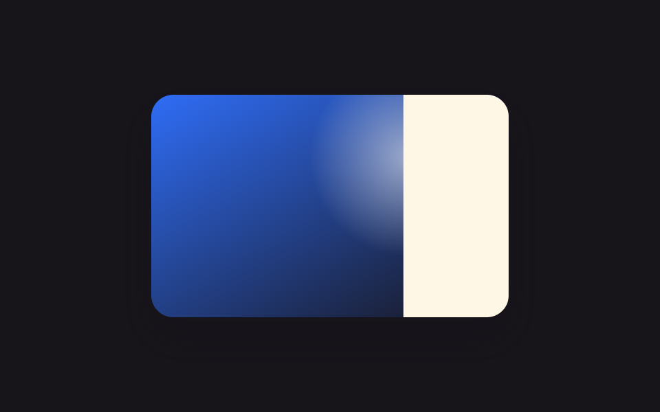
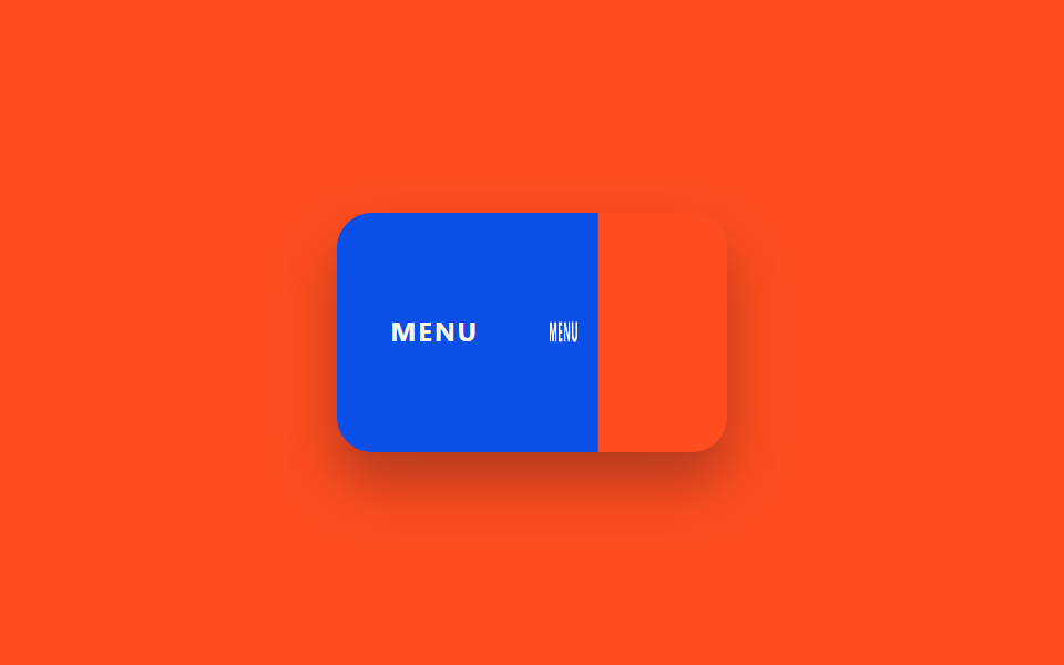
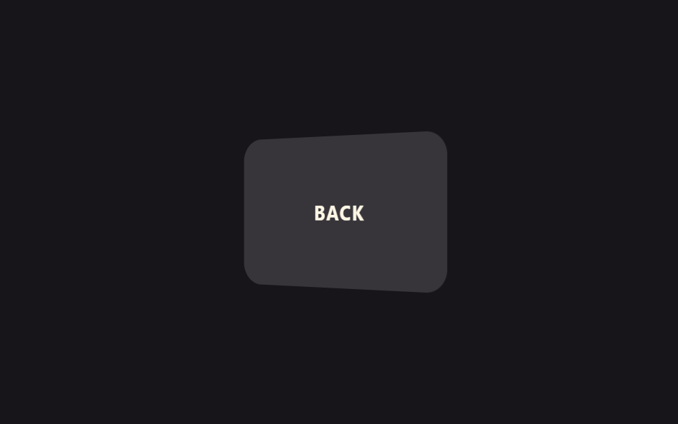
カードが中央の線を基準に半分に折りたたまれ、内容が内側に隠れます。紙のカードを閉じるように使います。
使いどころメニュー表の折りたたみインタラクション、折りたたみ式案内カード
preserve-3drotateYtransform-origin
<main class="stage">
  <div class="fh-card is-demo">
    <div class="fh-half fh-half--static">MENU</div>
    <div class="fh-half fh-half--fold">
      <div class="fh-half__face fh-half__face--front">MENU</div>
      <div class="fh-half__face fh-half__face--back"></div>
    </div>
  </div>
</main>
@use "../../../../site/static/demo-tokens" as *;
// ── 변수 3개 ──────────────────────────────────────────
$duration: $dur-enter;
$easing: $ease-spring;
$color: $subject-blue;
@include stage($stage-orange);
.fh-card {
position: relative;
display: flex;
width: 176px;
height: 108px;
perspective: 900px;
border-radius: $r-card;
overflow: hidden;
box-shadow: $shadow-raised;
}
.fh-half {
width: 50%;
height: 100%;
display: flex;
align-items: center;
justify-content: center;
background: $subject-blue-deep;
color: $subject-cream;
font: 700 12px/1.3 -apple-system, "Segoe UI", sans-serif;
letter-spacing: .08em;
}
.fh-half--fold {
position: relative;
transform-style: preserve-3d;
transform-origin: left center; // 규칙8: 왼쪽 변 경첩 접힘
transition: transform $duration $easing;
background: none;
}
.fh-half__face {
position: absolute;
inset: 0;
display: flex;
align-items: center;
justify-content: center;
backface-visibility: hidden;
font: 700 12px/1.3 -apple-system, "Segoe UI", sans-serif;
letter-spacing: .08em;
color: $subject-cream;
}
.fh-half__face--front { background: $subject-blue-deep; }
.fh-half__face--back { background: rgba(23, 20, 26, .78); transform: rotateY(180deg); }
// 데모 루프: 오른쪽 절반이 왼쪽 절반 위로 접힌다
@keyframes fh-fold {
0% { transform: rotateY(0); }
50% { transform: rotateY(-172deg); }
100% { transform: rotateY(0); }
}
.fh-card.is-demo .fh-half--fold { animation: fh-fold $duration * 2.4 $easing infinite; }
@media (prefers-reduced-motion: reduce) {
.fh-card.is-demo .fh-half--fold { animation: none !important; transition: none !important; transform: none !important; }
}html, body {
margin: 0;
overflow: hidden;
}
.stage {
box-sizing: border-box;
min-height: 100vh;
display: grid;
place-items: center;
margin: 0;
background: #ff4d1f;
font-family: -apple-system, "Segoe UI", "Noto Sans KR", sans-serif;
padding: clamp(8px, 4vw, 24px);
}
.fh-card {
position: relative;
display: flex;
width: 176px;
height: 108px;
perspective: 900px;
border-radius: 16px;
overflow: hidden;
box-shadow: 0 14px 24px rgba(23, 20, 26, 0.32);
}
.fh-half {
width: 50%;
height: 100%;
display: flex;
align-items: center;
justify-content: center;
background: #0a4fe8;
color: #fff7e6;
font: 700 12px/1.3 -apple-system, "Segoe UI", sans-serif;
letter-spacing: 0.08em;
}
.fh-half--fold {
position: relative;
transform-style: preserve-3d;
transform-origin: left center;
transition: transform 600ms cubic-bezier(0.2, 0.8, 0.2, 1);
background: none;
}
.fh-half__face {
position: absolute;
inset: 0;
display: flex;
align-items: center;
justify-content: center;
backface-visibility: hidden;
font: 700 12px/1.3 -apple-system, "Segoe UI", sans-serif;
letter-spacing: 0.08em;
color: #fff7e6;
}
.fh-half__face--front {
background: #0a4fe8;
}
.fh-half__face--back {
background: rgba(23, 20, 26, 0.78);
transform: rotateY(180deg);
}
@keyframes fh-fold {
0% {
transform: rotateY(0);
}
50% {
transform: rotateY(-172deg);
}
100% {
transform: rotateY(0);
}
}
.fh-card.is-demo .fh-half--fold {
animation: fh-fold 1440ms cubic-bezier(0.2, 0.8, 0.2, 1) infinite;
}
@media (prefers-reduced-motion: reduce) {
.fh-card.is-demo .fh-half--fold {
animation: none !important;
transition: none !important;
transform: none !important;
}
}import { CSSProperties, useState } from "react";
import styles from "./FoldHalf.module.scss";
export interface FoldHalfProps {
duration?: string;
easing?: string;
label?: string;
}
export default function FoldHalf({
duration = "600ms",
easing = "cubic-bezier(.2, .8, .2, 1)",
label = "MENU",
}: FoldHalfProps) {
const [folded, setFolded] = useState(false);
const style = { "--duration": duration, "--easing": easing } as CSSProperties;
return (
<div
className={styles.card}
style={style}
role="button"
tabIndex={0}
aria-pressed={folded}
onClick={() => setFolded((v) => !v)}
onKeyDown={(e: { key: string }) => (e.key === "Enter" || e.key === " ") && setFolded((v) => !v)}
>
<div className={styles.static}>{label}</div>
<div className={`${styles.fold} ${folded ? styles.closed : ""}`}>
<div className={`${styles.face} ${styles.front}`}>{label}</div>
<div className={`${styles.face} ${styles.back}`} />
</div>
</div>
);
}03 半分に折る — 計測 累積面積 13.074% · 動いたフレーム 19/23GODRICH オリジナル · SCSS と React は zip に同梱 · カード フリップ アニメーション 9選【コピペ20行】
このデモが属する記事
 カード フリップ アニメーション 9選【コピペ20行】カード フリップ アニメーションとは、マウスを乗せたりクリックしたりするとカードがくるっと回転したり半分に折れたりして、裏側の内容が現れる効果のことです。コードが分からなくても、下のデモにマウスを乗せてみれば何が起きているか一目で分かります この記事のデモをすべて見る