04本が開く効果
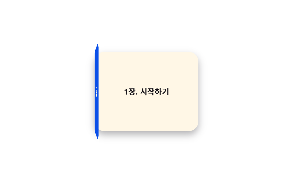
表紙が左辺を軸に -150deg 開いて中のページを見せる。006 のフリップカードはカード全体を中心軸で180deg 裏返すが、これは片方の辺だけが軸で完全には裏返らない。
使いどころオンボーディングガイド、カタログ表紙の展開
transform-origin: leftbackface-visibility경첩 회전
<main class="stage">
  <div class="book">
    <div class="book__page">第1章 はじめに</div>
    <div class="book__cover is-demo">
      <div class="book__face book__face--front">マニュアル</div>
      <div class="book__face book__face--back"></div>
    </div>
  </div>
</main>
@use "../../../../site/static/demo-tokens" as *;
// ── 변수 3개 ──────────────────────────────
$duration: $dur-enter; // 표지가 열리는 시간
$easing: $ease-spring;
$color: $subject-blue-deep; // 표지 색 (크림 글자가 얹히므로 진한 파랑)
@include stage($stage-paper);
.book {
position: relative;
width: 170px;
height: 130px;
perspective: 800px;
}
.book__page {
position: absolute;
inset: 0;
display: grid;
place-items: center;
border-radius: $r-card;
background: $subject-cream;
color: $subject-ink;
font-weight: 700;
font-size: 13px;
line-height: 1.3;
font-family: inherit;
box-shadow: $shadow-press;
}
// 표지는 왼쪽 모서리를 축으로 돈다 — 카드 전체를 뒤집는 006 의 flip 과 달리 한쪽 변만 경첩이다
.book__cover {
position: absolute;
inset: 0;
transform-style: preserve-3d;
transform-origin: left center; // 규칙8: 왼쪽 변 경첩
animation: open $dur-loop $easing infinite;
}
.book__face {
position: absolute;
inset: 0;
display: grid;
place-items: center;
border-radius: $r-card;
font-weight: 700;
font-size: 15px;
line-height: 1;
font-family: inherit;
color: $subject-cream;
backface-visibility: hidden; // 표지 안쪽 면이 앞면 글자와 겹쳐 비치지 않게
}
.book__face--front { background: $color; }
.book__face--back { background: darken($color, 14%); transform: rotateY(180deg); }
@keyframes open {
0%, 15% { transform: rotateY(0deg); }
55% { transform: rotateY(-150deg); }
85%, 100% { transform: rotateY(0deg); }
}
// ── 접근성: 움직임 줄이기 설정이면 펼친 상태로 고정 ────────────
@media (prefers-reduced-motion: reduce) {
.book__cover { animation: none; transform: rotateY(-150deg); }
}html, body {
margin: 0;
overflow: hidden;
}
.stage {
box-sizing: border-box;
min-height: 100vh;
display: grid;
place-items: center;
margin: 0;
background: #ffffff;
font-family: -apple-system, "Segoe UI", "Noto Sans KR", sans-serif;
padding: clamp(8px, 4vw, 24px);
}
.book {
position: relative;
width: 170px;
height: 130px;
perspective: 800px;
}
.book__page {
position: absolute;
inset: 0;
display: grid;
place-items: center;
border-radius: 16px;
background: #fff7e6;
color: #17141a;
font-weight: 700;
font-size: 13px;
line-height: 1.3;
font-family: inherit;
box-shadow: 0 6px 12px rgba(23, 20, 26, 0.32);
}
.book__cover {
position: absolute;
inset: 0;
transform-style: preserve-3d;
transform-origin: left center;
animation: open 2s cubic-bezier(0.2, 0.8, 0.2, 1) infinite;
}
.book__face {
position: absolute;
inset: 0;
display: grid;
place-items: center;
border-radius: 16px;
font-weight: 700;
font-size: 15px;
line-height: 1;
font-family: inherit;
color: #fff7e6;
backface-visibility: hidden;
}
.book__face--front {
background: #0a4fe8;
}
.book__face--back {
background: rgb(2.7645438341%, 21.8398962891%, 64.1374169503%);
transform: rotateY(180deg);
}
@keyframes open {
0%, 15% {
transform: rotateY(0deg);
}
55% {
transform: rotateY(-150deg);
}
85%, 100% {
transform: rotateY(0deg);
}
}
@media (prefers-reduced-motion: reduce) {
.book__cover {
animation: none;
transform: rotateY(-150deg);
}
}import type { CSSProperties } from "react";
import styles from "./BookOpen.module.scss";
export type BookOpenProps = {
duration?: number;
easing?: string;
/** 표지 색 */
color?: string;
cover?: string;
page?: string;
};
type Vars = CSSProperties & { "--duration"?: string; "--easing"?: string; "--color"?: string };
export default function BookOpen({
duration = 600,
easing = "cubic-bezier(.2,.8,.2,1)",
color = "#0a4fe8",
cover = "매뉴얼",
page = "1장. 시작하기",
}: BookOpenProps) {
const vars: Vars = { "--duration": `${duration}ms`, "--easing": easing, "--color": color };
return (
<div className={styles.book} style={vars}>
<div className={styles.page}>{page}</div>
<div className={styles.cover}>
<div className={`${styles.face} ${styles.front}`}>{cover}</div>
<div className={`${styles.face} ${styles.back}`} />
</div>
</div>
);
}04 本が開く効果 — 計測 累積面積 32.419% · 動いたフレーム 17/23GODRICH オリジナル · SCSS と React は zip に同梱 · 【一行でコピペOK】CSS 3D アニメーション9選
このデモが属する記事
 【一行でコピペOK】CSS 3D アニメーション9選css 3d アニメーションは、perspectiveとtransform-style: preserve-3dだけで奥行きを作るCSSの技法です。回転するキューブや円周上のカルーセル、ホバーで傾くカードなど9種類を選び、それぞれ一行でコピ この記事のデモをすべて見る