092本の矢印が入れ替わる
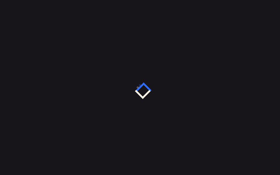
同じ対角線上の矢印2本が反対方向へ滑るように動き、入れ替わるように交差します。
使いどころ並べ替え方向の切り替えボタン、交換・更新アイコン
translaterotatestagger
<main class="stage">
  <div class="xs-wrap" aria-hidden="true">
    <span class="xs-arrow xs-arrow--a"></span>
    <span class="xs-arrow xs-arrow--b"></span>
    <span class="xs-trail xs-trail--a"></span>
    <span class="xs-trail xs-trail--b"></span>
  </div>
</main>
@use "../../../../site/static/demo-tokens" as *;
// ── 변수 3개 ──────────────────────────────────────────
$duration: 1.8s;
$easing: $ease-spring;
$color: $subject-blue;
@include stage($stage-ink);
.xs-wrap {
position: relative;
width: 40px;
height: 40px;
}
.xs-arrow {
position: absolute;
top: 16px;
left: 16px;
width: 16px;
height: 16px;
border-top: 3px solid;
border-right: 3px solid;
}
// 두 화살표가 같은 대각선 위에서 서로 반대 방향으로 미끄러지며 자리를 맞바꾸듯 교차한다. 46%에서 오버슛했다 50%에서 정착한다
.xs-arrow--a { border-color: $color; transform: translate(-6px, 6px) rotate(-45deg); }
.xs-arrow--b { border-color: $subject-cream; transform: translate(6px, -6px) rotate(135deg); }
@keyframes xs-swap-a {
0%, 100% { transform: translate(-6px, 6px) rotate(-45deg); }
46% { transform: translate(8px, -8px) rotate(-45deg); }
50% { transform: translate(6px, -6px) rotate(-45deg); }
}
@keyframes xs-swap-b {
0%, 100% { transform: translate(6px, -6px) rotate(135deg); }
46% { transform: translate(-8px, 8px) rotate(135deg); }
50% { transform: translate(-6px, 6px) rotate(135deg); }
}
.xs-arrow--a { animation: xs-swap-a $duration $easing infinite; }
.xs-arrow--b { animation: xs-swap-b $duration $easing infinite; }
// 트레일 파티클 — 교차하는 화살표 각각 뒤로 작은 점이 살짝 지연되어 흐리게 따라붙는다
.xs-trail {
position: absolute;
top: 16px;
left: 16px;
width: 4px;
height: 4px;
border-radius: 50%;
opacity: 0;
}
.xs-trail--a { background: $color; }
.xs-trail--b { background: $subject-cream; }
@keyframes xs-trail-a {
0%, 100% { opacity: 0; transform: translate(-3px, 3px) scale(.6); }
50% { opacity: .35; transform: translate(3px, -3px) scale(1); }
}
@keyframes xs-trail-b {
0%, 100% { opacity: 0; transform: translate(3px, -3px) scale(.6); }
50% { opacity: .35; transform: translate(-3px, 3px) scale(1); }
}
.xs-trail--a { animation: xs-trail-a $duration $easing 60ms infinite; }
.xs-trail--b { animation: xs-trail-b $duration $easing 60ms infinite; }
@media (prefers-reduced-motion: reduce) {
.xs-arrow--a { animation: none !important; transform: translate(-6px, 6px) rotate(-45deg) !important; }
.xs-arrow--b { animation: none !important; transform: translate(6px, -6px) rotate(135deg) !important; }
.xs-trail--a, .xs-trail--b { animation: none !important; opacity: 0 !important; }
}html, body {
margin: 0;
overflow: hidden;
}
.stage {
box-sizing: border-box;
min-height: 100vh;
display: grid;
place-items: center;
margin: 0;
background: #17141a;
font-family: -apple-system, "Segoe UI", "Noto Sans KR", sans-serif;
padding: clamp(8px, 4vw, 24px);
}
.xs-wrap {
position: relative;
width: 40px;
height: 40px;
}
.xs-arrow {
position: absolute;
top: 16px;
left: 16px;
width: 16px;
height: 16px;
border-top: 3px solid;
border-right: 3px solid;
}
.xs-arrow--a {
border-color: #2f6df6;
transform: translate(-6px, 6px) rotate(-45deg);
}
.xs-arrow--b {
border-color: #fff7e6;
transform: translate(6px, -6px) rotate(135deg);
}
@keyframes xs-swap-a {
0%, 100% {
transform: translate(-6px, 6px) rotate(-45deg);
}
46% {
transform: translate(8px, -8px) rotate(-45deg);
}
50% {
transform: translate(6px, -6px) rotate(-45deg);
}
}
@keyframes xs-swap-b {
0%, 100% {
transform: translate(6px, -6px) rotate(135deg);
}
46% {
transform: translate(-8px, 8px) rotate(135deg);
}
50% {
transform: translate(-6px, 6px) rotate(135deg);
}
}
.xs-arrow--a {
animation: xs-swap-a 1.8s cubic-bezier(0.2, 0.8, 0.2, 1) infinite;
}
.xs-arrow--b {
animation: xs-swap-b 1.8s cubic-bezier(0.2, 0.8, 0.2, 1) infinite;
}
.xs-trail {
position: absolute;
top: 16px;
left: 16px;
width: 4px;
height: 4px;
border-radius: 50%;
opacity: 0;
}
.xs-trail--a {
background: #2f6df6;
}
.xs-trail--b {
background: #fff7e6;
}
@keyframes xs-trail-a {
0%, 100% {
opacity: 0;
transform: translate(-3px, 3px) scale(0.6);
}
50% {
opacity: 0.35;
transform: translate(3px, -3px) scale(1);
}
}
@keyframes xs-trail-b {
0%, 100% {
opacity: 0;
transform: translate(3px, -3px) scale(0.6);
}
50% {
opacity: 0.35;
transform: translate(-3px, 3px) scale(1);
}
}
.xs-trail--a {
animation: xs-trail-a 1.8s cubic-bezier(0.2, 0.8, 0.2, 1) 60ms infinite;
}
.xs-trail--b {
animation: xs-trail-b 1.8s cubic-bezier(0.2, 0.8, 0.2, 1) 60ms infinite;
}
@media (prefers-reduced-motion: reduce) {
.xs-arrow--a {
animation: none !important;
transform: translate(-6px, 6px) rotate(-45deg) !important;
}
.xs-arrow--b {
animation: none !important;
transform: translate(6px, -6px) rotate(135deg) !important;
}
.xs-trail--a, .xs-trail--b {
animation: none !important;
opacity: 0 !important;
}
}import { CSSProperties } from "react";
import styles from "./DoubleArrowSwap.module.scss";
export interface DoubleArrowSwapProps {
duration?: string;
easing?: string;
color?: string;
}
export default function DoubleArrowSwap({
duration = "1.8s",
easing = "cubic-bezier(.2, .8, .2, 1)",
color = "#2f6df6",
}: DoubleArrowSwapProps) {
const style = { "--duration": duration, "--easing": easing, "--color": color } as CSSProperties;
return (
<div className={styles.wrap} style={style} aria-hidden="true">
<span className={`${styles.arrow} ${styles.a}`} />
<span className={`${styles.arrow} ${styles.b}`} />
<span className={`${styles.trail} ${styles.trailA}`} />
<span className={`${styles.trail} ${styles.trailB}`} />
</div>
);
}09 2本の矢印が入れ替わる — 計測 累積面積 0.637% · 動いたフレーム 22/23GODRICH オリジナル · SCSS と React は zip に同梱 · 矢印 CSS アニメーション9選【コピペOK】
このデモが属する記事
 矢印 CSS アニメーション9選【コピペOK】リンクの矢印にマウスを乗せた瞬間にすっと伸びたり、ボタンの矢印が絶えずゆっくり跳ねたりする動きを見たことはありませんか。この記事はそうした矢印 css アニメーションを、一行でコピペOKなコード9個にまとめたものです。 この記事のデモをすべて見る