07動くドットパターン
radial-gradient で描いた小さなドットパターンをタイル状に並べ、background-position を斜め方向にゆっくり流すことで、ドットが途切れなく流れて見える。
使いどころプレゼン・スライドの背景、カードグリッドの背後の背景
radial-gradient 도트background-size 타일대각선 흐름
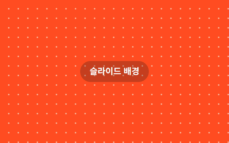
<main class="stage">
  <p class="hint">スライド背景</p>
</main>
@use "../../../../site/static/demo-tokens" as *;
// ── 변수 3개 ──────────────────────────────────────────
$duration: $dur-loop; // 점 한 칸만큼 흐르는 시간
$easing: linear;
$color: $subject-cream; // 점 색
// ── 데모 무대 ──────────────────────────────────────────
@include stage($stage-orange);
.stage {
position: relative;
overflow: hidden;
}
// radial-gradient 로 찍은 점 패턴을 타일링하고 background-position 만 대각선으로 흘려보낸다
.stage::before {
content: "";
position: absolute;
inset: 0;
background-image: radial-gradient(circle, rgba($color, .6) 1.5px, transparent 1.5px);
background-size: 20px 20px;
animation: dotdrift $duration $easing infinite;
}
.hint {
position: relative;
margin: 0;
padding: 10px 20px;
border-radius: $r-pill;
background: rgba($stage-ink, .25);
color: $stage-paper;
font: 700 clamp(14px, 4vw, 18px)/1.3 -apple-system, "Segoe UI", "Noto Sans KR", sans-serif;
}
@keyframes dotdrift {
from { background-position: 0 0; }
to { background-position: 20px 20px; }
}
@media (prefers-reduced-motion: reduce) {
.stage::before { animation: none; }
}html, body {
margin: 0;
overflow: hidden;
}
.stage {
box-sizing: border-box;
min-height: 100vh;
display: grid;
place-items: center;
margin: 0;
background: #ff4d1f;
font-family: -apple-system, "Segoe UI", "Noto Sans KR", sans-serif;
padding: clamp(8px, 4vw, 24px);
}
.stage {
position: relative;
overflow: hidden;
}
.stage::before {
content: "";
position: absolute;
inset: 0;
background-image: radial-gradient(circle, rgba(255, 247, 230, 0.6) 1.5px, transparent 1.5px);
background-size: 20px 20px;
animation: dotdrift 2s linear infinite;
}
.hint {
position: relative;
margin: 0;
padding: 10px 20px;
border-radius: 999px;
background: rgba(23, 20, 26, 0.25);
color: #ffffff;
font: 700 clamp(14px, 4vw, 18px)/1.3 -apple-system, "Segoe UI", "Noto Sans KR", sans-serif;
}
@keyframes dotdrift {
from {
background-position: 0 0;
}
to {
background-position: 20px 20px;
}
}
@media (prefers-reduced-motion: reduce) {
.stage::before {
animation: none;
}
}import type { CSSProperties, ReactNode } from "react";
import styles from "./DotPatternDriftBg.module.scss";
export type DotPatternDriftBgProps = {
children?: ReactNode;
/** 점 한 칸만큼 흐르는 시간 (기본 2000ms) */
duration?: number;
/** 점 색 */
color?: string;
className?: string;
};
type Vars = CSSProperties & { "--duration"?: string; "--color"?: string };
export default function DotPatternDriftBg({
children,
duration = 2000,
color = "#fff7e6",
className = "",
}: DotPatternDriftBgProps) {
const vars: Vars = { "--duration": `${duration}ms`, "--color": color };
return (
<div className={`${styles.stage} ${className}`} style={vars}>
<div className={styles.dots} aria-hidden="true" />
{children}
</div>
);
}07 動くドットパターン — 計測 累積面積 24.738% · 動いたフレーム 23/23GODRICH オリジナル · SCSS と React は zip に同梱 · CSS 背景 アニメーション 9選 — 一行でコピペOK
このデモが属する記事
 CSS 背景 アニメーション 9選 — 一行でコピペOKcss 背景 アニメーションは、CSSだけで背景を動かし続ける手法です。この記事では9種類を選び、background-positionとtransform、filter: blurという仕組みだけで実装しました。グリッドの9つはifram この記事のデモをすべて見る