01呼吸するような拡大+影
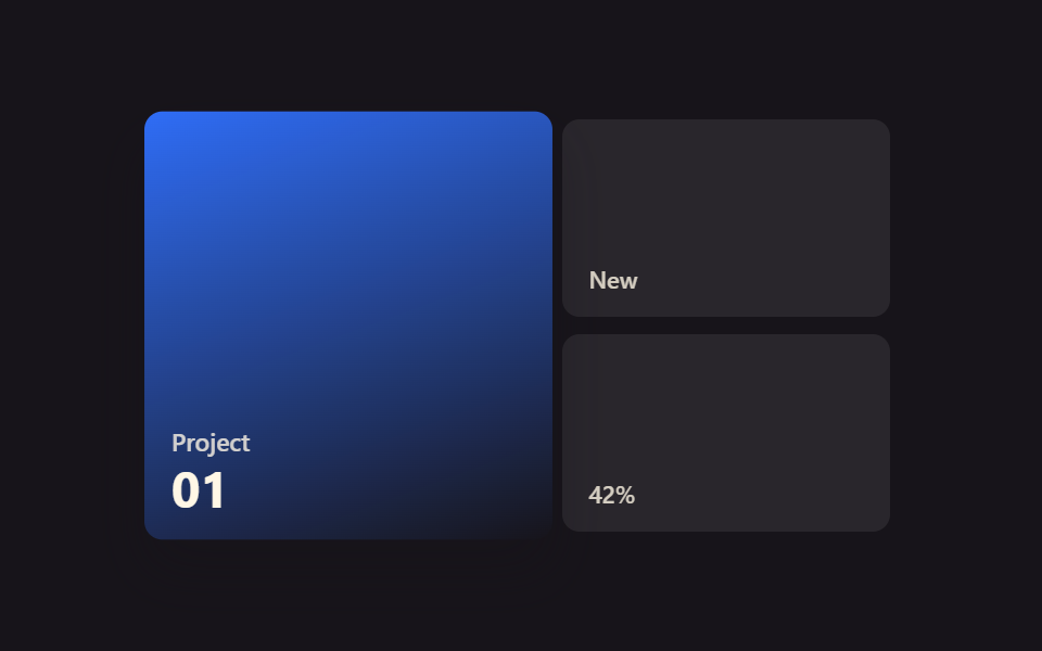
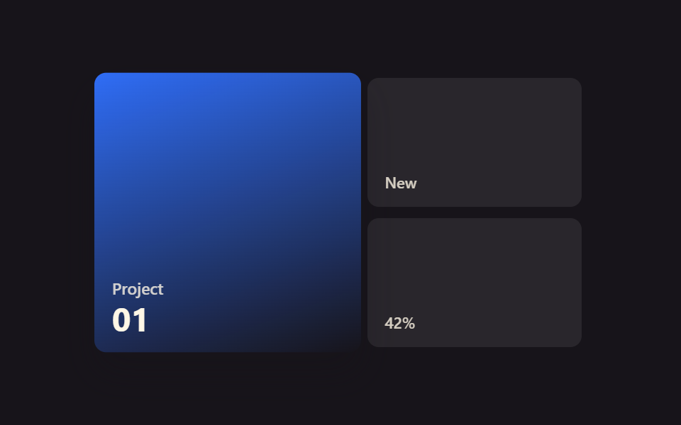
ポートフォリオのタイルにマウスを乗せると、transform: scale(1.04)でタイル全体がわずかに拡大し、影が深くなって呼吸するように反応する。
使いどころポートフォリオのプロジェクトタイル、製品紹介グリッド
scalebox-shadow300ms
<main class="stage">
  <div class="bs-grid is-demo">
    <div class="bs-tile bs-tile--a bs-focal">
      <span class="bs-tile__tag">Project</span>
      <span class="bs-tile__num">01</span>
    </div>
    <div class="bs-tile bs-tile--b">
      <span class="bs-tile__tag">New</span>
    </div>
    <div class="bs-tile bs-tile--c">
      <span class="bs-tile__tag">42%</span>
    </div>
  </div>
</main>
@use "../../../../site/static/demo-tokens" as *;
// ── 변수 3개 ──────────────────────────────────────────
$duration: $dur-base;
$easing: $ease-spring;
$color: $subject-blue;
@include stage($stage-ink);
.bs-grid {
width: min(340px, 90vw);
aspect-ratio: 340 / 190;
display: grid;
grid-template-columns: 1.2fr 1fr;
grid-template-rows: 1fr 1fr;
gap: $sp-2;
}
.bs-tile {
border-radius: $r-sm;
display: flex;
flex-direction: column;
justify-content: flex-end;
padding: $sp-3;
box-sizing: border-box;
color: $subject-cream;
font: 600 12px/1 -apple-system, "Segoe UI", sans-serif;
}
.bs-tile--a {
grid-row: 1 / 3;
background: linear-gradient(160deg, $color, rgba(23, 20, 26, .85));
}
.bs-tile--b, .bs-tile--c {
background: rgba(255, 255, 255, .08);
}
.bs-tile__tag { opacity: .8; font-size: 11px; }
.bs-tile__num { font-size: 22px; font-weight: 700; margin-top: $sp-1; }
// 실사용: 진짜 마우스 호버로 트랜지션
.bs-focal {
transition: transform $duration $easing, box-shadow $duration $easing;
box-shadow: $shadow-press;
}
.bs-focal:hover {
transform: scale(1.04);
box-shadow: $shadow-raised;
}
// 데모 루프: is-demo 는 같은 모양을 keyframes 로 무한 재생 (캡처용 — 헤드리스는 :hover 를 못 건다)
@keyframes bs-breathe {
0%, 100% { transform: scale(1); box-shadow: $shadow-press; }
50% { transform: scale(1.04); box-shadow: $shadow-raised; }
}
.bs-grid.is-demo .bs-focal { animation: bs-breathe $duration $easing infinite; }
@media (prefers-reduced-motion: reduce) {
.bs-focal:hover,
.bs-grid.is-demo .bs-focal { animation: none !important; transform: none !important; box-shadow: $shadow-press !important; }
}html, body {
margin: 0;
overflow: hidden;
}
.stage {
box-sizing: border-box;
min-height: 100vh;
display: grid;
place-items: center;
margin: 0;
background: #17141a;
font-family: -apple-system, "Segoe UI", "Noto Sans KR", sans-serif;
padding: clamp(8px, 4vw, 24px);
}
.bs-grid {
width: min(340px, 90vw);
aspect-ratio: 340/190;
display: grid;
grid-template-columns: 1.2fr 1fr;
grid-template-rows: 1fr 1fr;
gap: 8px;
}
.bs-tile {
border-radius: 8px;
display: flex;
flex-direction: column;
justify-content: flex-end;
padding: 12px;
box-sizing: border-box;
color: #fff7e6;
font: 600 12px/1 -apple-system, "Segoe UI", sans-serif;
}
.bs-tile--a {
grid-row: 1/3;
background: linear-gradient(160deg, #2f6df6, rgba(23, 20, 26, 0.85));
}
.bs-tile--b, .bs-tile--c {
background: rgba(255, 255, 255, 0.08);
}
.bs-tile__tag {
opacity: 0.8;
font-size: 11px;
}
.bs-tile__num {
font-size: 22px;
font-weight: 700;
margin-top: 4px;
}
.bs-focal {
transition: transform 300ms cubic-bezier(0.2, 0.8, 0.2, 1), box-shadow 300ms cubic-bezier(0.2, 0.8, 0.2, 1);
box-shadow: 0 6px 12px rgba(23, 20, 26, 0.32);
}
.bs-focal:hover {
transform: scale(1.04);
box-shadow: 0 14px 24px rgba(23, 20, 26, 0.32);
}
@keyframes bs-breathe {
0%, 100% {
transform: scale(1);
box-shadow: 0 6px 12px rgba(23, 20, 26, 0.32);
}
50% {
transform: scale(1.04);
box-shadow: 0 14px 24px rgba(23, 20, 26, 0.32);
}
}
.bs-grid.is-demo .bs-focal {
animation: bs-breathe 300ms cubic-bezier(0.2, 0.8, 0.2, 1) infinite;
}
@media (prefers-reduced-motion: reduce) {
.bs-focal:hover,
.bs-grid.is-demo .bs-focal {
animation: none !important;
transform: none !important;
box-shadow: 0 6px 12px rgba(23, 20, 26, 0.32) !important;
}
}import { CSSProperties } from "react";
import styles from "./BreathScaleShadow.module.scss";
type Vars = CSSProperties & {
"--duration"?: string;
"--easing"?: string;
"--color"?: string;
};
export interface BreathScaleShadowProps {
duration?: string;
easing?: string;
color?: string;
}
export default function BreathScaleShadow({
duration = "300ms",
easing = "cubic-bezier(.2, .8, .2, 1)",
color = "#2f6df6",
}: BreathScaleShadowProps) {
const style: Vars = {
"--duration": duration,
"--easing": easing,
"--color": color,
};
return (
<div className={styles.grid} style={style}>
<div className={`${styles.tile} ${styles.tileA} ${styles.focal}`}>
<span className={styles.tag}>Project</span>
<span className={styles.num}>01</span>
</div>
<div className={`${styles.tile} ${styles.tileB}`}>
<span className={styles.tag}>New</span>
</div>
<div className={`${styles.tile} ${styles.tileC}`}>
<span className={styles.tag}>42%</span>
</div>
</div>
);
}01 呼吸するような拡大+影 — 計測 累積面積 2.481% · 動いたフレーム 23/23GODRICH オリジナル · SCSS と React は zip に同梱 · 【コピペOK】CSSベントグリッドホバーアニメーション9選
このデモが属する記事
 【コピペOK】CSSベントグリッドホバーアニメーション9選ポートフォリオサイトや製品紹介ページで、大きな四角と小さな四角が写真のコラージュのように組み合わさったレイアウトを見たことはないでしょうか。あれはベントグリッドと呼ばれるレイアウトで、この記事ではマス目にマウスを乗せたときの反応を作るCSS この記事のデモをすべて見る