05花火ドット
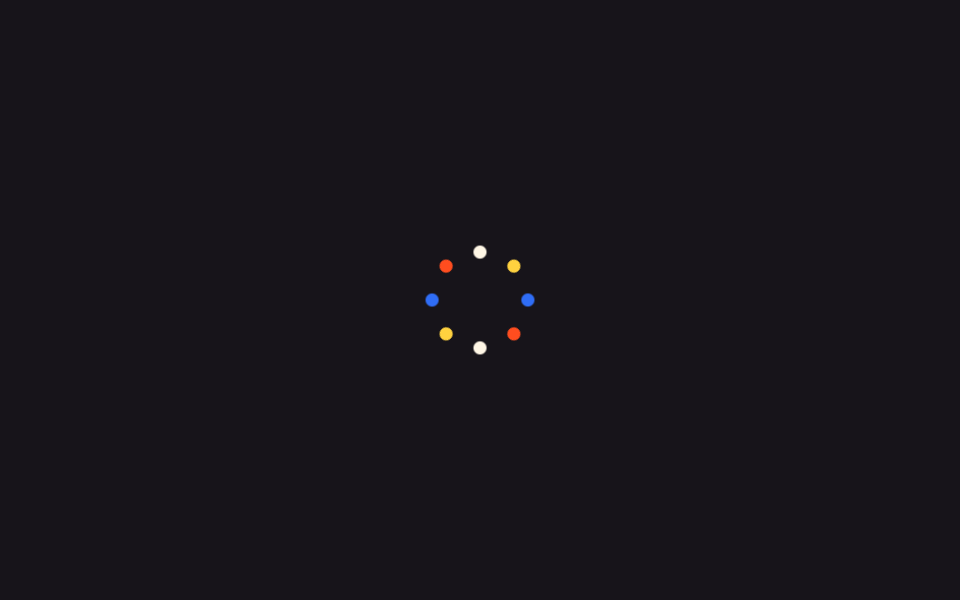
中心の点1つが--angleカスタムプロパティで角度を分け持つ8個の点に分かれ、rotate(var(--angle))とtranslateYで花火のように広がりopacityで消える。
使いどころ目標達成のお祝い画面、レベルアップ通知
custom propertyrotate()+translateY1s
<main class="stage">
  <div class="fw-wrap is-demo">
    <span class="fw-dot"></span><span class="fw-dot"></span><span class="fw-dot"></span><span class="fw-dot"></span>
    <span class="fw-dot"></span><span class="fw-dot"></span><span class="fw-dot"></span><span class="fw-dot"></span>
  </div>
</main>
@use "../../../../site/static/demo-tokens" as *;
// ── 변수 3개 ──────────────────────────────────────────
$duration: 1s;
$easing: $ease-out;
$color: $stage-yellow;
@include stage($stage-ink);
$piece-colors: $color, $subject-blue, $stage-orange, $subject-cream;
.fw-wrap {
position: relative;
width: 8px;
height: 8px;
}
.fw-dot {
position: absolute;
top: 0;
left: 0;
width: 8px;
height: 8px;
border-radius: $r-pill;
opacity: 0;
}
// 점 8개가 --angle 을 30~360deg 로 나눠 갖고, rotate + translateY 로 불꽃처럼 퍼진다
@for $i from 1 through 8 {
.fw-dot:nth-child(#{$i}) {
background: nth($piece-colors, ($i - 1) % 4 + 1);
--angle: #{$i * 45deg};
}
}
@keyframes fw-burst {
0% { transform: rotate(var(--angle)) translateY(0) scale(1); opacity: 1; }
70% { opacity: 1; }
100% { transform: rotate(var(--angle)) translateY(-92px) scale(.3); opacity: 0; }
}
.fw-wrap.is-demo .fw-dot { animation: fw-burst $duration $easing infinite; }
@media (prefers-reduced-motion: reduce) {
.fw-wrap.is-demo .fw-dot { animation: none !important; opacity: 0 !important; }
}html, body {
margin: 0;
overflow: hidden;
}
.stage {
box-sizing: border-box;
min-height: 100vh;
display: grid;
place-items: center;
margin: 0;
background: #17141a;
font-family: -apple-system, "Segoe UI", "Noto Sans KR", sans-serif;
padding: clamp(8px, 4vw, 24px);
}
.fw-wrap {
position: relative;
width: 8px;
height: 8px;
}
.fw-dot {
position: absolute;
top: 0;
left: 0;
width: 8px;
height: 8px;
border-radius: 999px;
opacity: 0;
}
.fw-dot:nth-child(1) {
background: #ffd23f;
--angle: 45deg;
}
.fw-dot:nth-child(2) {
background: #2f6df6;
--angle: 90deg;
}
.fw-dot:nth-child(3) {
background: #ff4d1f;
--angle: 135deg;
}
.fw-dot:nth-child(4) {
background: #fff7e6;
--angle: 180deg;
}
.fw-dot:nth-child(5) {
background: #ffd23f;
--angle: 225deg;
}
.fw-dot:nth-child(6) {
background: #2f6df6;
--angle: 270deg;
}
.fw-dot:nth-child(7) {
background: #ff4d1f;
--angle: 315deg;
}
.fw-dot:nth-child(8) {
background: #fff7e6;
--angle: 360deg;
}
@keyframes fw-burst {
0% {
transform: rotate(var(--angle)) translateY(0) scale(1);
opacity: 1;
}
70% {
opacity: 1;
}
100% {
transform: rotate(var(--angle)) translateY(-92px) scale(0.3);
opacity: 0;
}
}
.fw-wrap.is-demo .fw-dot {
animation: fw-burst 1s ease-out infinite;
}
@media (prefers-reduced-motion: reduce) {
.fw-wrap.is-demo .fw-dot {
animation: none !important;
opacity: 0 !important;
}
}import { CSSProperties } from "react";
import styles from "./FireworkDots.module.scss";
type Vars = CSSProperties & Record<string, string>;
export interface FireworkDotsProps {
duration?: string;
easing?: string;
color?: string;
}
const COLORS = ["var(--color)", "#2f6df6", "#ff4d1f", "#fff7e6"];
export default function FireworkDots({
duration = "1s",
easing = "ease-out",
color = "#ffd23f",
}: FireworkDotsProps) {
const style: Vars = { "--duration": duration, "--easing": easing, "--color": color };
return (
<div className={styles.wrap} style={style}>
{Array.from({ length: 8 }, (_, i) => {
const dotStyle: Vars = {
background: COLORS[i % COLORS.length],
"--angle": `${(i + 1) * 45}deg`,
};
return <span key={i} className={styles.dot} style={dotStyle} />;
})}
</div>
);
}05 花火ドット — 計測 累積面積 1.597% · 動いたフレーム 23/23GODRICH オリジナル · SCSS と React は zip に同梱 · 紙吹雪 アニメーション css キラキラ演出9選
このデモが属する記事
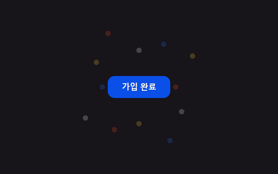 紙吹雪 アニメーション css キラキラ演出9選会員登録や決済が終わった瞬間、画面いっぱいに色とりどりの紙の破片が舞い散る演出を見たことはありませんか。あれは紙吹雪 アニメーション cssと呼ばれるコードで作られていて、ボタンを押す、チェックを入れるといった操作一つで同じお祝いの動きを、 この記事のデモをすべて見る