09イージング比較デモ
quart・back・spring・bounceの4曲線を同じ2秒・同じ距離で並べて動かすと、減速の形の違いが一目でわかる。
使いどころイージングを選ぶ前に候補をひとつの画面で見比べるとき
cubic-bezierlinear()비교
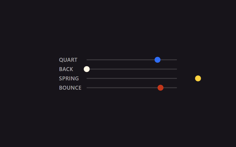
<main class="stage is-demo">
  <div class="compare">
    <div class="lane">
      <span class="label">quart</span>
      <div class="track"><div class="puck puck--quart"></div></div>
    </div>
    <div class="lane">
      <span class="label">back</span>
      <div class="track"><div class="puck puck--back"></div></div>
    </div>
    <div class="lane">
      <span class="label">spring</span>
      <div class="track"><div class="puck puck--spring"></div></div>
    </div>
    <div class="lane">
      <span class="label">bounce</span>
      <div class="track"><div class="puck puck--bounce"></div></div>
    </div>
  </div>
</main>
@use "../../../../site/static/demo-tokens" as *;
// ── 변수 3개 ──────────────────────────────────────────
$duration: $dur-loop; // 2s — 네 레인 전부 같은 길이라야 곡선 모양만으로 비교가 된다
$easing: cubic-bezier(.25, 1, .5, 1); // 대표값(quart). 레인마다 실제 값은 아래 참고
$color: $subject-blue;
@include stage($stage-ink);
$track-w: 184px;
$puck-w: $sp-3;
$travel: $track-w - $puck-w;
.compare {
display: flex;
flex-direction: column;
gap: $sp-2;
width: $track-w + $sp-12 + $sp-2; // 라벨 폭 + 간격 + 트랙 폭
}
.lane {
display: flex;
align-items: center;
gap: $sp-2;
}
.label {
width: $sp-12;
flex: 0 0 auto;
font: 600 11px/1 -apple-system, "Segoe UI", "Noto Sans KR", sans-serif;
color: rgba(255, 255, 255, .6);
text-transform: uppercase;
letter-spacing: .03em;
}
.track {
position: relative;
flex: 1 1 auto;
width: $track-w;
height: 2px;
background: rgba(255, 255, 255, .15);
border-radius: $r-xs;
}
.puck {
position: absolute;
top: 50%;
left: 0;
width: $puck-w;
height: $puck-w;
border-radius: $r-pill;
transform: translate(0, -50%);
}
.puck--quart { background: $subject-blue; }
.puck--back { background: $subject-cream; }
.puck--spring { background: $stage-yellow; }
.puck--bounce { background: $error; }
.stage.is-demo .puck--quart {
// ease-out-quart — 01번과 같은 값
animation: move $duration cubic-bezier(.25, 1, .5, 1) infinite alternate;
}
.stage.is-demo .puck--back {
// ease-in-out-back — 02번과 같은 값. 출발 전 뒤로 당겼다가 도착 뒤 넘어간다
animation: move $duration cubic-bezier(.68, -.6, .32, 1.6) infinite alternate;
}
.stage.is-demo .puck--spring {
// spring-snappy — 06번과 같은 값. 오버슈트 뒤 여러 번 오간다
animation: move $duration linear(0, .055, .197, .394, .612, .824, 1.009, 1.153, 1.25, 1.3, 1.307, 1.281, 1.231, 1.167, 1.099, 1.035, .982, .942, .916, .905, .907, .917, .935, .955, .976, .995, 1) infinite alternate;
}
.stage.is-demo .puck--bounce {
// bounce-linear — 04번과 같은 값. 방향을 안 바꾸고 매 루프 제자리로 순간 복귀한다
animation: move-once $duration linear(0, .013, .053, .118, .21, .328, .473, .643, .84, .97, .875, .807, .766, .75, .761, .798, .861, .951, .973, .943, .939, .962, .995, .984, 1) infinite;
}
@keyframes move {
from { transform: translate(0, -50%); }
to { transform: translate($travel, -50%); }
}
@keyframes move-once {
from { transform: translate(0, -50%); }
to { transform: translate($travel, -50%); }
}
@media (prefers-reduced-motion: reduce) {
.stage.is-demo .puck { animation: none; transform: translate($travel, -50%); }
}html, body {
margin: 0;
overflow: hidden;
}
.stage {
box-sizing: border-box;
min-height: 100vh;
display: grid;
place-items: center;
margin: 0;
background: #17141a;
font-family: -apple-system, "Segoe UI", "Noto Sans KR", sans-serif;
padding: clamp(8px, 4vw, 24px);
}
.compare {
display: flex;
flex-direction: column;
gap: 8px;
width: 240px;
}
.lane {
display: flex;
align-items: center;
gap: 8px;
}
.label {
width: 48px;
flex: 0 0 auto;
font: 600 11px/1 -apple-system, "Segoe UI", "Noto Sans KR", sans-serif;
color: rgba(255, 255, 255, 0.6);
text-transform: uppercase;
letter-spacing: 0.03em;
}
.track {
position: relative;
flex: 1 1 auto;
width: 184px;
height: 2px;
background: rgba(255, 255, 255, 0.15);
border-radius: 4px;
}
.puck {
position: absolute;
top: 50%;
left: 0;
width: 12px;
height: 12px;
border-radius: 999px;
transform: translate(0, -50%);
}
.puck--quart {
background: #2f6df6;
}
.puck--back {
background: #fff7e6;
}
.puck--spring {
background: #ffd23f;
}
.puck--bounce {
background: #c2361a;
}
.stage.is-demo .puck--quart {
animation: move 2s cubic-bezier(0.25, 1, 0.5, 1) infinite alternate;
}
.stage.is-demo .puck--back {
animation: move 2s cubic-bezier(0.68, -0.6, 0.32, 1.6) infinite alternate;
}
.stage.is-demo .puck--spring {
animation: move 2s linear(0, 0.055, 0.197, 0.394, 0.612, 0.824, 1.009, 1.153, 1.25, 1.3, 1.307, 1.281, 1.231, 1.167, 1.099, 1.035, 0.982, 0.942, 0.916, 0.905, 0.907, 0.917, 0.935, 0.955, 0.976, 0.995, 1) infinite alternate;
}
.stage.is-demo .puck--bounce {
animation: move-once 2s linear(0, 0.013, 0.053, 0.118, 0.21, 0.328, 0.473, 0.643, 0.84, 0.97, 0.875, 0.807, 0.766, 0.75, 0.761, 0.798, 0.861, 0.951, 0.973, 0.943, 0.939, 0.962, 0.995, 0.984, 1) infinite;
}
@keyframes move {
from {
transform: translate(0, -50%);
}
to {
transform: translate(172px, -50%);
}
}
@keyframes move-once {
from {
transform: translate(0, -50%);
}
to {
transform: translate(172px, -50%);
}
}
@media (prefers-reduced-motion: reduce) {
.stage.is-demo .puck {
animation: none;
transform: translate(172px, -50%);
}
}import type { CSSProperties } from "react";
import styles from "./EasingCompare.module.scss";
export type EasingCompareProps = {
/** 네 레인 공통 주기 (기본 2000ms) — 같은 길이라야 곡선 모양만으로 비교가 된다 */
duration?: number;
};
const LANES = [
{ key: "quart", label: "QUART", cls: styles.puckQuart },
{ key: "back", label: "BACK", cls: styles.puckBack },
{ key: "spring", label: "SPRING", cls: styles.puckSpring },
{ key: "bounce", label: "BOUNCE", cls: styles.puckBounce },
] as const;
export default function EasingCompare({ duration = 2000 }: EasingCompareProps) {
return (
<div className={styles.stage} style={{ "--duration": `${duration}ms` } as CSSProperties}>
<div className={styles.compare}>
{LANES.map((lane) => (
<div className={styles.lane} key={lane.key}>
<span className={styles.label}>{lane.label}</span>
<div className={styles.track}>
<div className={`${styles.puck} ${lane.cls}`} />
</div>
</div>
))}
</div>
</div>
);
}09 イージング比較デモ — 計測 累積面積 4.24% · 動いたフレーム 23/23GODRICH オリジナル · SCSS と React は zip に同梱 · css イージング関数 9選 — コピペで使えるスプリング・バウンス
このデモが属する記事
 css イージング関数 9選 — コピペで使えるスプリング・バウンスボタンを押す、カードが現れる——動きの速さが一定だと硬く見え、最初は速く途中からゆっくりだったり最後に少し弾んだりすると自然に見えます。この速度変化を4つの数値で指定するのがcss イージング関数のcubic-bezier、跳ねる動きをばね この記事のデモをすべて見る