08親指アイコンのバウンス
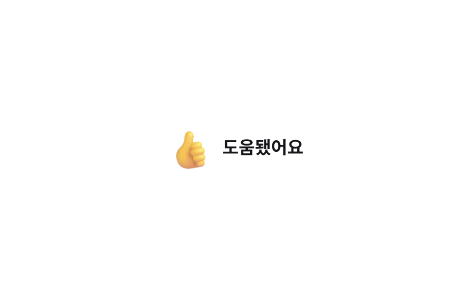
チェックすると親指アイコンが-20度から5度を経て0度に戻る間、scaleも一緒に伸び縮みして手振りのように揺れる。
使いどころ回答の「役に立った」ボタン、レビューの「参考になった」表示
rotate+scale:checked손짓 이징
<main class="stage">
  <label class="thumb is-demo">
    <input type="checkbox" class="thumb__input">
    <span class="thumb__icon" aria-hidden="true">👍</span>
    <span class="thumb__label">参考になった</span>
    <span class="thumb__fx" aria-hidden="true"><span class="thumb__spark thumb__spark--star"></span><span class="thumb__spark thumb__spark--dot"></span><span class="thumb__spark thumb__spark--star"></span><span class="thumb__spark thumb__spark--dot"></span><span class="thumb__spark thumb__spark--star"></span><span class="thumb__spark thumb__spark--star"></span></span>
  </label>
</main>
@use "../../../../site/static/demo-tokens" as *;
// ── 변수 3개 ──────────────────────────────────────────
$duration: $dur-base; // 손짓이 도는 시간
$easing: $ease-spring; // 스프링 이징
$color: $subject-blue; // 켜졌을 때 강조색
// ── 데모 무대 ──────────────────────────────────────────
@include stage($stage-paper);
.thumb {
position: relative; // 한 겹: 임팩트 스파크의 좌표 기준 (레이아웃 불변)
display: inline-flex;
align-items: center;
gap: clamp(8px, 2.6vw, 12px);
cursor: pointer;
-webkit-tap-highlight-color: transparent;
&__input { position: absolute; opacity: 0; width: 1px; height: 1px; }
&__icon {
font-size: clamp(26px, 7.2vw, 32px);
display: inline-block;
transform: scale(1) rotate(0deg);
filter: grayscale(1) opacity(.55);
transition: filter $duration $easing;
}
&__label { font-weight: 600; font-size: clamp(15px, 4.2vw, 18px); line-height: 1; font-family: inherit; color: $subject-ink; }
// 한 겹: 물리 임팩트 스파크(미니 별+점) — 엄지 착지 순간 아이콘 중심에서 발사. 좌표·페이드는 JS 가 계산한다.
&__fx { position: absolute; top: 50%; left: 0; pointer-events: none; } // left 는 fire 직전 JS 가 아이콘 중심으로 이동
&__spark {
position: absolute; top: 0; left: 0;
width: 8px; height: 8px; margin: -4px 0 0 -4px;
opacity: 0;
pointer-events: none;
will-change: transform, opacity;
}
&__spark--star {
width: 10px; height: 10px; margin: -5px 0 0 -5px;
background: $color;
clip-path: polygon(50% 0%, 61% 35%, 98% 35%, 68% 57%, 79% 91%, 50% 70%, 21% 91%, 32% 57%, 2% 35%, 39% 35%);
}
&__spark--dot { background: $color; border-radius: 50%; }
&__input:checked ~ &__icon { filter: grayscale(0) opacity(1); animation: thumb-bounce $duration $easing; }
&.is-demo &__icon { animation: thumb-bounce-loop $dur-loop $easing infinite; }
}
@keyframes thumb-bounce {
0% { transform: scale(1) rotate(0deg); }
30% { transform: scale(1.25) rotate(-20deg); }
60% { transform: scale(1.1) rotate(5deg); }
100% { transform: scale(1) rotate(0deg); }
}
@keyframes thumb-bounce-loop {
0%, 15% { filter: grayscale(1) opacity(.55); transform: scale(1) rotate(0deg); }
40% { filter: grayscale(0) opacity(1); transform: scale(1.25) rotate(-20deg); }
60% { transform: scale(1.1) rotate(5deg); }
80%, 100% { filter: grayscale(1) opacity(.55); transform: scale(1) rotate(0deg); }
}
// ── 접근성 ──────────────────────────────────────────
@media (prefers-reduced-motion: reduce) {
.thumb__icon { transition: filter 1ms; }
.thumb__input:checked ~ .thumb__icon { animation: none !important; }
.thumb.is-demo .thumb__icon { animation: none !important; }
.thumb__spark { display: none; } // 파티클 버스트는 꺼짐 — 기본 상태 전환만
}html, body {
margin: 0;
overflow: hidden;
}
.stage {
box-sizing: border-box;
min-height: 100vh;
display: grid;
place-items: center;
margin: 0;
background: #ffffff;
font-family: -apple-system, "Segoe UI", "Noto Sans KR", sans-serif;
padding: clamp(8px, 4vw, 24px);
}
.thumb {
display: inline-flex;
align-items: center;
gap: clamp(8px, 2.6vw, 12px);
cursor: pointer;
-webkit-tap-highlight-color: transparent;
}
.thumb__input {
position: absolute;
opacity: 0;
width: 1px;
height: 1px;
}
.thumb__icon {
font-size: clamp(26px, 7.2vw, 32px);
display: inline-block;
transform: scale(1) rotate(0deg);
filter: grayscale(1) opacity(0.55);
transition: filter 300ms cubic-bezier(0.2, 0.8, 0.2, 1);
}
.thumb__label {
position: relative;
font-weight: 600;
font-size: clamp(15px, 4.2vw, 18px);
line-height: 1;
font-family: inherit;
color: #17141a;
}
.thumb__fx {
position: absolute;
top: 50%;
left: 0;
pointer-events: none;
}
.thumb__spark {
position: absolute;
top: 0;
left: 0;
width: 8px;
height: 8px;
margin: -4px 0 0 -4px;
opacity: 0;
pointer-events: none;
will-change: transform, opacity;
}
.thumb__spark--star {
width: 10px;
height: 10px;
margin: -5px 0 0 -5px;
background: #2f6df6;
clip-path: polygon(50% 0%, 61% 35%, 98% 35%, 68% 57%, 79% 91%, 50% 70%, 21% 91%, 32% 57%, 2% 35%, 39% 35%);
}
.thumb__spark--dot {
background: #2f6df6;
border-radius: 50%;
}
.thumb__input:checked ~ .thumb__icon {
filter: grayscale(0) opacity(1);
animation: thumb-bounce 300ms cubic-bezier(0.2, 0.8, 0.2, 1);
}
.thumb.is-demo .thumb__icon {
animation: thumb-bounce-loop 2s cubic-bezier(0.2, 0.8, 0.2, 1) infinite;
}
@keyframes thumb-bounce {
0% {
transform: scale(1) rotate(0deg);
}
30% {
transform: scale(1.25) rotate(-20deg);
}
60% {
transform: scale(1.1) rotate(5deg);
}
100% {
transform: scale(1) rotate(0deg);
}
}
@keyframes thumb-bounce-loop {
0%, 15% {
filter: grayscale(1) opacity(0.55);
transform: scale(1) rotate(0deg);
}
40% {
filter: grayscale(0) opacity(1);
transform: scale(1.25) rotate(-20deg);
}
60% {
transform: scale(1.1) rotate(5deg);
}
80%, 100% {
filter: grayscale(1) opacity(0.55);
transform: scale(1) rotate(0deg);
}
}
@media (prefers-reduced-motion: reduce) {
.thumb__icon {
transition: filter 1ms;
}
.thumb__input:checked ~ .thumb__icon {
animation: none !important;
}
.thumb.is-demo .thumb__icon {
animation: none !important;
}
.thumb__spark {
display: none;
}
}// 한 겹: 임팩트 스파크 물리 파티클 — 엄지가 착지하는 순간(체크 오버슈트) 아이콘에서
// 미니 별+점이 튄다. 각 파티클은 질량·감쇠(-k/m·v — 임팩트라 빠른 감쇠)·중력을 매 프레임
// 준암시 오일러 적분으로 받아 퍼졌다 멈춘다. transform 은 JS 가 계산해 기입한다.
(function () {
var ps = [].slice.call(document.querySelectorAll('.thumb__spark'));
var reduce = matchMedia('(prefers-reduced-motion: reduce)').matches;
var alive = false, raf = 0, last = 0;
function fire() {
if (reduce || !ps.length) return;
var w = document.querySelector('.thumb'), icon = w && w.querySelector('.thumb__icon'), fx = w && w.querySelector('.thumb__fx');
if (!fx || !icon) return;
fx.style.left = (icon.offsetLeft + icon.offsetWidth / 2) + 'px'; // 아이콘 중심으로 발사점 이동(라벨 .thumb 기준)
var now = performance.now();
for (var i = 0; i < ps.length; i++) {
var m = .5 + Math.random() * .6; // 가벼운 질량 0.5~1.1 (임팩트)
var ang = -Math.PI / 2 + (Math.random() - .5) * 3.2; // 위쪽 부채꼴 ±92°
var v0 = (120 + Math.random() * 80) * (1.1 - m * .15); // 가벼울수록 빠르게 출발
ps[i]._p = { x: 0, y: 0, vx: Math.cos(ang) * v0, vy: Math.sin(ang) * v0,
m: m, k: 4.0, g: 300, rot: (Math.random() - .5) * 40, spin: ps[i].className.indexOf('star') < 0 ? 0 : (Math.random() - .5) * 720,
s: .4 + m * .3, born: now + i * 16, life: 550 + Math.random() * 350 };
}
if (!alive) { alive = true; last = now; raf = requestAnimationFrame(step); }
}
function step(t) {
var dt = Math.min((t - last) / 1000, .05); last = t; // 탭 복귀 시 폭주 방지 클램프
var any = false;
for (var i = 0; i < ps.length; i++) {
var el = ps[i], p = el._p; if (!p) continue;
var age = t - p.born;
if (age < 0) { any = true; continue; } // 방출 전 지연(순차 분사)
if (age >= p.life) { el.style.opacity = '0'; el._p = null; continue; } // 수명 끝 → 그 자리에 정지
p.vx += (-p.k / p.m * p.vx) * dt; // 감쇠 가속도 = -k/m·v
p.vy += (p.g - p.k / p.m * p.vy) * dt; // 중력 가속도 = g (질량 무관)
p.x += p.vx * dt; p.y += p.vy * dt; p.rot += p.spin * dt;
var o = age / p.life; // 수명 후반 45%에서 페이드아웃
el.style.opacity = o < .55 ? '1' : (1 - (o - .55) / .45).toFixed(3);
el.style.transform = 'translate(' + p.x.toFixed(1) + 'px,' + p.y.toFixed(1) + 'px) rotate(' + p.rot.toFixed(1) + 'deg) scale(' + p.s.toFixed(3) + ')';
any = true;
}
if (any) raf = requestAnimationFrame(step); else alive = false; // 전부 정지하면 루프 종료
}
// 트리거 1: 실제 클릭 — 체크되는 순간(엄지 착지) 발사
document.querySelectorAll('.thumb').forEach(function (t) {
var inp = t.querySelector('.thumb__input');
if (inp) inp.addEventListener('change', function () { t.classList.remove('is-demo'); if (inp.checked) fire(); });
if (inp) inp.addEventListener('pointerdown', function () { t.classList.remove('is-demo'); });
});
// 트리거 2: 데모 루프 — 바운스 오버슈트(2s 루프의 40% ≈ 800ms)에 맞춰 발사
function demoShot() {
document.querySelectorAll('.thumb').forEach(function (t) {
if (t.classList.contains('is-demo')) setTimeout(fire, 800);
});
}
setInterval(demoShot, 2000);
demoShot();
})();import { useCallback, useEffect, useRef, useState } from "react";
import type { ChangeEvent, CSSProperties } from "react";
import styles from "./ThumbsUpBounce.module.scss";
export type ThumbsUpBounceProps = {
duration?: number;
easing?: string;
defaultHelpful?: boolean;
onChange?: (helpful: boolean) => void;
};
type Vars = CSSProperties & { "--duration"?: string; "--easing"?: string };
/** 임팩트 스파크 1개의 물성 — 가벼운 질량·빠른 감쇠로 착지 순간 퍼졌다 멈춘다 */
type Particle = {
x: number; y: number; vx: number; vy: number;
m: number; k: number; g: number;
rot: number; spin: number; s: number;
born: number; life: number;
};
// 미니 별 4개 + 동그라미 점 2개 교차 배치 (점은 회전 없이 translate+scale 만)
const KINDS = ["star", "dot", "star", "dot", "star", "star"] as const;
/** 질량-감쇠 물리 초기 상태. 감쇠 = -k/m·v (임팩트라 빠른 감쇠 k=4), 중력 = g. */
function spawn(now: number, i: number): Particle {
const m = 0.5 + Math.random() * 0.6; // 가벼운 질량 0.5~1.1
const ang = -Math.PI / 2 + (Math.random() - 0.5) * 3.2; // 위쪽 부채꼴 ±92°
const v0 = (120 + Math.random() * 80) * (1.1 - m * 0.15); // 가벼울수록 빠르게 출발
const isDot = KINDS[i] === "dot";
return {
x: 0, y: 0,
vx: Math.cos(ang) * v0, vy: Math.sin(ang) * v0,
m, k: 4.0, g: 300,
rot: (Math.random() - 0.5) * 40, spin: isDot ? 0 : (Math.random() - 0.5) * 720,
s: 0.4 + m * 0.3,
born: now + i * 16, life: 550 + Math.random() * 350, // 순차 분사 + 수명 랜덤
};
}
export default function ThumbsUpBounce({ duration = 300, easing = "cubic-bezier(.2,.8,.2,1)", defaultHelpful = false, onChange }: ThumbsUpBounceProps) {
const [helpful, setHelpful] = useState(defaultHelpful);
const [burstKey, setBurstKey] = useState(0);
const wrapRef = useRef<HTMLLabelElement>(null);
const vars: Vars = { "--duration": `${duration}ms`, "--easing": easing };
const fire = useCallback(() => setBurstKey((k) => k + 1), []);
// 준암시 오일러 적분 루프 — rAF 안에서 좌표를 계산해 transform 에 쓴다 (keyframes 하드코딩 아님)
useEffect(() => {
if (!burstKey) return;
if (window.matchMedia("(prefers-reduced-motion: reduce)").matches) return;
const wrap = wrapRef.current;
if (!wrap) return;
const icon = wrap.querySelector<HTMLElement>(`.${styles.icon}`);
const fx = wrap.querySelector<HTMLElement>(`.${styles.fx}`);
if (!icon || !fx) return;
fx.style.left = `${icon.offsetLeft + icon.offsetWidth / 2}px`; // 아이콘 중심으로 발사점 이동(아이콘 애니메이션과 분리)
const els = Array.from(fx.querySelectorAll<HTMLElement>(`.${styles.spark}`));
if (!els.length) return;
const now = performance.now();
const ps: (Particle | null)[] = els.map((_, i) => spawn(now, i));
let raf = 0, last = now;
const step = (t: number) => {
const dt = Math.min((t - last) / 1000, 0.05); // 탭 복귀 시 폭주 방지 클램프
last = t;
let any = false;
for (let i = 0; i < els.length; i++) {
const el = els[i], p = ps[i]; if (!p) continue;
const age = t - p.born;
if (age < 0) { any = true; continue; } // 방출 전 지연
if (age >= p.life) { el.style.opacity = "0"; ps[i] = null; continue; } // 수명 끝 → 정지
p.vx += (-p.k / p.m * p.vx) * dt; // 감쇠 = -k/m·v
p.vy += (p.g - p.k / p.m * p.vy) * dt; // 중력 + 감쇠
p.x += p.vx * dt; p.y += p.vy * dt; p.rot += p.spin * dt;
const o = age / p.life;
el.style.opacity = o < 0.55 ? "1" : (1 - (o - 0.55) / 0.45).toFixed(3);
el.style.transform =
`translate(${p.x.toFixed(1)}px,${p.y.toFixed(1)}px) rotate(${p.rot.toFixed(1)}deg) scale(${p.s.toFixed(3)})`;
any = true;
}
if (any) raf = requestAnimationFrame(step); // 전부 정지하면 루프 종료
};
raf = requestAnimationFrame(step);
return () => cancelAnimationFrame(raf);
}, [burstKey]);
return (
<label className={styles.thumb} style={vars} ref={wrapRef}>
<input
type="checkbox"
className={styles.input}
checked={helpful}
onChange={(e: ChangeEvent<HTMLInputElement>) => { setHelpful(e.target.checked); if (e.target.checked) fire(); onChange?.(e.target.checked); }}
/>
<span className={`${styles.icon} ${helpful ? styles.isHelpful : ""}`} aria-hidden="true">👍</span>
<span className={styles.label}>도움됐어요</span>
<span className={styles.fx} aria-hidden="true">
{KINDS.map((kind, i) => (
<span key={`${burstKey}-${i}`} className={`${styles.spark} ${kind === "star" ? styles.sStar : styles.sDot}`} aria-hidden="true" />
))}
</span>
</label>
);
}08 親指アイコンのバウンス — 計測 累積面積 1.192% · 動いたフレーム 20/23GODRICH オリジナル · SCSS と React は zip に同梱 · CSS ハート アニメーション 9選 — 一行でコピペOK
このデモが属する記事
 CSS ハート アニメーション 9選 — 一行でコピペOKcss ハート アニメーションを9種類まとめました。いいねボタンのハートから星評価、拍手カウントや絵文字リアクションまで、押した瞬間に画面がはっきり反応するものだけを選び、ほとんどはtransformとopacityだけで動き、05だけwi この記事のデモをすべて見る